Обзор лучших ресурсов по разработке бренда, разработке упаковки
contact us | ok@ohmycode.ru
contact us | ok@ohmycode.ru
An all-packaging, all-America edition of Friday Likes this week, with work from Minneapolis, Los Angeles, and Brooklyn.
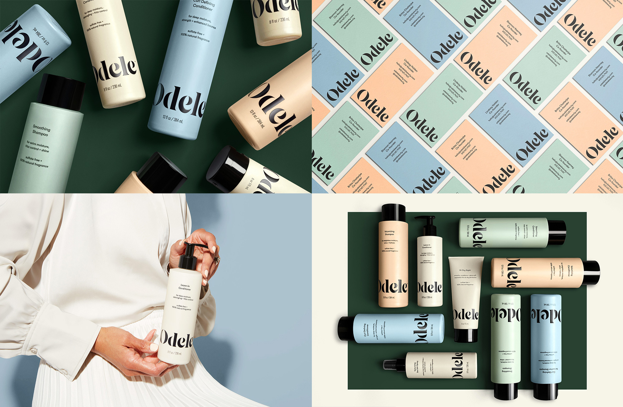
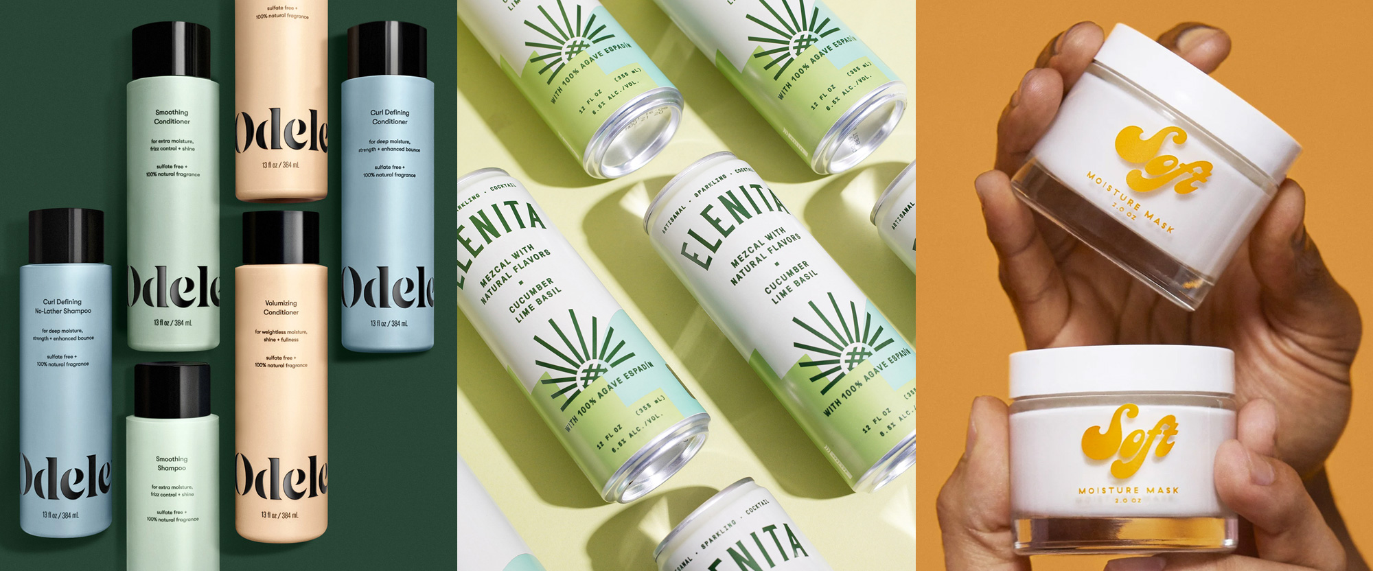
Odele is a new line of salon-quality, gender-neutral, hair care products that launched exclusively at Target this January. The packaging, designed by Minneapolis, MN-based Buddy-Buddy, revolves around a lovely, curvy wordmark in a bold, stenciled, high-contrast structure that, even if not the most novel, benefits from a great rhythm thanks to the particular letters in the name that yield a nice combination of round characters and ascenders with strong vertical strokes. Pastel colors seem to be making a bit of a comeback after a small break in the past 2 - 3 years and they look quite nice here as a contrast to the black wordmark, all in a matte finish on the packaging. I like how the wordmark sits at the bottom of the bottles, giving it a certain heaviness that grounds the minimal design. Being gender neutral, I think that the design leans a little more feminine but I would totally buy it for my mostly masculine hair care regimen (which is not much to speak of). See full project
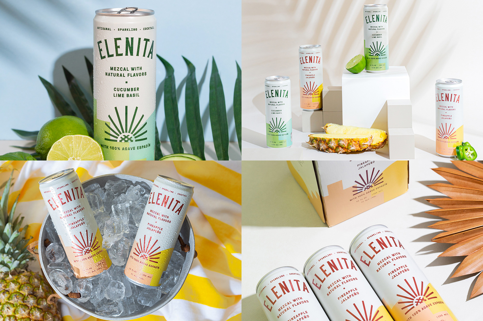
Elenita is a new sparkling cocktail in a can with mezcal as the punch to a range of flavors like pinneaple jalapeño and cucumber lime basil, which sound pretty delicious, even at 5:37am as I write this. The packaging, designed by Los Angeles, CA-based Nice People, has a fun and unexpected mix of elements that work great together on the tall can. The condensed, flared serif on a curve has a vintage feel that alludes to the long tradition of mezcal while the sun-slash-agave-plant icon on the bottom adds a touch of newness. The odd-shaped color blocks in the background at the bottom read, to me at least, like structural shapes you would fine in old haciendas (which are common spaces to be found at places where mezcal is made). But perhaps that’s too much rhapsodizing… in the end, the cans simply look like a good time waiting to happen and like a much better experience and product than a White Claw. See full project
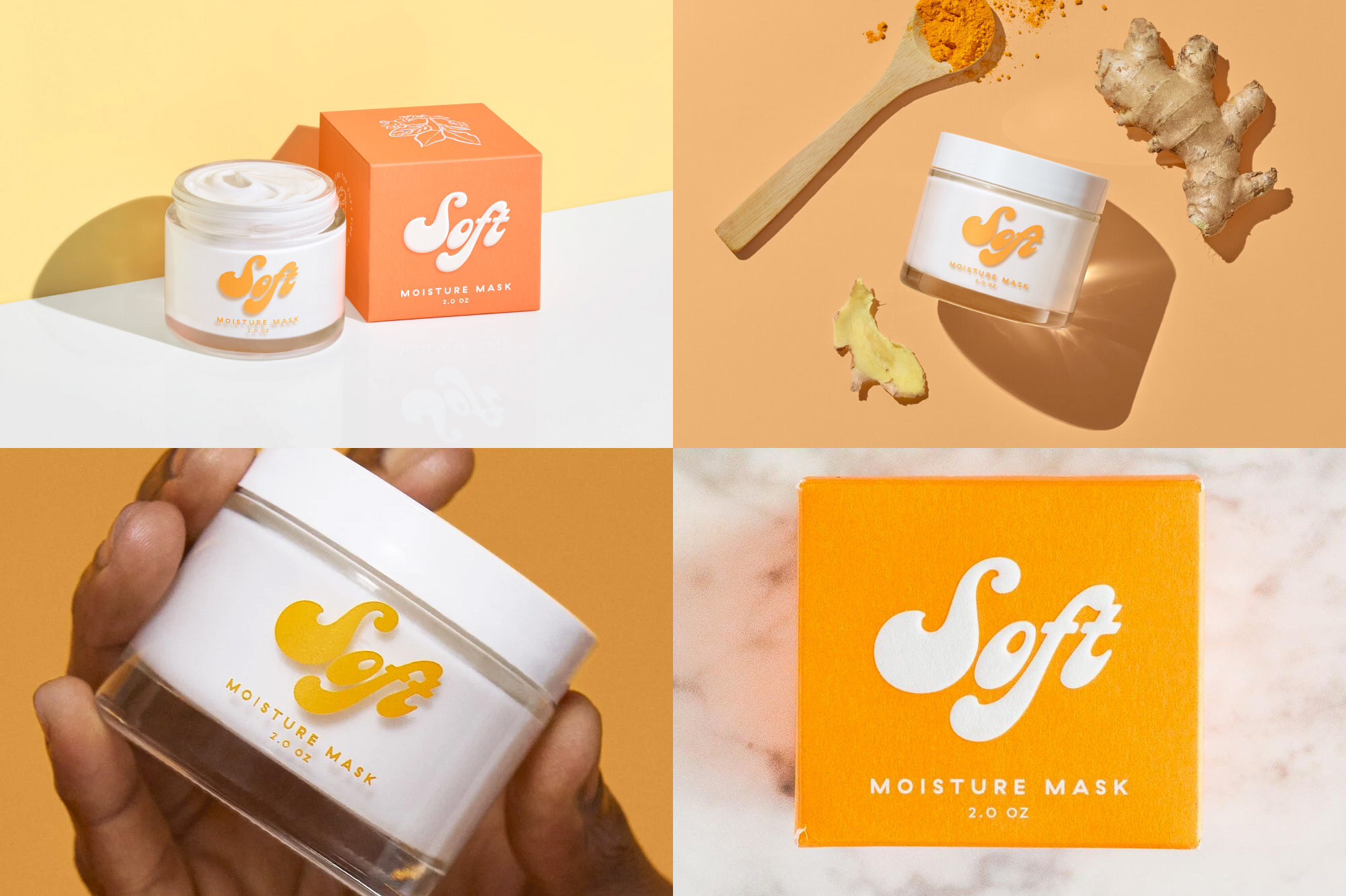
Soft is a new skincare line specifically for men with a face mask as its first product. The packaging, designed by Brooklyn, NY-based Zan Inc. leans heavily on the Soft name with what literally looks like the softest logo ever on Friday Likes in a pillowy, heavy-bottomed script. I really, really wish they had made a proper ligature out of the “ft” as it’s screaming to be fused like a face mask to a man’s pores — LOL, no, I have not been drinking Elenita, I came up with that simile completely sober. Anyway, despite the lack of ligature, the logo looks great in the white/peach color combination, especially in the slightly puffy rendition on the box. 10/10 would smear on my face. See full project
 each year since publication began in 2006

 Новости Союза дизайнеров
Все о дизайне в Санкт-Петербурге.
Новости Союза дизайнеров
Все о дизайне в Санкт-Петербурге.