Обзор лучших ресурсов по разработке бренда, разработке упаковки
contact us | ok@ohmycode.ru
contact us | ok@ohmycode.ru
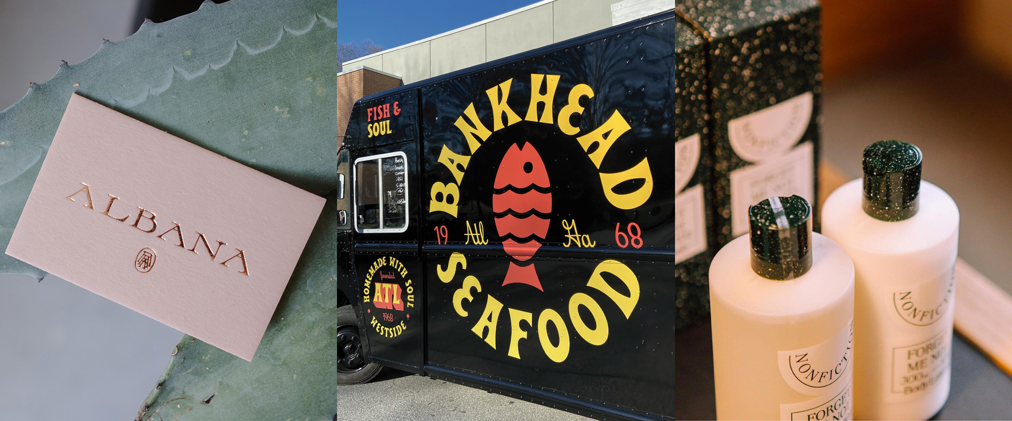
A diverse range of serif-based typographic shenanigans this week, with work from Guadalajara, Atlanta, and New York.
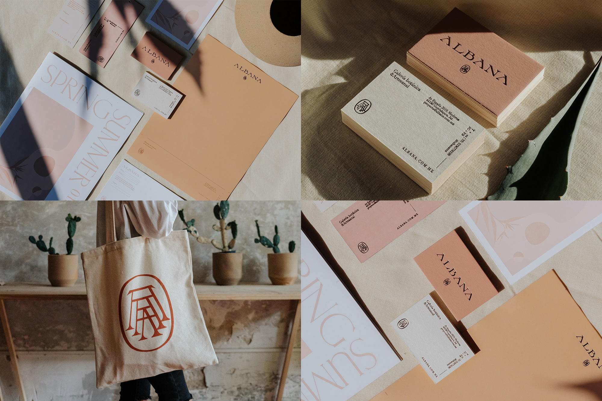
Albana is a retail store in Guadalajara, Mexico, selling artisan pots and other clay crafts as well as highly Instagrammable plants and other design objects. The identity, designed by local firm Monotypo, features a lovely, high-waisted, flared serif that has an interesting aesthetic that manages to be contemporary but with a bit of Prehispanic flair. The wordmark has a great rhythm with all the “A”s in its name that create very similar counterspaces that are usually a pain to deal with when it’s only one “A”. There is a triple-A monogram that is also quite nice that, to me, reads as pots stacked one inside another. (Whether on purpose or not, it reminds me of Albrecht Dürer’s signature.) The color palette with the rich, dark orange clay color and supporting warm tones is great and, as always, finishing it off with gold foil is a hit. If I didn’t kill every plant that comes into our house I would go stock on pots from Albana right now. See full project
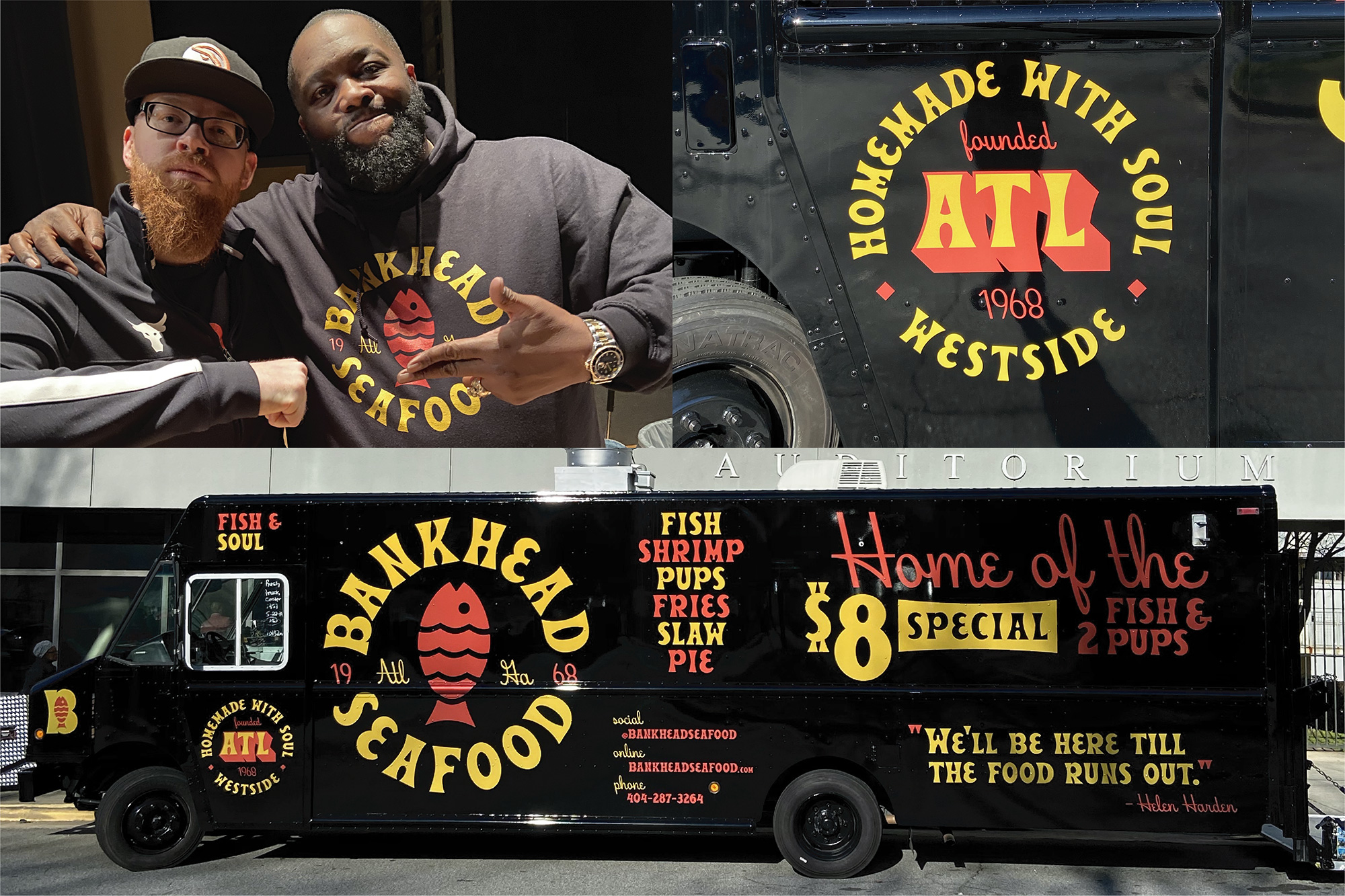
Bankhead Seafood was a Westside neighborhood staple in Atlanta, GA, for 50 years until it was closed by its long-time owner in 2018. To keep the restaurant alive, rappers Killer Mike (pictured) and T.I., who grew up in the neighborhood, purchased the name and recipes and will be reopening the restaurant in the future and rolling out a food truck this April with an identity designed by local designer The Studio Temporary (pictured). Featuring a cornucopia — I should use that word more often — of typefaces, the truck looks exciting, looks bad-ass, and looks full of soul. Everything looks as if it was sign-painted on the truck, which is an effect hard to pull off with mere fonts but the combinations, lock-ups, and simple two-color approach make it look pretty authentic. That reverse-slanted italic script is all kinds of good and goes surprisingly well with the retro flared serif. To pull off this look you can get all the fonts from Hoodzpah — typesetting bravado not included. See full project
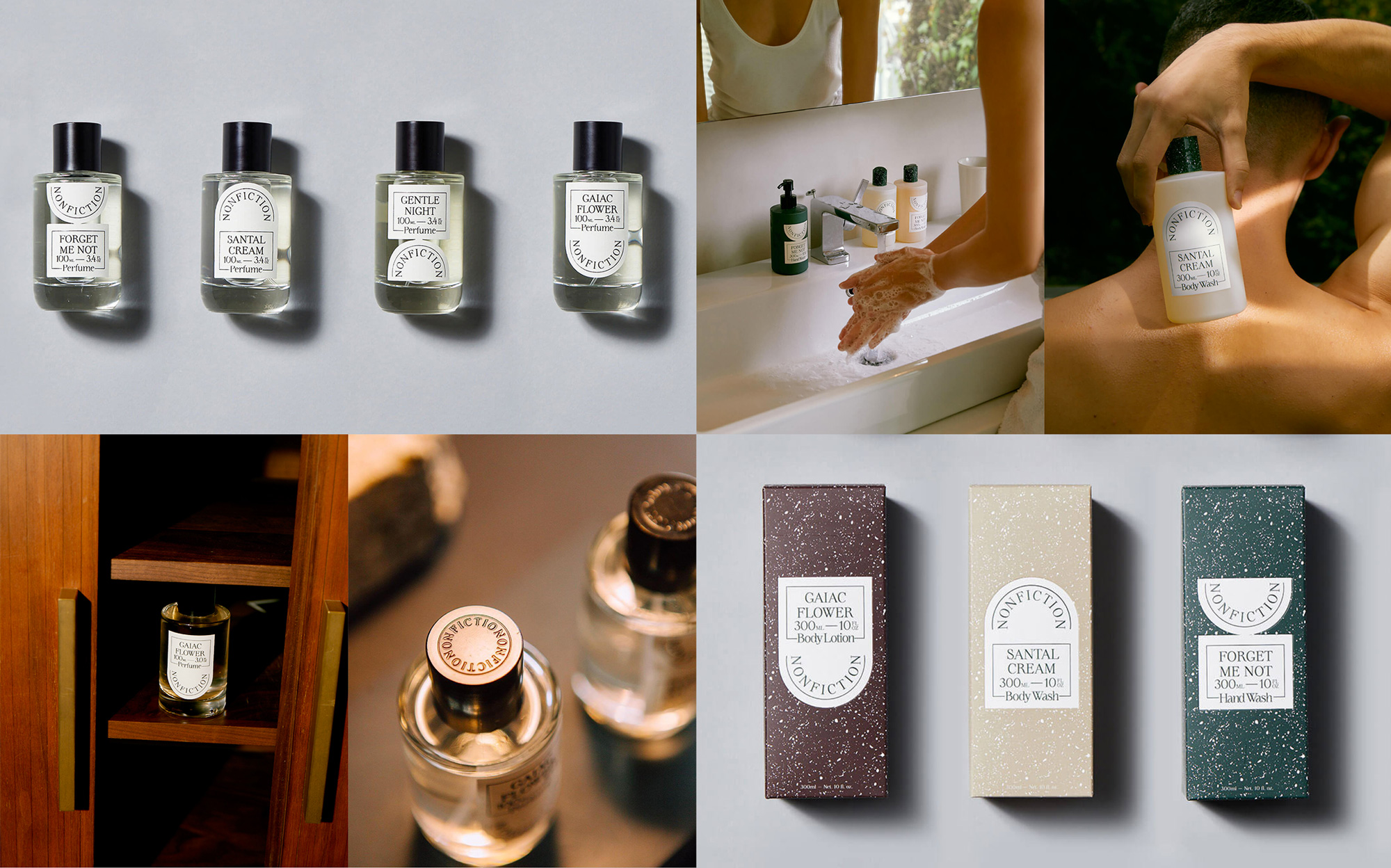
Nonfiction is a new body and fragrance brand currently sold exclusively through Sephora Korea. The packaging, designed by New York, NY-based With Projects, is a kind of Venn diagram of the two projects above, mixing an elegant thin serif but with a lot of typesetting on a curve. On its own, though, without bringing today’s other projects into the mix, the packaging has a kind of classical aesthetic through the serif typeface and the terrazzo-like texture that together makes it look as if it came out of the Roman empire. I love the funky die cut of the labels where the logo is on a half circle that connects with a rectangular shape. There is definitely a subtle too-cool-for-school, deadpan aesthetic but it’s perfectly executed and makes the product feel classy and contemporary. See full project
 each year since publication began in 2006

 Новости Союза дизайнеров
Все о дизайне в Санкт-Петербурге.
Новости Союза дизайнеров
Все о дизайне в Санкт-Петербурге.