Обзор лучших ресурсов по разработке бренда, разработке упаковки
contact us | ok@ohmycode.ru
contact us | ok@ohmycode.ru
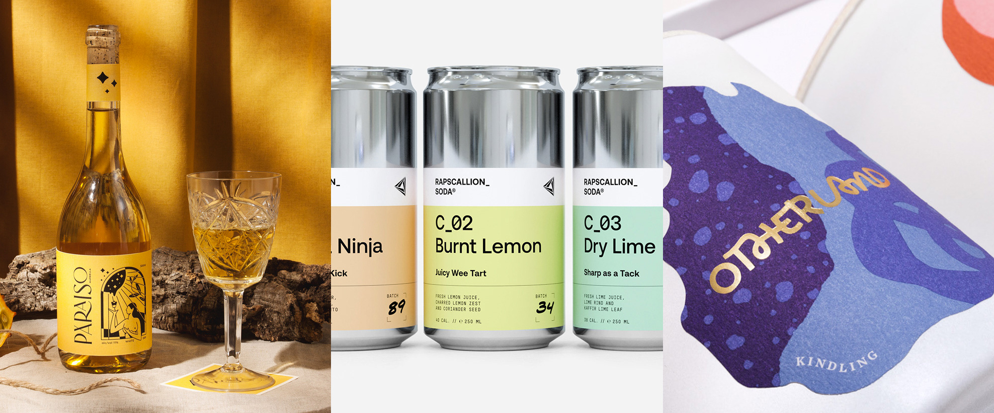
A little bit of everything from everywhere this week, with work from Warsaw, Glasgow, and Brooklyn.
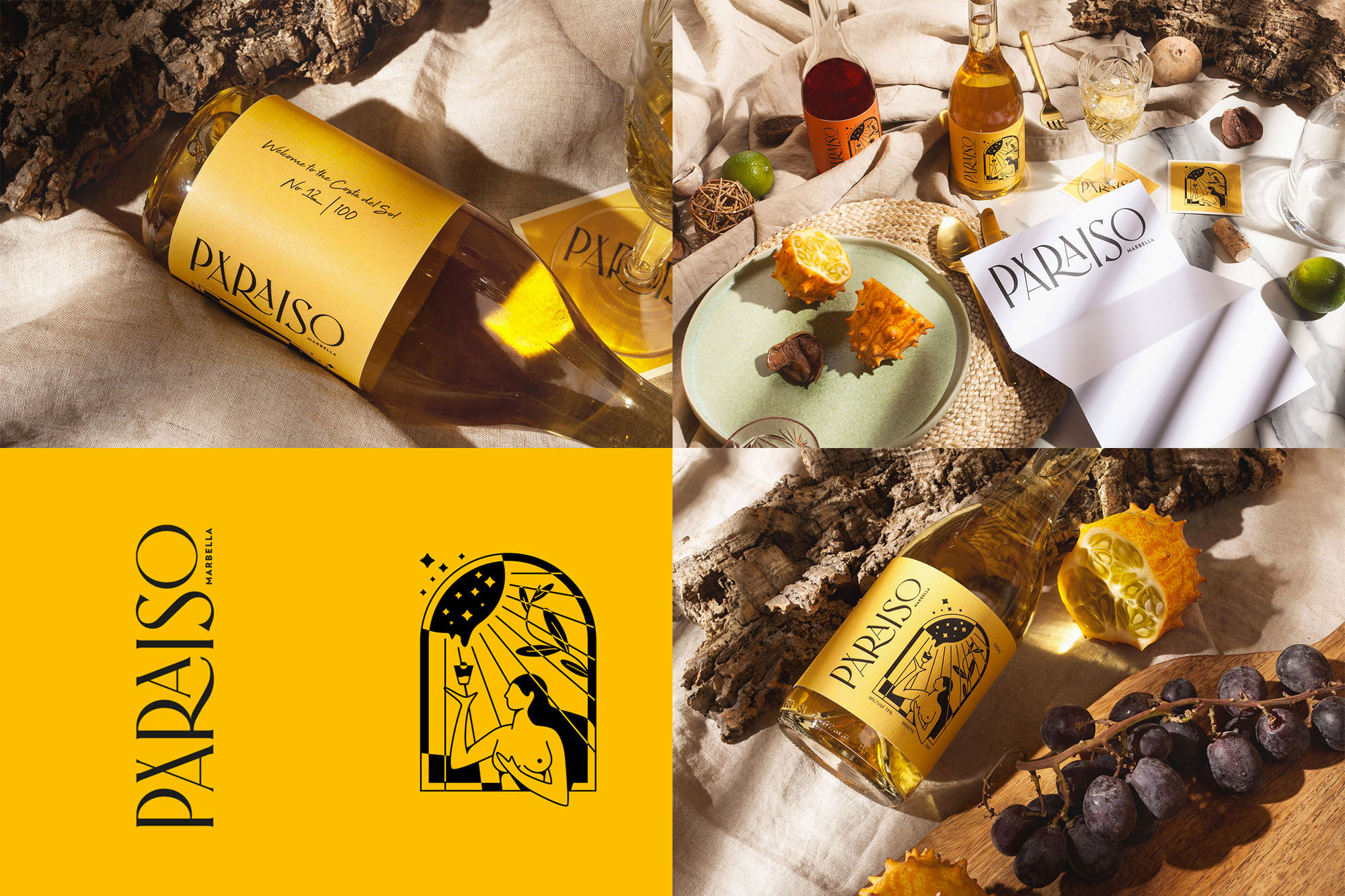
I usually don’t include a project in Friday Likes if the client has no online presence — it usually means a project is being presented as real when it isn’t — so when I couldn’t find a link for this client I reached out to Warsaw, Poland-based Unifikat to inquire. Due to unfortunate circumstances, the client has not been able to get their new real estate marketing business online and even their name is on hold until they are able to move forward but Unifikat assured me it was real. And it’s so nice that I’m okay with including this in the hopes that maybe some good vibes will help them get on track again. As another disclaimer, this isn’t even the identity for the business, it’s a promotional item to send to prospective clients in Marbella on Spain’s Costa del Sol, that Unifikat has labeled as “Paraiso” (Paradise). So… with all that out of the way… this could easily be the identity for a restaurant, bakery, or café so it’s quite impressive that it’s basically a one-off promo project. The wordmark is absolutely beautiful with the unexpected crossing at the top of the “A” and the lovely “RA” pair. The only minor critique is that the “O” at the end is just scaled and its thickness is lighter than the rest of the letters. Accompanying the wordmark is a nice illustration that adds a great contrast. Also, bonus points for the Renaissance-like still life photo settings. See full project
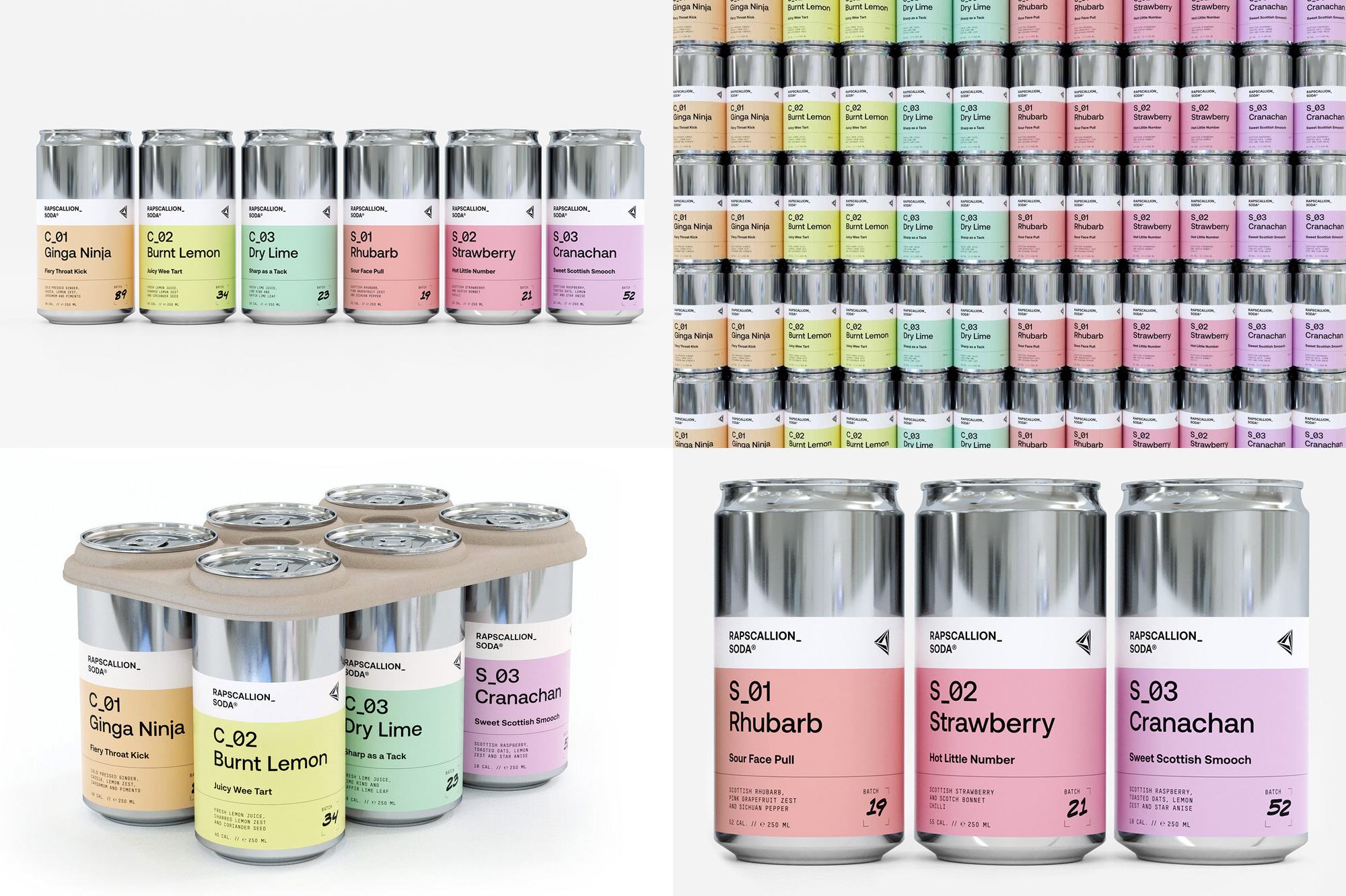
Rapscallion Soda is a brand of low-sugar sodas handmade with fresh fruit in Glasgow, Scotland. The new packaging, designed by local firm Freytag Anderson, may be an instant turn-off for some with its relatively trendy minimal/clinical design but there is no (or little) denying that this looks super nice, especially when all the cans are stacked in an enviable gradient. Even if dismissible as trendy, there are a lot of great things about its execution, from the effective typographic hierarchy to the half-height label that reveals the metal that provides a striking contrast to the white band and pastel colors. I also like how the playful names and descriptions of each soda counter the spareness of the design, making them come across almost as experiments by some young kids coming up with soda combinations and their names. If I saw a wall or even a portion of a shelf with these cans on it, it would most definitely catch my attention. See full project
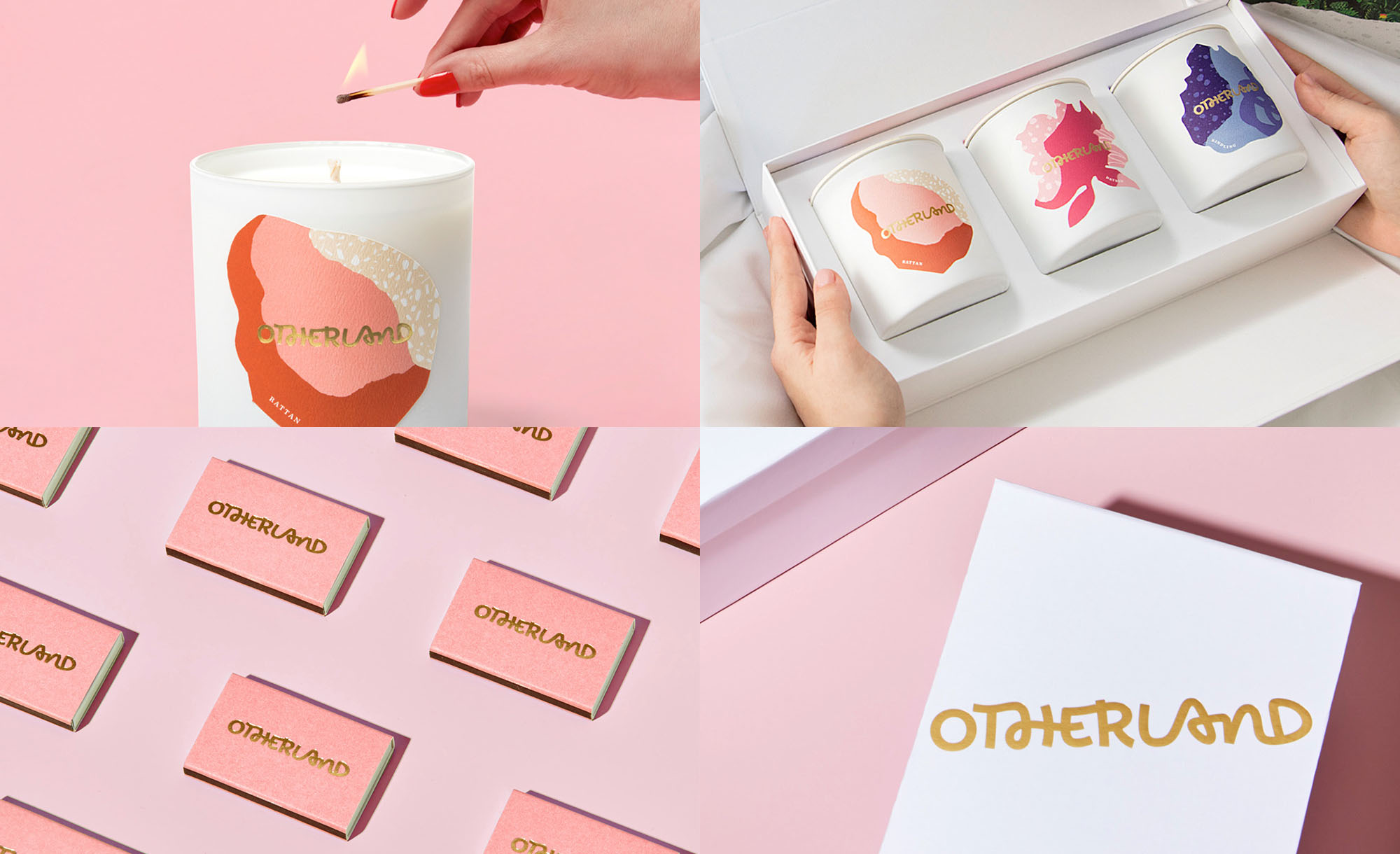
Otherland is a brand of very nice but not super high end candles made with lots of love, care, and research. It was launched in 2018 (so it’s a little old and I somehow missed seeing this when it first came out, so it may be old news for some of you.) The identity, designed by Brooklyn, NY-based Red Antler, has a delightful playful touch that starts with the logo. An almost clumsy, weird, funky, chunky script with odd ligatures in the wrong pairs, contradicting slants, and even a unicase “n” — all of it, somehow, works and creates a kind of alternate fun candle world. Each scent has a unique, abstract illustration of color, textures, and patterns that try to convey the mix of smells of the candles, which are only available online, so a minimal, type-only solution would not be very helpful. Candles are shipped in striking white boxes that complement the white glass tumblers and provide a crisp backdrop for the colorful illustrations and gold wordmark to shine. I would order a candle just to get my hands on a matchbox. See full project
 each year since publication began in 2006

 Новости Союза дизайнеров
Все о дизайне в Санкт-Петербурге.
Новости Союза дизайнеров
Все о дизайне в Санкт-Петербурге.