Обзор лучших ресурсов по разработке бренда, разработке упаковки
contact us | ok@ohmycode.ru
contact us | ok@ohmycode.ru
A special 2019 LAD Awards winners edition of Friday Likes with packaging and identity projects from Guadalajara, Mexico City, and Lima. (These are only a few highlights, do check out all the winners, lots of great work.)
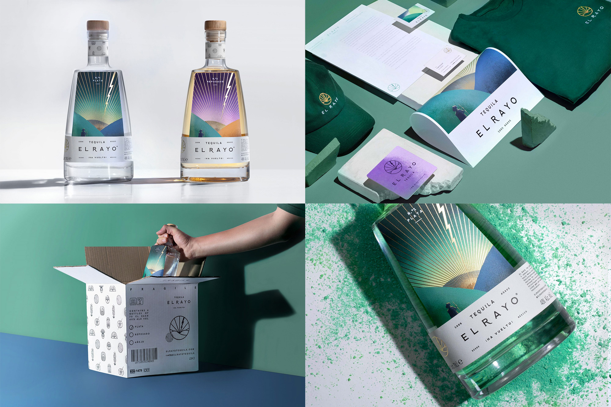
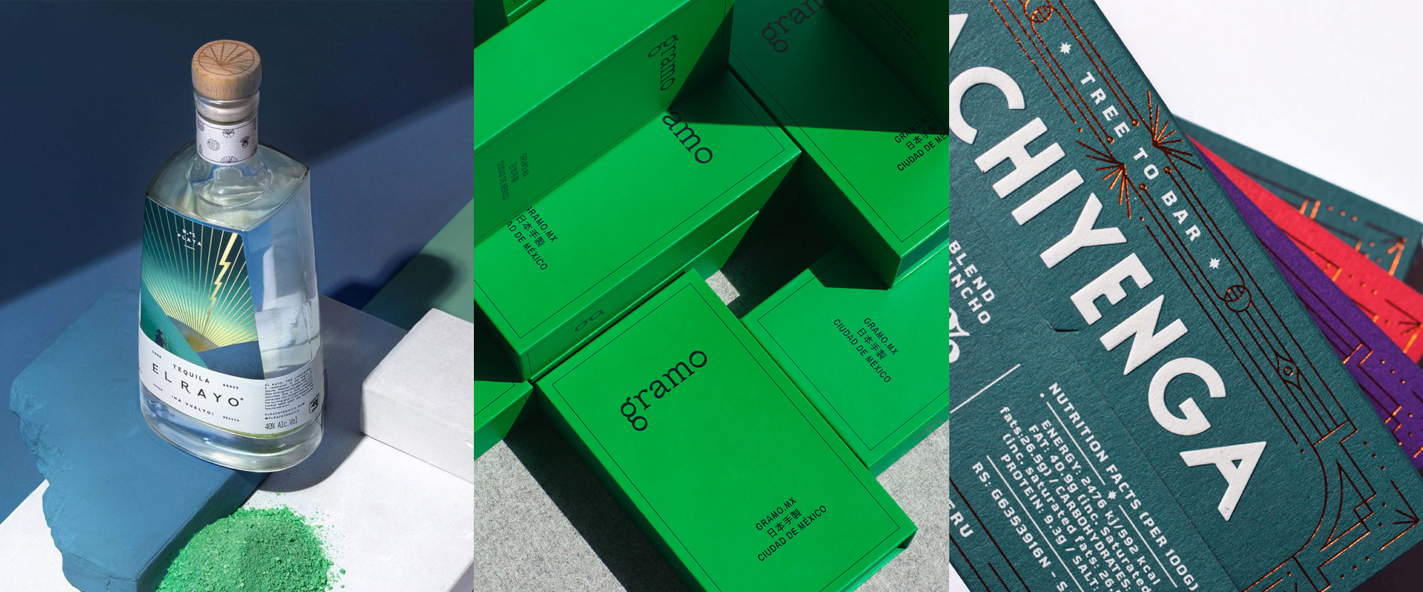
El Rayo is a brand of tequila available in the UK but made in Guadalajara, Mexico, from blue agave and created specifically to be paired with tonic. It’s named after the folk tale of a farmer who witnessed a lightning bolt hit an agave plant, cooking it, and releasing its juicy contents, leading to the discovery of tequila. The myth takes center stage on the packaging, designed by Guadalajara-based Toro Pinto, with a lovely illustration of a farmer facing giant mountains with the lightning bolt reproduced in gold foil. The simple and elegant typography for the name and contents looks great in the white band that contrasts so well with the rich-colored illustrations. I really like how the two tequilas use the same illustration but look so different through very simple color shifts. The abstract lightning in logo form is also quite good and is joined by a range of other badges peppered on case boxes. 10/10 would ⚡ See full project
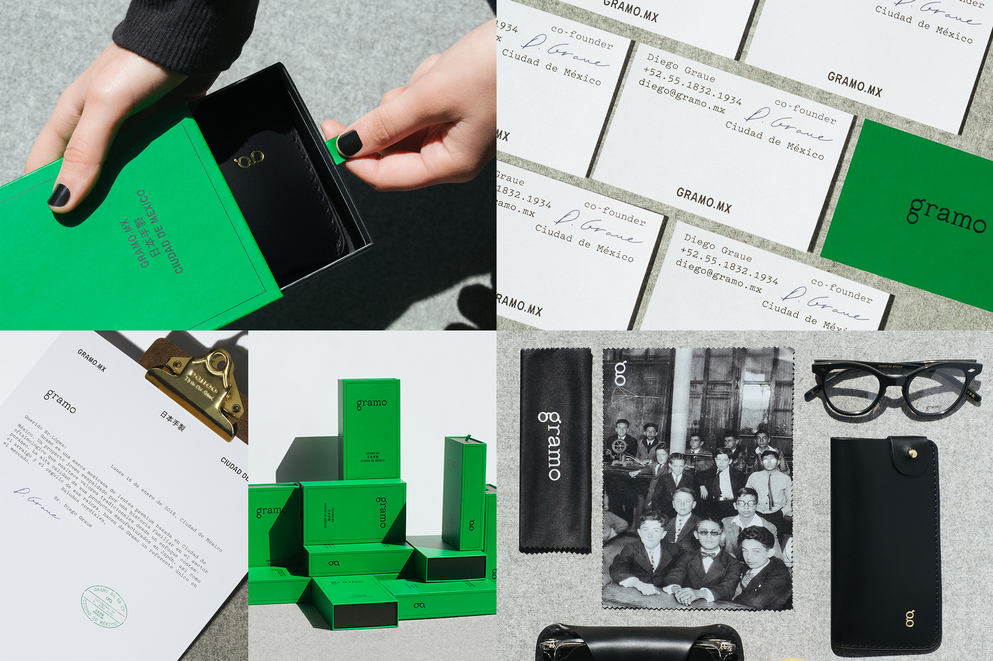
Gramo is a brand of eyewear designed by the owners of Escópica, an eyewear retailer in Mexico City, Mexico, whose family has been in the eye business since the late 1800s. (Dig this announcement from their great grandparent.) Their glasses are designed in Mexico, hand-crafted in Japan, and named after popular neighborhoods in the city, retailing for around $275. The identity, designed by local firm Sociedad Anónima, establishes a high-end and design-y vibe with a minimal but slightly quirky lowercase wordmark reminiscent of typewriter fonts. The winning detail is the double-storey “g” that when rotated 90 degrees looks like an abstract pair of glasses. It’s not a mind-blowing concept but it’s very subtly and elegantly done here. The bright, rich green color is unexpected and looks great as does all the hipster-y typography. 10/10 would

 Новости Союза дизайнеров
Все о дизайне в Санкт-Петербурге.
Новости Союза дизайнеров
Все о дизайне в Санкт-Петербурге.