Обзор лучших ресурсов по разработке бренда, разработке упаковки
contact us | ok@ohmycode.ru
contact us | ok@ohmycode.ru
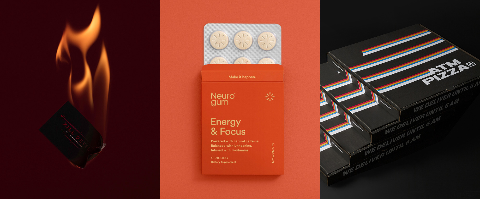
A very well-photographed group of otherwise unrelated projects this week, with work from Mexico City, Los Angeles, and Monterrey.
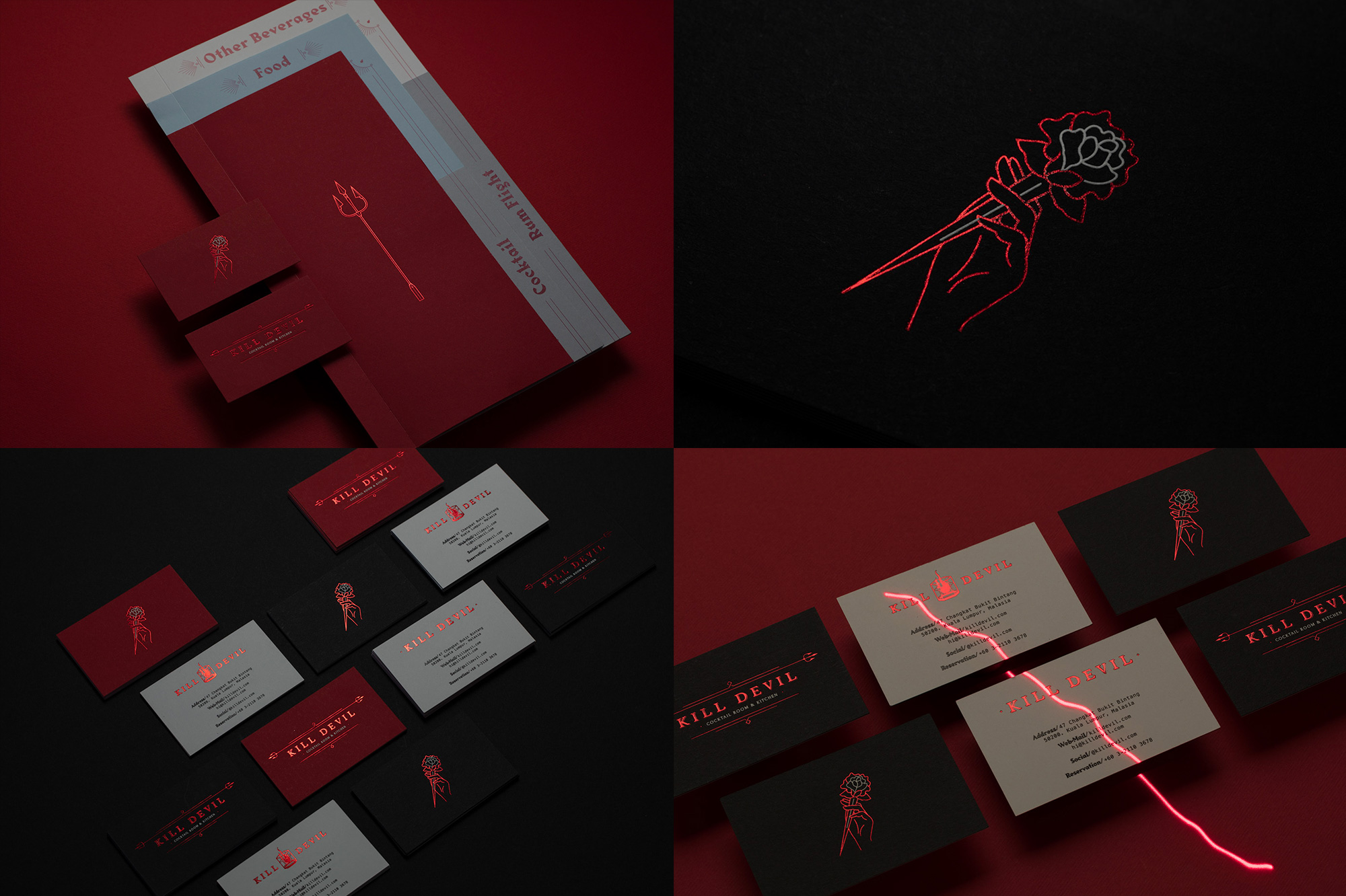
Kill Devil is a bar and restaurant (or, in their words, a cocktail room and kitchen) in Kuala Lumpur, Malaysia, serving Central and South American, Cuban, and Latin Caribbean food and drink, all with a devil-ish attitude. The identity, designed by Mexico City, Mexico-based Human, is, as they describe it “Striking yet elegant, naughty yet principled, fun-loving and sexy” with the always-winning combination of black and red along with a spiky bold font for the menu and a classier serif for the logo, complemented by thorny icons like a trident, a rose/dagger, and a flaming glass. I’m not a huge fan of the design per se but it certainly nails the mood of the place. There are really only two applications to see — business cards and menu — but they have presented the hell (ha!) out of it. See full project
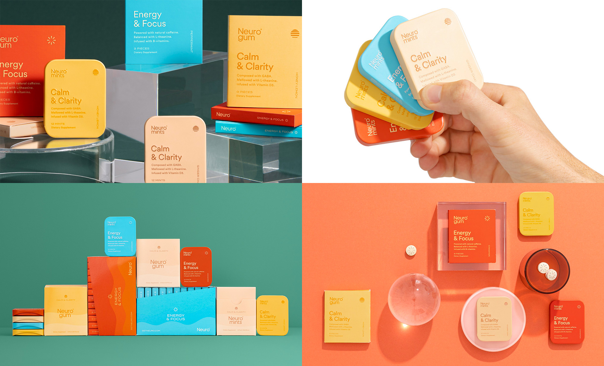
Neuro is a brand of nootropic-based energy gum and mints made from natural caffeine, L-theanine, and B-vitamins that aim to improve cognitive function and state of mind. The identity and packaging, designed by Los Angeles, CA-based Herman-Scheer, is fairly straightforward but its bright, happy, sunshine-y colors and airy typography begin to set the mood for the promised effects of the gum and mints. One detail that I really like is the differentiating icon for “Calm & Clarity” (a sunset) and for “Energy & Focus” (a spark) in the corner of the packaging and debossed on the actual product. The minimalist packaging also adds a touch of luxury that makes it look as if Altoids and Tiffany & Co. had a baby. See full project
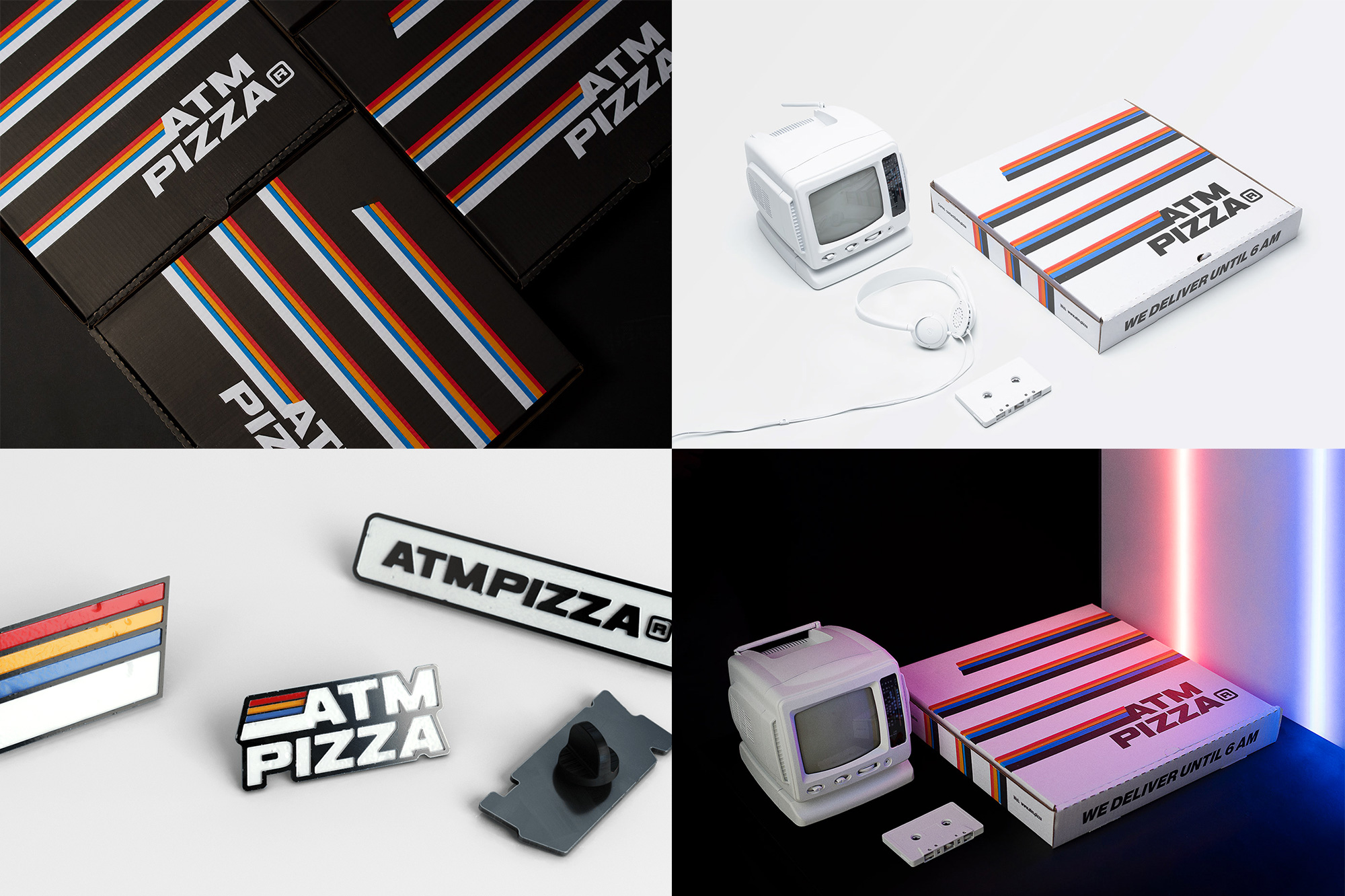
ATM Pizza is a pizza joint in Monterrey, Mexico, with a focus on delivering after-hours providing ample availability for pizza late into the night just as ATMs provide cashmoney all day long. The identity, designed by local firm Shift, is unapologetically 1980s-tastic and has a clunky aesthetic (which feels to be done on purpose) best exemplified by the Eurostile-ish wordmark with thick VHS stripes and the biggest side serving of a registered mark that side of the border. Their Instagram account is straight-up filled with bad nostalgia graphics and references and I’m here for all its gaudiness. See full project
 each year since publication began in 2006

 Новости Союза дизайнеров
Все о дизайне в Санкт-Петербурге.
Новости Союза дизайнеров
Все о дизайне в Санкт-Петербурге.