Обзор лучших ресурсов по разработке бренда, разработке упаковки
contact us | ok@ohmycode.ru
contact us | ok@ohmycode.ru
A wide range of wordmark heroes this week, with work from London, Melbourne, and Brooklyn.
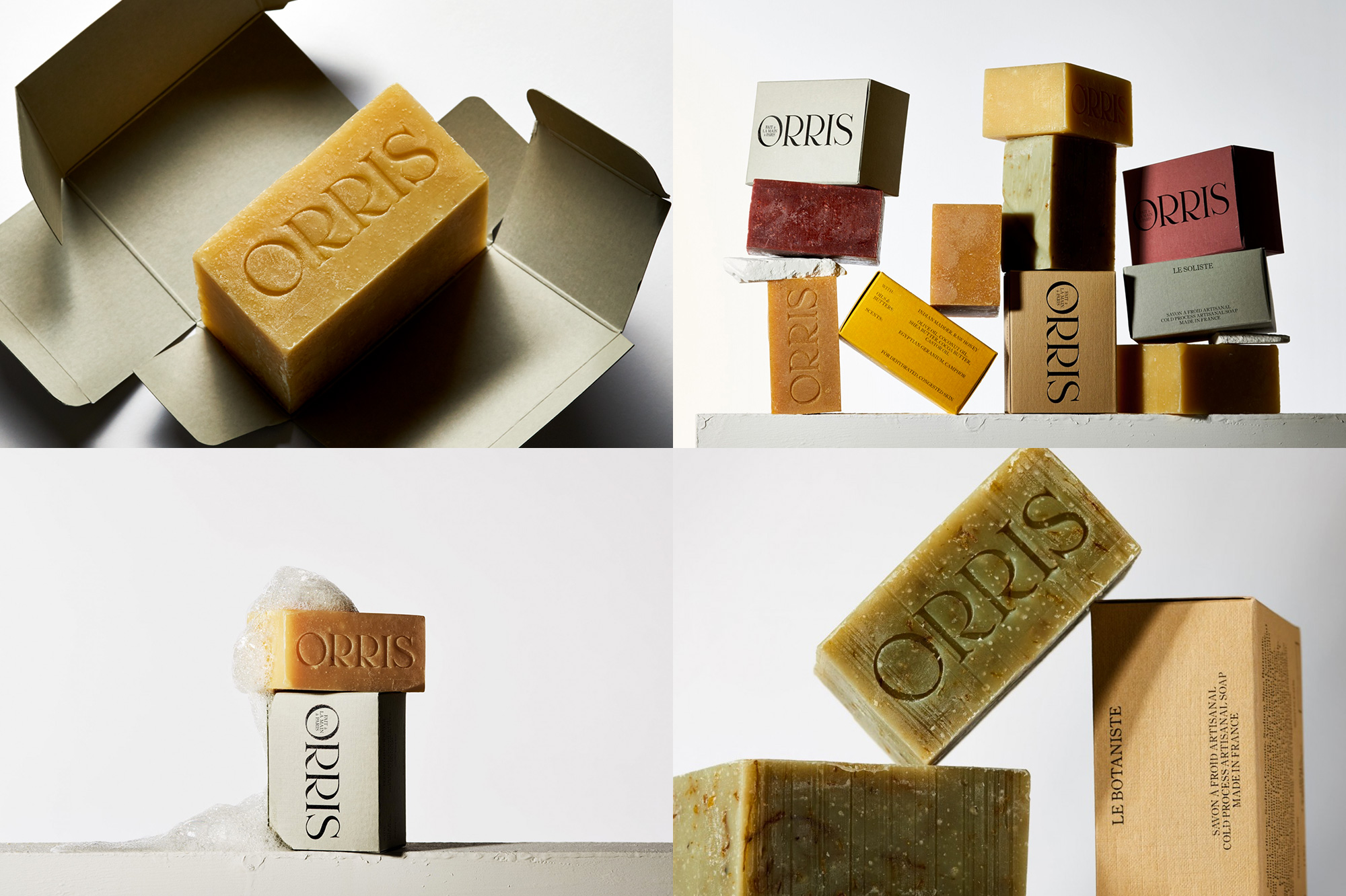
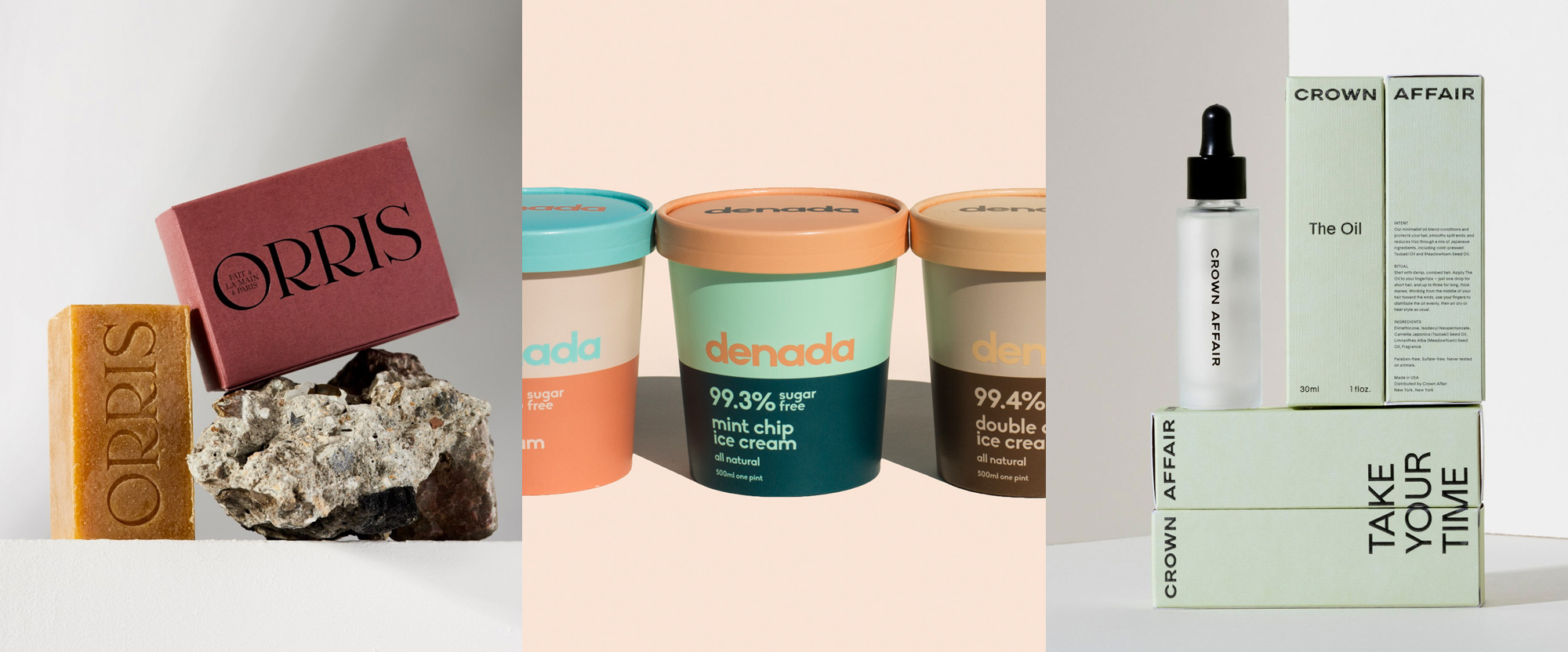
Orris is a brand of handcrafted soaps in Paris, where each cold-process-bar is “hand-poured and hand-cut, using the finest oils, butters, and botanicals”. They offer four different soaps and each has a dignified name: Le Botaniste (The Botanist), La Déesse (The Goddess), Le Nomade (The Nomad), and Le Soliste (The Soloist), so you know this is isn’t your everyday run of the mill soap and the identity, designed by London, UK-based Regular Practice, reflects that with a stunning, elegant serif that looks equally great foil stamped on the colored-stock boxes as it does carved on the soap. I would almost feel guilty about using the soap and eroding the deboss with my grubby hands. See full project
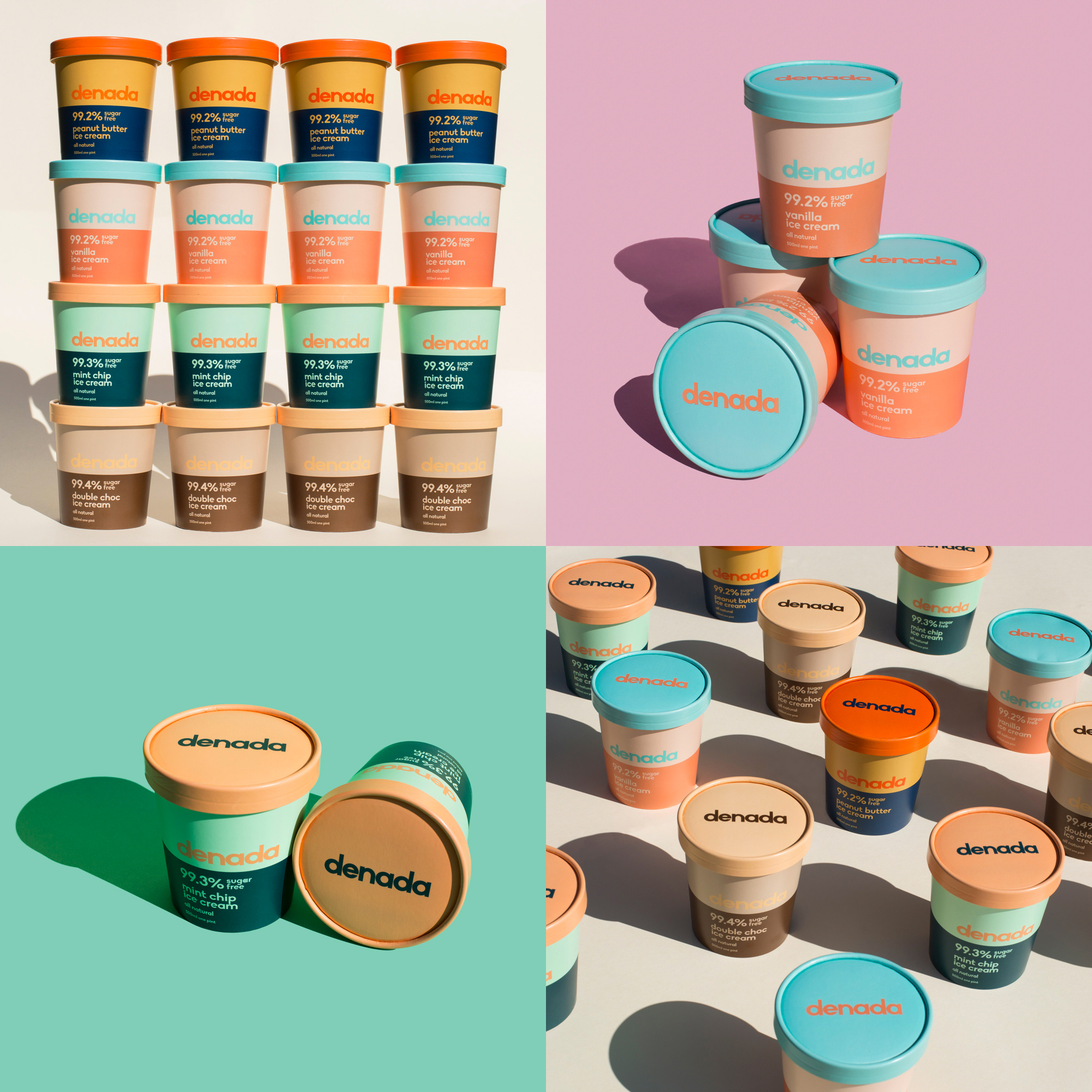
Denada is a brand of ice cream in Australia made without sugar, emulsifiers, or other weird stuff — its name, in Spanish, translates to “Of Nothing” (as in, I’m guessing, “This ice is cream is made of nothing bad”) and also “You’re Welcome” (as in, I’m projecting, “Here is ice cream, you’re welcome”). The identity and packaging, designed by Melbourne, Australia-based Jo Cutri Studio, follows the minimalism of the ingredients list with a very straightforward geometric sans serif logo that isn’t the most creative but is saved by the fact that all letters have a curve, giving it an inherent pleasant rhythm. The logo looks great on the equally minimally packaging that, while also straightforward, stands out for its unexpected three-way color combinations and ample white space around the logo. I would buy one of each flavor just to decorate my freezer. See full project
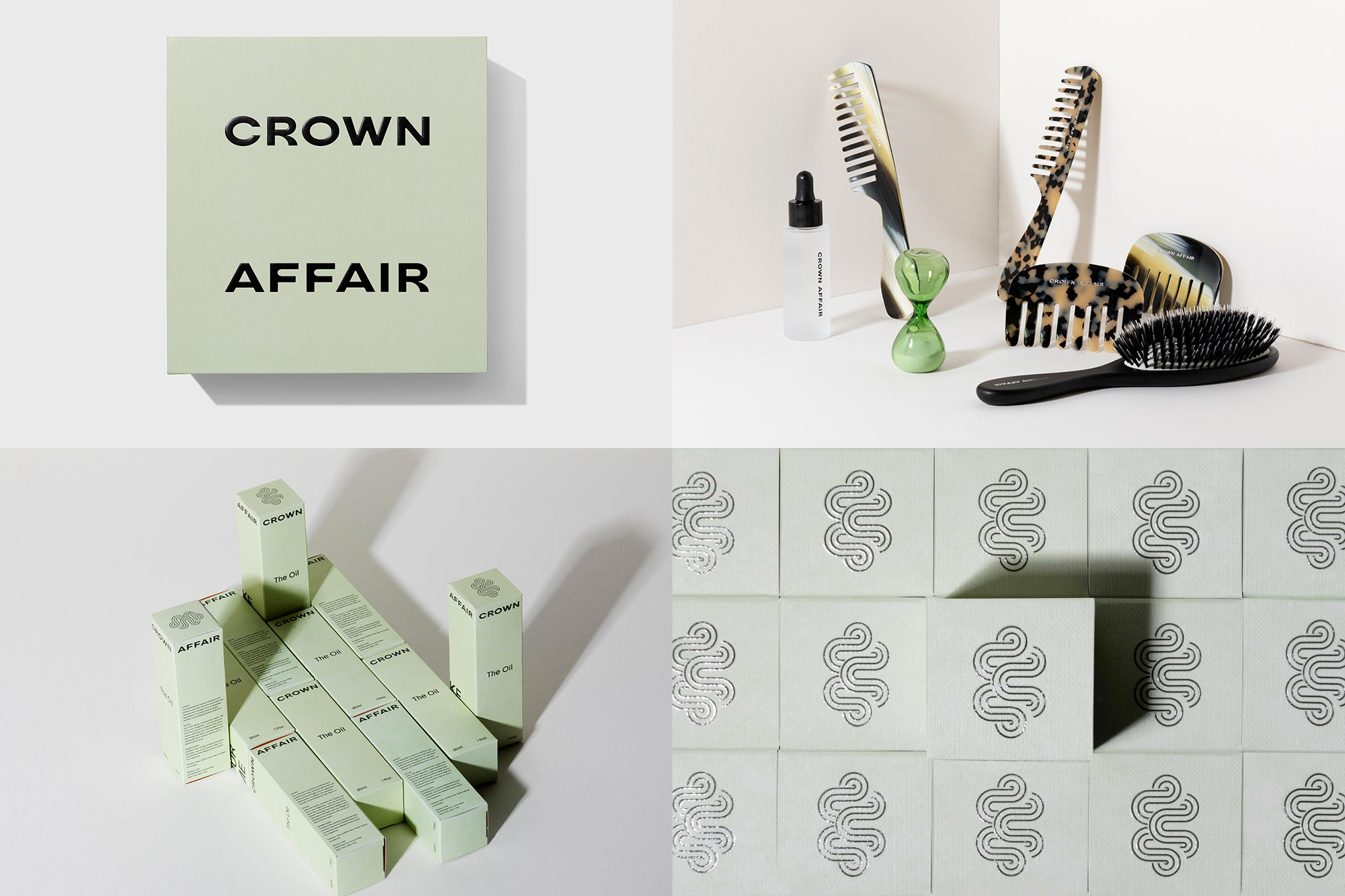
Crown Affair is a haircare brand that offers a full spectrum of quality products to, well, care for your hair, including brushes, combs, oils, and towels. The identity, designed by Brooklyn, NY-based Placeholder, has a striking balance of elegance and quirkiness best embodied by the wordmark in a classy, extended sans serif that features some anti-ink-traps in the “F”s and funky “R”s — a matching, text font designed with Grilli Type is also quite nice. A complementing icon of abstract luscious curls (although it’s used sideways, which also makes it look like wind dramatically blowing someone’s hair) makes spare but enjoyable appearances and the color palette across all the products and materials is spot on. Also, I never thought I would swoon for a comb — which I don’t even use — but those are some fine-looking combs. See full project
 each year since publication began in 2006

 Новости Союза дизайнеров
Все о дизайне в Санкт-Петербурге.
Новости Союза дизайнеров
Все о дизайне в Санкт-Петербурге.