Обзор лучших ресурсов по разработке бренда, разработке упаковки
contact us | ok@ohmycode.ru
contact us | ok@ohmycode.ru
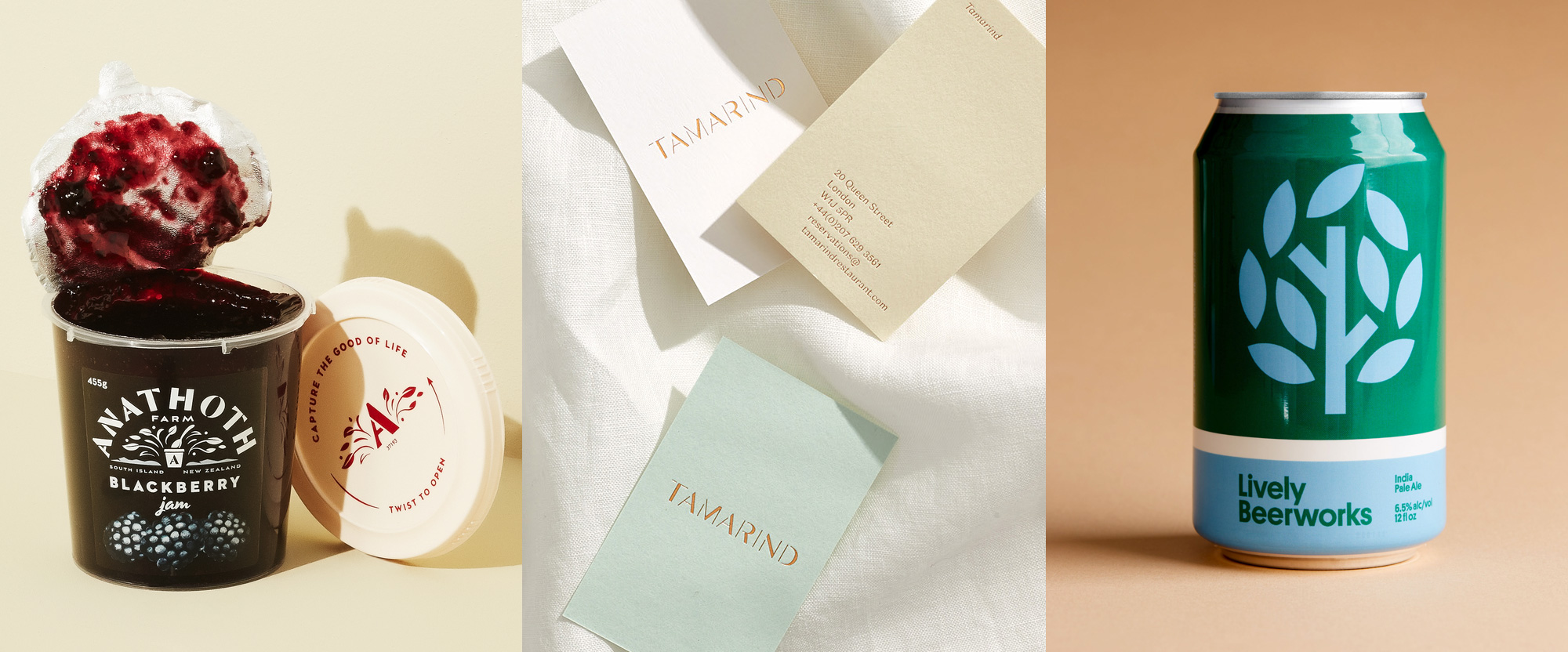
A serving of two thirds stencil and one third sans serif this week, with work from Auckland, London, and Oklahoma City.
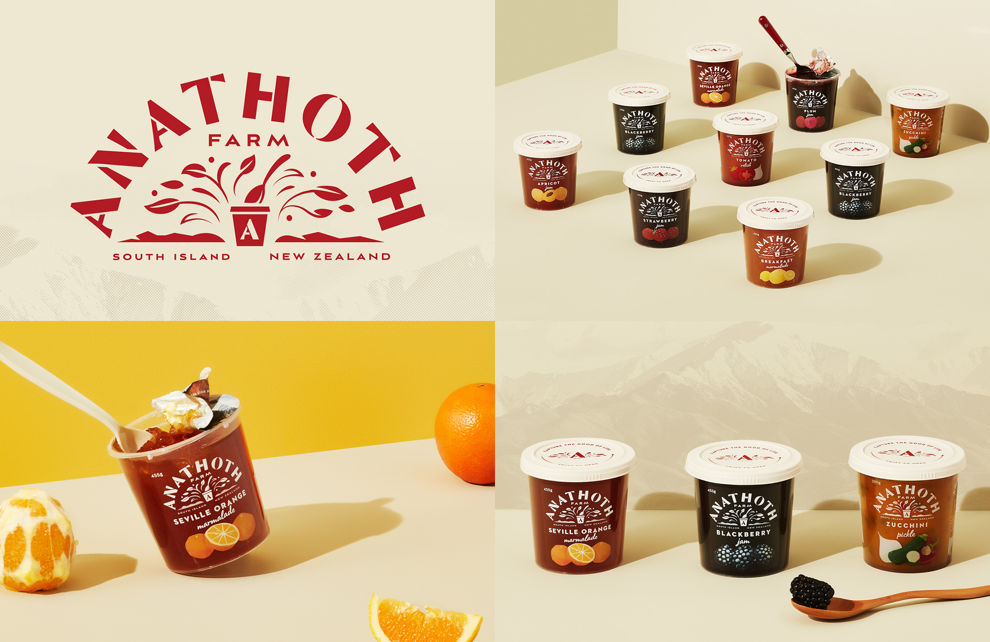
Anathoth Farm is a brand of jams and chutneys available in New Zealand made from real, whole fruit and vegetables sourced from local growers. The new identity, designed by Auckland, New Zealand-based Unified Brands, is a sophisticated evolution of what Anathoth had before, building on the combination of a stencil font and realistic illustration with an elegant flared sans serif stencil wordmark, an abstraction of the brand’s containers with some plant goodness coming out of them, and nicely contrasting new illustrations for each flavor. (Small quibble: the “O” is not quite right as it has a super thin contrast that is not present in any of the other letters.) The composition of the design on the container looks so great, with the logo taking up a lot space, printed only in white, with the illustrations in the bottom in full color, with everything offset by the deep, rich colors of the jams and chutneys. I want to make that blackberry one my jam. See full project
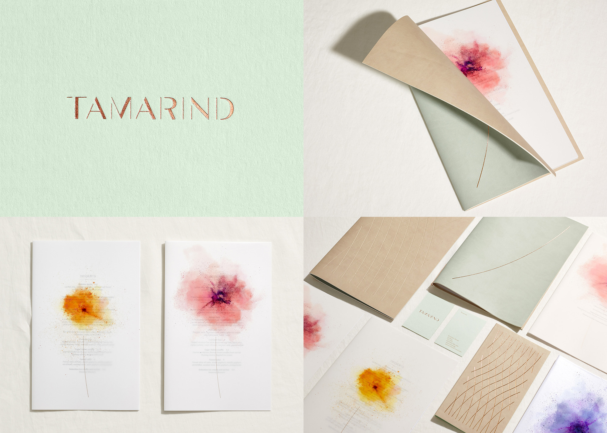
Tamarind, in the Mayfair district of London, UK, is one of the first Indian restaurants in the world to win a Michelin star. The identity and menus follow cues from the recently redesigned, airy and flower-infused space — a couple of images can be seen here and here. Designed by London-based Dutchscot, the highlight of the project, for me at least, are the beautiful abstract interpretations of flowers made from dry powder, alluding to Holi, the popular ancient Hindu festival where people cover themselves in color. Printed on translucent paper on the menus, the flowers become even more unique and elegant and I love the interplay with the cover, where a thin curved stroke in gold foil stamp is the stem. Everything here, from materials to color palette to production method, exudes sophistication. See full project
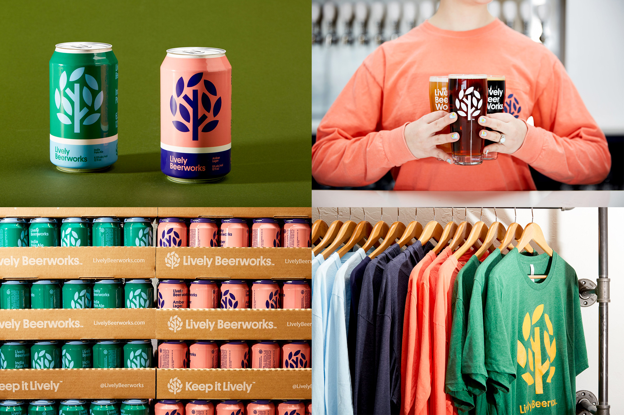
Lively Beerworks is a micro brewery in Oklahoma City, OK. The identity, designed by local firm Switch, revolves around a lovely (and lively) icon that is generously displayed on the can, taking up a good three quarters of the real estate, which is a nice change of pace from cans where primary logos take a back seat to more complex illustrations or layouts. The minimalist icon is supported by a minimalist type approach, with everything typeset in a single weight of Platform, which was overused for a while and I hadn’t seen it used in some time. It works great in this project, in particular with the, um, lively color palette that makes everything feel happy, like good beer should. See full project
 each year since publication began in 2006

 Новости Союза дизайнеров
Все о дизайне в Санкт-Петербурге.
Новости Союза дизайнеров
Все о дизайне в Санкт-Петербурге.