Обзор лучших ресурсов по разработке бренда, разработке упаковки
contact us | ok@ohmycode.ru
contact us | ok@ohmycode.ru
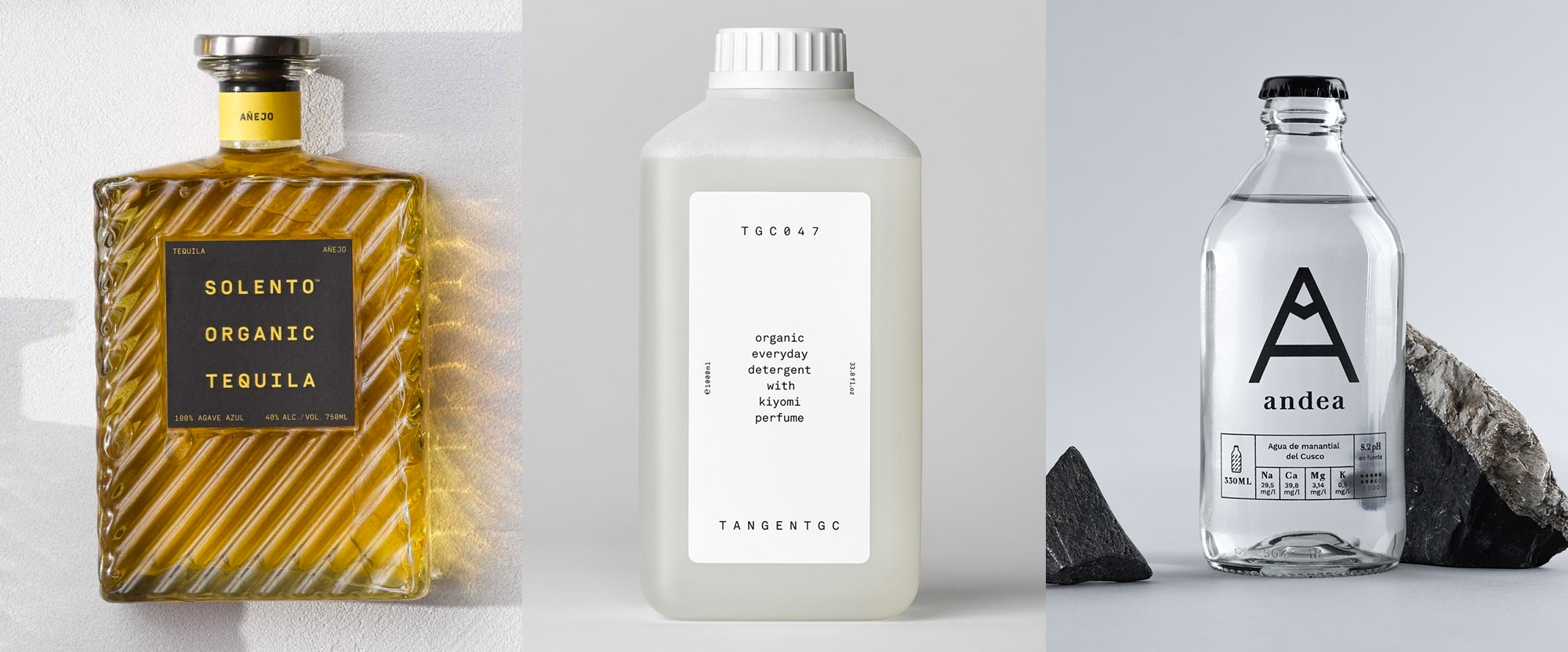
A bevy of nice bottles and their accompanying designs this week, with work from New York, Stockholm, and Lima.
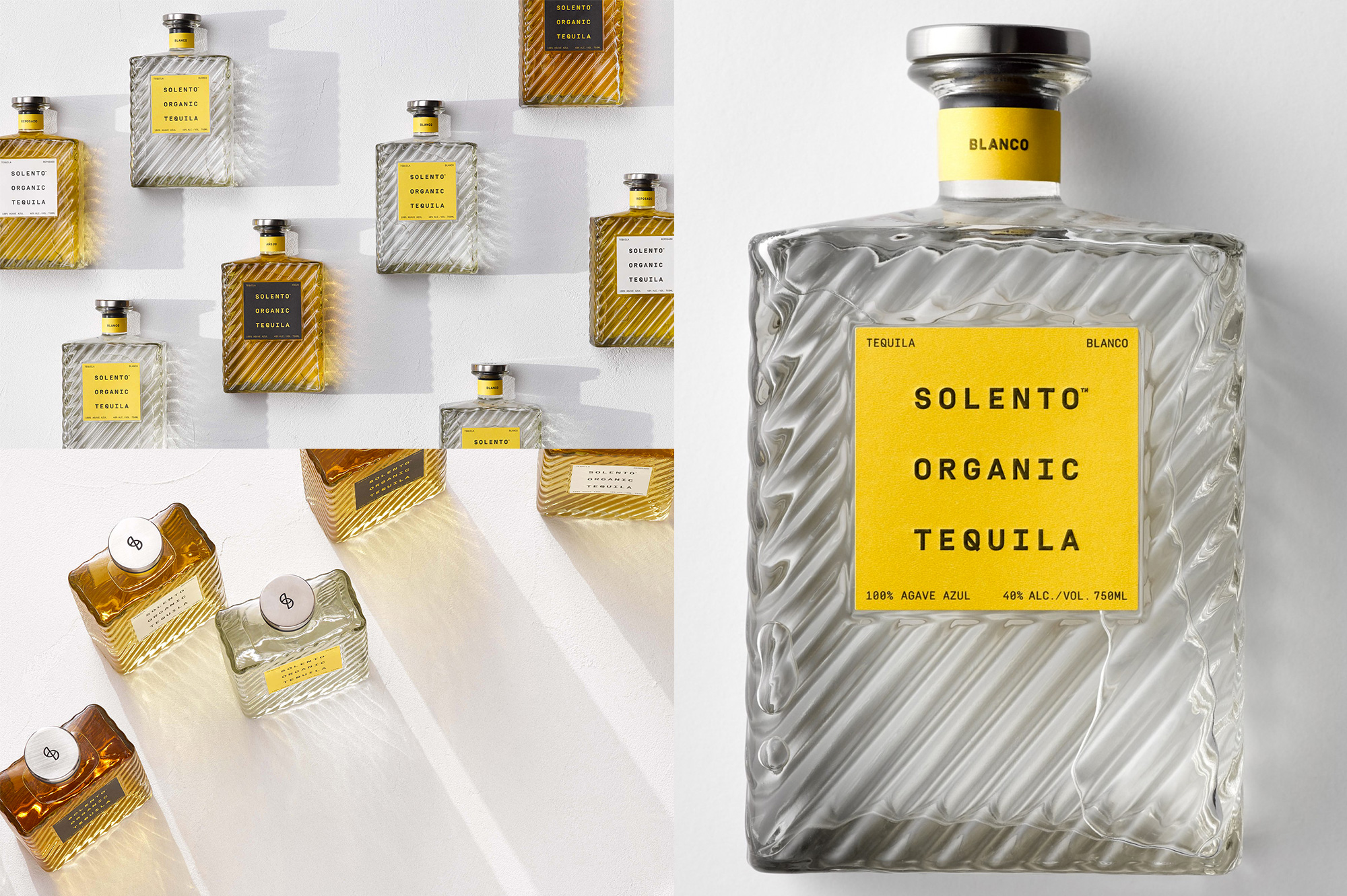
Solento is a small-batch brand of tequila founded in Encinitas, CA, by legendary surf filmmaker Taylor Steele in collaboration with a distillery in Mexico. The name is a contraction of the Spanish words sol (sun) and lento (slow) and the design, by New York, NY-based Javas Lehn Studio, is as chill as a slow-setting sun. With such a textural and unique bottle, the design elements are pared back to the bare minimum but they still pack a punch with the bold color contrast of the labels across the three different tequila styles. A monospace font is probably not what one thinks of when thinking about tequila but when you have three words with the same amount of letters, it’s almost a crime to NOT use a monospace font but, beyond that, it simply looks quite nice. I particularly like how the full name of the product forms an invisible square that sits at the center of the square label — it’s the small pleasures in life that bring me joy. See full project
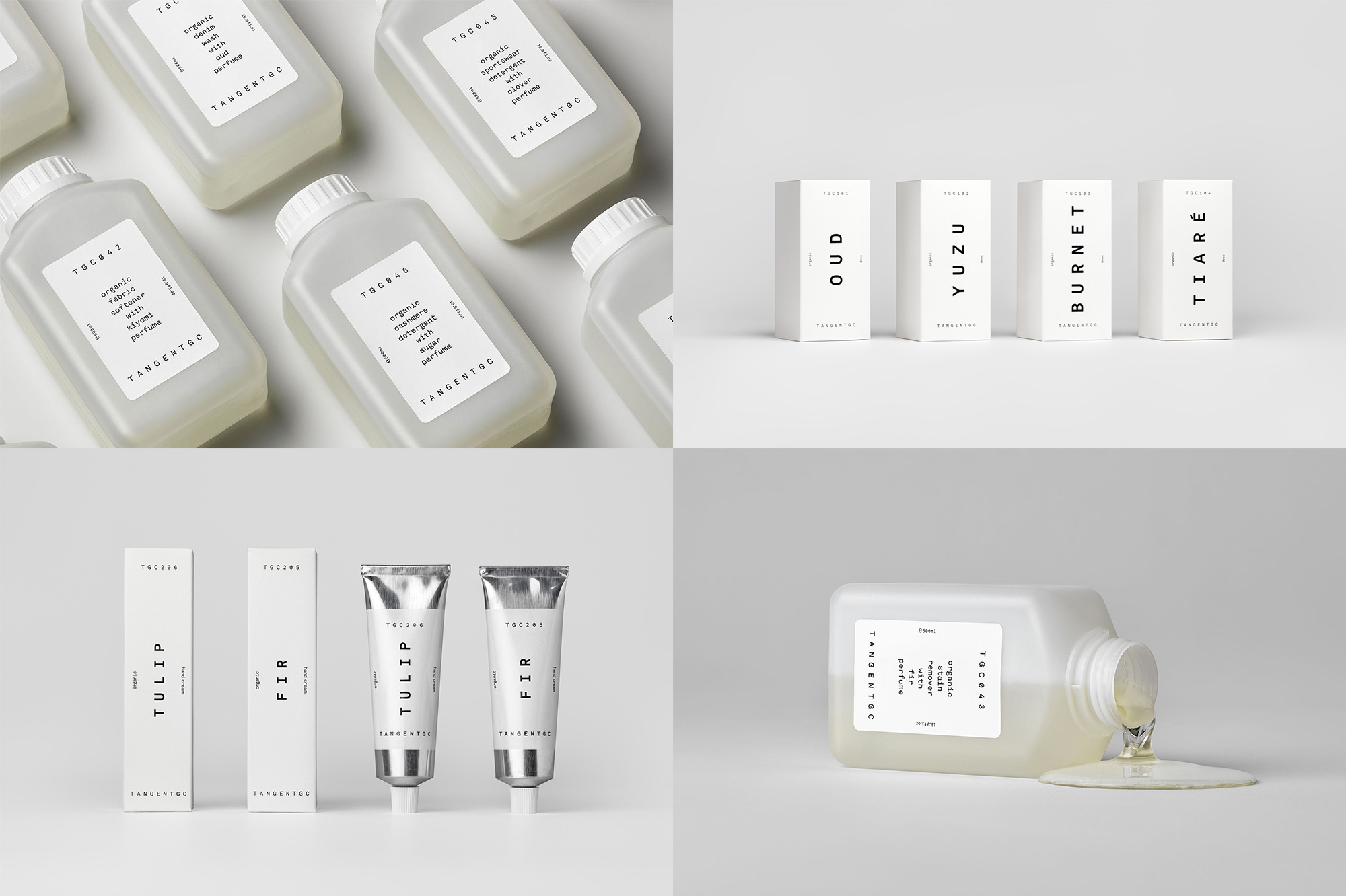
In other cool-bottle, monospace-font news we have Tangent GC, a brand of laundry, shoe, and skin care products based in Stockholm, Sweden, but available worldwide with select stockists. The identity, initially designed by Essen International and extended by Carl Nas Associates — Carl Nas worked on this project while he was at Essen — may be a little too spartan for many of you, I think it might even be so for me and I love me some spartan-looking things but the big, hunky bottles with the stout caps are somehow super cool and the extra plain labels are an enjoyable complement. Additional products, follow a similar typographic structure while adapting to smaller labels or boxes and boldly displaying the product’s name instead of the ingredients. While nice, I’m still mostly smitten by the laundry bottle — would love to reduce reuse recycle that bad boi. See full project
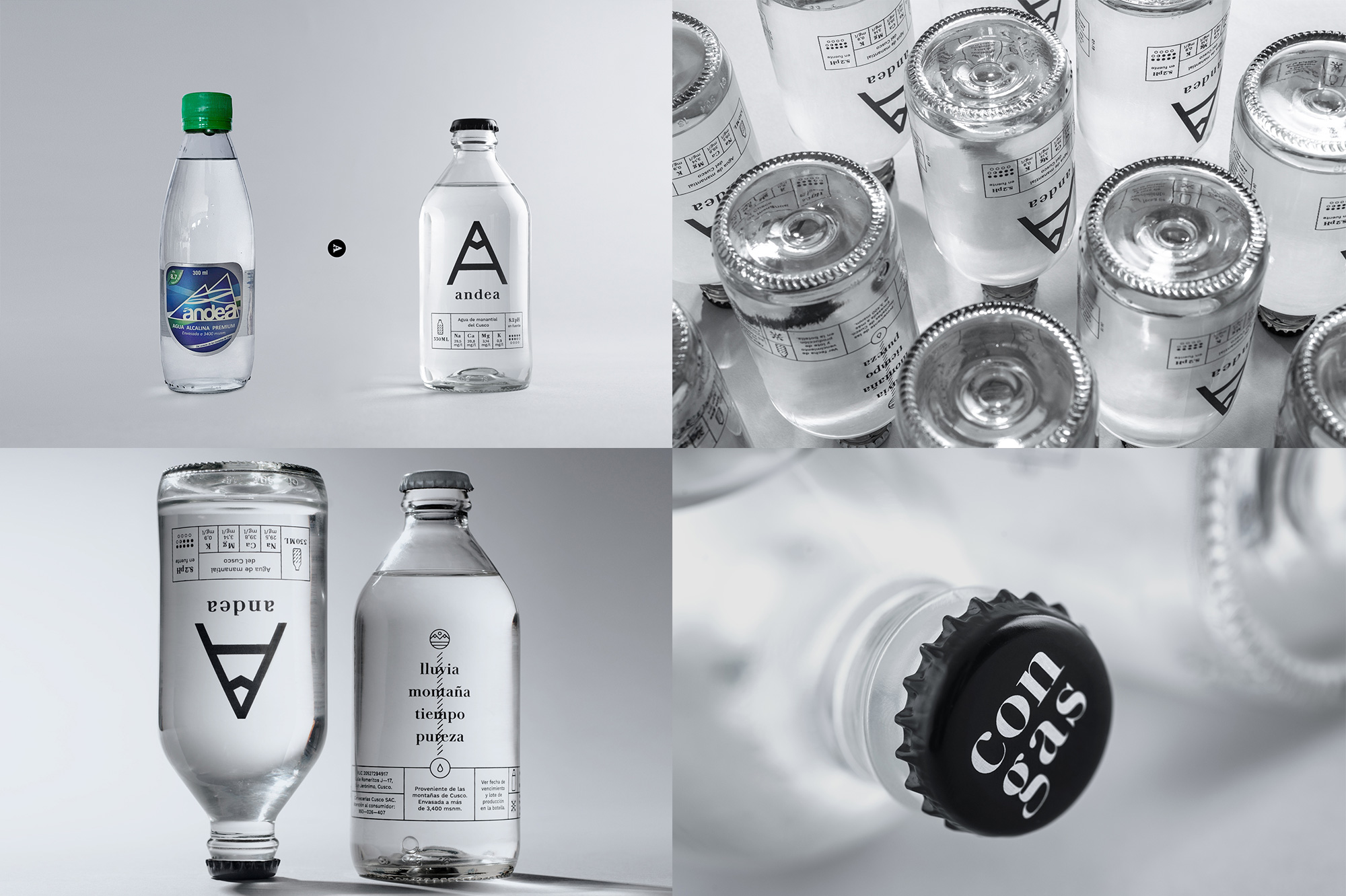
In yet another cool-bottle, but no monospace-font news we have Andea, a brand of natural spring water that comes from a mountain in Cusco, Peru. The new packaging and identity, designed by Lima, Peru-based After is probably one of the most dramatic before-and-after comparisons possible, going from a terribly generic bottle and label combination into a delightfully sophisticated bottle with the designed silkscreened on it so there that annoying line you get across the top and bottom when using clear labels isn’t there. The “A” on the front of the bottle includes a little mountain peak to allude to its origins and is complemented by a simple wordmark in lowercase serif for the name. One really nice detail are the caps, where white caps are for water without gas and black caps for water with gas, so the design of the bottle doesn’t need to change, keeping production costs lower. One of the client goals of the redesign was to have a product that restaurants would be proud to carry and offer to their guests and I’m a prime example of this working out: last February when I was in Lima, stuffing my face with delicious food — yes, I ordered two dishes, don’t judge me — I ordered water, was given a bottle of Andea, and I immediately took my phone out to photograph it without knowing anything about it. The next day, I had the pleasure of seeing After founder Alfonso Fernandez present this project at Ladfest. Moral of the story: I have no idea but the bottle is lovely. See full project
 each year since publication began in 2006

 Новости Союза дизайнеров
Все о дизайне в Санкт-Петербурге.
Новости Союза дизайнеров
Все о дизайне в Санкт-Петербурге.