Обзор лучших ресурсов по разработке бренда, разработке упаковки
contact us | ok@ohmycode.ru
contact us | ok@ohmycode.ru
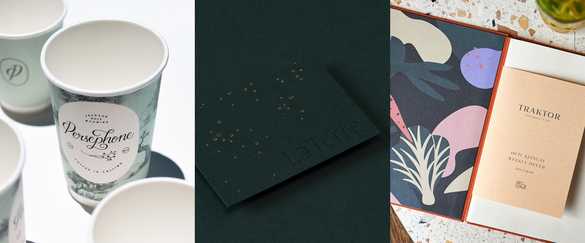
A trio of restaurants that you probably can’t go into with beautiful design make up the selection this week, with work from Guadalajara, Melbourne, and Budapest.

Persephone is a French style cafe and bakery in Jackson, WY, specializing in making its own breads with old world fermentation techniques and offering breakfast and lunch with locally sourced ingredients. Their identity, designed by Guadalajara, Mexico-based Heavy, has an aesthetic that’s as luscious as the nature and landscapes around the town in famed Jackson Hole, with individual rich and detailed illustrations cobbled together in compositions that have great play of scale with, say, an owl being the same size as a whole cabin, giving the materials an almost fairy-tale-ish vibe. All the illustrations are in black and offset by a simple color palette of mint and salmon colors that looks particularly great when overlaid. There is also the ornate logo that adds a delicate touch to the whole package and looks great everywhere, whether it’s on gold leaf on the window or baked in at the bottom of a coffee mug. See full project

La Terre is a high-end restaurant in Chengdu, China, serving organic, seasonal Western dishes. The identity, designed by Melbourne, Australia-based Pop & Pac, is described by them as being “Textured, sensory, and bold” and “inspired by raw natural elements refined to a sophisticated, layered finish”, which is exactly what I would have wanted to write so eloquently if this wasn’t the end of a long and tumultuous week. Instead, I’ll write what I can muster, which is: damn, that’s nice. To expand, though, I’m not really sure what all is going on with the gold textures, and the block of clay, and the patterns, and the weathered typography (at the link) but I’m down for this chocolate-y, forest-y, smokey-y, gold-infused concoction. See full project

Traktor was — it looks like they closed recently as their website and social have disappeared but a Tripadvisor review was as recent as February (which I realize is a lifetime in restaurants, especially now) — a fusion restaurant in Budapest, Hungary, offering farm-to-table ingredients freshly harvested from Hungarian soil. A recent renovation of the space resulted in a clash of a multitude of textures, styles, finishes, and details that are confoundingly eclectic but, also, highly amusing because there is a tractor inside the restaurant so, really, how can you judge that? The identity, by local firm studio NUR follows suit with a matching breadth of design treatments that range from the very elegant thin serif wordmark, to the playful and vibrant veggie patterns, to the slew of minimalist icons. I’m not sure these were meant to be together but they do so in a fairly convincing way and did I mention there is a tractor inside the restaurant? See full project
 each year since publication began in 2006

 Новости Союза дизайнеров
Все о дизайне в Санкт-Петербурге.
Новости Союза дизайнеров
Все о дизайне в Санкт-Петербурге.