Обзор лучших ресурсов по разработке бренда, разработке упаковки
contact us | ok@ohmycode.ru
contact us | ok@ohmycode.ru
No connecting thread or common approach this week, with work from Nashville, Amsterdam, and Oslo.
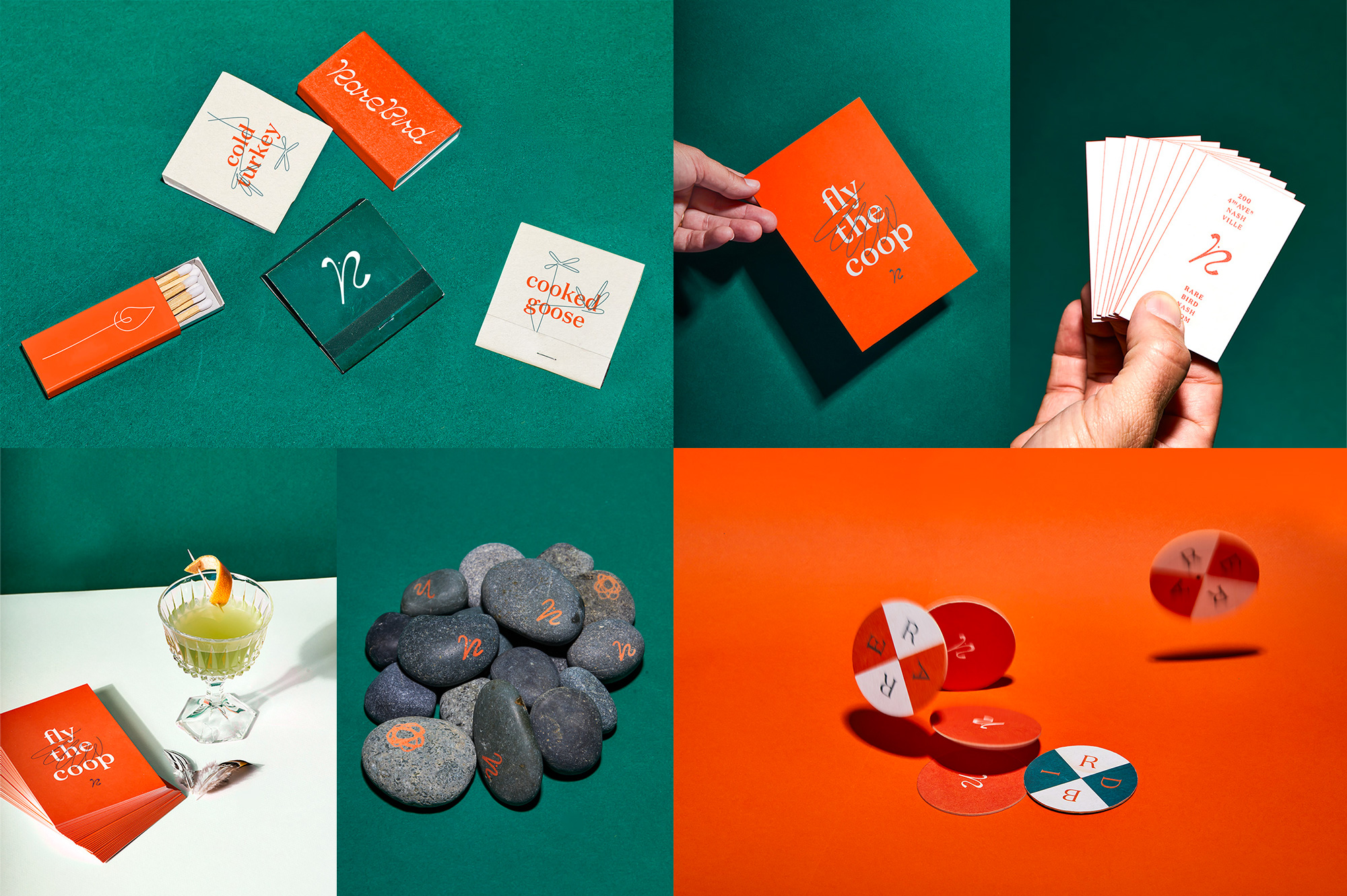
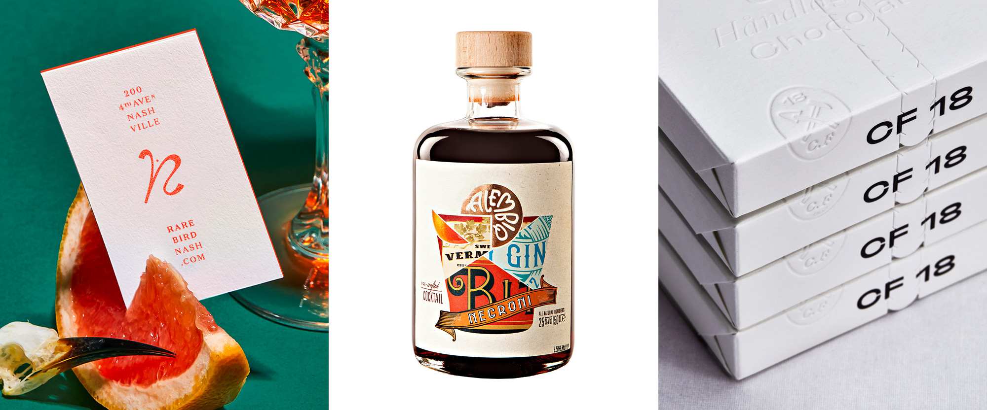
Rare Bird is a rooftop bar in the Noelle hotel in Nashville, TN, serving draft cocktails and “uncaged spirits”. The identity, designed by local firm, Peck Design Associates, features what they call “ornithic typography” — ornithic means related to birds — which I didn’t realize was a possible classification until I saw the funky, upwards, script typography employed for the logo and other headline text throughout the identity. It’s both ornithic and terrific but, aside from that rhyming praise, I think that the type works so well thanks to the name, which makes the type look indeed rare. I love how they turned the “R” into an abstract heron that complements the heron iconography of the hotel’s identity (also designed by Peck Design Associates and included in Friday Likes two years ago). The orange and forest green color palette is pretty nice and the garnish of thin-line illustrations adds an even more playful touch to what’s already a playful identity. It might be the endless sense of quarantine talking even as restrictions have been lifted but that rooftop bar looks so damn appealing right now. See full project
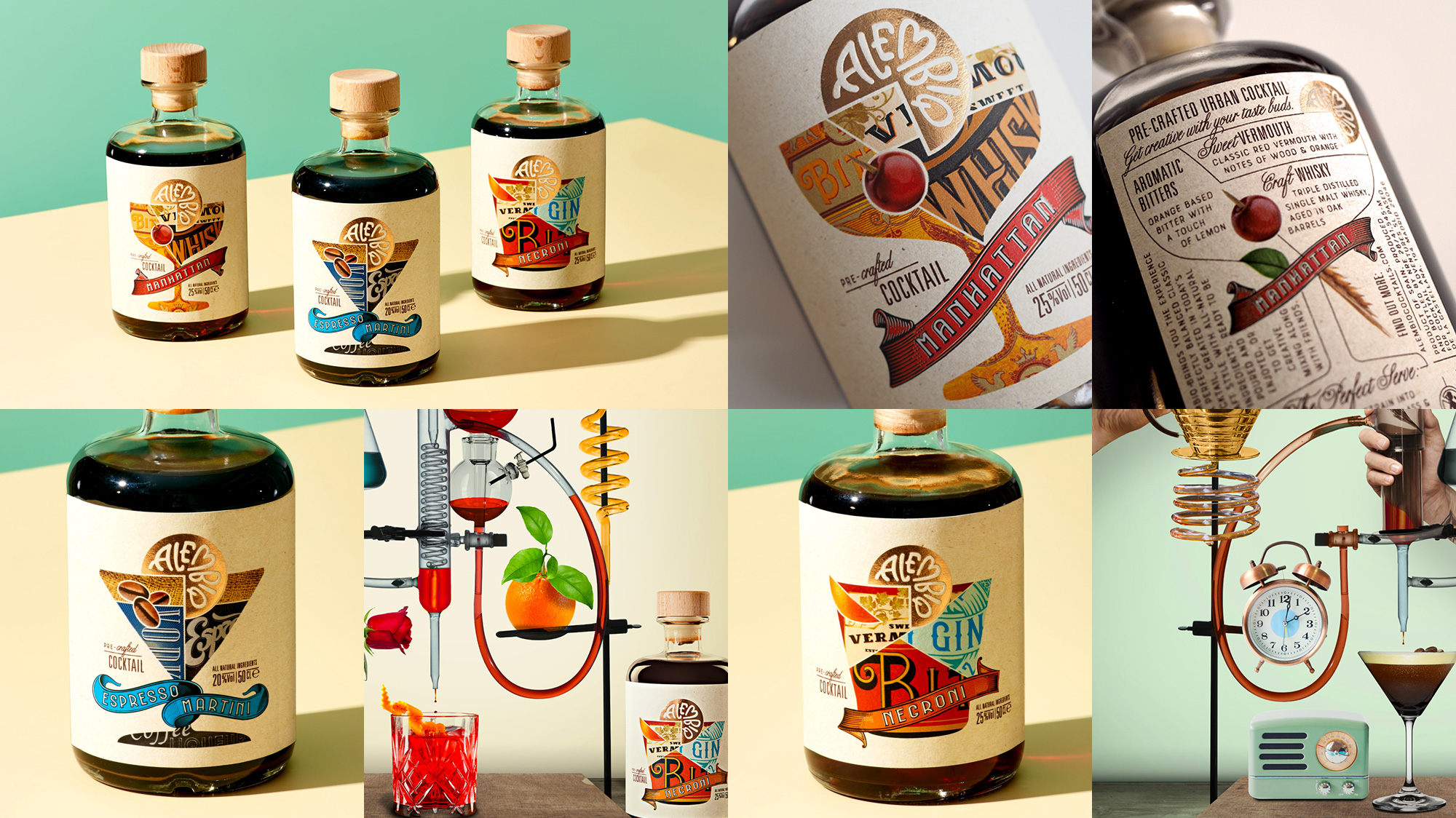
Alembiq is a new brand of pre-mixed cocktail classics — Negroni, Manhattan, and Martini — in a modern craft style made in a craft distillery in Spain. The packaging, designed by Amsterdam, Netherlands-based Positivity Branding, takes a cue from the principle of mixing ingredients with a label that mixes bits and pieces of other evocative labels of the ingredients to form the shape of the glass each cocktail is meant to be served in. To top off each composition, a citrus wedge logo has been designed to sit neatly on top. The logo itself is quite charming and playful with unapologetically quirky lettering and a heart for an “M”. To finish things off, a madcap range of promo shots showcase how each cocktail is “made”. This all has a great, ornate energy and the labels feel truly unique — I don’t think I’ve seen an approach/solution quite like that. See full project
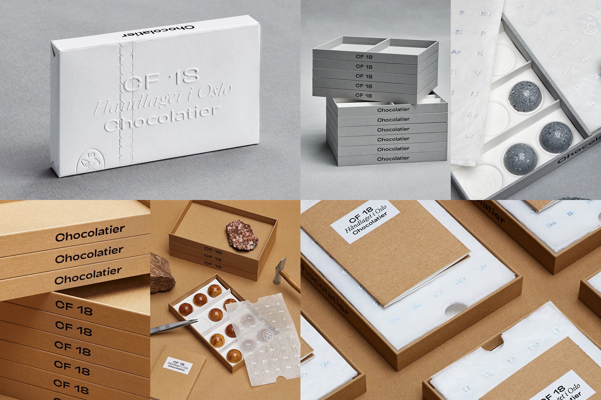
CF18 is a chocolatier in Oslo, Norway, with hand-made, made to order chocolates created by Christian Fredrik Furuholmen, a former a civil engineer who thought making delectable-looking chocolate would be more fun. He was not wrong. At all. The packaging, designed by local firm Olssøn Barbieri, honors Fredrik’s engineering past with a richly constructed, highly detailed box system that comes wrapped in a stunning paper box with debossing and embossing for days. The presentation is modeled in part after how stones are shown in museums and further connections are made to geology with the introduction of a simple icon that features a tiny hammer and a tiny shovel. The typography is minimal and contemporary and everything is so well considered, which is really the only acceptable approach to match the appearance of the chocolates themselves. See full project
 each year since publication began in 2006

 Новости Союза дизайнеров
Все о дизайне в Санкт-Петербурге.
Новости Союза дизайнеров
Все о дизайне в Санкт-Петербурге.