contact us | ok@ohmycode.ru
contact us | ok@ohmycode.ru

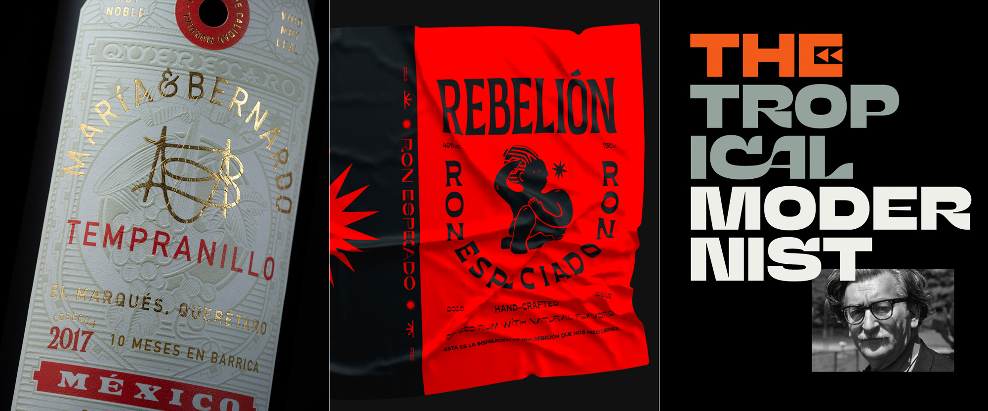
Today we segue from beautiful type on labels to a label with funky type to funky type, period, with work from Brooklyn, Bogotá, and Rio de Janeiro.

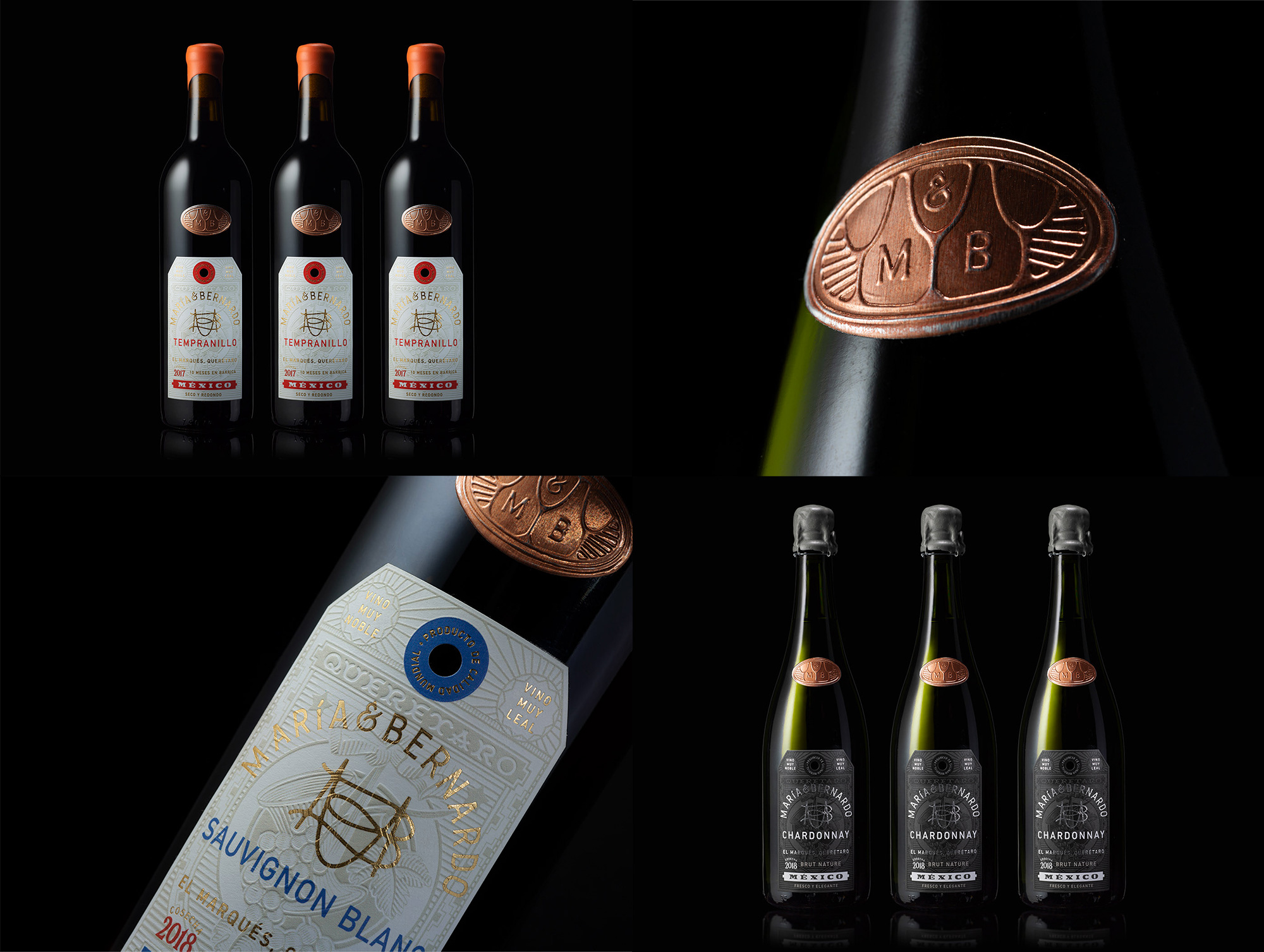
Maria & Bernardo is a vineyard in Querétaro, Mexico, with a 4-bungalow bed and breakfast in the same property that looks divine. Equally divine are the new labels for the wine, designed by Brooklyn, NY-based Abraham Lule, who took elements from Queretaro’s coat of arms, redrew them, and used them as a tone-on-tone background to then layer a slew of beautiful typographic treatments on it. Everything from the curvy MB monogram to the full name on a curve to the “QUERETARO” in the background is lovingly designed and while in principle none of the styles and approaches are visually related they all come together perfectly across the three different labels. As a bonus there is an excellent copper seal that features three wine cups and the negative space between them reveals the loose shape of two bottles. I’ll clink to that. See full project

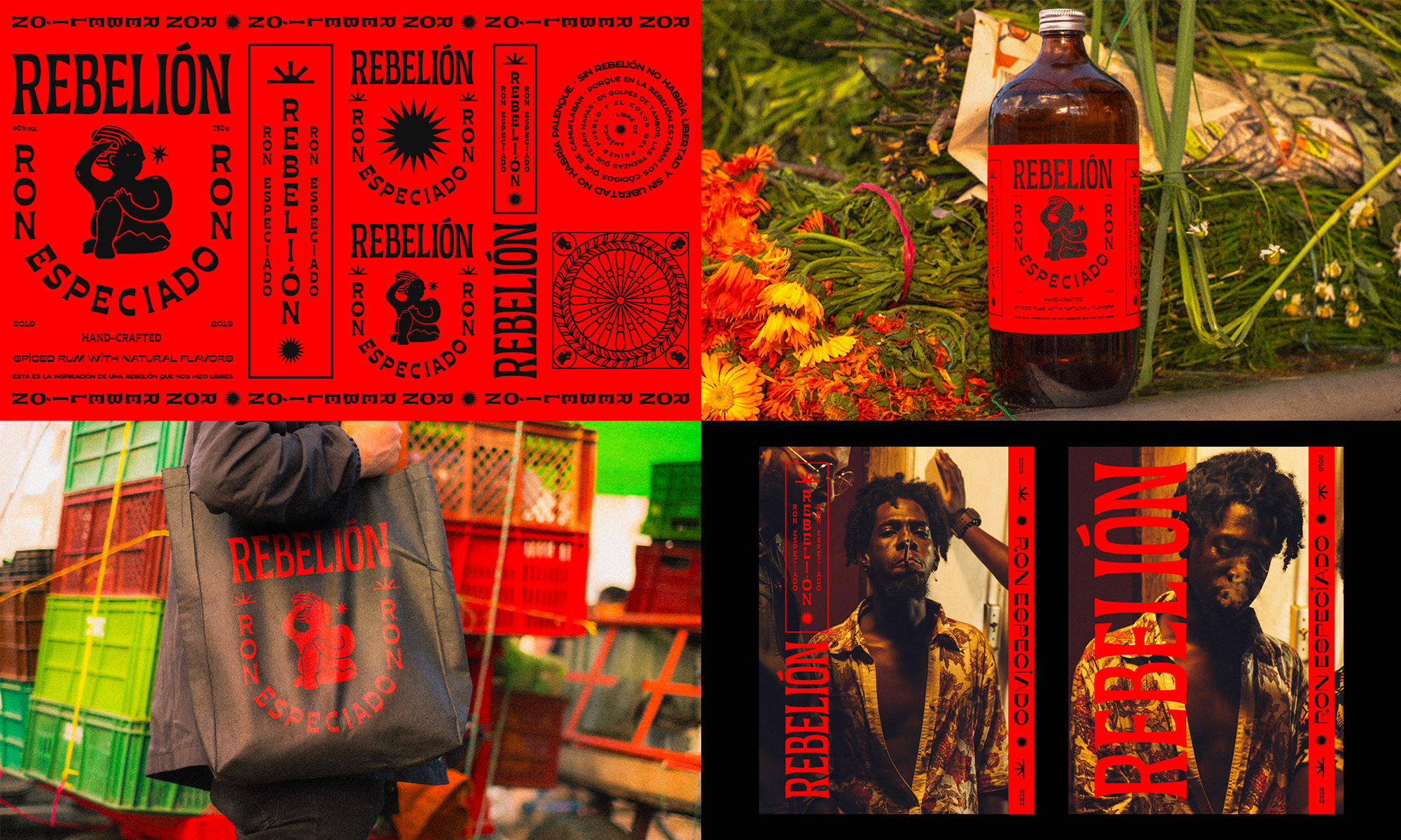
I was not able to find a website or social media account for this so I can’t confirm if it’s real but I had a shortage of selections this week so I’ll give them the benefit of the doubt because this is fun (the design, not the giving of the benefit of the doubt). Ron Rebelión is, in theory, a rum made in Colombia named in honor of the town of Palenque, considered to be the first free town for Africans in the Americas that rebelled against the Spaniards. Designed by Bogotá, Colombia-based Surchip and Juan Caicedo, the label and graphics have a bold and explosive aesthetic that manages to capture the spirit of rebellion through a unique combination of typefaces and off-kilter treatments that build around the great illustration that depicts how the women of Palenque used their braided hair to send codes and hide gold within — I know this because I watched the video at the link not because I’m that well-versed in the Colonial history of Colombia. Point being, this is rad. See full project

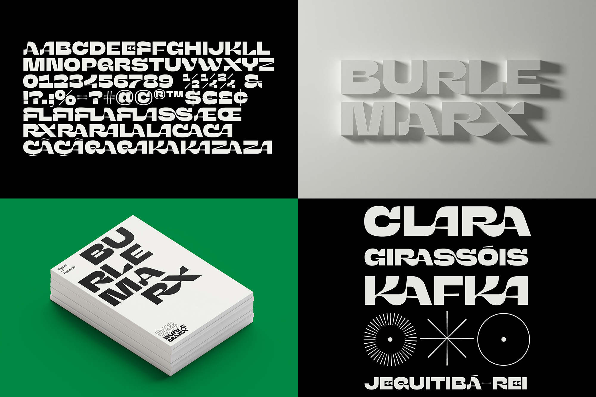
Instituto Burle Marx in Rio de Janeiro, Brazil, celebrates the life and work of Roberto Burle Marx, a Brazilian artist most well known for his landscape architecture but who also was an avid painter, print maker, musician, and ecologist. The identity for the institute, designed by local firm Tátil Design, revolves around a custom typeface inspired by the effusive, organic, and unexpected shapes found throughout Marx’s work. The resulting typeface is impossible to classify and very difficult to rationalize in words other than to say it’s absolutely delightful and unexpected. The ligatures, united by sinuous curves are so joyful and add so much uniqueness to the identity. There aren’t any real-life applications shown unfortunately, which is something I prioritize for Friday Likes selections but I really — REALLY — likes me that type and it’s Friday so here we are. See full project

 Новости Союза дизайнеров
Все о дизайне в Санкт-Петербурге.