Обзор лучших ресурсов по разработке бренда, разработке упаковки
contact us | ok@ohmycode.ru
contact us | ok@ohmycode.ru
Lots of very pretty and classy stuff this week, with work from Sydney, Seattle, and Mexico City.
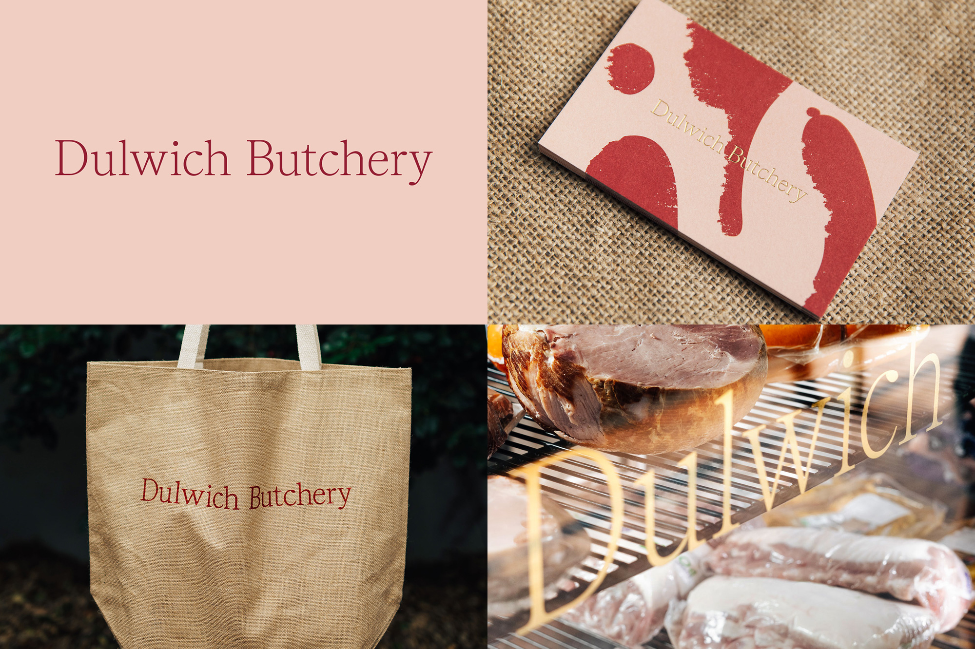
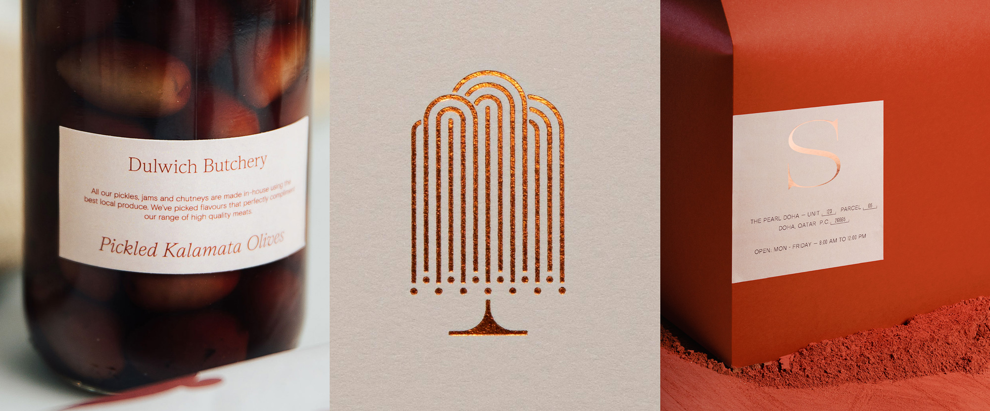
Dulwich Butchery is, as its name implies, a butchery in Dulwich, a suburb in the City of Burnside, Adelaide, South Australia, and based on the few photos available it looks like it has gots some quality meats. The identity, designed by Sydney, Australia-based The Colour Club, is infuriatingly simple with a wordmark simply typeset in Luzi Type’s Nantes that looks as if it was custom-crafted for this butchery in this corner of the world. It’s such a stunning serif and deployed in gold foil and gold leaf in most places, well, you know how much I like gold-anything on Fridays. To meat it up, a bold pattern of meat cuts and sausages in a scratchy texture serves as a fun complement and background. Also, bonus points for the burlap tote bag — I don’t think we see enough burlap on Brand New. See full project
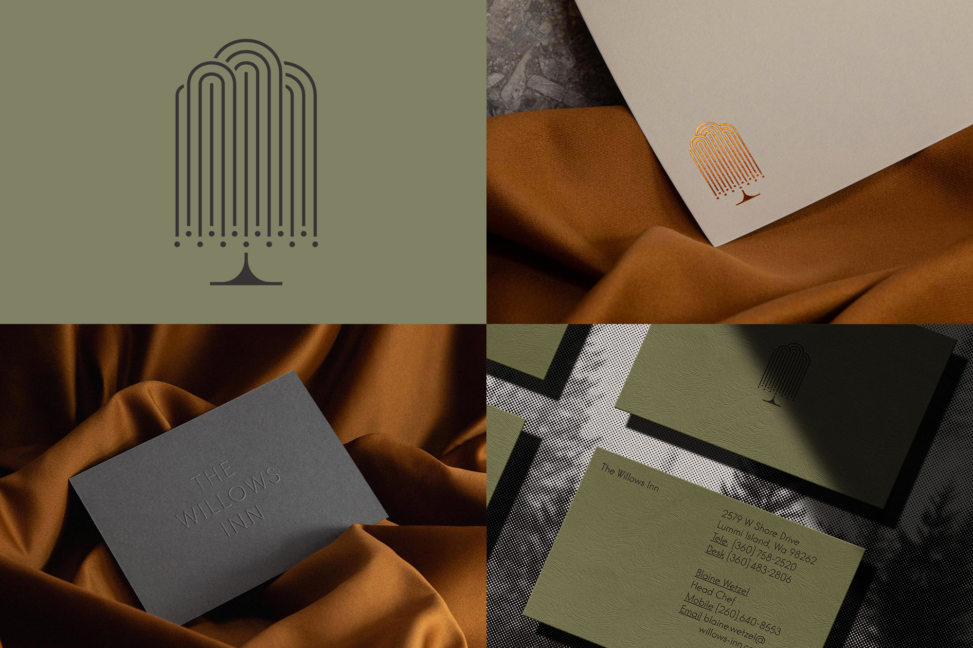
The Willows Inn is a high-end hotel in Lummi Island — which is in Washington state almost at the border with Vancouver, Canada — that also has a highly sought restaurant that only offers a single-seating, plated tasting menu that changes nightly. The identity, designed by Seattle, WA-based Parker, features a weeping willow tree logo that looks as exquisite as the restaurant’s plated dishes. I love how delicate the branches look and how successfully intertwined they look with the concentric-shape approach. The identity around it is perfectly suited with a simple and sophisticated color palette and a single, light sans serif, Elegant Lux Pro, used throughout. The only weeping on my end is of joy — granted, this is said for narrative purposes, I’m not really weeping for joy… this is nice but not crying-for-it-nice. See full project
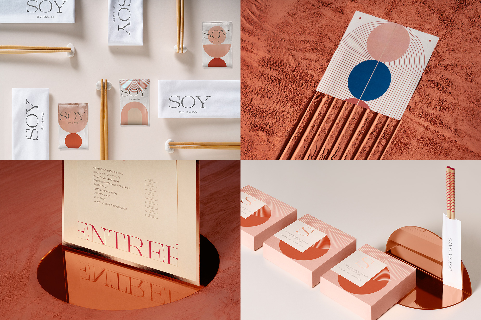
Soy By Sato is a contemporary Asian tapas restaurant in Doha, Qatar. The name refers to soybean, which has been used in countless recipes across Asia for many centuries and its ancient origins served as the inspiration for the identity, designed by Mexico City-based Futura, interpreted as primitive but contemporary concentric patterns of lines and arches. I’m not sure I’m on board mentally but, visually, count me in. The subtle patterns look great on the various applications in a lovely color palette accentuated by an elegant and dramatic serif wordmark. And you gotta hand it to Futura for setting up such ambitious backdrops for their photos — I think deep down this project is here because of all that clay that has been zen-gardened. See full project
 each year since publication began in 2006

 Новости Союза дизайнеров
Все о дизайне в Санкт-Петербурге.
Новости Союза дизайнеров
Все о дизайне в Санкт-Петербурге.