Обзор лучших ресурсов по разработке бренда, разработке упаковки
contact us | ok@ohmycode.ru
contact us | ok@ohmycode.ru
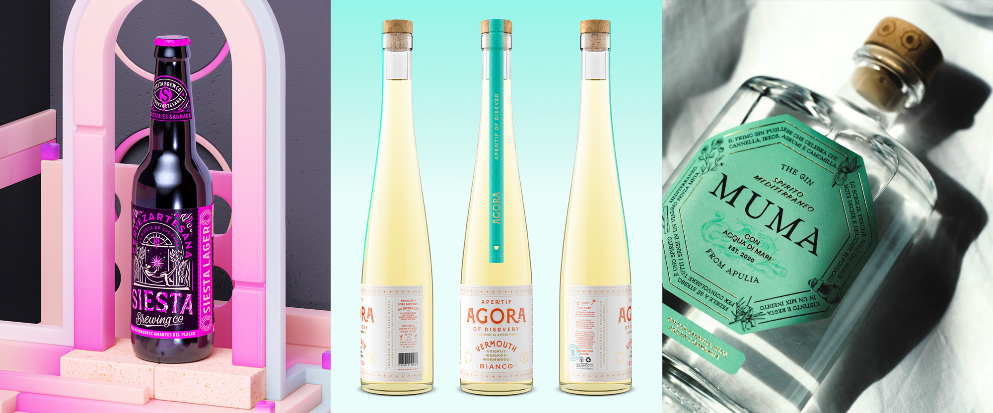
A triple threat of ornate, typographically-driven packaging this week with work from Amsterdam, Dublin, and Milan.
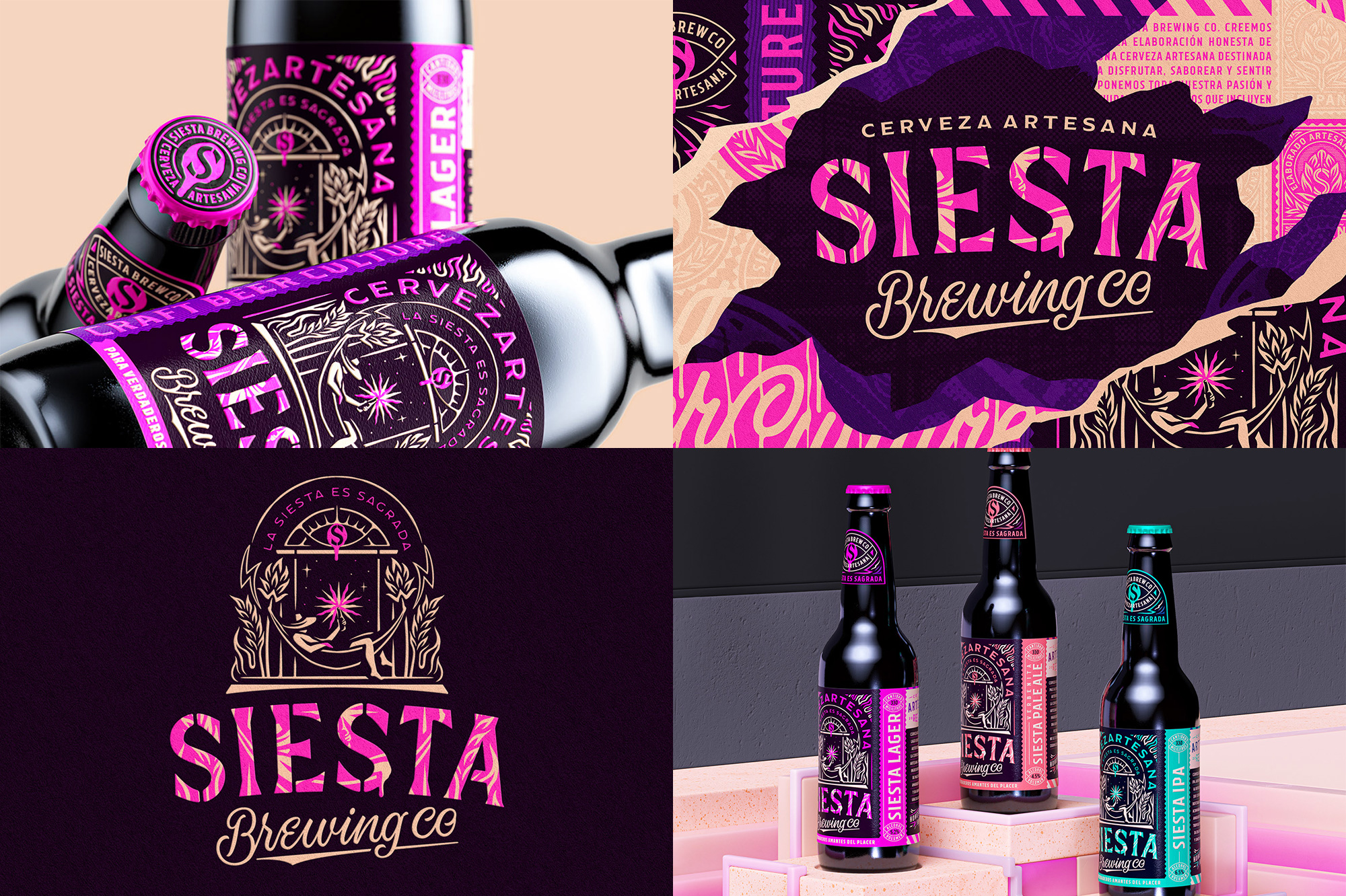
Siesta Brewing Co is a craft brewery and tap room in Burgos, Spain, offering a small selection of three bottled beers along with some seasonals. The name, which means “nap” in Spanish, takes center stage in the packaging, designed by Amsterdam, Netherlands-based Luis Utrillas, with a great illustration of a person napping on a hammock that hangs from two sturdy hops and a miracle-like spark that emanates from the bottle of beer at the center of the relatively ludicrous but kick-ass illustration. This is accompanied by fun(ky) typography and illustrations that are a fun(ky) mix of graffiti and, like, tiki? Hard to pinpoint. Anyway, there are a lot of great details throughout the various images shown at the project link, including the 1980s-tastic 3D renders behind the bottles. This brings new meaning to “siesta time!” in which you can take a nap after drinking this beer. See full project
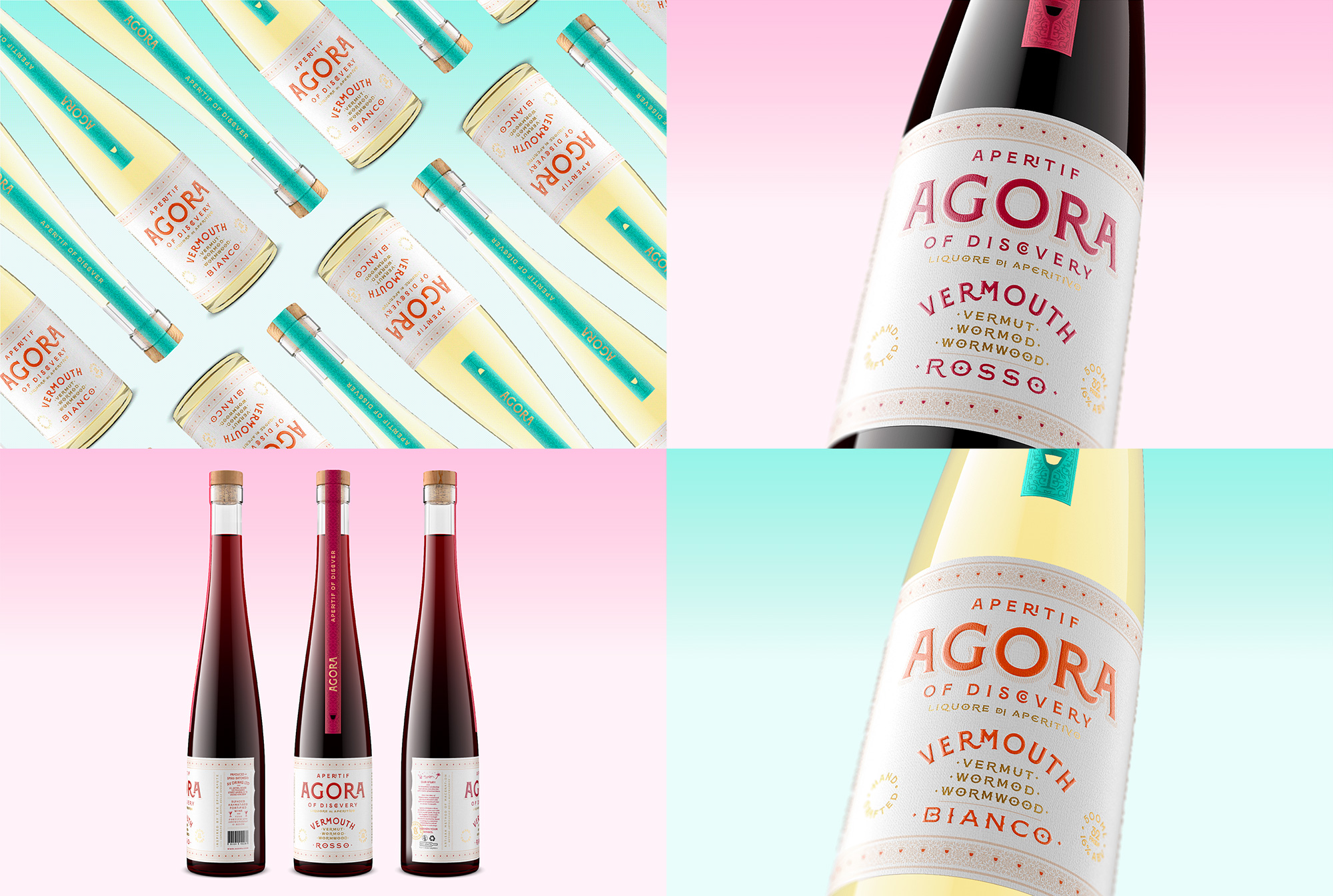
Agora Vermouth is a small-batch vermouth in “Bianco” and “Rosso” varieties created by Arthur Voulgaris, an “enthusiastic drinks industry professional” (which sounds like an awesome thing to be), made in Suffolk, England. The labels, designed by Dublin, Ireland-based Backbar Studios, are, in principle, nothing new, with their Victorian-esque aesthetic but there is no denying these are delightfully done with very nice typographic treatments, delicate shading, and ornate patterns to frame the label. For now, there is a slight disconnect between the real bottles seen in Agora’s Instagram page and the images above, which I imagine is a matter of budget so, Suffolk folks, get to buying some Agora so that they can upgrade to those bottles and extra long neck labels. See full project
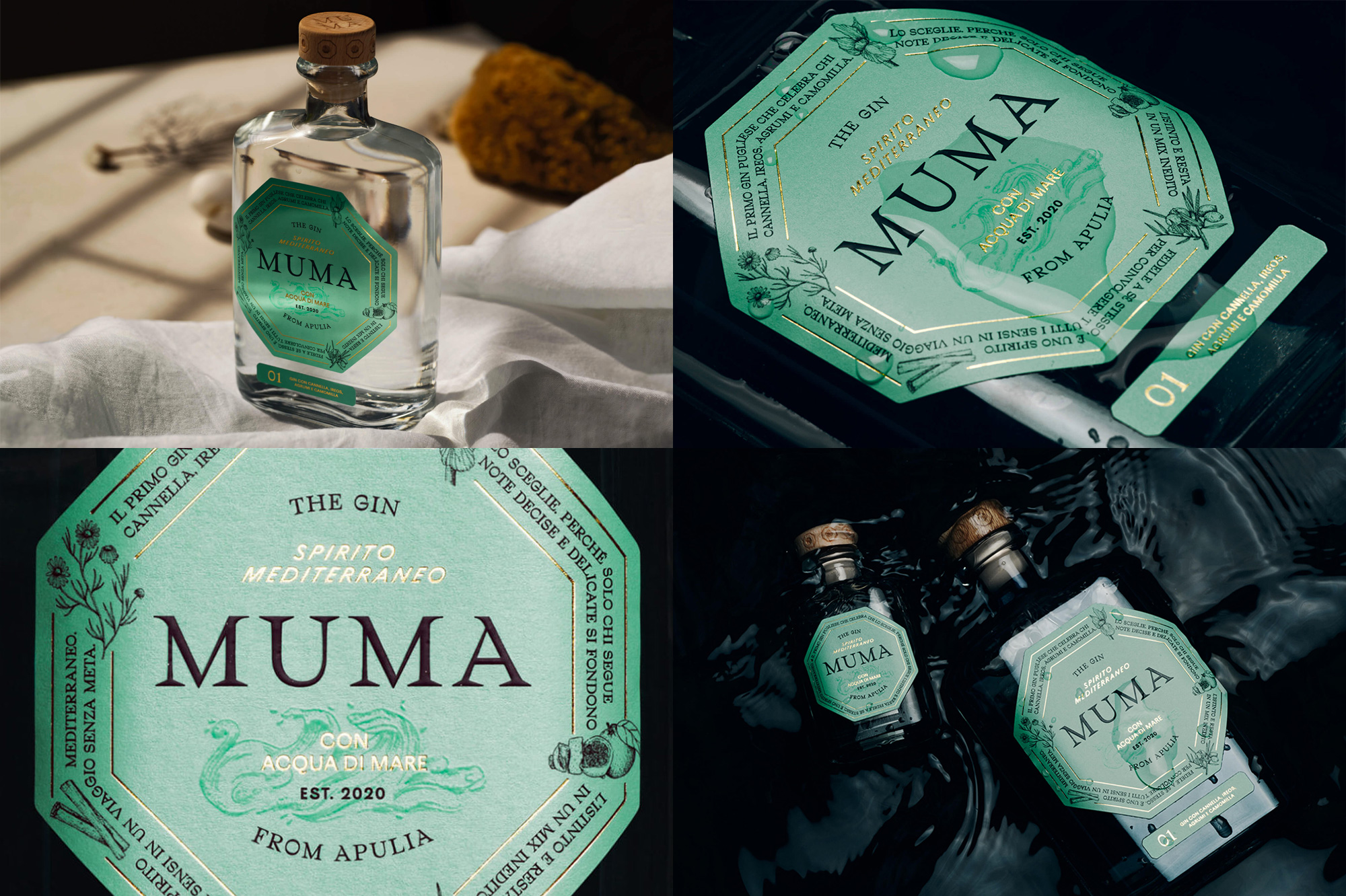
Muma is a gin made in the town of Trinitapoli in southeast Italy distilled using pure sea water from the Mediterranean Sea — no idea how that works but it doesn’t matter when it’s packaged this good. Designed by Milan, Italy-based Carosello Lab, the octagonal label — which references the eight ingredients of the gin (six botanicals, sea water, and a secret ingredient) — holds a cornucopia of typography and illustrations anchored by a very serif-y wordmark at the center. The mint color looks great against the clear spirit, the sparks of gold foil are, as always, appreciated, and the photography of the bottles against the dark gloomy water is mamma mia. See full project
 each year since publication began in 2006

 Новости Союза дизайнеров
Все о дизайне в Санкт-Петербурге.
Новости Союза дизайнеров
Все о дизайне в Санкт-Петербурге.