Обзор лучших ресурсов по разработке бренда, разработке упаковки
contact us | ok@ohmycode.ru
contact us | ok@ohmycode.ru
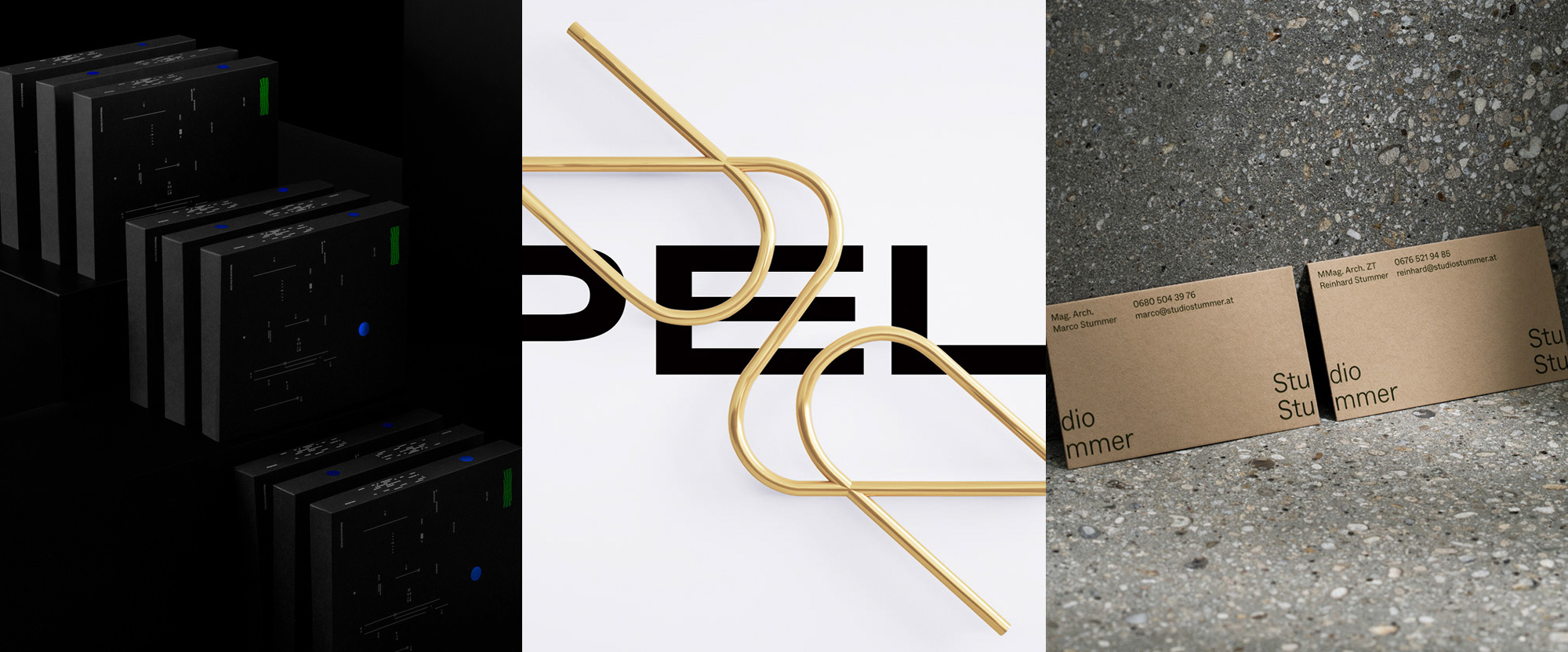
A couple of funky finished off with a minimalist palate cleanser this week, with work from Monterrey, Athens, and Linz.
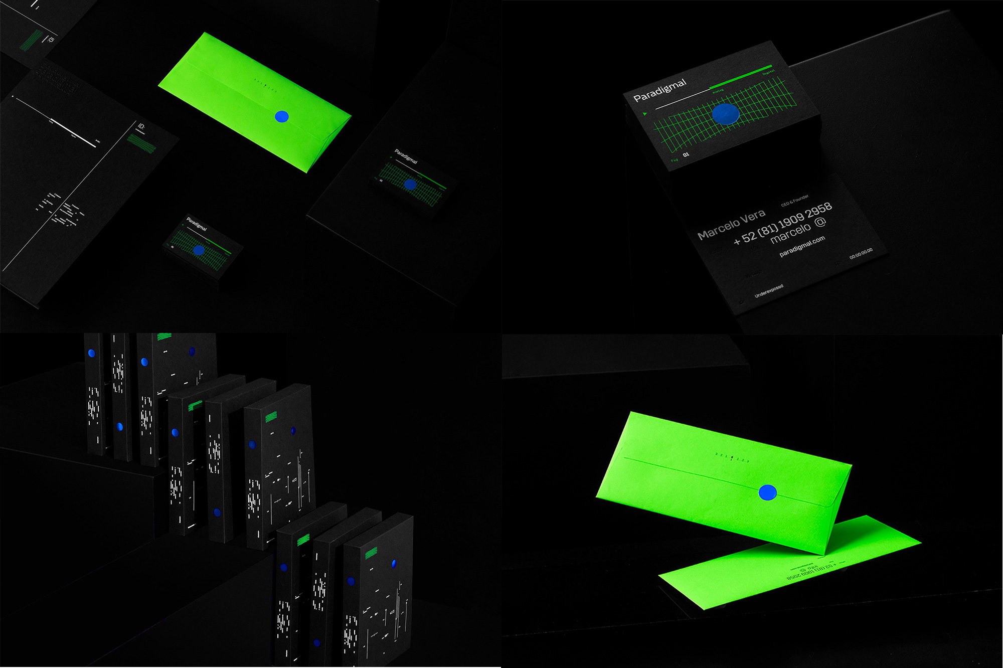
Paradigmal is a video production company in Monterrey, Mexico, offering creative direction, scripting, post-production finishing, and equipment rentals. Their identity, designed by local firm Sabbath, is “inspired by Dystopian Futures, Cyberpunk, Sci-fi / Neo-noir Cult Films & Anime themed aesthetics” which I didn’t realize was a range of inspirations that could be mixed together but now I know what that looks like and I’m here for it. The photos of the applications are a little like that Game of Thrones episode that was so dark that you couldn’t see anything but you could tell cool stuff was happening… that’s the feeling I get here: I’m not totally sure what’s going on but I like the overall vibe and the bursts of neon green and that blue amidst a sea of blackness. Paired with the Daft Punk-meets-Minority Report-meets-The Matrix photography at the link, I’m definitely enjoying the mood simply for it being so out there — like the truth. See full project
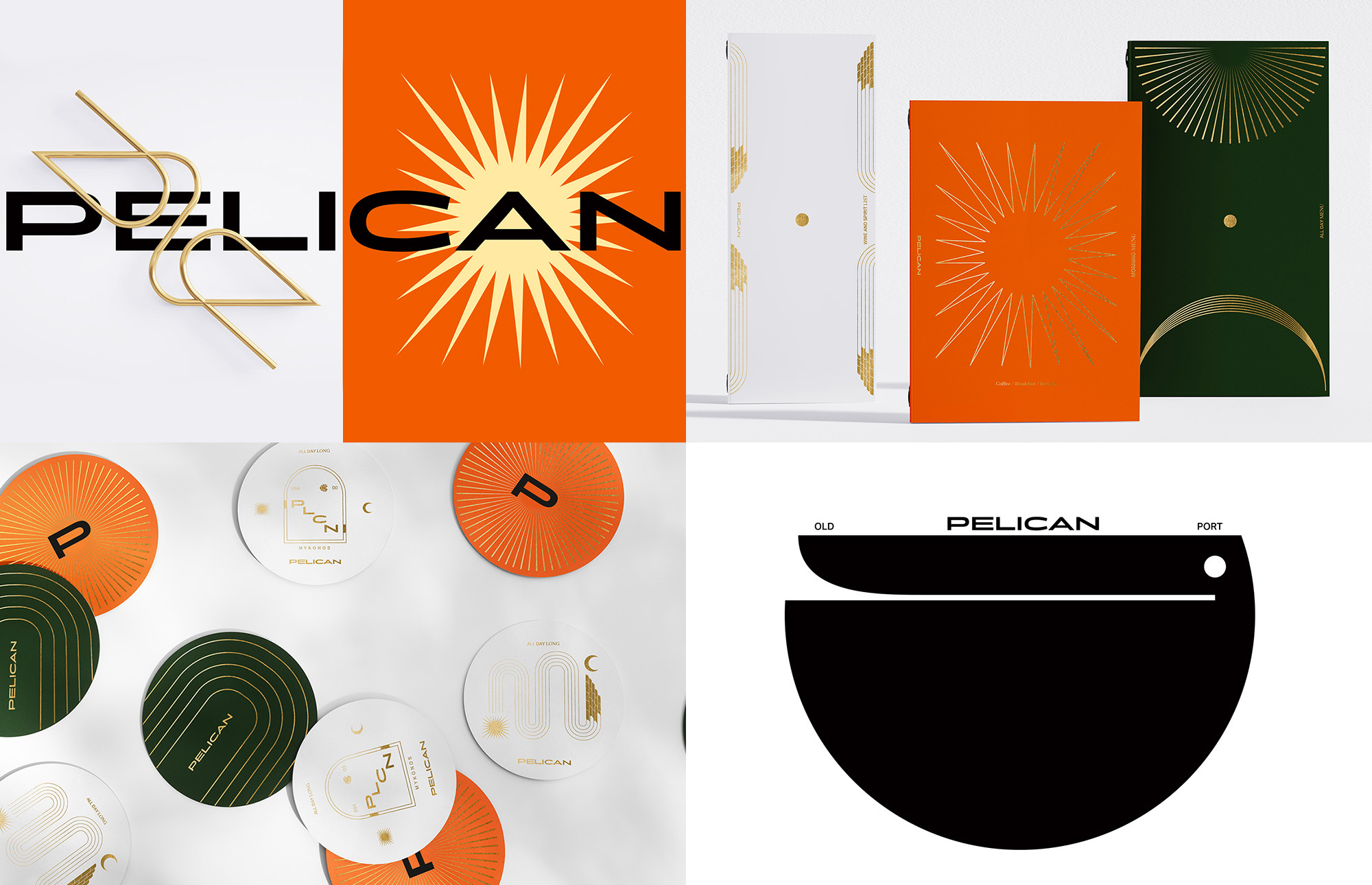
Pelican is an all-day café bar-restaurant, located at the Old Port of Mykonos, Greece. The identity, designed by Athens, Greece-based Luminous Design Group, features a handful of abstracted pelican icons/illustrations that, like the pelicans in Mynokos’ Old Port that walk amongst humans, mingle with the other design elements. I’ll admit that this is all mostly a lot of design flair for the sake of it but the combinations are all fairly satisfying if you don’t mind the trendiness — otherwise, you can tell the pelicans that they pelican’t do what they are doing. (Sorry, I wanted to work pelican’t into a sentence but it’s not easy.) See full project
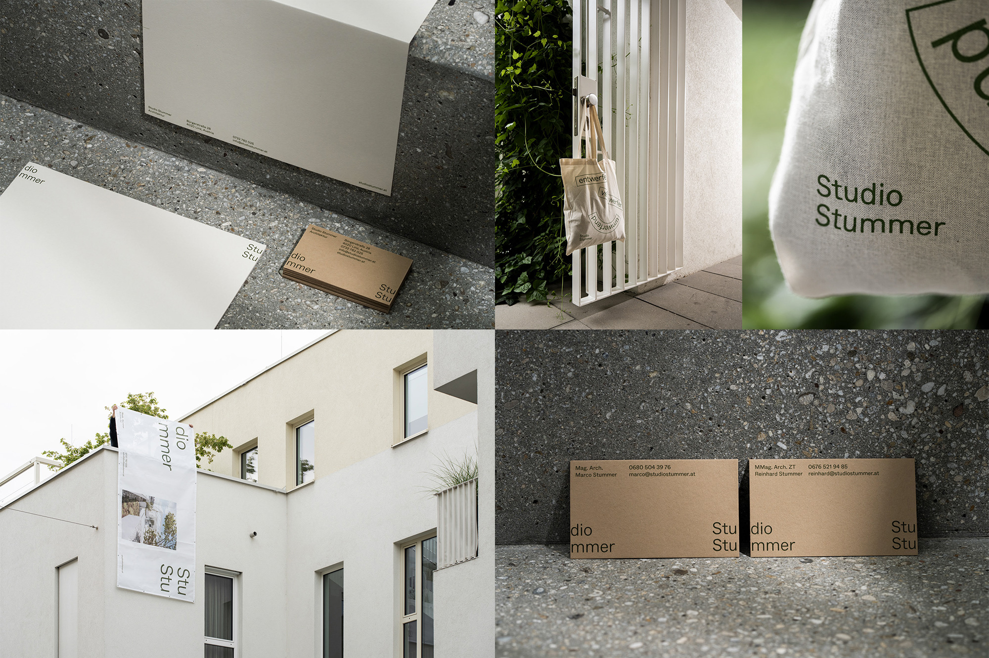
And now for something normal… Studio Summer is an architecture firm in Linz, Austria, working on residential and office buildings with a nice simplicity and airiness to their solutions. Their identity, designed by local firm Gletscher, channels that simplicity by using a single weight of Whyte with only one, subtle design gesture that takes advantage of the shared initial three letters in the two words of their name, “Stu”, to split them into opposite ends of the layout. With “Studio” being such a common word it makes the challenge of reading the full name easy and satisfying. A simple color palette of black, tan, and light brown evokes their style of architecture and looks Stu… pendous. (Sorry, I wanted to work a stu-something into a sentence but it’s not easy either.) See full project
 each year since publication began in 2006

 Новости Союза дизайнеров
Все о дизайне в Санкт-Петербурге.
Новости Союза дизайнеров
Все о дизайне в Санкт-Петербурге.