Обзор лучших ресурсов по разработке бренда, разработке упаковки
contact us | ok@ohmycode.ru
contact us | ok@ohmycode.ru
Twenty-one years after TGI Friday’s was established in the U.S., Whitbread, the UK’s largest hospitality company, opened the first location in Birmingham in 1986 and oversaw the huge, early success of TGI Friday’s UK, including its location in London’s Covent Garden, which, reportedly, was the busiest TGI Friday’s in the world by 1992. The chain grew to 45 locations by the mid 2000s but performance had declined and Whitbread sold its operating rights of all 45 restaurants back to T.G.I. Fridays UK Limited (a consortium consisting of Carlson Restaurants Worldwide Inc. and ABN Amro Capital) in 2007. Now, the chain has 85 locations across the UK, employs more than 6,000 people, and has recently changed its name to simply, Fridays, no “TGI” and no apostrophe, just a plural quantity of the last day of the working week. The new logo and identity, first covered in the Noted section two weeks ago, has been designed by London-based SomeOne.
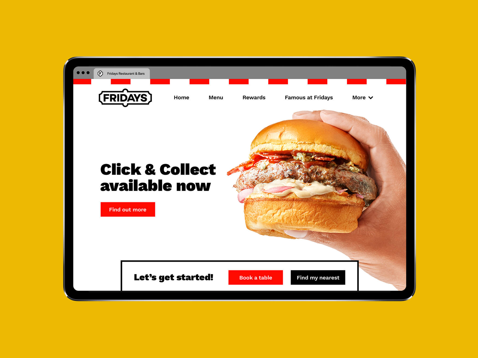
We began with a full strategic overhaul, drilling down to and establishing the key essence of the brand — The Fridays Feeling, that original idea of fun and entertainment from back in New York. It was essential that this strategic driver was something that could touch every corner of the brand, from the design, to customer service to physical interiors. The Fridays Feeling is a reflection of the energy and excitement the brand brings to the party.
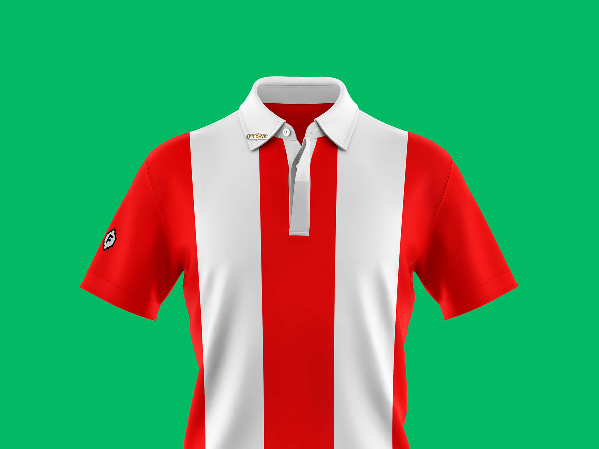
To align with the concentrated strategic thought, we also updated the name — Fridays. Over time the ‘TGI’ had become lost and confused, it was time to be single-minded and confident.
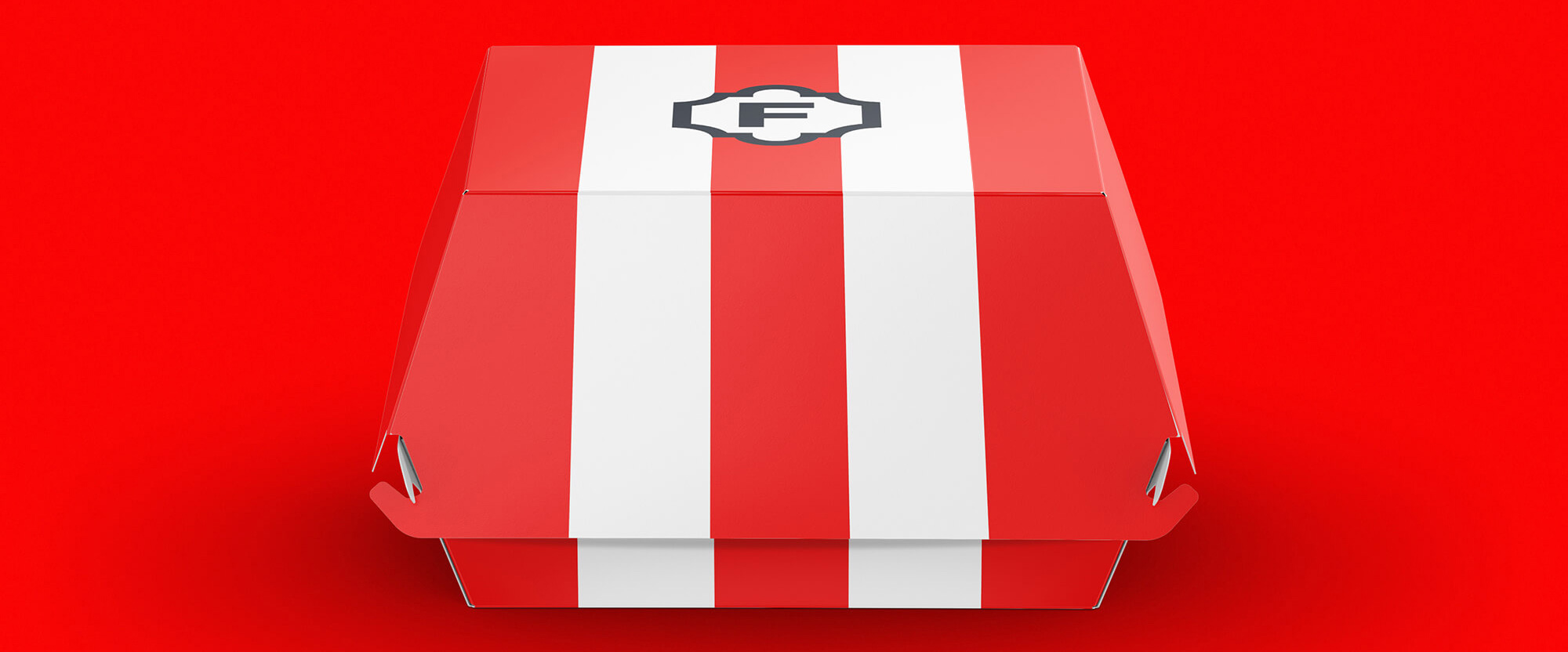
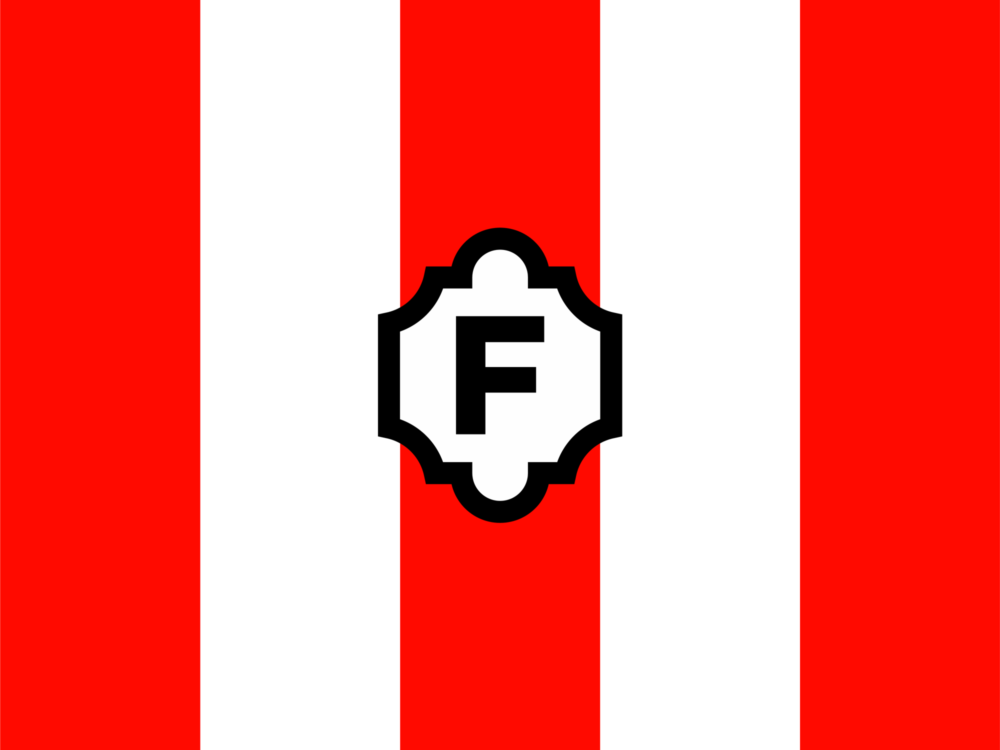
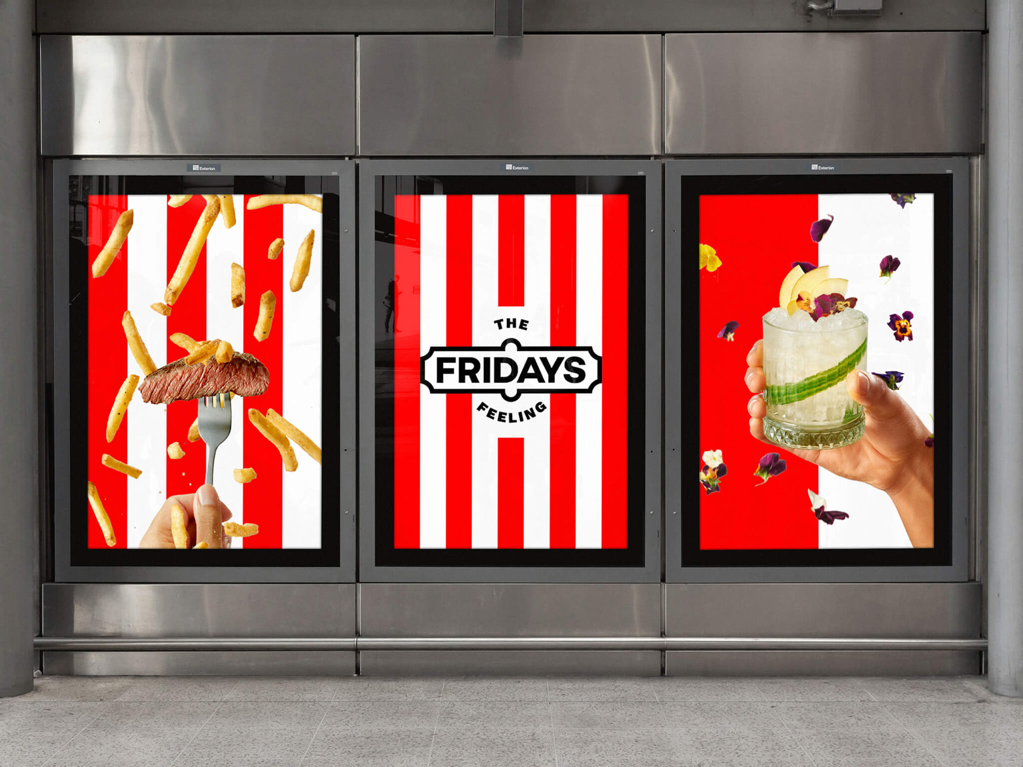
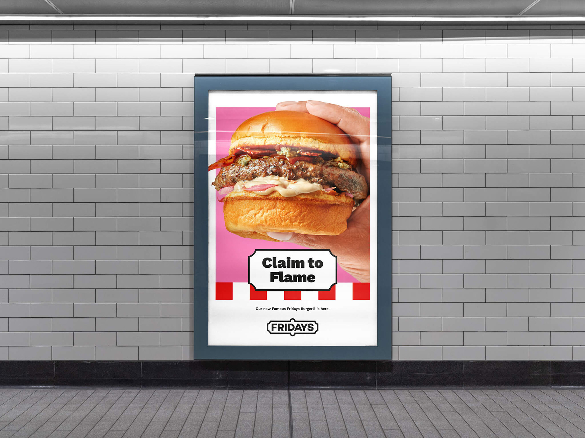
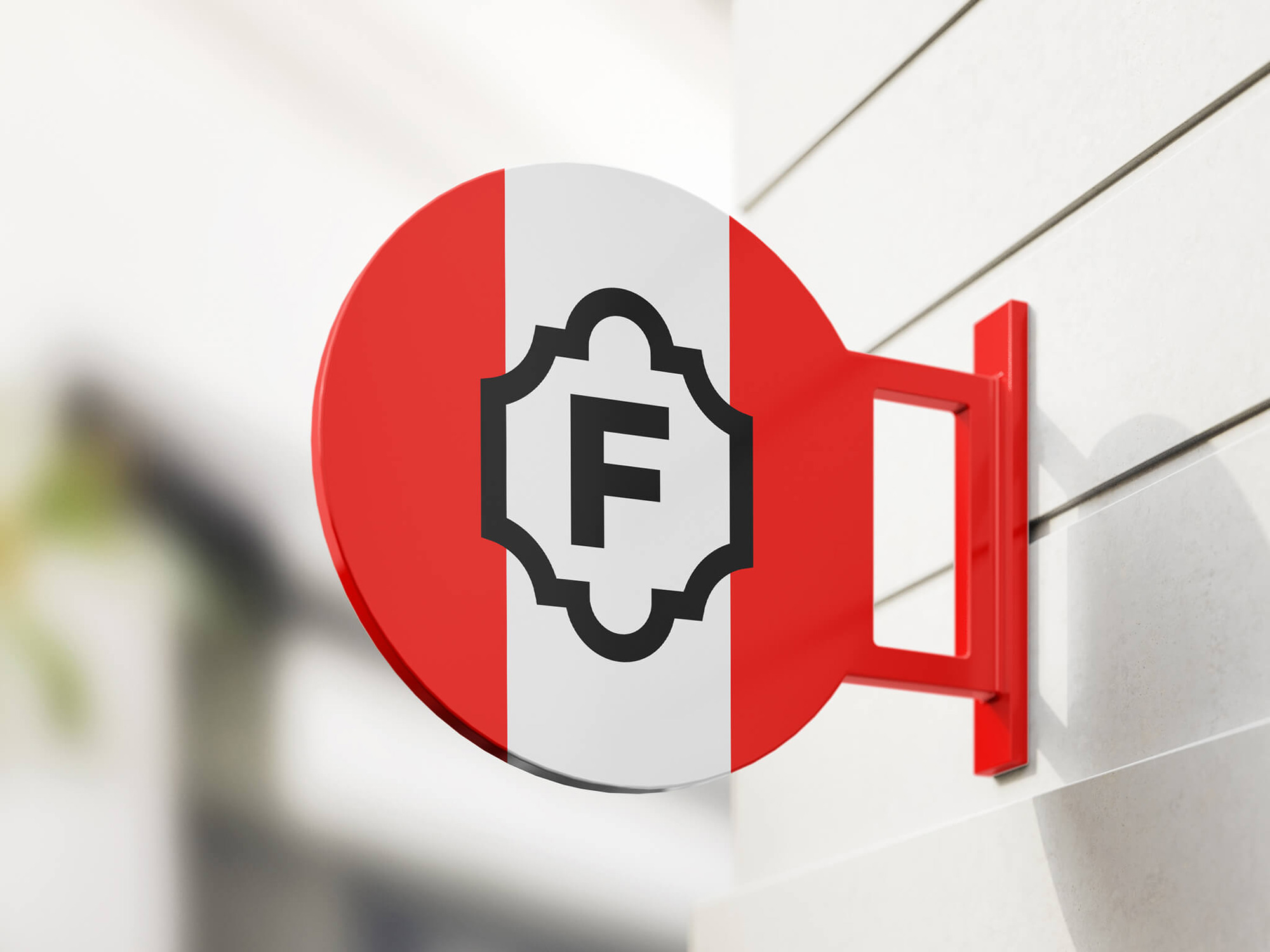
The new logo is inspired by the iconic original signage. After testing a range of logos from the past, we discovered the holding shape was in fact the most recognisable part. This was reintroduced in a bold, simple and sophisticated way. The logo also neatly reduces down to the F icon, a recognisable symbol to be deployed when closer to the brand, onsite or online.
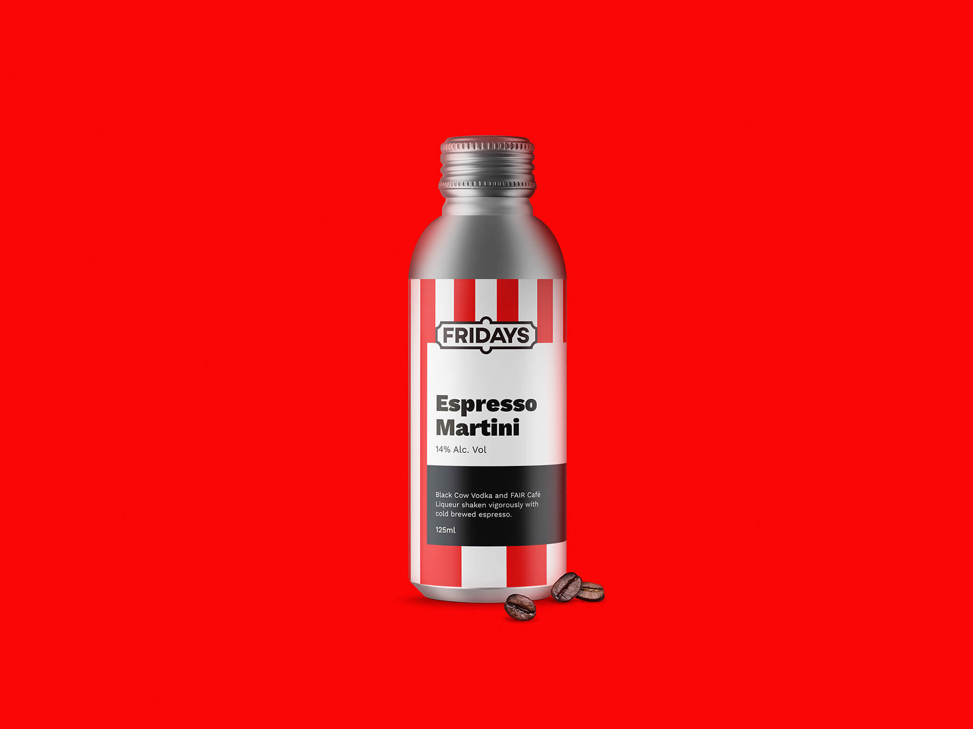
Since I said most of what I had to say about the logo already in the Noted post, I won’t spend a lot of time on it again but in looking at the identity around it I wish it had both more flair in the typography, perhaps through a literal flare in the sans to allude to the original logo, and also more nuance in the border beyond straight lines and half circles, in order to stand up better to the vibrancy of the application, which can overpower the logo. In the previous post I also mentioned that the logo “looks good on the red stripes”, as now shown above, which made me “wonder why they don’t make those vertical stripes a more meaningful aspect of the logo”. While the stripes are not part of the logo per se they are indeed an integral part of the new identity.
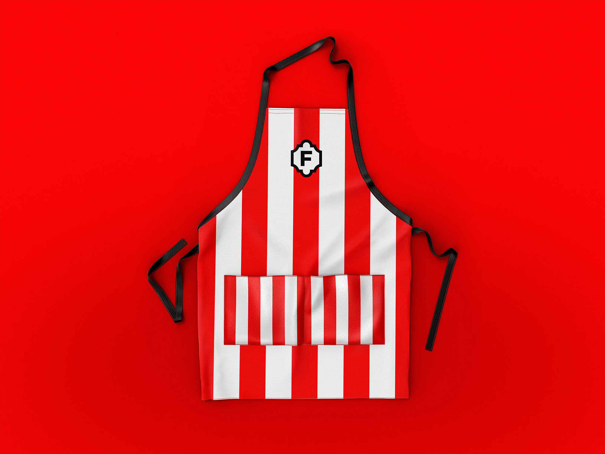
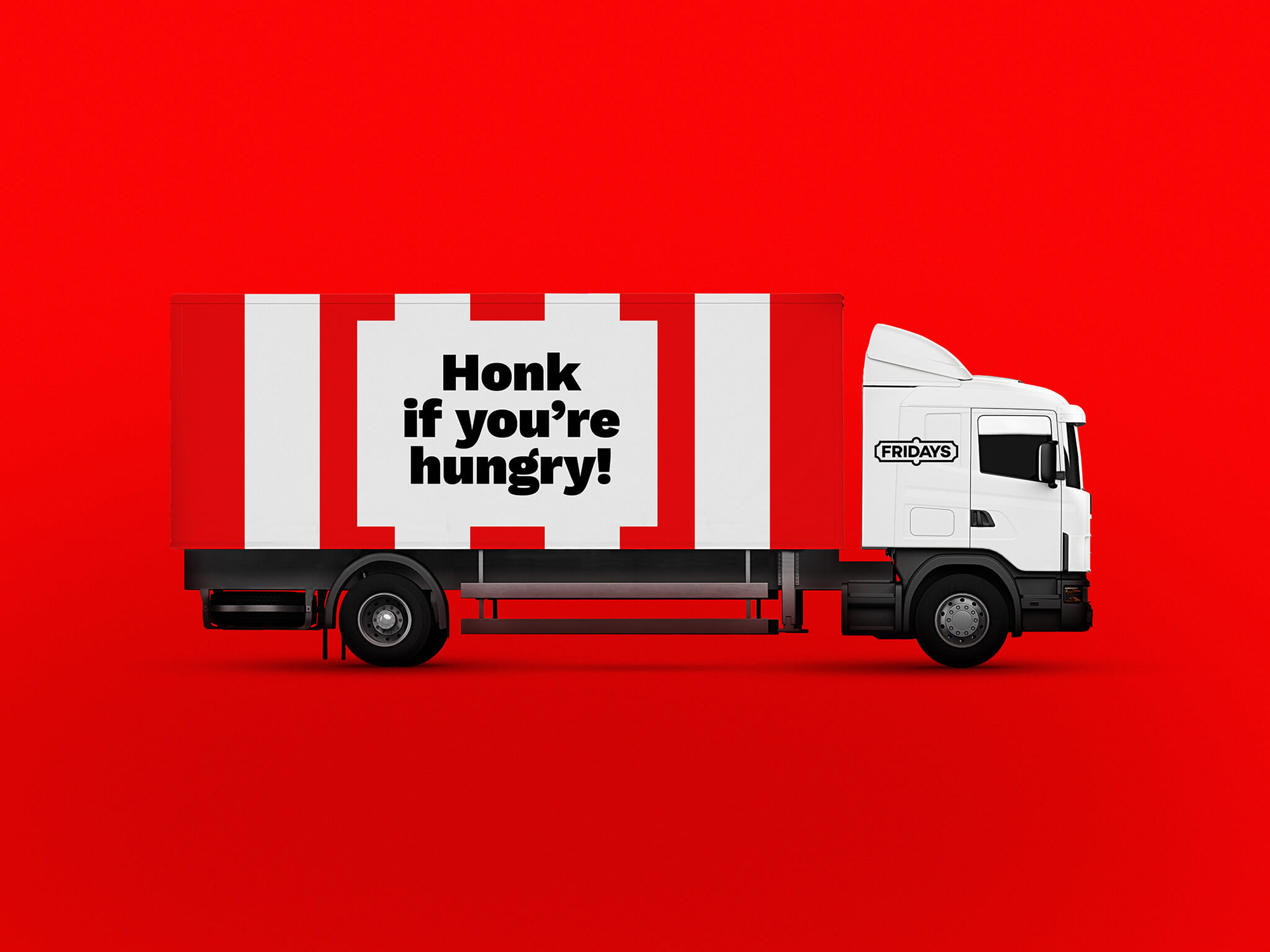
In addition to the logo, we’ve also gone back to the brand’s roots with the use of vertical stripes (which were inspired by the Barnum and Bailey circus). The original awnings of the 1965 bar used bold vertical stripes, something that had been diluted with the modern inclusion of angles and textures. The bold new vertical stripes form the backbone of the BrandWorld and can be flexed to play either a significant visual role or more of a subtle detail.
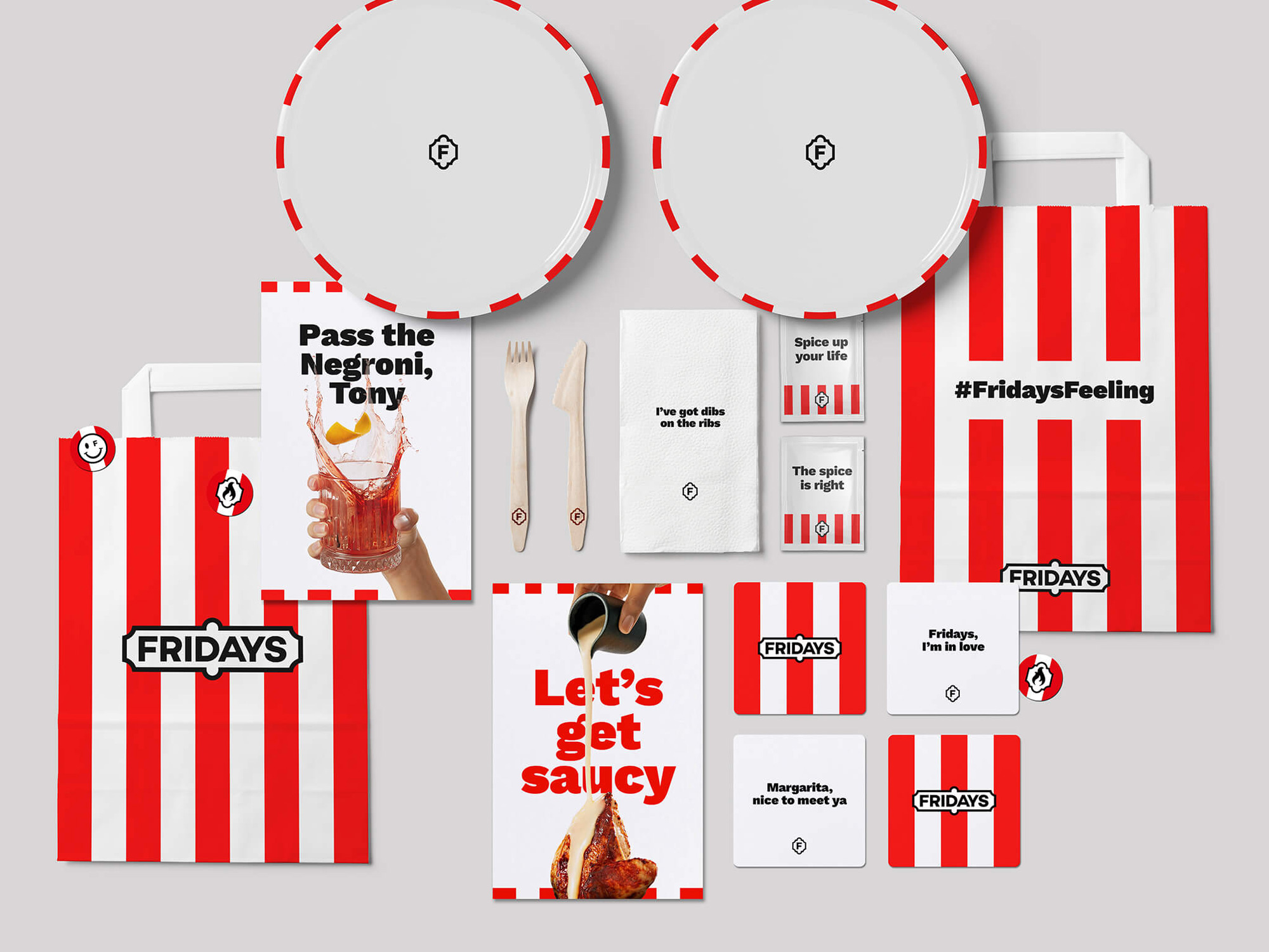
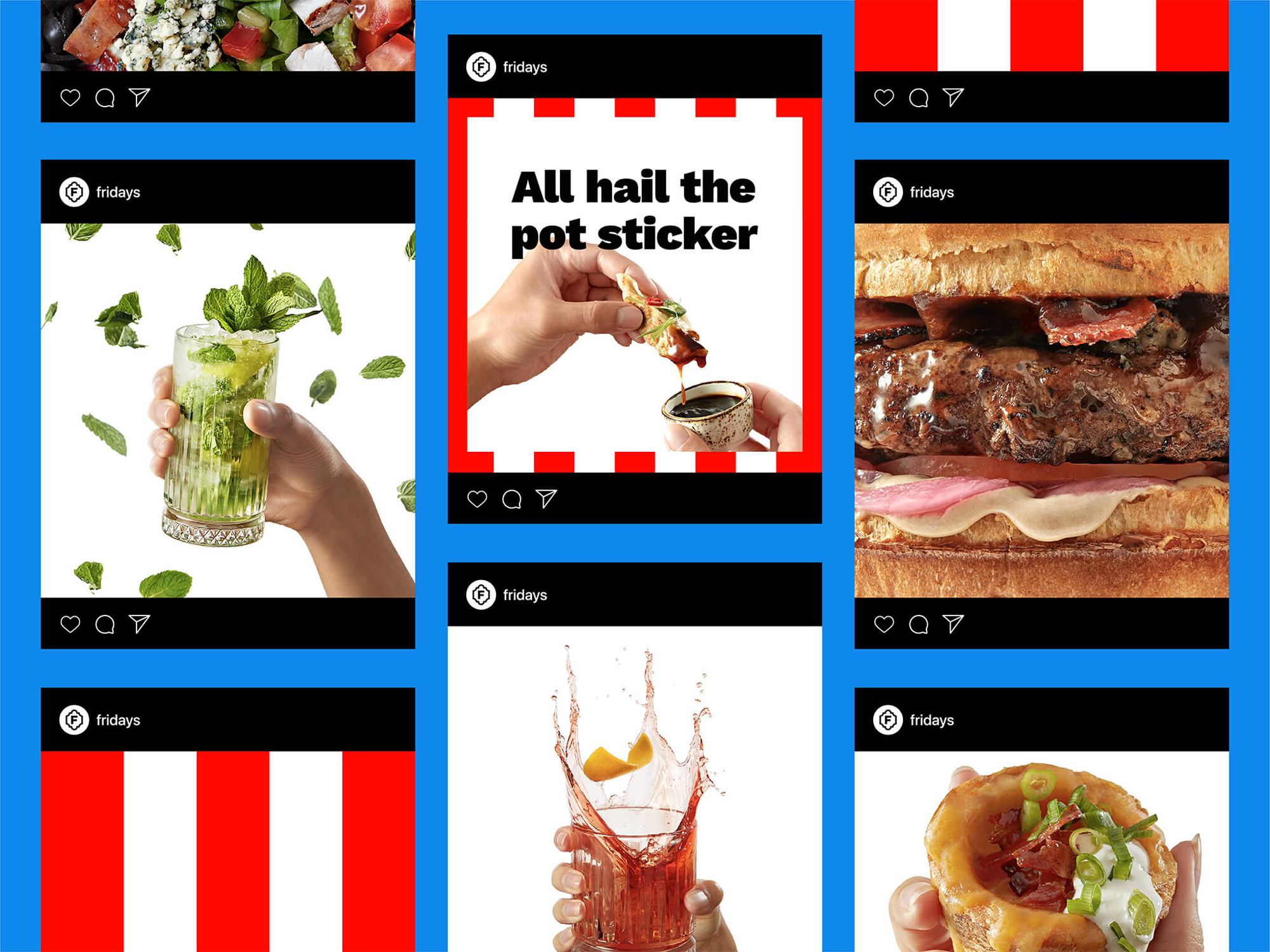
The use of the stripes is bold and vibrant and it’s amazing how easily recognizable they are as a stand-in for “TGI Friday’s” — and, perhaps, in the future, for “Fridays”. As seen above and in other applications below, the stripes can take over a layout going from edge to edge or they can be used as borders on the top and bottom (or around a circle), which I think is a very nice use of the stripes that looks more like the awning of a restaurant instead of just the referee-like stripes on staff uniforms.
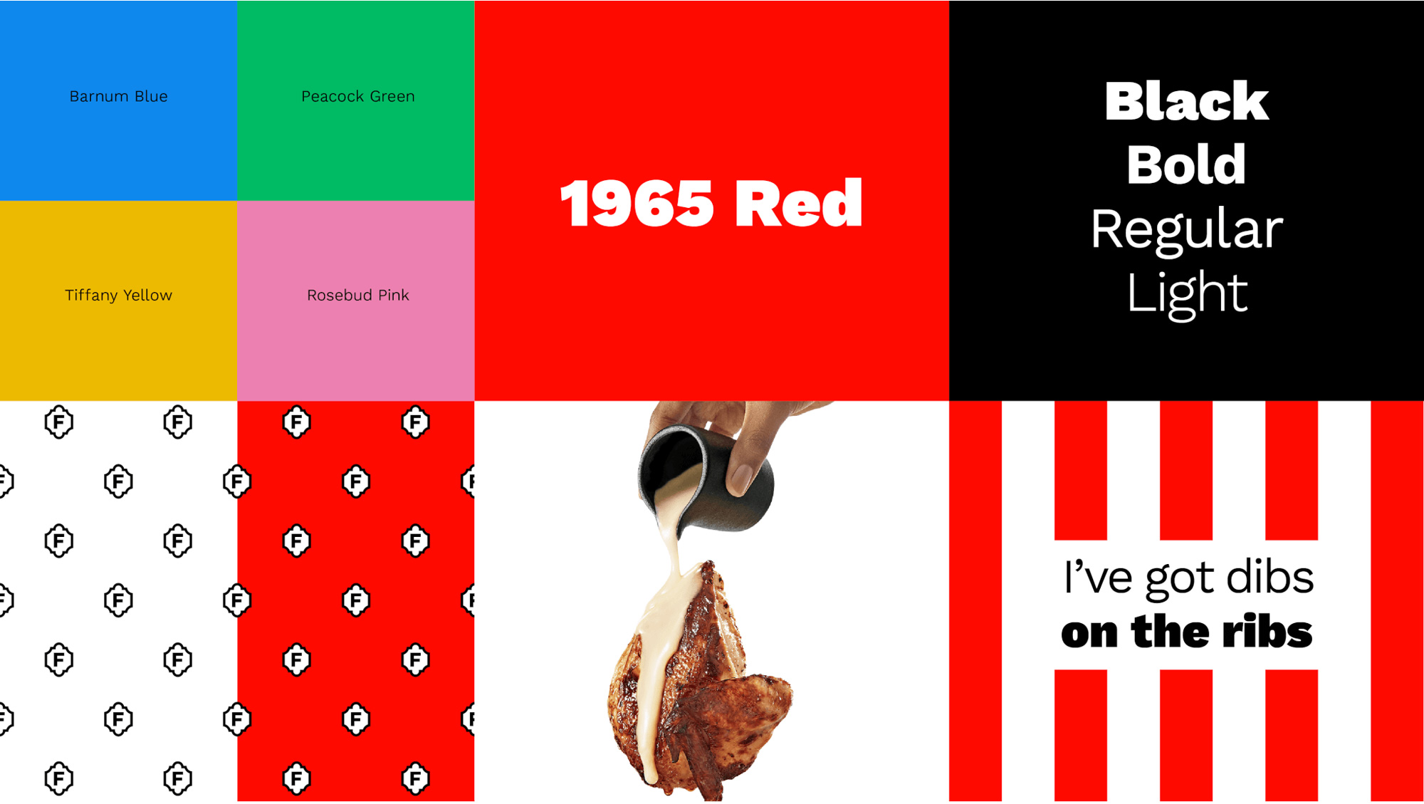
We’ve also developed a sumptuous new photography style, with The Fridays Feeling at the heart. We’ve amped up the action and saturation to make the food and drink look as appealing (and tasty) as possible. The inclusion of hands adds a premium touch and the oozes of sauce add that “can’t get enough” personality and delectability.

The photography and, um, videography in this project is particularly interesting as it establishes a consistent and unique style for a chain restaurant. It’s by no means “great” in the photographic sense of the word but it stands out through its use of stark white backgrounds, high contrast, and relative playfulness. I think the Instagram Stories above are the best example of the identity in application… if they came up on my phone they would definitely make me pause. They hit a lot of good notes: tempting cocktails and food, striking animated stripes, and simple bold typography, along with the neat “F” monogram as the avatar… which, yes, needs to be visually centered and nudged to the right a tad. Lastly, I wouldn’t say the “inclusion of hands adds a premium touch” because that’s not what hands do but I do like their inclusion as a way to draw you into the photos — a missed opportunity though to include more, any, hands of color.
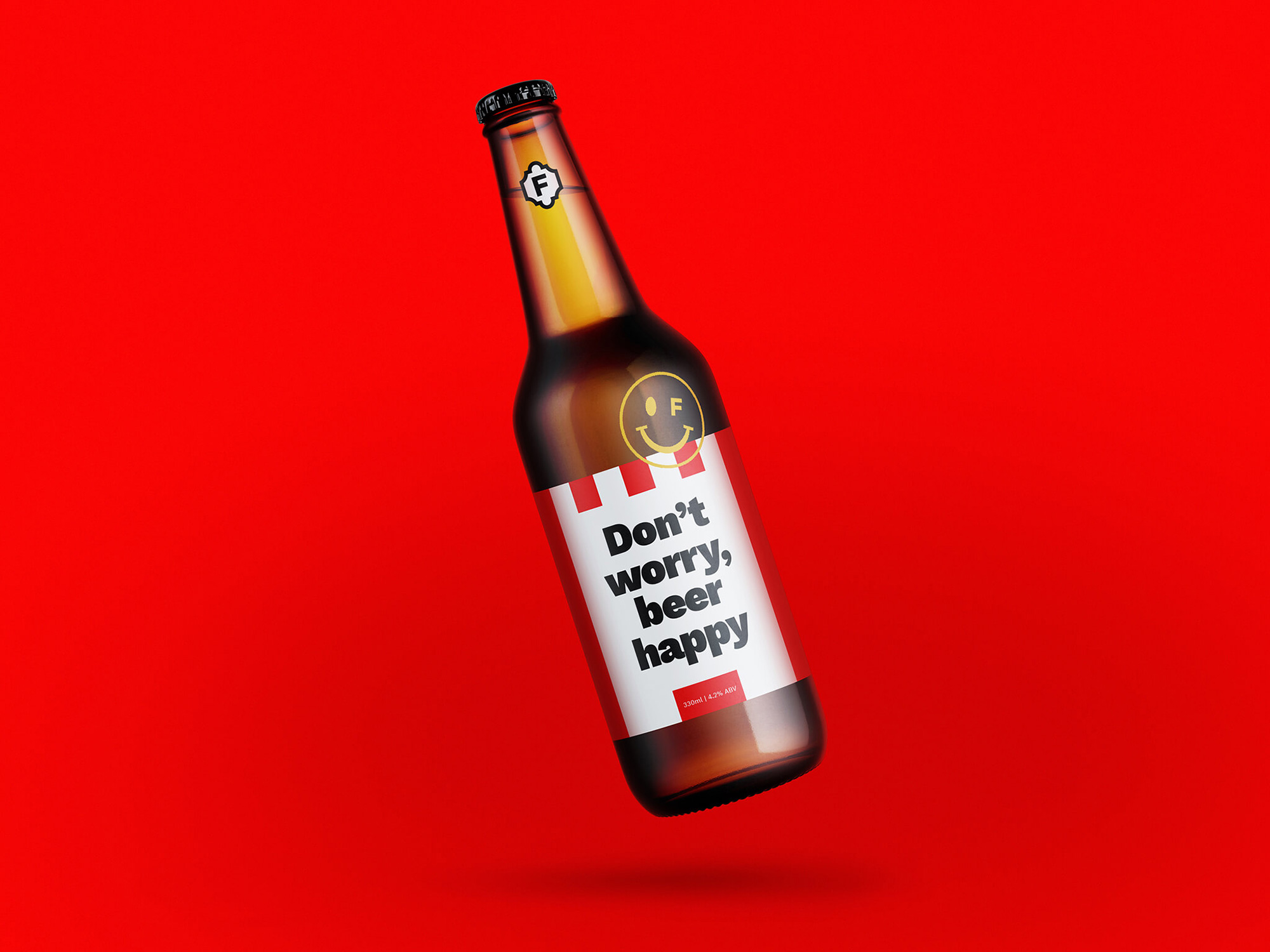
The applications have a great range of variety within the limited amount of identity elements and, as I mentioned in the Noted post, Work Sans works great as a complement to the stripes. I would also like to see more of that happy face with an “F” for an eye — there is something interesting visually and in attitude about it. Overall, I do think this does capture The Fridays Feeling in a relatively sophisticated way that also starts to ditch the tchotchke brand association that may not be as novel or enticing as it once was.
 each year since publication began in 2006

 Новости Союза дизайнеров
Все о дизайне в Санкт-Петербурге.
Новости Союза дизайнеров
Все о дизайне в Санкт-Петербурге.