Обзор лучших ресурсов по разработке бренда, разработке упаковки
contact us | ok@ohmycode.ru
contact us | ok@ohmycode.ru
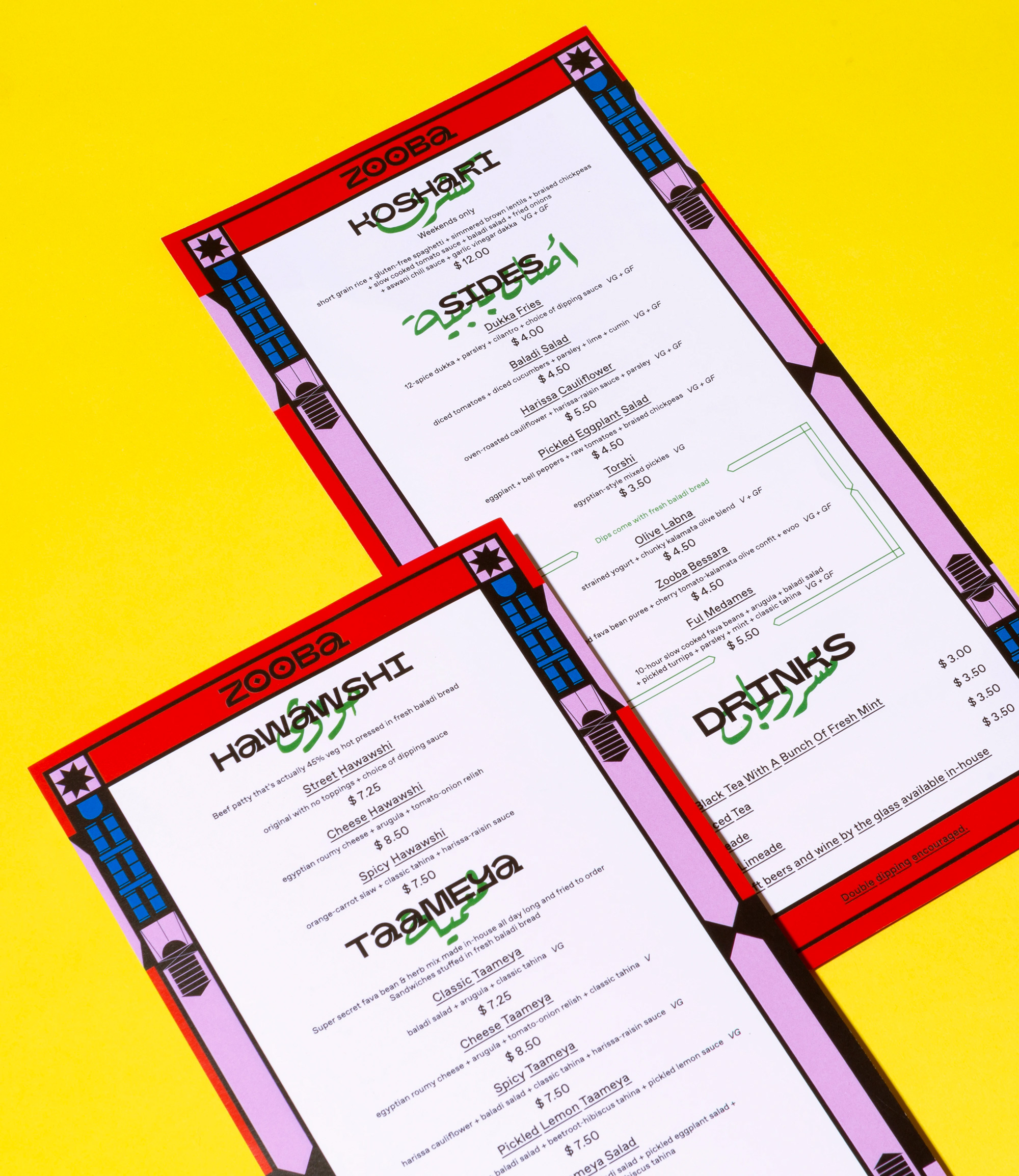
Established in 2012, Zooba is a small chain of fast-casual restaurants in Cairo, Egypt, where it has six locations that offer a modern twist on traditional Egyptian street food. Earlier this year, Zooba opened its first location in the United States in New York, NY, with the goal of expanding not just to the other boroughs but to other cities or, as they say, “spreading across the US like bessara on baladi bread”. Representing Egyptian culture is also a big part of what drives Egyptian-American founder Chris Khalifa and head chef and co-founder Moustafa El Refaey, so that people know what bessara is, what baladi is, and most importantly, what “ta’ameya” is, which is the Egyptian equivalent of falafel and one of their signature dishes. As part of its expansion, Zooba introduced a new identity designed by New York-based &Walsh.
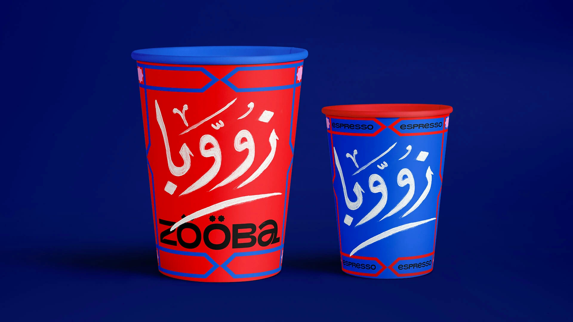
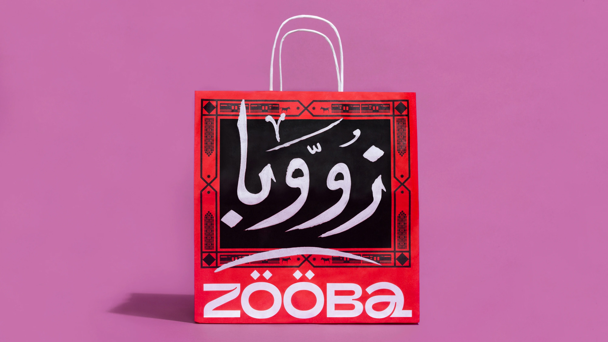
We went to Cairo and were inspired by the beauty of the layered visuals we saw on the streets: the hand-painted typography on foul carts, geometric patterned tapes, mix & matched colored tiles, posters, and painted illustrations on walls.
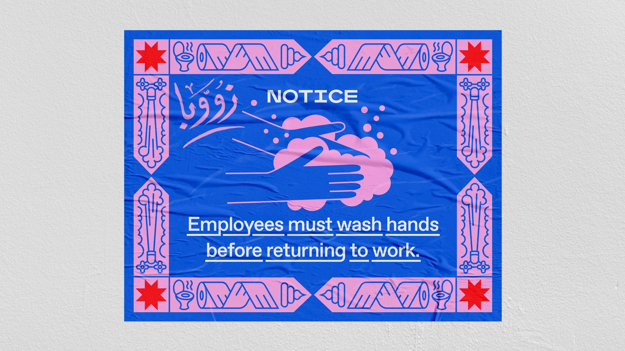
We worked with a Cairo-based calligraphy artist to paint the Arabic type for the branding. We layered this with modern versions of patterns and illustrations inspired by the streets of Cairo. Just like their food is a modern twist on traditional classics, we aimed to do this with the visual language.
The old logo, in what looks like a tweaked version of FF Cocon — which I think is typographic public enemy number one (beyond Comic Sans or Papyrus) but doesn’t get such a bad rap since it isn’t so widely available — was not very good, although I’ll admit there was something enjoyable about the repeating “ö”s. The new logo is a custom wordmark in, literally, an un-categorizable style that conveys the eclectic offering of the restaurant as something that is foreign yet exciting and novel. I really like the logo for its expressiveness and oddity but I can see how a lot of folks here will be like “Nah, hard pass on that a”, which in all its unicase glory I should instinctually hate, yet I very much admire. The diamond umlauts are a nice way of bringing in the style of Arabic calligraphy and typography into the wordmark. The only thing I would have loved to see was some kind of notch/inktrap in the “O”s as they are too clean in contrast to the other letters… perhaps some kind of overlapping or ligature approach could have created that missing counterspace that is so interesting in the other letters.
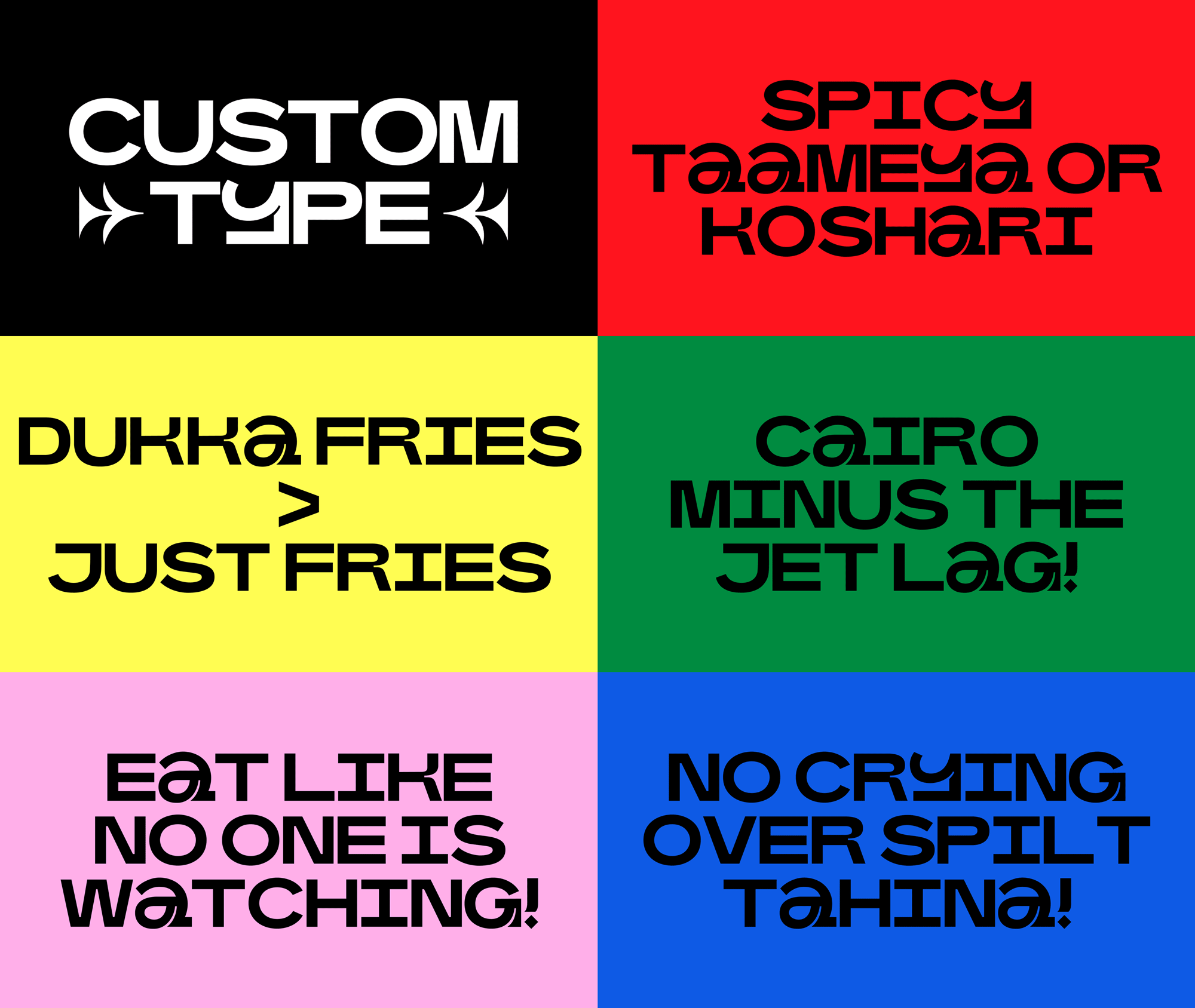
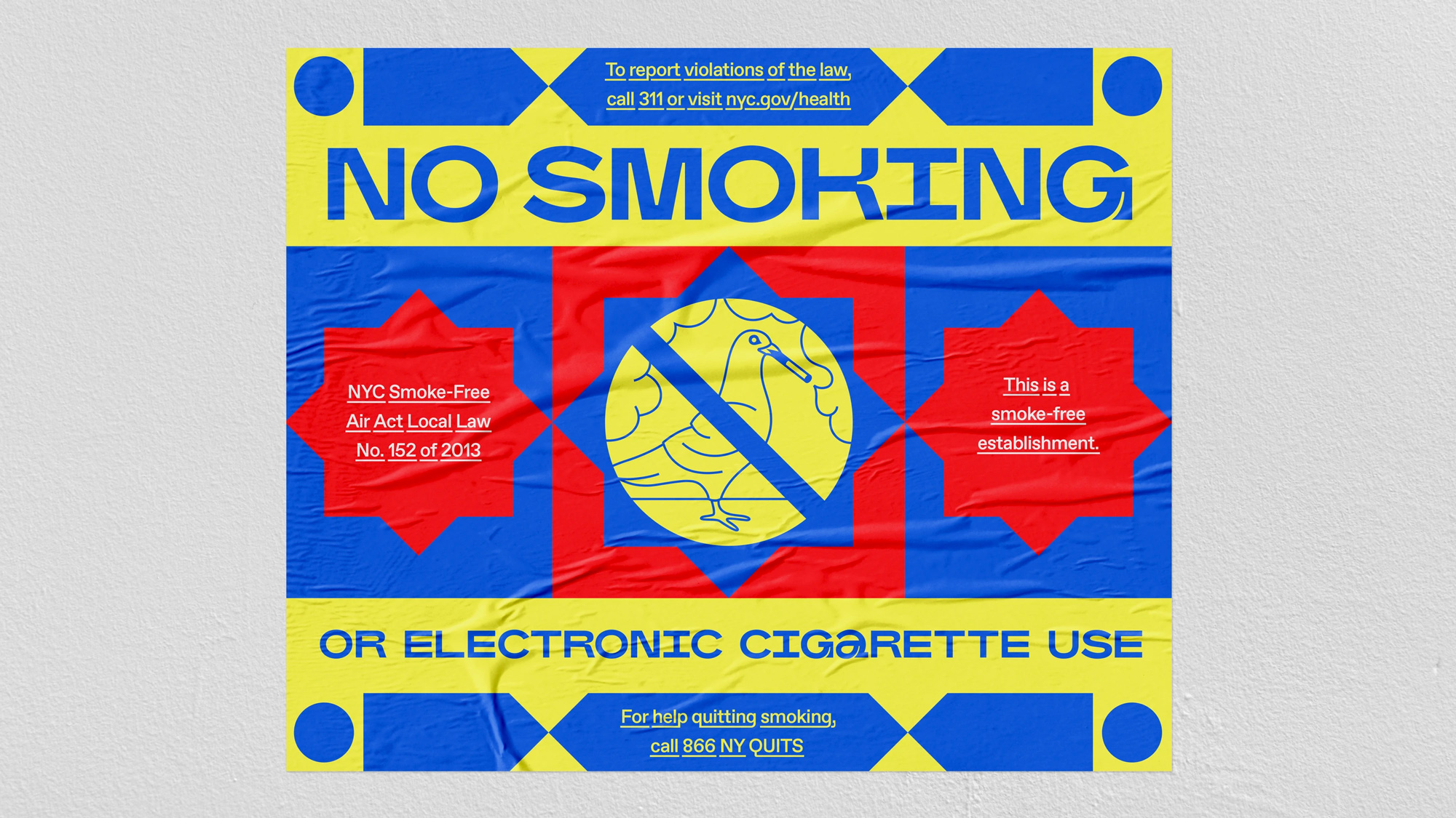
A custom typeface in the same style of the logo expands the visual language in a consistent way and allows the restaurant to very easily communicate in a recognizable voice. I also can’t believe I’m saying this but I wish there were a few more unicase touches… like perhaps a funky “e” or “m” to balance things out and force some other characters into the same structure, like that “Y”, which I both love and hate.
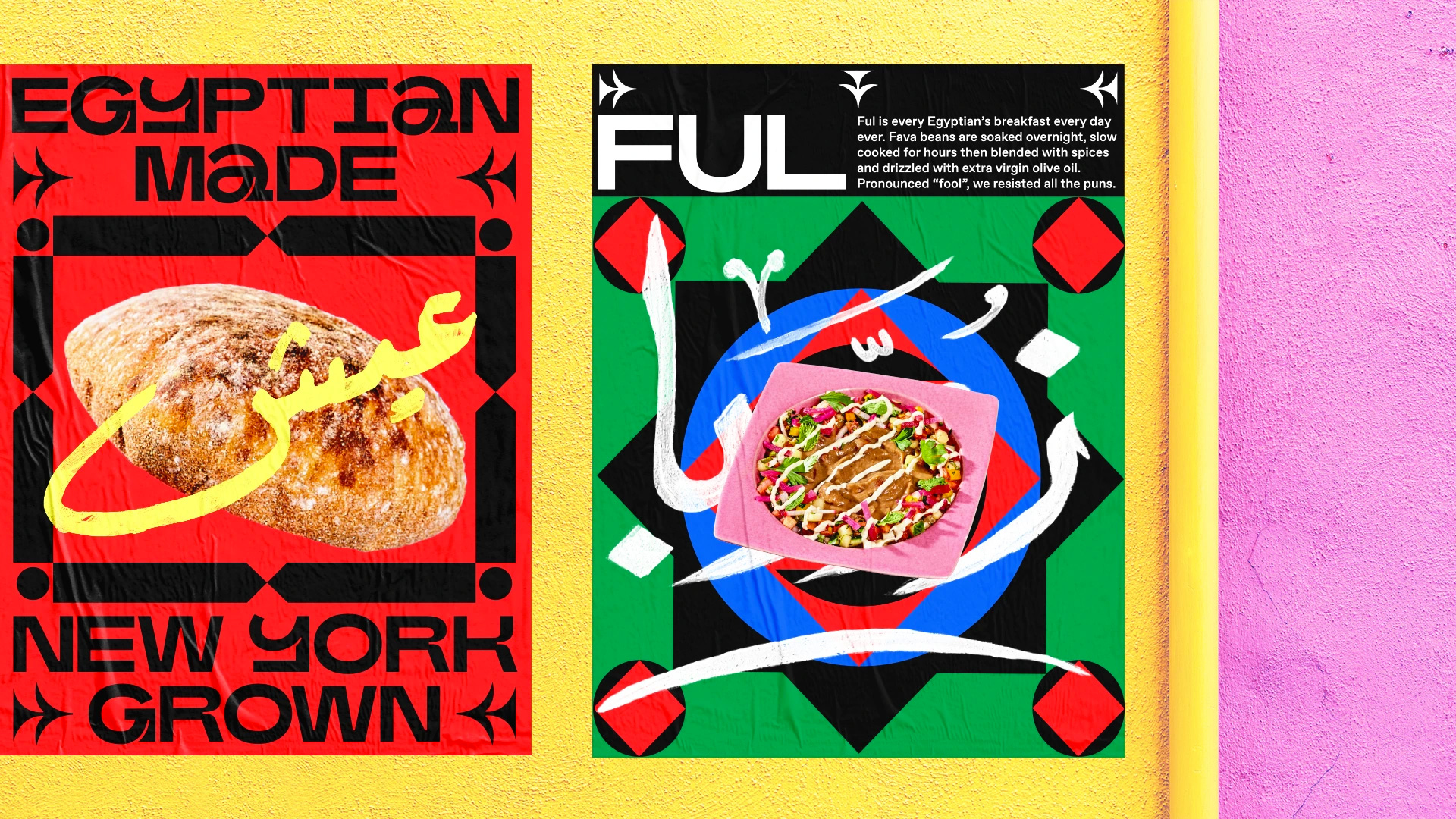
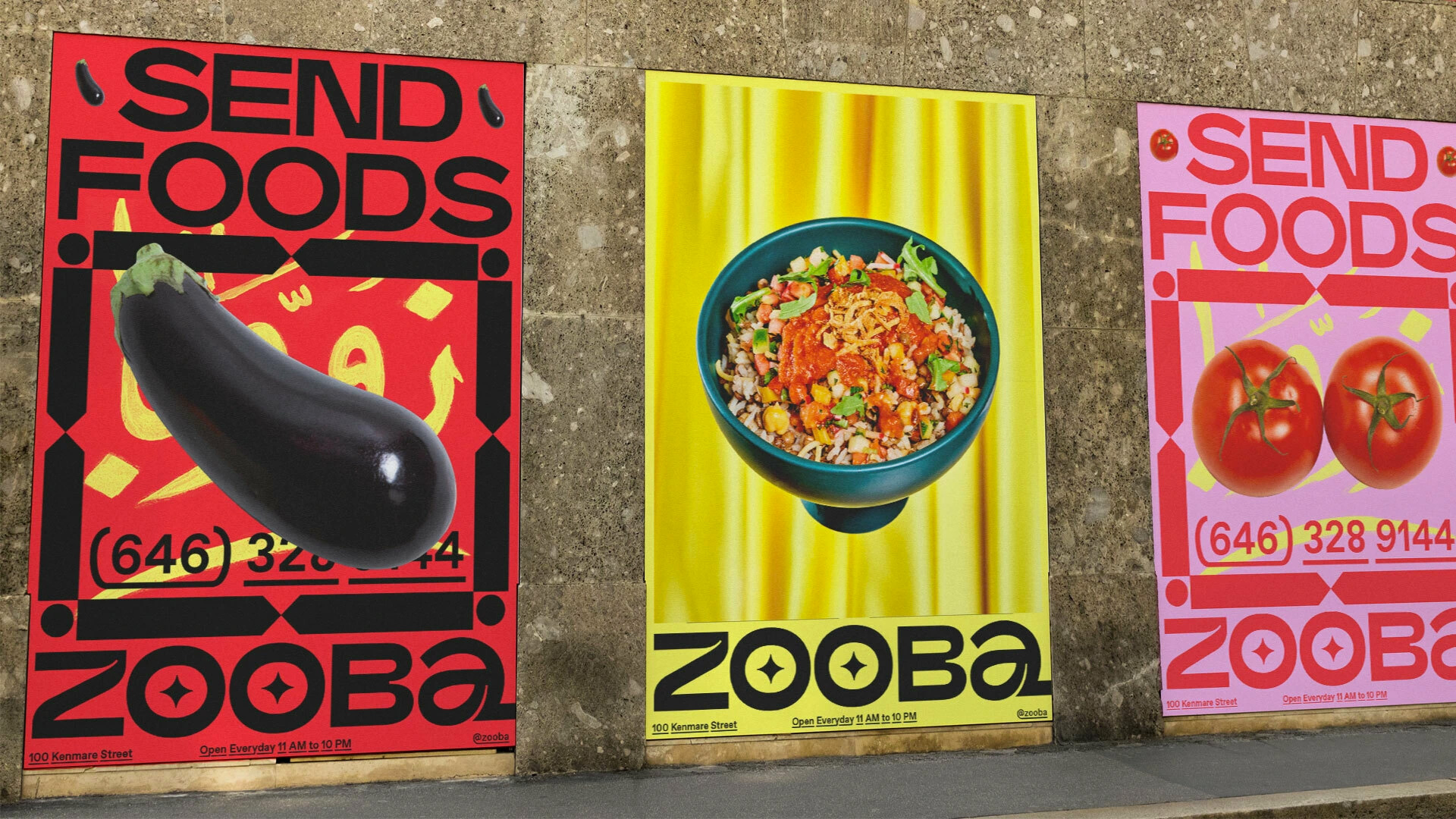
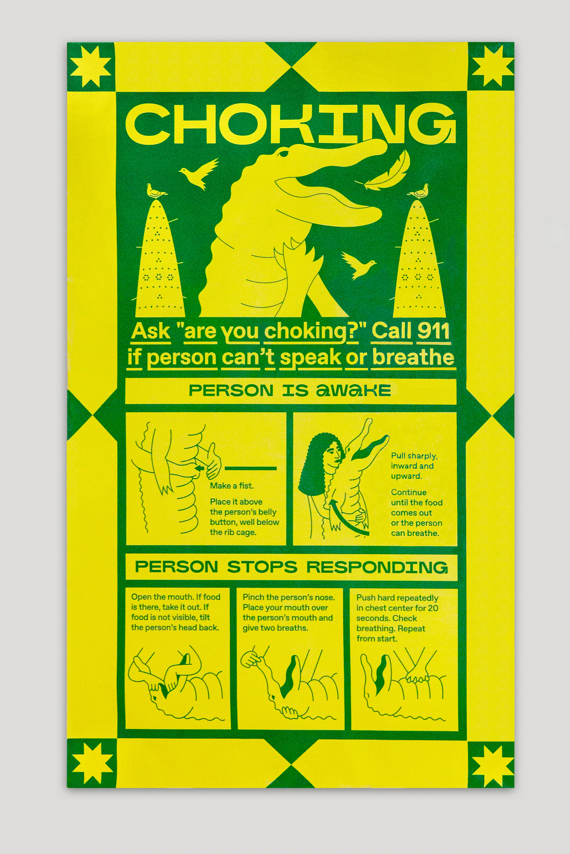
The identity then builds into structured yet wild compositions that combine the custom type with exuberant borders and frames and accentuated by custom Arabic calligraphy. A little chaotic but I think they channel the energy of what one envisions as Middle Eastern street vernacular. The only things I really don’t like are the silhouetted food items on random fabric backgrounds — something about it is just too unappealing when it comes to food. As a secondary typeface there is a sans serif with underlines built in — which I know I’ve seen before but I’m blanking on its name and previous use — that is okay but perhaps distracting in an unnecessary way.
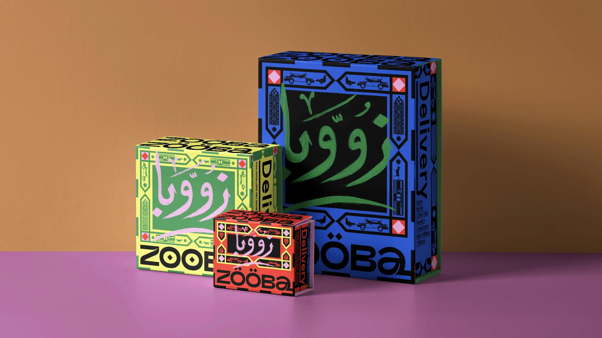
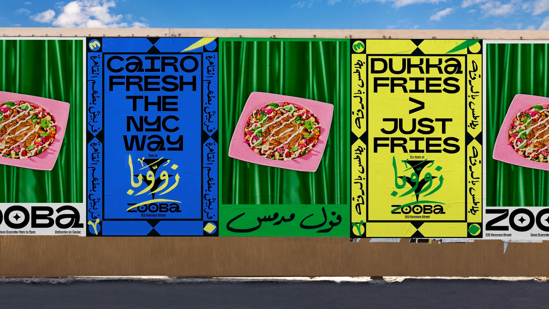
These are my favorite applications, with a great chaotic aesthetic and a very interesting mix of traditional street graphics and super weird contemporary icons mixed into the frames — there is a donkey pulling a subway car, a pigeon next to a taxi, and some other stuff that’s hard to decipher. The food wraps below are pretty cool too, looking like freshly printed newspapers but, again, with a contemporary twist that creates some fun moments.
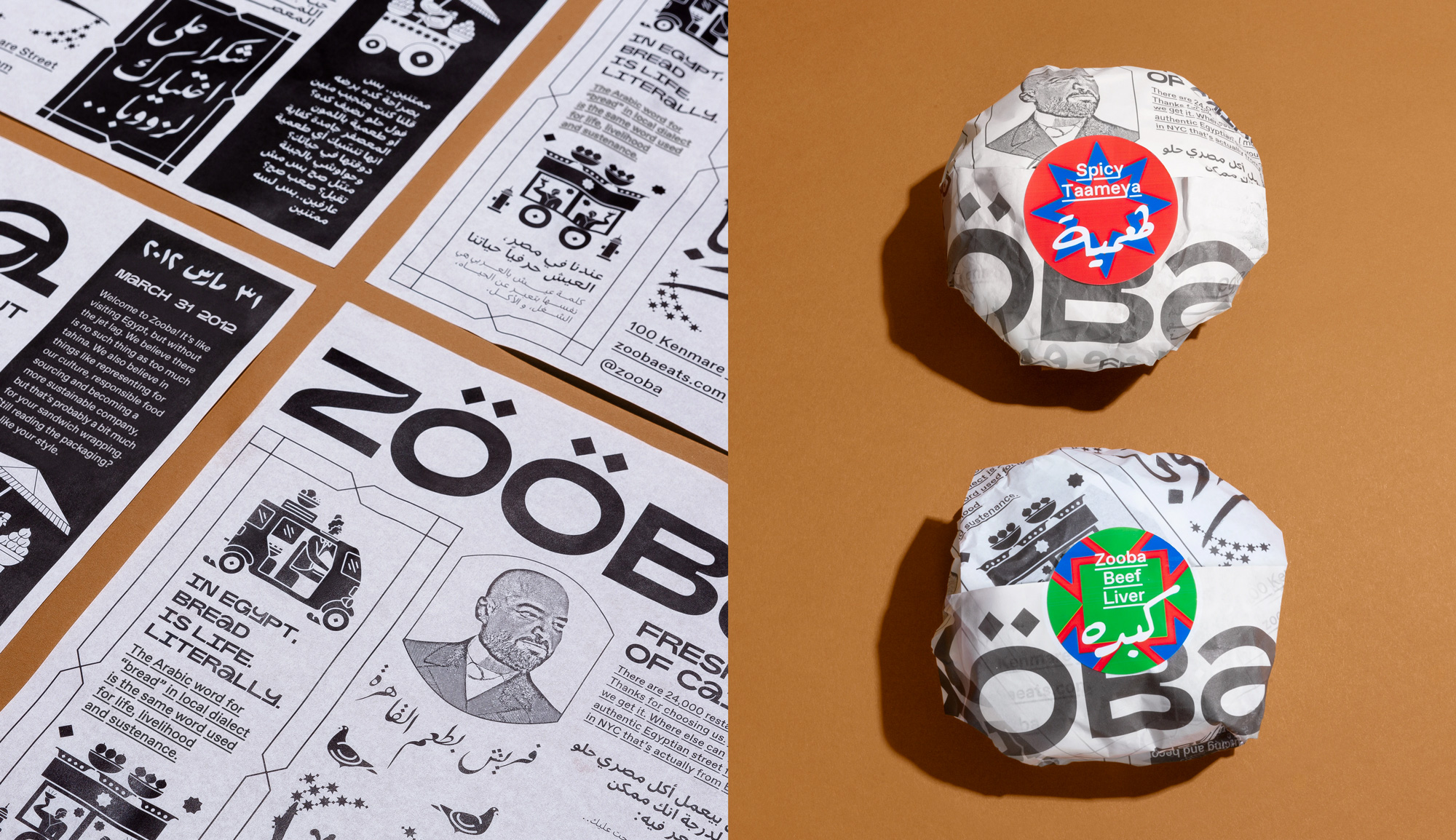
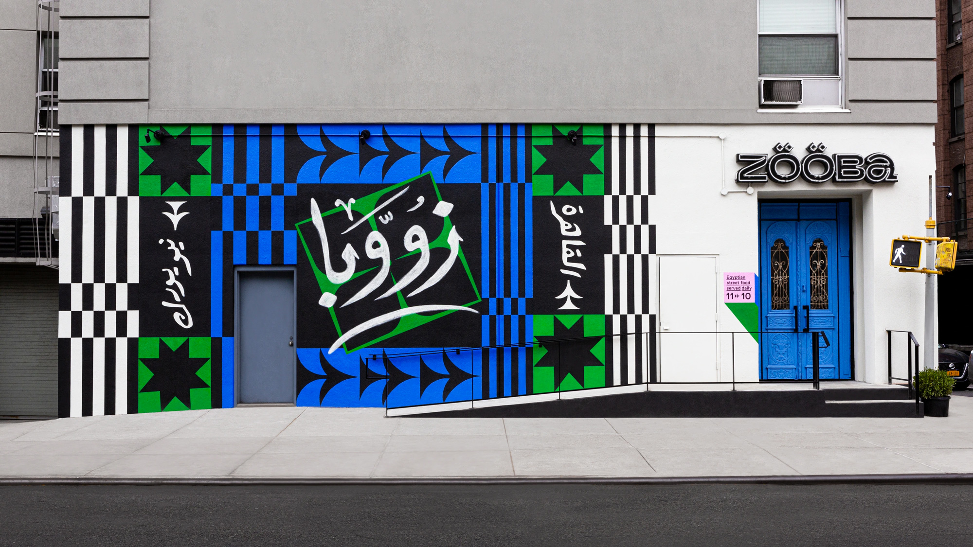
If, like me at the beginning, you are thinking that that’s a lot of Photoshopping and rendering, a lot of this stuff is indeed for real. This Grub Street article has a ton of photos of the food wraps, bags, and exterior mural (which is really great). Even the weird-ass posters with the fabric backdrops and silhouetted food posters were actually printed and wheat-pasted in the restaurant. So, props to both &Walsh and the client for making this stuff happen.
Overall, I find this highly entertaining and I think it’s quite appropriate for an ethnic restaurant in New York trying to break through the massive restaurant noise. This identity will probably play very well in New York and, if it expands, in other large cities but would most likely freak out people in smaller cities or suburbs, which is probably not the target market but given how good the food looks… you never know.
 each year since publication began in 2006

 Новости Союза дизайнеров
Все о дизайне в Санкт-Петербурге.
Новости Союза дизайнеров
Все о дизайне в Санкт-Петербурге.