contact us | ok@ohmycode.ru
contact us | ok@ohmycode.ru
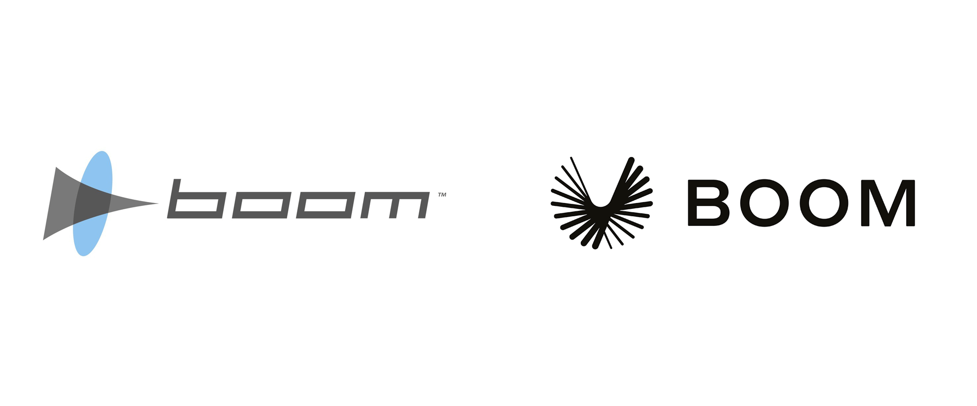
Established in 2014, Boom (as in “sonic boom” not “boom goes the dynamite”) is an aerospace company designing, building, and flight-testing a supersonic passenger jet — a Concorde for the new age. Based in a hangar in Denver, CO, Boom is currently developing the XB-1, their first test aircraft which will pave the way for Overture, their 55-seat commercial passenger jet — with ticket costs priced around what people currently pay for business class — that will cut travel times by almost 60% flying at Mach 2.2, e.g., New York to London in 3.5 hours. Japan Airlines and Virgin Group have already pre-ordered 20 and 10 planes respectively. Recently, Boom introduced a new identity designed by San Francisco, CA-based Manual.

Boom enlisted Manual to advance and elevate their brand identity, tell the story of their first test aircraft the XB-1, and refine the narrative and vision for what will ultimately be their 55-seat commercial passenger jet. We worked closely with the Boom team to name and strategically position their future commercial airliner, Overture, as a benchmark in supersonic business travel with the potential to radically change the way people experience long distance travel.


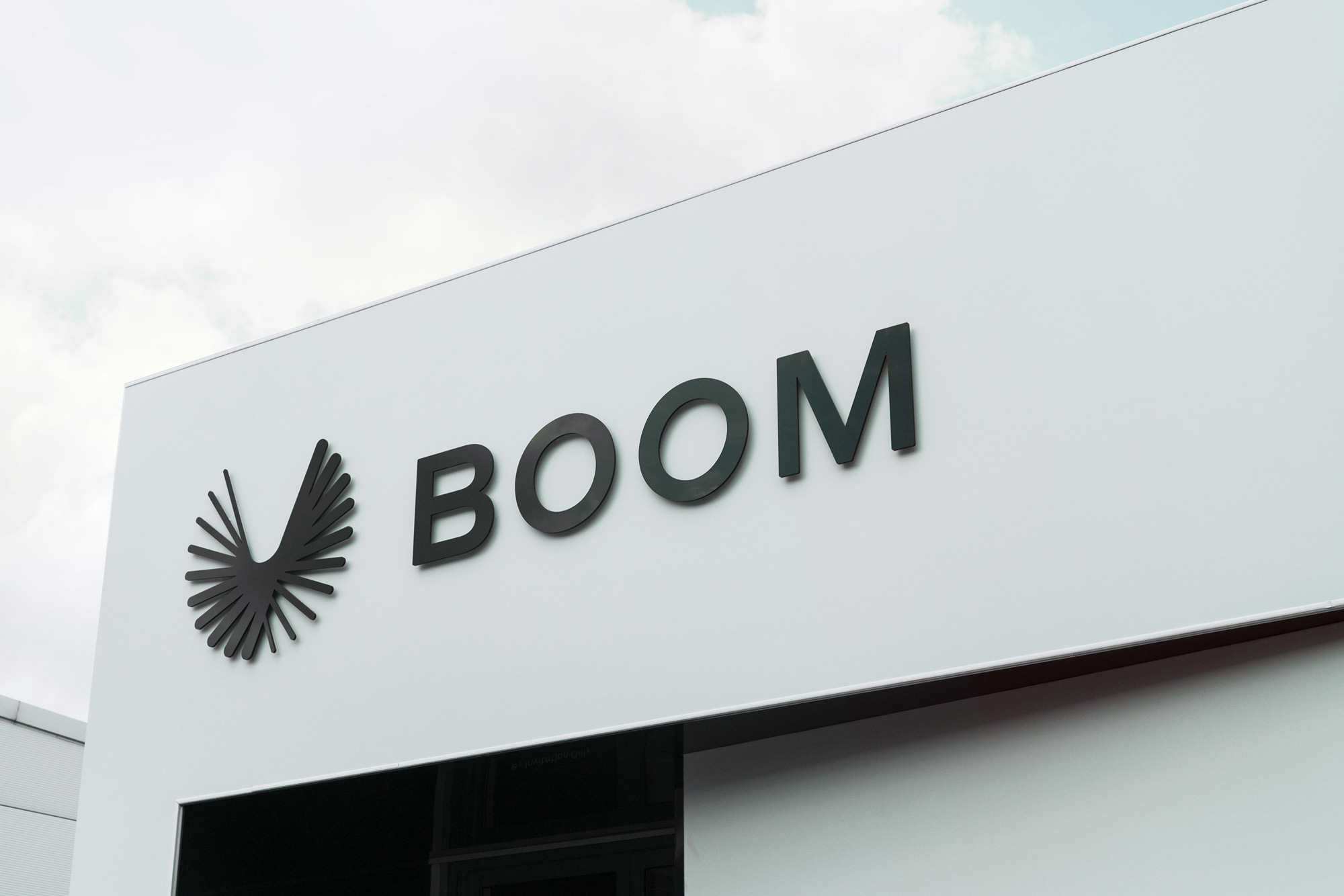
Although it wasn’t quite right, there is something I liked about the old logo, particularly the icon that looked like a diagram of something passing fast through a portal (i.e., breaking the sound barrier). The new logo is much more refined and less heavy-handed on the “this thing is fast!” narrative. The icon is a lovely abstraction of… flight. It’s kind of nothing and everything. To me it looks like a front view of a bird’s flapping wings captured as a composite but it could also be seen as a propeller. Although its overall shape is symmetrical, the asymmetry within it is great. The only thing I wonder is if the individual shapes of the icon would have been better in more hard-angled caps instead of the rounded caps. The wordmarks, set in Commercial Type’s Styrene, look solid.
I’m a fan of the flat animation but not so much of the 3D version as it singles out the individual pieces too much and creates what would be a very deep logo if you were to stack all those sticks, which kind of goes against the cool flatness of the icon.
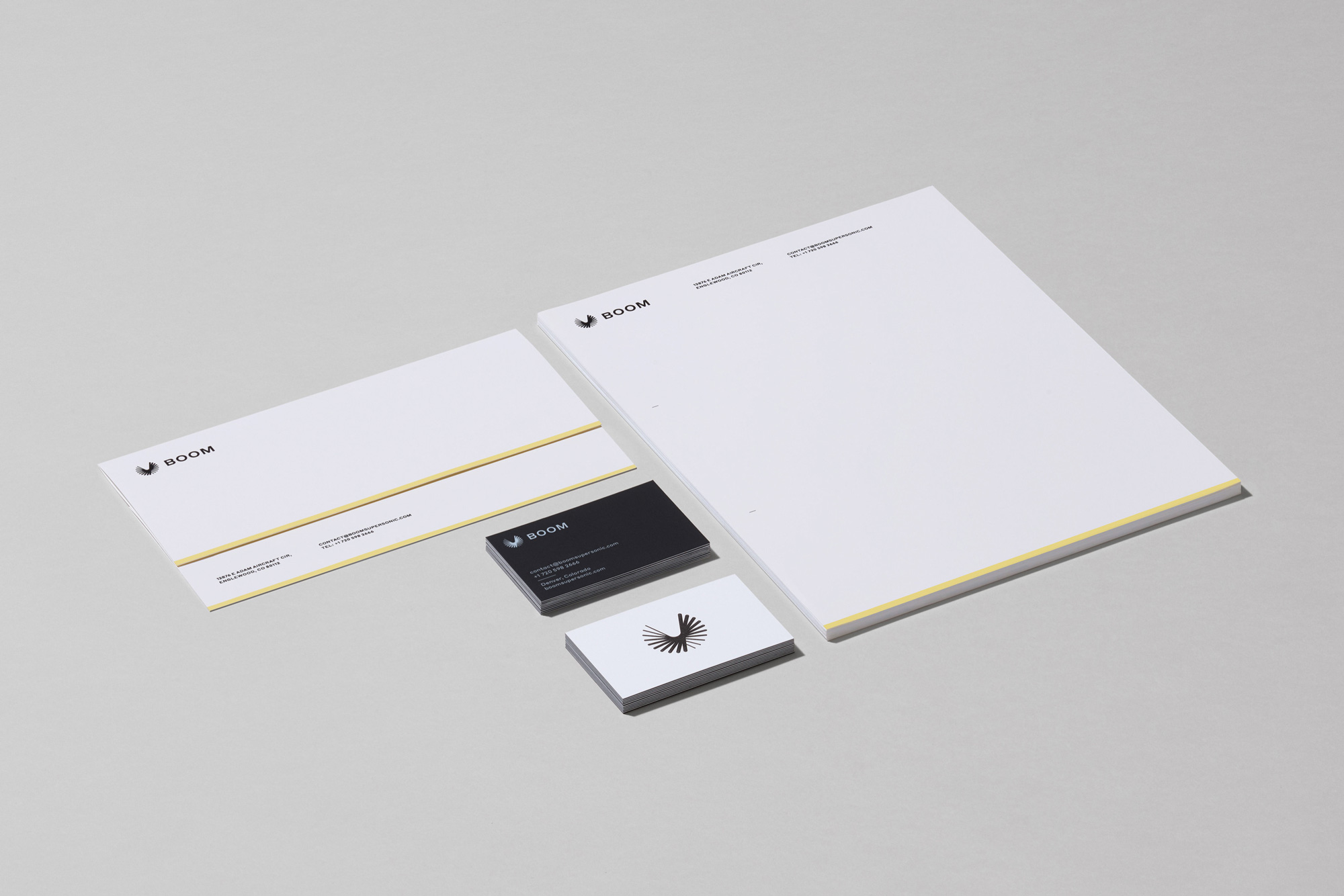
One thing to point out about the color palette, which might be my favorite detail of this project, is the use of the yellow accent bars you will see through most applications, which are a reference to the yellow accents found in Peregrine falcons, that, when going on a high-speed dive, are the fastest living creature on the planet. It’s an understated detail and probably no one will see the yellow bar on the bottom of a letterhead and think, “Of course, Peregrine falcons!” but it’s the kind of reasoned decision that brings joy to my logo-reviewing world.
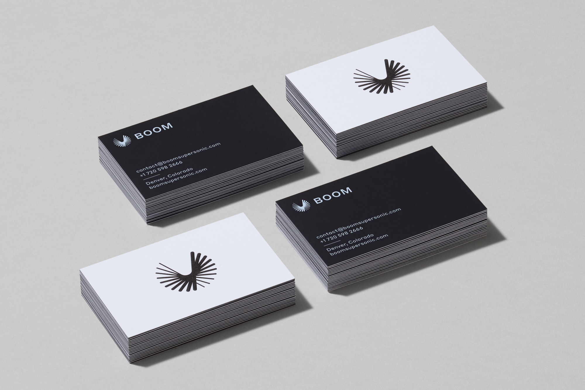
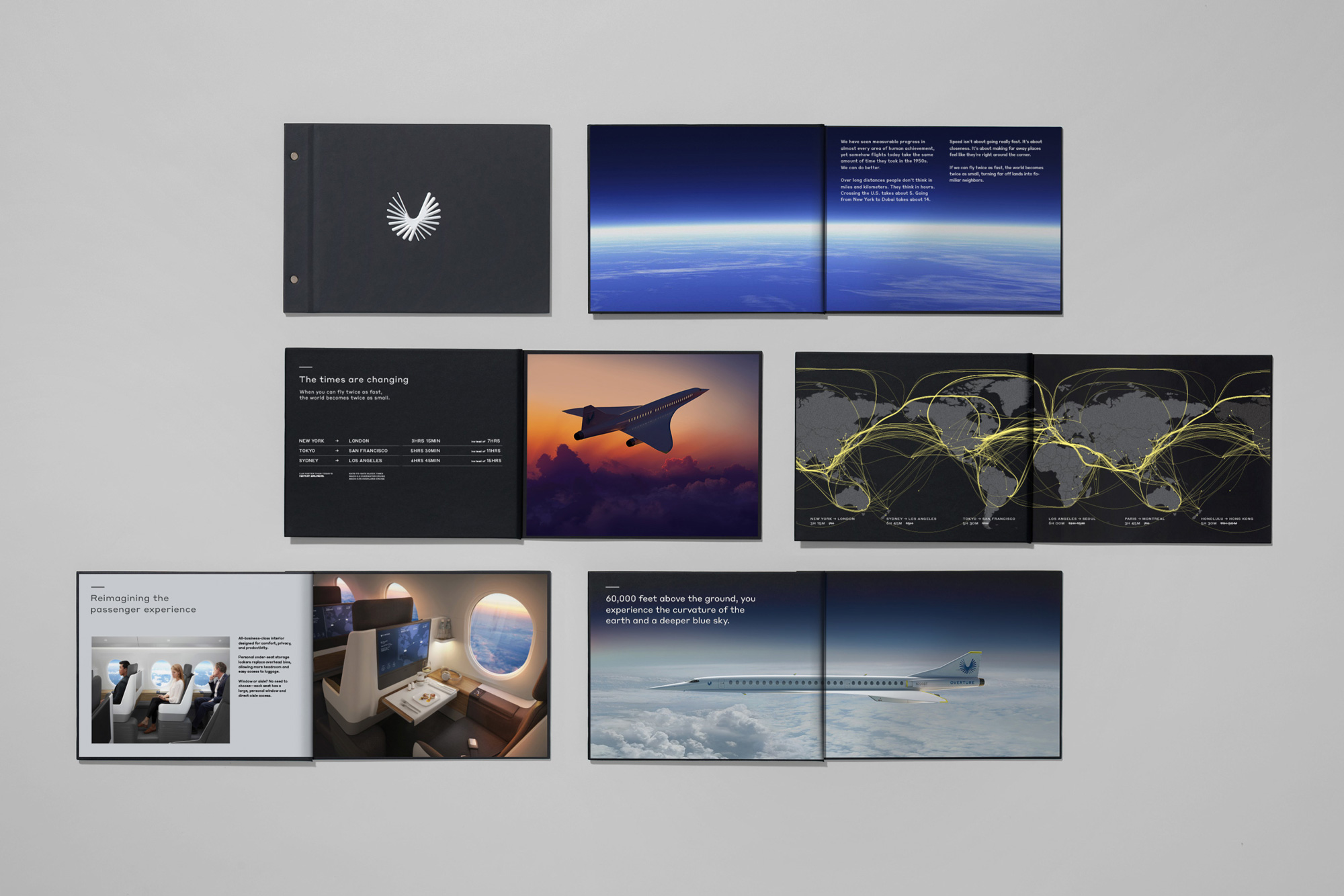

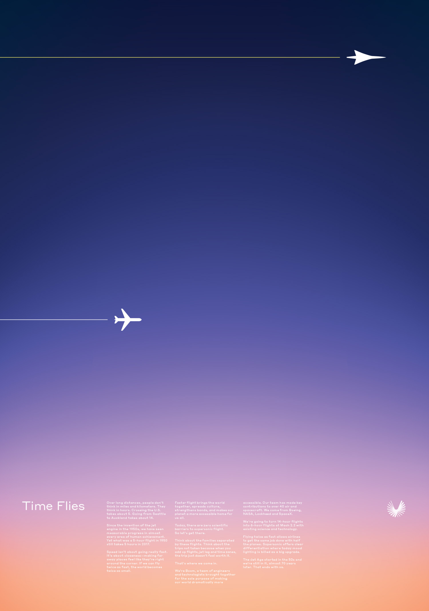
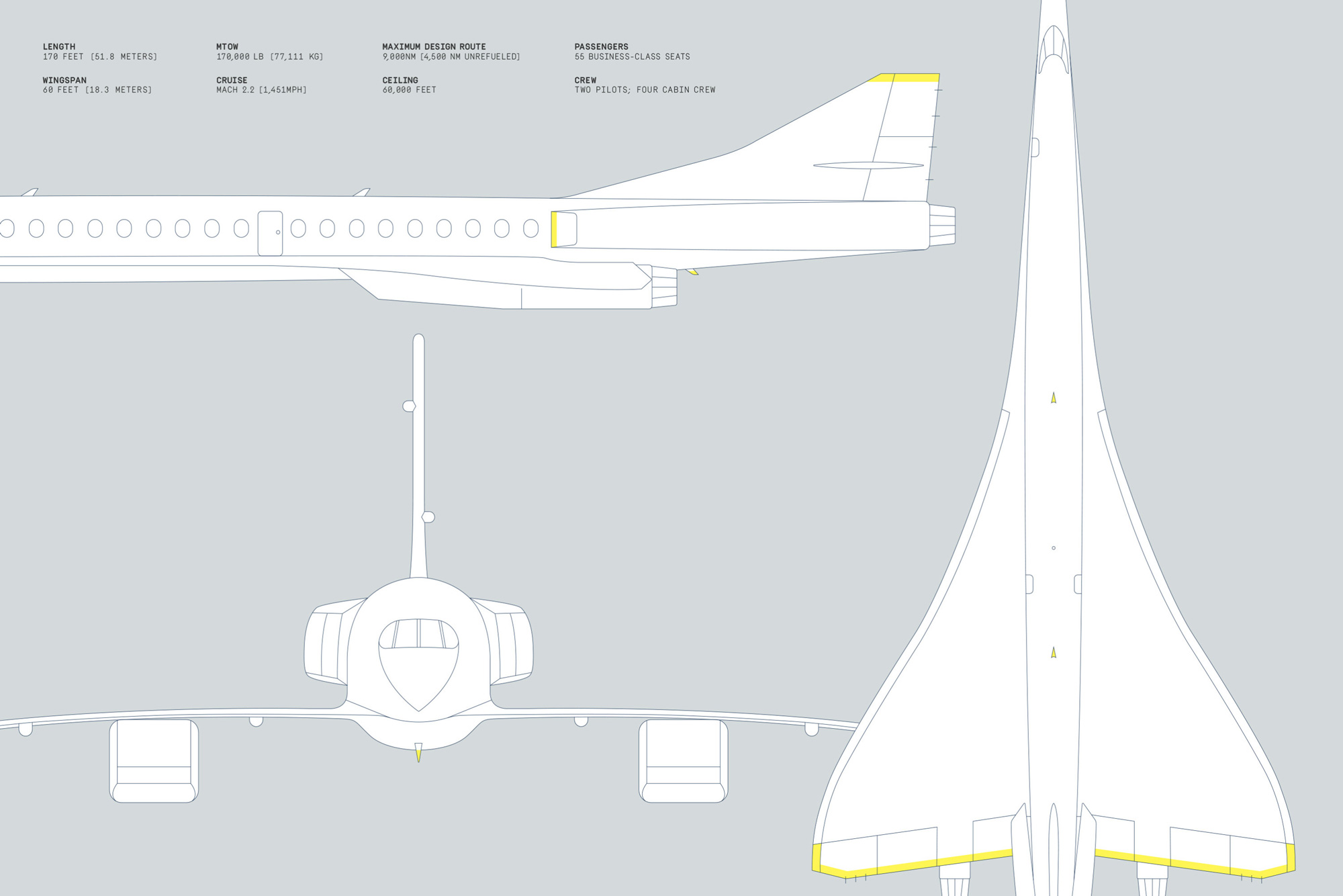
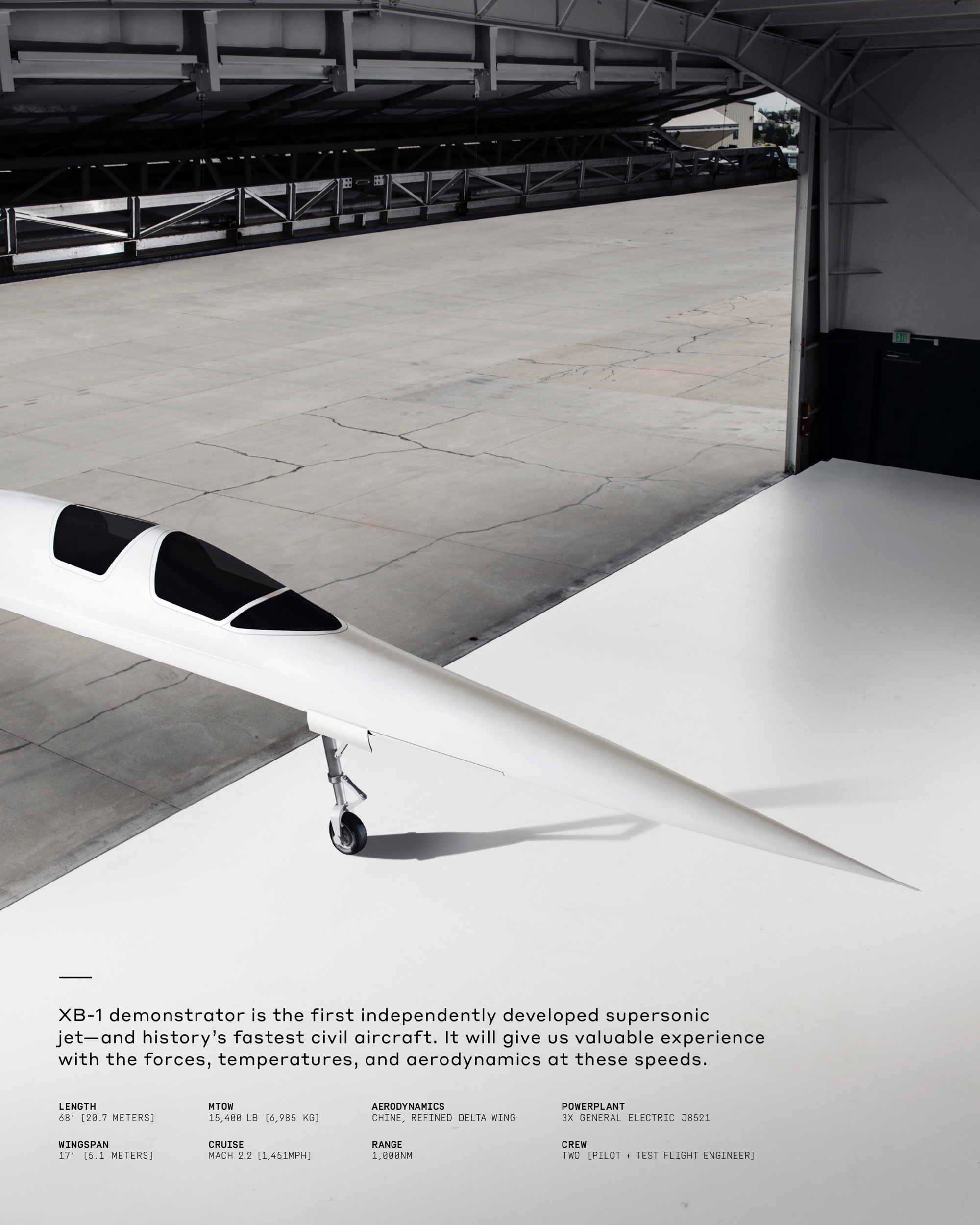
The applications all have a good mix of elegance and tehnicality through great use of white space and the choice of Styrene, which has such a unique aesthetic.
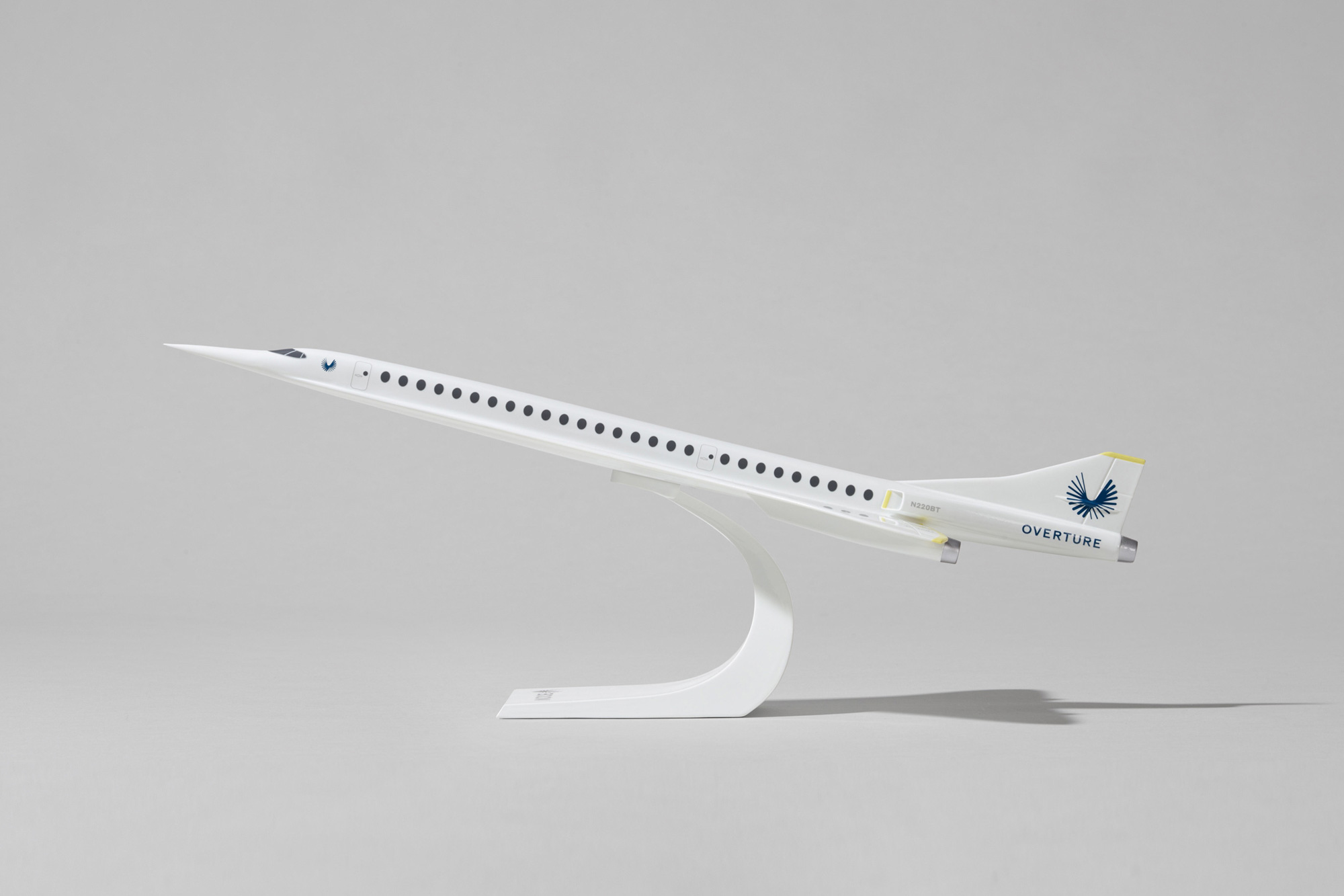
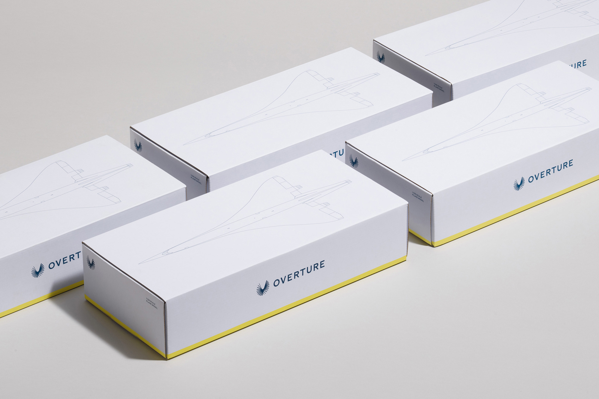
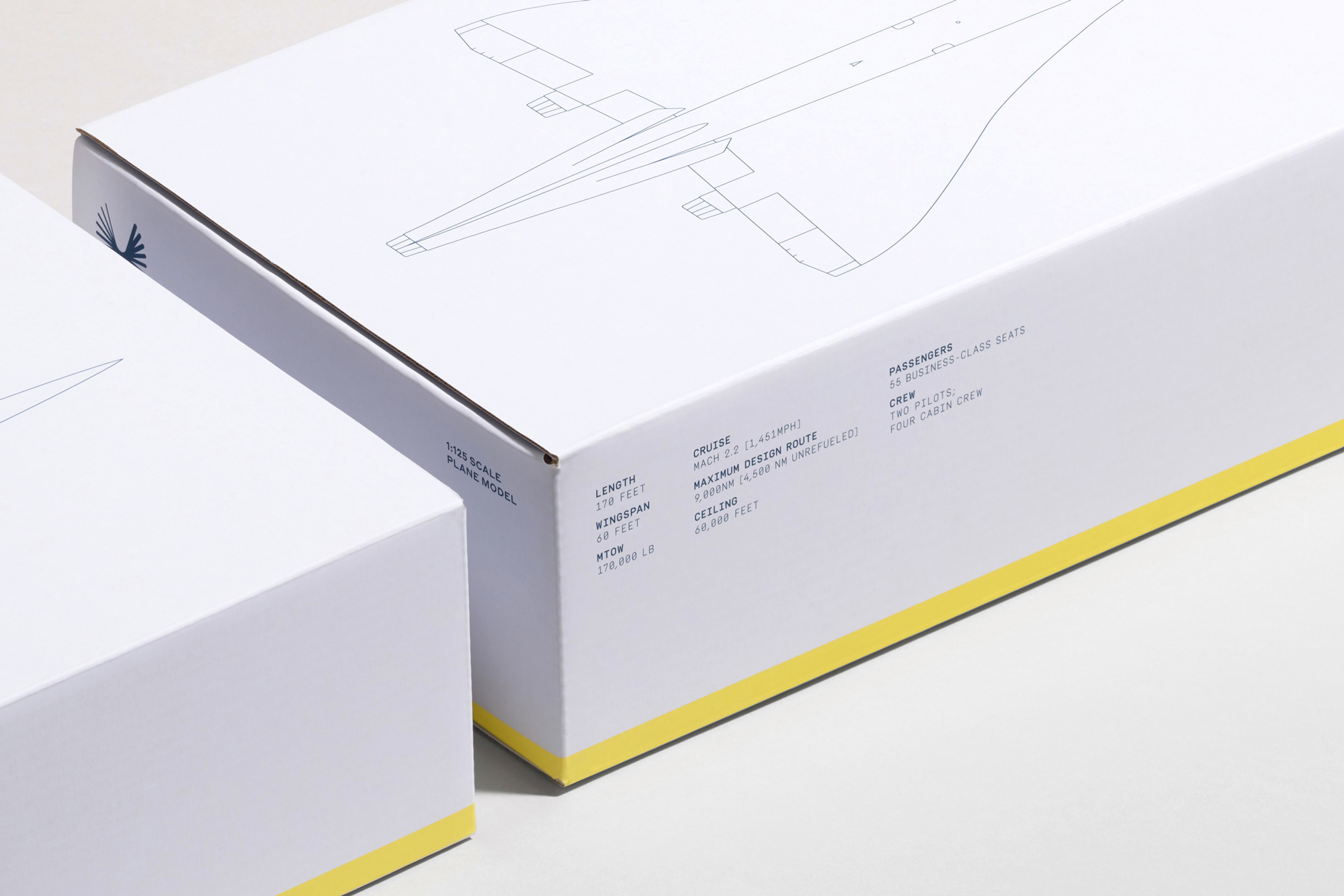
The packaging for the little model airplane features the yellow bars again as well as generous white space and a cool line drawing of the plane that make the boxes look like luxurious blueprints.
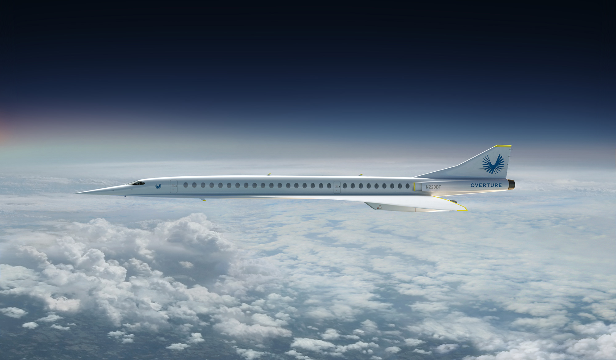
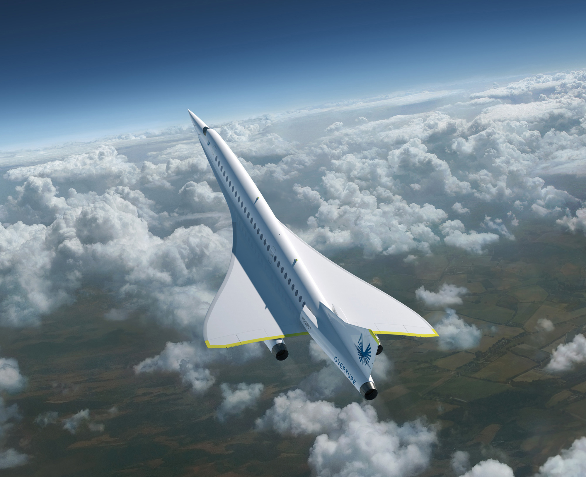
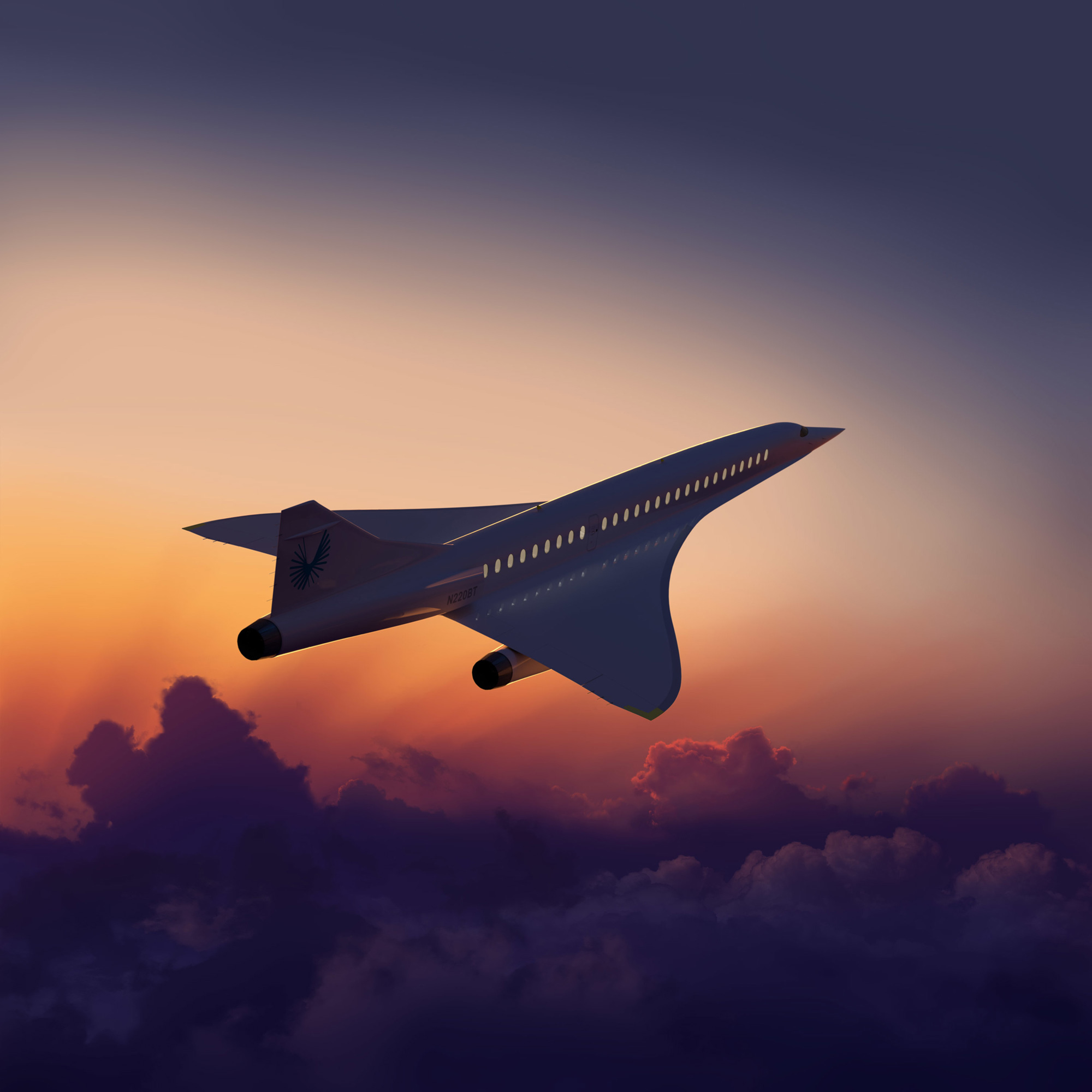
The livery looks great. I really dig the name so small at the end of the plane… and, once again, the yellow accents… love ‘em.
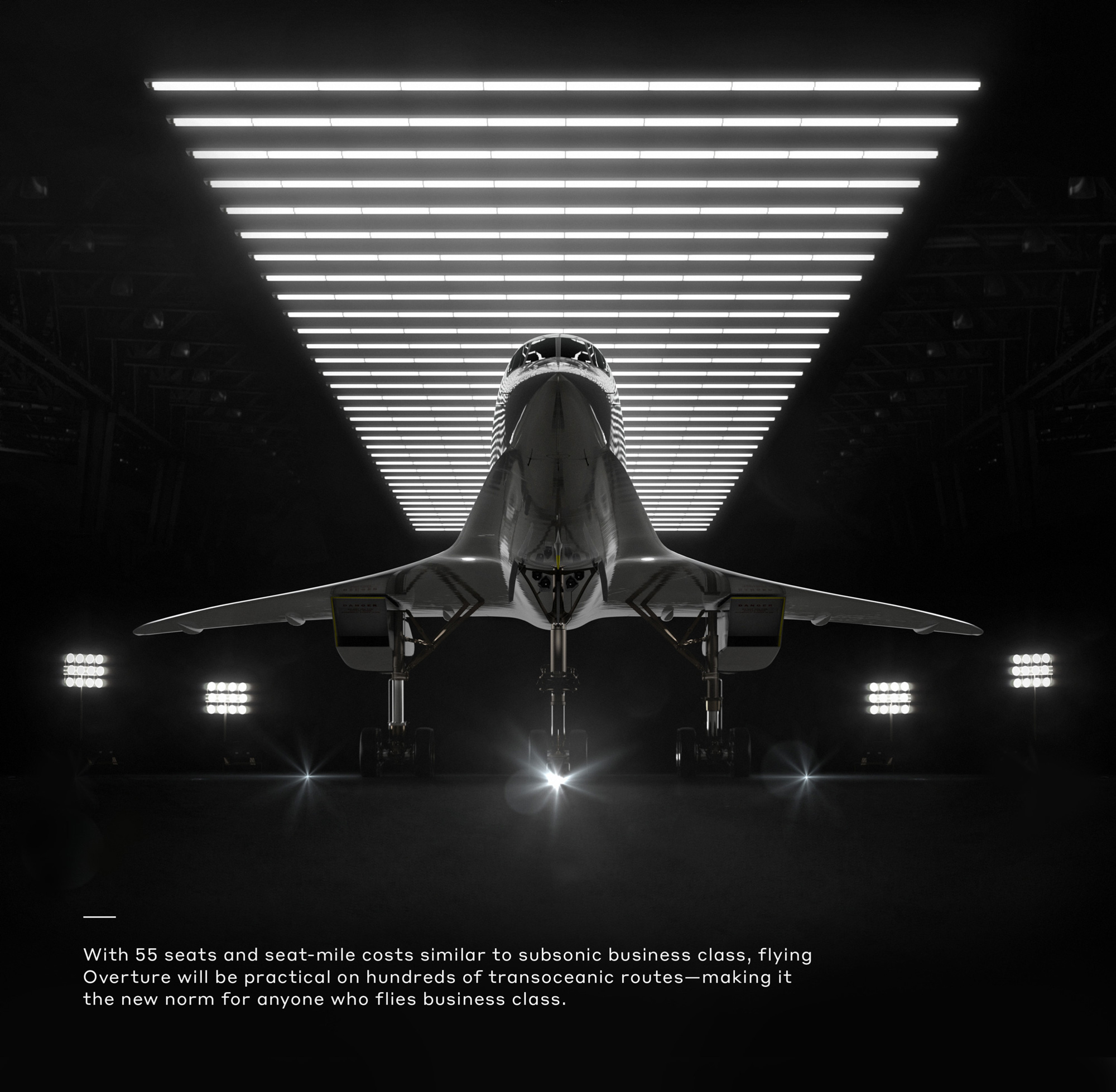
It will be interesting to see what happens to the identity of these planes once they are being operated by Japan Airlines or Virgin — does their identity erase Overture’s? Do they live together? We’ll have to wait and see. Overall, this is an identity that looks like the millions and billions of dollars being invested in the technology as well as worth the thousands of dollars passengers will plunk down to get to where they are going fast. Real fast.

 Новости Союза дизайнеров
Все о дизайне в Санкт-Петербурге.