contact us | ok@ohmycode.ru
contact us | ok@ohmycode.ru
(Est. 1922) “Better Homes & Gardens serves, connects and inspires readers who infuse color and creativity into each aspect of their lives. Reaching 40 million readers a month via the most trusted print magazine, the brand also extends across a robust website, multiple social platforms, tablet editions, mobile apps, broadcast programs and licensed products. Better Homes & Gardens fuels our readers’ passions to live a more colorful life through stunning visuals, a balance of substance and surface, and a blend of expert and reader ideas. Better Homes & Gardens is published 12 times a year by Meredith Corporation, with a rate base of 7.6 million.”
Lippincott project page
Better Homes &Gardens press release
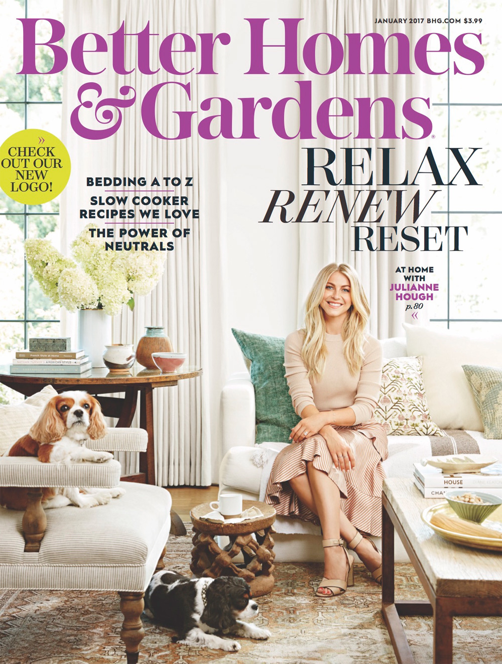
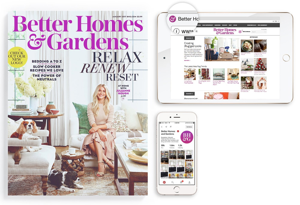
One challenge was modernizing the identity for relevance and appeal to a millennial audience without alienating the core readership. Our first decision was to approach the design as a considered evolution of the brand so as not to jeopardize the equity with a wholesale logo change. The new design is rooted in the heritage, but as a new, simplified expression ready to carry the brand into the future. It links all the platforms and extensions through a modern and adaptable identity system. And by creating a consistent, cohesive brand identity that is recognizable in print, online and in-market, we are able to give readers, friends and fans a greater connection and affinity to a richer Better Homes & Gardens.
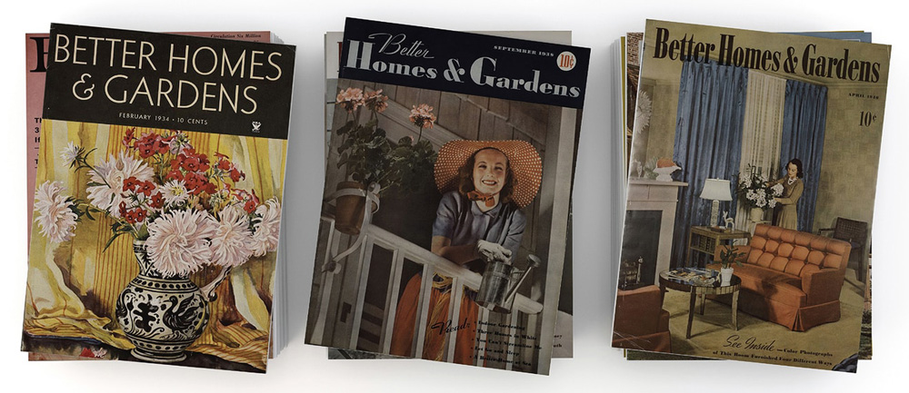
Central to the update is the return of the ampersand, which was used prior to World War Two and before the magazine shifted to emphasize the post-war “home” element in the name. The new ampersand provides a distinctive visual cue that connects the brand’s assets while reflecting its creativity. For the design system, we created a toolkit that captured the spirit of the magazine while providing the flexibility to adapt across all of the Better Homes & Gardens platforms.
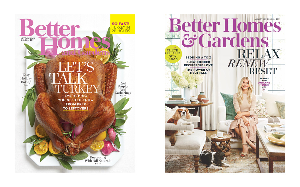
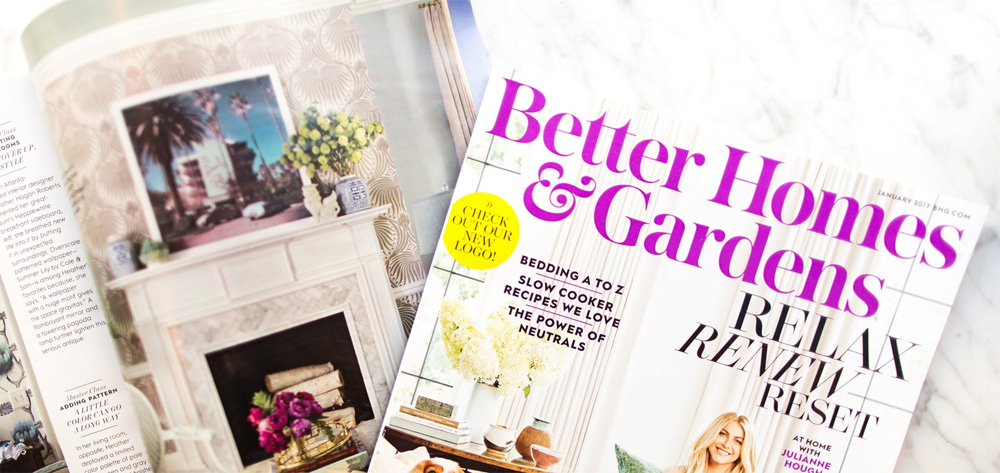
The old logo was quite bad, especially in its handling of "Homes and Gardens" that had the "H" acting as a descender and as a roof for the tiny "and Gardens", making the outside areas feel less important than the homes. Also, that shrub icon was useless and sad. The new logo is a traditional, elegant serif that doesn't intend to become an instantly recognizable masthead like TIME but simply convey the full title clearly and with a hint of the classy homes and gardens you will find inside. The press release and project description make a big whoop of the ampersand and, while, yes, it is nice, it's not super duper special, which is fine. The cover is a vast improvement because the title now makes more sense but it's still the usual headline bonanza of current magazines. The "responsiveness" of the logo that minimizes to BH&G or just the & is the best attribute of the redesign, allowing the publication to stay consistent across platforms.
Thanks to Tiffany Taylor for the tip.

 Новости Союза дизайнеров
Все о дизайне в Санкт-Петербурге.