Обзор лучших ресурсов по разработке бренда, разработке упаковки
contact us | ok@ohmycode.ru
contact us | ok@ohmycode.ru
I don’t want to botch this introduction so I’m copy-pasting from Wikipedia: “The Parliament of the United Kingdom is the supreme legislative body of the United Kingdom, the Crown dependencies and overseas territories. It alone possesses legislative supremacy and thereby ultimate power over all other political bodies in the UK and its territories. Its head is the Sovereign of the United Kingdom (currently Queen Elizabeth II) and its seat is the Palace of Westminster in the City of Westminster, one of the inner boroughs of the capital city, London. The parliament is bicameral, consisting of an upper house (the House of Lords) and a lower house (the House of Commons).” The UK Parliament recently introduced a new identity designed by London-based SomeOne.
The new identity can be seen on a beta website for UK Parliament.
The new visual identity uses ‘UK Parliament’ rather than ‘Houses of Parliament’ to highlight the role of the institution in the UK’s constitution, and to distinguish it from the building it occupies.
The two Houses share a large number of public-facing services which require a consistent parliamentary identity. The new visual identity will be implemented across these services in a phased approach, to ensure that the public can easily identify the services provided by the UK Parliament.
The House of Commons and House of Lords will continue to use their own, existing visual identities.
The new visual identity has been designed to provide the consistency and coherence that was previously lacking, and to enable faster, clearer visual communication, primarily across digital platforms. Greater simplicity and clarity has been a priority, particularly online where the existing assets did not reproduce clearly at smaller sizes on mobile devices.
The old and new logos are based around the crowned portcullis, the emblem of both Houses of Parliament in use as an identifier since 1967 — a full history can be found here. In its original execution as the logo for the Houses of Parliament, and like many other crest- and coat-of-arm-looking things, it did not hold up well in digital devices and small-size applications. Its execution was fine and it isn’t worth debating the actual elements of the icon as it has been used in one way or another since 1735. We can, however, debate the use of Trajan to accompany it but, really, there is no debate: it was lame. The new logo introduces three variations of the portcullis, with the largest version (directly above) featuring some bonus texturing and as it reduces in size, it reduces in detail, with the smallest version aptly minimizing every single element. The icon is paired with a relatively funky sans serif — it’s not a geometric sans! — that works quite nicely and, maybe it’s because it says “Parliament”, but it somehow does manage to look government-y in a bureaucratic yet friendly way.
This redesign has, naturally, ignited the ire of the internet as many folks are complaining that the logo is the same and that the £50,000 price tag is ridiculous because nothing changed. Had they changed to something completely different they would have ALSO complained, but that’s not the point. The point is that the new icon — in its primary use (above) — is significantly different and addresses the issues that made the original so difficult to render at small sizes, mainly removing all those damn dots… as well as cleaning up the rest of the shapes. It’s not a raise-the-roof redesign but it gets the job done nicely.
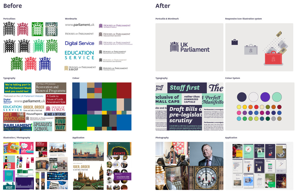
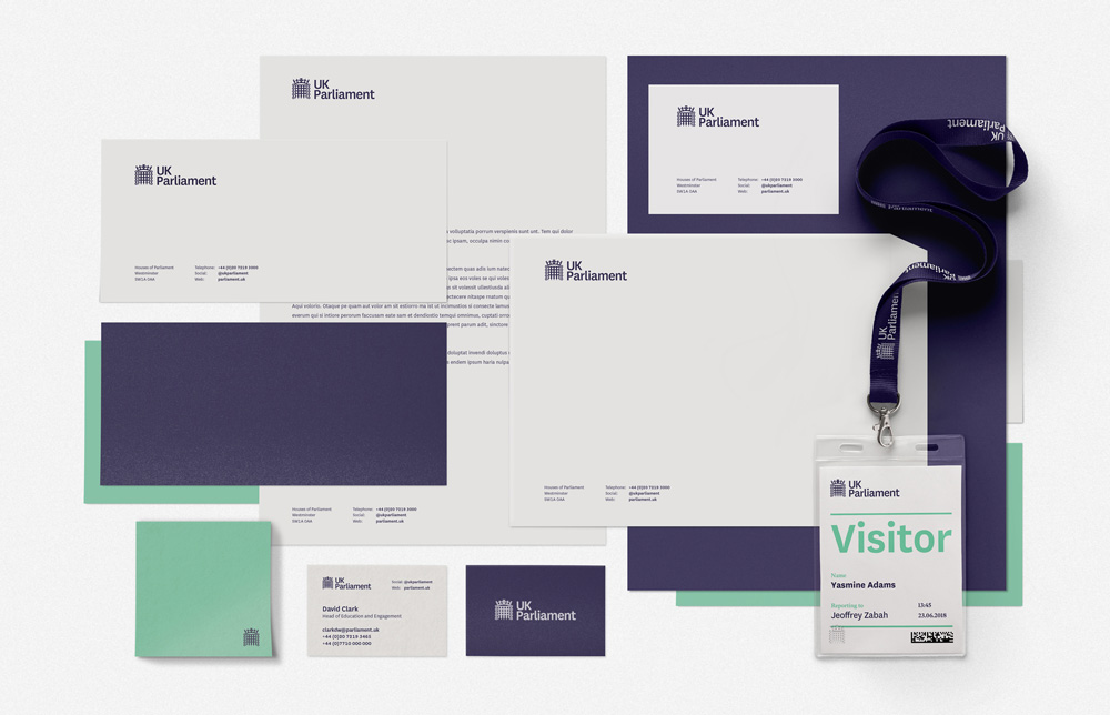
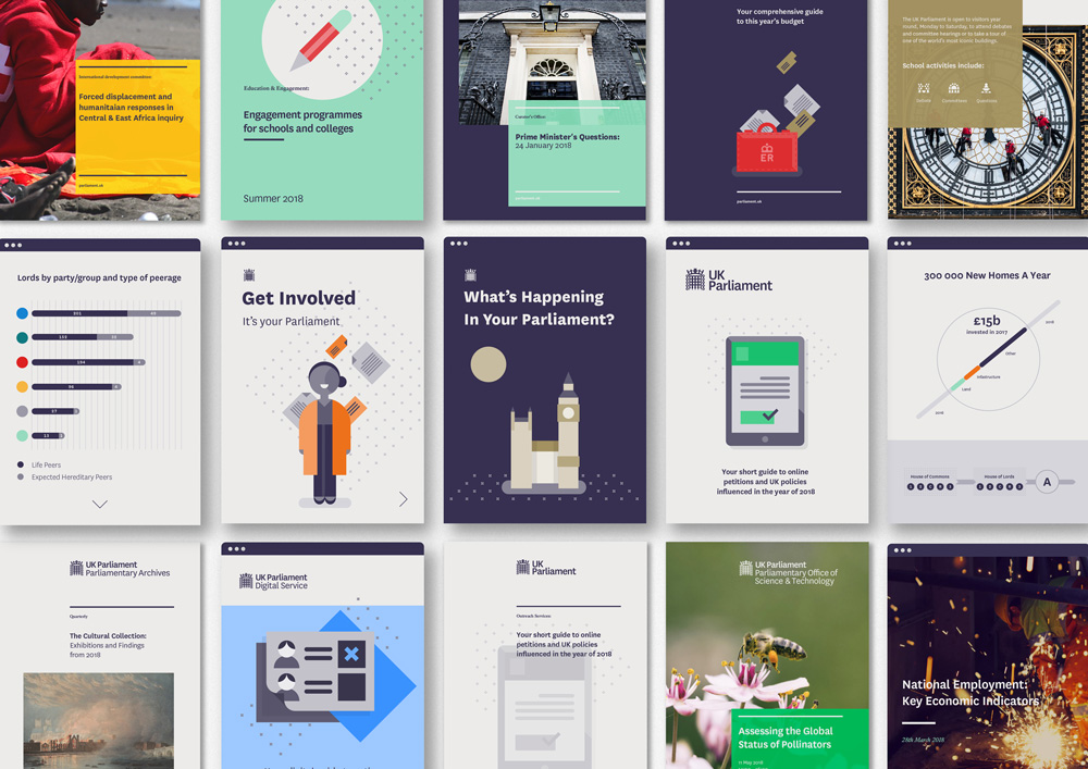
The applications have a great, simple, flexible system behind them that yield clean and crisp layouts that look like the governing body has its act together. The one thing I don’t like is the use of the overly cute icons and graphics… there is something off-putting about government materials looking like a newsletter sign-up page for Uber. But maybe there is some insight that says that cutesy illustrations play better in government communications. Nonetheless, this is a solid improvement that introduces a smart system to what was clearly a free-for-all approach and the identity manages to come across as both accessible and authoritative.
Thanks to Matthew for the tip.

 Новости Союза дизайнеров
Все о дизайне в Санкт-Петербурге.
Новости Союза дизайнеров
Все о дизайне в Санкт-Петербурге.