contact us | ok@ohmycode.ru
contact us | ok@ohmycode.ru
Established in 2009, GetYourGuide is an online booking platform for various kinds of experiences around the world, from simple things like museum tickets to more thrilling things like shark cage diving. (The official range of their offerings is “skip-the-line tickets to the world’s most iconic attractions, walking tours by top local experts, immersive food and beverage tours, cooking and craft classes, bucket-list experiences and niche offerings you won’t find anywhere else”.) Based in Berlin, Germany, and with offices in 14 other countries, the company employs over 400 travel experts that curate the selections on the site which have yielded 15 million bookings since its inception. Most active in Europe, GetYourGuide is looking to expand its presence across the U.S. and Asia. Earlier this month, GetYourGuide introduced a new identity designed by DesignStudio.
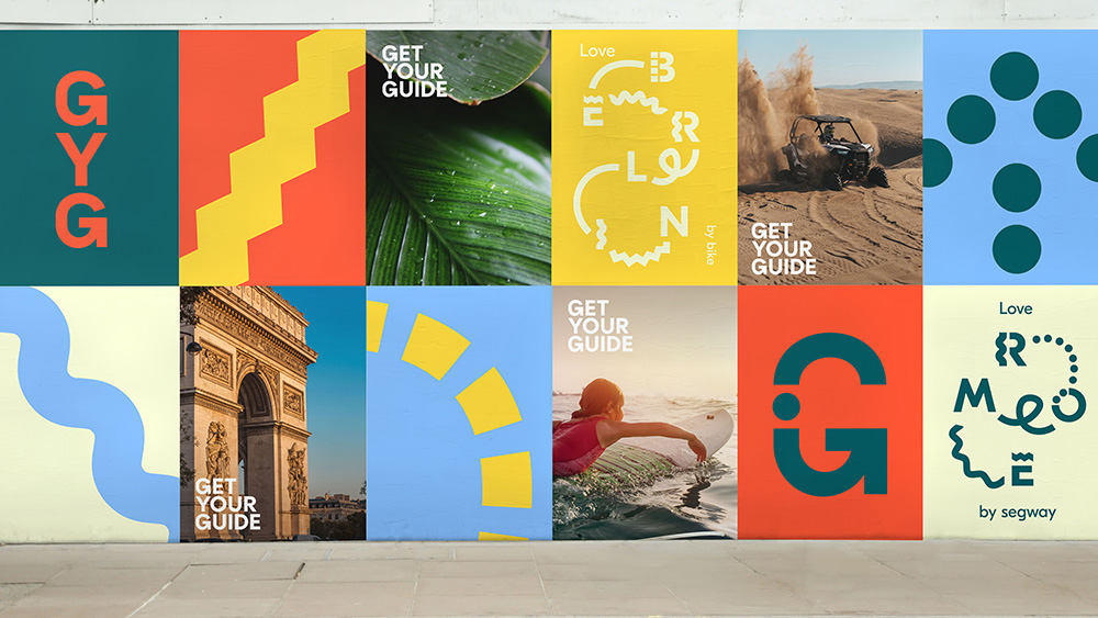
GetYourGuide goes much further than A to B; joining people to places, ideas to itineraries, moments with even better moments. To celebrate these journeys, and communicate connected experiences, we created five different lines inspired by all the ways we travel. These lines connect to copy and imagery to explain different journeys in a simple, light-hearted way.
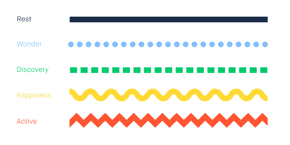
The playful lines twist and turn, forming the GetYourGuide wordmark. It represents the different activities GetYourGuide provides, and how much fun people can have. The wordmark captures the spirit of these diverse journeys. From the directional arrow we’ve hidden in the G’s, to the graphic language that’s embedded in our letterforms. The logo reflects how people holiday, whether it’s going with the flow or being super organised. There are multiple versions so that it fits every format and size - from giant billboards, to a tiny mobile icon.
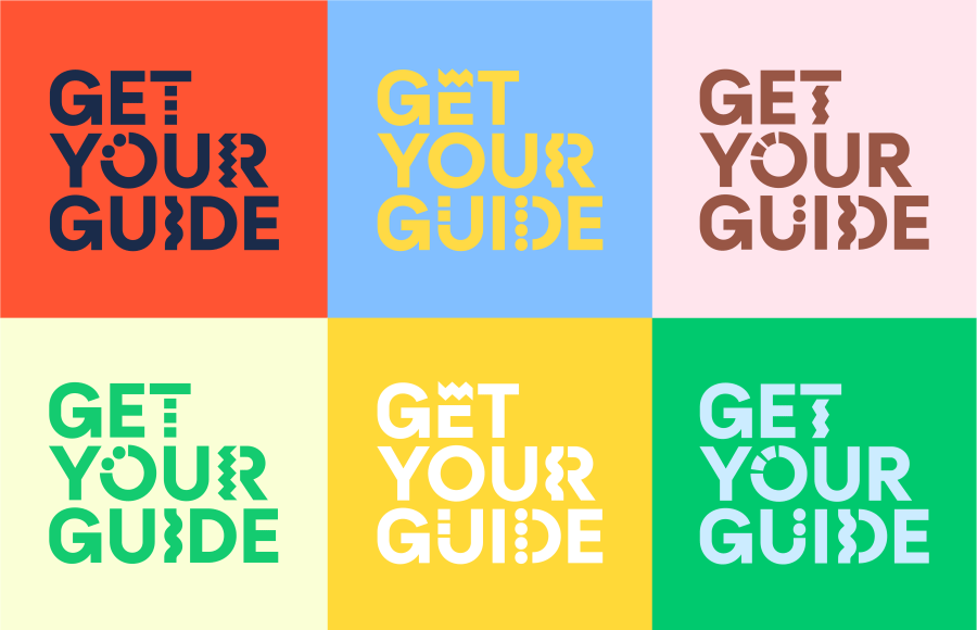
The old logo was pretty nice, with a bold arrow that could be interpreted as a location pinpoint icon, a marker for where to start a line, or even some kind of identifying ribbon worn by an actual guide person. Even without an interpretation, the logo was attractive (typeset in Bree) and engaging. The new logo has two personalities: an expressive one that puts to use the five brand lines and a non-expressive one that is just, well, not expressive. Neither manages to feel as cheerful or approachable as the old one, especially not the straightforward logo, which feels very heavy, static, and not terribly exciting. The “hidden” arrow in the “G”s is not exactly hidden (nor novel) and they make the “G”s look extra dense. The expressive version of the logo sort of starts to convey the variety of their offerings and the excitement of doing something new but there is something very forced about how the lines are worked into the letters and the logo comes across as trying too hard to look fun.
The lines in application are engaging with their different behaviors. I like how they can interact with live action footage and, in the first video above (from the :10 to the :13 mark), when the lines mix and match moving in a common direction is pretty neat but, in general, the lines work their best when animated rather than static as seen in the applications below where, again, like the logo, things start to feel heavy and static (even when the goal is the opposite).
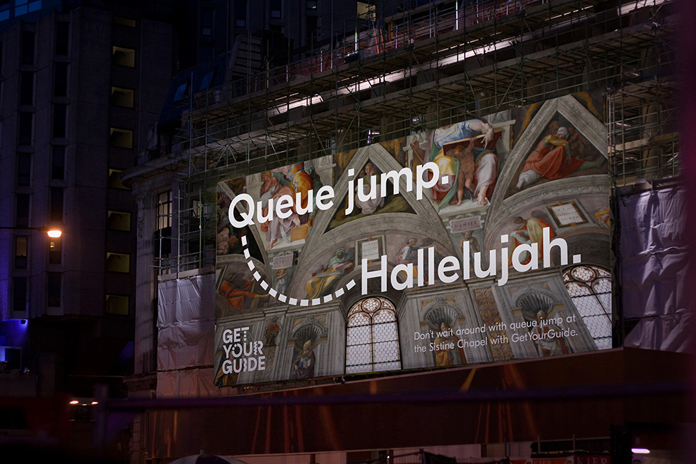
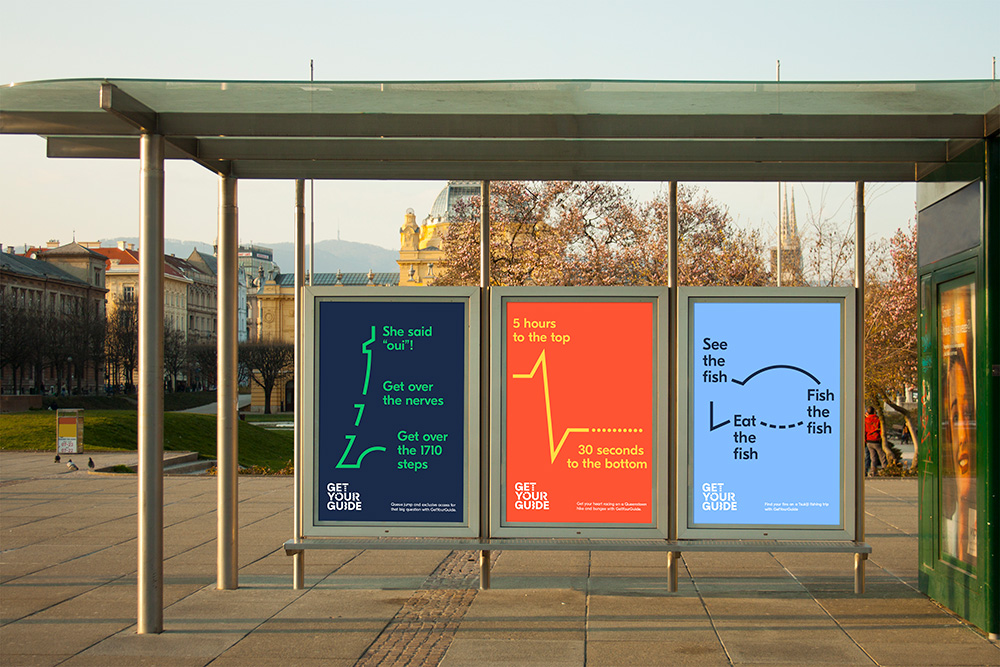
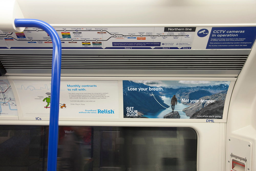
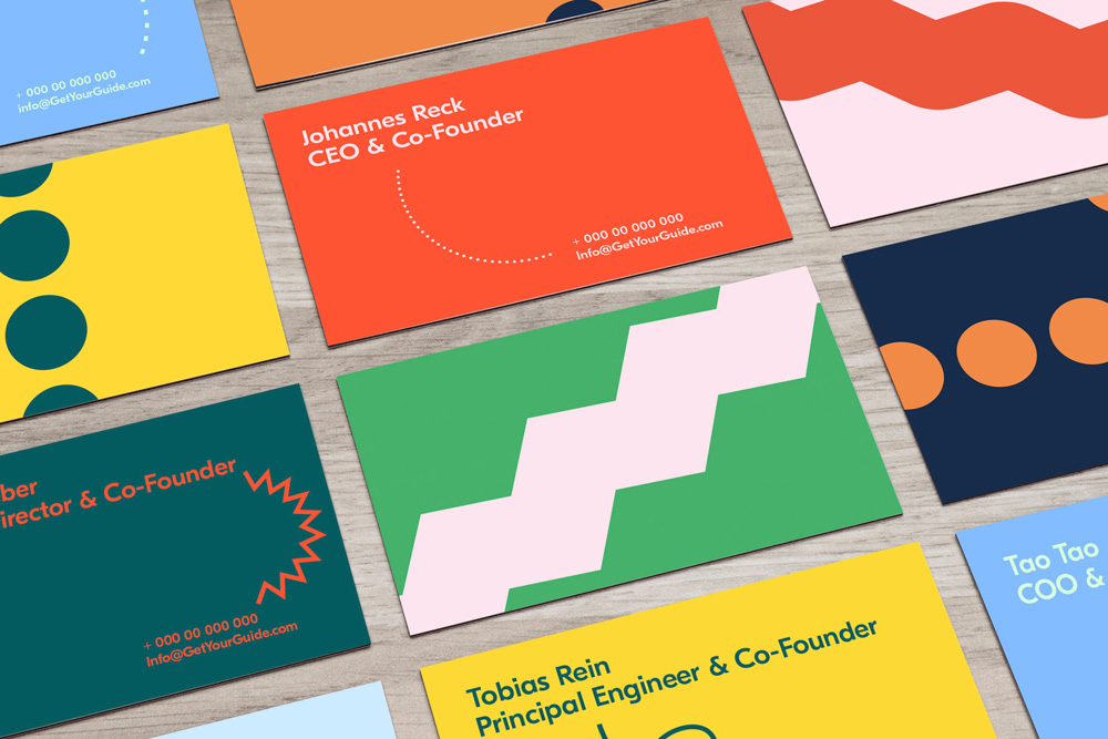
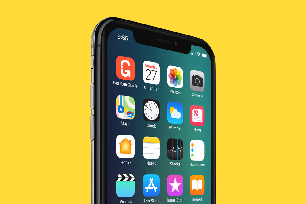
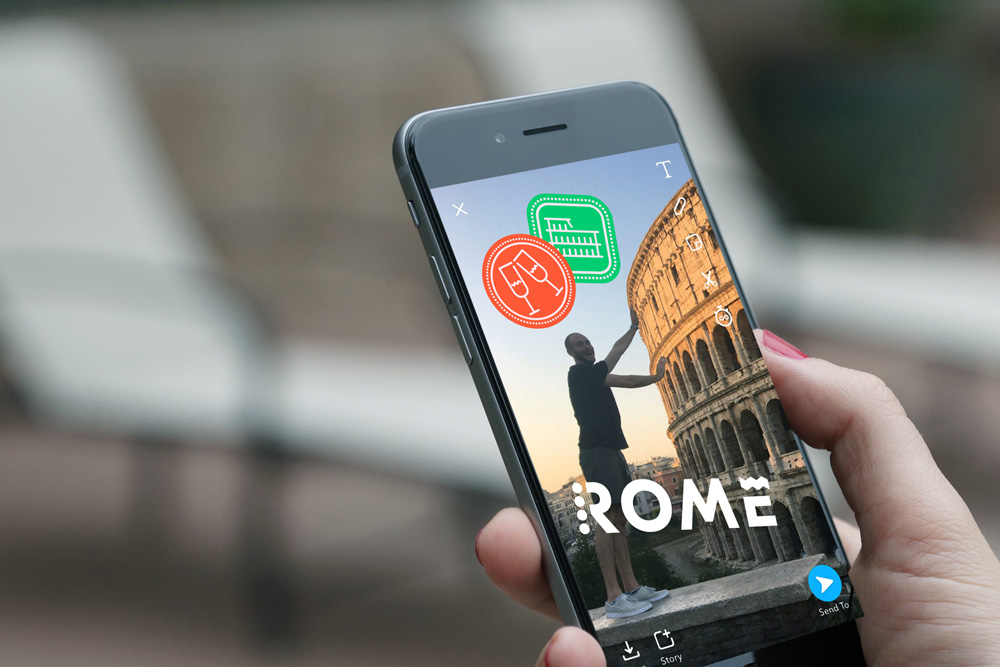
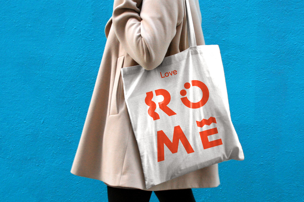
Overall, this is fine but mostly dry and not entirely invigorating at first glance which, in this case, isn’t ideal as it should feel more nimble and enticing — the promo spot above almost gets there but doesn’t quite cross the finish line.

 Новости Союза дизайнеров
Все о дизайне в Санкт-Петербурге.