contact us | ok@ohmycode.ru
contact us | ok@ohmycode.ru

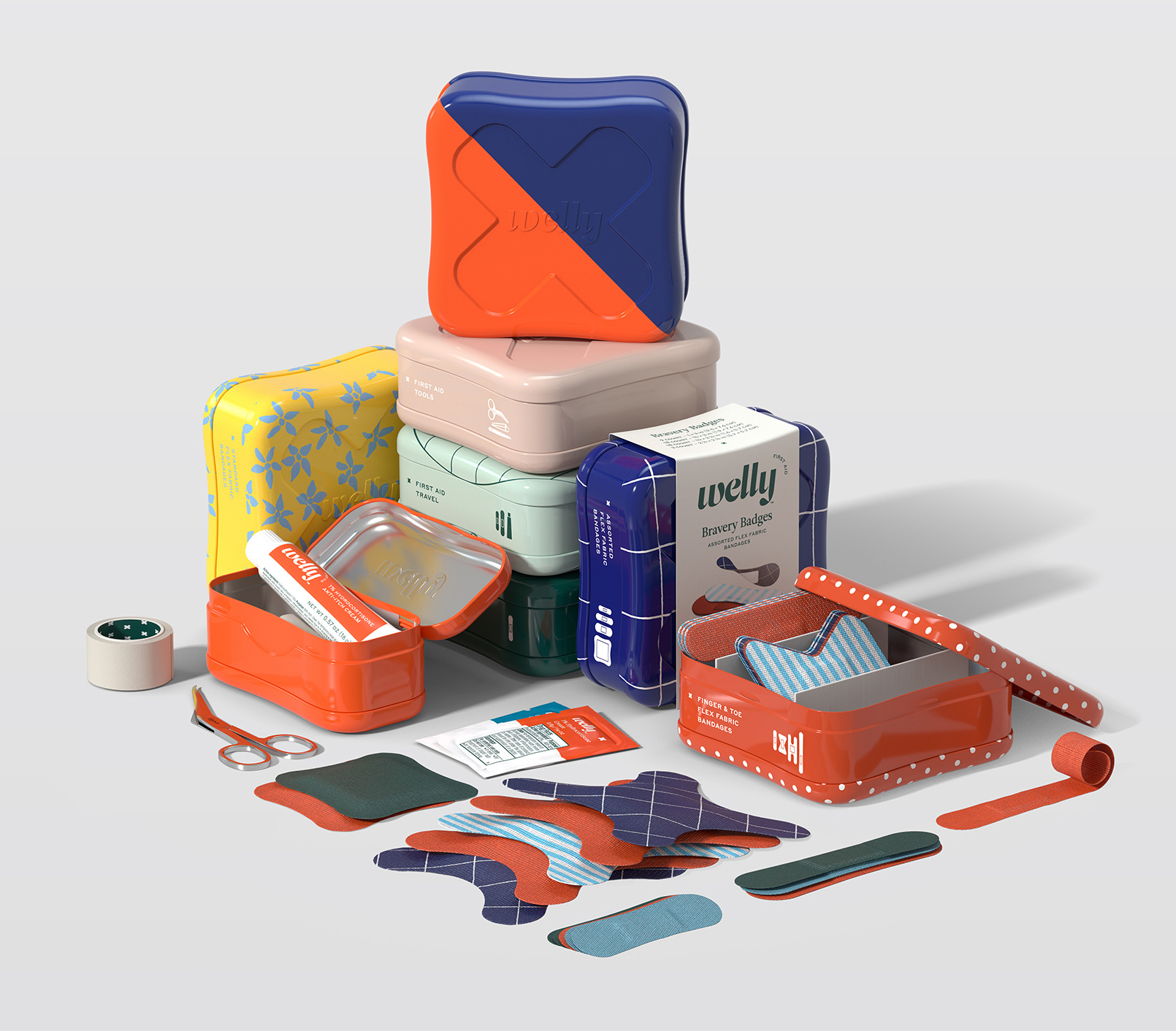
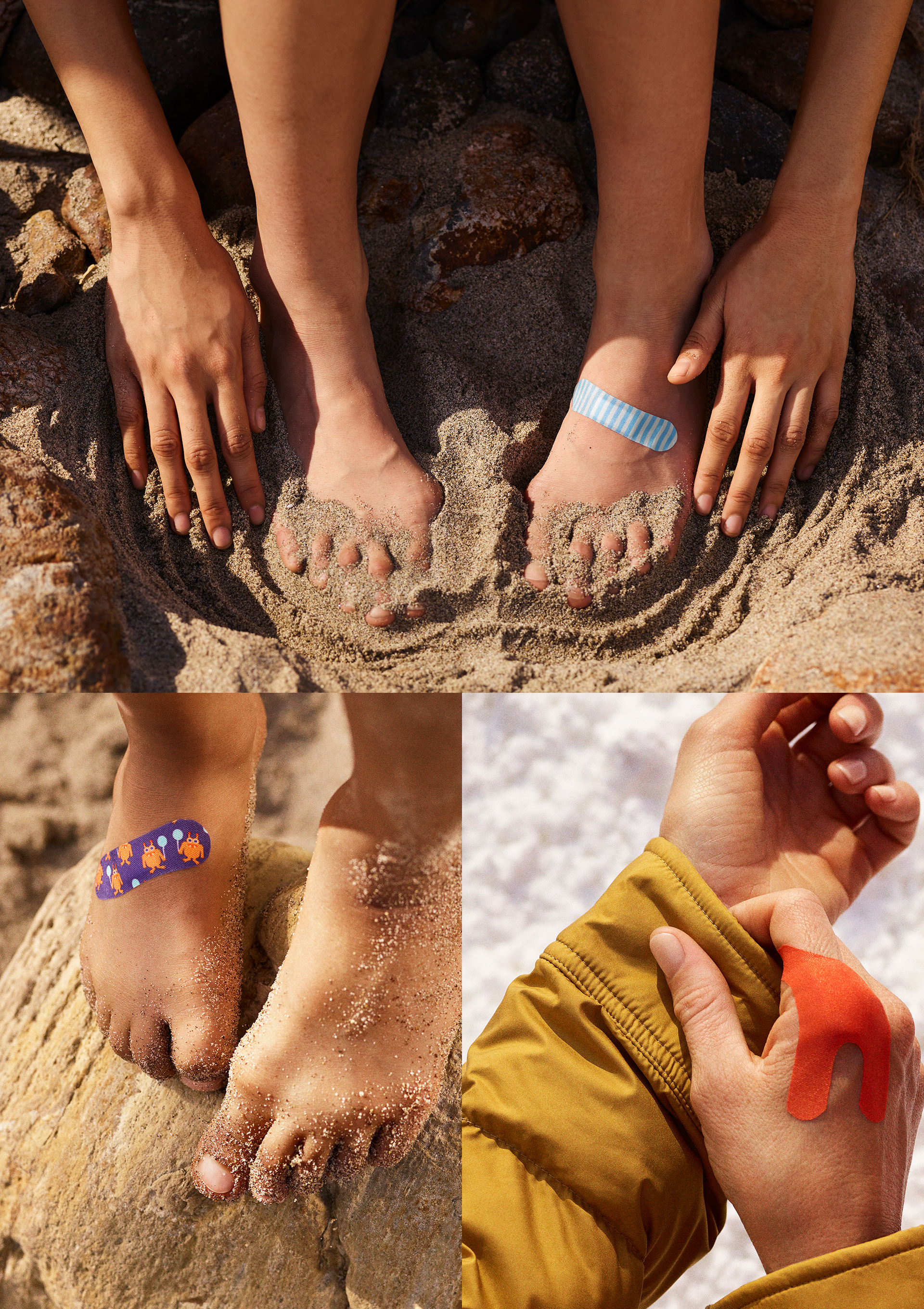
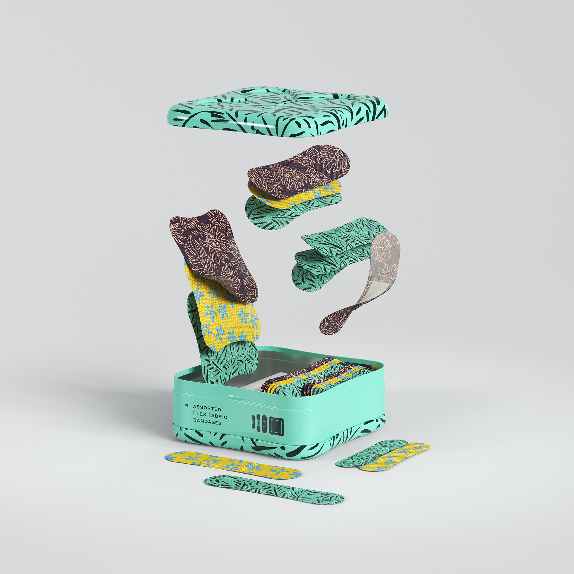
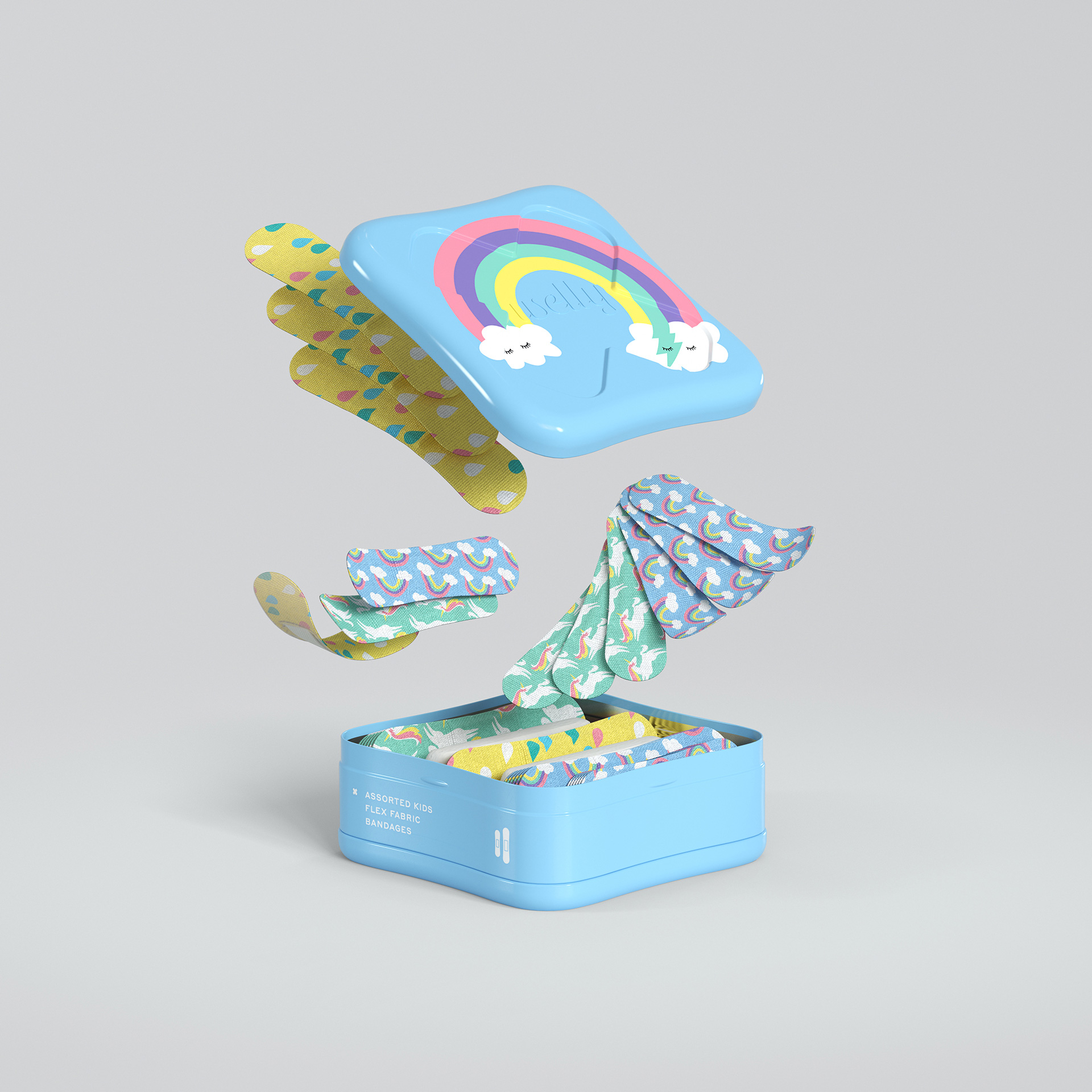
Launched this year, 2019 if you are reading in the future, Welly is a new line of premium bandages and first aid products available exclusively at Target. Created by Eric Ryan — who started the popular eco-friendly household brand Method (which also got its big national break on Target) — Welly offers a range of 25 items that span bandages, first aid tools, and ointments, bundled in fun little recyclable tins. The bandages are designed to stand out, with eclectic patterns, bold colors, and fun (and functional) shapes. Welly worked with New York, NY-based Prime Studio on product design and Partners&Spade on brand and identity.

The primary logo is a lovely stencil-italic-semi-script-bold thing that doesn’t conform to any kind of convention of first-aid aesthetics. It’s simply a very nice piece of typography that could easily be for yogurt, a magazine, or a hair salon, which isn’t meant as a negative criticism but to point out that the goal of the logo in this case is more to convey a higher degree of designy-ness and lifestyle-ness than it is to indicate they sell bandages. If I have any complaints it would be that the spacing is just a tiny bit tight around the “e” but, really, it’s just splitting hairs as it’s a lovely logo that manages to avoid all current trends including the geometric sans serif, the spiky bold serif, and the Chobani.

Love this! When most badges are gratuitous I appreciate how this one is at least extra fun and relevant, putting a bandage over the state bird.
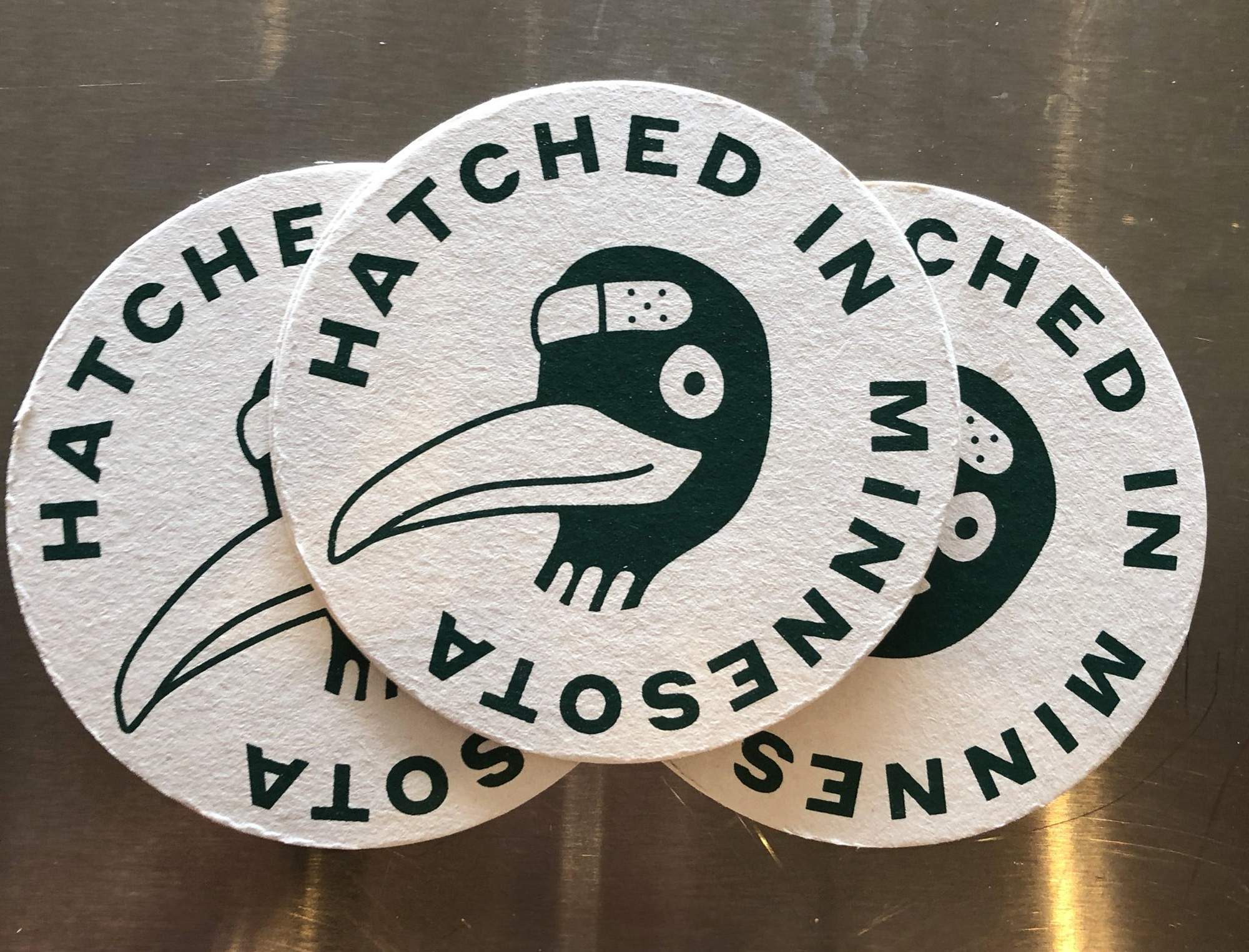

Not much to see or say about this logo, just including it as part of the identity elements. This one plays a subtle role, debossed on the lids of the tins.
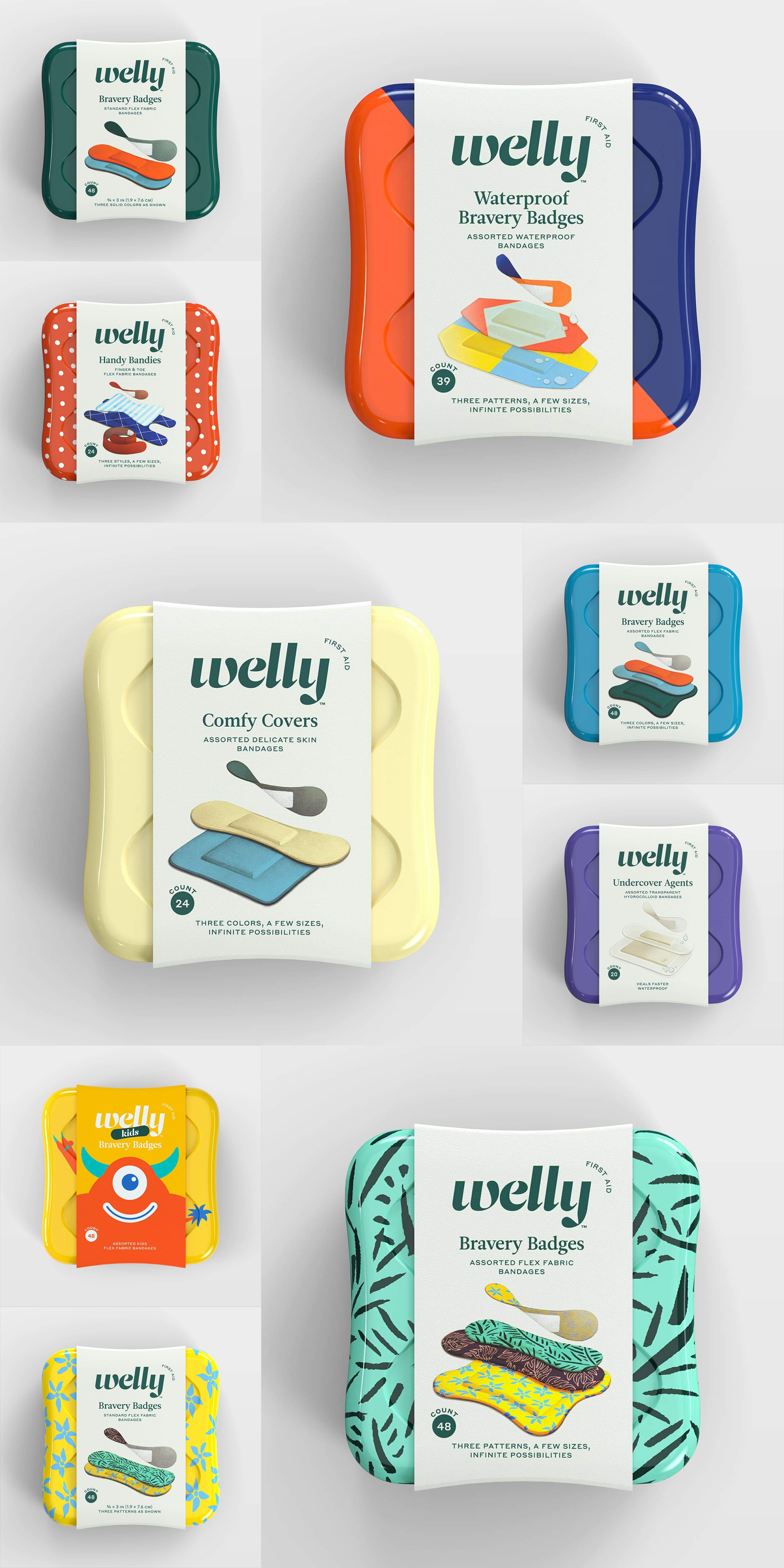

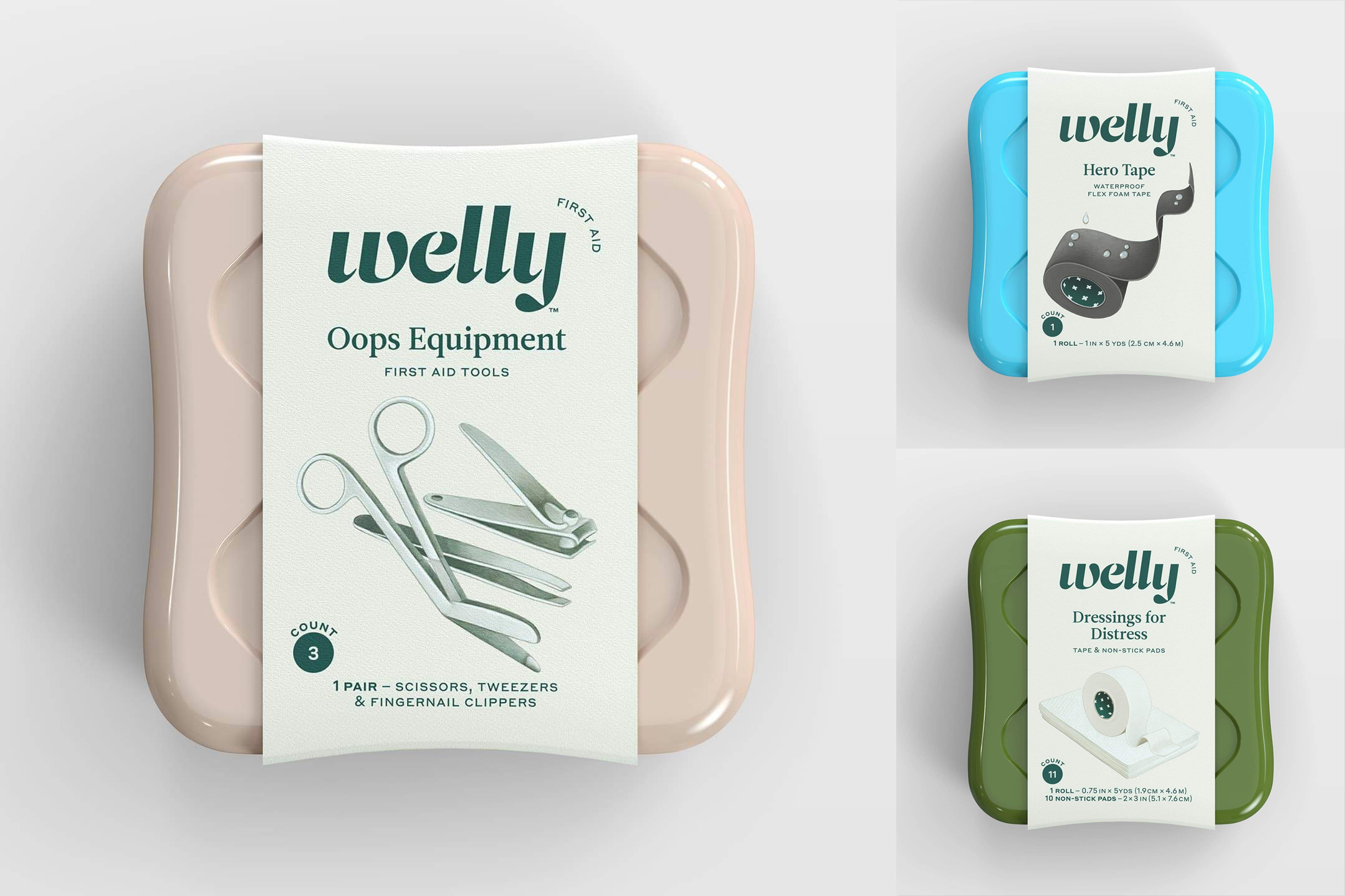
The tins are quite nice in both shapes, the square and vertical, but particularly the square with the rounded corners and slightly thinning centers. All the colors and patterns look great on them and I really like how the paper belly band accentuates the curves of the tin. Design-wise, the labels are busy, especially at their small size, but they are still quite nice and the illustrations of the products inside are great — in particular the ones directly above — which, again, sidestep trends by going with a kind of realistic vintage aesthetic you rarely see these days.
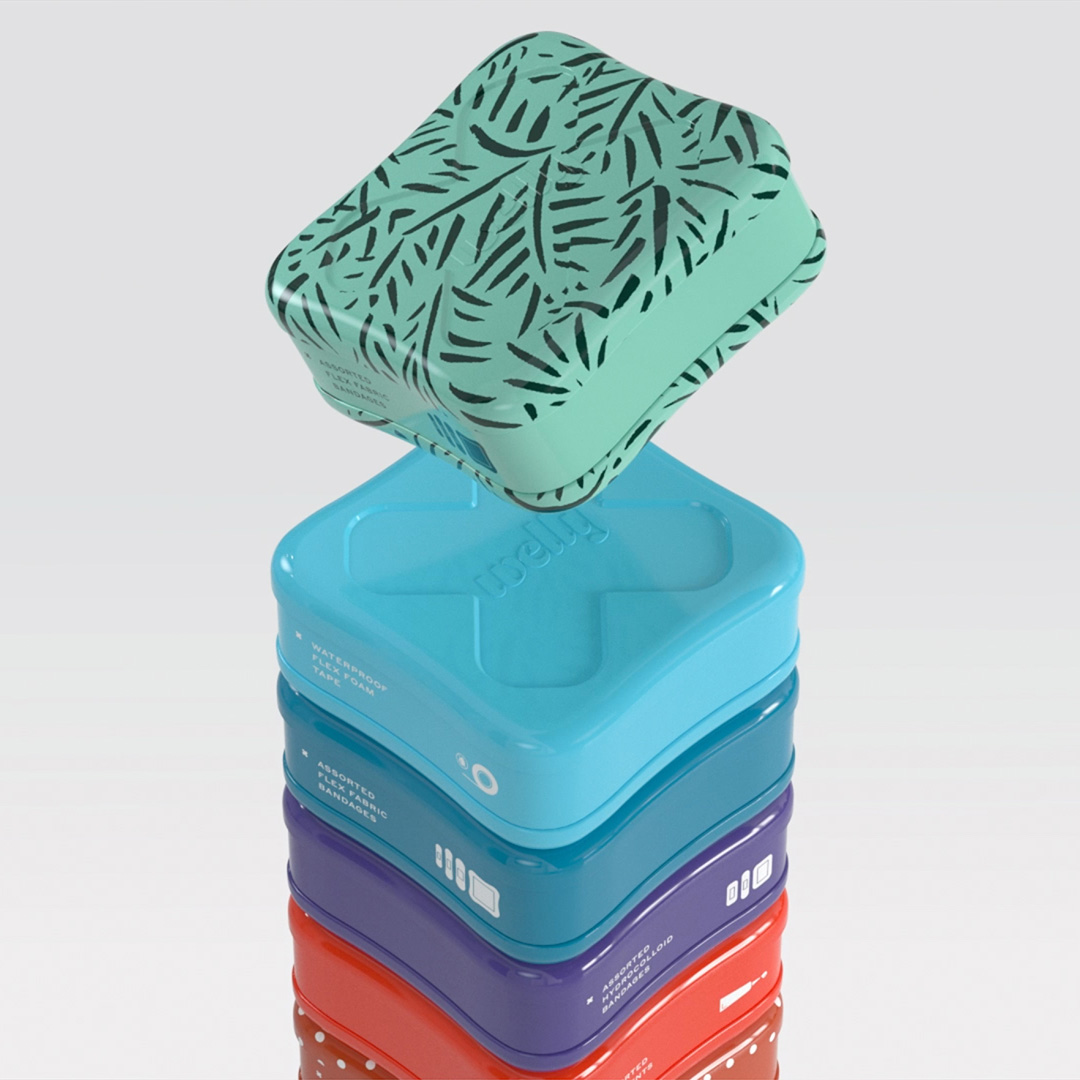
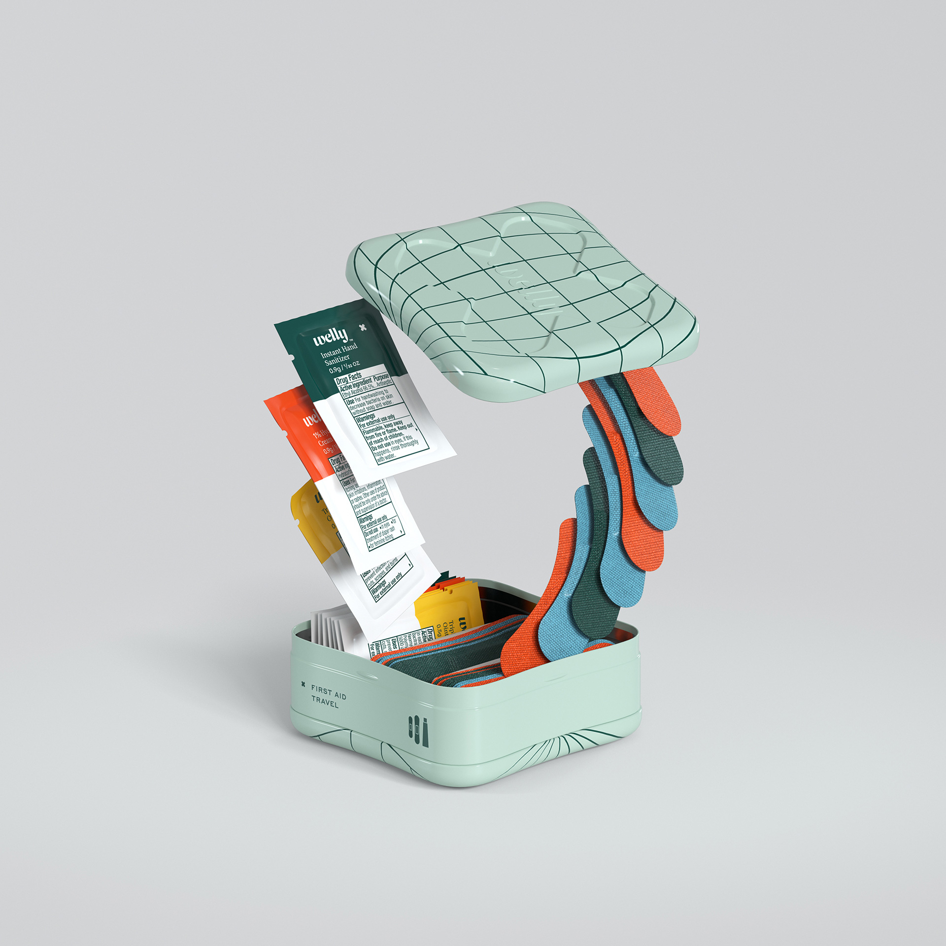
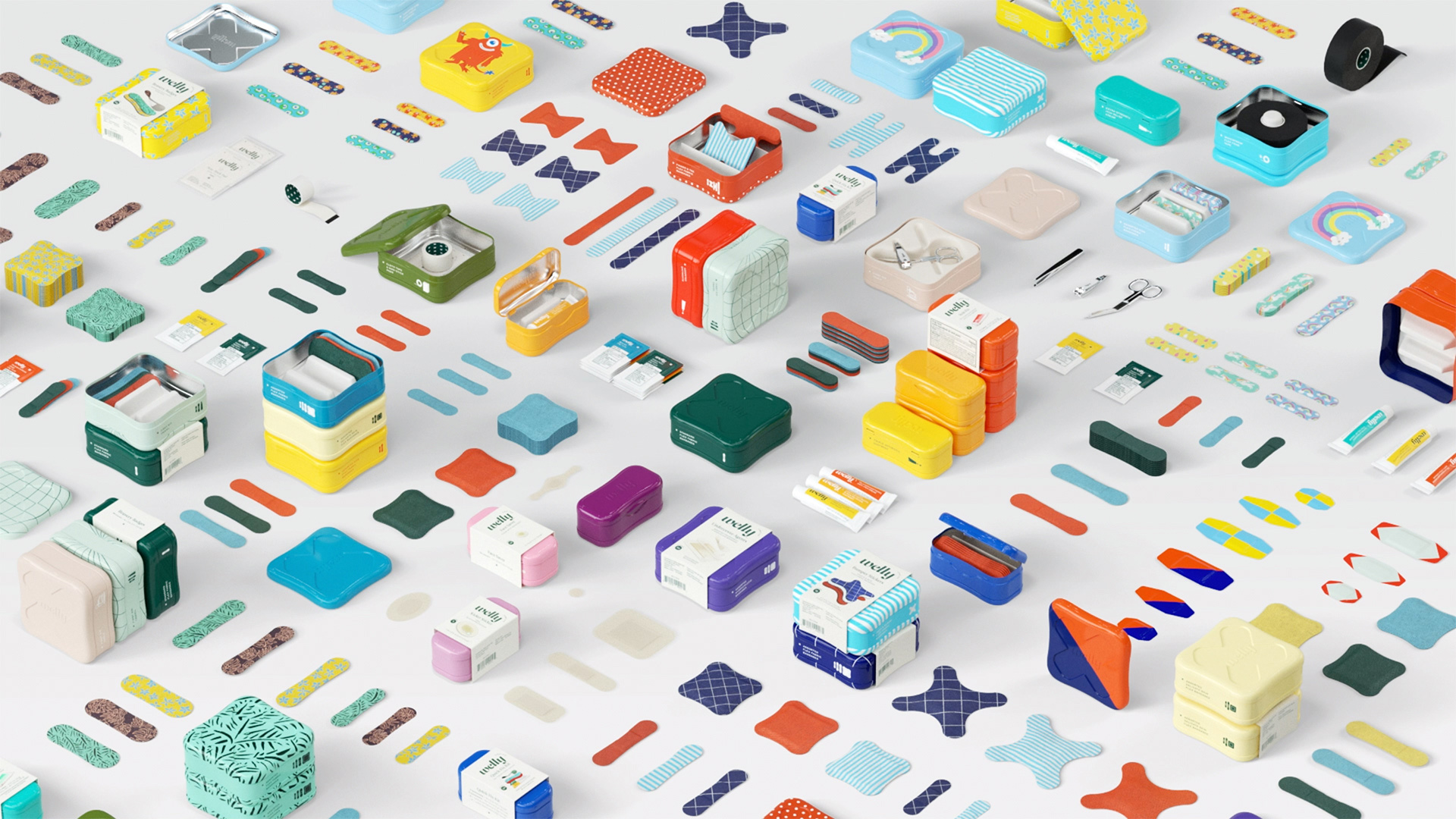
Overall, this is yet another great Target brand — or, well, another brand that lives within Target as this doesn’t seem to be a traditional in-house Target brand — that manages to make an ordinary product category into something more enjoyable, memorable, and covetable and elevate its design while keeping it affordable.
Thanks to Brenton Rawlinson for the tip.

 Новости Союза дизайнеров
Все о дизайне в Санкт-Петербурге.