Обзор лучших ресурсов по разработке бренда, разработке упаковки
contact us | ok@ohmycode.ru
contact us | ok@ohmycode.ru
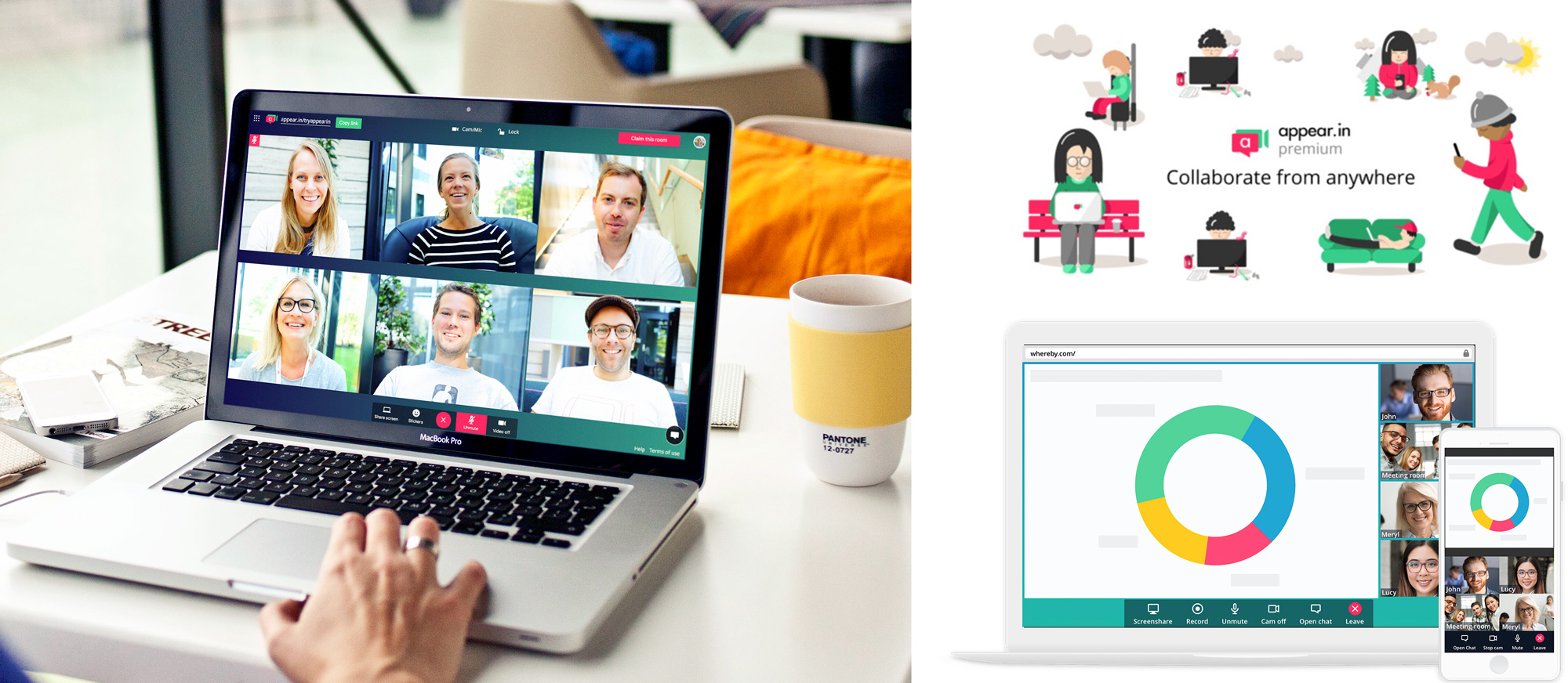
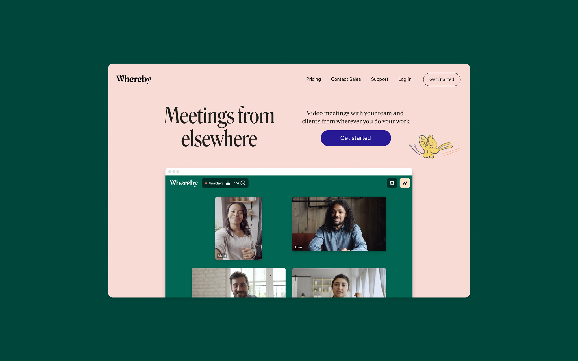
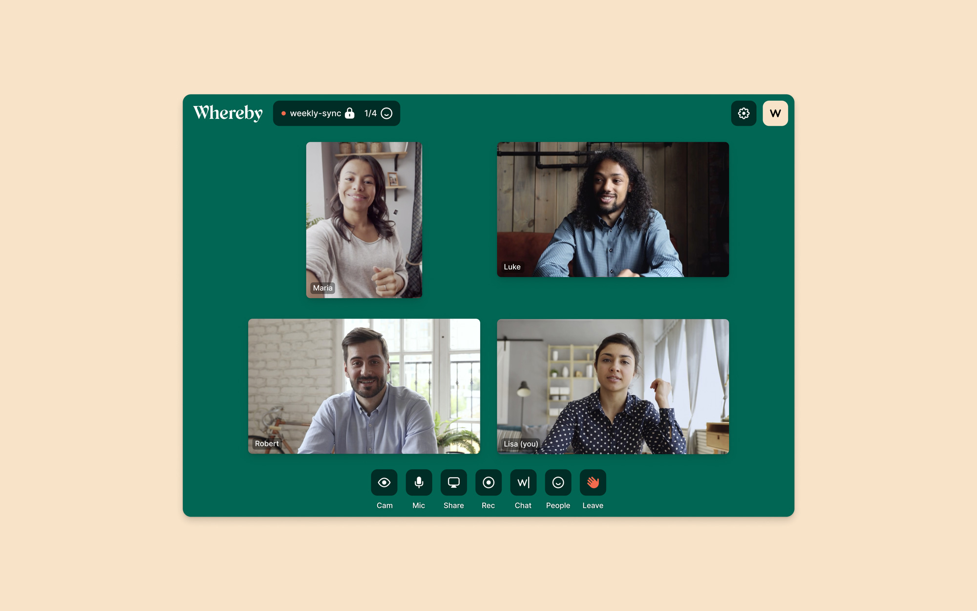
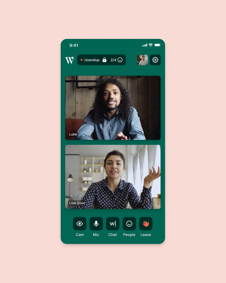
Established in 2013 as appear.in — a name they had to forego due to a trademark dispute — Whereby is a video meeting service targeted to small and medium businesses empowering people to work remotely. Based in Oslo, Norway, Whereby practices what it preaches with a small team of 25 people working from 12 different locations after what started as a summer intern project inside Norwegian telecom company Telenor. Now part of small, independent company Video Communication Service AS, Whereby introduced its new name, created by Berkeley, CA-based A Hundred Monkeys, in August and its new identity, designed by Oslo-based Heydays.
The meaning of our new name Whereby is “the means or method by which something gets done”, which nicely aligns with our goal of helping users collaborate. It is also composed of the two words “Where”, indicating location, and “By”, indicating closeness, and was short and simple enough to work globally (we are used in literally every country and territory worldwide every month). It is a word that is not very common in everyday language anymore, and feels a bit formal/literary to most people. But that also means it is unique and available for us to fill it with our own meaning.
Our new visual profile is designed to spark imagination and curiosity, while giving a feeling of calmness. Being based here in Norway with a tradition of having team gatherings in the mountains, we also included elements of nature. When creating the new profile Heydays turned to the land of fantasy, fairy tales, dreams, and poetry.
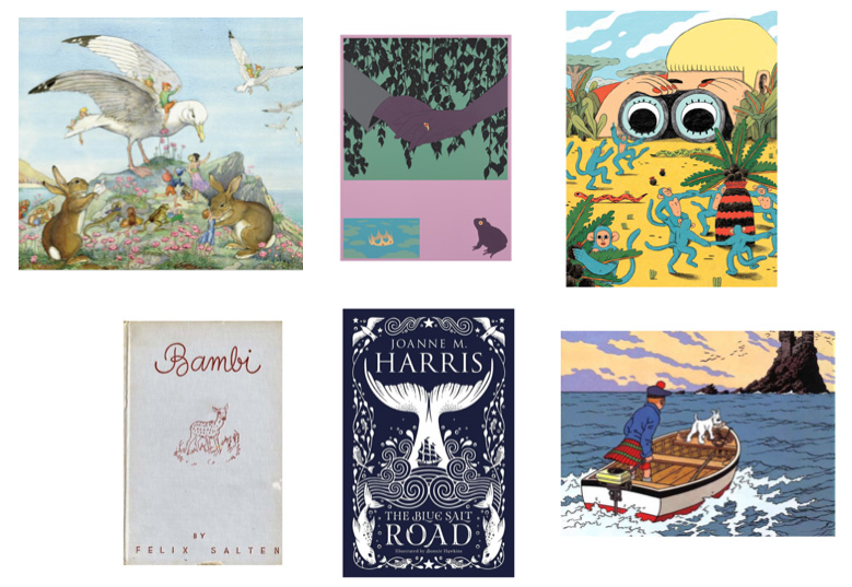
The inspiration for our new fonts came from wonderful books of old times — one of the ways people then had to communicate and share knowledge.
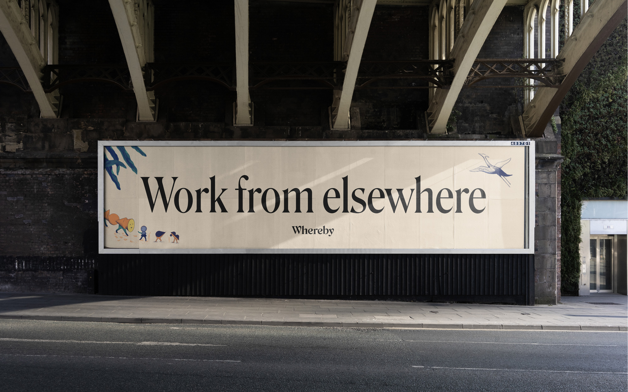
The old name was awkward and trying too hard to be clever with the “.in” top-level domain name and the logo, while descriptive, was undesigned almost to a fault where it looked more like an icon inside a Settings menu instead of a product logo. The new logo, very much granted, says literally nothing about the product itself and could represent any company in any industry and it’s also a problem that the new name doesn’t quite communicate anything specific but what both logo and name have going in their favor is a more aspirational, emotion-driven approach that has the potential to be perceived as more of a work lifestyle element versus just a tool.
I like the new name mostly because I didn’t realize how much I like the word “whereby”… it’s somewhere between being legal and regal, with somewhat of a flourish to it. It could be an issue for non-English speakers to read this as “where-bee” perhaps. Visually, the logo is quite nice: an elegant, ever-so-slightly exuberant serif neatly presented. Kind of hard not to like its aesthetic and paired with the lighter weight of Roslindale it has nice editorial feel.
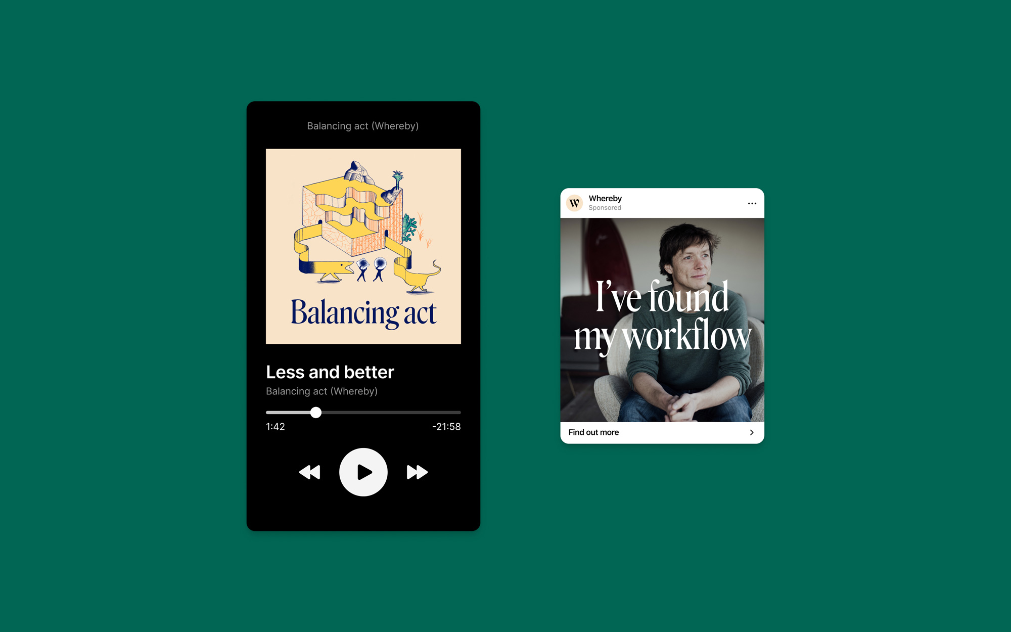
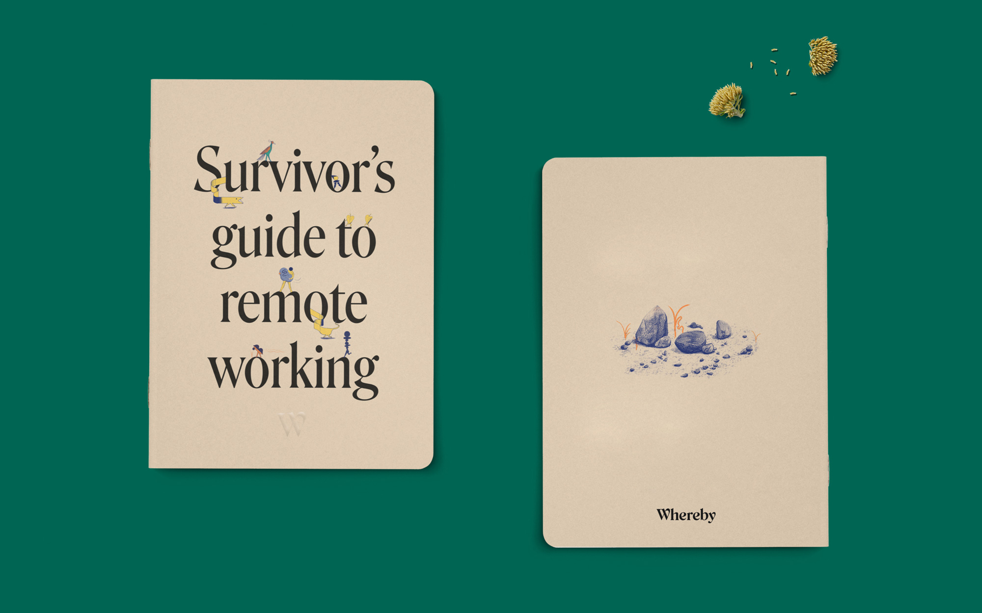
The illustrations are created by French illustrator duo Icinori. […] Icinori has a unique artistic style, playing on surrealism and dreaming, which we found to fit well with our ambition of curiosity and exploring new ways for the future. We worked with them to come up with a universe of characters who collaborate on exploring their surroundings and building things. The colors used are inspired by nature, to give a feeling of humanity and calmness.
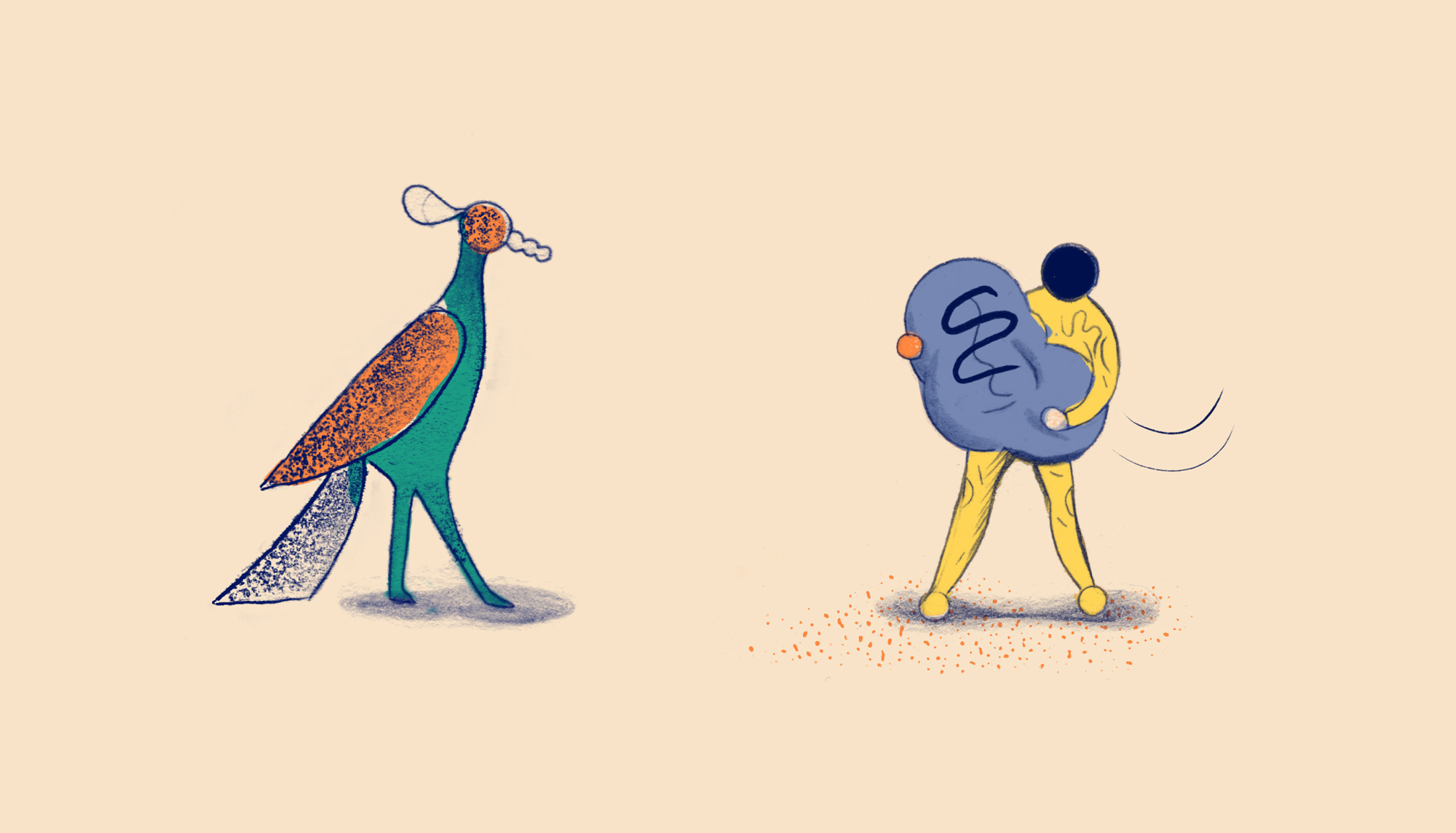
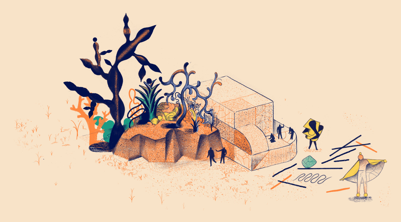
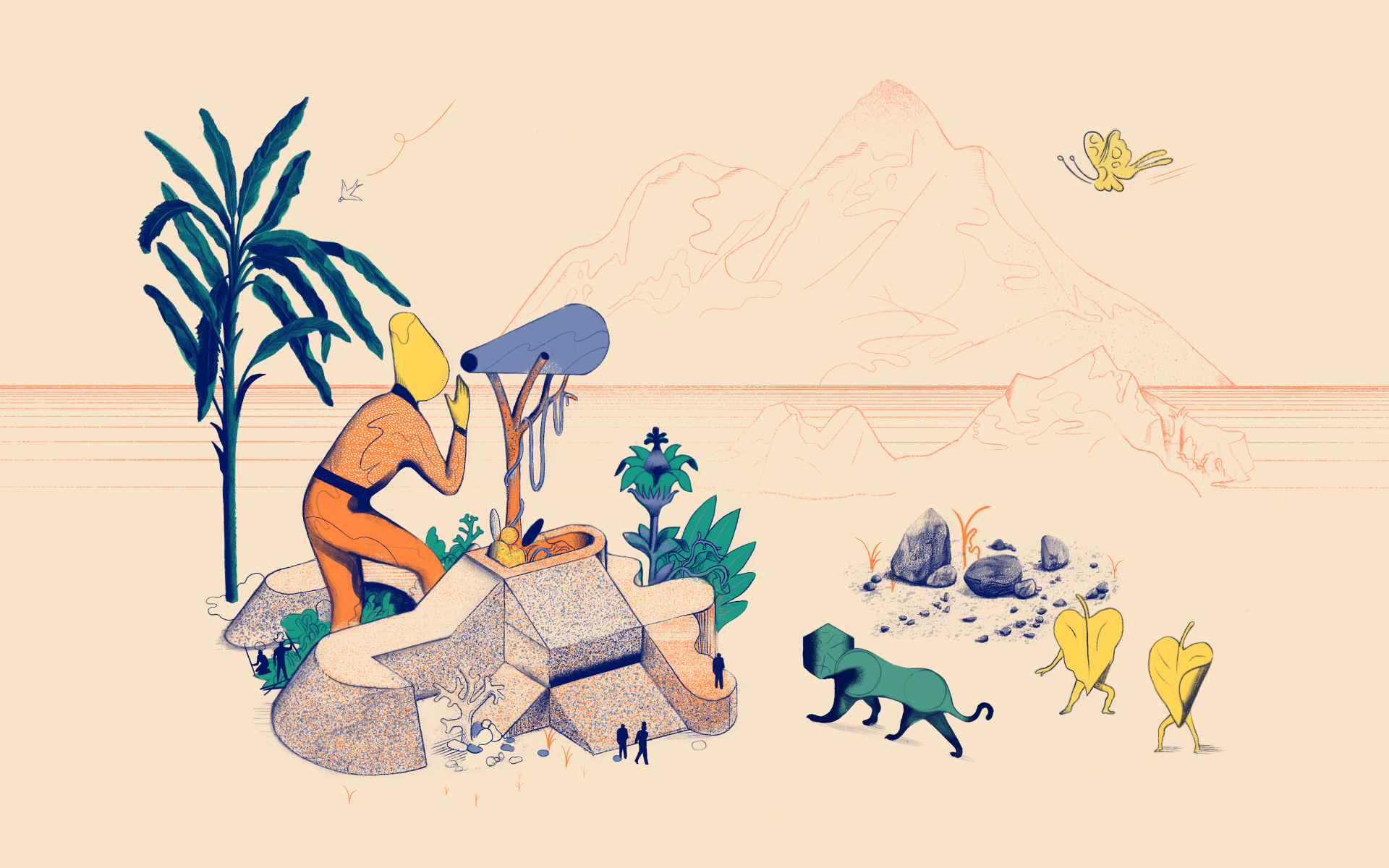
While the illustrations are a welcome respite from the expected tech-sector style of illustrations and while I very much like the trippy vibe I think this further separates the brand from the product itself where things stop making sense as to what they have to do with video conferencing or even working remotely. There is something sort of charming about the illustration directly above with the weird-shaped-head person talking into a megaphone to communicate with someone on the mountain in front but the square-headed lion and the dancing leaves? I dunno, man. Conceptually it’s questionable but visually I’m definitely intrigued and on board because they are pretty great illustrations.
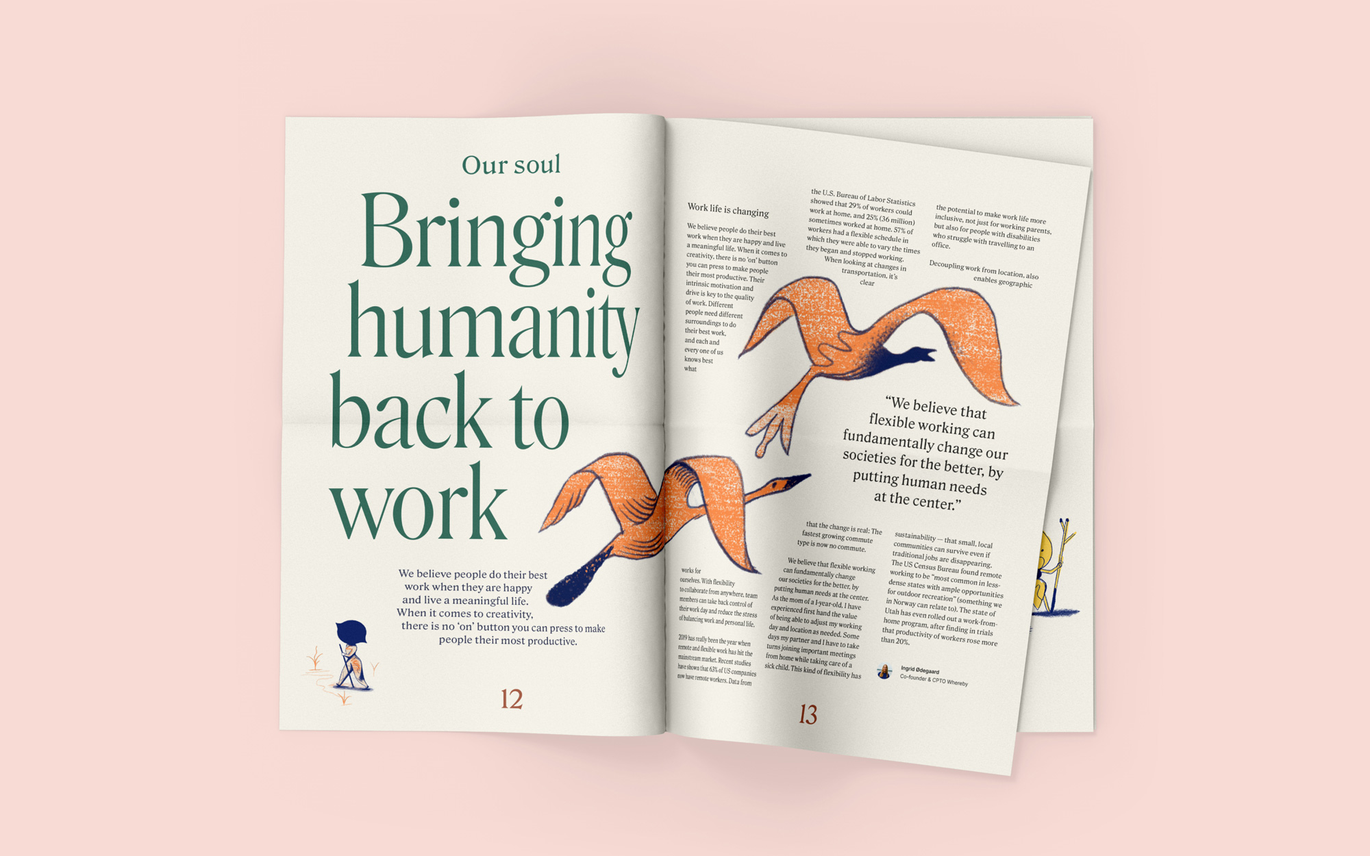
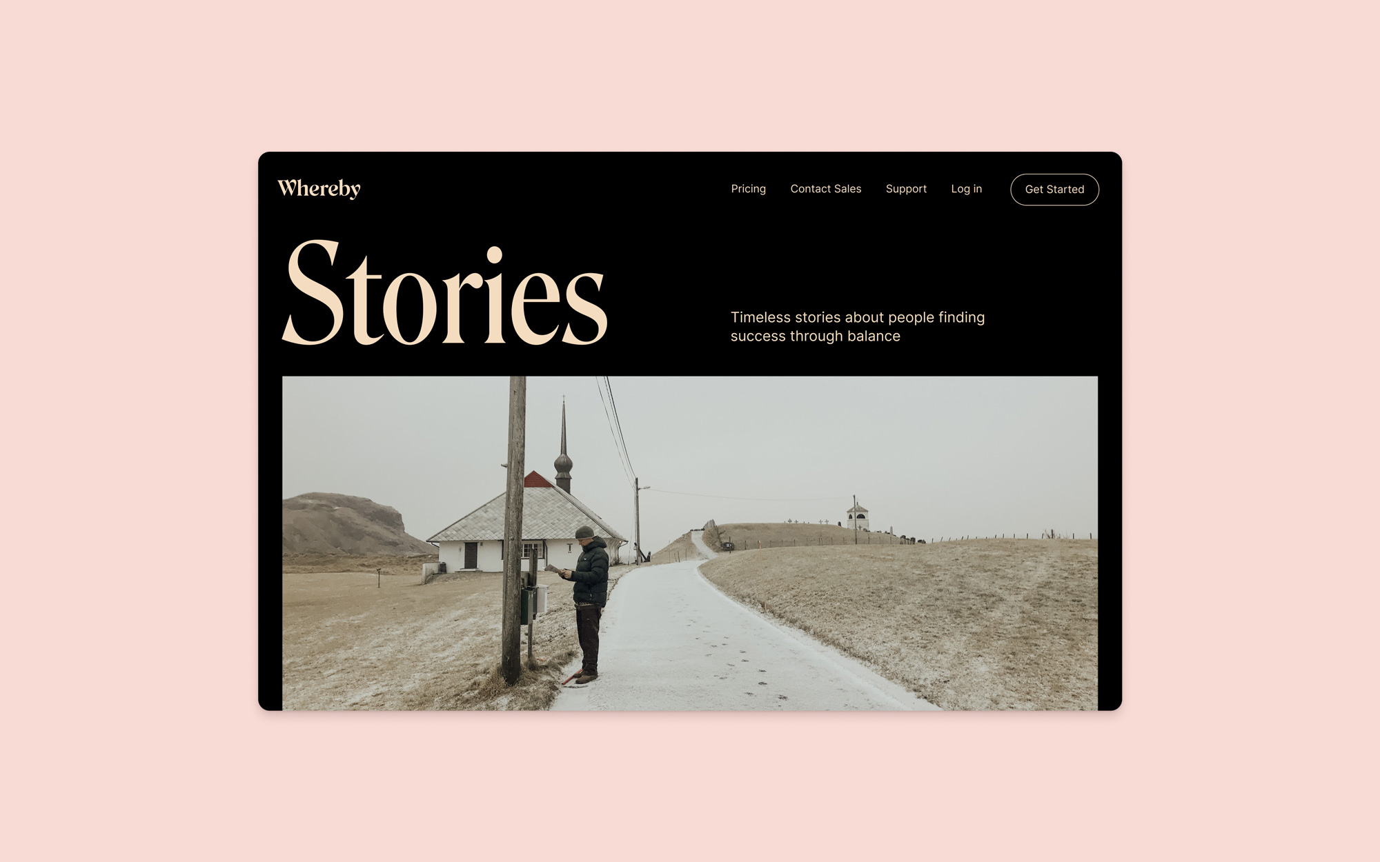
The applications are all nice and good. The serif typography is crisp and, as mentioned earlier, have a really strong editorial feel — like this could all be a sophisticated version of Medium or something. Overall, as much as I like this all on the surface and as an intriguing identity, I wonder if it’s all now too loose and/or ethereal, losing the sense of this being about an actual piece of technology for work instead of some kind of meditative app for finding your zen?
 each year since publication began in 2006

 Новости Союза дизайнеров
Все о дизайне в Санкт-Петербурге.
Новости Союза дизайнеров
Все о дизайне в Санкт-Петербурге.