Обзор лучших ресурсов по разработке бренда, разработке упаковки
contact us | ok@ohmycode.ru
contact us | ok@ohmycode.ru
Established in 1985, Qualcomm is a technology company that has focused on connectivity and communication, having set the standard for mobile 3G network and producing some of the ubiquitous smartphone’s innards and workings. Employing over 33,000 people and headquartered in San Diego, CA, Qualcomm holds 130,000 patents worldwide. After focusing on developing connectivity, security, and intelligence for the mobile industry, the company is growing into new sectors like automotive, computing, IoT, health care, and artificial intelligence. During CES in January, Qualcomm introduced a new identity designed by Interbrand.
Working with Interbrand, Qualcomm has established a new brand strategy to engage [new] audiences, optimized the expression of their portfolio to better position their complex purpose-built platforms, and updated how they go to market with a cohesive approach across their businesses. This strategy also laid the foundation for a refreshed identity, expressing an openness and approachability that mirrors the way technology has become a more accessible, seamless part of people’s lives. The visual elements and voice highlight Qualcomm’s role in the innovation landscape—always in context of real world application, always at the center, and always powering and improving from within.
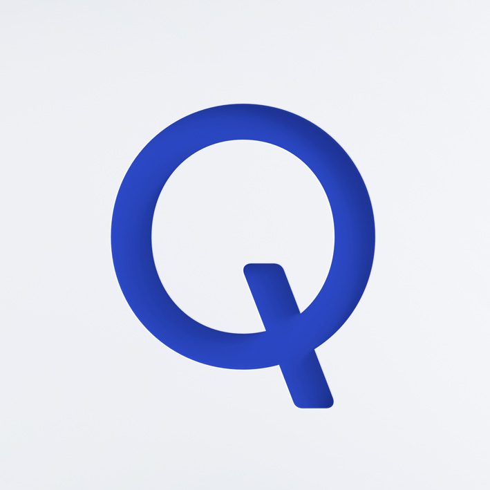
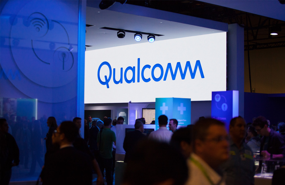
The old logo was a bit of a mess, with too many inconsistencies to pull off the “mm” ligature at the end: The “Q” was way too bold, the “u” far too squared and condensed, and the “m”s were the only pieces with rounded corners. The new logo retains the essence of the old one — which, quirks and all, had its good share of equity — but redraws it pretty much perfectly. The thicknesses of all letters match, the proper capitalization of the word is more readable, and the “mm” is now a much better integrated part of the wordmark. It still stands out as the only uppercase/unicase pair of letters but it is visually strong and unified. I’m certain there was an exploration to make the “m”s lowercase and match the roundedness of the other characters but I like that they stuck with the transistor-esque-looking diagonal “m”s. The subtle-shading rendering version gives the logo a softness that’s kind of interesting.
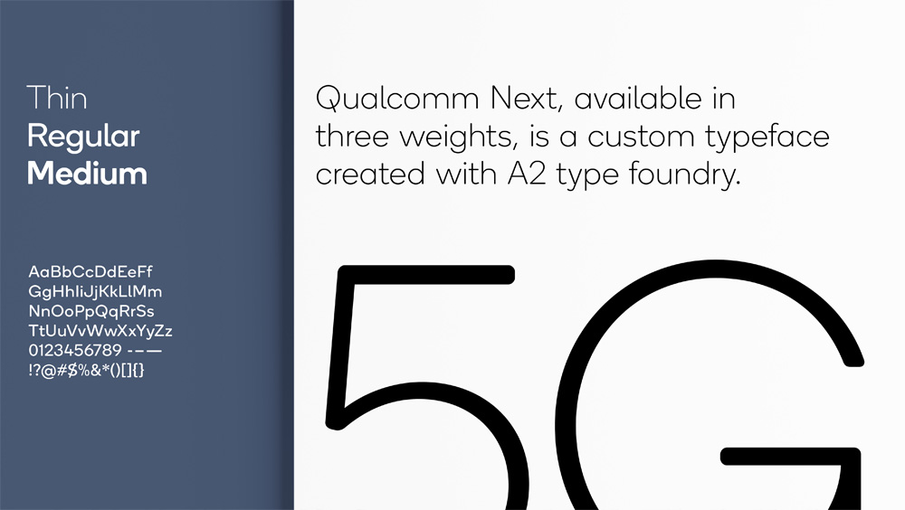
I probably would have complained about it, but I wonder if they tried to do the lowercase “m” in the typeface an inverted “w” to keep the diagonals from the logo. Maybe it could have given the typeface one more level of proprietary-ness as, for the most part, it looks like any number of rounded sans serifs out there. It’s nice, no doubt.
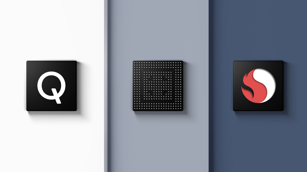
Not so sure about these icons, in either variation. The layered ones are a little more interesting but they look fuzzy.
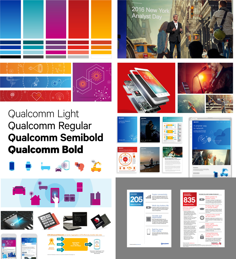
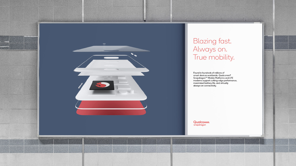
The design system is based on layers that show Qualcomm is at the core of innovating these platforms (Artificial intelligence, Internet of things, Automotive and Mobile). Their products and the products their customers create, always exist on the top most layer of the system. Qualcomm’s brand colors are found on the lower most layers to reinforce that their inventions and breakthroughs are there to support their customers’ next innovation or product.
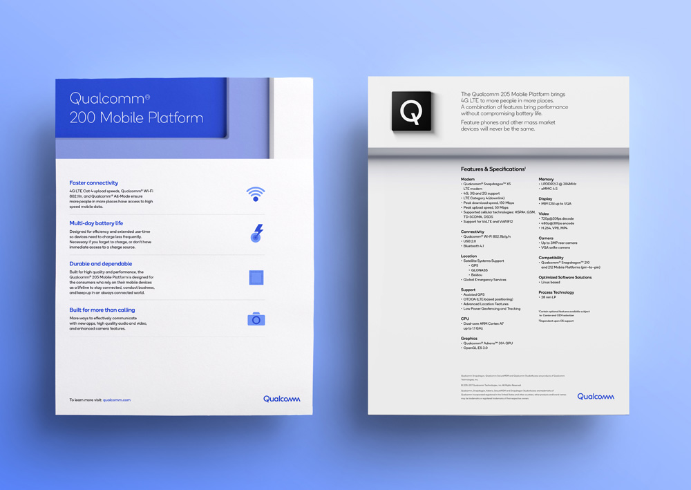
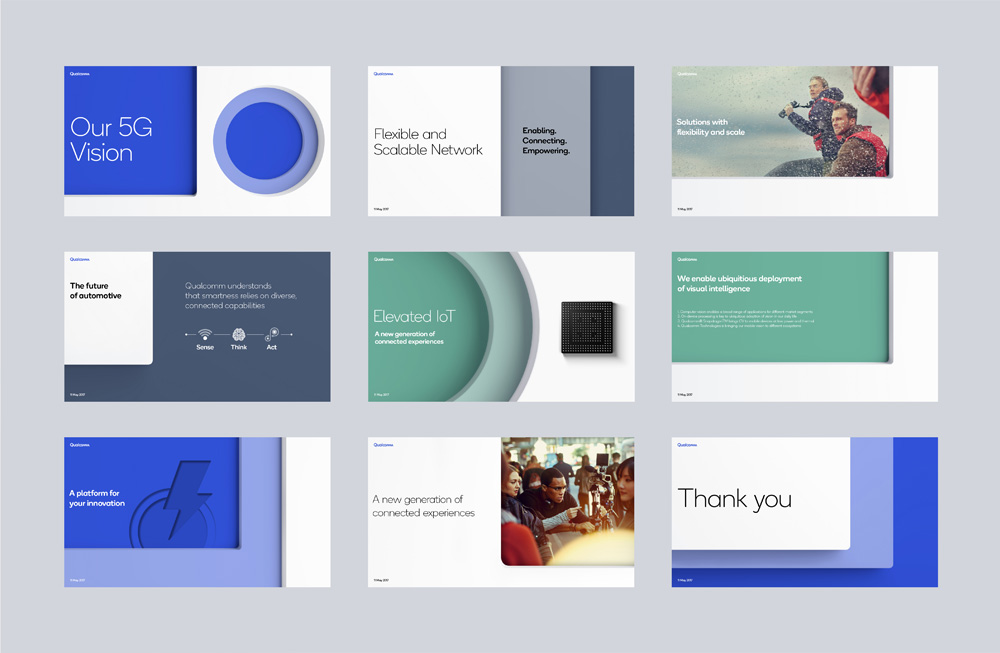

I like the concept that they are employing for applications, it’s a nice metaphor and gives the applications some purpose. The thick-plastic-like layers look attractive and techie but I do wonder how easy it is to implement this system as the identity elements aren’t as straightforward as usual. The color palette strikes a good balance of looking techie but not too blunt or obtuse or even the other extreme of super-happy-friendly vibes.
Qualcomm Snapdragon is the brand’s global flagship mobile product, producing premium platforms for innovation in the mobile category. One of the goals of the rebrand is to take the equity that exists within the Snapdragon product brand and funnel it back to the Masterbrand.
Given that this is a business to business company and not consumer-facing, this is all relatively exciting — especially considering how mediocre the logo and identity looked before. Overall, this is a solid evolution that better represents a company as big and influential as Qualcomm.

 Новости Союза дизайнеров
Все о дизайне в Санкт-Петербурге.
Новости Союза дизайнеров
Все о дизайне в Санкт-Петербурге.