Обзор лучших ресурсов по разработке бренда, разработке упаковки
contact us | ok@ohmycode.ru
contact us | ok@ohmycode.ru
Established in 2002, Institut Ramon Llull is an organization founded by the Catalan Government, the Government of the Balearic Islands, and the Barcelona City Council with the purpose of promoting Catalan language and culture locally and abroad. The institute is named after Ramon Llull, a medieval writer and philosopher from the Balearic Islands, who is considered the first notable writer in the Catalan language and contributed substantially to its development. Among its activities, the institute promotes language studies at universities abroad, the translation of literature and thought written in Catalan, and Catalan cultural production in other areas like theatre, film, circus, dance, music, the visual arts, design, and architecture and, as the official body certifying linguistic competence in Catalan abroad, it organizes examinations and awards certificates. Recently, Institut Ramon Llull introduced a new identity designed by Barcelona, Spain-based Toormix.
From the Ramon Llull Institute we were asked to develop a graphic and visual code for communication that would allow for the encompassing of activities as diverse as Catalan courses, literary presentations, poetry recitals, performing arts activities, concerts, presence in fairs, among others.
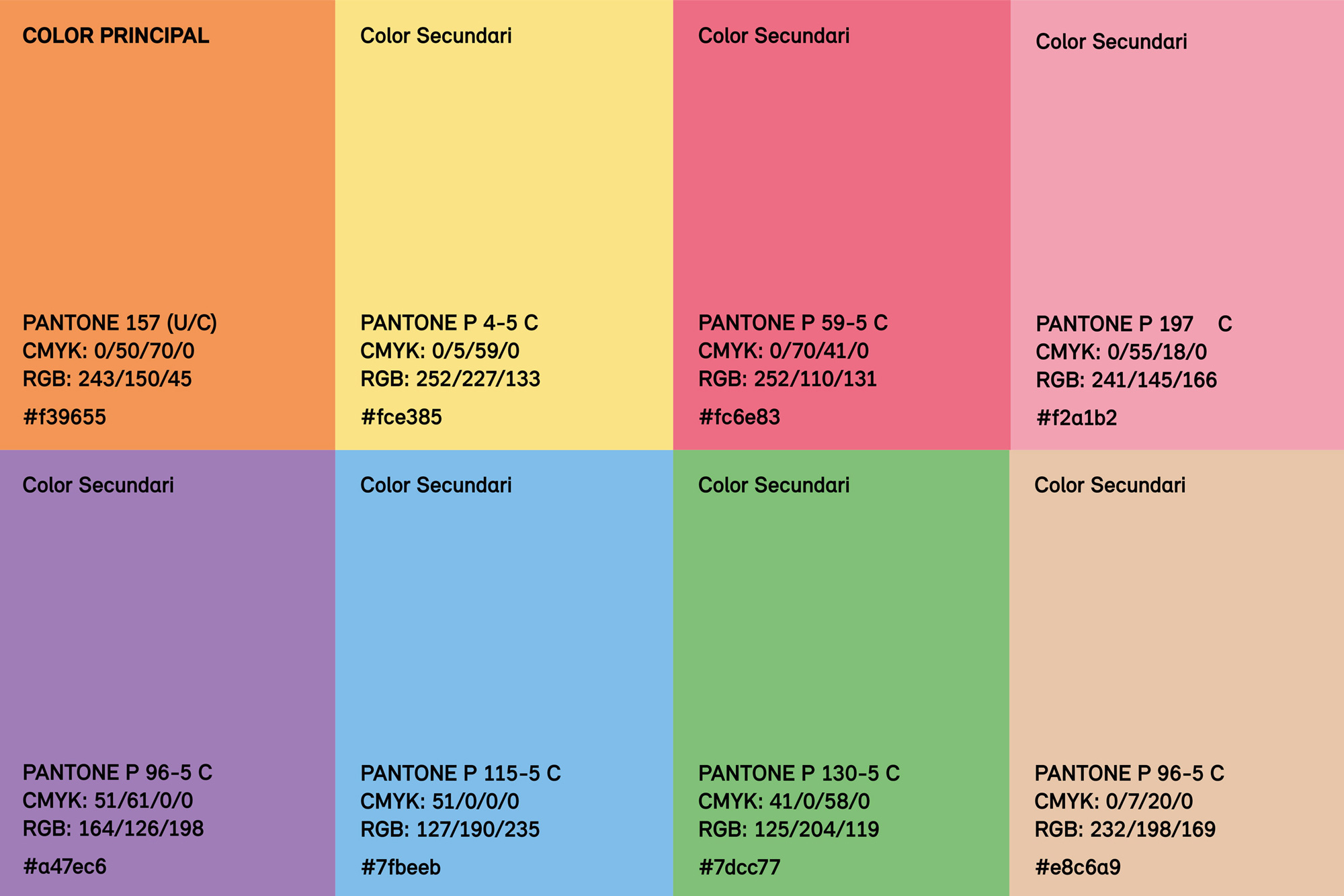
The difficulty when it came to developing the project was to create a visual framework that would be strongly identifiable with the institution and at the same time allow each activity to be expressed based on their characteristics and communicative resources. To this end, the brand was refined with a typographic update, seeking a new font that was consistent with the original image yet containing more friendly forms. An adjustment that also accompanies an expansion of the corporate color palette and a whole series of new standardized resources to create a toolbox with which the design team can work in a versatile and consistent manner.
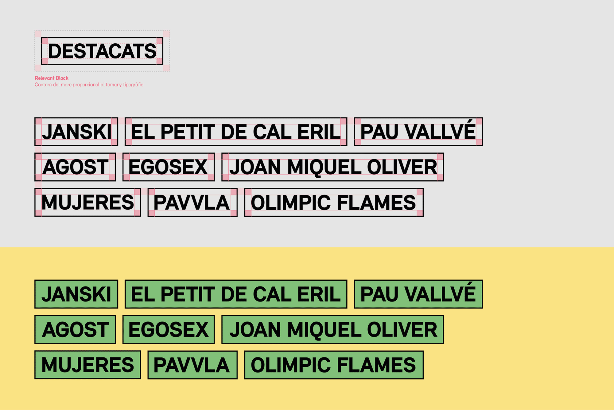
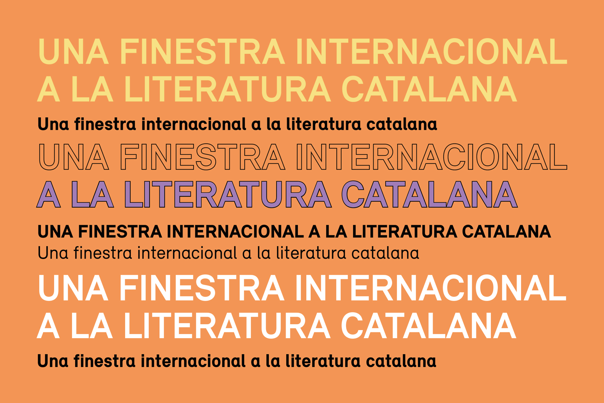
The old logo already had a great thing going with the quadruple-“l” device that played off the numerous “l”s in Llull. Originally paired with FF DIN, the new logo uses Binnenland’s Relevant which isn’t a huge change but it has a lovely new detail in that the “a” now echoes the curl of the “l”s, adding just an extra bit of cohesiveness to the whole unit. It’s also now more unique and has less of the mechanical aesthetic of FF DIN, which allows the brand extensions to look lighter and more in tune with a cultural institution instead of the German engineering DIN is known for.
Given the variability and diversity of activities, as well as their nature, the main objective was to develop a new open and flexible system that would allow each of these activities to maintain its own character without damaging the global identity of the institution, which had only been merely testimonial until the development of the project. As such, it was necessary to arm the Ramon Llull Institute with greater presence as a driving force, as well as bring visibility to its brand in order to convert it into a seal of approval and quality for the recipient. It is about generating an identifiable brand so that anyone who may be interested in their activities, regardless of their nature, can identify that it forms part of a single benchmark identity.
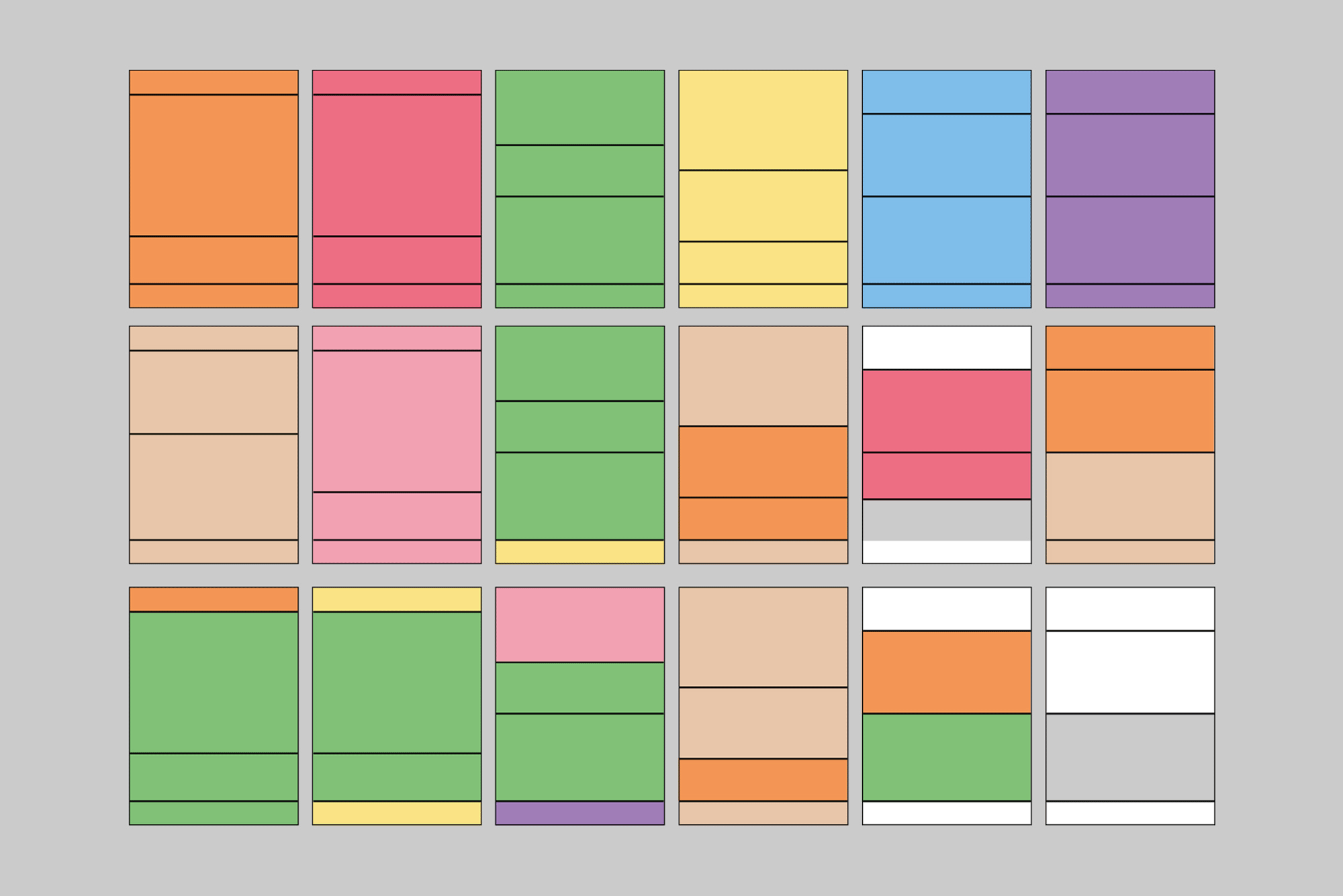
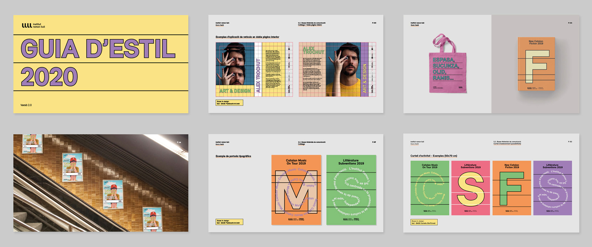
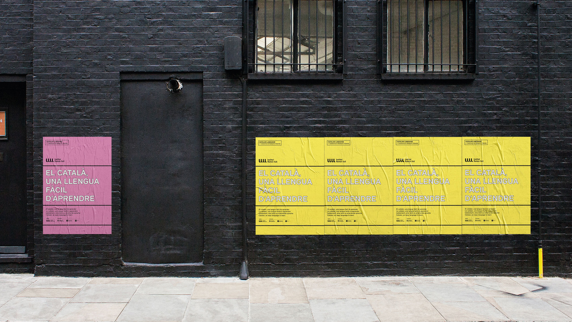
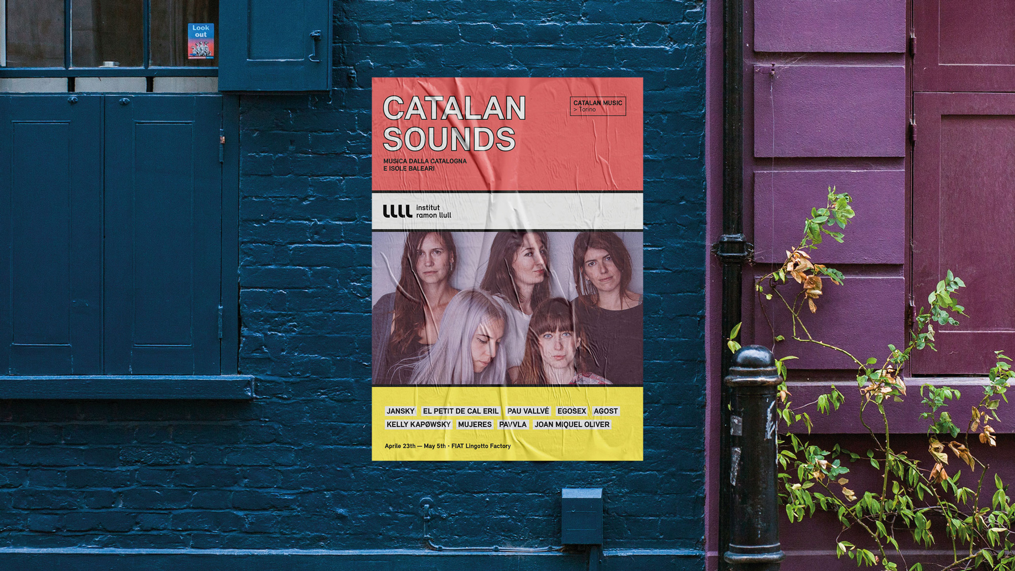
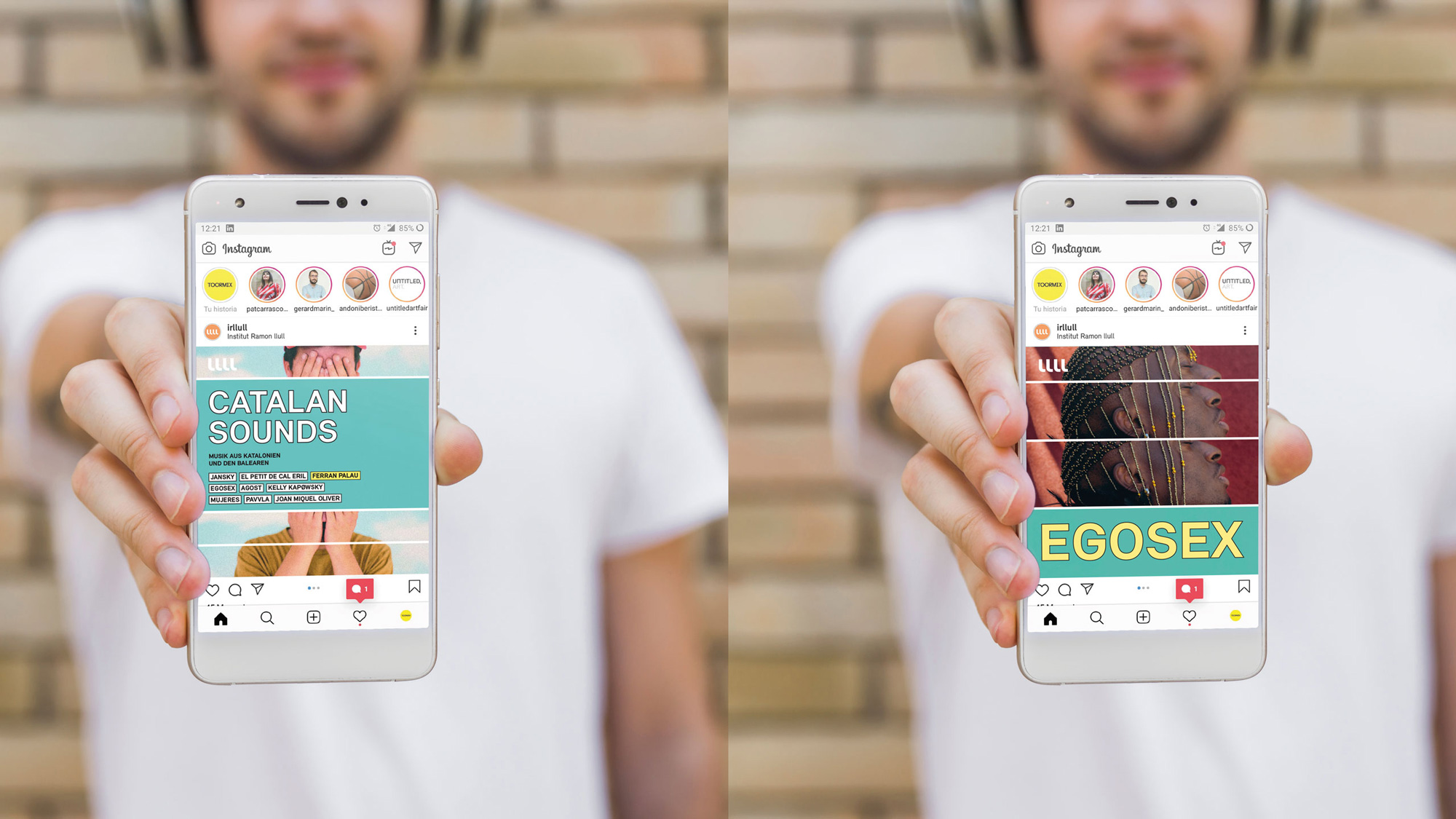
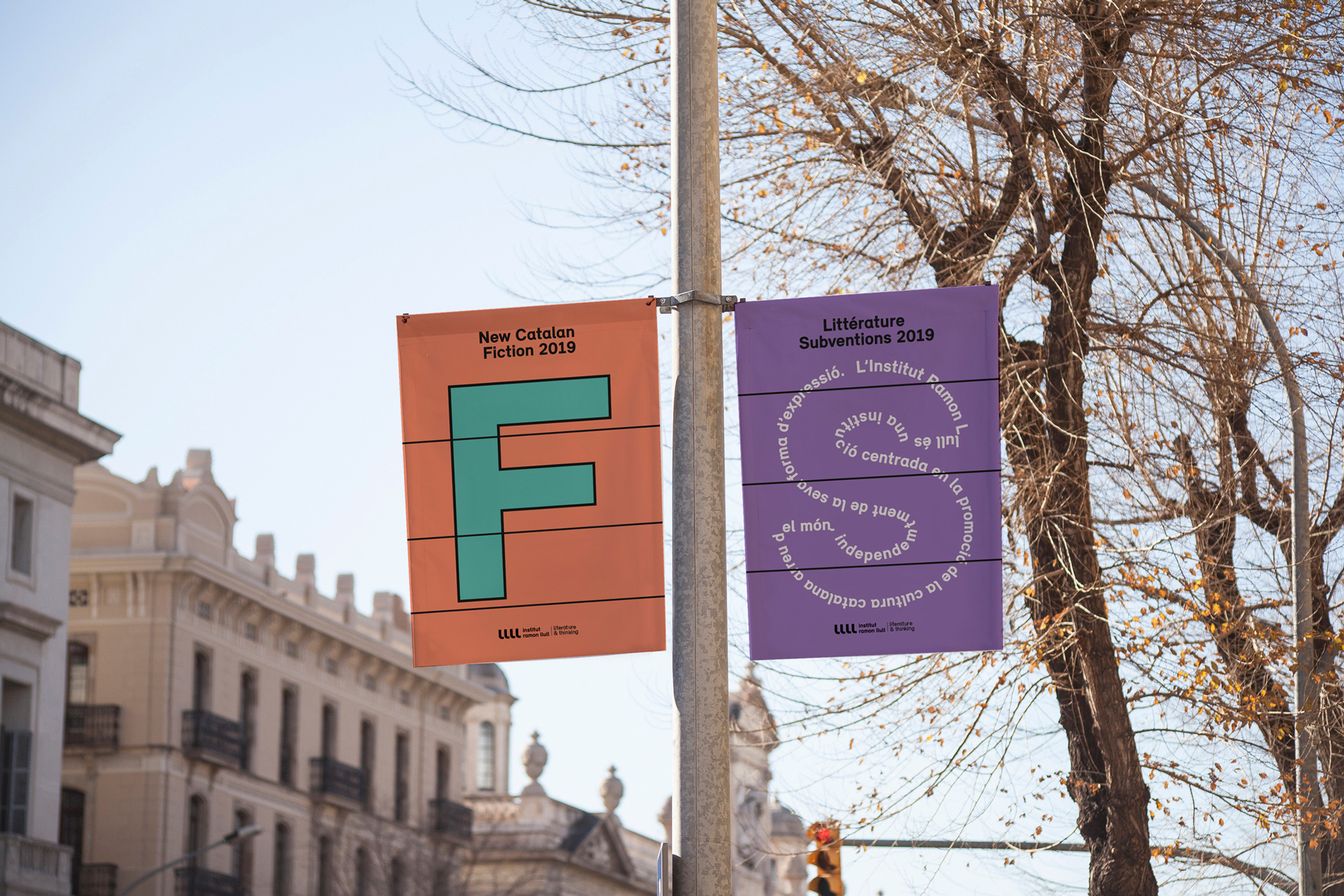
Through the construction of a new graphic code, thus allowing for the development of all the materials and the definition of a series of basic rules of space construction, we wished to create a multiple system in terms of possibilities yet at the same time simple to apply, being pragmatic for the recipient. By means of a geometry of space in four strips (in reference to the four stripes of the Catalan flag), the new expanded color palette, new typographic resources and a definition of the “look & feel” recommended for photographic and illustration materials, we sought to reorder the entire identity without changing the essence of the logo, which had already been established but was not being used with sufficient forcefulness, strength and above all, presence.
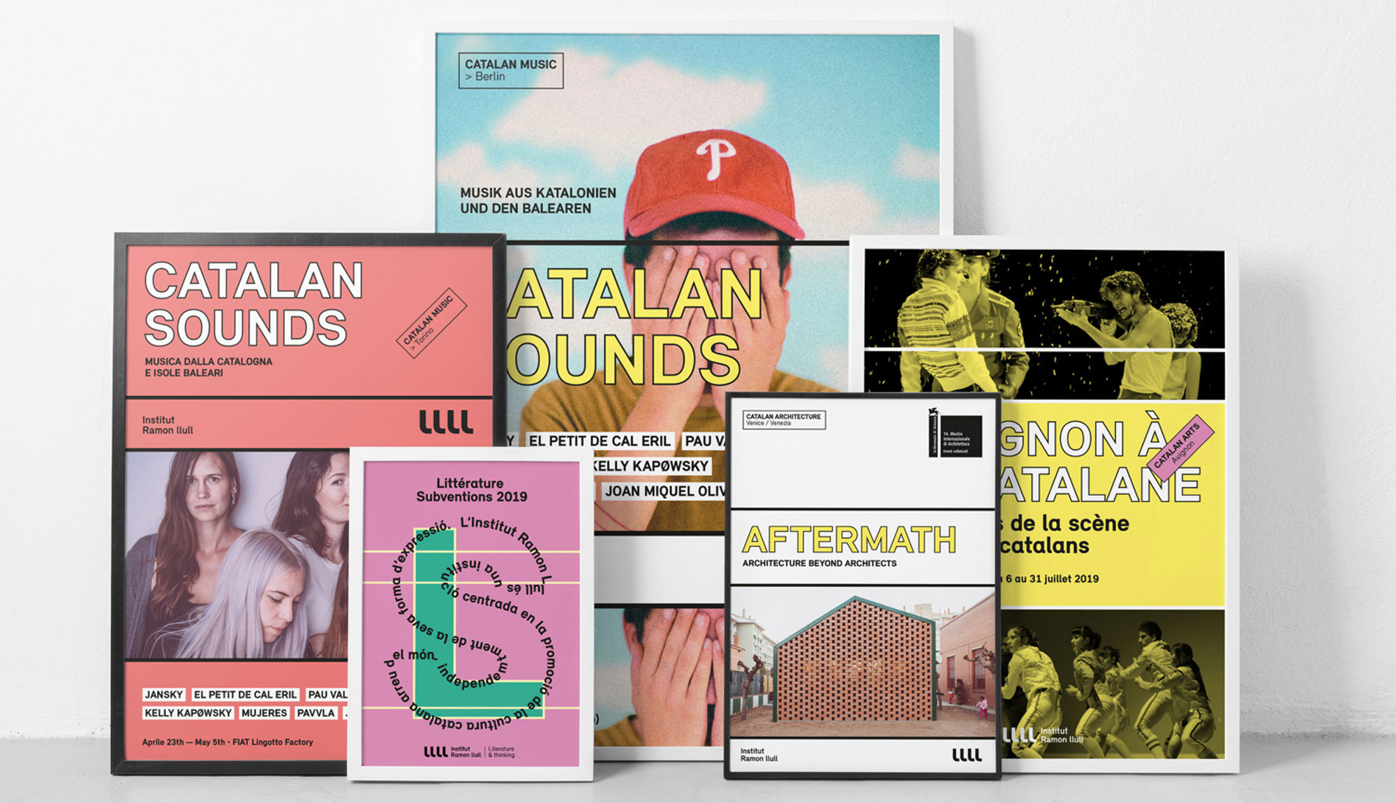
The identity uses a relatively simple mix of elements in a relatively simple horizontally-driven set of layouts but the result is fairly rich and textured. The stroked typography looks really great and adds a touch of playfulness to the otherwise deadpan sans serif trend. The horizontal blocks are boldly delimited by the use of thick black (or white) strokes that contrast starkly with the pastel colors and yield eye-catching layouts. I like how the photography can be used to span multiple blocks with a line running across them or be cropped more neatly. And across all layouts the quadruple-“l” mark stands out nicely.
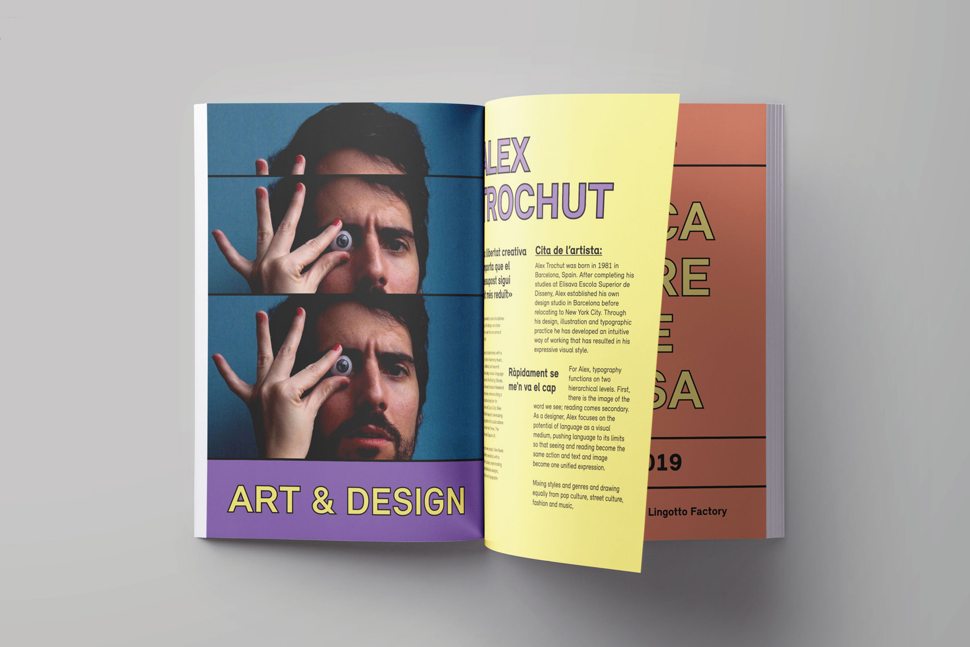
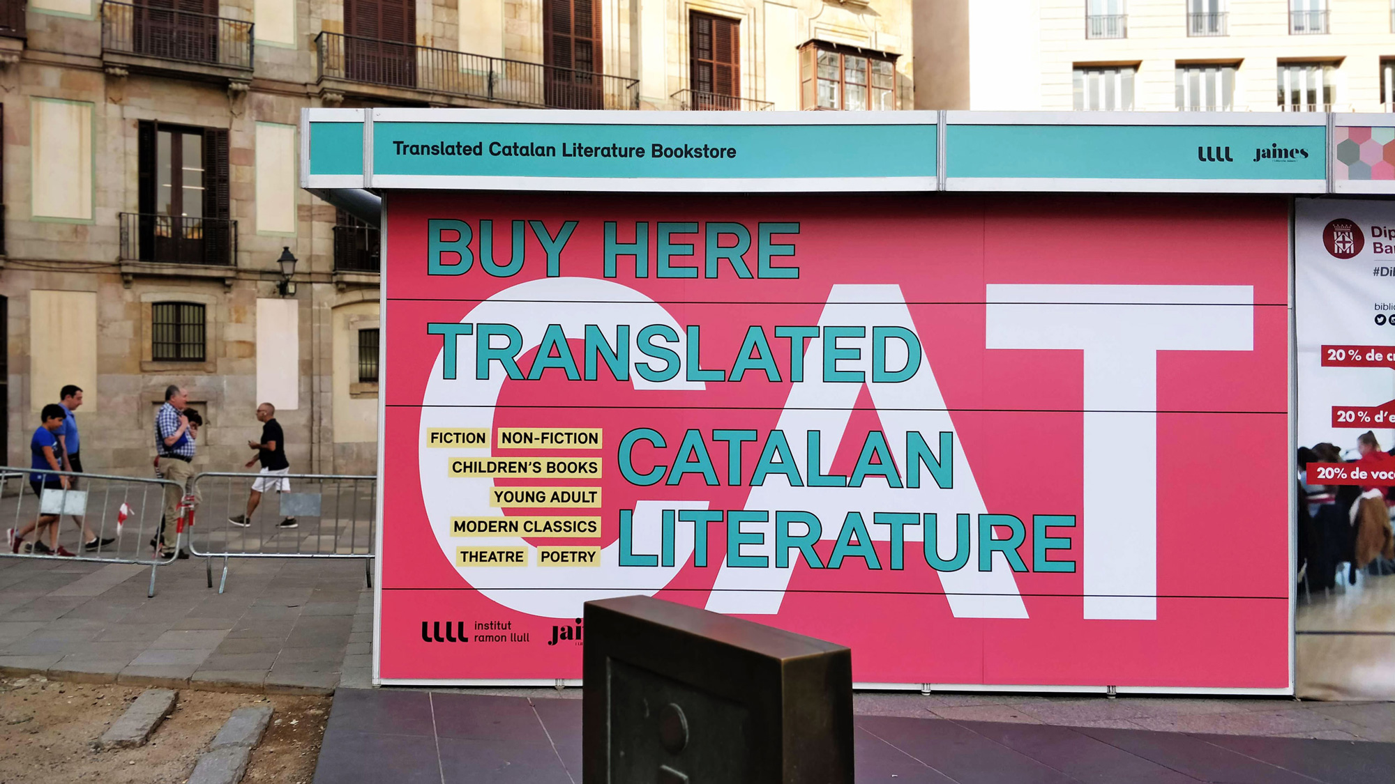
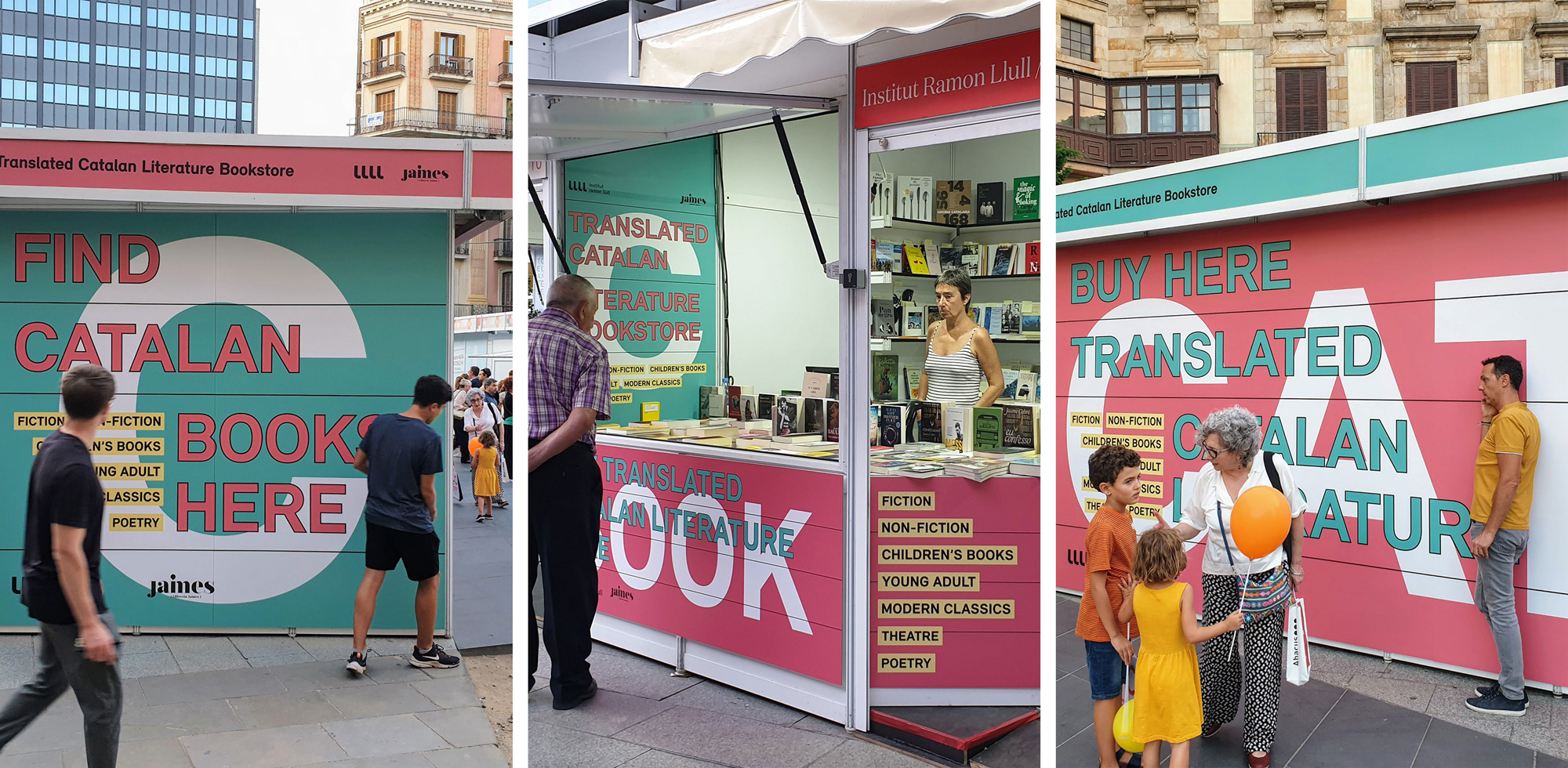
Overall, this has a very familiar Barcelon-ian aesthetic, with the use of large, stacked, uppercase typography but the combination of the color palette and the funky black stroke do provide a point of differentiation among all the excellent-looking cultural (and government) institution identities found throughout the city.
 each year since publication began in 2006

 Новости Союза дизайнеров
Все о дизайне в Санкт-Петербурге.
Новости Союза дизайнеров
Все о дизайне в Санкт-Петербурге.