contact us | ok@ohmycode.ru
contact us | ok@ohmycode.ru
“Duncan Channon is an independent, integrated full-service advertising and design agency. Duncan Channon specializes in re-launching brands and is known for turning StubHub into a household name and transforming the Esurance brand. Current clients include Ebates, Kona Brewing, Redhook, John Muir Health, StubHub, DriveTime, Tahoe South, Sonoma-Cutrer and the California Tobacco Control Program, among others. Duncan/Channon was founded in 1990 and is housed in an historic building in downtown San Francisco.”
Underware (Amsterdam / Den Haag)
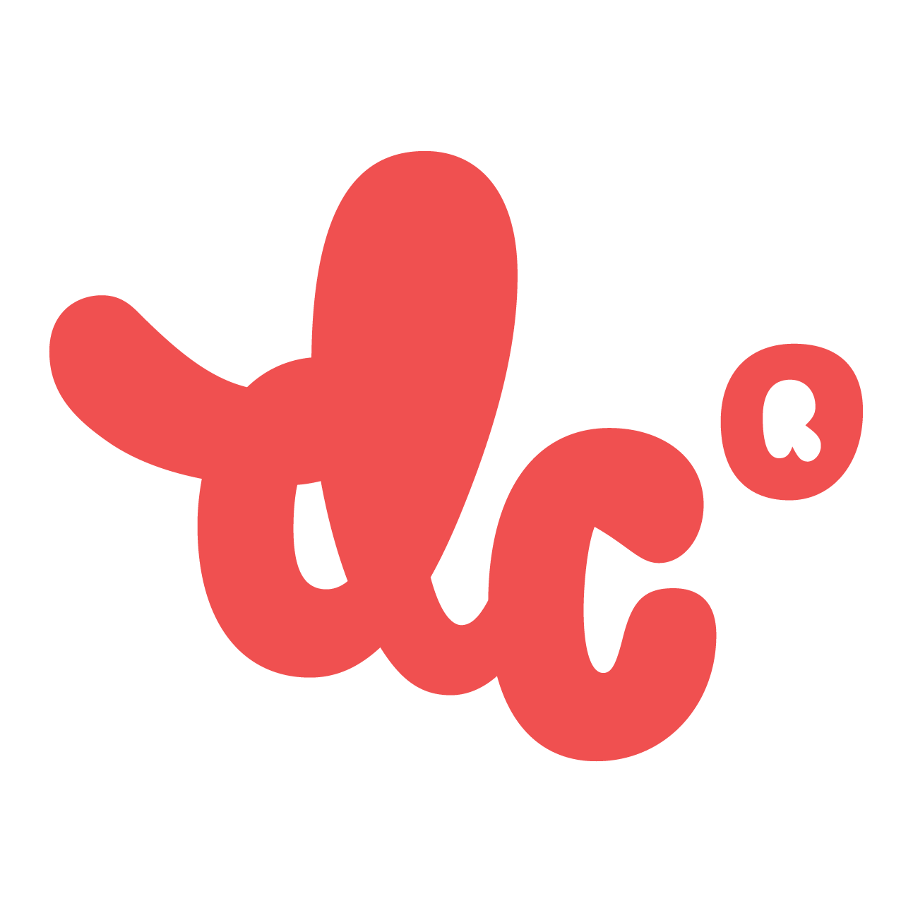
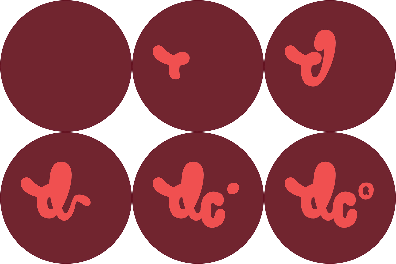
CCO Michael Lemme led the rebrand. “Our new mark is custom-made – hat tip to our co-conspirators in Helsinki / Amsterdam / Den Haag, Underware. In the context of increasingly algorithmic and measured marketing, we wanted our identity to be a symbol of the incalculable, unpredictable role of creativity and personal expression in every aspect of our work.”
I rarely post design firm or creative agency redesigns but this one stood out as most design firms typically have a very pared back logo that is usually a direct opposite of the kind of work they do and most are happy to go with simple wordmarks or monograms. The old D/C monogram was perfectly fine and well suited, even landing on the more extroverted end of the spectrum when it comes to design firm logos. The new one is completely unexpected in its bubble-gum-ness and joy for fatty curves (and I don't mean that in an overweight manner, it reminds me of fatty edges on a juicy brisket). I don't think it's the best logo possible but, as an expression of a design firm that does playful work, it's a viable, enjoyable logo. I have a feeling it won't last more than 5 years but that would be fine. I like the script approach and the way you can't even see the counterspaces but I'm not a huge fan of the ® symbol… I can see that it's there mostly to balance out the swash of the "d" but it demands far too much attention. Overall, sure, why not? And I appreciate Duncan Channon's pre-emptive trolling of their own logo.


 Новости Союза дизайнеров
Все о дизайне в Санкт-Петербурге.