Обзор лучших ресурсов по разработке бренда, разработке упаковки
contact us | ok@ohmycode.ru
contact us | ok@ohmycode.ru
Established in 2018, National Open Youth Orchestra (NOYO) is the world’s first disabled-led youth orchestra that promotes musical excellence by empowering disabled and non-disabled musicians aged 11 to 25 to train and perform together. Based in Bristol, UK, NOYO is an initiative of Open Up Music, a charity founded in 2007 with the mission to make orchestras accessible to young disabled people. The NOYO ensemble is currently training and practicing with first performances scheduled for 2020. Recently, the organization introduced a new identity designed by Bristol-based Fiasco Design.
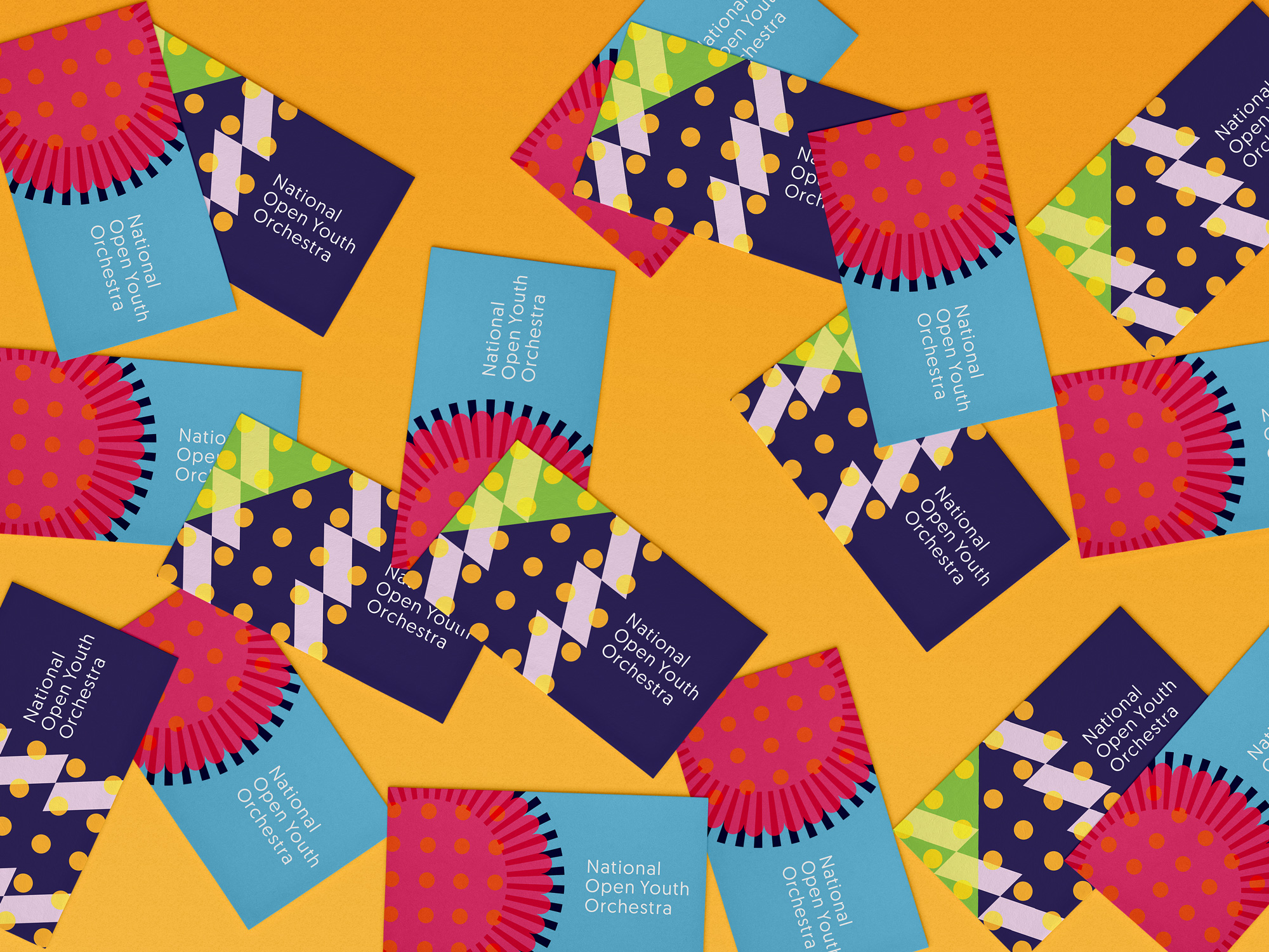
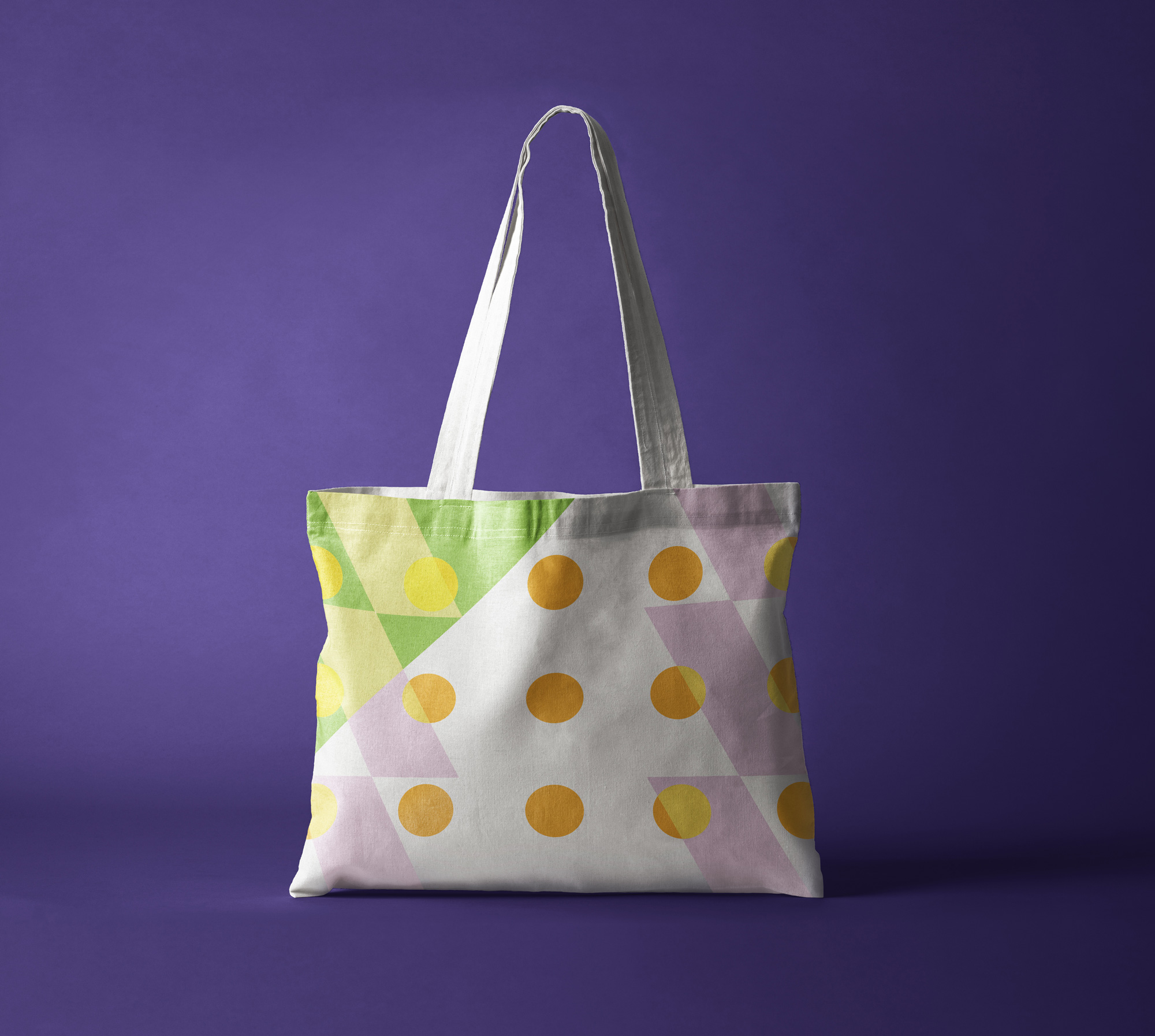
We worked in collaboration with the team at NOYO to create a system that allows their members to compose bespoke icons, that in turn feed into on and offline applications, putting the young people at the heart of the organisation’s branding.
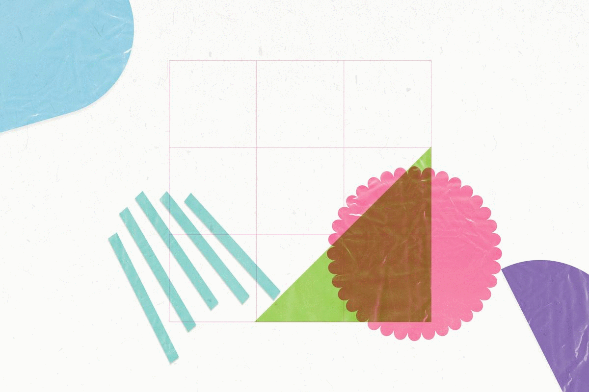
We devised a grid system along with a number of coloured, cut-out shapes. During a series of workshops the young people were asked to place the shapes into the grid in any arrangement they wished. The results were then photographed and digitised to create a suite of unique icons.
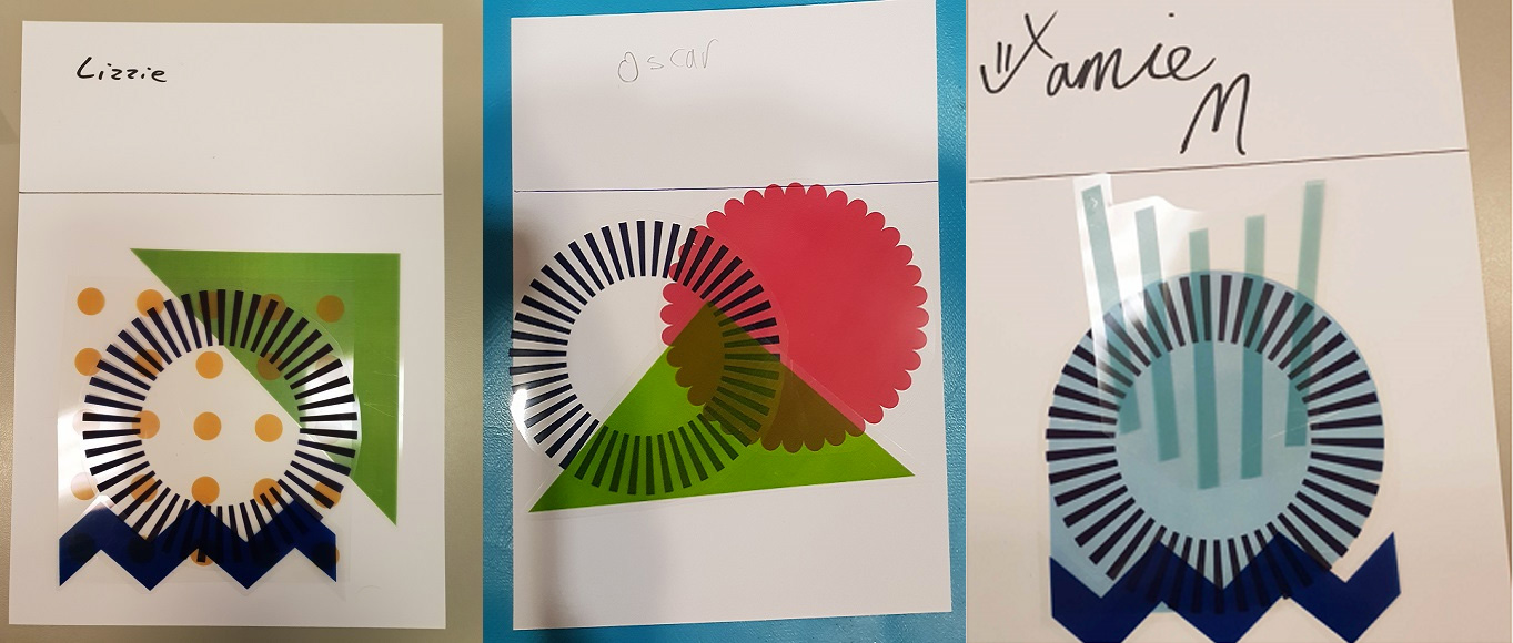
The old logo had the right idea — even though it took me a few glances to understand what that idea was — by aligning all the “O”s into a column but that left the rest of the alignment in major disarray. With some kerning (or easier yet, a monospace font) this could have been resolved into a more decent wordmark. Still, it looked too serious and stuffy. Even without the explanation and backstory, the new logo instantly feels more youthful and joyful and the icons — even if undecipherable or seemingly random — do pay off with the words “Open” and “Youth” in the name. Once you know the backstory, this is pretty great, heartwarming, and difficult to dislike (not that there is much to dislike). The individual icon compositions are different levels of interesting and not interesting but as a collection they convey rhythm, collaboration, and uniqueness. The simple wordmark is a good, elegant complement.
These bespoke icons are then combined with an accessible, easy-to-read font - designed for people with learning disabilities, and a vibrant colour palette to create an expressive, playful visual identity that reflects the organisations creative side.
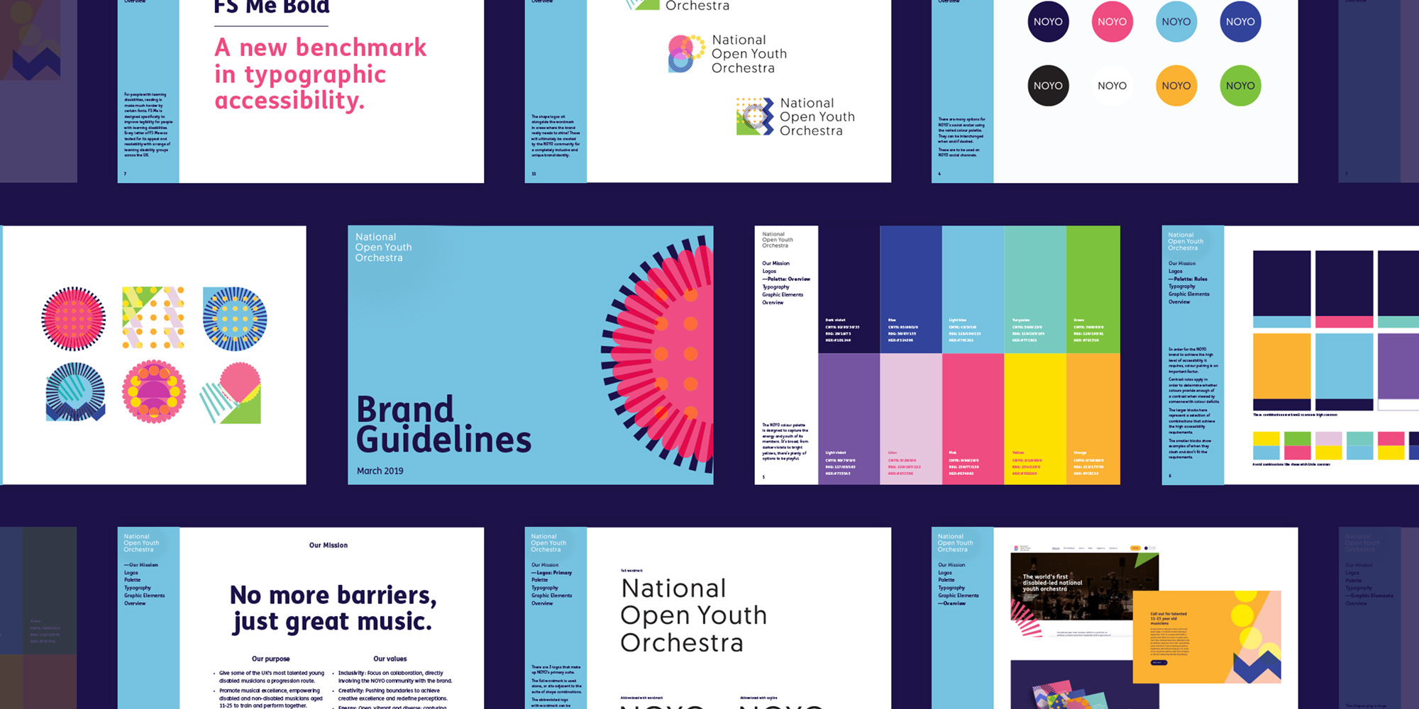
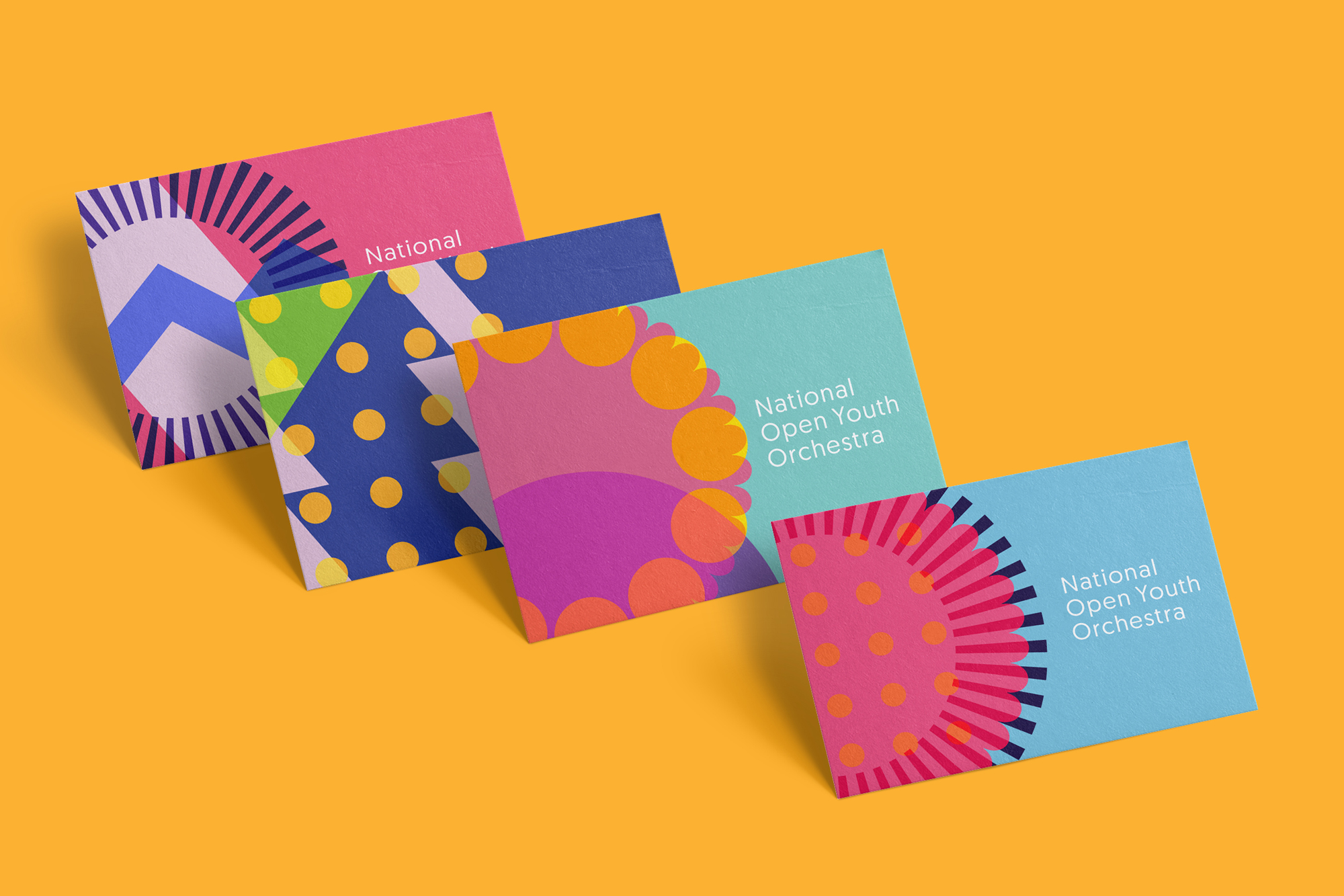
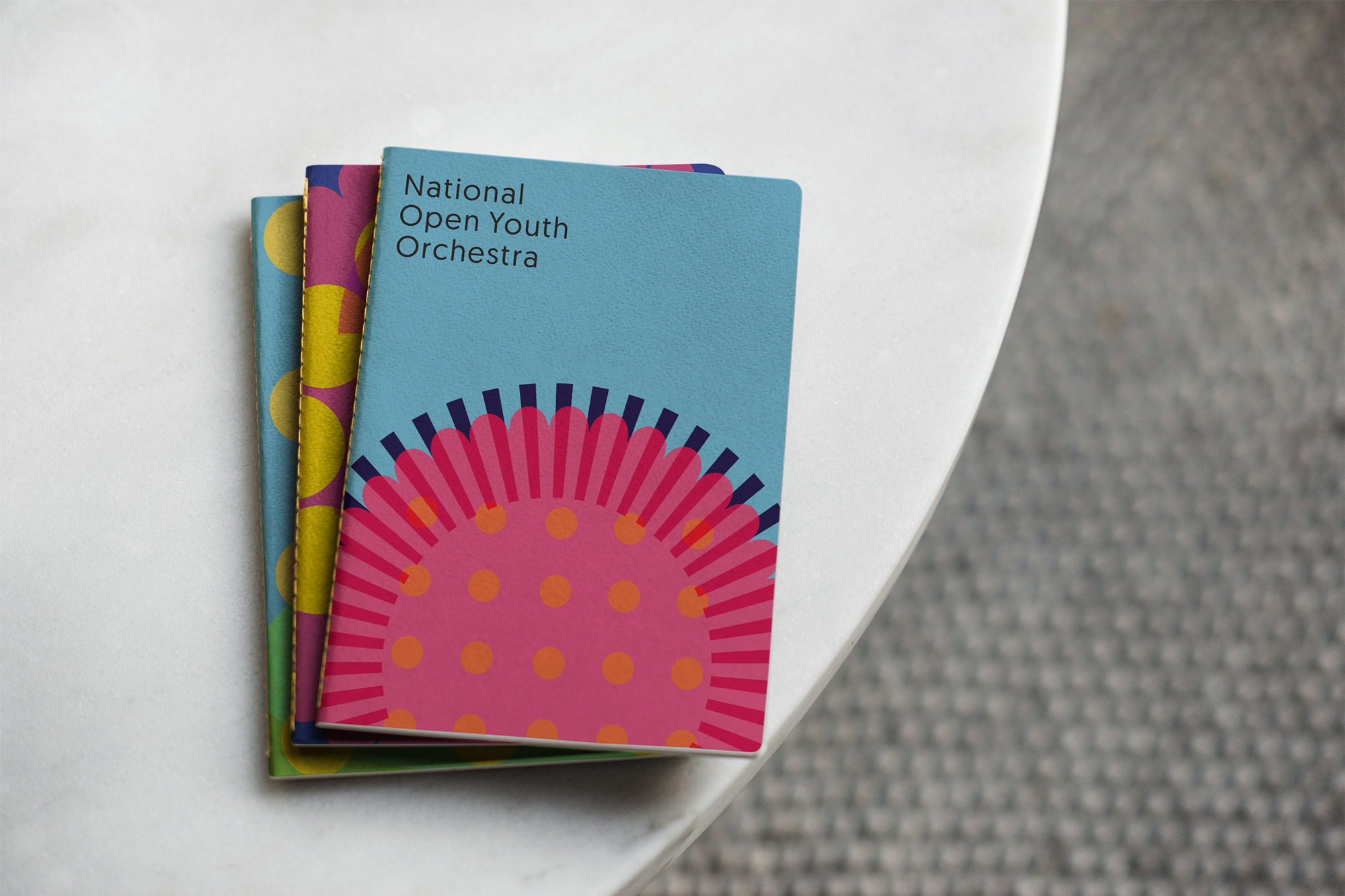
The icons work fine on the logo but they are much better when used large and cropped as the main application visuals with the light wordmark on its own as the more serious endorsement signature. The secondary font, Fontsmith’s FS Me, works well in combination with the two main elements. I like how they managed to go with a multi-color approach yet it doesn’t feel trendy or annoying.
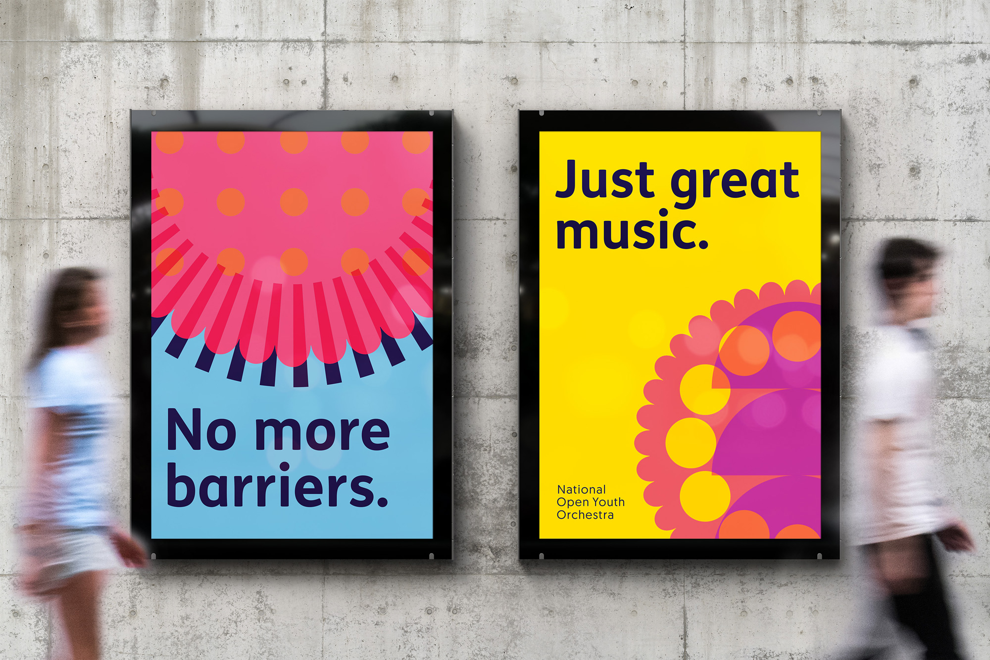
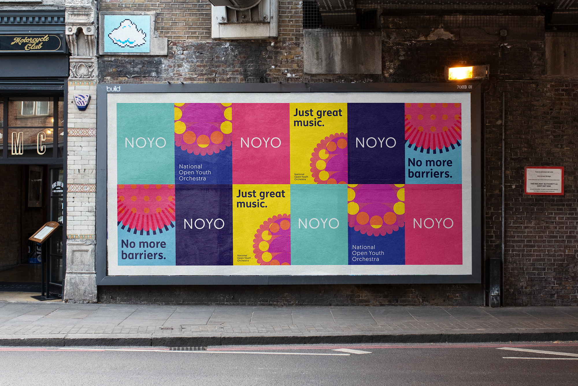
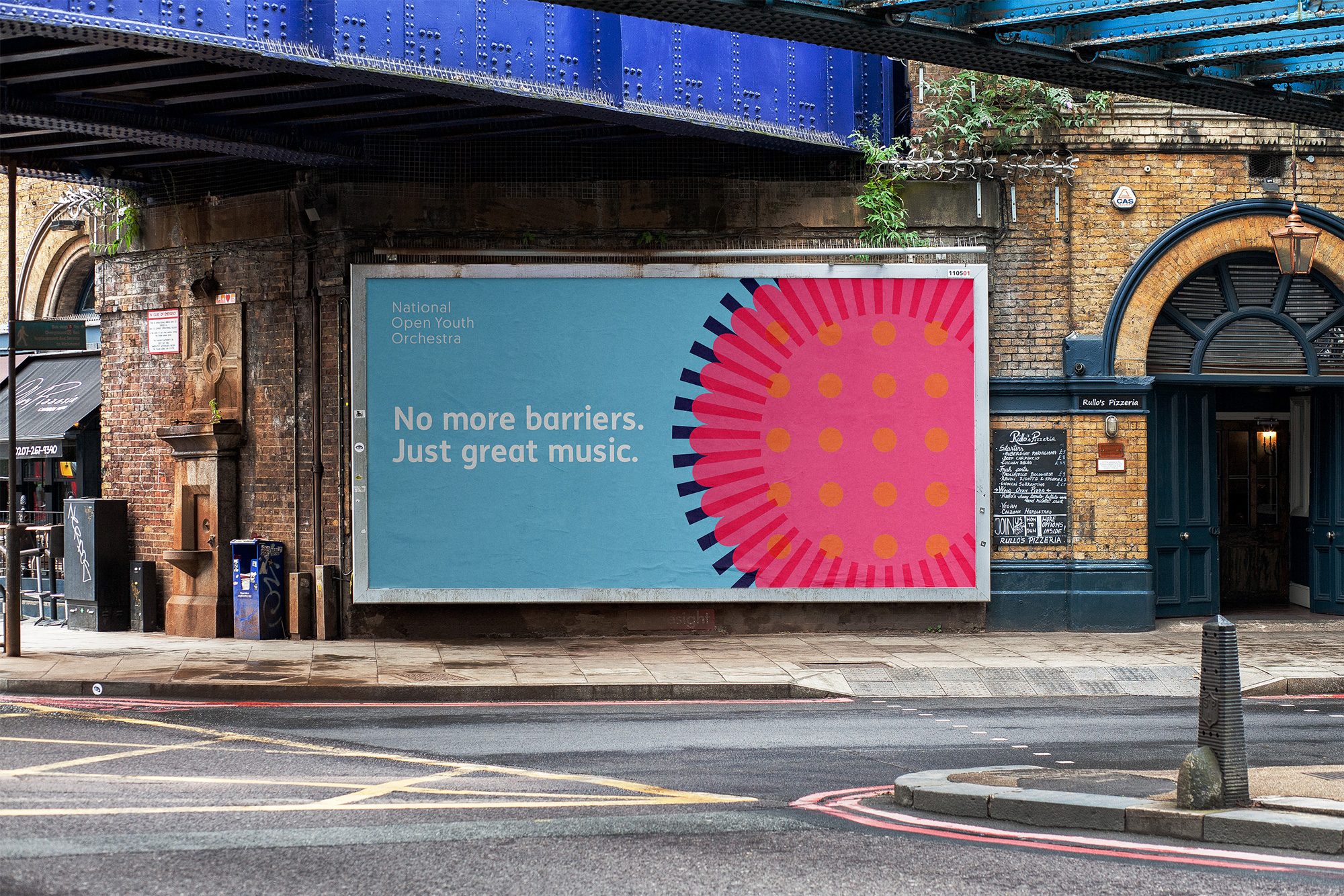
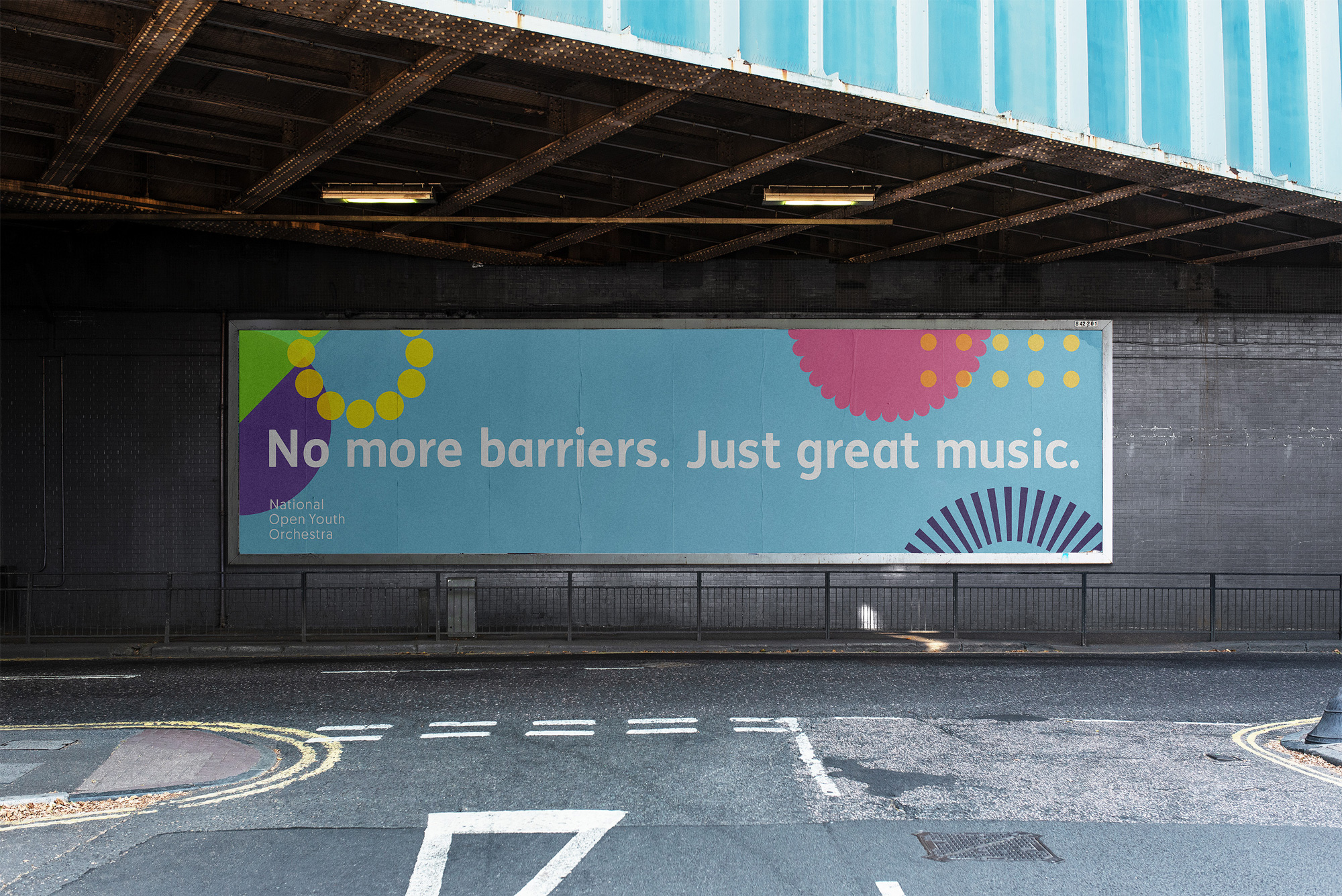
Overall, this is a thoughtful approach that helps support the organization’s empowerment mission by giving NOYO musicians the opportunity to shape how it presents itself, all while being visually enthusiastic and energetic.

 Новости Союза дизайнеров
Все о дизайне в Санкт-Петербурге.
Новости Союза дизайнеров
Все о дизайне в Санкт-Петербурге.