Обзор лучших ресурсов по разработке бренда, разработке упаковки
contact us | ok@ohmycode.ru
contact us | ok@ohmycode.ru
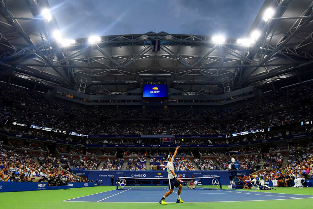
Established in 1968, the U.S. Open is one of the four major tournaments that comprise tennis’ Grand Slam and, dating back to 1881 (as the U.S. National Championship), it is one of the oldest tennis championships in the world. Held annually every August, the U.S. Open has been played in New York since 1978 with championships for men’s and women’s singles, men’s and women’s doubles, and mixed doubles. Spanning two weeks and multiple courts, it is one of the highest attended annual sporting events with an approximate, cumulative average of 700,000 people since 2005. Yesterday, the United States Tennis Association (national governing body for tennis in the U.S. and owner and organizer of the U.S. Open) introduced a new logo for the tournament, designed by New York, NY-based Chermayeff & Geismar & Haviv.
The mark that had been used for 20 years—an illustration of a flaming ball paired with thin serif type and a red swoosh—was a complicated image that had challenges in digital media and did not represent the tournament well as a premium sporting and entertainment brand. There were also several versions of the mark, which made it difficult to build recognition. While the rendition of the mark posed challenges, the core concept of a flaming tennis ball still captures many of the attributes of the US Open—energy, excitement, movement.
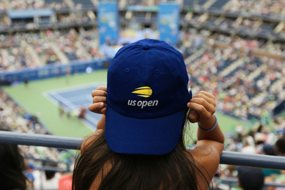
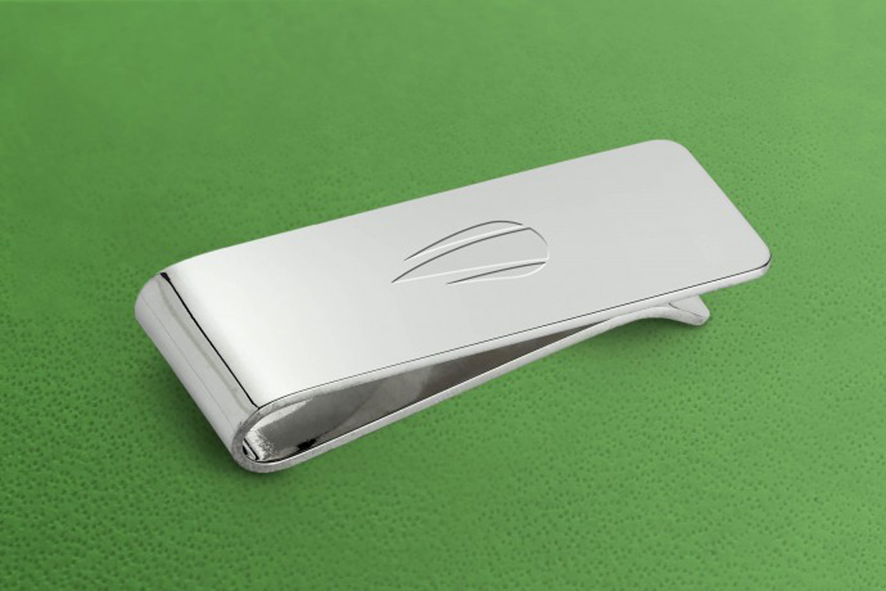
The new mark is an evolution of the flaming ball idea, distilled to its essence to work as a simple icon. The new modern symbol is paired with an italic, lowercase sanserif typography, with the name held together by a flipped “u” and an “n.” The result expresses the energy, spirit, and velocity of the flaming tennis ball and the US Open itself, while modernizing the look, providing a more youthful appeal, and optimizing the identity for applications on everything from apps and Instagram to billboards, print ads, and swag.
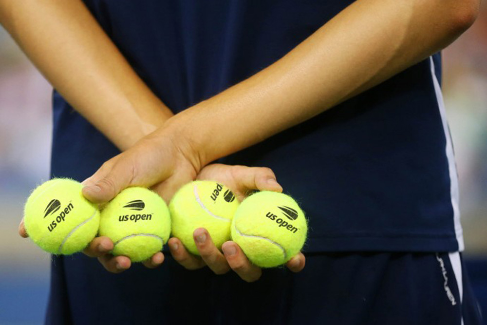
The old logo was atrocious, almost like a parody of a tennis tournament logo: a literally flaming ball? If Brand New had existed in 1997 when this logo was released it would have been destroyed, especially if you try to wrap your head around the physics of the direction of the flame vis-à-vis the implied direction of the swoosh… doesn’t compute. Long way of saying it was a terrible concept, badly executed, and hard to use at small scale. The new logo features a speeding tennis ball that manages to keep the equity of the flame AND the swoosh but in a minimal, evocative way. I think the icon is quite great; it’s simple, it’s fairly obvious what it is, it reduces very nicely, and it conveys the speed of the sport (or at least the speed at which balls travel). I wish the icon had a slightly greener hue; I understand that official U.S. Open balls are more yellow than the traditional bright green balls but in this particular hue combined with that blue, I’m getting very strong VISA vibes.
The wordmark… I’m having conflicting issues with it. I have a very negative reaction to the all-lowercase approach because this is called the “U.S. Open” not “us open” (as in “us open, Tarzan and Jane enter, sit”) and unlike company or product names that have more flexibility in how they are capitalized in writing versus in the logo, I think this needed to be properly capitalized. BUT, I kind of really like how the “u” and the “n” are the same, just rotated, nicely book-ending the italicized wordmark which, by the way, it feels like forever since we’ve seen an italic wordmark.
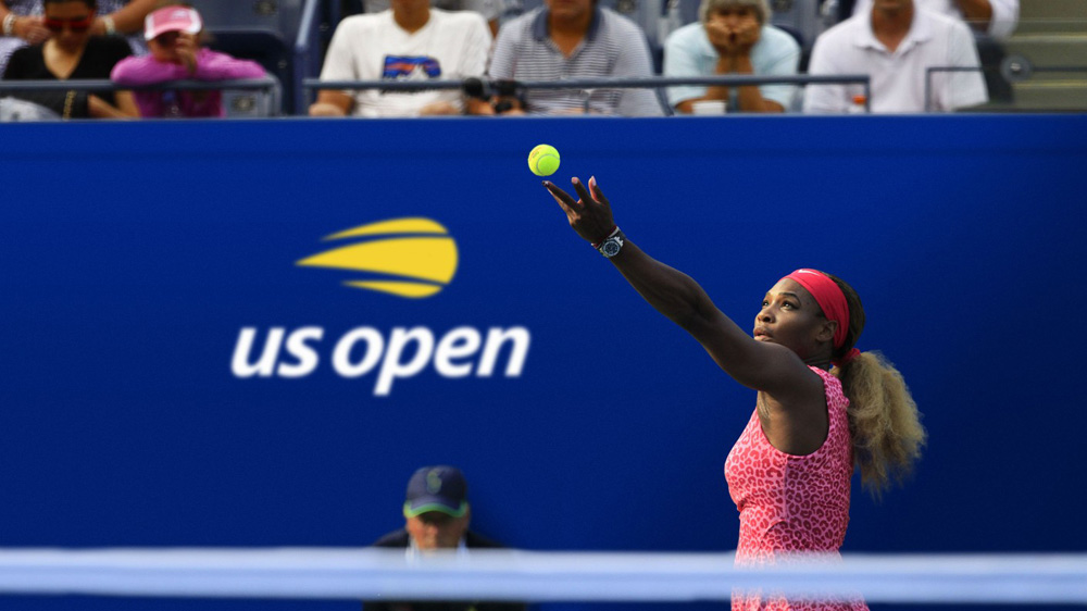
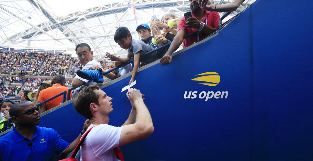
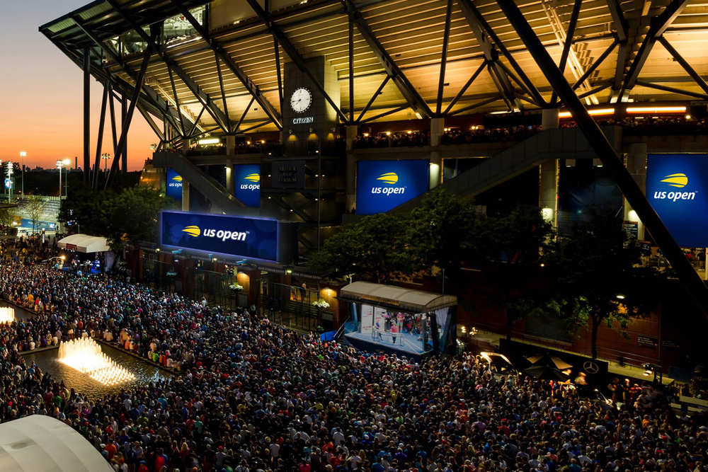
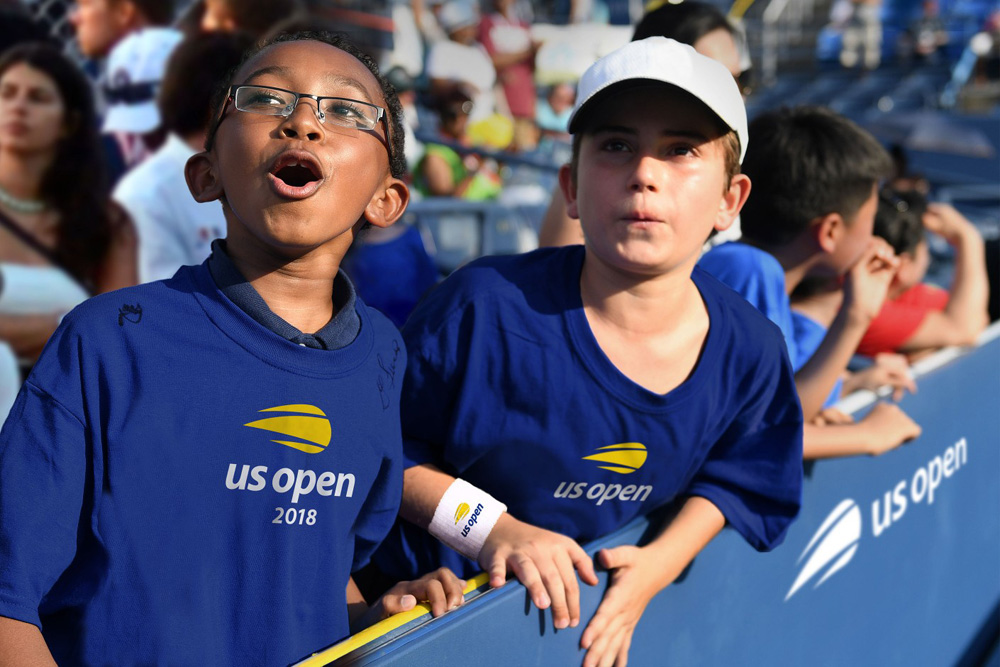
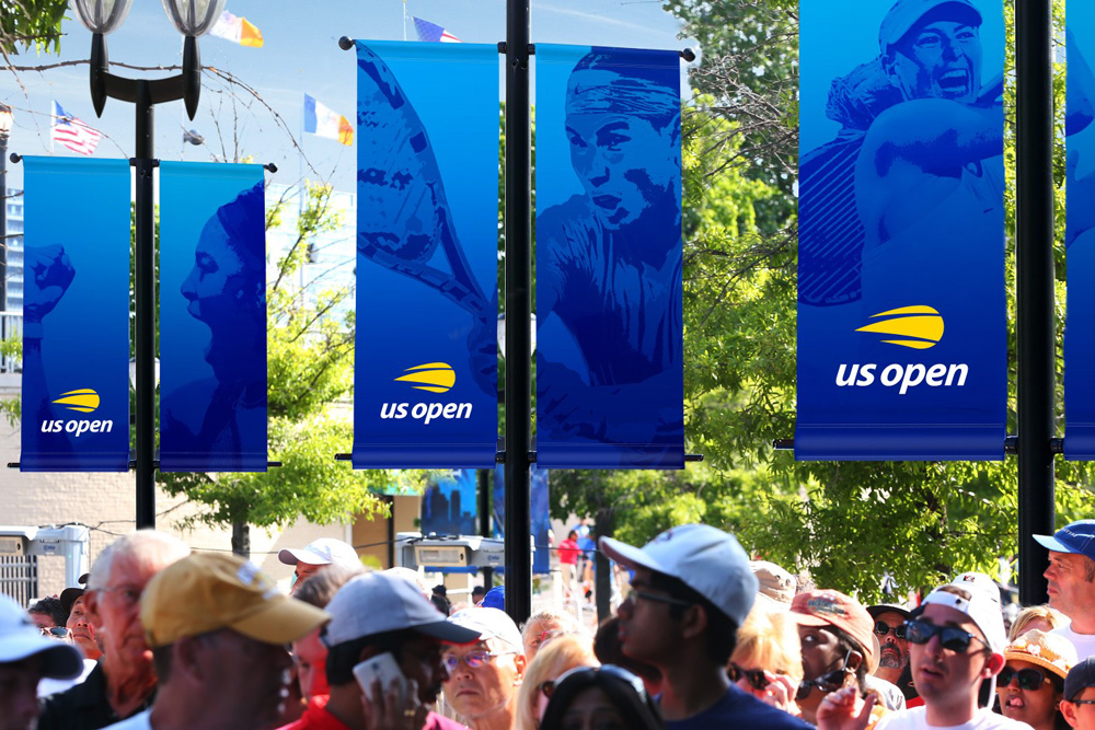

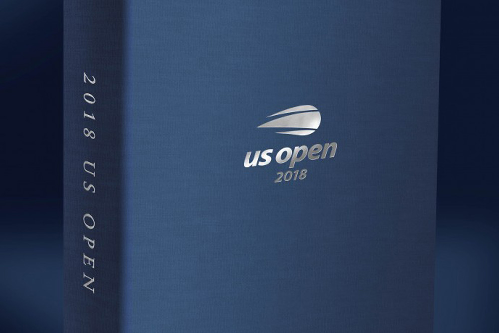
The applications are not very interesting — it’s just the logo on places and on stuff — so it’s hard to muster much of an opinion other than, sure, the logo works on anything and everything (which, to its credit, can not be said about every logo). Overall, this is a major improvement and I really appreciate the new icon in its simplicity and ease of use — I feel like minimal graphic icons in logos is a bit of a lost art and this captures a bit of that old school simplicity.

 Новости Союза дизайнеров
Все о дизайне в Санкт-Петербурге.
Новости Союза дизайнеров
Все о дизайне в Санкт-Петербурге.