Обзор лучших ресурсов по разработке бренда, разработке упаковки
contact us | ok@ohmycode.ru
contact us | ok@ohmycode.ru
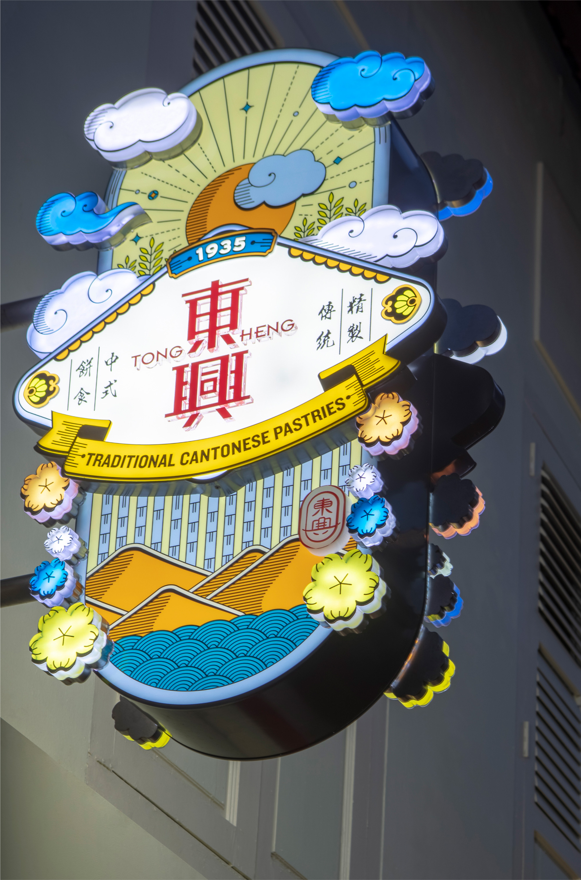
Established in 1935, Tong Heng is a family-owned pastry shop specializing in traditional Cantonese pastries and are renowned for their signature diamond-shaped egg tarts. With two retail locations in Singapore and making its pastries 90% by hand — they barely use any machines (other than ovens) — Tong Heng builds on its heritage that began long before its 1935 birth date when its founder, an immigrant from China, was selling coffee and toast from a push cart in the early 1900s. Today, the pastry shop is consistently busy and its egg tarts attract international attention. In 2018*, Tong Heng introduced a new identity designed by Singapore-based &Larry.
* 2018 is WAY outside my time limits for posting but I thought this was a very charming story — see this video here (they mention the rebranding towards the end) — for a small family-owned business with a long legacy as well as the design being pretty good.
The new brandmark and identity system pay respect to the original design while being thoroughly optimised for modern day requirements. The brand essence for Tong Heng, summed up as “Joy in a Bite”, is incorporated into the Chinese character for ‘joy’ (興) as the radicals for ‘a bite’ (一口).
I do not know nearly enough — and by that I mean, I know nothing, like Jon Snow — about Chinese characters to attempt to write an informed opinion on either the before or after logo as it relates to the typography, readability, or appropriateness of the evolution. Visually, I do like the softness of the old logo better as well as the seal-like composition but its ITC Bauhaus Latin typography was certainly out of place. The new, more angular shapes feel a little harsh for a family-owned business making pastries but, as mentioned, I’ll defer to our Singaporean readers to comment if this is better. The new Latin wordmark is alright… it wouldn’t have been my choice but it’s an option, sure. I know in my second paragraph I mentioned the design of this project was good and the opening opinion is not favorable but here we go with the good stuff that gets better as you scroll…
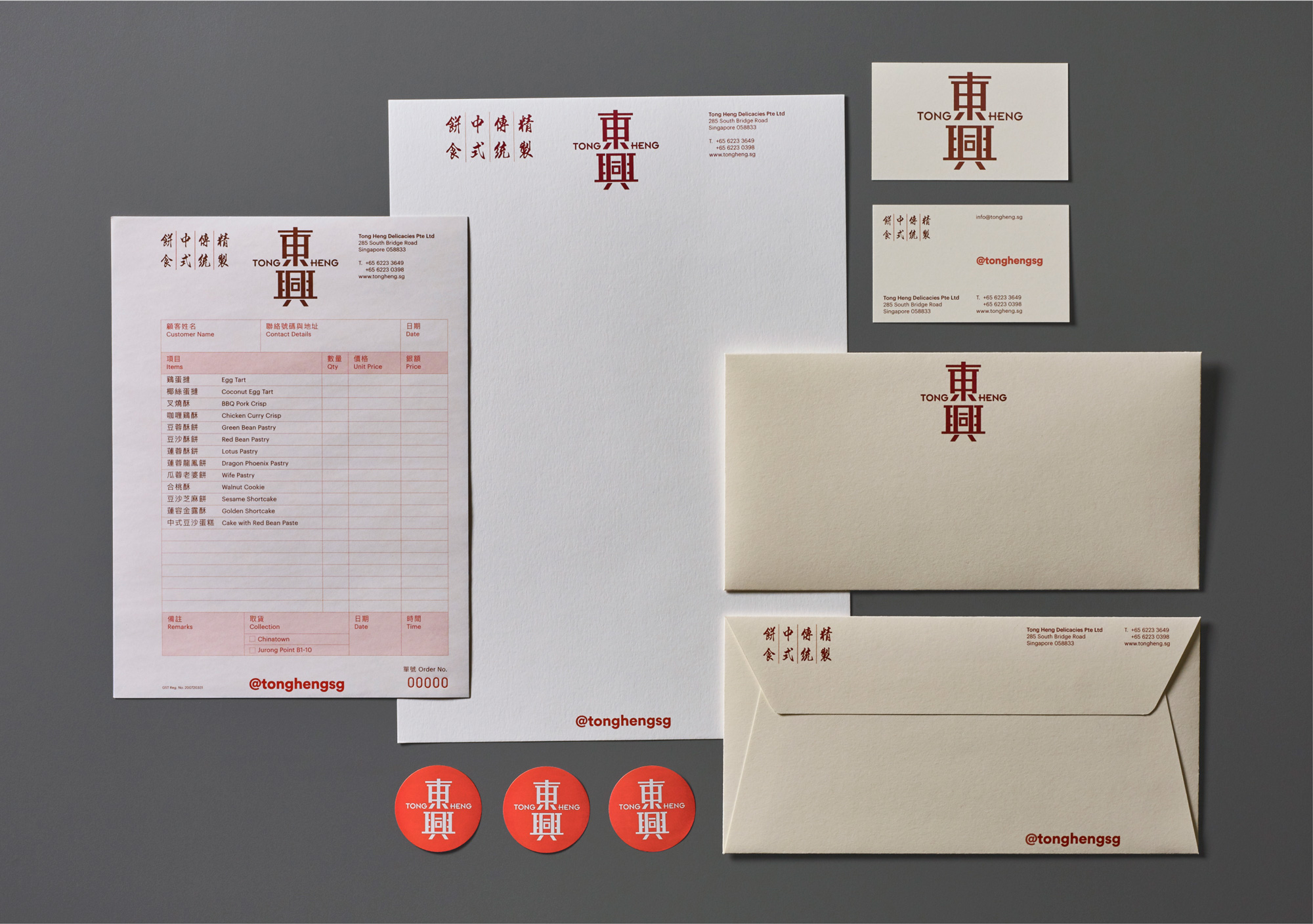
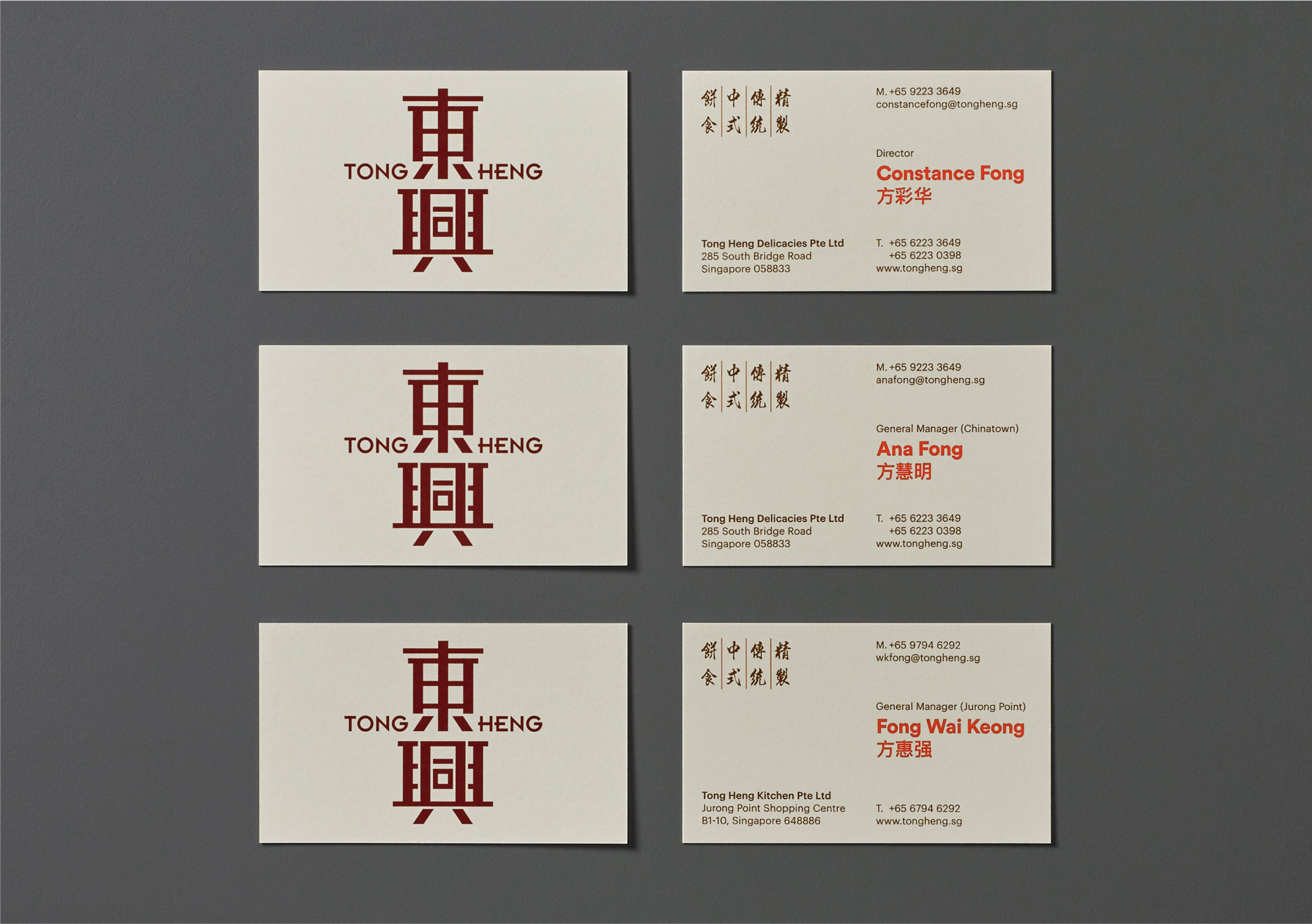
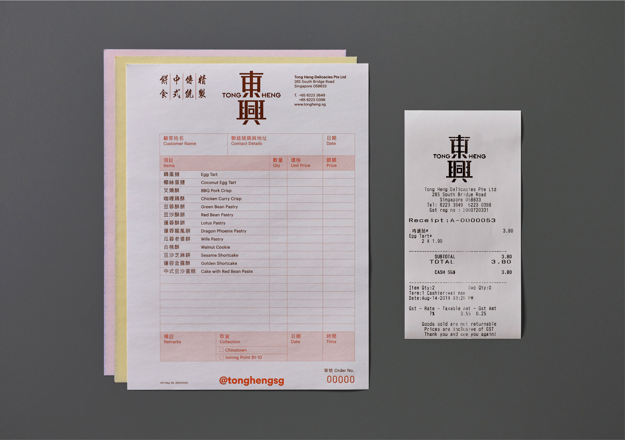
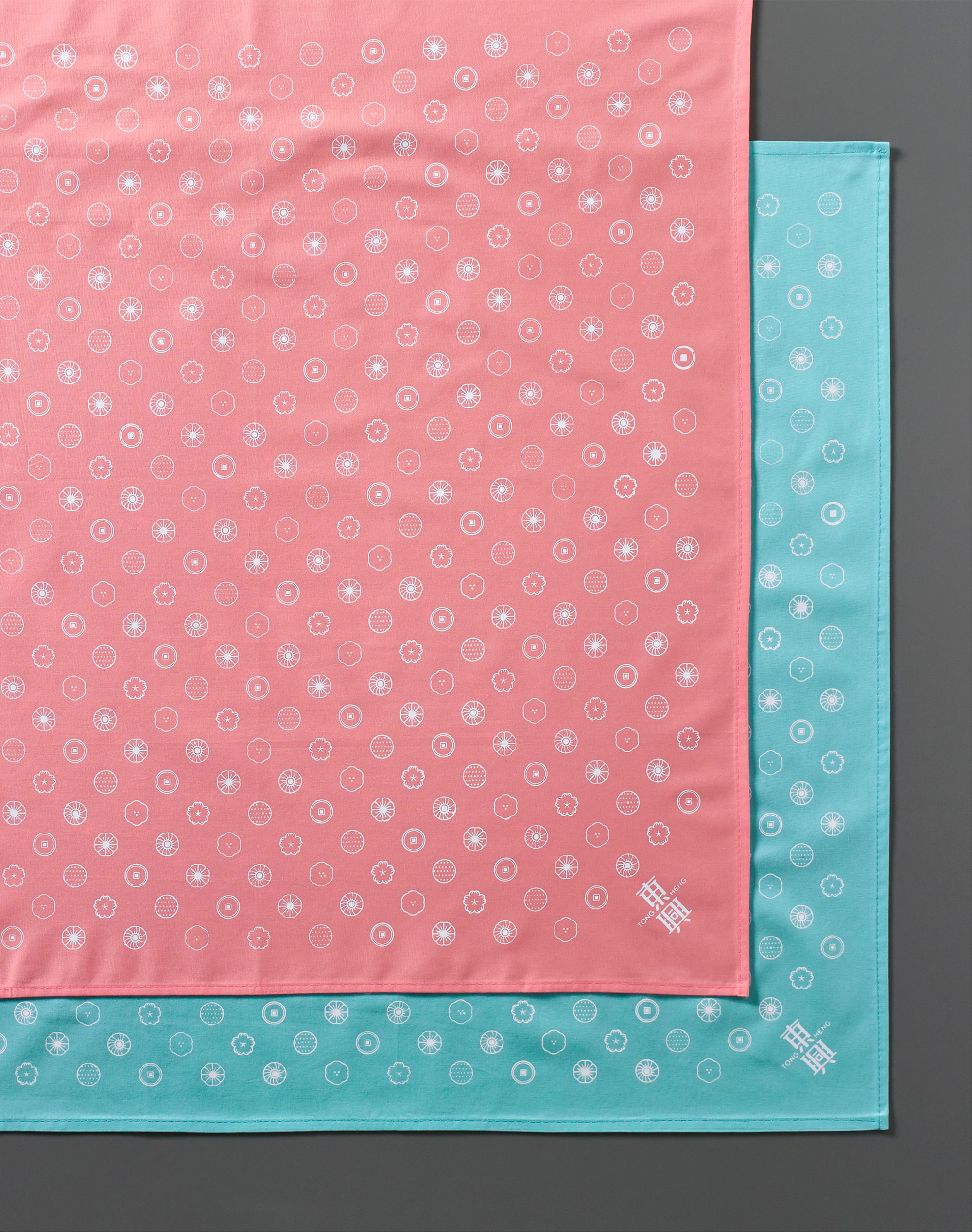
The stationery is pretty good, with a kind of old-school approach to them and the invoice looks great. Something about invoices lately that really gets me going. There are some odd instances of an oversized sans serif in orange across these materials, though, that’s kind of awkward.
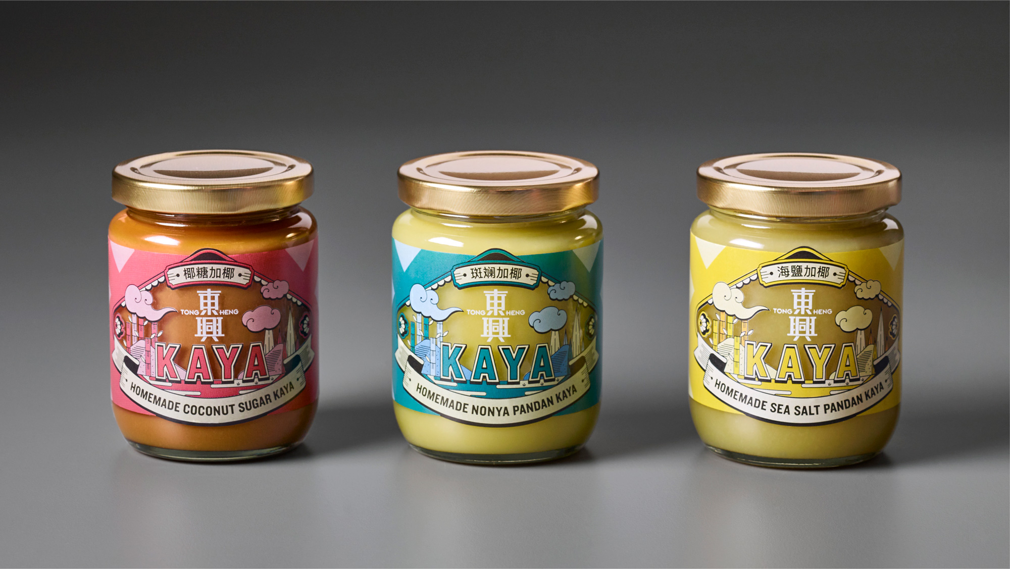
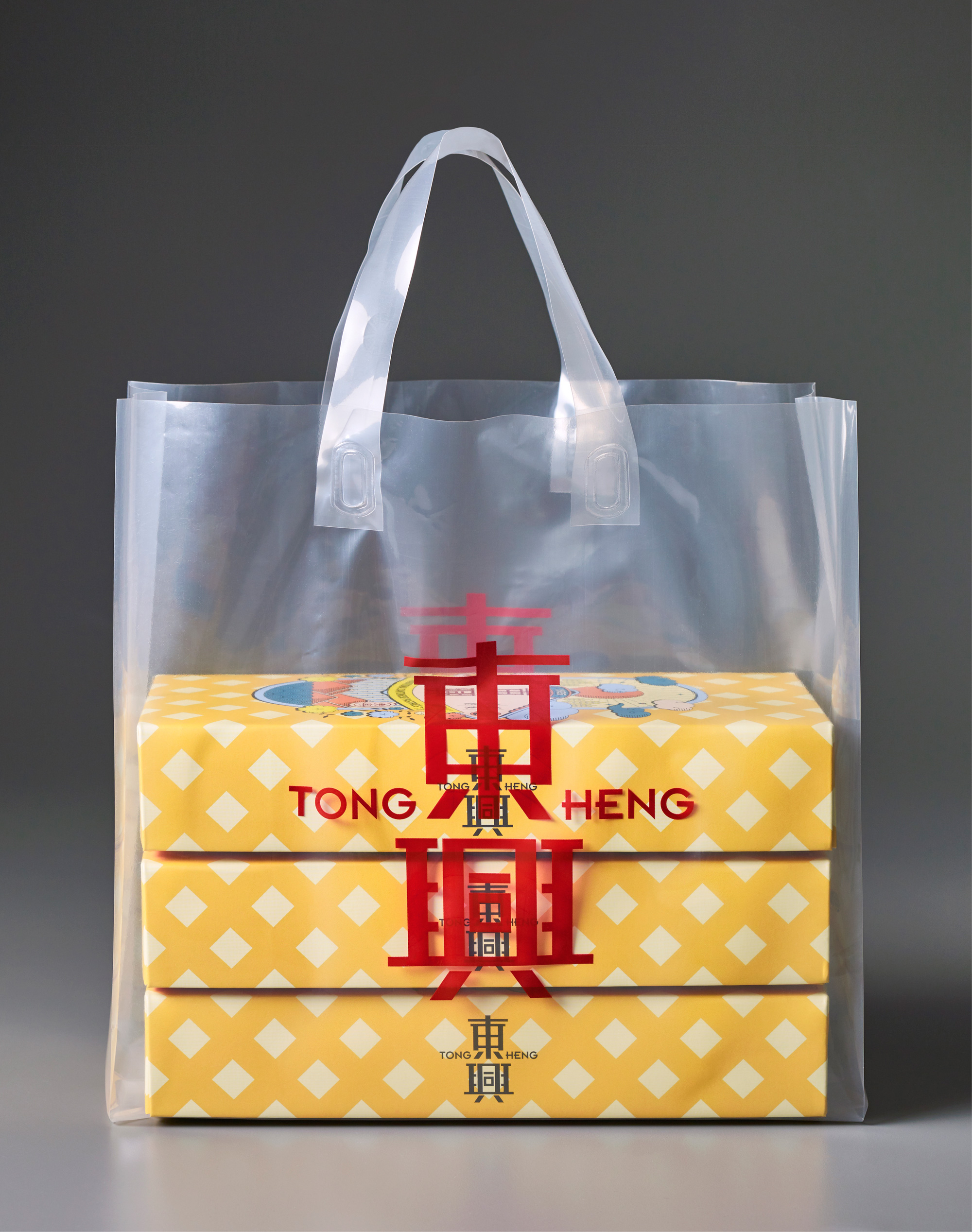
The packaging for Tong Heng is a focal point for brand engagement and differentiation. In discussing what ‘heritage’ meant to Tong Heng, when so many brands claimed some form of ‘heritage’, the answer fell back on the name and the tradition: bringing joy to people in every pastry Tong Heng makes.
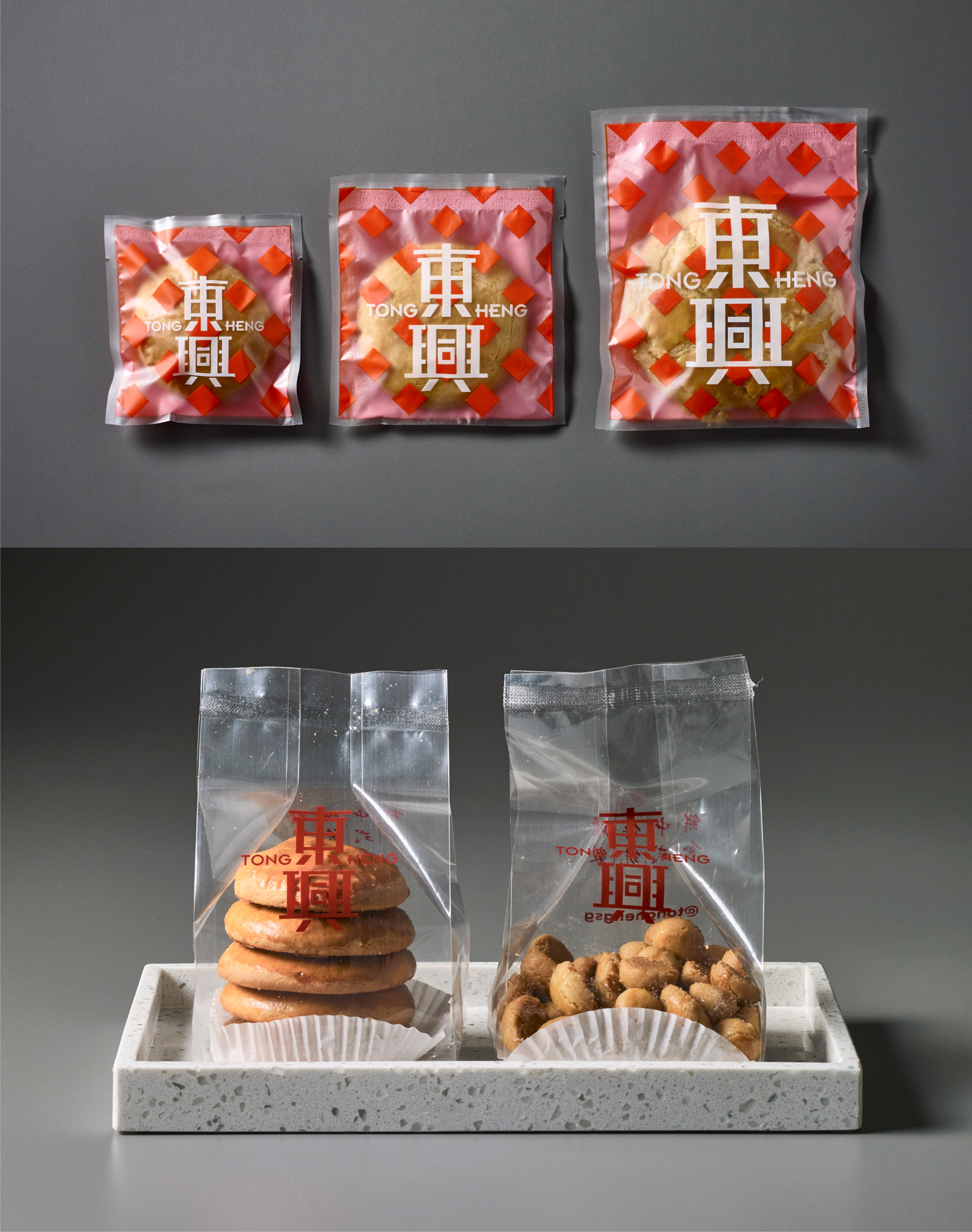
Designing with this in mind, what emerged was a vibrant portrayal of the essential elements of the brand: the diamond shape of Tong Heng’s signature egg tarts, ‘lucky clouds’ and other Chinese symbology for auspicious days, various shapes of pastries and ingredients, etc.
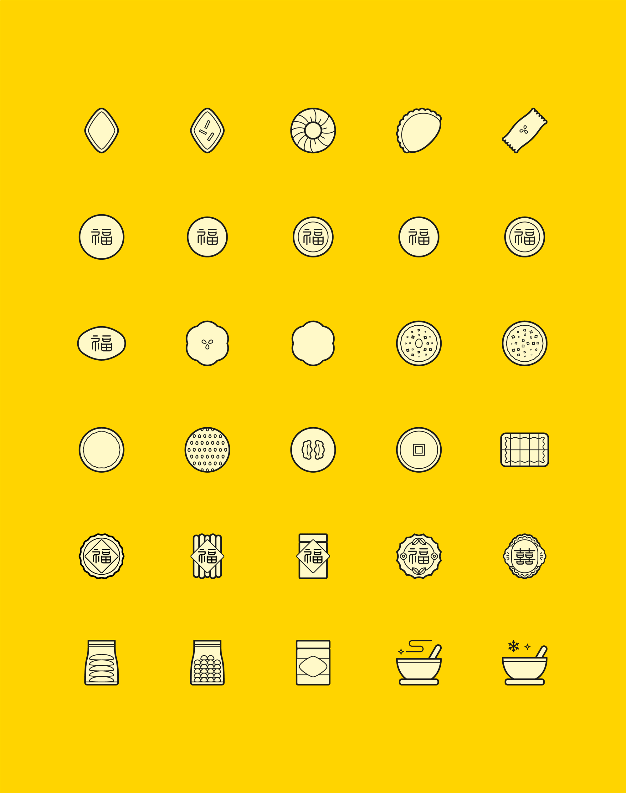
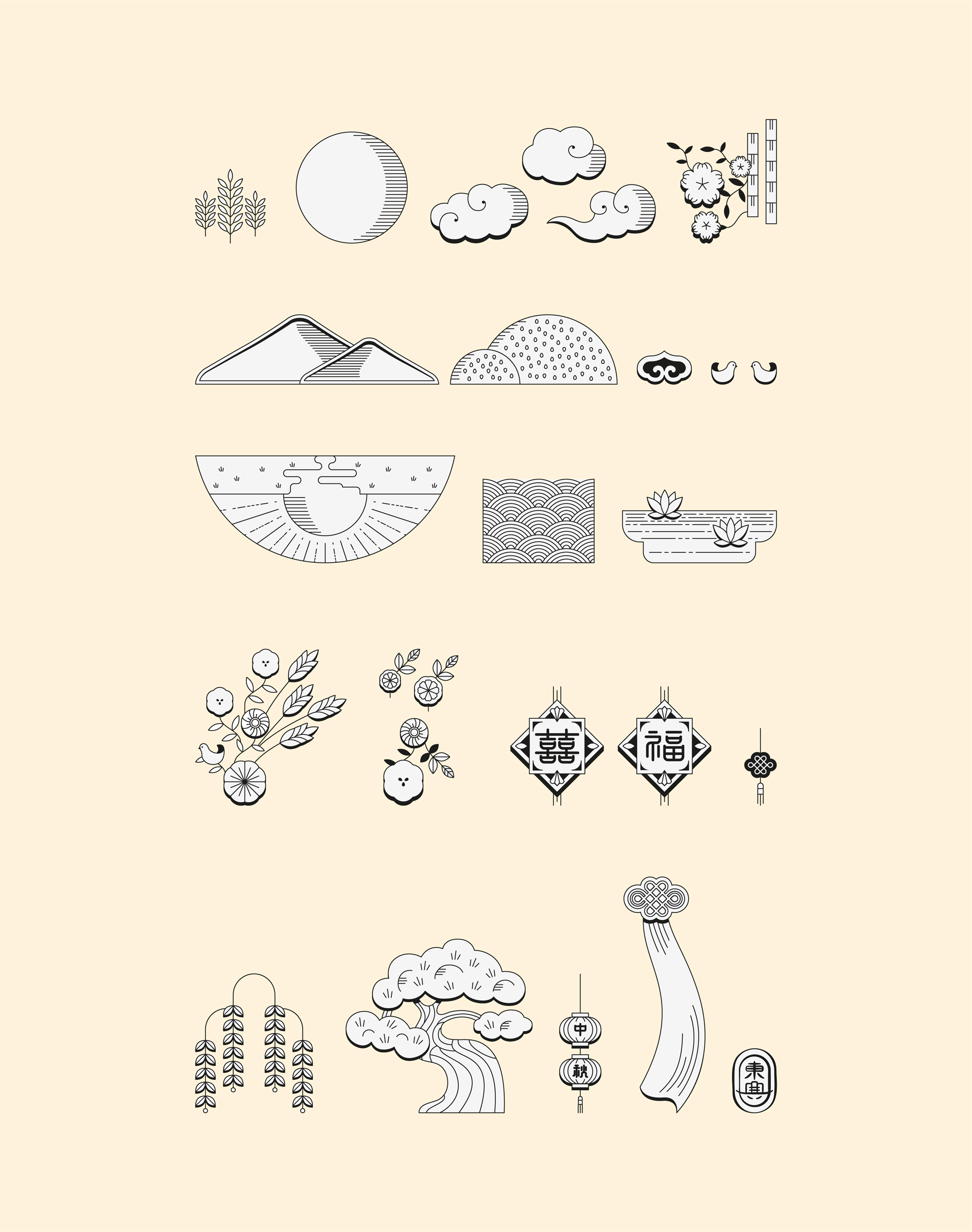
The style of the illustrations is delightful, with barely a hint of shadow that adds a great deal of depth and texture to the detailed drawings. The little birds, with the shadow on the tails are so good. This is a great way of giving the common single-thickness line drawing style a fresh approach.
The packaging design eschews the typical aesthetics of a ‘modern traditional’ brand for a decidedly young-at-heart look. The three colour variants are illustrated with rich Chinese symbology, and are designed with modular inserts to keep delicate pastries securely in place during transport.
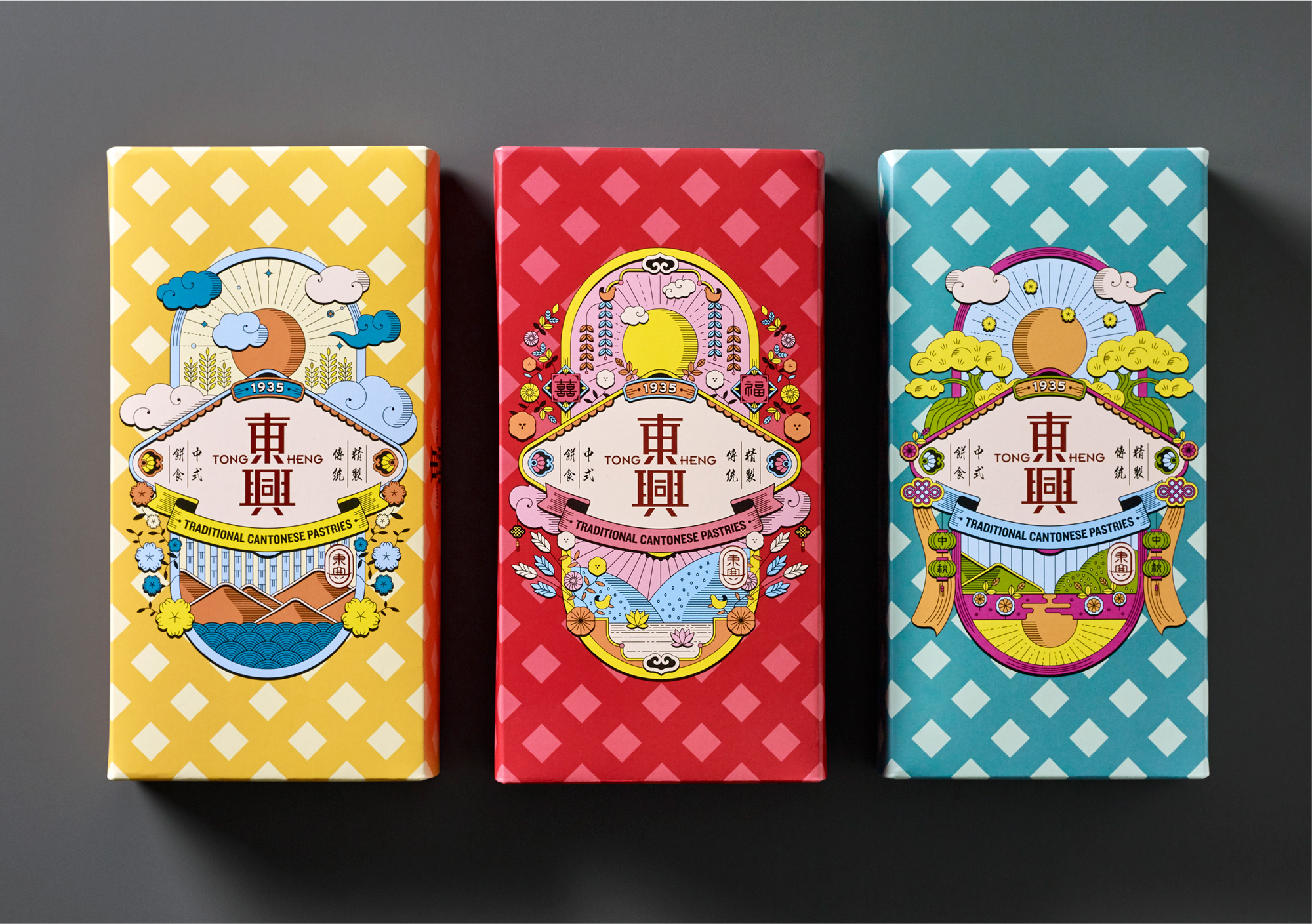
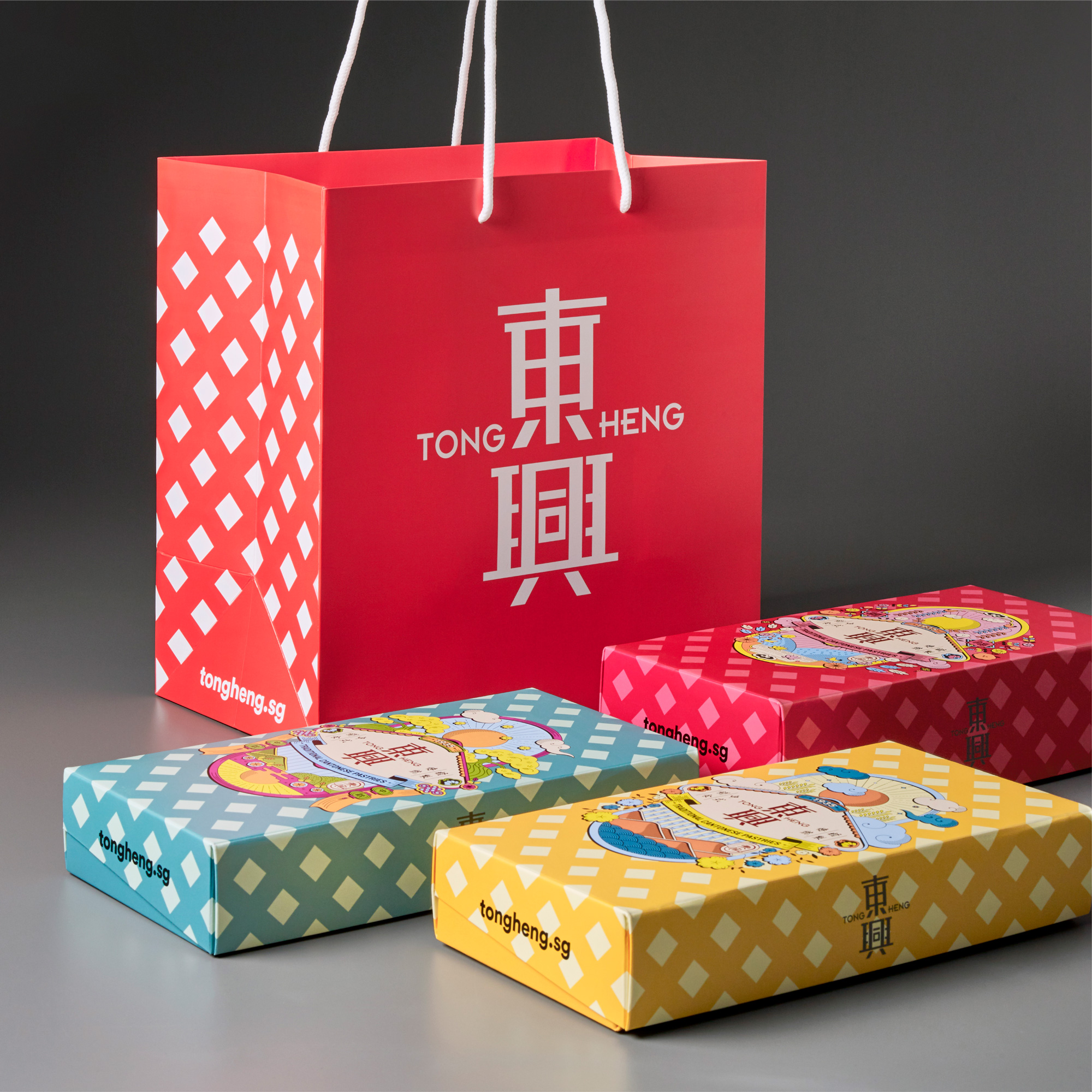
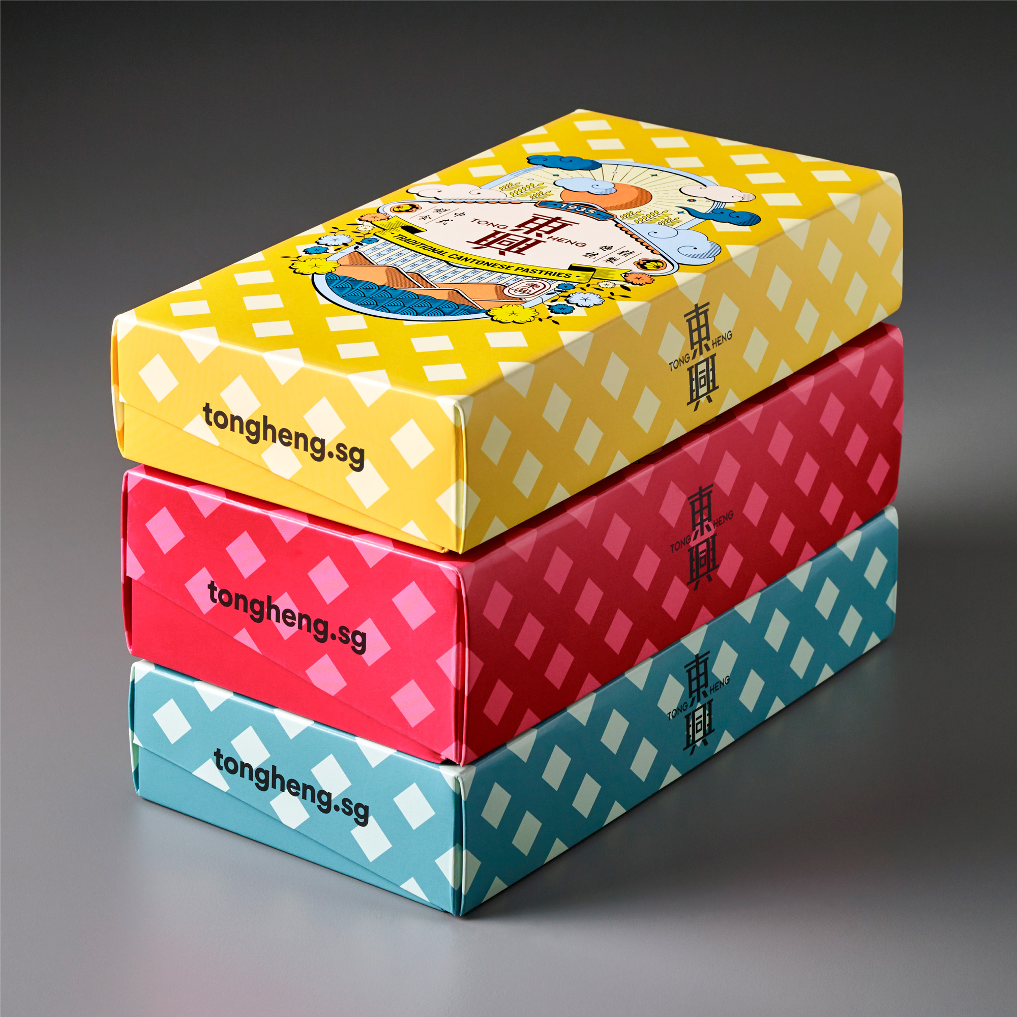
The illustrations come together in the most festive ways on the packaging in different configurations within the same compositions. The colors are neat and the integration of the logo as well as some additional elements like the date and the description of the brand looks great. I’m not a big fan of the diamond pattern backgrounds… would have loved to see the flat colors on their own or perhaps less of a contrast with the patterns.
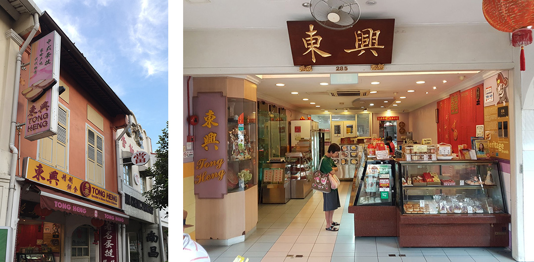
For main store in Chinatown, &Larry worked closely with Nomura Design on the customer journey experience and also to ensure that the staff have ample room to work in. Special care was given to the materiality to enhance the sense of place and time, as as to modernising the product displays for the Instagram generation. These principles were also executed for the smaller satellite store in Jurong Point.
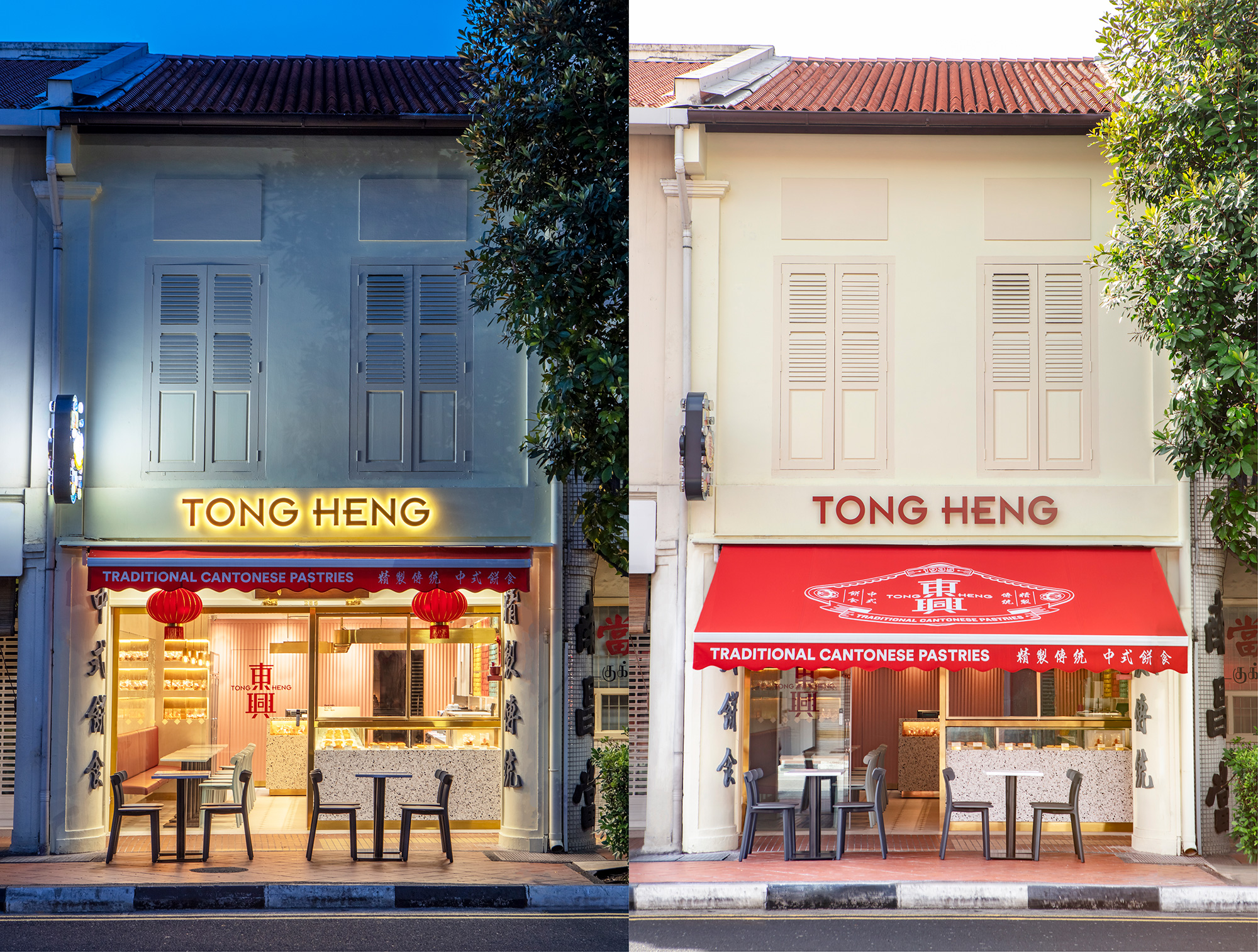
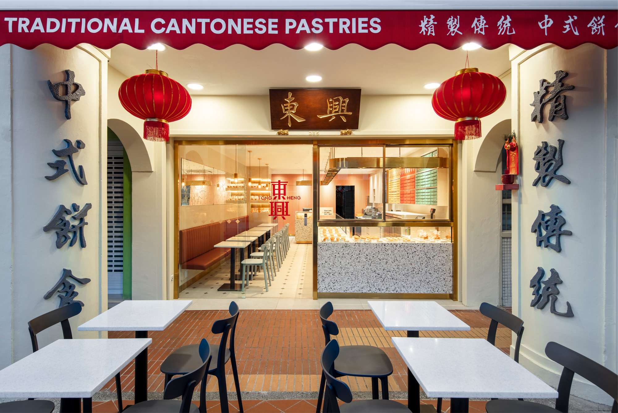
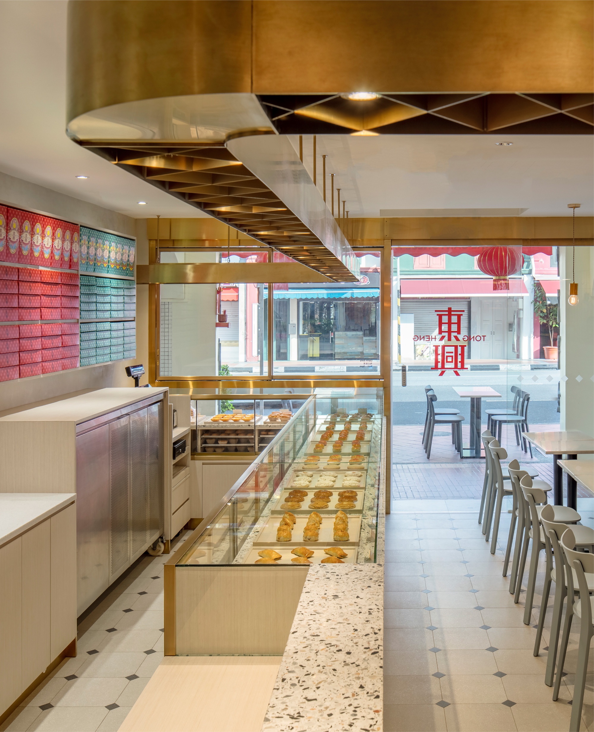
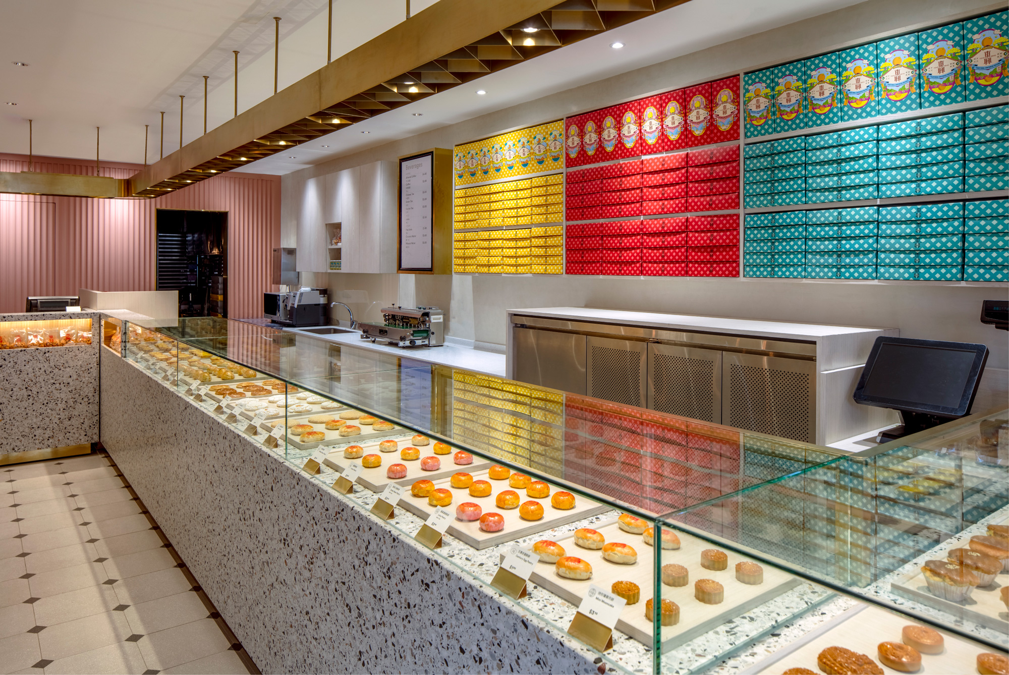
The new store looks fantastic. As a tourist I would not hesitate a second to step into that store and as a recurring customer I’m sure anyone would appreciate the improvement over the old store. I love how the wall behind the display case is filled with the packaging — it actually makes the diamond pattern look quite nice, so what do I know?
Overall, save for a few design details here and there, this is a great evolution that modernizes a 110-year-old business that maintains a feeling of tradition while making the product look even more delectable and covetable.
 each year since publication began in 2006

 Новости Союза дизайнеров
Все о дизайне в Санкт-Петербурге.
Новости Союза дизайнеров
Все о дизайне в Санкт-Петербурге.