Обзор лучших ресурсов по разработке бренда, разработке упаковки
contact us | ok@ohmycode.ru
contact us | ok@ohmycode.ru
Established in 2014, The Flower Collective is a wholesale plant nursery dedicated to “crafting naturally potent cannabis products through traditional growing, harvesting and extraction techniques.” Located in Nederland, CO, a tiny town (population 1,500+) near the Rockies, at an elevation of 8,228 feet, the operation benefits from the high altitude, which reduces their water intake, which in turn comes from snowmelt in the Indian Peaks Wilderness, minimizing their impact on the environment. In their 5,000-square-foot facility with 16 employees, The Flower Collective specializes in bubble hash — a cannabis concentrate made using ice water — and offers concentrates as well as joints and blunts. After spending some time as a medical cannabis provider, The Flower Collective is now a licensed recreational cannabis supplier and has introduced a new identity and packaging designed by Boulder, CO-based Cast Iron Design.
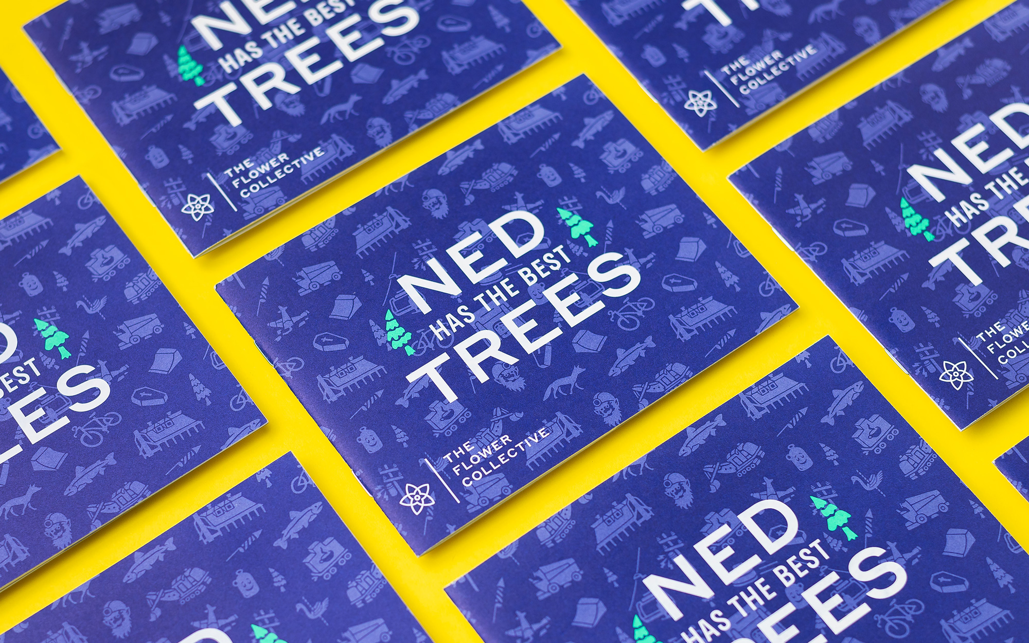
The goal of the brand identity was to create an aesthetic that could quickly grab the attention of timid tourists while also establishing a rich personality for loyal locals. The color system of near-neon accents over deep cobalt was inspired, in part, by ’60s blacklight posters, giving the packaging an aesthetic influenced by cannabis culture without falling into the same color palettes and visual tropes common with competitors. The bold typography system, custom icons, and creative copywriting help express The Flower Collective’s unique location, product qualities, and sense of humor.
The logo features a nice abstract rendition of a flower in a tightly executed, not-thin, not-thick stroke style that pairs with the wordmark of equal thickness. Not much else to rhapsodize about the logo — it’s solid. And things only get more interesting from here…
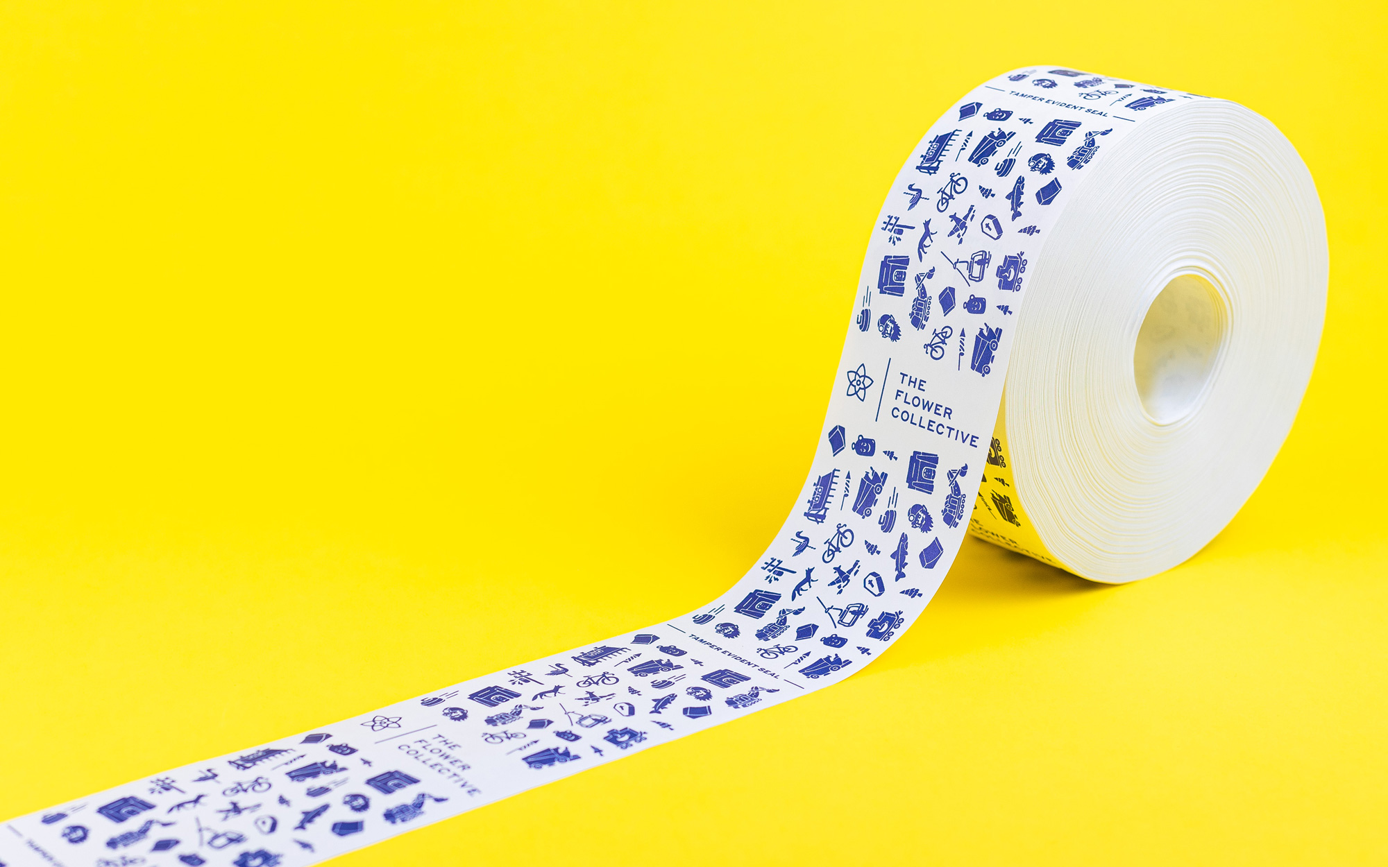
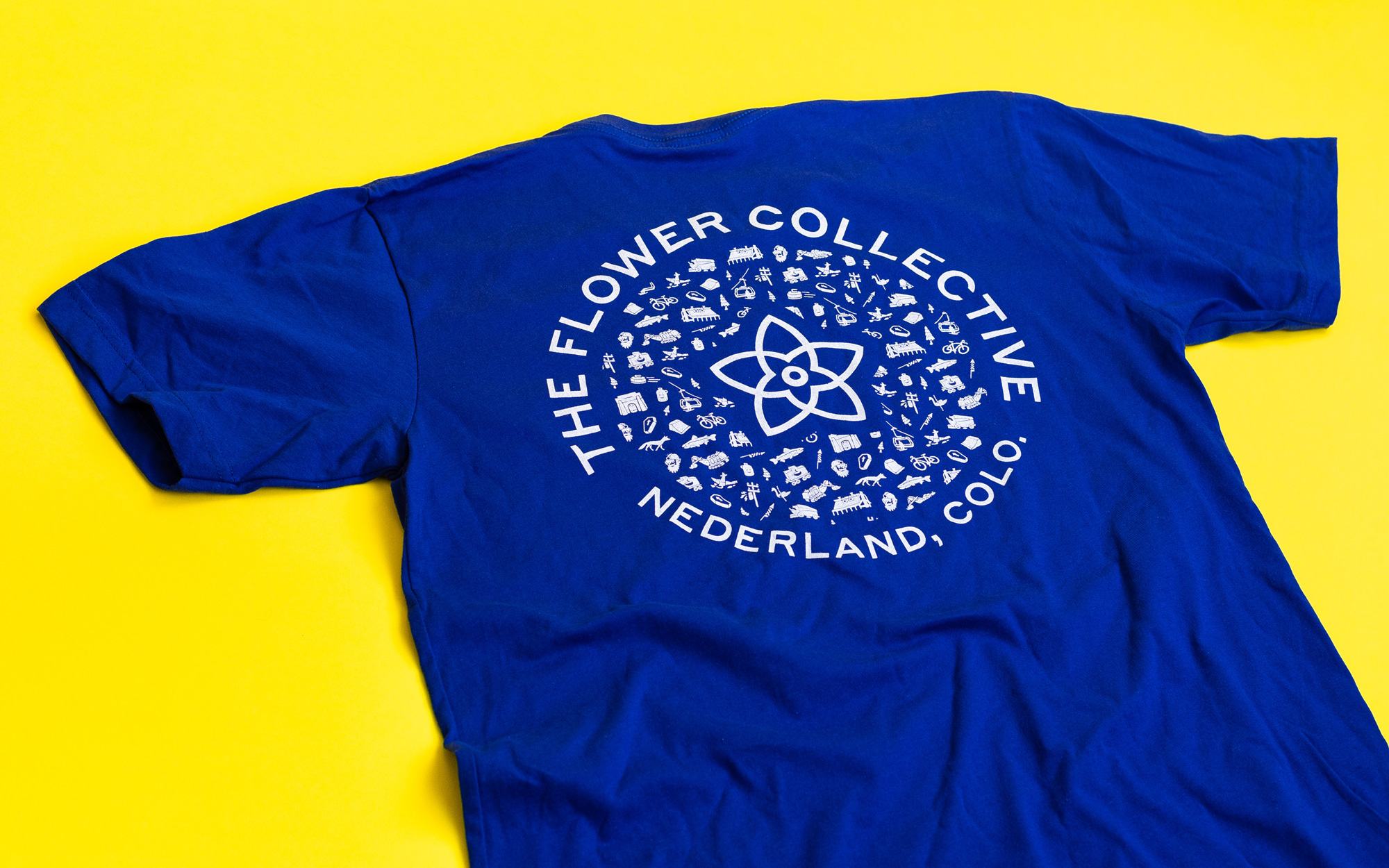
The Flower Collective’s facilities are located in Nederland, Colorado. Ned is a town of only 1,500 residents nestled in the Rocky Mountains against a large reservoir. It’s known for having a distinct culture and an abundance of character packed into a small area. We played off of their “Ned cred” by creating an icon set where each icon represents a landmark or characteristic of Nederland.
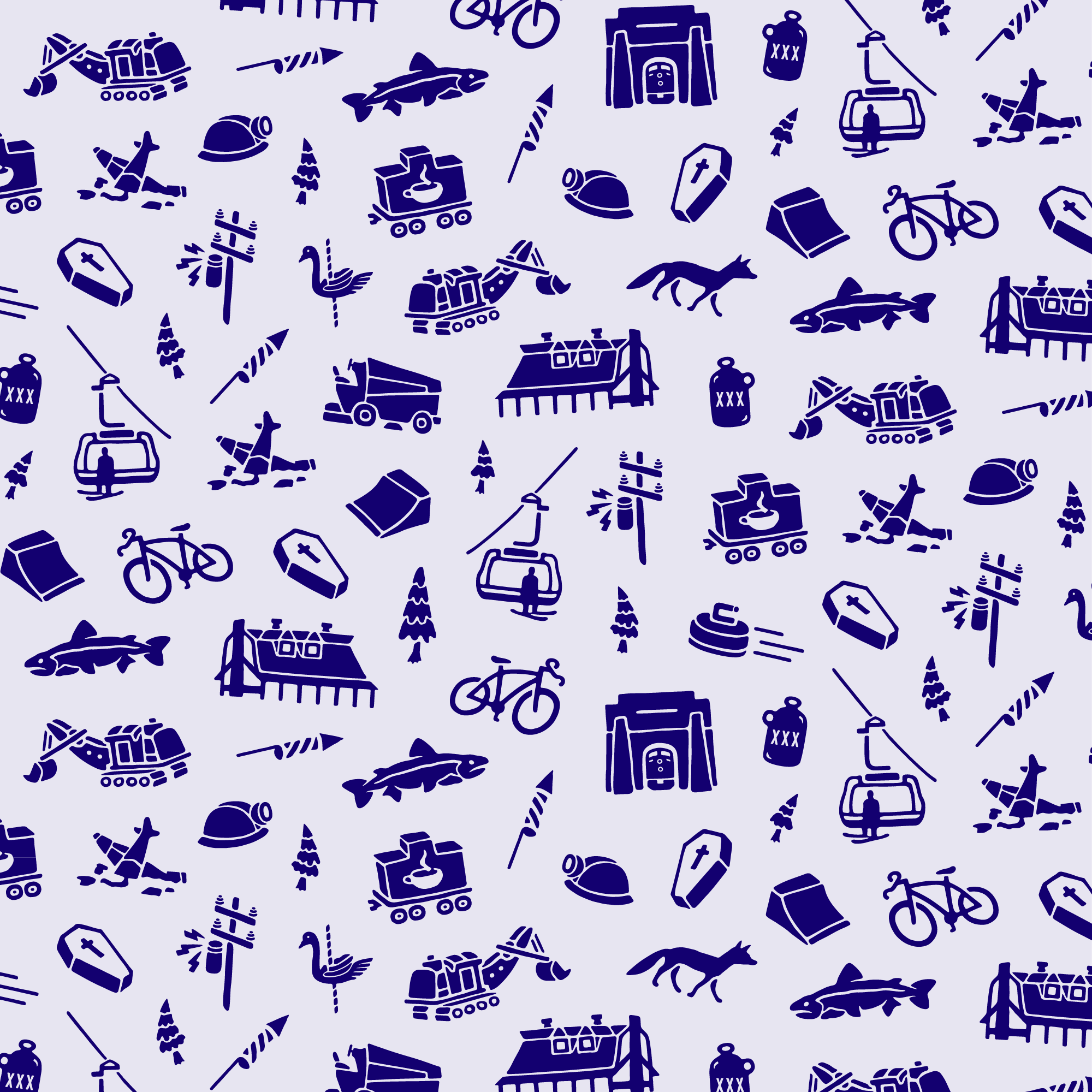
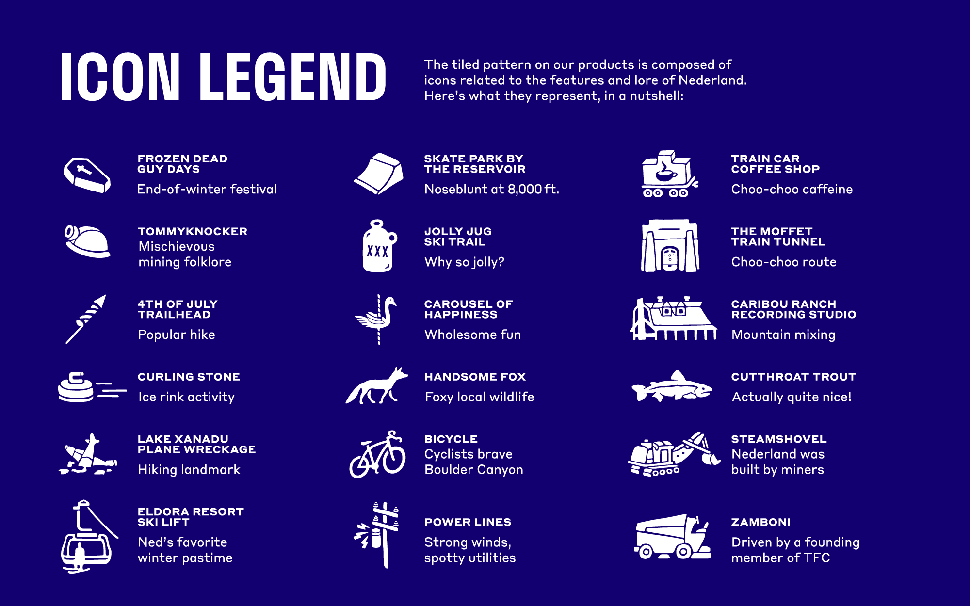
For a town of so few people, Nederland sure is weird. Among other quirks, they celebrate, since 2002, Frozen Dead Guy Days, which honors the frozen body of a Norwegian man that resides in the town. It’s a long story. Point being, the uniqueness of the town is charmingly captured in the brand pattern that features all kind of local references. Its wobbly hand-drawn style provides a fun contrast to the crisp logo and a backdrop for all of the packaging.
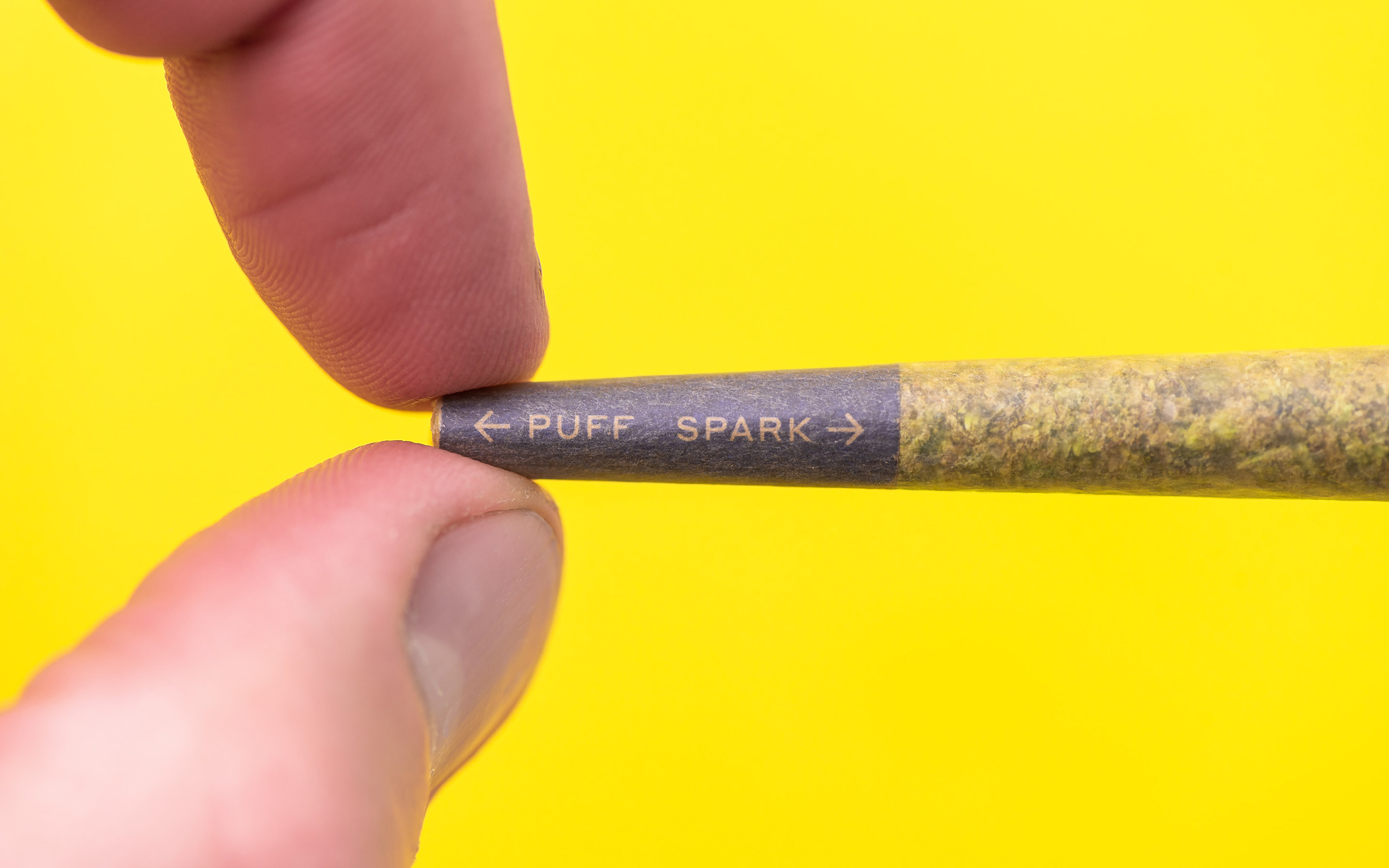
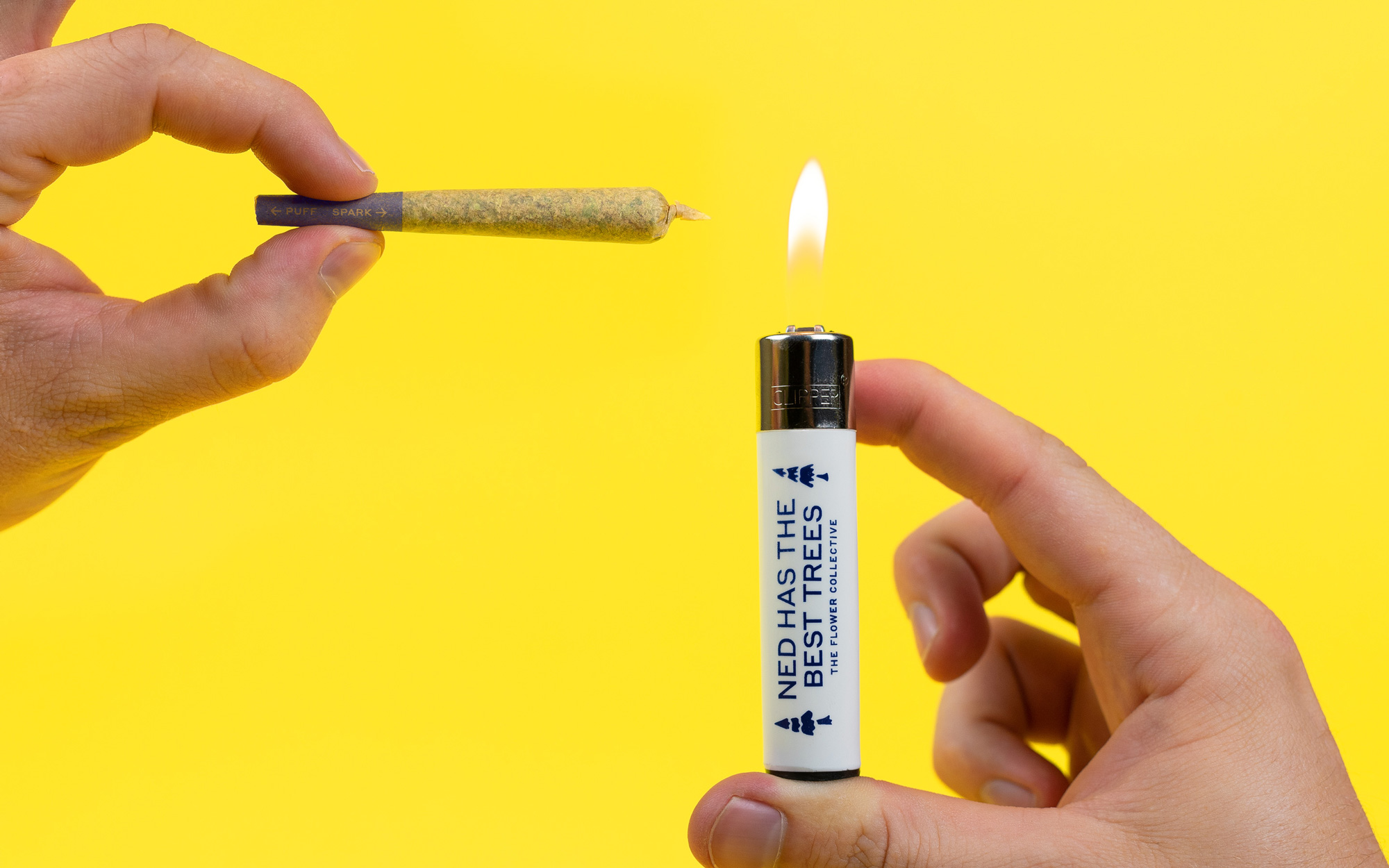
Creative copywriting was a point of emphasis, injected into nearly every touchpoint. The basic guidelines are to keep things short, avoid negativity, and draw a little inspiration from a cannabis-induced state of mind, with the hope of inducing a smile, smirk, laugh, or eye roll.
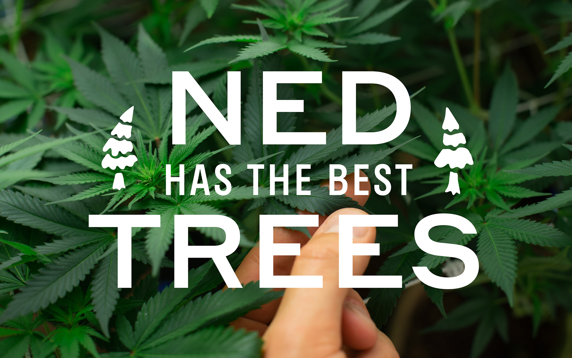
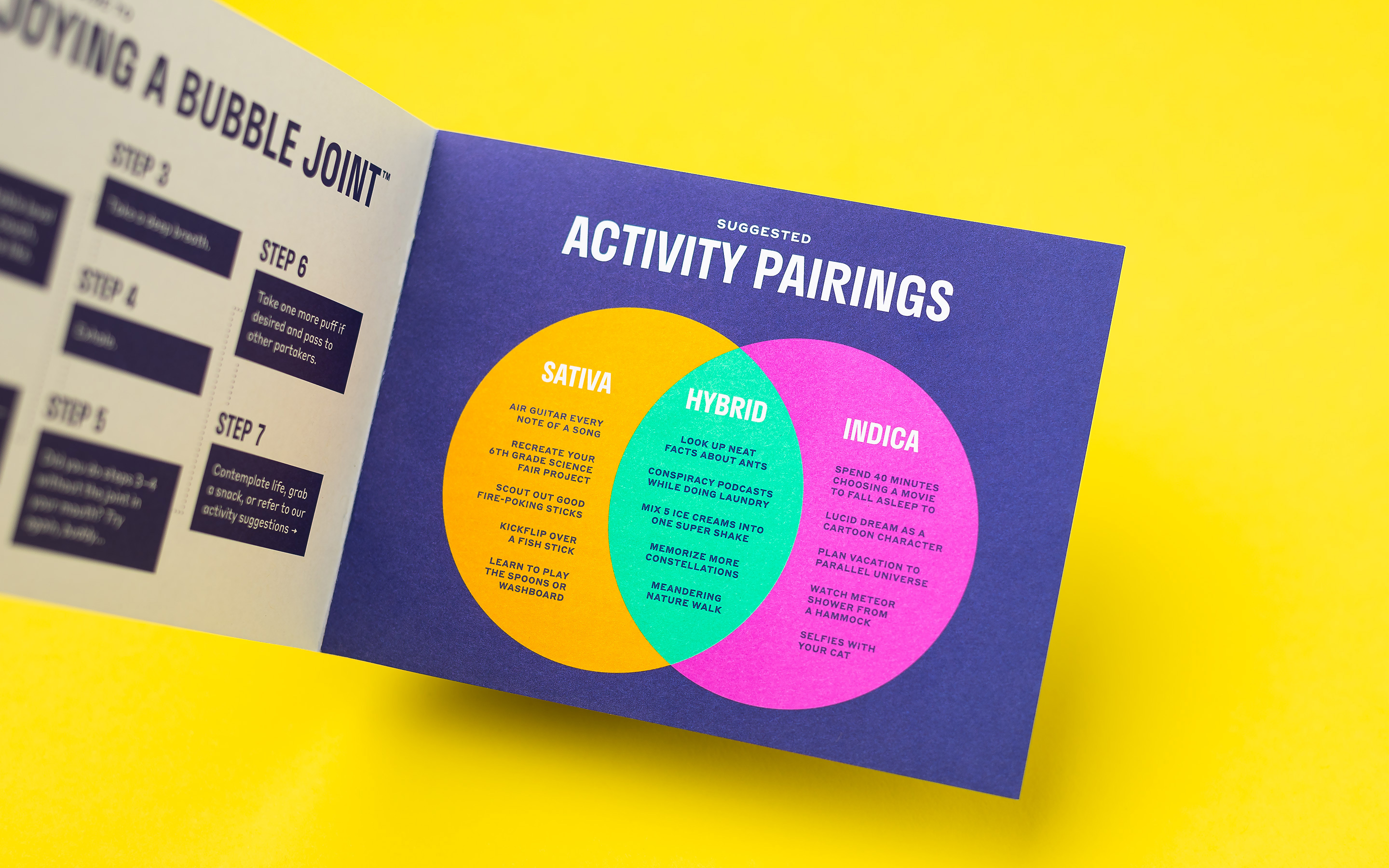
The copywriting is literally a group of stoned friends writing corporate copy and Cast Iron nailed the tone and absurdity. There are a few more examples of the writing in their project that I left out for brevity of the post but there is a lot more. The copywriting even paid off when a customer posted an example of it on Reddit, which made it to the home page and garnered more than 45,000 upvotes.
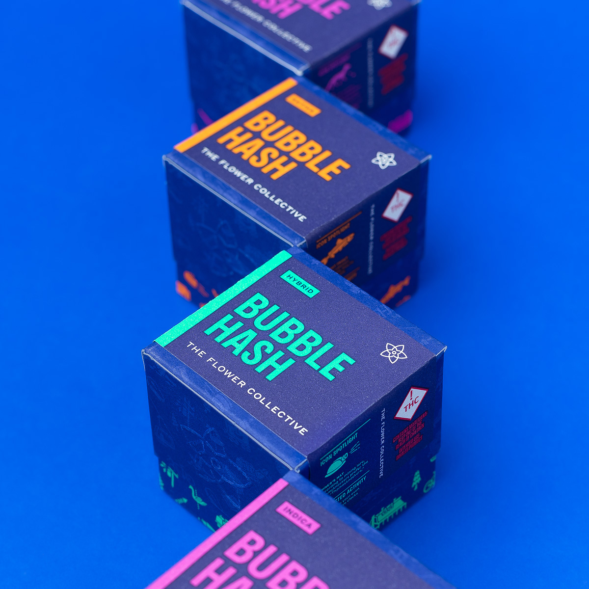
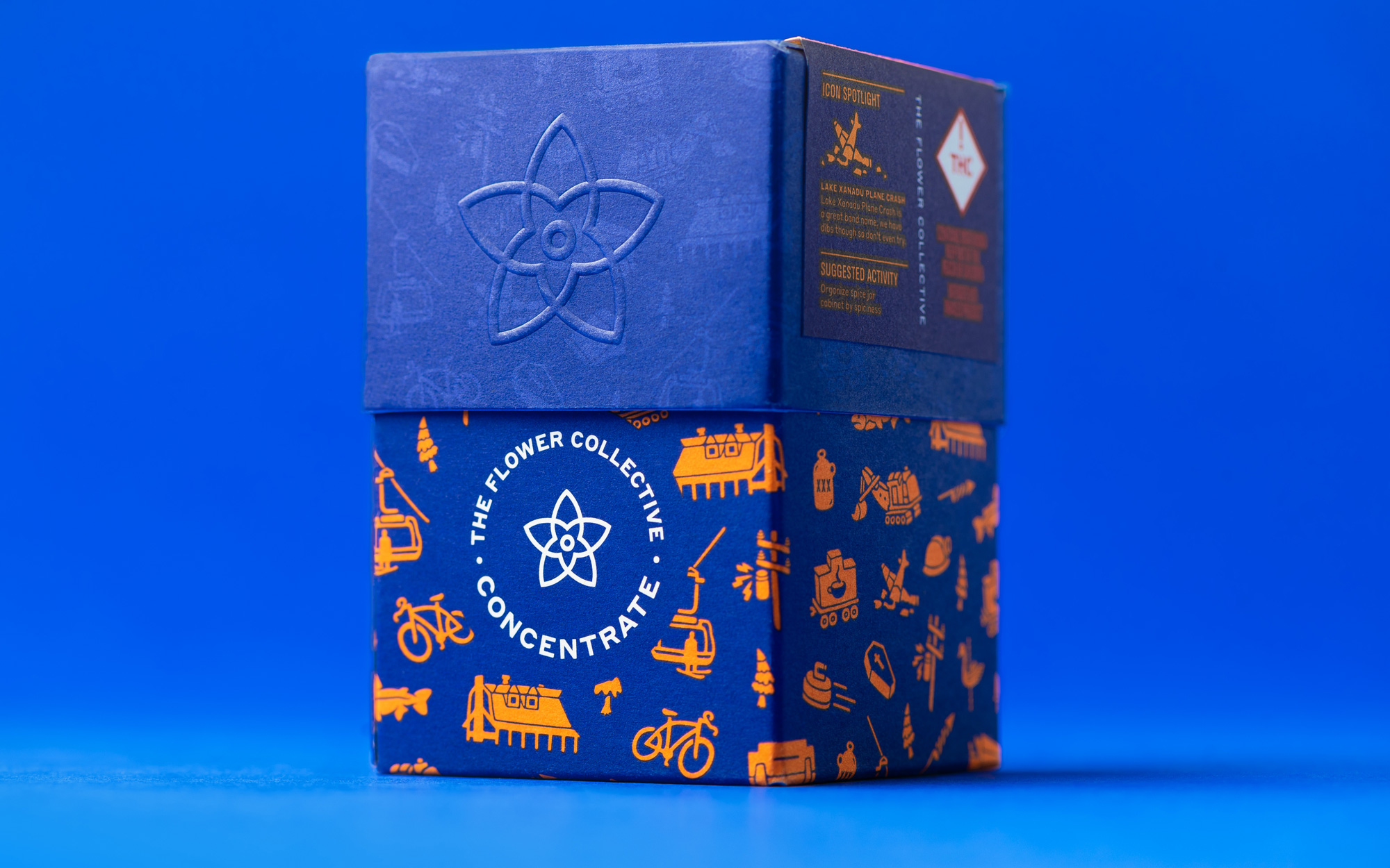
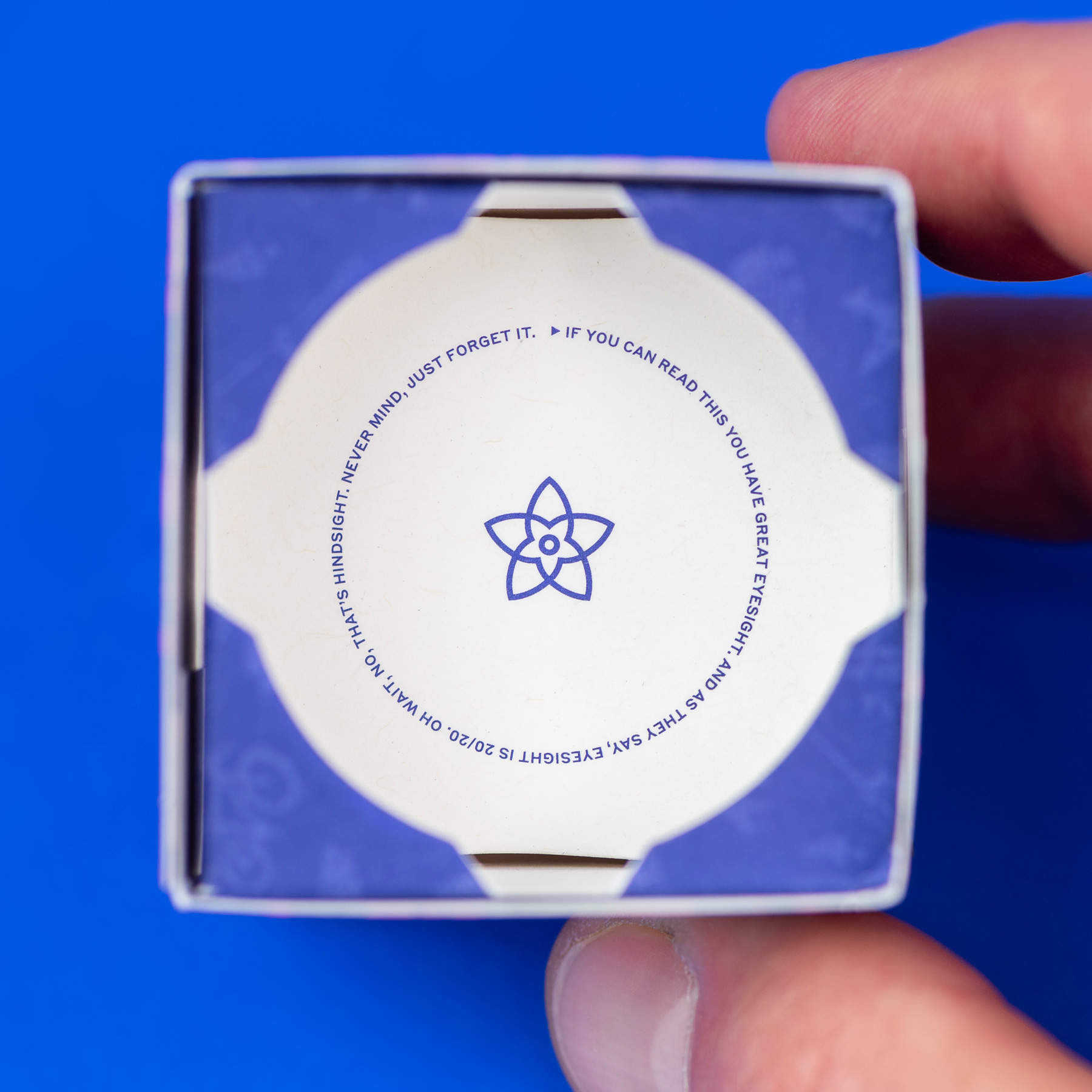
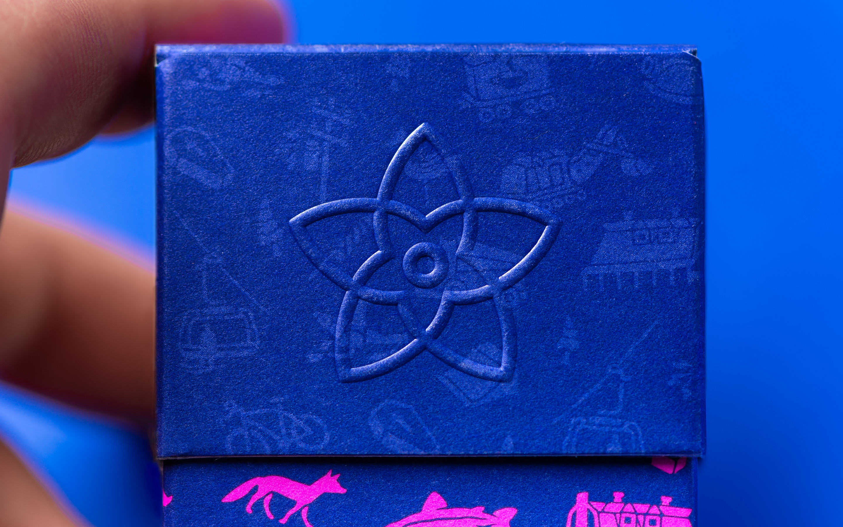
The concentrate packaging comes in a special box, as if you were getting a ring from Tiffany’s but funner. What’s kind of interesting about the box is that none of the elements really go together but, yet, they do. There is no reason the pattern should exist both in bright colors and then as tone-on-tone, there is no reason to add the extra groovy typeface, there is no reason to introduce a condensed typeface or wraparound label or embossed icon but, in the end, it packs a punch and it works.
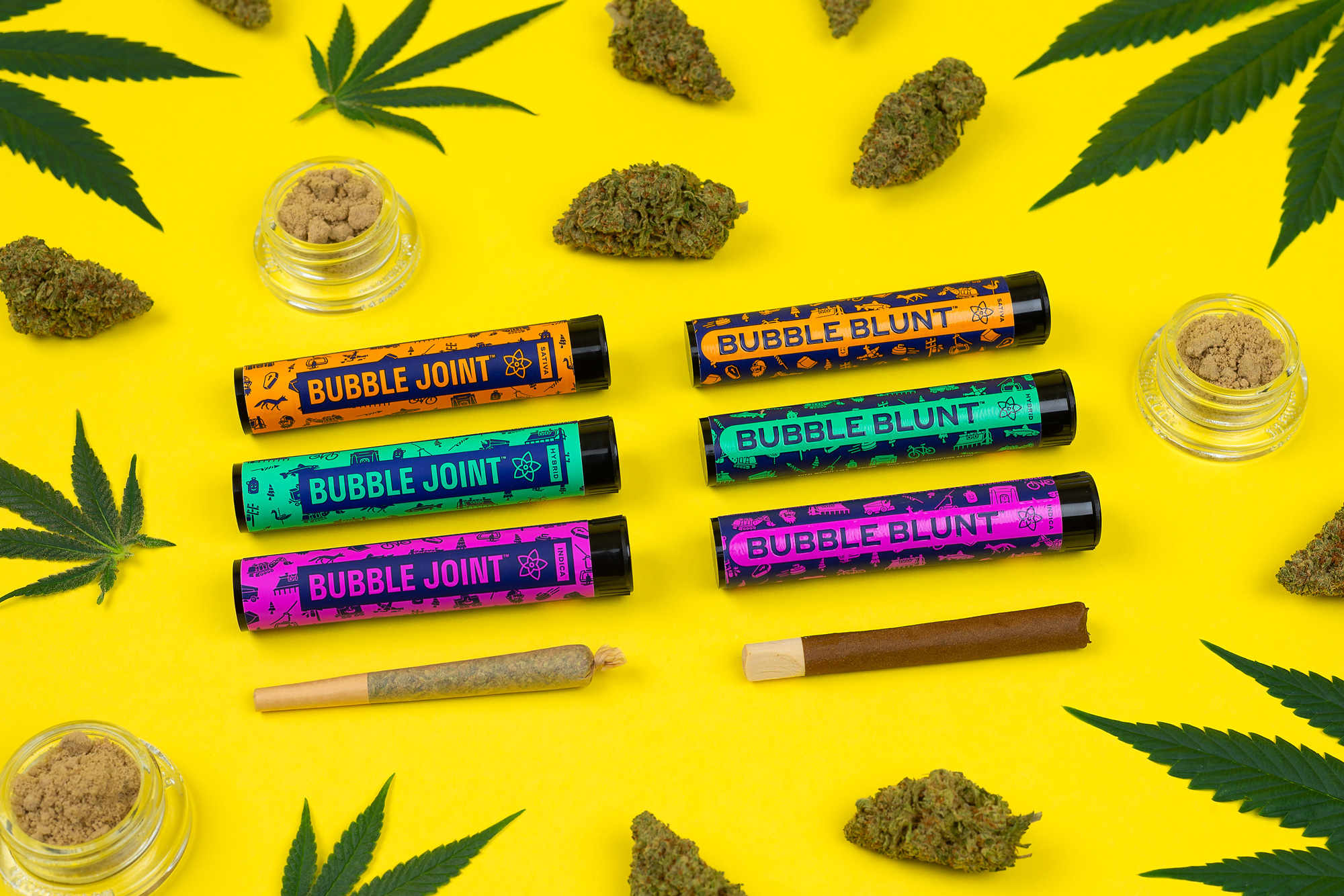
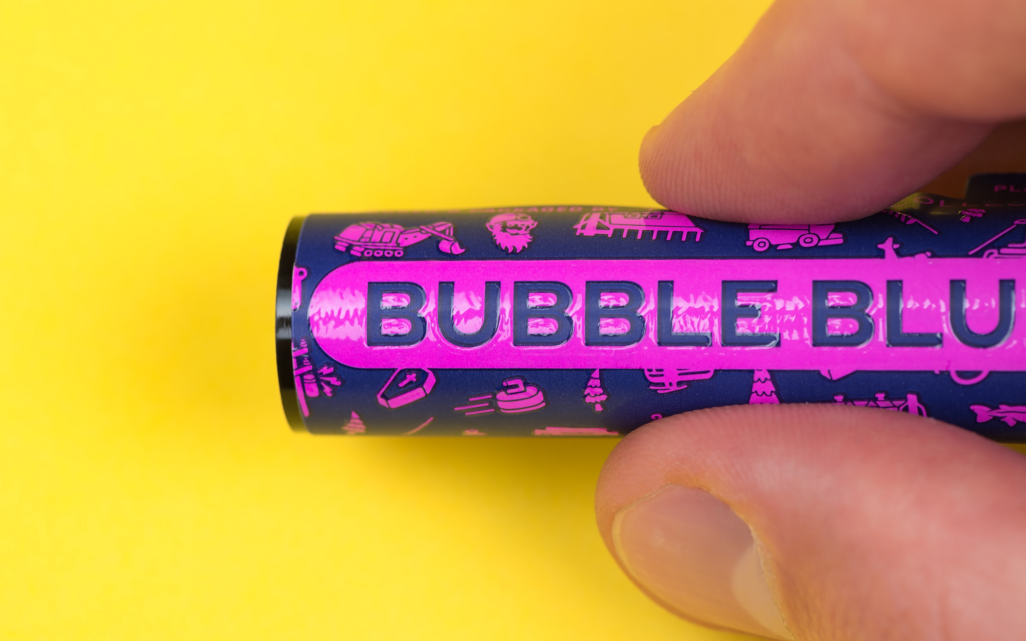
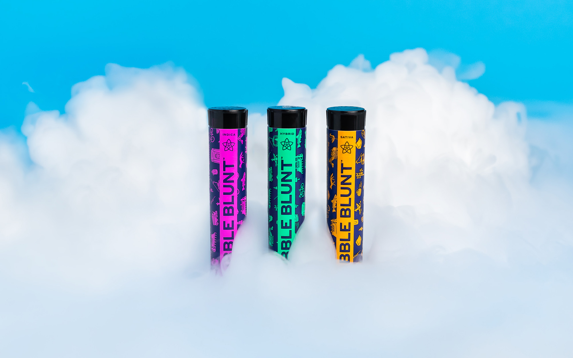
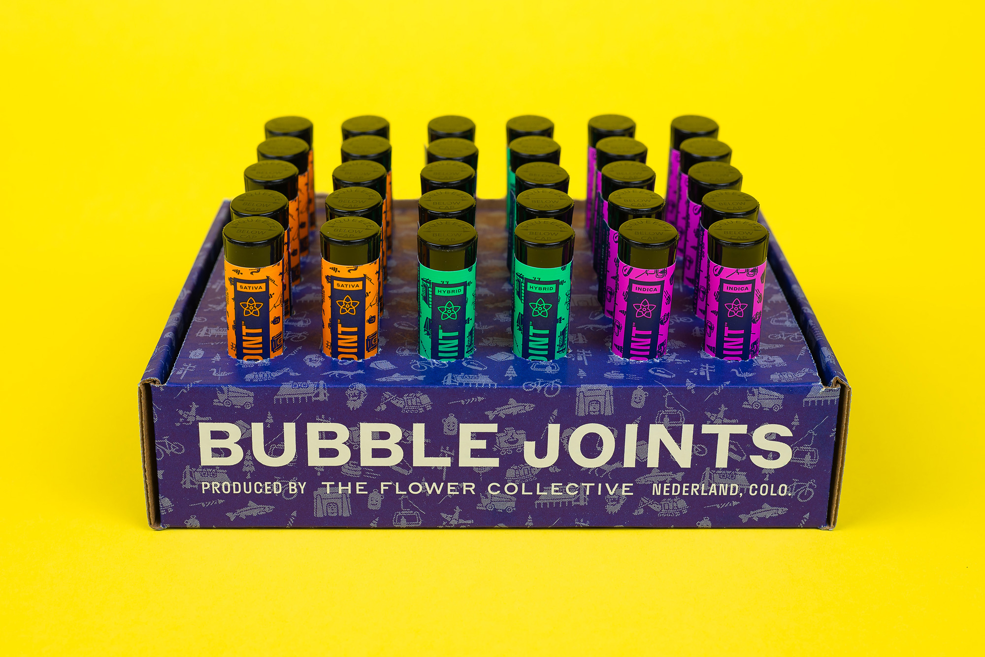
The tubes, having less real estate and more limitations of what you can do on them are more immediately successful than the boxes, with the pattern adding a nice bit of texture and the product descriptor clear and big. The main dark blue color works nicely with the bright colors, which literally pop out of the display box.
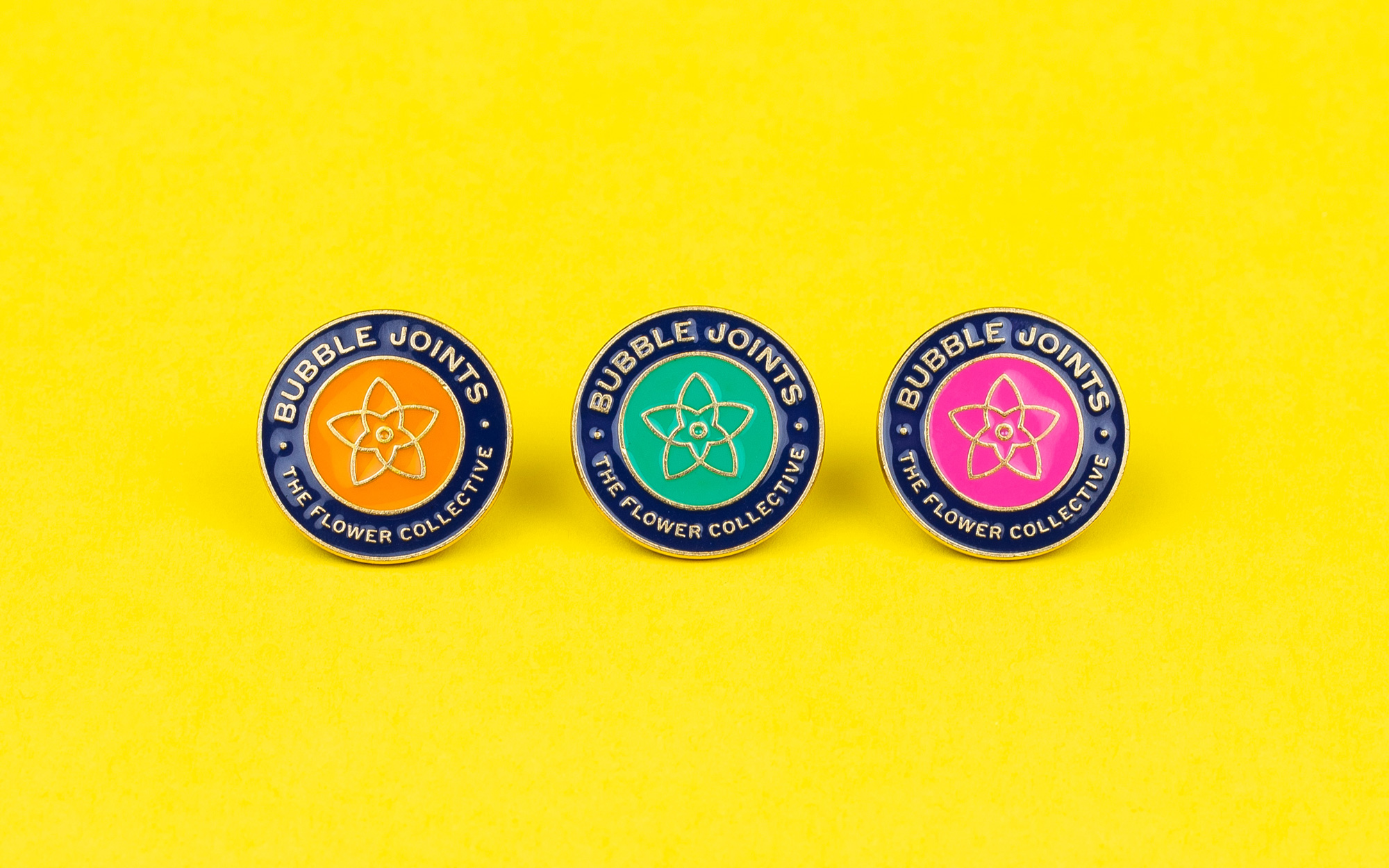
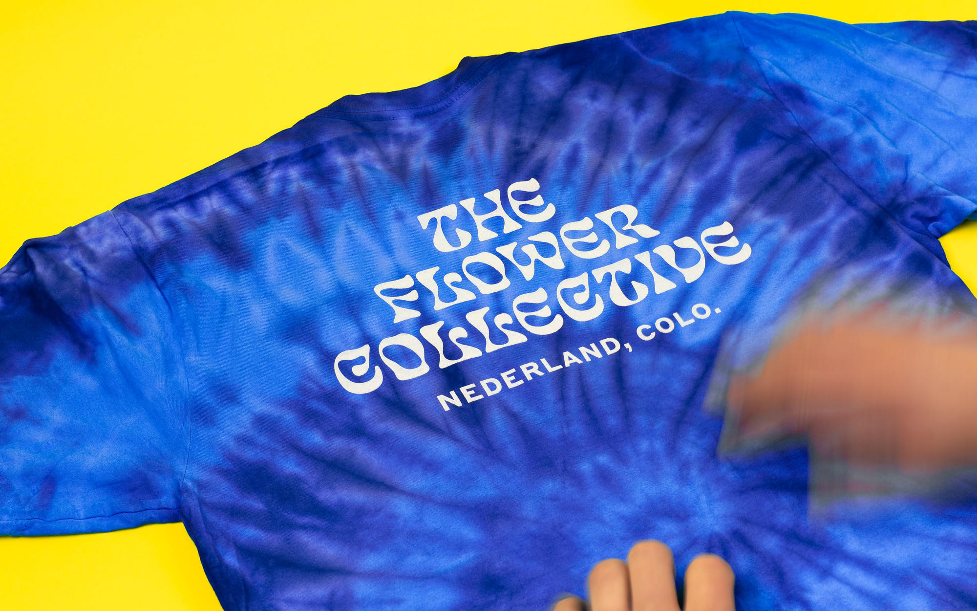
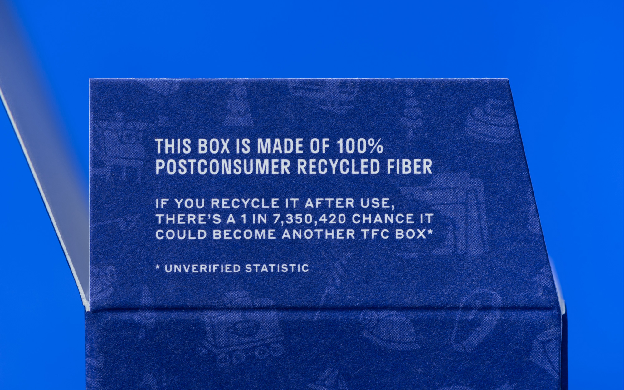
The swag and other materials are all kinds of fun and good quality. To boot, Cast Iron Design has done a great job in minimizing the carbon footprint of where the goodies come from and put together a surprisingly fun video that highlights each vendor’s environmental benefits and distance from The Flower Collective.
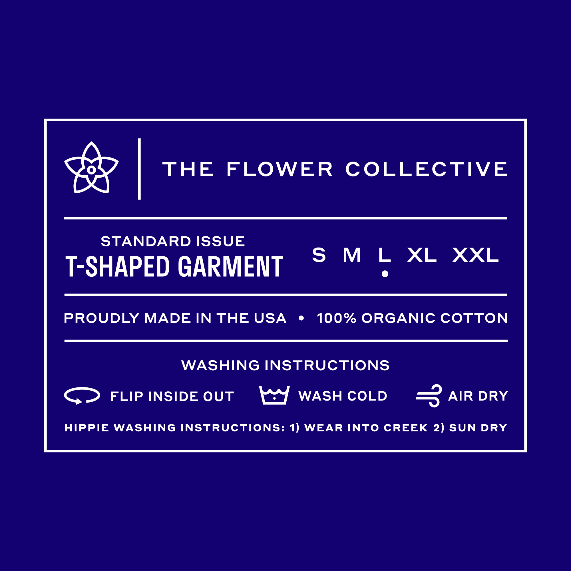
In addition to design, we’ve carefully selected materials, processes, and production partners for a multitude of print and promotional items. Special attention is paid to distance since transportation/shipping is a significant contributor to an object’s carbon footprint. Utilizing stateside vendors also helps ensure employees are paid a more reasonable wage (garment workers in developing countries are some of the lowest paid laborers in the world). It’s by no means foolproof, but sourcing as locally as possible is a key component of sustainable systems thinking. Although individually packaged products are inherently unsustainable, The Flower Collective is taking marked steps in the right direction.
Overall, this is one of those projects where you can tell everyone had fun working on it, including the client. With the rise of recreational cannabis, these brands are going in every kind of possible direction, from luxurious to douchey to lighthearted fun and with little rules and playbooks in place, it’s great to see some of these brands, like this one, run wildly in their own unexpected direction.

 Новости Союза дизайнеров
Все о дизайне в Санкт-Петербурге.
Новости Союза дизайнеров
Все о дизайне в Санкт-Петербурге.