Обзор лучших ресурсов по разработке бренда, разработке упаковки
contact us | ok@ohmycode.ru
contact us | ok@ohmycode.ru
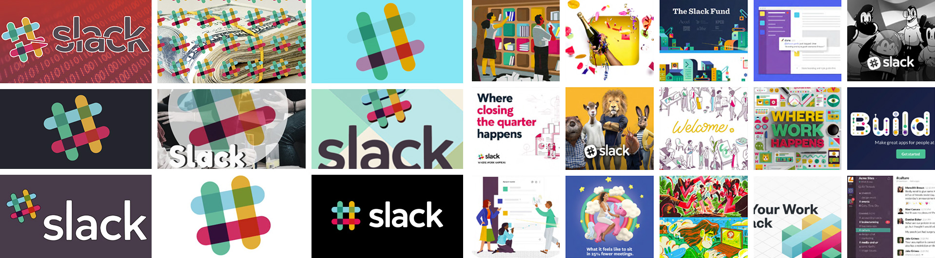
Launched in 2013, Slack is a collaboration platform that allows people to work together more efficiently by keeping conversations, files, and to-do lists in a unified ecosystem that operates across desktop and mobile. During a 70-week period between 2014 and 2015, and without any formal advertising in its early years, the user base grew by 5 percent each week and has now grown to 8 million daily active users — 70,000 of them on paid accounts (even at the lowest price point, that’s $560,000 a month in billing). Slack went from a semi-obscure application to a mainstream one used as much by designers and developers as people on the client side. For many employees across many professional roles, it’s now as important to be good at your chosen profession as it is to be good at Slack. As part of preparing the company to go public, Slack introduced yesterday a new identity designed in collaboration by their in-house team and New York, NY-based Pentagram partner Michael Bierut.
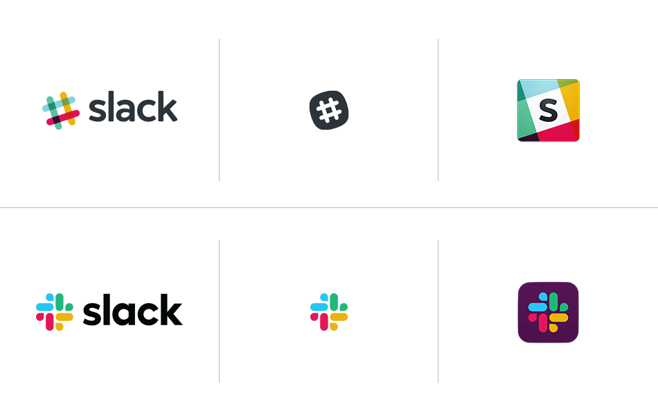
Our first logo was created before the company launched. It was distinctive, and playful, and the octothorpe (or pound sign, or hash, or whatever name by which you know it) resembled the same character that you see in front of channels in our product.
It was also extremely easy to get wrong. It was 11 different colors—and if placed on any color other than white, or at the wrong angle (instead of the precisely prescribed 18º rotation), or with the colors tweaked wrong, it looked terrible.
We developed different versions of the logo to compensate, which worked well for different purposes. But that meant that every app button looked different, and each one in turn was different from the logo.
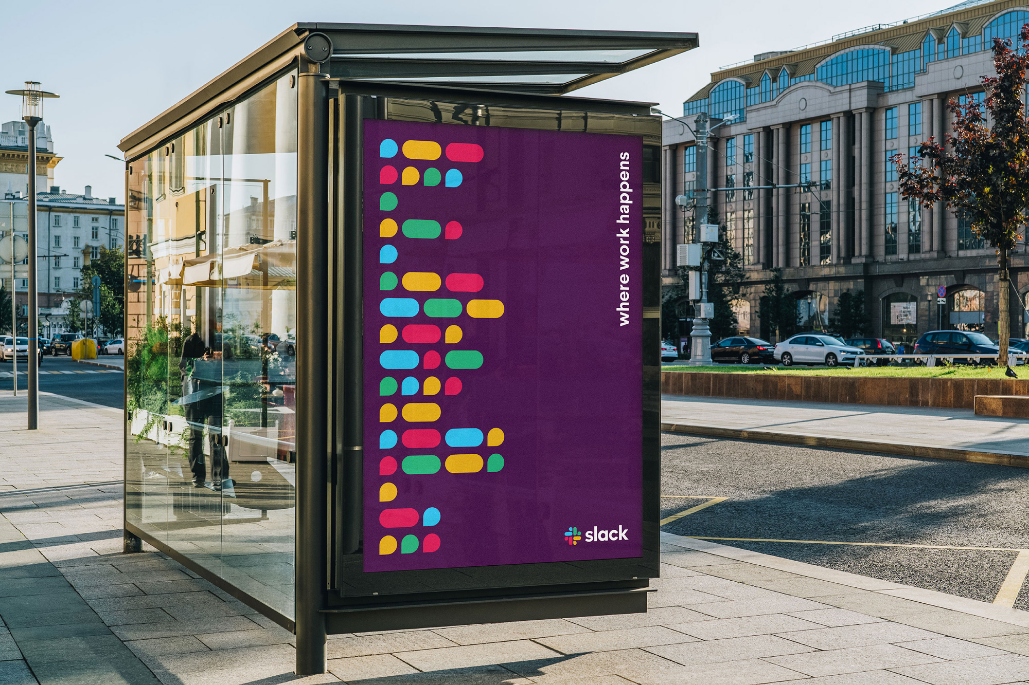
Derived from the original logo and built on a grid, the new octothorpe is comprised of two basic geometric shapes—a speech bubble and lozenge—that can be extracted and used as graphic elements. The speech bubble evokes communication and connectivity, and will form the basis of a system of customized icons, illustrations and motifs with rounded corners that echo the shapes of the logo.
As mentioned in Slack’s blog post, their logo was designed before it even launched; it doesn’t specify what year but even if it were 2012 or 2011, it was a time before the hash tag had become the ubiquitous symbol it is today. At the time it may have seemed unique and appropriate — as it tied in with Slack’s “channel” system — but today every single social platform uses hash tags in a significant way. Not as their logo, sure, but as an integral part of their content and, to me, that has always been the most significant aspect holding back the old Slack logo. It was simply too generic of a mark and that’s why it was drenched in 11 colors and rotated at an angle — a sort of extreme measure to own the symbol. The variation where the symbol was a single color and placed in a heavily rounded-corner square was the most successful and had the possibility of outpacing the ubiquity of the hash tag on its own. However, it was the super colorful version that most people associated Slack with. All this to say, as much as many people had grown accustomed to the hash tag symbol, I don’t think it had enough depth to build a multi-billion-dollar public brand with.
The new logo does away with the direct representation of the hash tag — referred to by both Pentagram and Slack as “octothorpe” — and its rotation which, yes, was a big part of its equity but can be a problematic feature for wide and mainstream implementation. The main problem with the new icon is that it is not the old icon which I know is a dumb statement to make but it’s the number one reason people will not like it, which, in itself, can be a dumb reason to discredit it. It’s a nice, dynamic icon with a pleasant geometry and simple shapes that looks great at small sizes. The little droplet shapes — which we hadn’t seen in a while and this is their most heavy use since Duffy’s Bahamas identity in the early 2000s — give the icon a visual burst. It captures the premise of the platform in a more interpretative way than the literal hash tag and, again, it’s simply a good-looking mark.
The wordmark is unsurprising at this point in design history and I do wish maybe it were something else not just for the sake of being something else but I feel like the hard angles of the characters clash with the roundedness of the icon shapes. Making the wordmark black against the colorful icon accentuates this contrast — given that they are committing to a colorful logo I’m surprised the wordmark isn’t set in the dark purple color as it would help build up its equity.
The one thing I’m not completely sold on is the color palette. There is something odd about the specific hues chosen that don’t completely gel together. The blue and green don’t have enough contrast between them, the red/pink is too bright, and the yellow is too muted.
The updated palette features four primary colors, more manageable than the original’s eleven, which suffered against any background color other than white. These have been optimized to look better on screen, and the identity also retains Slack’s distinctive aubergine purple as an accent color. Used in the platform’s main communication channel, the color makes Slack instantly recognizable against the white of other desktop windows.
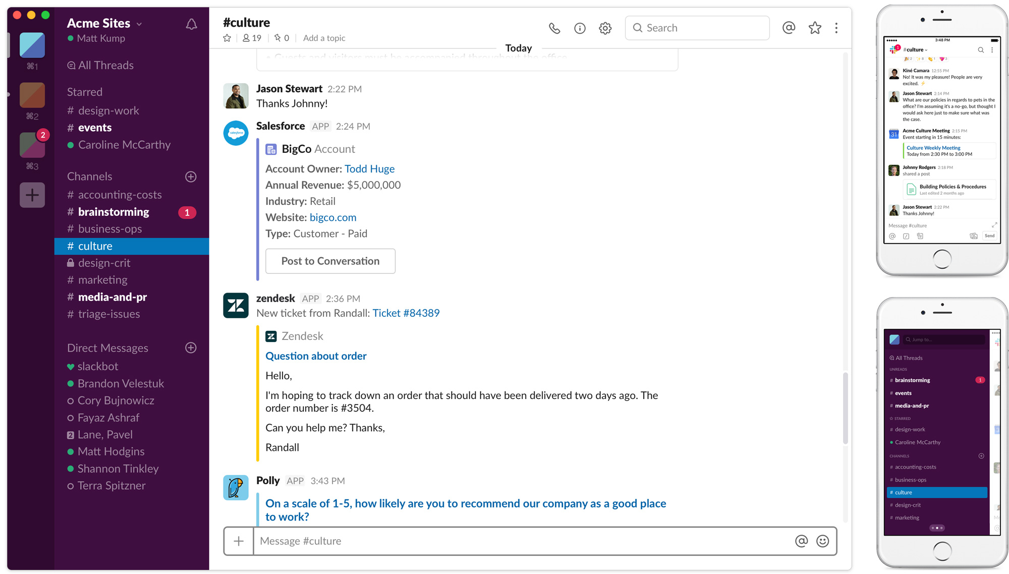
Seeing the icon in an app button, it’s really hard to argue against it. It’s fair if you don’t like it or if you think the old icon was better but technically, pragmatically, and even conceptually, this is a more robust interpretation.
There aren’t many applications but something like the above shows promise in building a playful visual vocabulary that manages to look like a text-message conversation that can help make the two shapes of the icon potentially more recognizable and tied in to the Slack experience. Something like the below… should be avoided. It’s a clunky approach that waters down the shapes and their impact and sophistication.
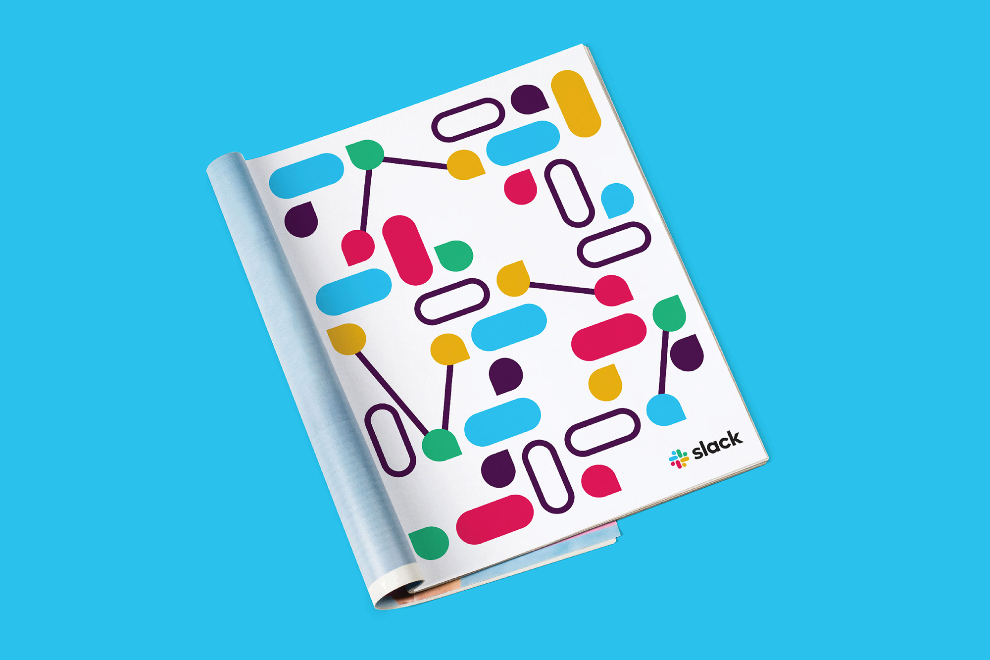
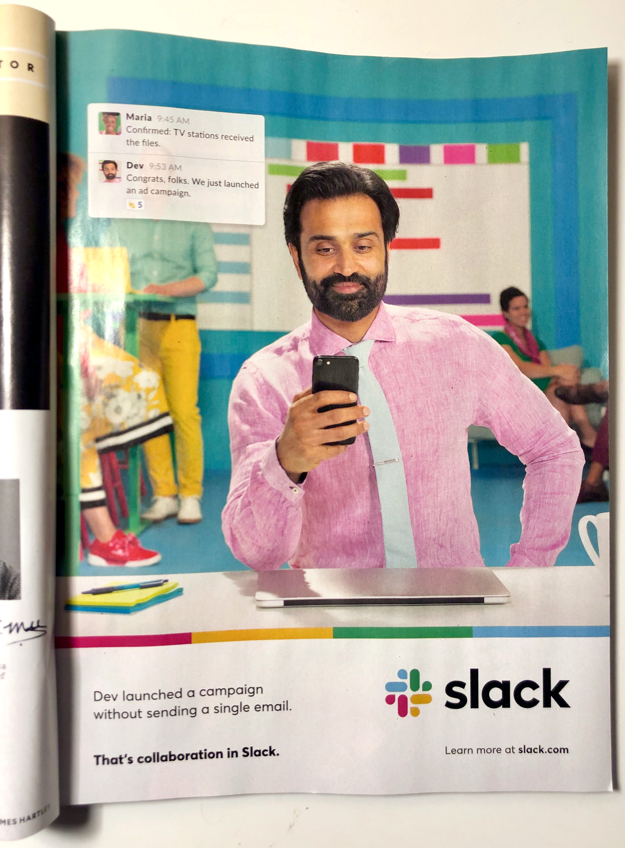
The actual print ads that ran in Fast Company and The New Yorker — that dropped a day before the digital launch (who would have thought print could outpace digital?!) — as well as the video above point to an interesting aesthetic that builds on the simplicity and colorful-ness of the icon… a kind of simplified, abstracted, candy-colored world that, if you were getting philosophical, could be interpreted as the result of using Slack.
Overall, yes, a logo many people had grown accustomed to has been ripped away from their (your) hands and change is hard but this is a perfectly fine replacement. In the first 12 hours of its release I would say it has actually done pretty well and has survived the first wave of reactions fairly unscathed. Sure there there was the obligatory looks like a swastika tweet (because there is always that one guy) but I feel that for people that wanted to hate the change as a default reaction there isn’t much to hate here and, guaranteed, a year from now this new icon will be as familiar and representative of Slack as the hash tag had become. #truth

 Новости Союза дизайнеров
Все о дизайне в Санкт-Петербурге.
Новости Союза дизайнеров
Все о дизайне в Санкт-Петербурге.