Обзор лучших ресурсов по разработке бренда, разработке упаковки
contact us | ok@ohmycode.ru
contact us | ok@ohmycode.ru
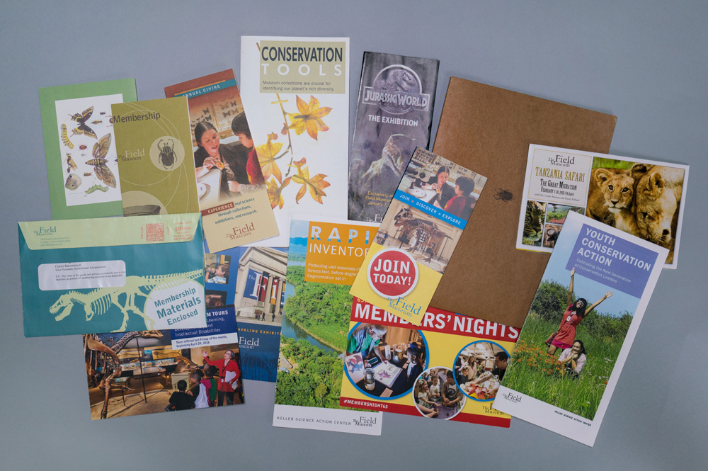
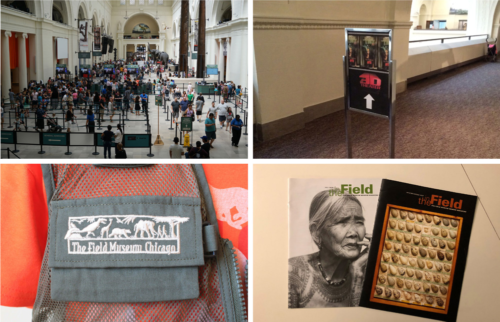
Established in 1893, the Field Museum in Chicago, IL, is one of the largest natural history museums in the world with approximately 30 million artifacts and specimens in its collection — of which only about 1% is on display at any given time. Housed in a massive neoclassical building that provides over 480,000 square feet of exhibit space, the museum hosts a number of permanent exhibits, rotating exhibits, a library, and space for more than 150 scientists in charge of the collections that include everything form 500,000 bird eggs to Javanese masks to meteorites to 30,000 records of Costa Rican fungi. This month, the Field Museum introduced a new identity designed by Chicago-based Leo Burnett Department Of Design.
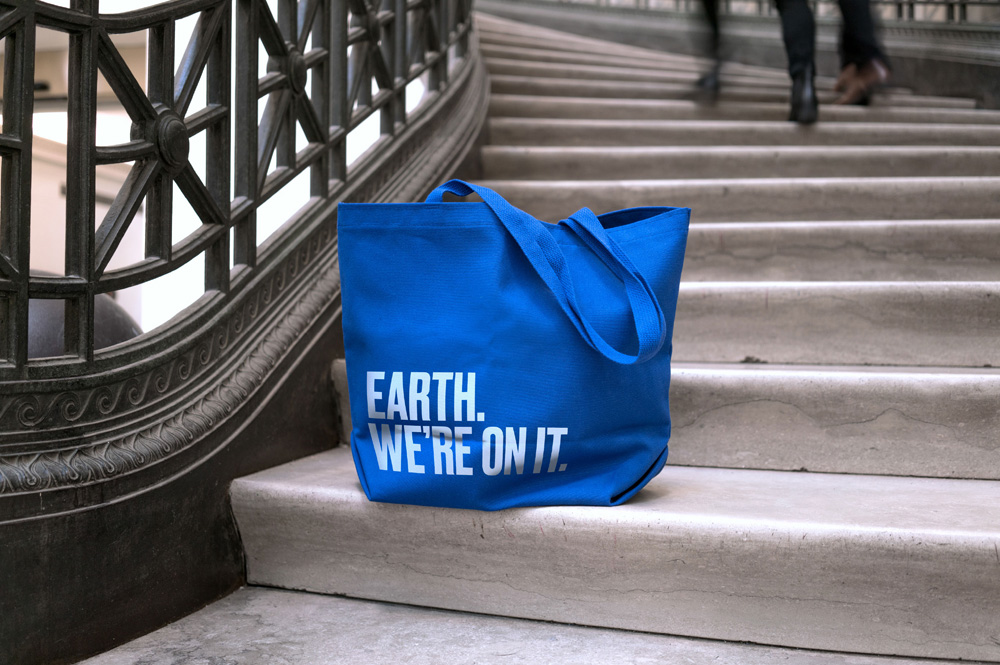
The introduction of a new Field Museum brand comes at an important time. This year, the museum’s 125th anniversary, is a galvanizing moment to clarify who we are, what we do and what we stand for. At a time when people are coming together to acknowledge the importance of the scientific community, the Field is putting a stake in the ground as a forward-thinking leader in scientific discovery. The new wordmark illustrates a purposeful change, helping transform the brand’s image from passive to active and strong.
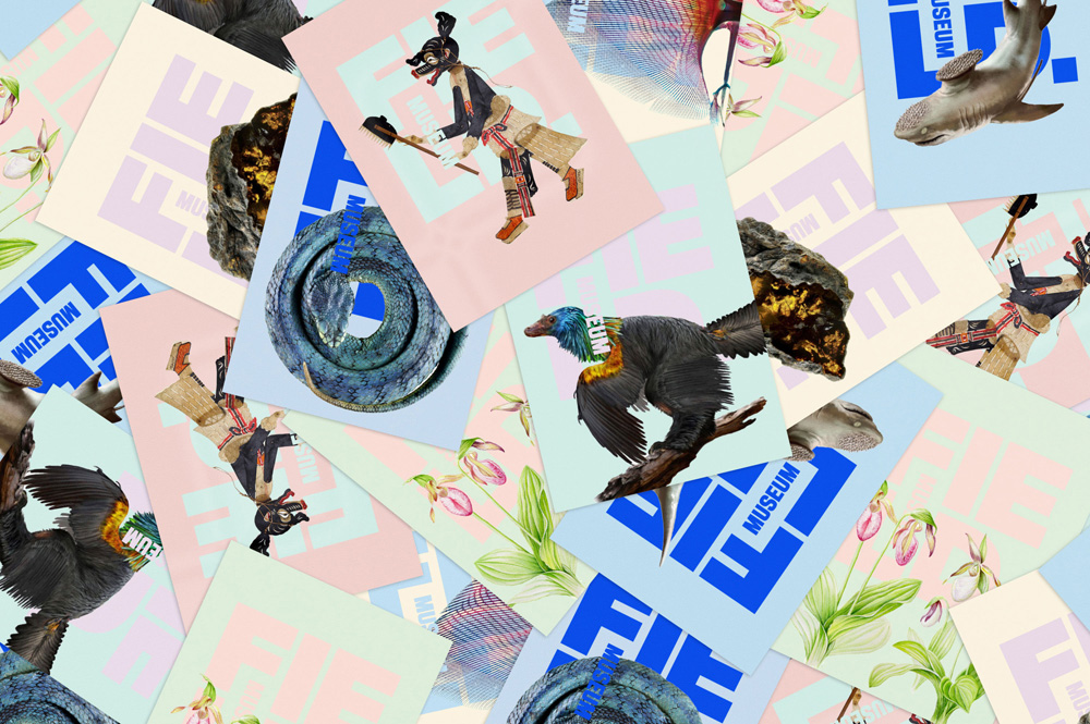
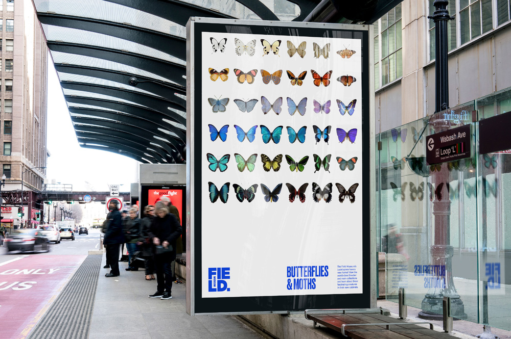
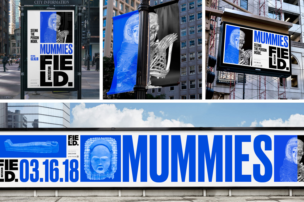
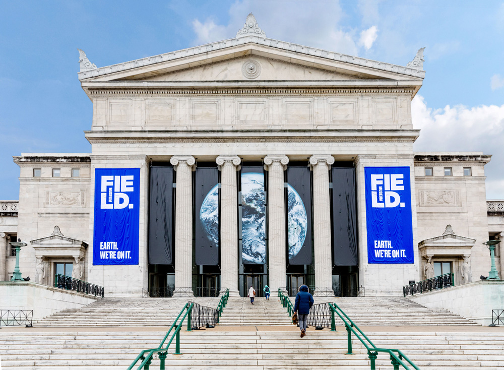
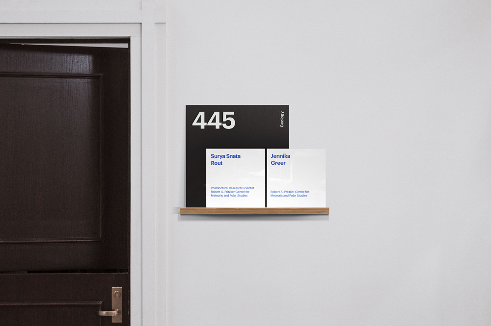
It all begins with the logo, rooted in one of the most reoccurring shapes found in our natural world: the square. It’s reminiscent of everything from archaeological excavation sites to the architectural details of the Field Museum building itself. Our logo includes two squares: the small square represents the fraction of the Museum’s collection on display, while the large square, the logo itself, represents the museum’s massive collection as a whole. Its boldness conveys the massive impact the Museum has had on the community, city and world. Like the Earth, our color is blue. Blue embodies optimism and our constant effort to uncover solutions for a better world.
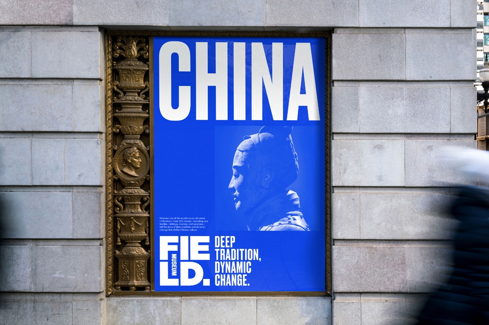
The old logo was quite bad, with a terribly spaced serif badly anchored on a clumsy line and using three inharmonious type sizes for each of the words in the name. The only good thing I have to say about it is that “Field” was large and that’s not saying much. The new logo is a full and drastic departure and introduces a very bold graphic device that’s almost a shock in how different it is. Visually, I kind of love it; the letters are bold, aligning neatly and leaving little rivers of counterspace flowing through them and I like how and where they placed “MUSEUM”. Conceptually and contextually I have a bit of a hard time seeing it as a logo for a natural history museum housed in what looks like a Greek temple but that’s probably decades of preconceptions at work. I really like the boldness of this and how the word is broken up - although I’m sure it will generate many “What’s a Fie Ld?” comments. The rationalization about the squares is a little flimsy but I’m a sucker for square logos, so I’ll buy it.
The choice of the trendy blue as the primary color might be the most contentious thing for this crowd. I think it works well and even though it seems trendy as hell to most of us, this is pretty bold for a major mainstream museum that attracts millions of visitors a year for whom “There’s that blue again” has no meaning whatsoever and to whom the color will come across as bold, daring, and exciting, particularly in contrast to all the black and red museum logos.
The logo-as-window approach… sure, why not? It works quite well with this particular structure as the counterspaces break the pictures in interesting ways and I like how “MUSEUM” stands out in white.
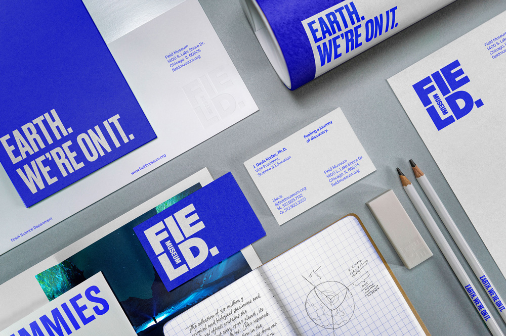
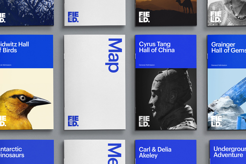
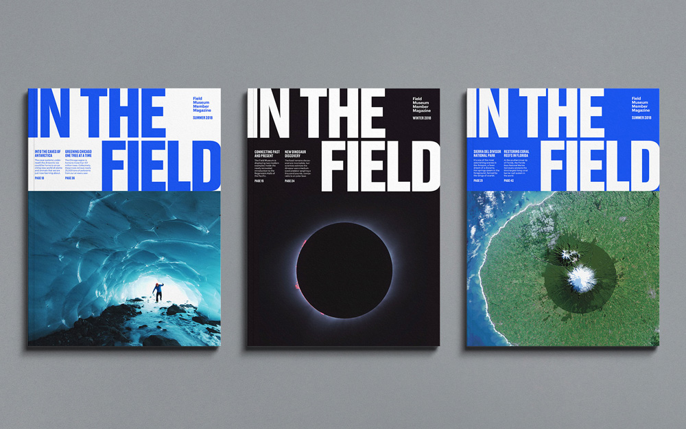
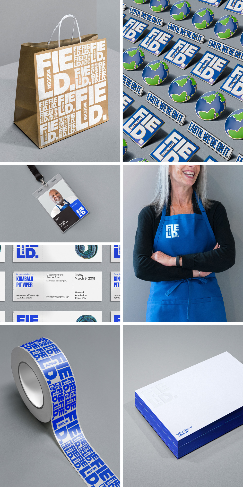
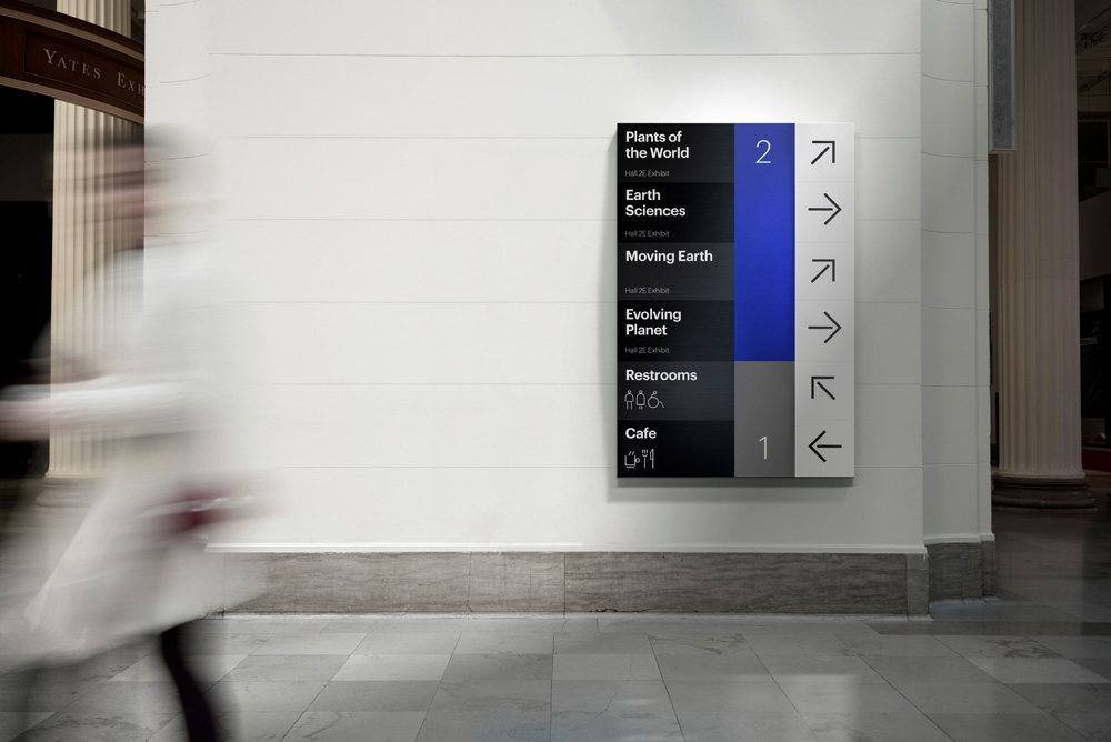
The old identity looked really old, sad, and disjointed. The new identity has a great combination of typefaces that bring a lot of flexibility to the system while keeping everything cohesive… mostly in part to the use of the blue. The grid approach (below) is simple but effective and the use of the condensed Druk allows big type to be used in small spaces.
Overall, I’m a big fan of this and appreciate how hard this must have been for the client in adopting something so drastically different from what they were used to. I think this gives a vibrant, exciting, and contemporary personality to the museum and will stand out among the rest of the more traditional- and safe-looking natural history museums around the world — even locally, this stands out vividly in relation to the Art Institute of Chicago, MCA, and the nearby Adler Planetarium and Shedd Aquarium.

 Новости Союза дизайнеров
Все о дизайне в Санкт-Петербурге.
Новости Союза дизайнеров
Все о дизайне в Санкт-Петербурге.