Обзор лучших ресурсов по разработке бренда, разработке упаковки
contact us | ok@ohmycode.ru
contact us | ok@ohmycode.ru
When it comes to countries or cities — especially those I haven’t been to — I prefer to not try to describe them myself. Here’s Fodor’s description: “Argentina’s magnificent landscapes create memorable backdrops for amazing experiences. Wine lovers can sample world-class Malbecs at Mendoza’s high-altitude vineyards with Andes Mountain views; adventure seekers revel in the colorful canyons of the Northwest; and nature lovers marvel at the thundering torrents of Iguazú Falls. In Patagonia, top-notch outdoor activities beckon, from scaling translucent glaciers to spotting penguins and whales. Urban adventures also await in Buenos Aires, with its thriving foodie scene, chic shopping districts, and vibrant nightlife.” On the economic side, here’s Wikipedia’s description: “Benefiting from rich natural resources, a highly literate population, a diversified industrial base, and an export-oriented agricultural sector, the economy of Argentina is Latin America’s third-largest, and the second largest in South America. It has a ‘very high’ rating on the Human Development Index and a relatively high GDP per capita, with a considerable internal market size and a growing share of the high-tech sector.” Recently, Argentina’s Ministry of Tourism introduced a new country brand designed by Futurebrand.
(You can read the official decree, in Spanish, here.)
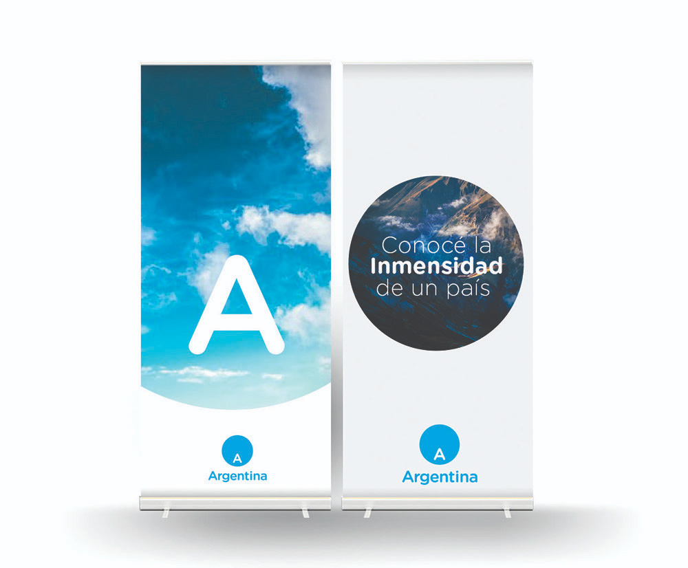
Gustavo Koniszczer, Managing Director for Latin America of FutureBrand, defined for Brandemia the new symbol as “a viewer through which everything the country has to share and show, but always with reference to the ‘A’ marking the location of the country in the world”. Consequently, the main use of the symbol will be to contain photography and video.
The old logo — first introduced in 2005 and revised in 2012 (by Futurebrand as well) — featured a festive set of ribbons that didn’t quite say anything in particular about Argentina other than using the blue and yellow colors of the country flag. The old wordmark was somewhat interesting, conveying a slight sense of richness and craft through a detailed flared sans serif that didn’t conform to any trend. Overall, it wasn’t a great logo but its effusive and distinctive graphic presence made it stand out.
The new logo features an “A” placed on the southern end of a blue circle, hinting at the location of Argentina in the globe. It’s a smart point of distinction to make and a useful idea to serve as the foundation for a logo but the execution is far from exciting, interesting, or evocative. It was close to being something relatively cool but there is something very dispirited about the final mark and it’s a feeling further accentuated by the stock imagery and default treatment used for the logo-as-window approach. The stroke version is possibly the most interesting thing here but even that fails to excite.
The wordmark, in Gotham Rounded, continues beating the same monotonous tone of the logo. To its credit, the word “Argentina” looks good typeset in Gotham Rounded but as the identifying font for a country it lacks a sense of engagement. To its conceptual credit, the choice of Gotham Rounded follows the choice of Gotham (non-rounded) as the type family used in the logos of the Argentinian government.

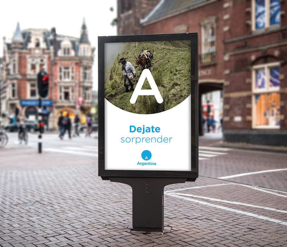

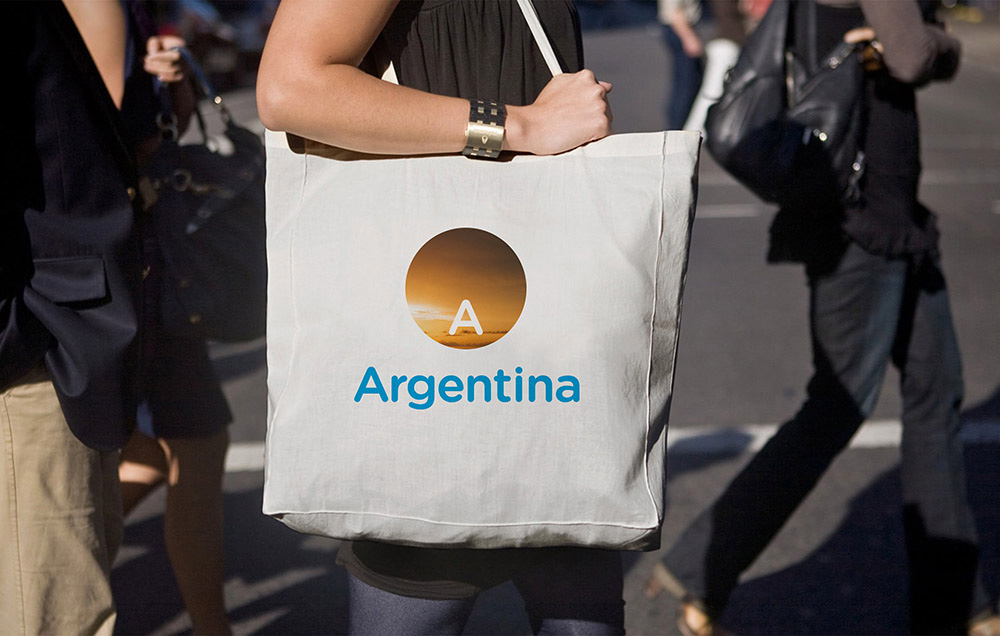
The application renders don’t help this project in any way — there are a few more images on Brandemia but nothing that will drastically sway you to keep or change your opinion — all lacking any kind of enthusiasm or excitement or intrigue for Argentina. If the applications are going to revolve around photography, the photography should be as mind-blowingly amazing as Argentina seems to be. Overall, this could have been a fairly interesting logo but the execution lacked interest and the applications didn’t quite help sell it any better.
Thanks to Rodrigo Díez for the tip.

 Новости Союза дизайнеров
Все о дизайне в Санкт-Петербурге.
Новости Союза дизайнеров
Все о дизайне в Санкт-Петербурге.