Обзор лучших ресурсов по разработке бренда, разработке упаковки
contact us | ok@ohmycode.ru
contact us | ok@ohmycode.ru
Established in 2018, Laka is an insurtech company based in London, UK, that offers insurance specially customized to cyclists, which would be enough to set it apart but it also does it through a “crowd” model where customers’ monthly rates vary and will be higher or lower (up to a pre-determined max rate) based on how many claims the rest of the customers have filed — more claims means higher rate, less claims means lower rate. Laka has two insurance options: one that covers the bicycle for loss and damage and one that covers the human for injuries and health and mental treatments. In general, Laka is free of unintelligible insurance terms, explaining everything in common, even enjoyable, language and promotes the idea that, like cycling pelotons, everything is better when working together. This month, Laka introduced a new identity designed by London-based Ragged Edge.
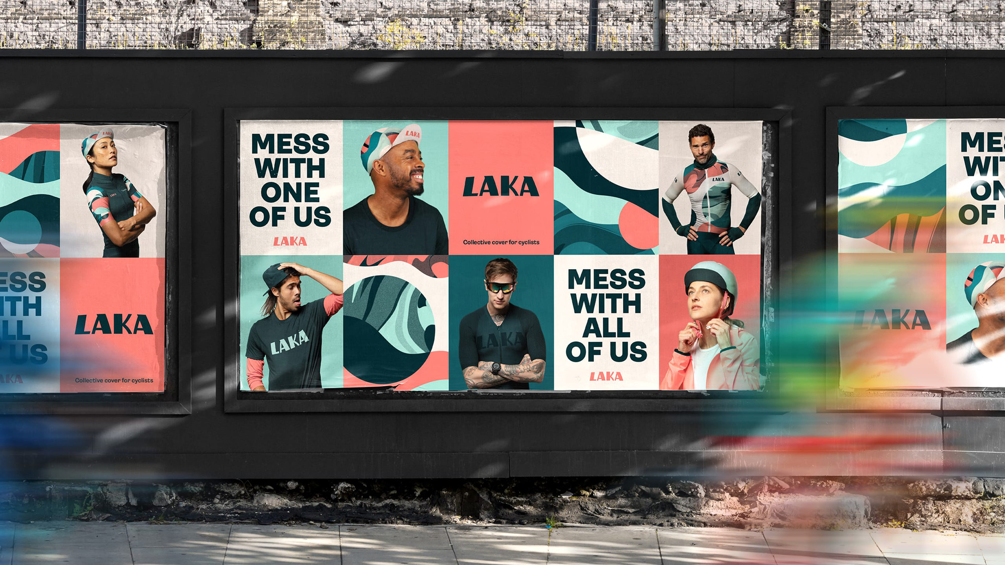
Laka’s fun-loving and characterful new identity is the antidote to the insurance industry. It recognises the different tribes that exist in cycling yet brings them together to feel part of a bigger collective team, celebrating its strength in numbers.
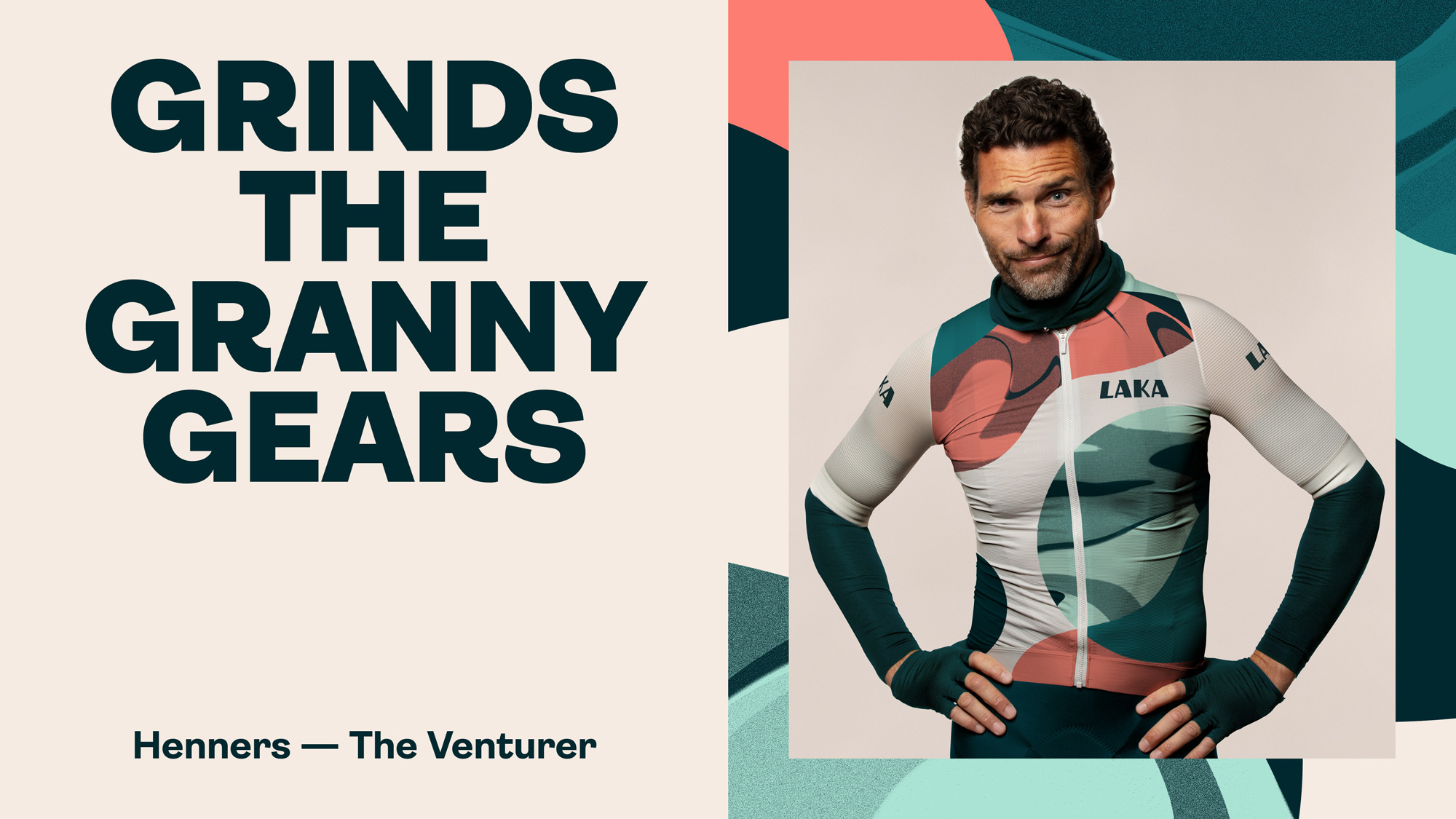
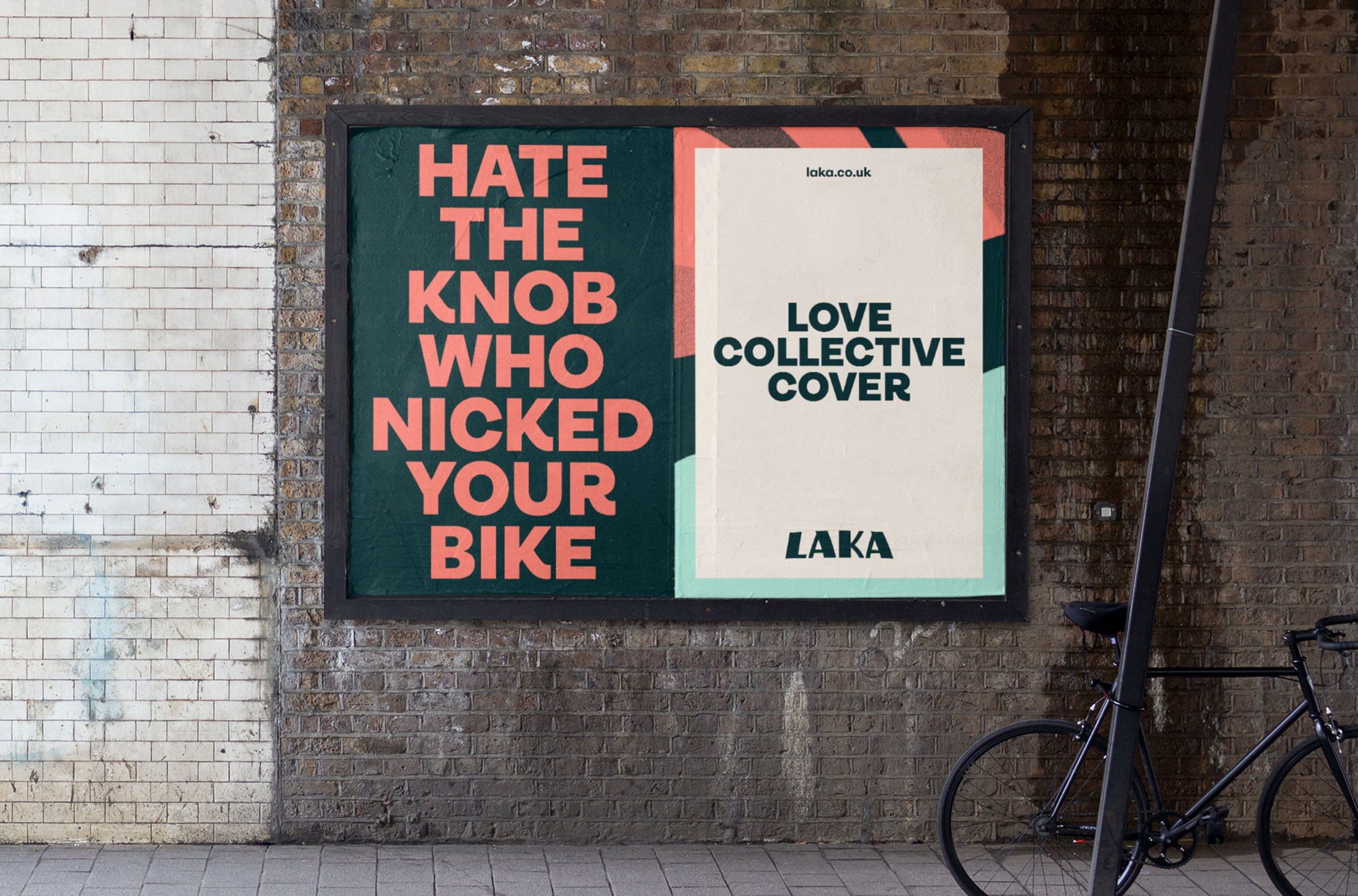
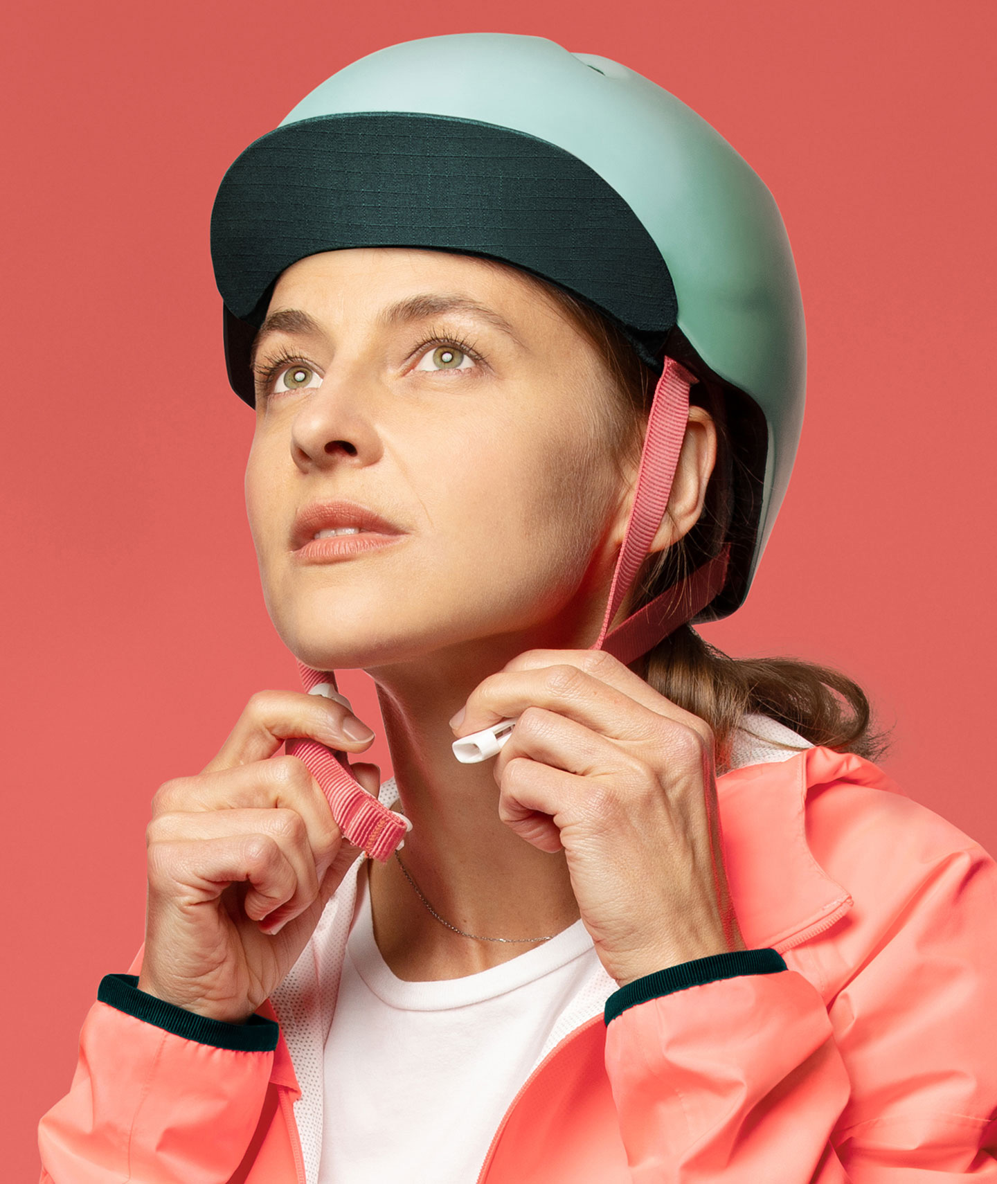
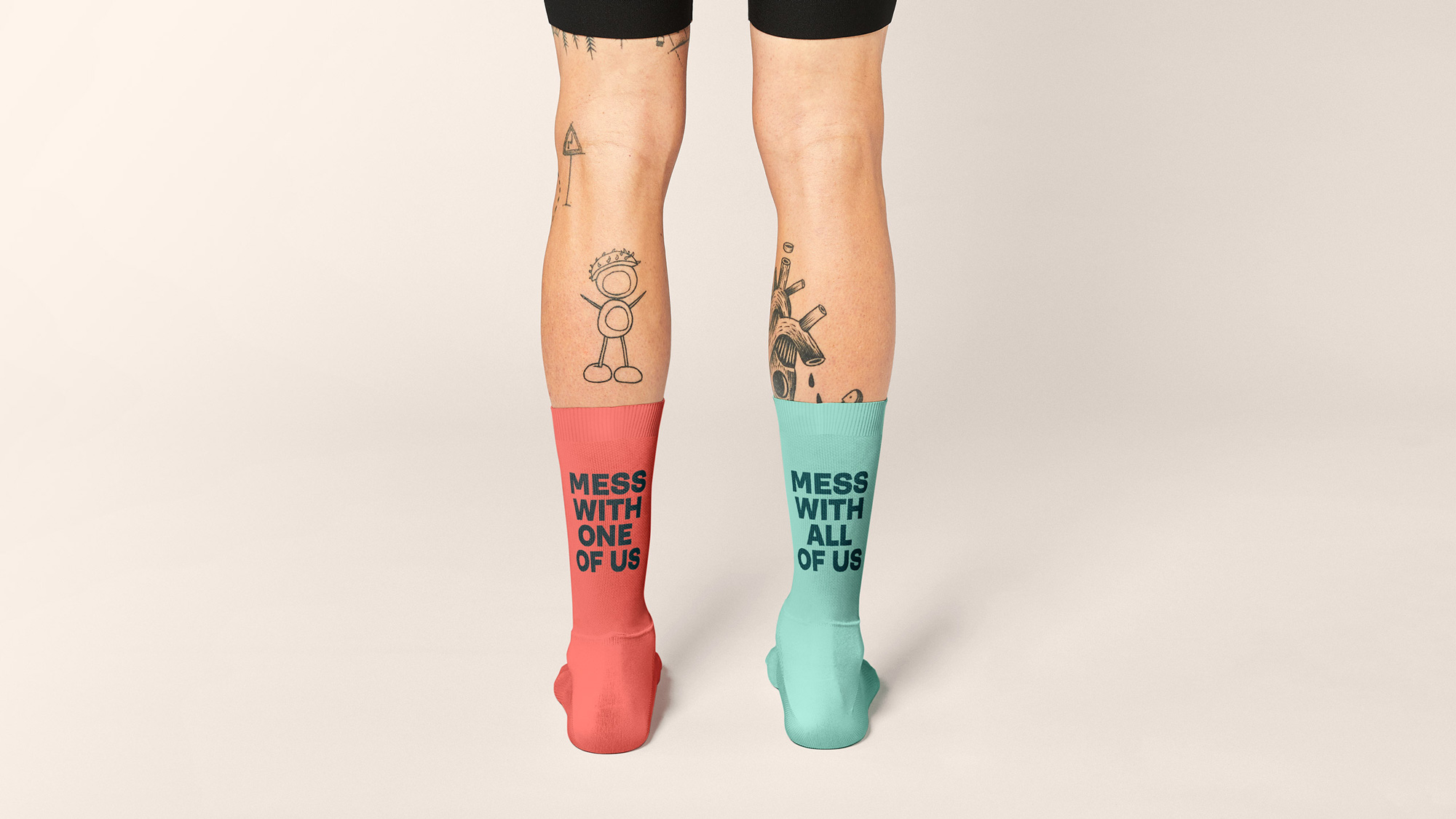
Bold portraiture photography heroes the collective’s diverse members, and strong team colours unites them. Landscape-like patterns are inspired by mud, sweat and tears from a ride. And a tone of voice that’s never afraid to go full-on bike nerd is used as a rallying cry to members - mess with one of us, mess with all of us.
The old logo was more or less fine… nothing to get too excited or upset by and mostly generic but perhaps its biggest drawback was that it didn’t look very professional or exude confidence. The new logo fixes those two things with a very polished wordmark that looks and feels extremely confident. Like the old logo, I don’t think it says “insurance” in any way but it definitely feels more European-vintage-cycling somehow, which may be a taxonomy I just made up but that’s the vibe I’m getting. The Art Deco-ish letterforms are set on a very, very subtle curve, which I feel could have been exaggerated like 5% to make it more evident. As lovely as the logo is, the rest of the identity goes into other visual territories, which leaves the logo feeling a little out of place in most applications.
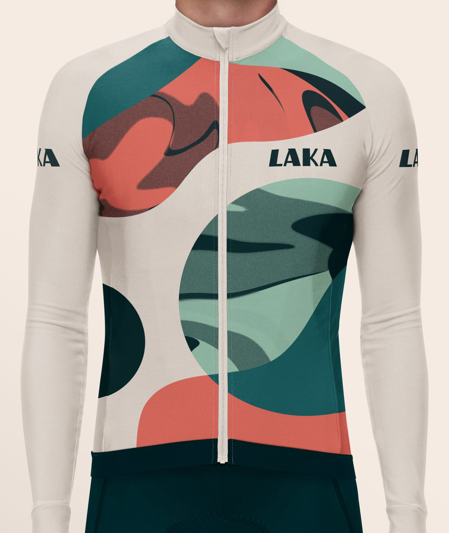
Every team needs its unifying colours. We added patterns inspired by the mud, sweat and tears on a cyclist’s bib shorts. Bold portraiture heroes individual members. A commanding tone of voice is never afraid to go full-on bike nerd. And together these elements create a bold identity for Team Laka that’s absolutely nothing like an insurance company.
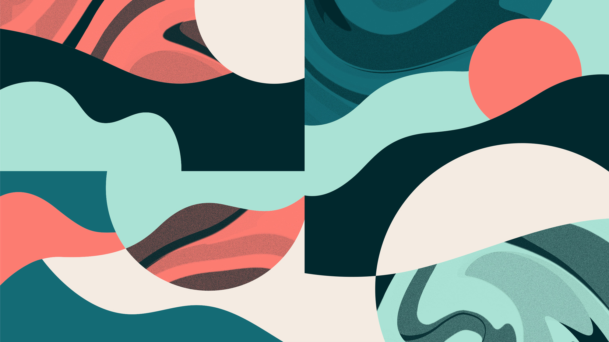
I’m not exactly sure how the patterns are “inspired by the mud, sweat and tears on a cyclist’s bib shorts” but I absolutely love them visually. The compositions are great, the colors are perfect together, and the textures are just right.
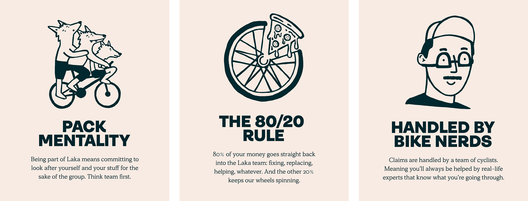
The spot illustration style also comes out of left field but, like the rest of the elements, it’s so good that I can overlook it. I guess that even if visually things don’t align, the overall fun and expressive ethos of the company is shared among the identity elements.


In application, the identity introduces Ambit, which has some fun quirks, as the main headline typeface and it looks great used big and bold. I feel like it clashes a lot with the logo but, as I mentioned, the logo ends up looking a like it came from another project. Still, oddly enough, all the elements come together, if not convincingly, at least very appealingly.

Overall, the identity comes across as a cycling team first, insurance provider second. It’s almost as if they built a full-on cycling corporate team identity that was pure visual joy and then happened to apply it to an insurance company, which is not a bad thing at all as I think it positions Laka as a cohort that gets what cycling is all about and what cyclists need as they battle cars, thieves, and potholes.
 each year since publication began in 2006

 Новости Союза дизайнеров
Все о дизайне в Санкт-Петербурге.
Новости Союза дизайнеров
Все о дизайне в Санкт-Петербурге.