Обзор лучших ресурсов по разработке бренда, разработке упаковки
contact us | ok@ohmycode.ru
contact us | ok@ohmycode.ru
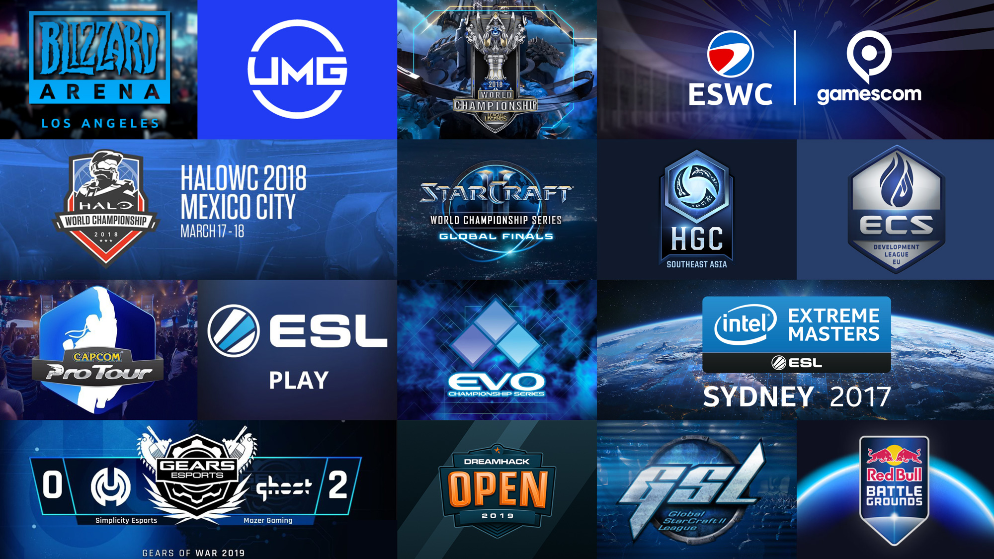
Established in 2000, ESL (Electronic Sports League) is the largest esports company in the world, organizing international leagues and tournaments online and offline for the most popular games — Overwatch, Gears of War, Halo, and more — culminating in stadium-size events. With offices in Germany, North America, UK, Spain, France, Poland, China, and Australia, ESL estimates its fan base to be 242 million people globally — 80% in the coveted 18 - 34 demographic — and creates over 1,500 hours of content each year with its reach growing more as esports becomes one of the fastest growing segments of media and entertainment. Earlier this year, ESL introduced a new identity designed by Superunion.
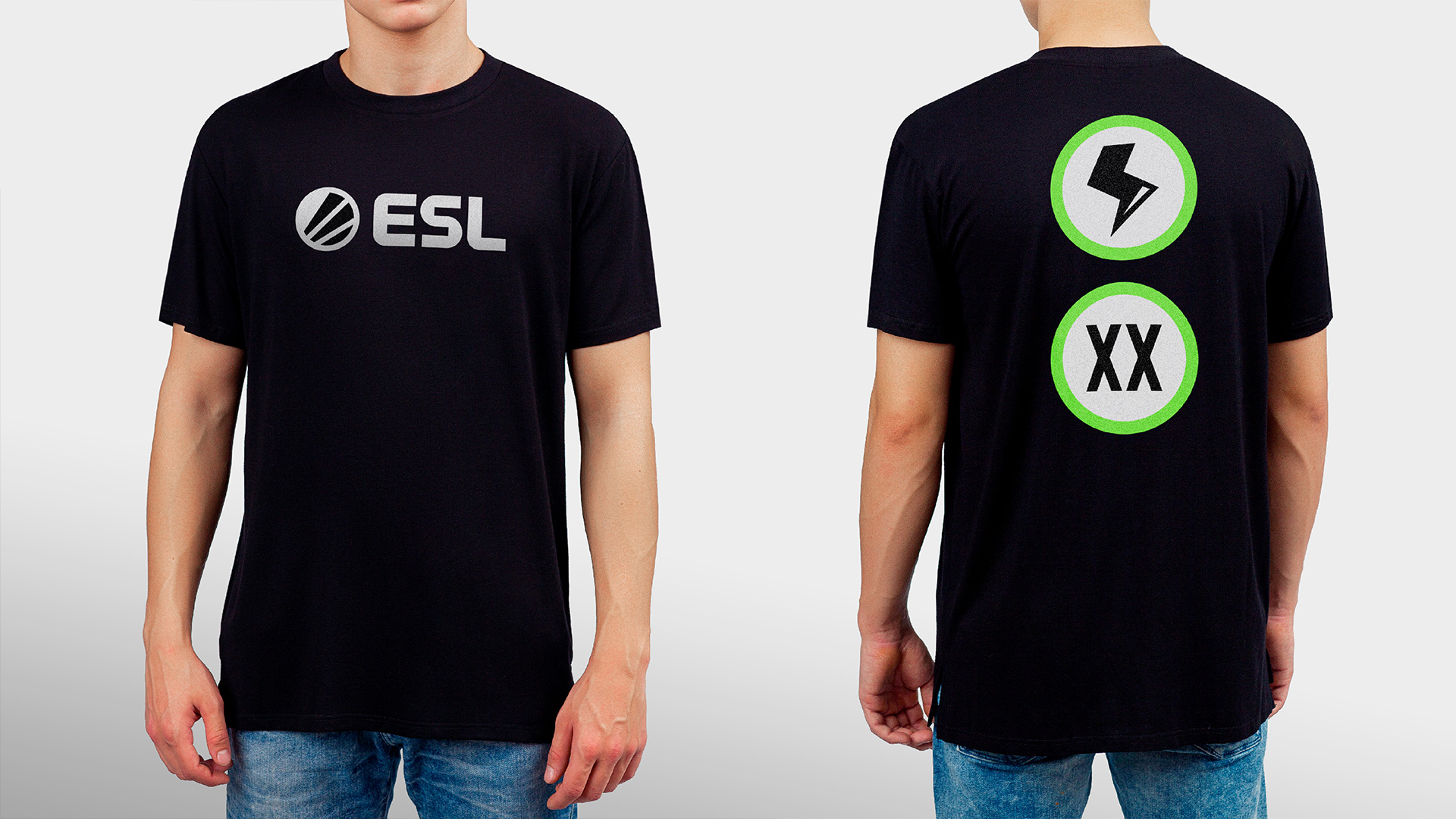
There is not a whole lot to say about the logo as it is a straightforward graphic evolution of the previous one, which I am not sure what it’s meant to be (spotlights? an abstract “E”? something else?). Improvements to the icon and wordmark are both good and solid. The icon is now a more cohesive single unit and the wordmark is more interesting with its three letters working better together. I’m actually surprised [spoiler] that the wordmark didn’t get expanded into a full alphabet as that would make sense but, in general, the logo update doesn’t really play a significant role in the redesign or inform the identity — not that it has to necessarily, just pointing it out because things get funky from here.
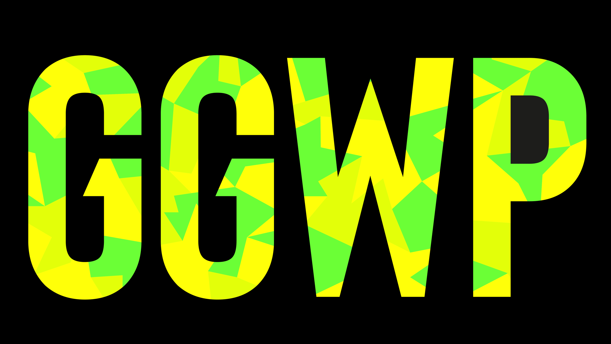
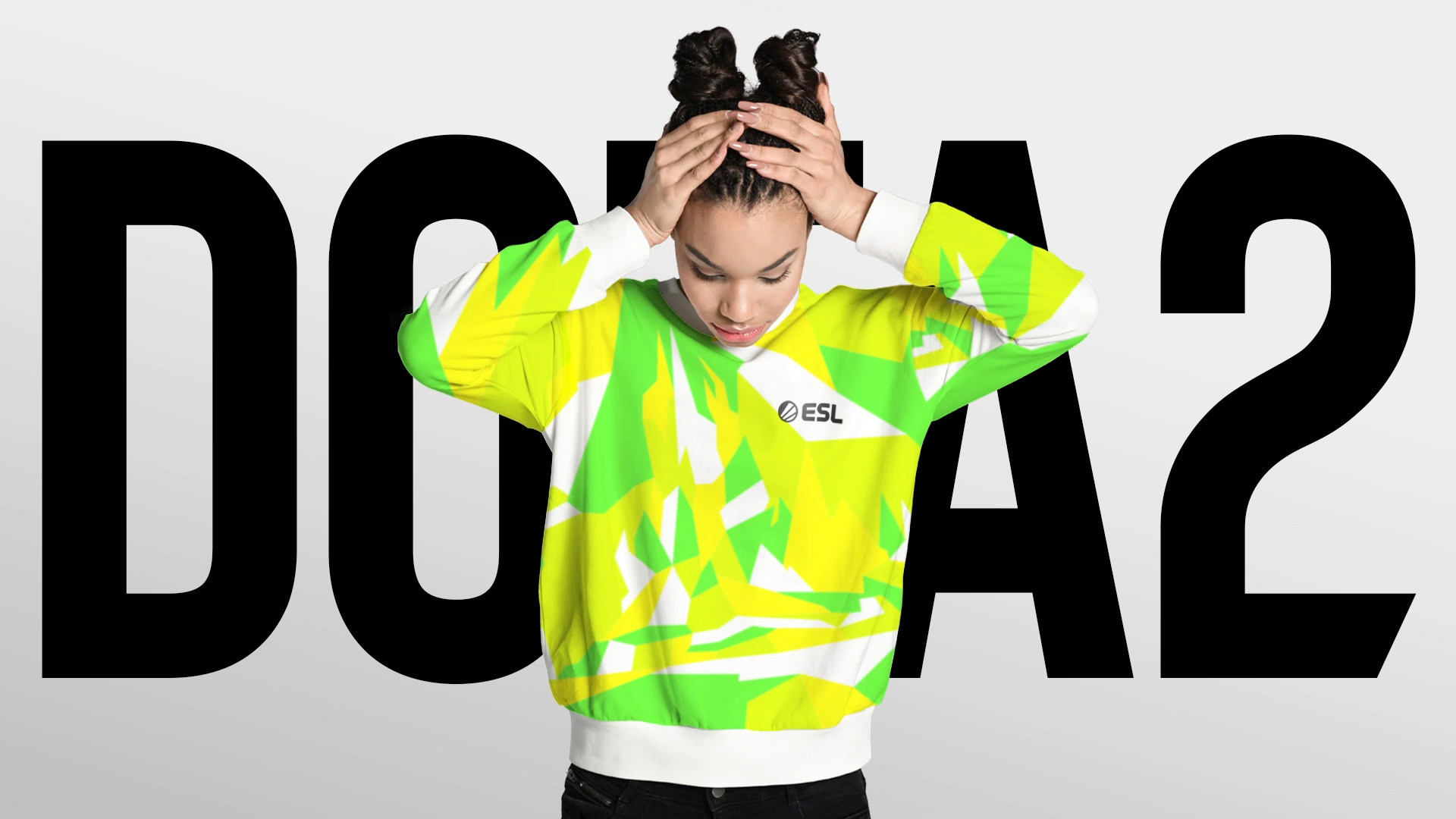
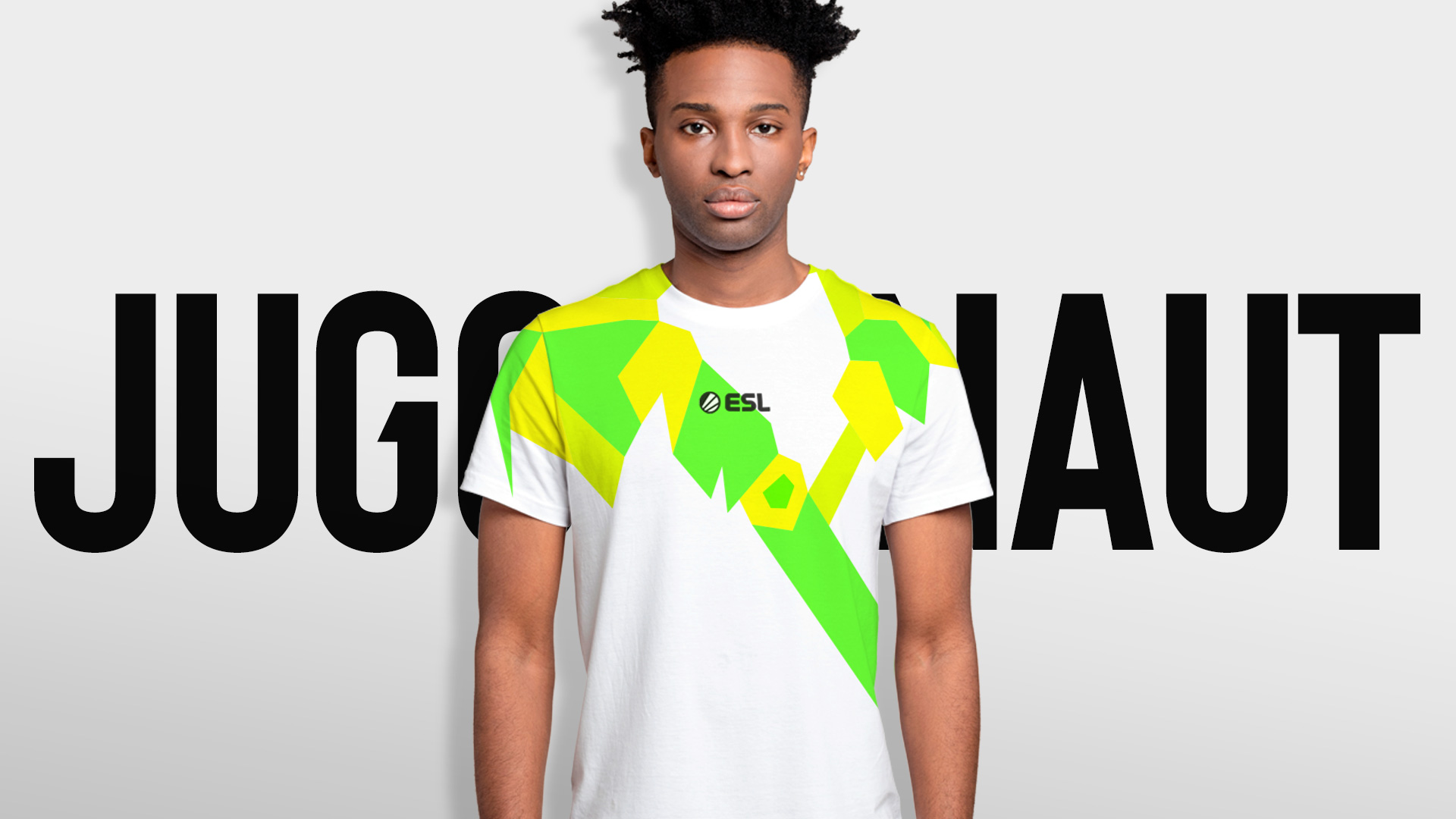
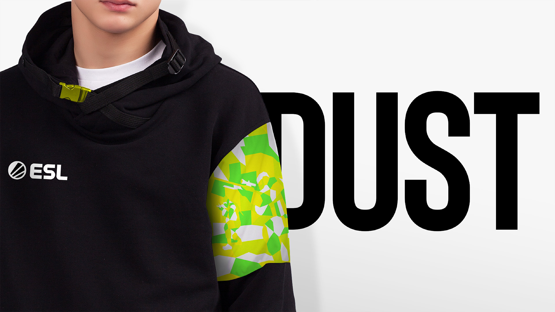
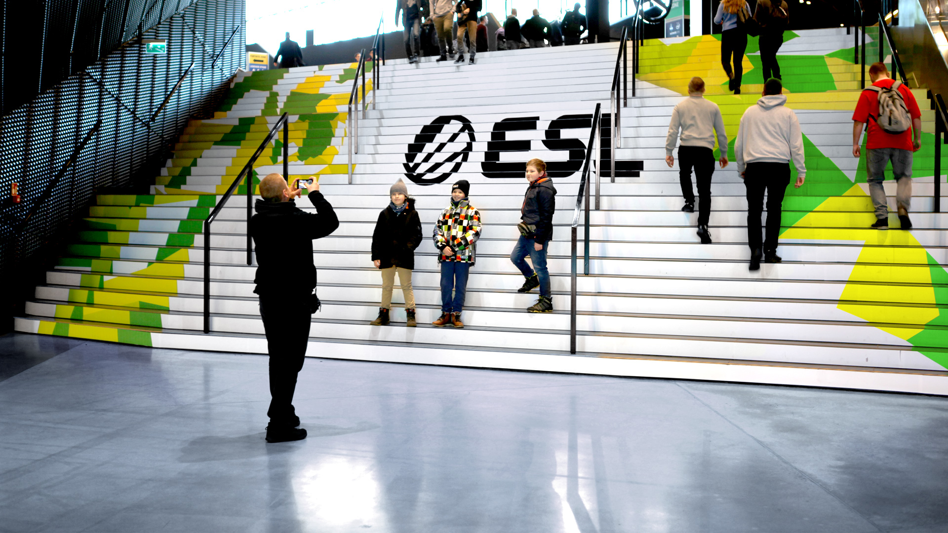
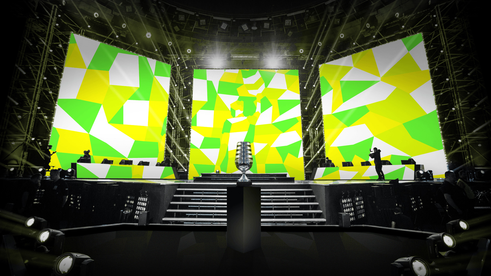
Gamers love ‘easter eggs’: secrets, codes and hidden messages. So the visual identity uses subverted camouflage to embed iconic moments from classic games in esports.
We created a series of camouflage images with hidden scenes from different games and tested them with groups of young gamers. We refined the images to make sure the scenes could be found by fans, but weren’t too easy to spot.
The design language has to cover a huge range of games, from card strategy to battle royal. This graphic technique allows ESL to speak directly to different audiences and fans, in their own language. It allows them to ‘brand’ content from other games. But its searing, intense camo is always instantly recognizable as ESL.
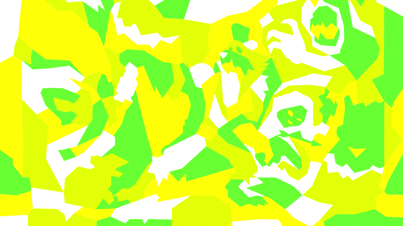
The main design element is the bright camo pattern created from polygon abstractions of stills from select video games, which is a great way of acknowledging the games that ESL lives on while also giving it its own high-octane aesthetic that happens to have a smart backstory. The patterns can be relatively more literal as a kind of paint-by-numbers of specific scenes or they can be even more abstract and then slowly revealing into game environments. My eyeballs are offended from the color assault but this is clever, relevant, and, in its jagedness, very well executed and appropriate for the industry.
The ‘hi-vis’ colour palette (Psycho Yellow, Slime Green and Toxic Green) is inspired by military camo, pumped up to match the sheer intensity of this sport.
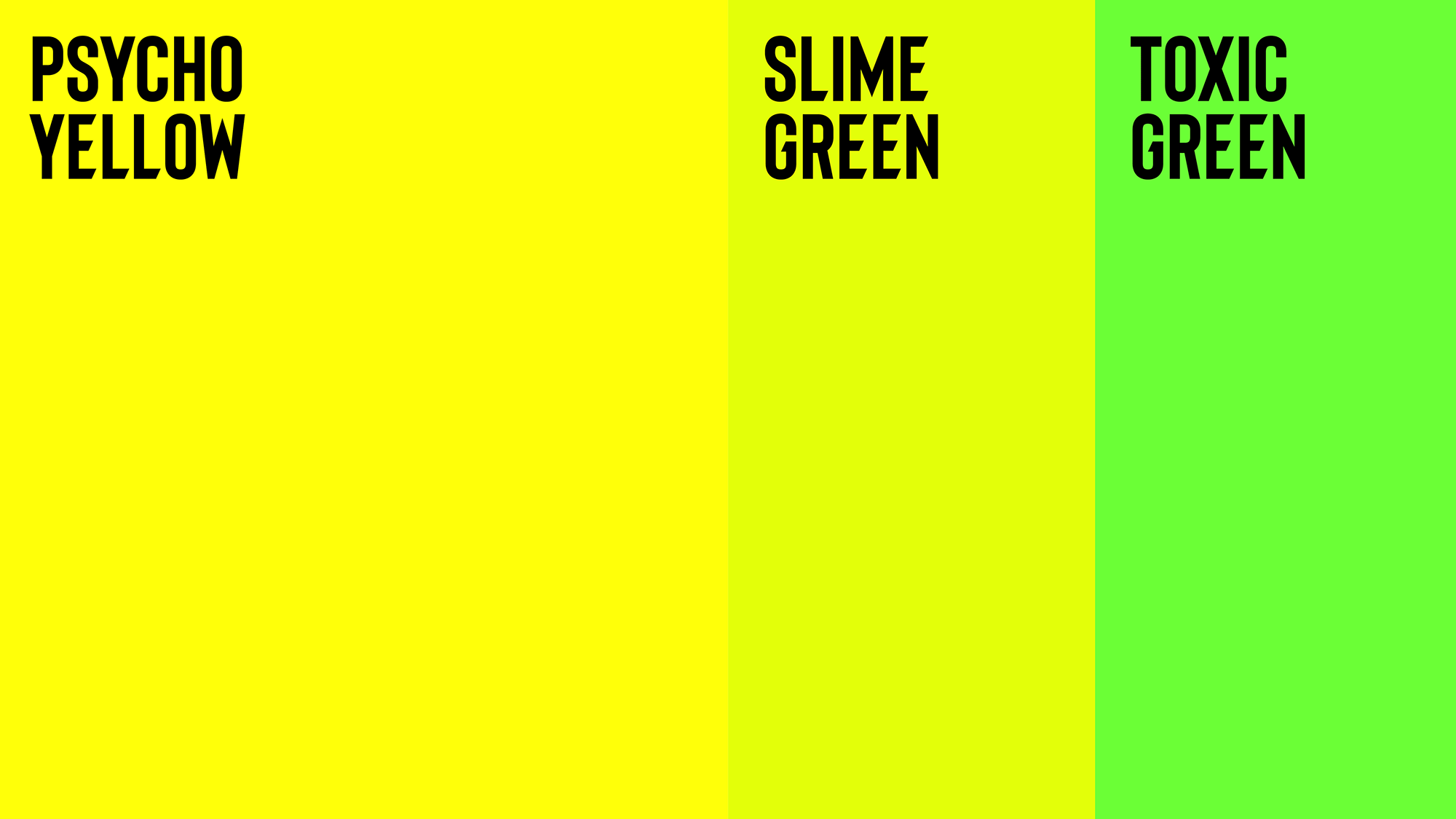
The color palette is horrible but perfect and the names only exacerbate those conflicting feelings — I’m still undecided if I hate it or love it. Probably both.
Along with the Hidden Worlds, we created a bespoke typeface. Working with up and coming typographer Ellen Luff, the typeface is cut to be distinctive and sympathetic with the camo forms.
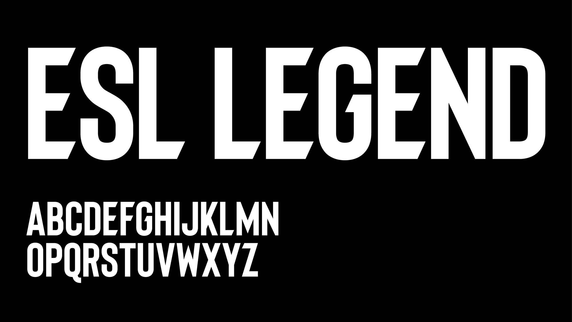
The custom font is fairly disappointing especially considering that they had a great starting point with the wordmark (and then that could have tied together the logo to the identity). I understand why the custom typeface looks like how it does, building on the aesthetic of actual sports logos — think any college custom typeface from Nike — and doubling down on its all-guns-blazing aesthetic but it’s a bit of a cliché that doesn’t offer anything new. It’s a condensed spiky sans serif like a dozen other condensed spiky sans serifs. Nonetheless it’s hard to argue that it’s bad because it works with what’s going on around it.
The identity comes to life in digital content. 2D camouflaged graphics suddenly switch to 3D environments through AR and animation, erupting out into the real world.
The animated posters are a fun idea and, although my knowledge of AR implementation is null, I assume these would be fairly realistic to implement and since people have their phones out all day it’s also realistic to assume their audience would interact with them. Even without the AR, the posters demand a lot of attention and would certainly stand out in most environments. And not to keep harping on it but the logo looks even more disconnected in these applications.
Overall, I would say this is very much on point for the audience, for activating the events, and for giving ESL its own distinguishable identity that isn’t just generic esports stuff, which is what they had been doing before.

 Новости Союза дизайнеров
Все о дизайне в Санкт-Петербурге.
Новости Союза дизайнеров
Все о дизайне в Санкт-Петербурге.