Обзор лучших ресурсов по разработке бренда, разработке упаковки
contact us | ok@ohmycode.ru
contact us | ok@ohmycode.ru
Established in 1926, McKinsey & Company is a global management consulting firm that works with organizations across the private, public, and social sectors to advice them on how perform their best. As has been reported over the years, some of their clients have also performed their worst, like Enron, and controversies surrounding their involvement with certain clients have been a recent concern. Nonetheless, McKinsey is a global powerhouse, with more than 28,000 employees across 129 cities in 65 countries working for high-profile clients and many of its employees have gone on to become C-suite executives for equally notable companies. This week, McKinsey introduced a new identity designed by Wolff Olins.
Our new identity has been designed to communicate a balance between old and new, heritage and modernity. Some things about our firm are changing enormously, and others - like our commitment to hiring and developing exceptional people - will always stay the same. We decided to embrace this inherent tension by making the idea of “high contrast” a guiding light for our new identity.
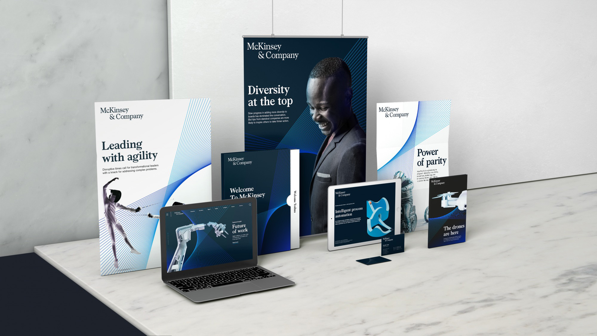
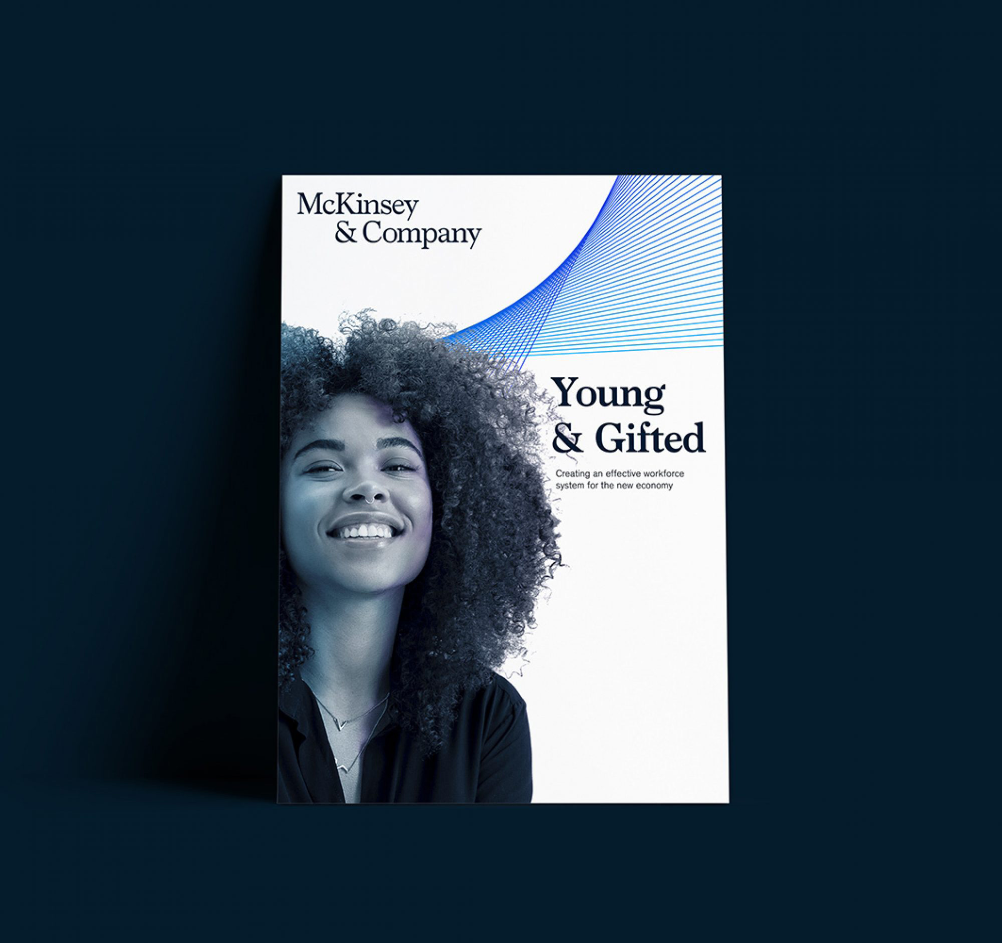
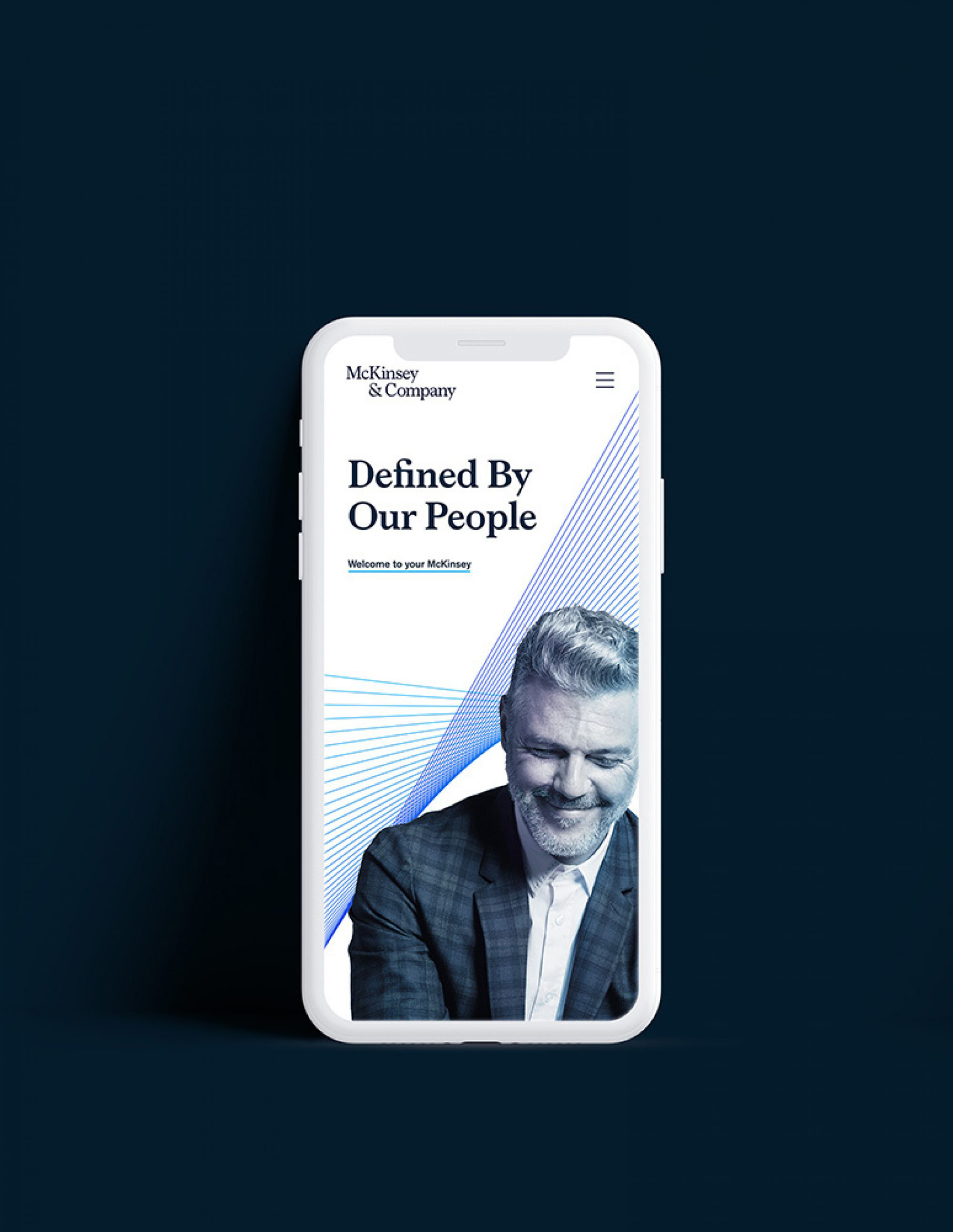
Our script mark has been refined and realigned. An evolution of our historic serif logo, redesigned with modern character to maximize our digital as well as physical presence.
The old logo was already decent, with a relatively different serif, nicely spaced, and with a solid ampersand. The new logo is an excellent evolution that adds personality and uniqueness through a custom serif with some lovely details: like the terminals of the “c” and “a”, the slightly angled axis of the “e”, and the subtle dip in the top part of the ampersand. Even the usually problematic bottom serifs are elegantly blended to make the kerning as good as possible. The alignment of the stacked words is a welcome break from centered or flush-left conventions and looks surprisingly good in that arrangement. The logo looks great big and small, which is a rare achievement for a serif wordmark but its well-modulated contrast allows it to shrink very well.
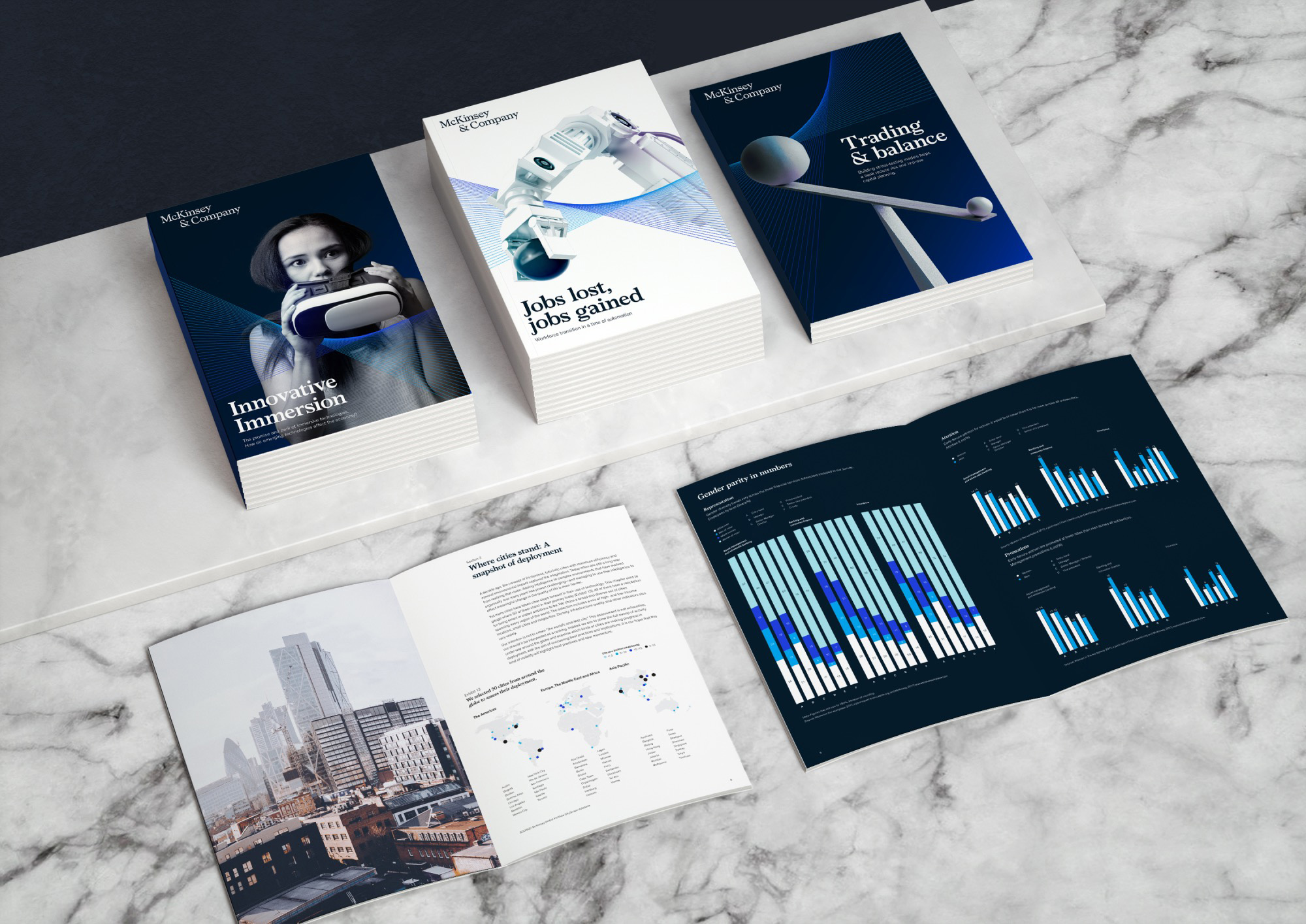
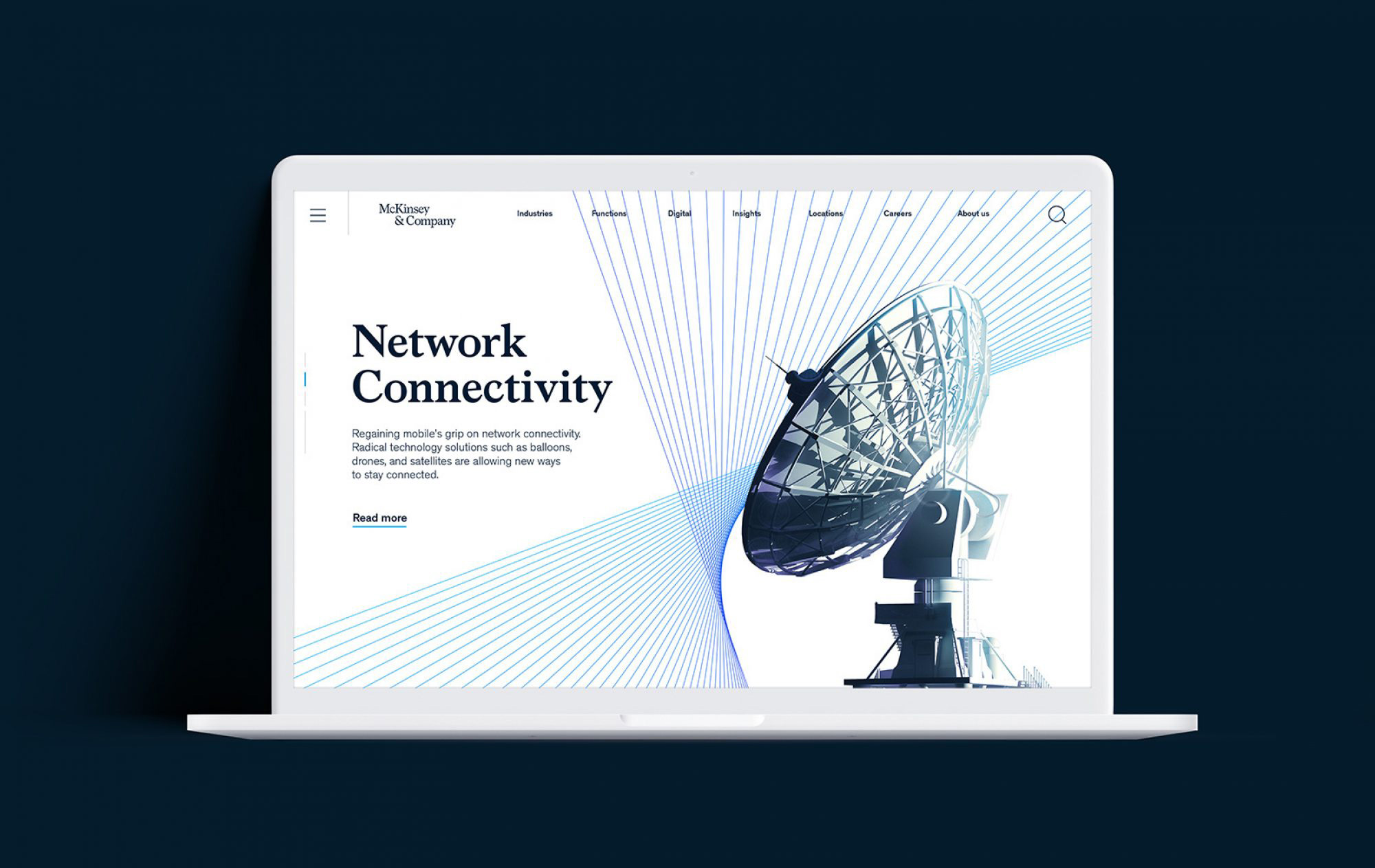
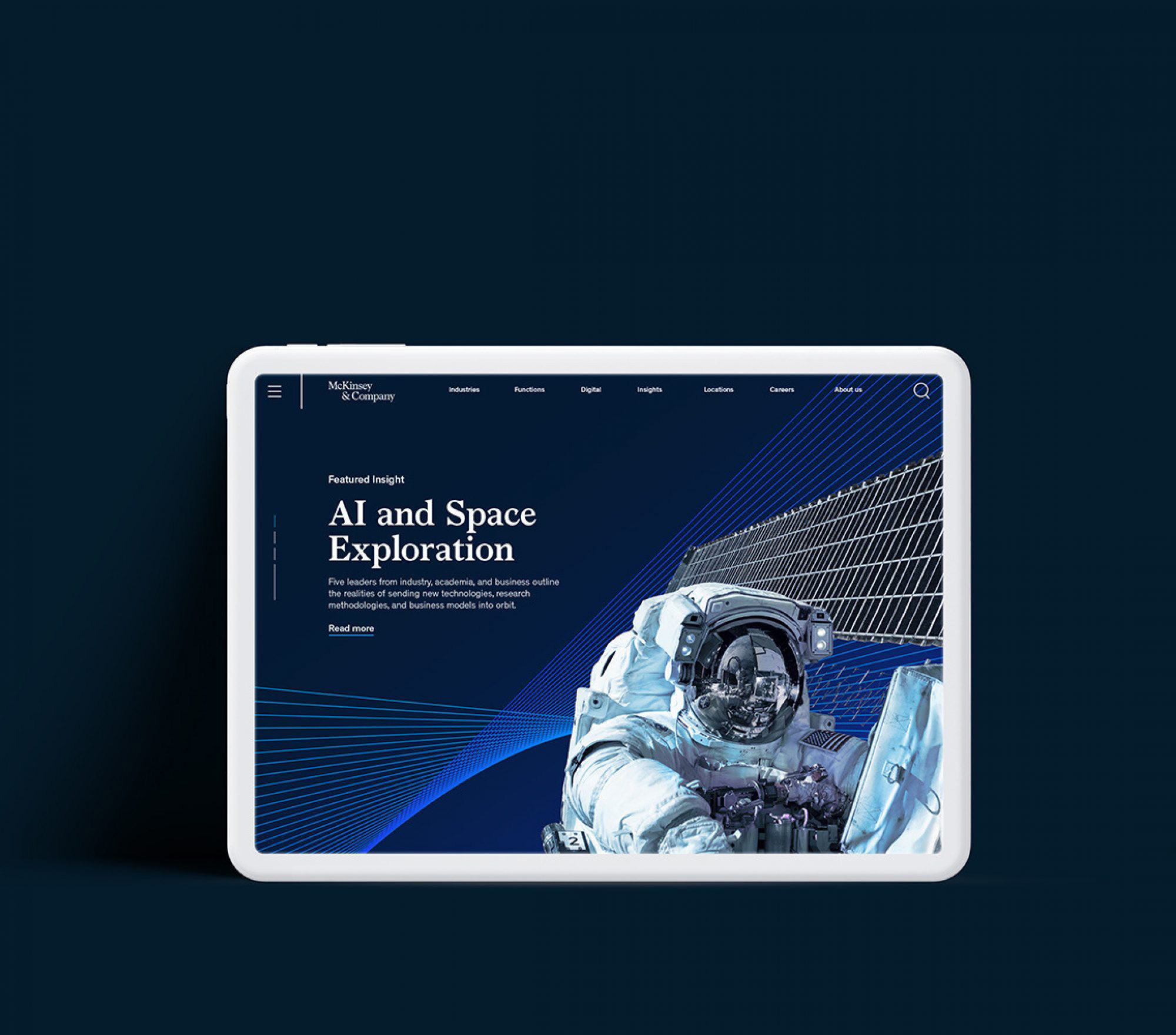
We have a new typeface that is unique to us, named Bower. Its letterforms are intentionally characterful and bold, helping our headlines cut through.
The custom font, named after Marvin Bower, who helped define the structure and principles of McKinsey in the 1930s and 40s, is really nice and blends some of the current trends — spikier serifs plus Windsor-esque serifs plus Chobani-esque charmers — into a bold, crisp, and elegant solution. The best way to appreciate it is clicking through McKinsey’s website.
Our new dynamic element, the ‘Partnership Mark’, has been crafted to symbolize the way we aspire to partner with clients: in dynamic, agile ways.
At first, the “Partnership Mark” sounds kind of douche-y and is no different from a number of other connected-line patterns we’ve seen before but these are particularly well executed and nicely implemented throughout the identity in a way that complements all the other elements quite well. It’s also interesting that they are using it as their social media avatar.
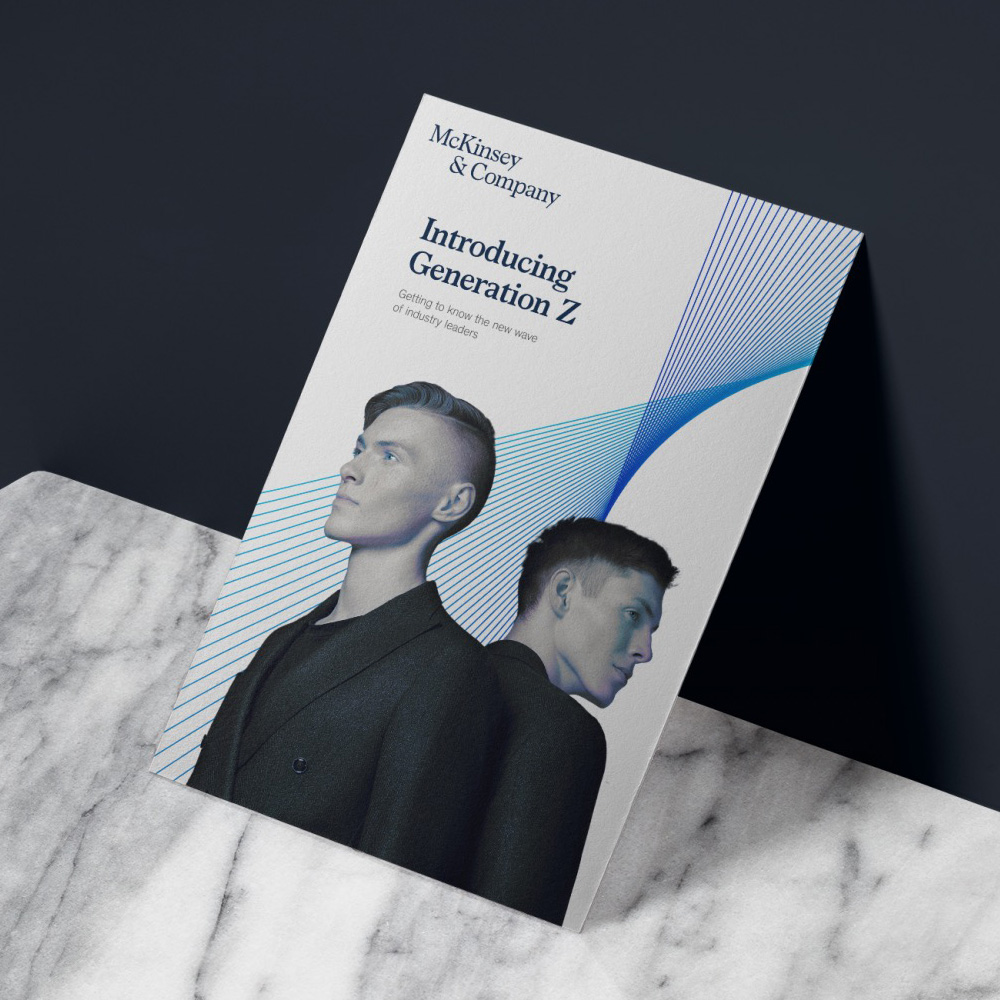
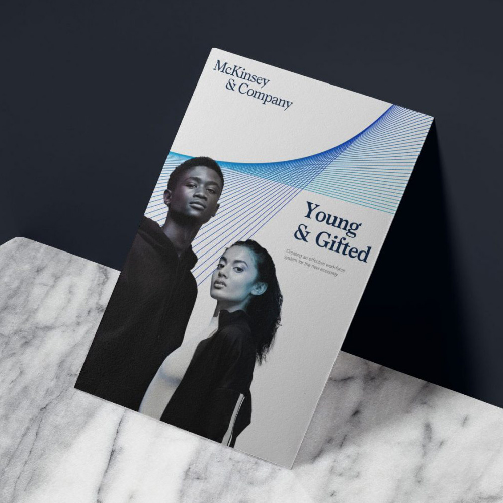
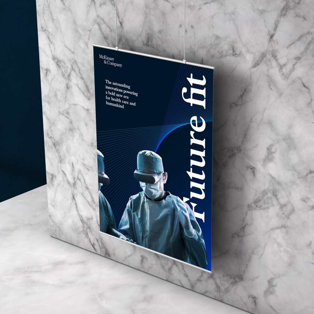
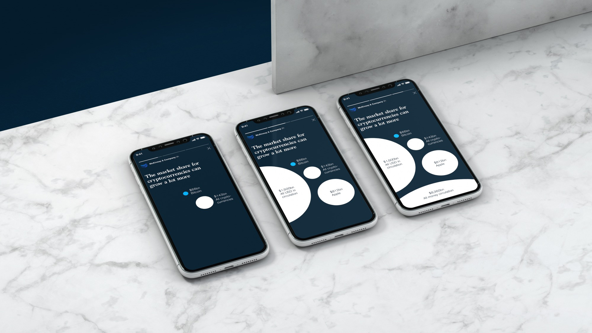
We are introducing a bold and recognizable imagery style, which uses contrast and intense focus to bring clarity and unique perspective to a topic.
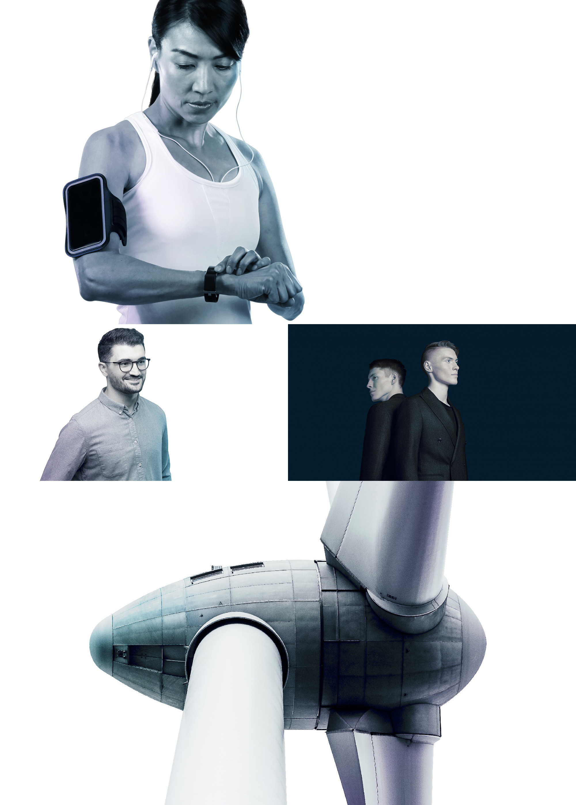
Finally, a novel approach to grayscale photography that isn’t the Spotify duotone. Adding a shimmer of blues and purples to the sides is a great way of establishing a house style that can make any number of images appear as if they came from the same source.
First, shit. That’s an ambitious way of presenting an identity. As seen in the video and images below, a lot of care has actually gone into presenting this, which I think is a direct translation of how thoughtful the whole identity system is.
This is all a really fantastic take on the most corporate of corporate designs: everything looks elegant, sophisticated, and serious without settling for boring, safe, or repetitive. The identity elements are mixed and matched in slightly different ways but there is a clear relationship between all of them across all mediums.
It may not be right or woke to fawn over a huge corporate job like this but I do think this is an exemplary case study of identity design at this level. This could have easily been unmemorable or lacking the ambition to implement a relatively complex system at the scale of this company. There is a strong sense of confidence (perhaps bordering on over-confidence) from McKinsey in this identity that supports their elite personality, which may be a turn-off for some but that’s a job well done from both McKinsey and Wolff Olins.
Thanks to Bart Zimny for the tip.

 Новости Союза дизайнеров
Все о дизайне в Санкт-Петербурге.
Новости Союза дизайнеров
Все о дизайне в Санкт-Петербурге.