Обзор лучших ресурсов по разработке бренда, разработке упаковки
contact us | ok@ohmycode.ru
contact us | ok@ohmycode.ru
(Est. 2000) Rightmove is UK’s largest property portal and operates a two-sided network. On one side it has the UK’s largest and most engaged property audience and on the other side it has the largest inventory of properties. Rightmove’s customers are primarily estate agents, lettings agents, and new homes developers. Rightmove plc floated on the London Stock Exchange on 15 March 2006.
The Team (London, UK)
The Team project page
Rightmove blog post
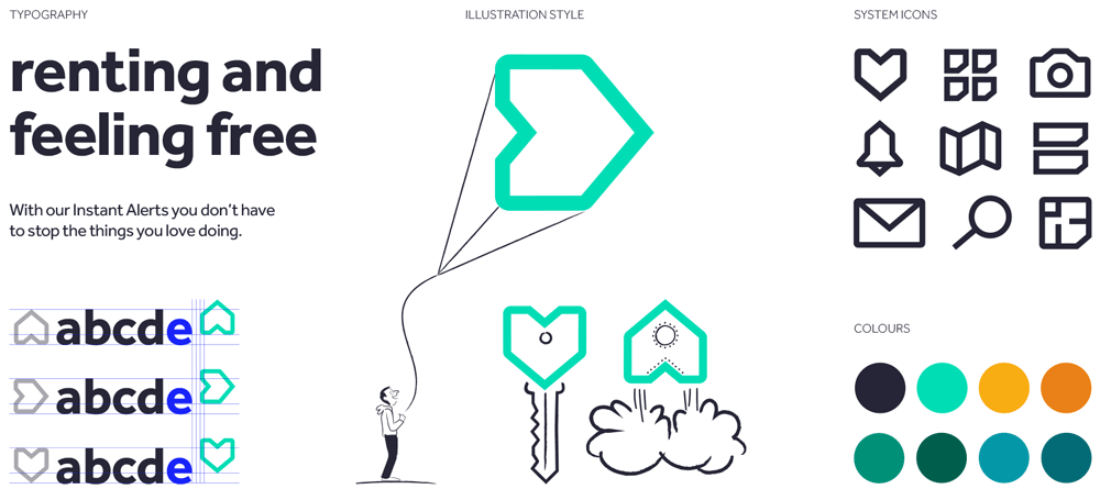
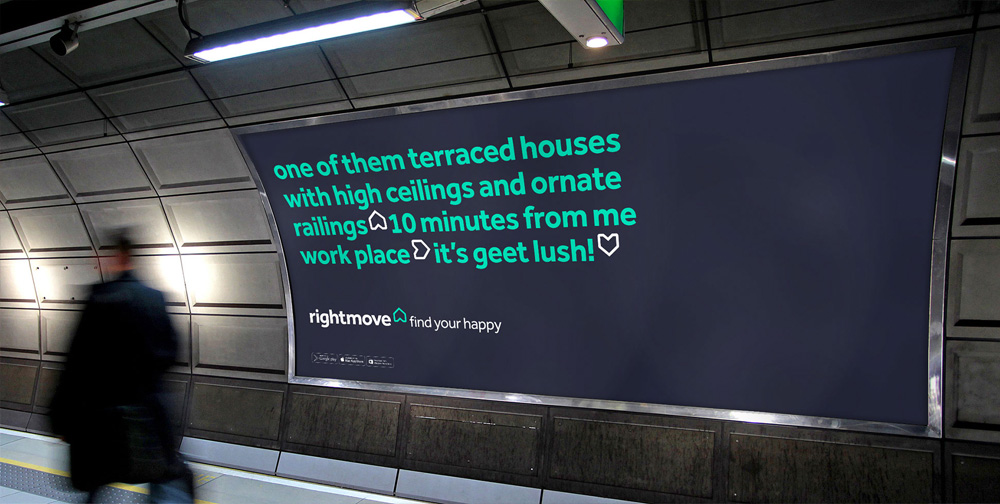
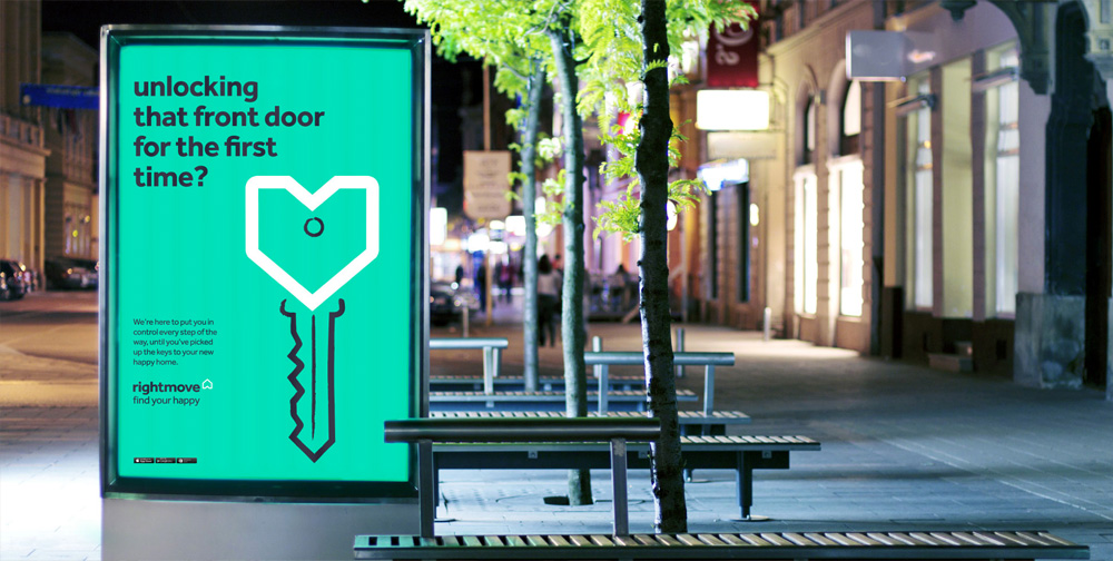
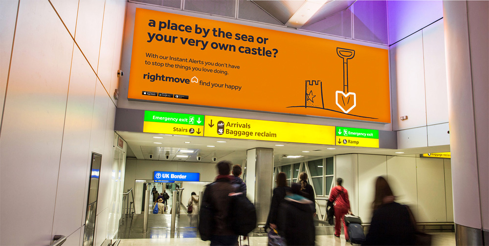
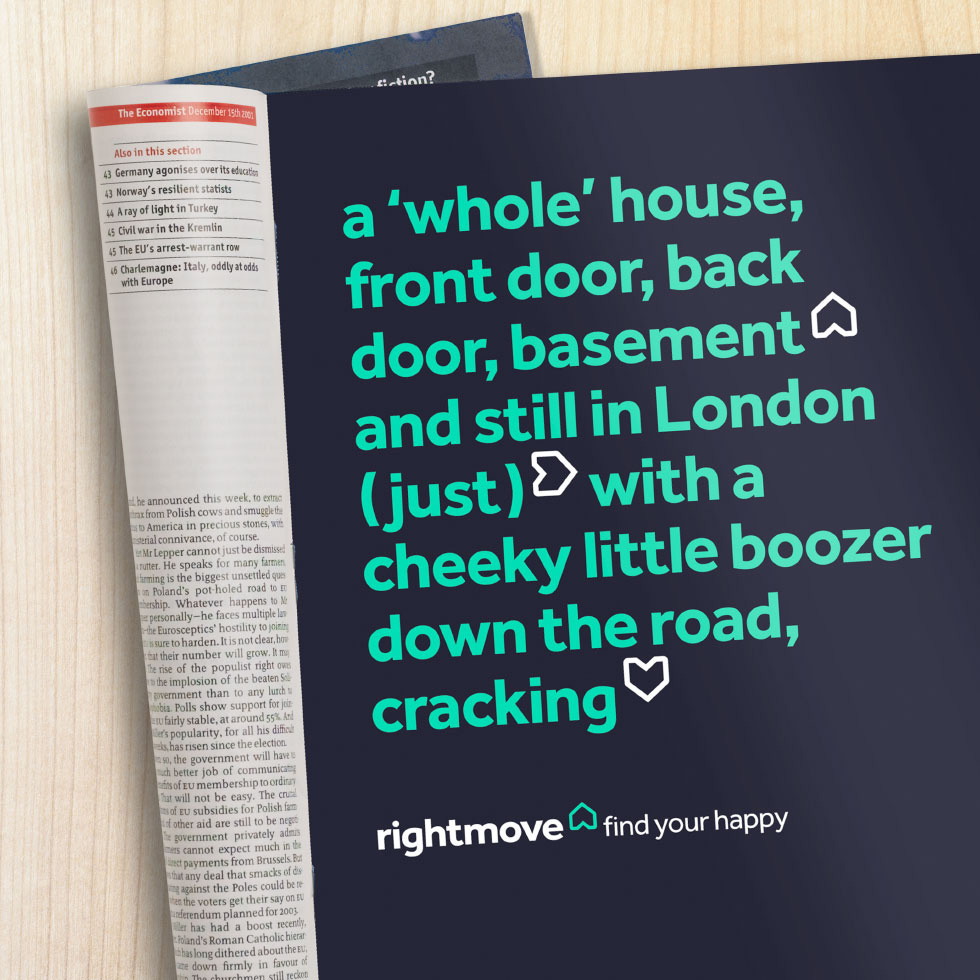
Today, Rightmove empowers the UK’s property decisions by helping people ‘find their happy’. Inspired by the well-known proverb ‘home is where the heart is’, we took the original logo and evolved it for a new era. We injected human warmth and charm into the existing brand to ensure continued success.
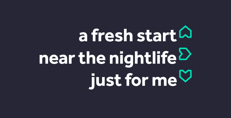
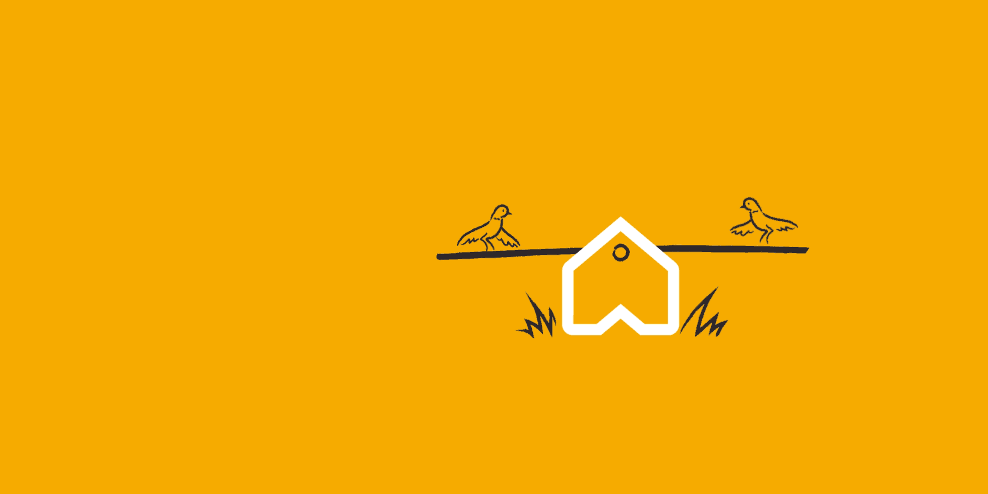
The old logo had the rightidea (no space on purpose) with an upward arrow matching the shape of a classic house drawing. Maybe too cute or too clip-arty for a large real estate organization and the wordmark was dry as a wall. The new logo maintains the basic two elements but both are more engaging and better executed. The icon is a more abstract house that now has the benefit of working like an arrow when rotated 90 degrees and like a heart when rotated 180 — an idea that comes alive quite smartly in the ads where the description of a listing is punctuated by the house, its location by the arrow, and an adjective or opinion by the heart. The wordmark is nice; nothing extraordinary but works well with the icon. The illustration style and concept (of putting the icon as part of the shape of something in the illustration) I don't like personally but I can see how it's appropriate for a broader market. And it's too bad that whoever did the introduction video didn't get the memo about the illustration style and applied it instead of the cool and smooth but totally gratuitous Dribbble style. Overall, a friendly improvement that does match the design description of adding warmth to the brand.

Thanks to Sam Mearns for the tip.

 Новости Союза дизайнеров
Все о дизайне в Санкт-Петербурге.
Новости Союза дизайнеров
Все о дизайне в Санкт-Петербурге.