Обзор лучших ресурсов по разработке бренда, разработке упаковки
contact us | ok@ohmycode.ru
contact us | ok@ohmycode.ru
Established in 1973, Historic Houses (formerly Historic Houses Association) is a nonprofit organization that represents the UK’s largest collection — over 1,600 — of independently-owned historic houses and gardens. They work with each house’s owner to help them understand how to manage and welcome visitors and keep the historic value of the property while celebrating those that take exceptional care of their houses, castles, and/or gardens. Historic Houses recently introduced a new identity designed by London, UK-based Johnson Banks.
From even the first meetings we all agreed that the name had to shorten to ‘Historic Houses’ (hence removing the HHA acronym).
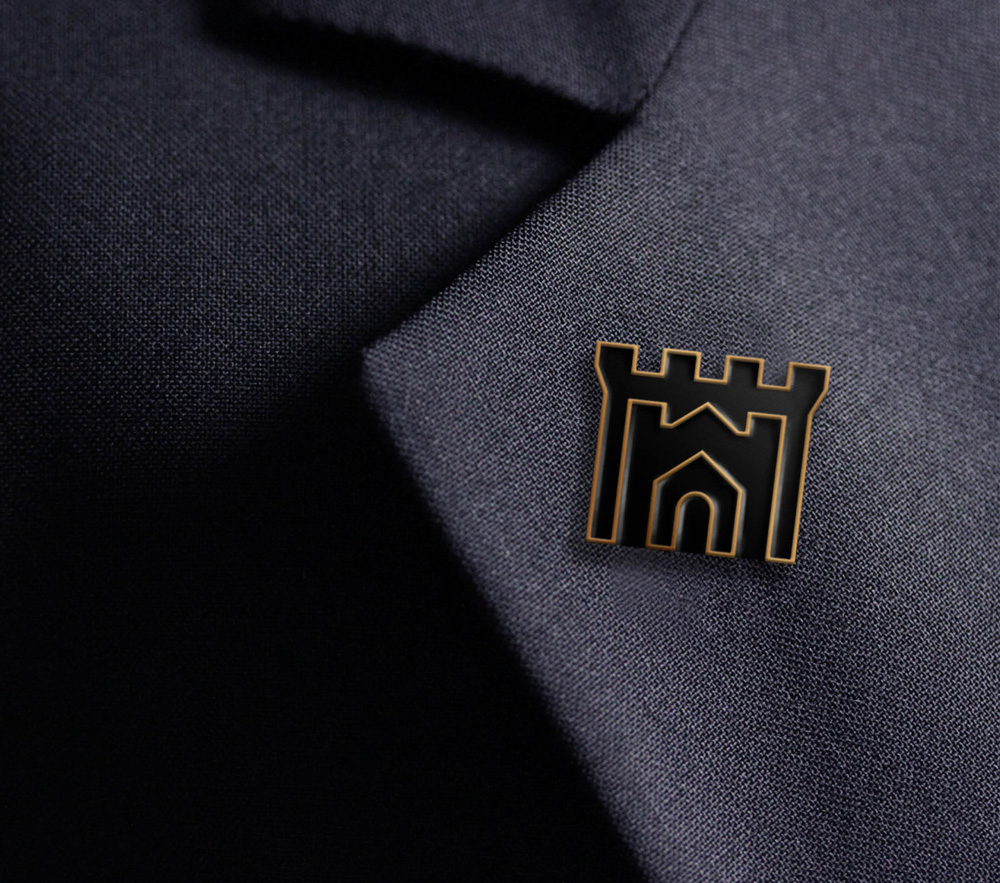
Their original symbol - a Palladian style portico - had survived untouched for nearly thirty years and initially seemed worthy of retirement. But we began to see that developing it into something that hinted at the sheer quantity and variety of their houses, from cottages to castles, could be very useful.
The icon in the old logo looked almost as if it was built using Microsoft Excel but as clunky as it was it did manage to convey, uninvitingly, that this had to do with historic houses. The condensed serif acronym and long name underneath didn’t help in making the association look any more exciting. The icon in the new logo does a fantastic job in communicating the range of properties represented by the organization, from large castles to small homes. The icon looks deceivingly simple but it’s a pretty amazing feat, using the same thickness and overall weight in the three types of properties represented while aptly contrasting the physical size relationships between a castle, a mansion, and a home. It’s a bonus that, with a little extra imagination, the middle counterspace could be read as an “H”. The Gotham-esque wordmark is a nice and simple complement that looks elegant and accessible, keeping the focus on the icon.
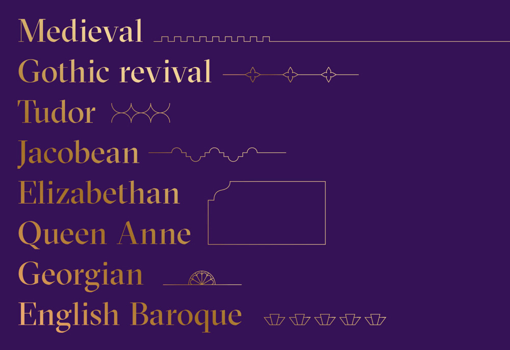
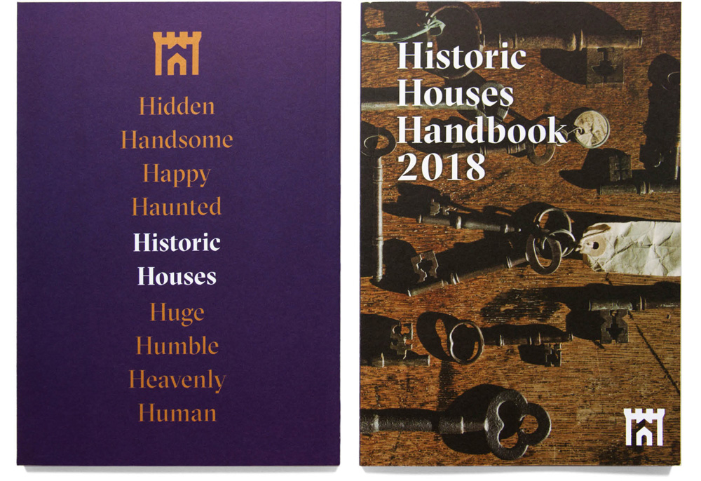
We have also developed a whole series of architectural details and flourishes that encapsulate centuries of building styles, and when used with their new typefaces allow for a far more luxurious approach to their design.
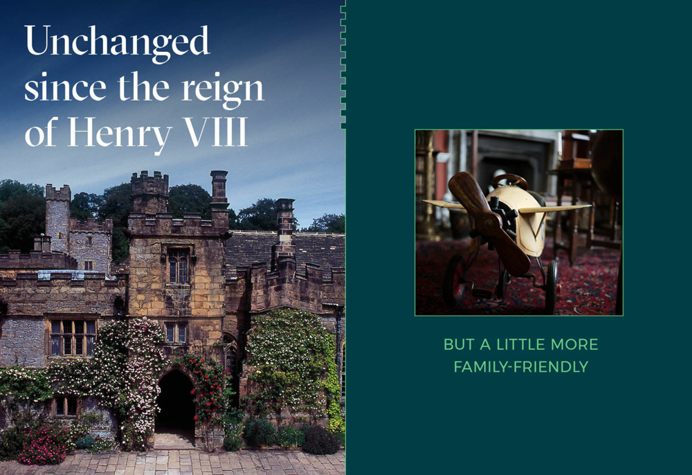
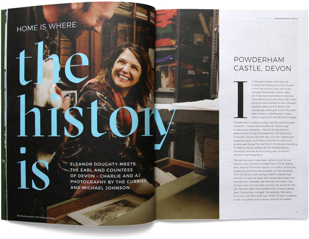
The design scheme itself concentrates on the key difference that these houses offer - that they are lived-in, alive and accessible, not dusty museums frozen in time.
Images are intentionally rich and beautiful, but we contrast this with an approach to copywriting that captures the people and places, making the scheme far more personal than their competitors.
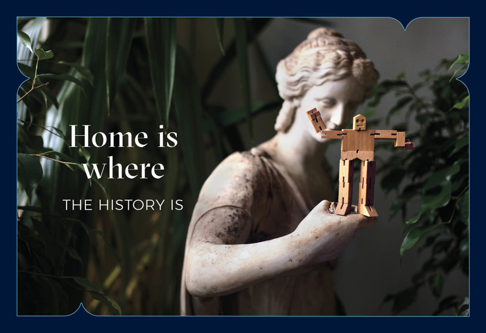
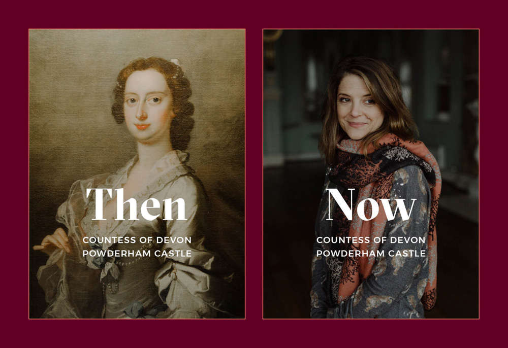
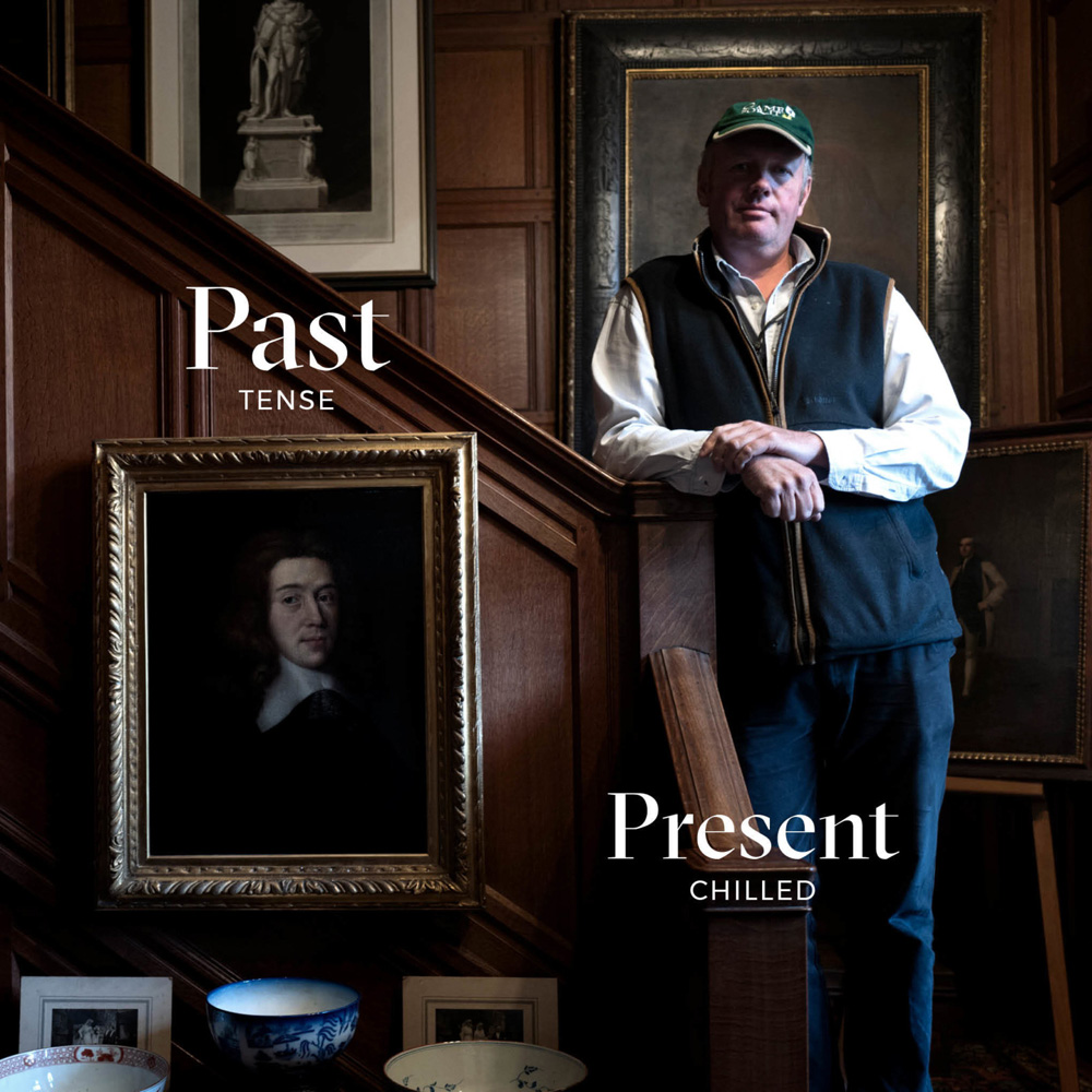
The identity focuses on communicating the convergence of old and new through copywriting and imagery, with a boost from the combination of GT Sectra and Montserrat. It all has charming, endearing effect that helps convey that these aren’t museums but homes where regular people live that just happen to be way more beautiful than your drywall-built, IKEA-adorned rental.
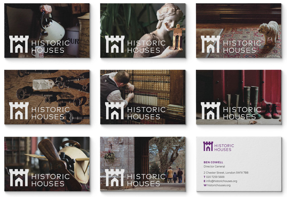
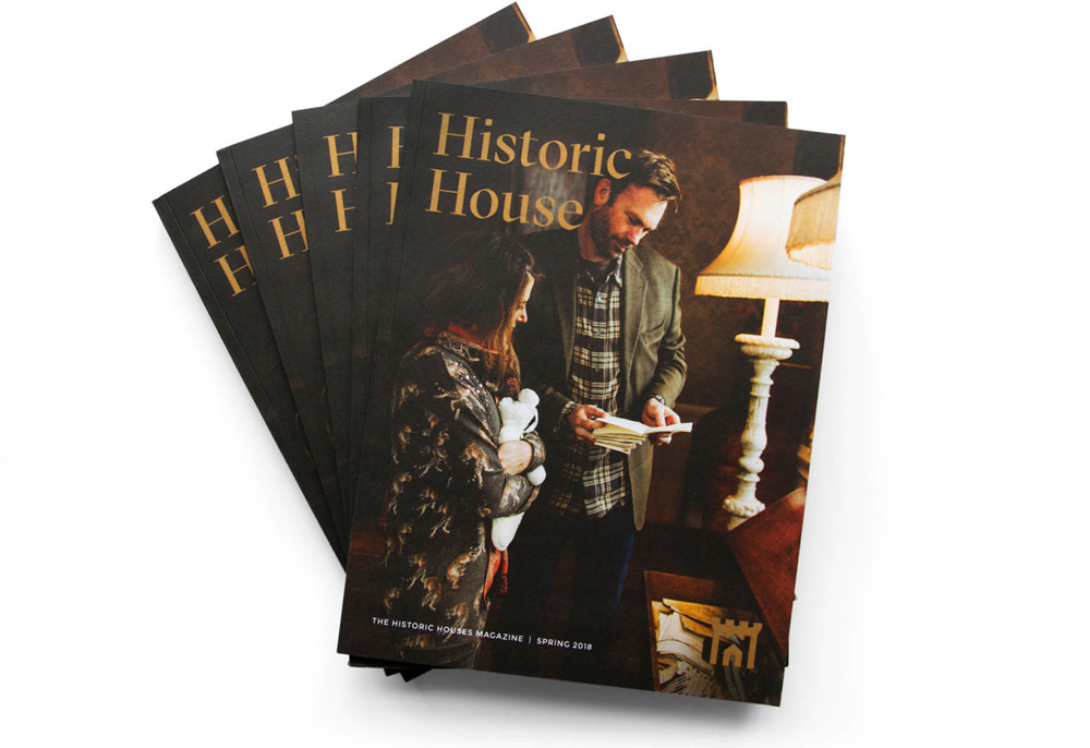
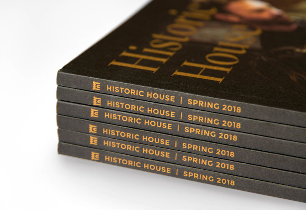
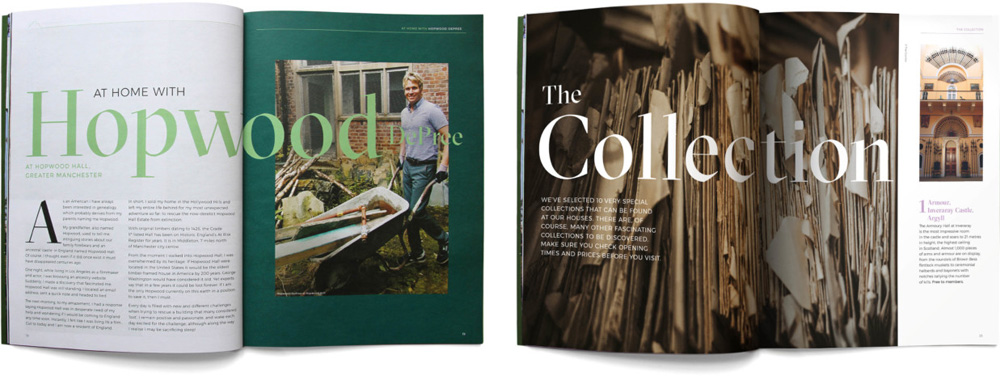
The applications all make the best use of photography, showcasing the properties in irresistible golden hues all neatly adorned with the beautiful GT Sectra and punctuated by the bold icon. Overall, the identity elevates that stature of the organization to a more historically-significant and culturally-robust one.

 Новости Союза дизайнеров
Все о дизайне в Санкт-Петербурге.
Новости Союза дизайнеров
Все о дизайне в Санкт-Петербурге.