Обзор лучших ресурсов по разработке бренда, разработке упаковки
contact us | ok@ohmycode.ru
contact us | ok@ohmycode.ru
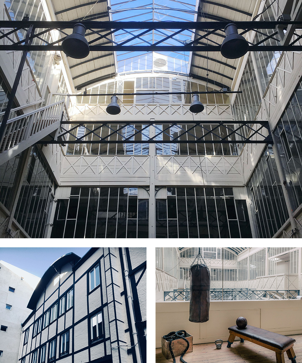
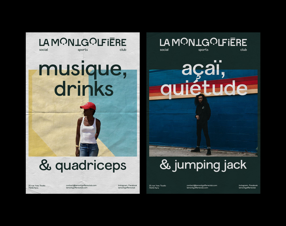
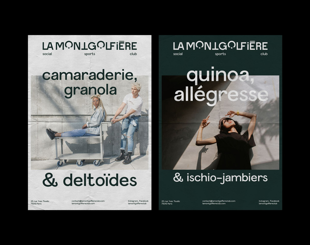
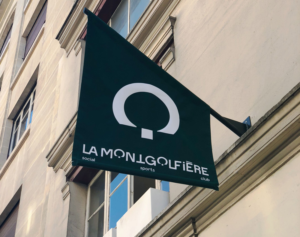
Opening this year, La Mongolfière (“The Hot Air Balloon” in English) is a new social club, slash sports club, slash arts scene in Paris, France. Its name, and part of what makes this interesting, comes from the building it’s housed in: a 2,000-square-meter (6,500-square-foot) factory originally used for the production of hot air balloon canvas, built in the 1850s — it originally had a courtyard with no ceiling, allowing balloons to launch from inside. Now, guests will be able to do crossfit in its atrium, sip adult beverages, and enjoy some art all in the same building. The identity for La Mongolfière has been designed by Paris-based Brand Brothers.
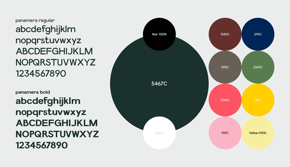
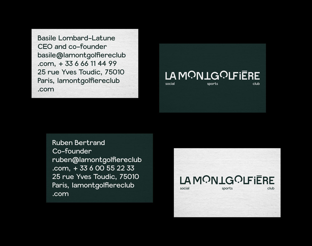
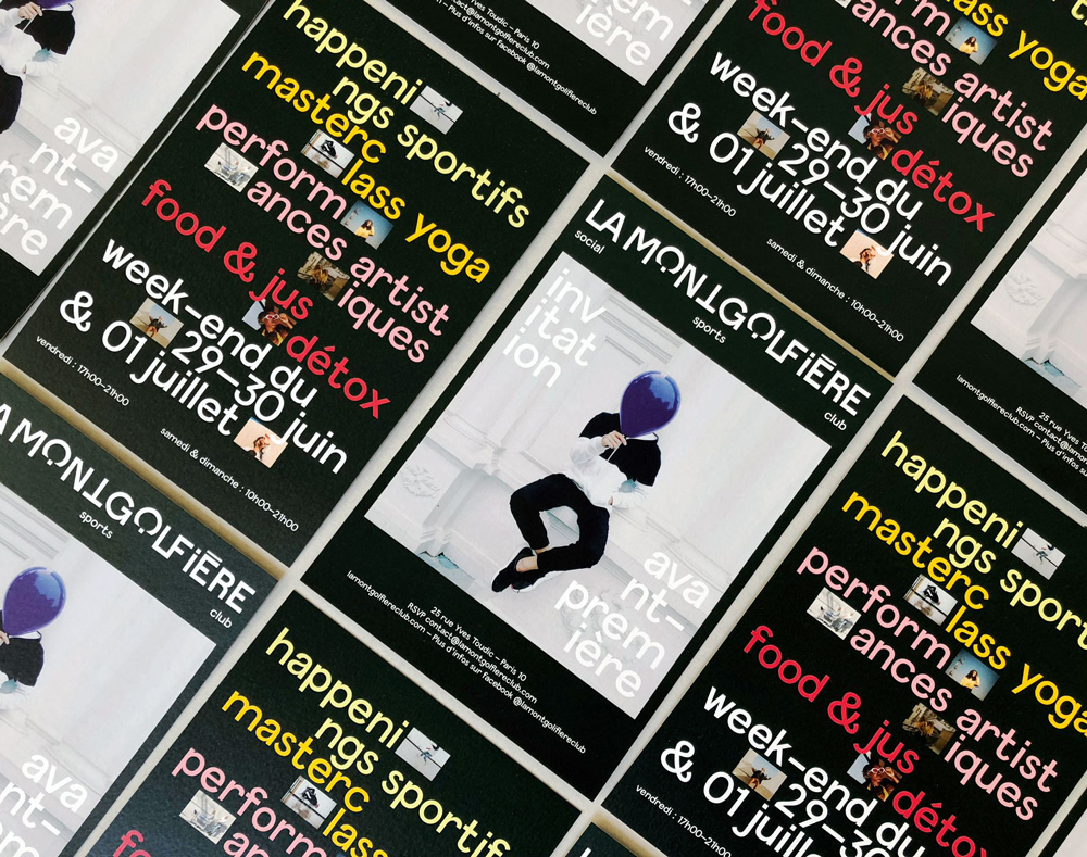
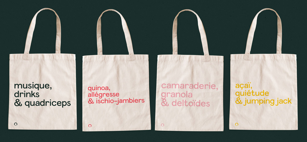
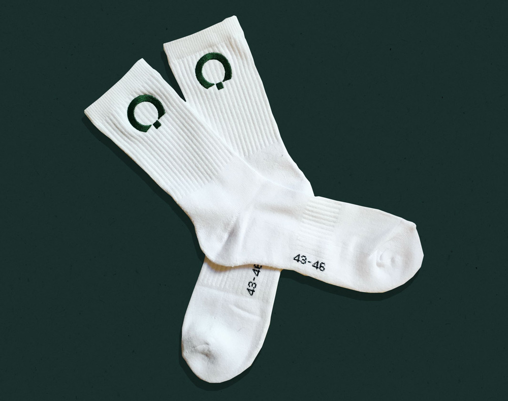
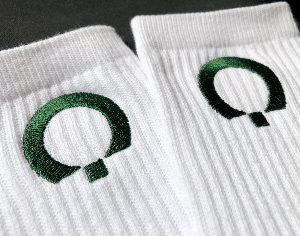
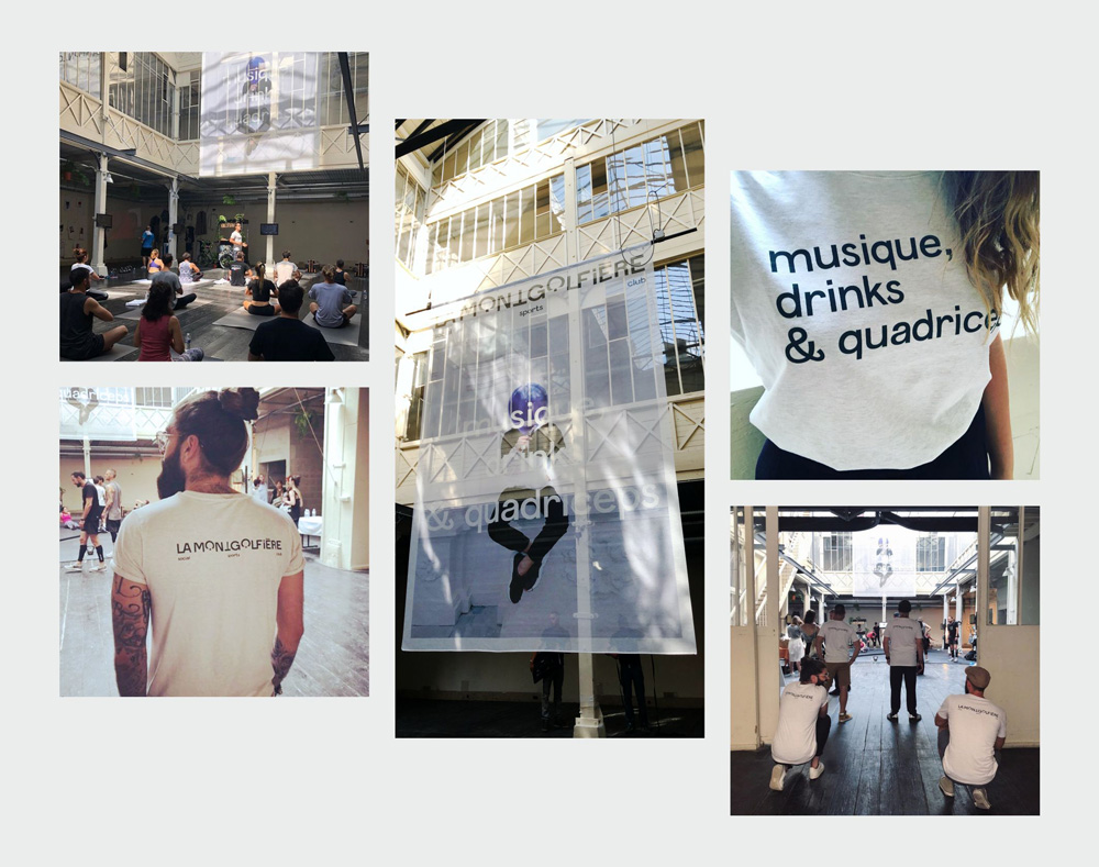
The logo, a typogram entirely designed for La Montgolfière, is a statutory lettering including subtle graphic accidents, revealing a bold state of mind. The “O’s” are transformed into monograms, revealing the simplified design of a hot-air balloon. Supported by a simple graphic system, based on a fir green (the initial hue of the beams forming the framework of the facade) and the Panamera character, we have developed for pre-opening a visual language based on multiple typographical and photographic compositions and the production of strong verbal hooks. Posters, postcards, socks, totes bags, t-shits, flags, but above all a monumental tulle flag (6 meters high) welcomed a few hundred curious people last June. See you in September.
The logo is a bit on the awkward side but I think it leans so hard into its awkwardness that it works (at least it does for a hot-air-balloon-turned-gym kind of place). It’s a long name and there is a lot going on in it: there are ligatures, there is an upside down “T”, a lowercase “i” among all uppercase letters, and two “O”s drawn as abstract hot air balloons. My gut reaction is that I don’t quite like it but at the same time I like the amount of no fucks given: the logo does what it wants and the identity has gots its back.
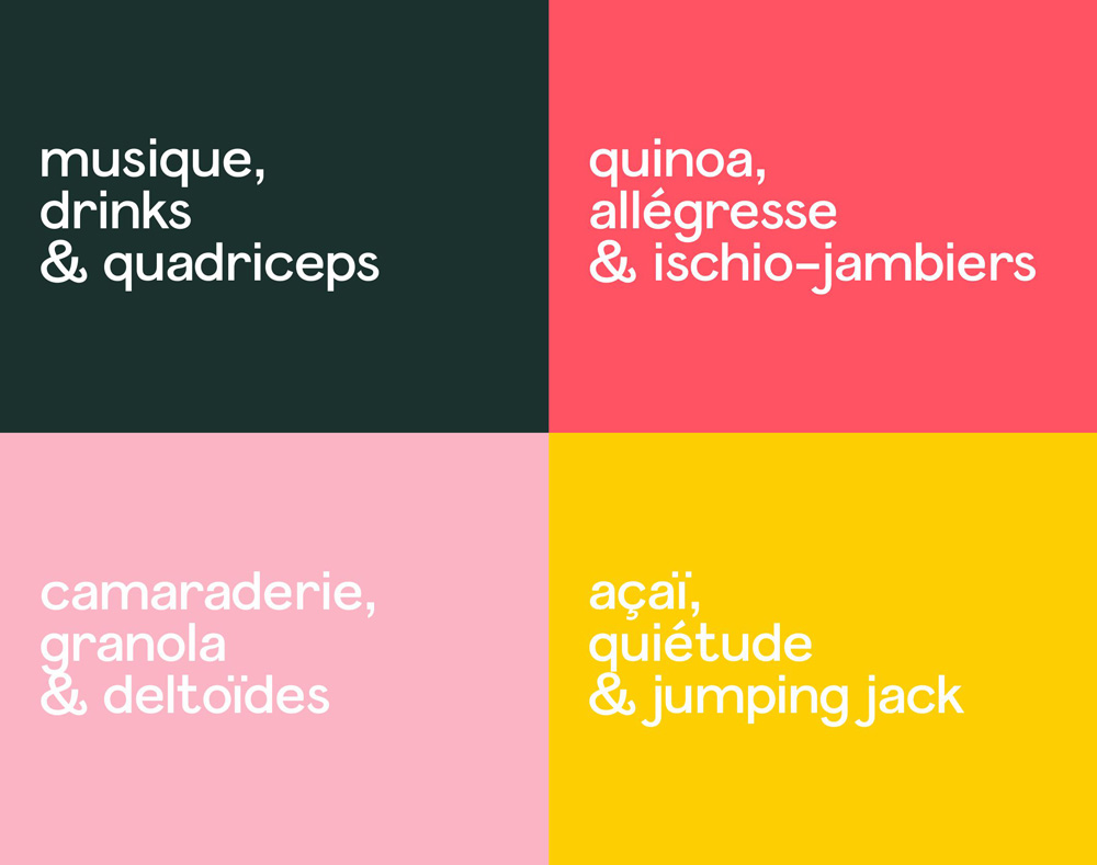
Like the logo, the identity is a mix of ideas and approaches, starting with the copywriting that conveys the different offerings of the place by combining loose words in French and English that sound like a healthy hipster’s to-do list. All typeset in the quirky Panamera, the identity has a loose and care-free vibe.
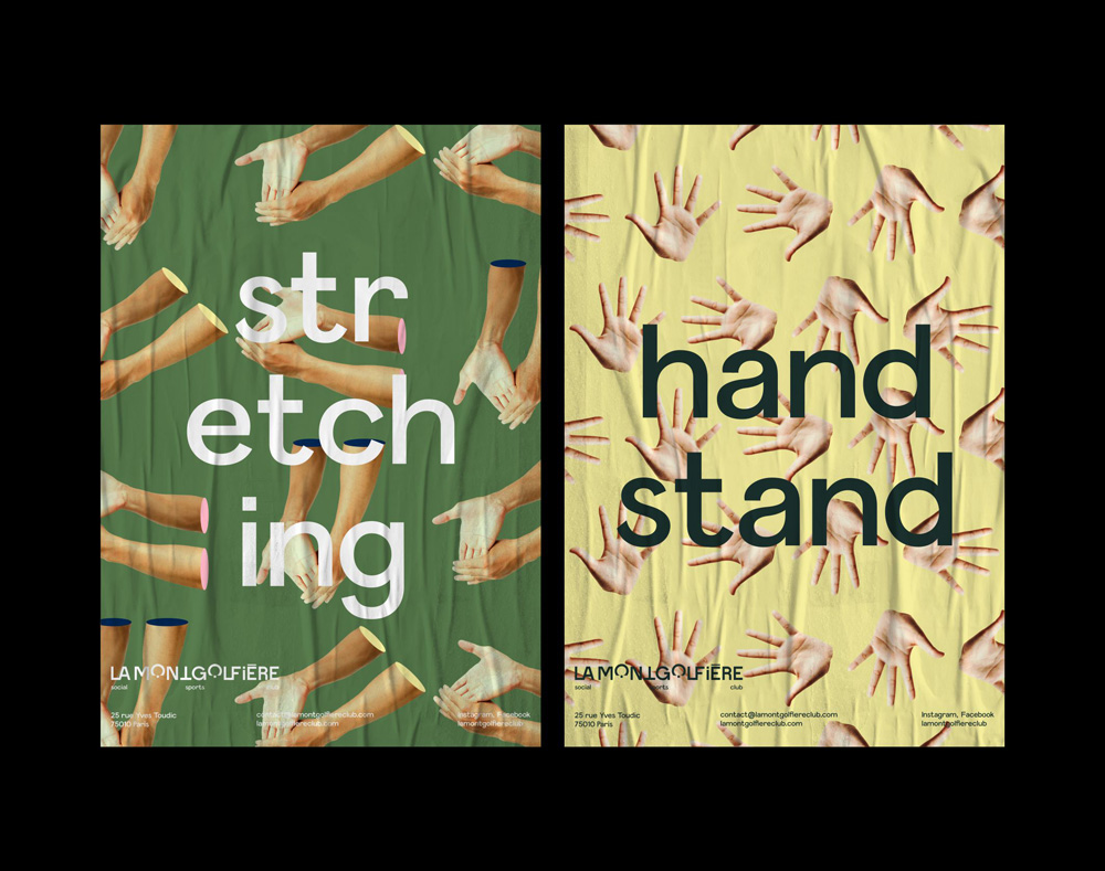
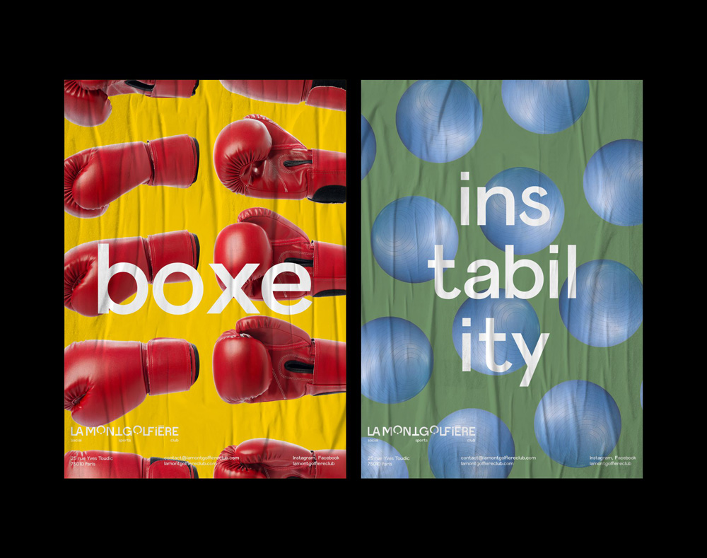
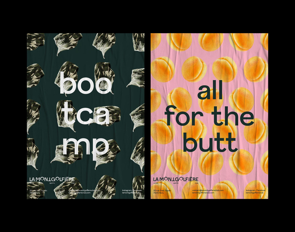
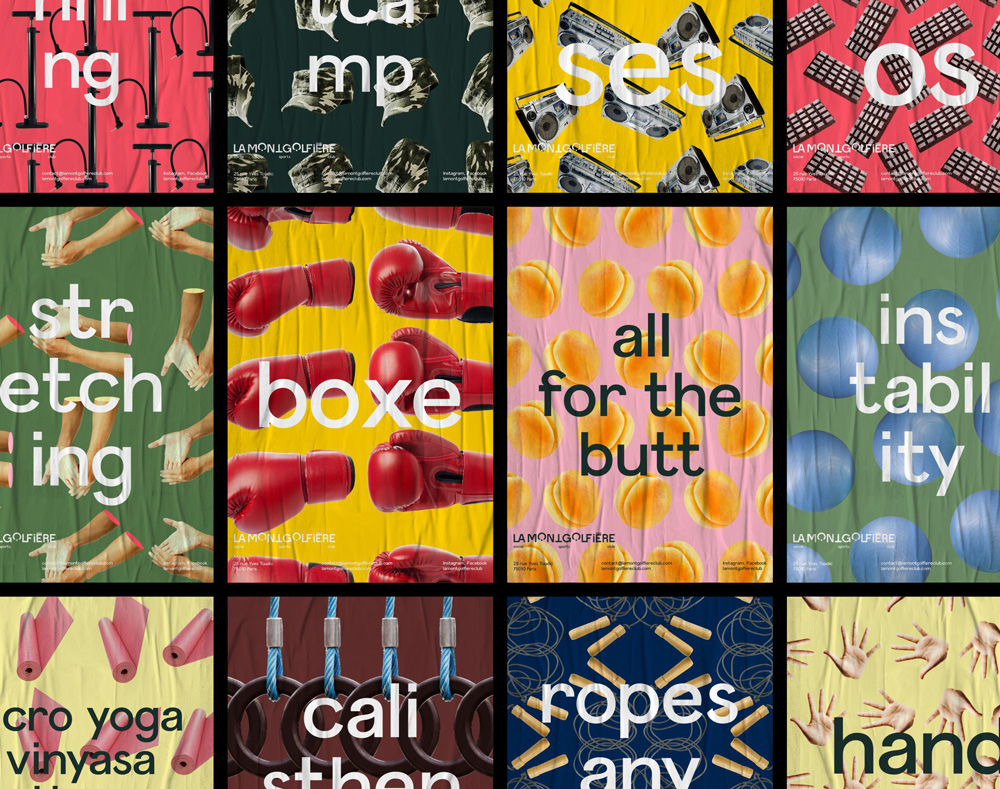
This second series of posters — with the patterns behind it — is what got my attention. There is a great sense of playfulness and even though the identity is already quite out there these posters really let loose with some awkward imagery, compositions, and word associations. The other applications — the first set of posters, postcards, etc. — are also good but feel like they are trying harder to look cool.
Overall, this is a great, funky solution for what is an odd brief of trying to find an identity and tone of voice for a social/sports club housed in an old hot air balloon factory — there is no playbook for that.

 Новости Союза дизайнеров
Все о дизайне в Санкт-Петербурге.
Новости Союза дизайнеров
Все о дизайне в Санкт-Петербурге.