Обзор лучших ресурсов по разработке бренда, разработке упаковки
contact us | ok@ohmycode.ru
contact us | ok@ohmycode.ru
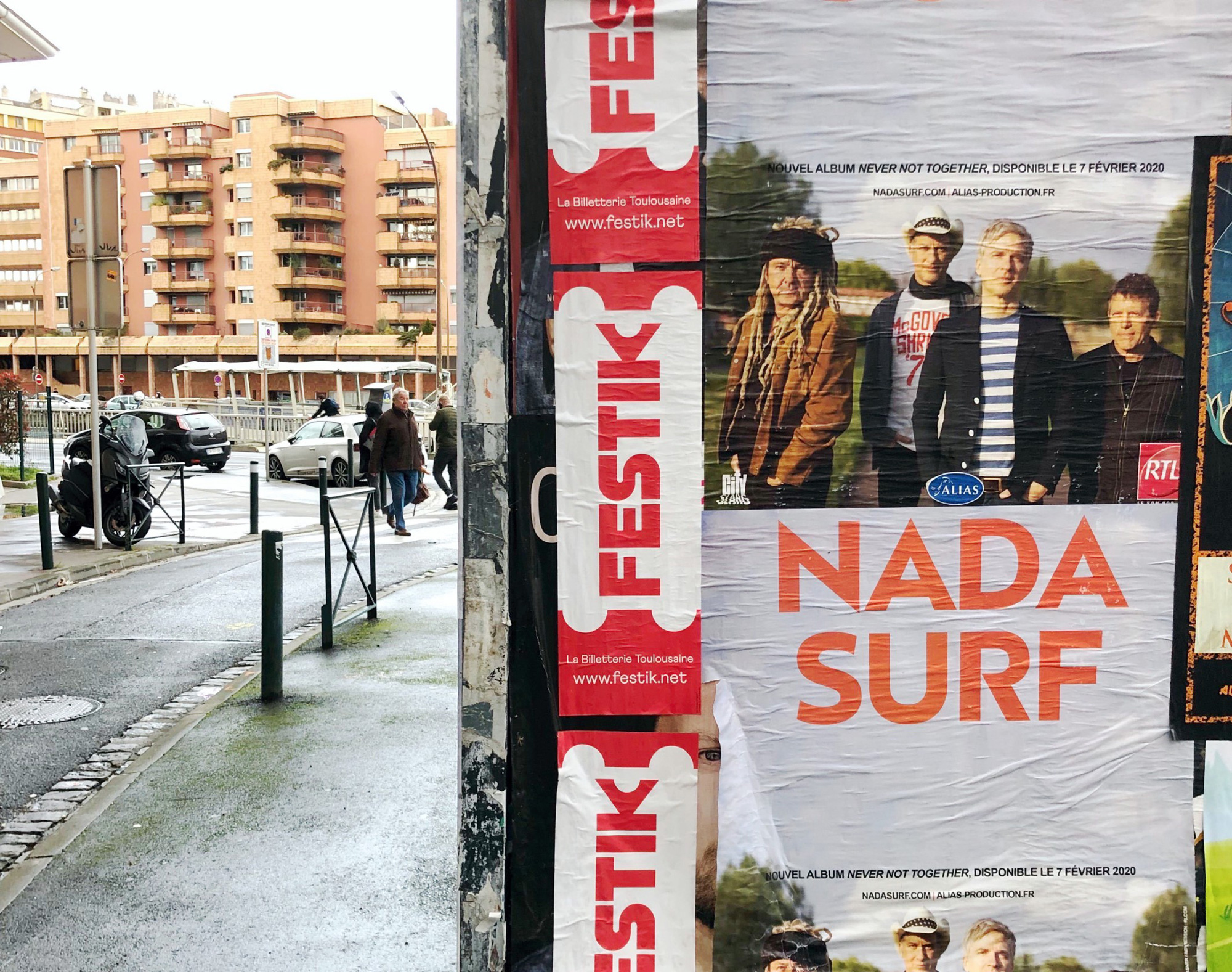
Established in 2012, Festik is a ticketing service company based in Toulouse, France, providing tickets to the public and various services for event organizers and producers, including advance online and in-person ticket sales and day of event ticket sales and check-in control. Offering tickets for concerts, conferences, museums, theater, comedy, and sports, Festik places a lot of emphasis for both ticket buyers and event organizers on being an ethical company and adding a touch of humanity to an otherwise cut-throat industry. It seems to be somewhere between Ticketmaster and Eventbrite. Meant to be launched at the Printemps de Bourges festival in April (which was cancelled), the identity, designed by Paris, France-based Brand Brothers hasn’t been rolled out online except for one image on their Instagram account, so I’ll count that as a launch for an event company during these times.
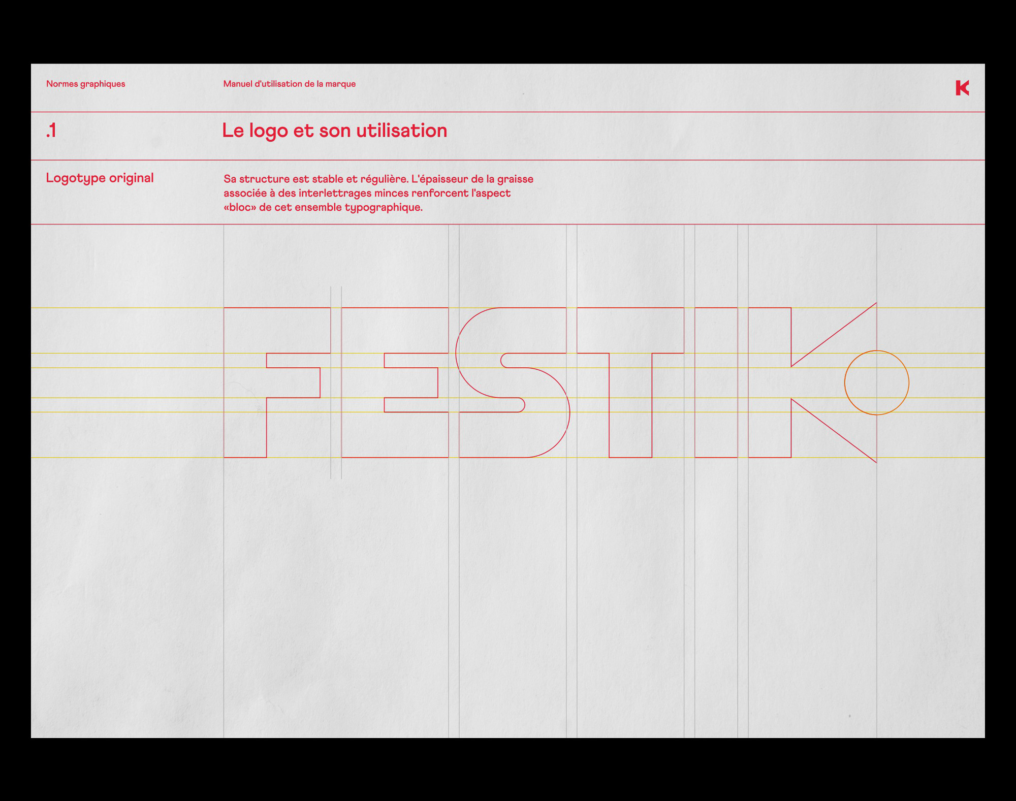
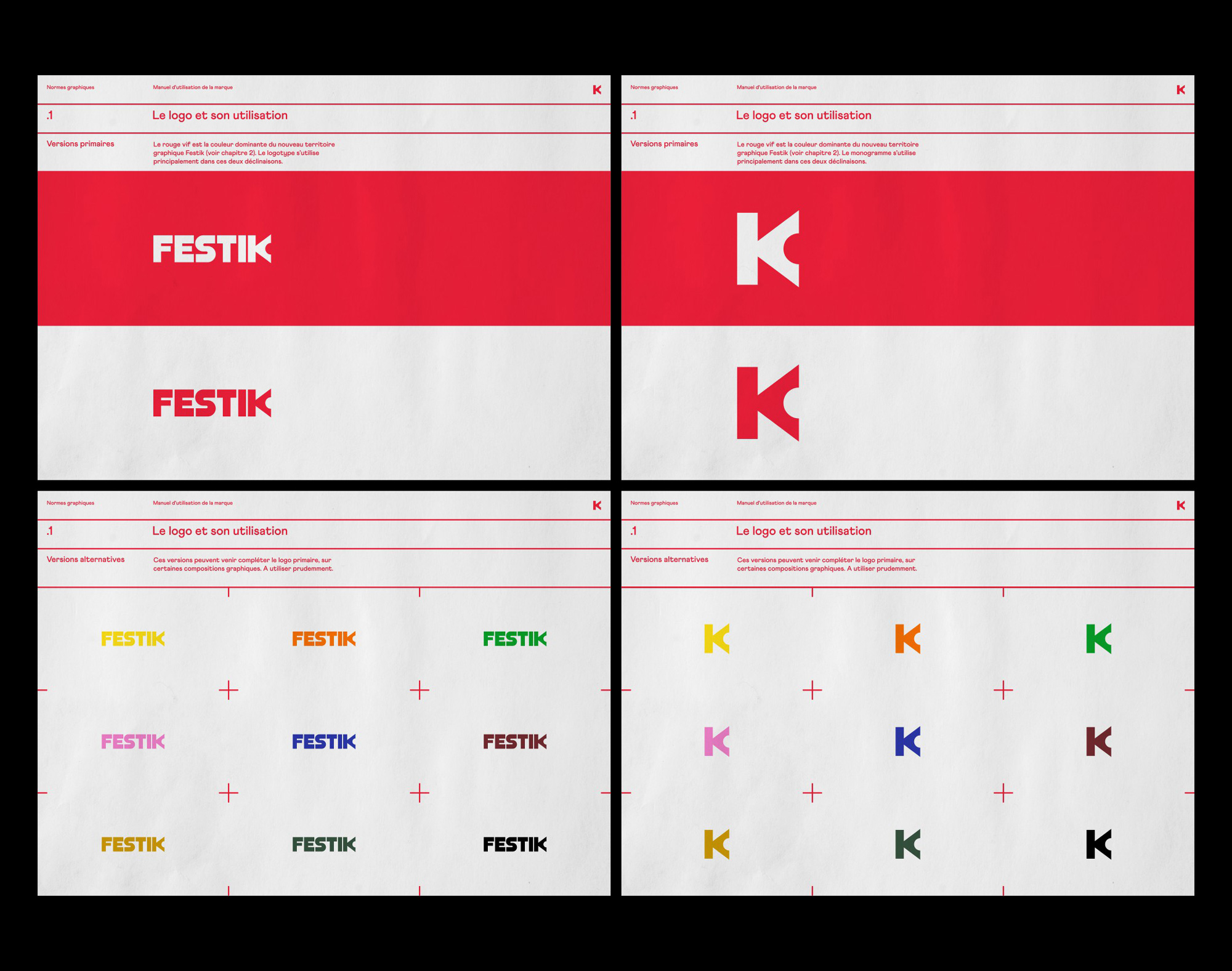
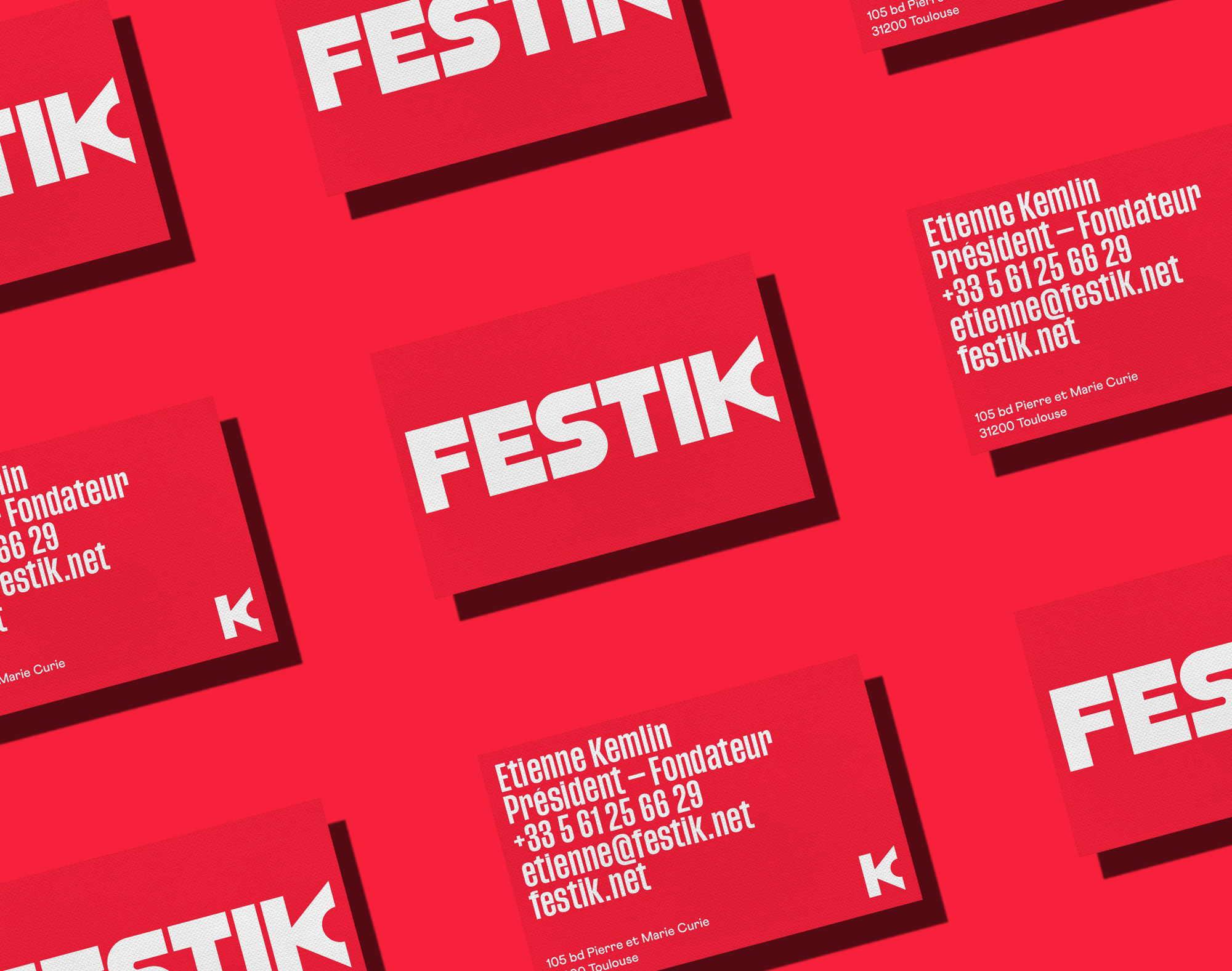
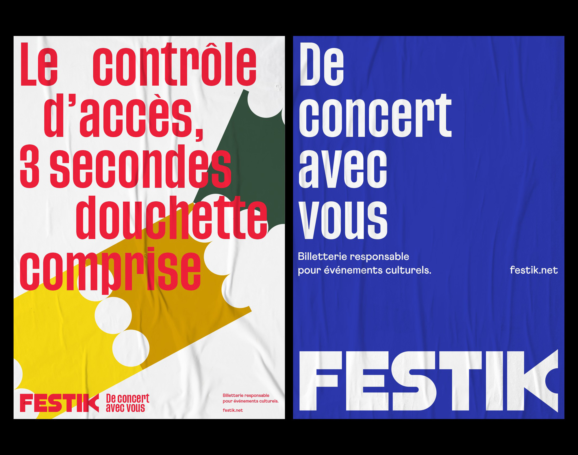
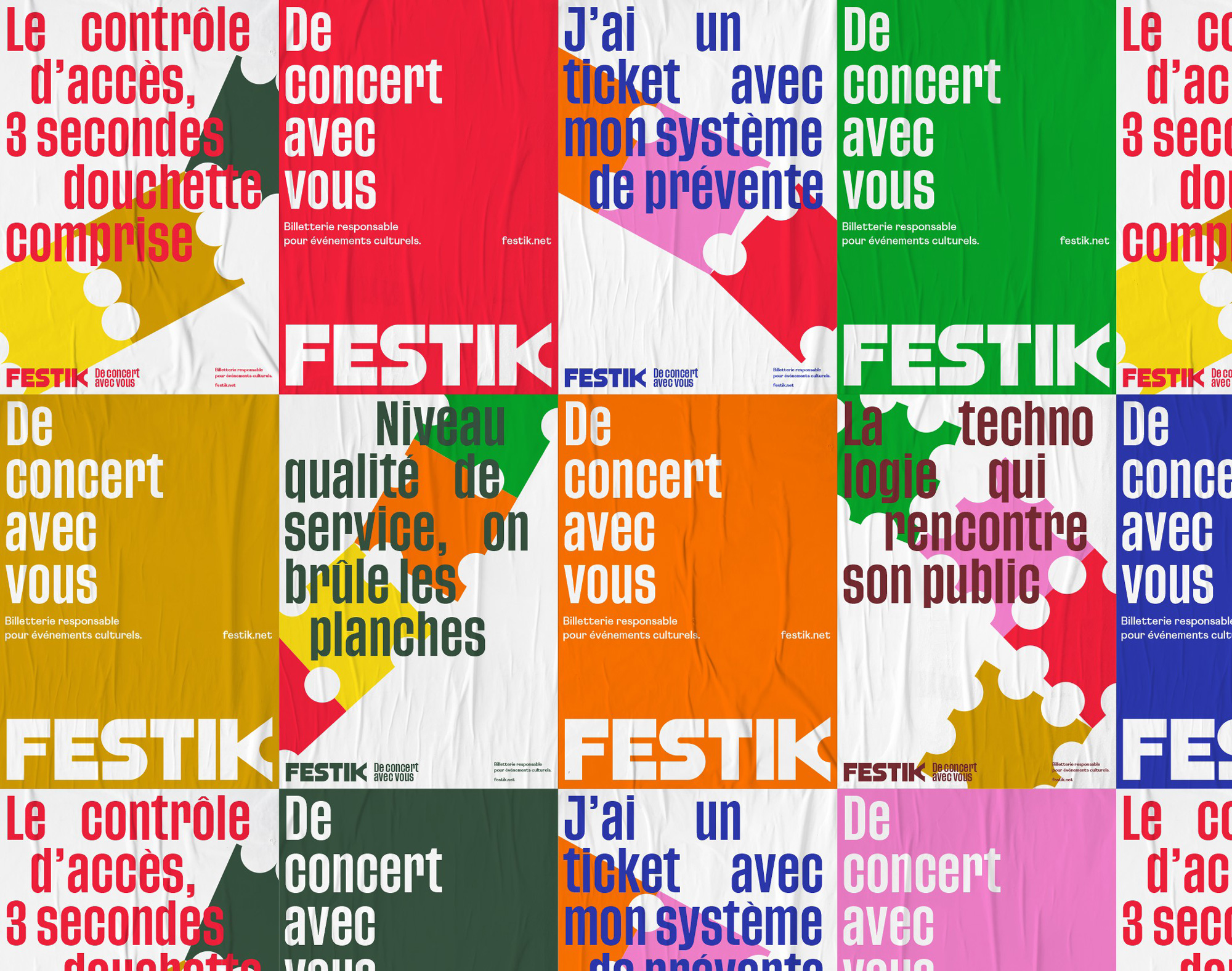
Our work is based around a new logo with a typographic design developed for the occasion: a solid and stable construction and reduced letter-spacing that gives the typographic block an ideal presence and visibility. The K becomes the pivot of the identity; it is the starting point of the visual system, composed of geometric shapes that remind the shape of event tickets, as well as a set of bright colours. The elements of the visual territory offer Festik the possibility of a simple and versatile graphic design.
The old logo had a good idea of turning the “s” into a ticket being torn along the dotted perforation and it could have been evolved into something nice, given how clunky the original execution was. The new logo maintains the perforated notch gesture in a more abstract way in the “K”, which punctuates the custom wordmark. The “K” is awkward on its own but it works quite well at the end of the very geometric letters that precede it and adds a quirky element to make the wordmark more ownable for the company and recognizable for the ticket buyers. While the single ticket notch isn’t as effective as the multiple notches from the old logo, the name of the company helps take you there and it’s interesting how even though we rarely use tear-off tickets anymore, the idea remains strong and feasible.
The pattern above is visually very interesting and cool but I think it changes the concept of the ticket tear into more of a ticket punching gesture like when you are on a train, which is a very different experience.
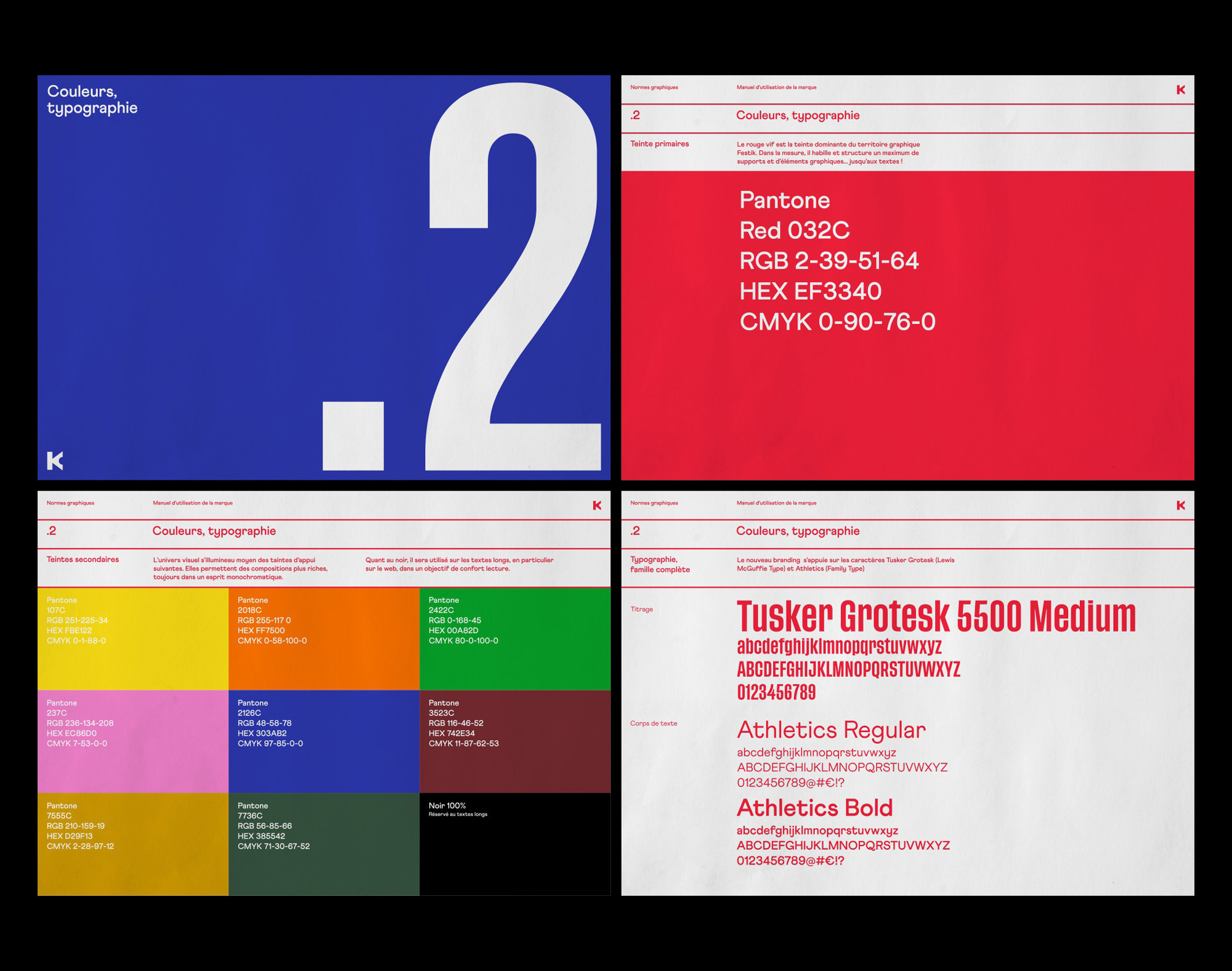
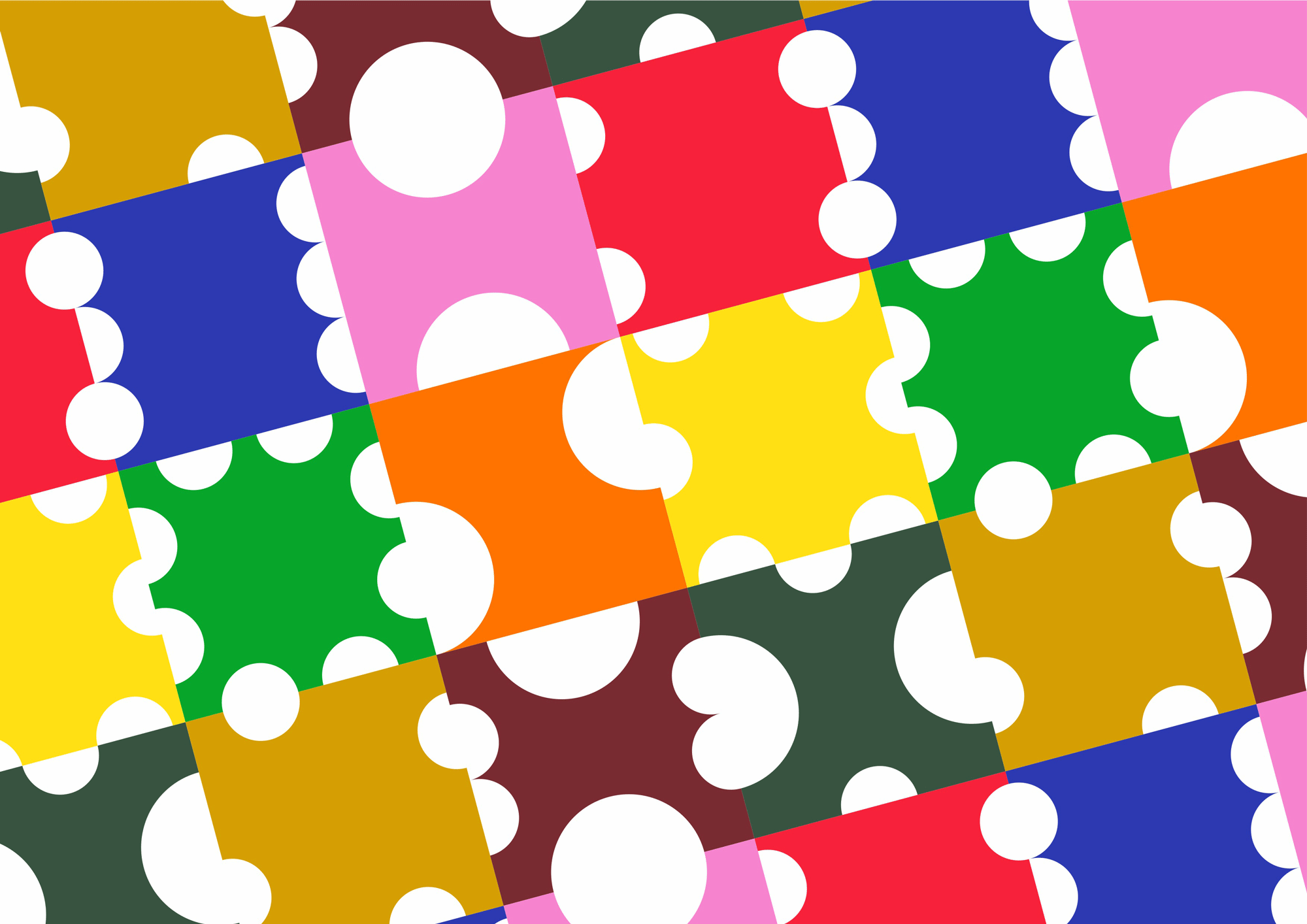
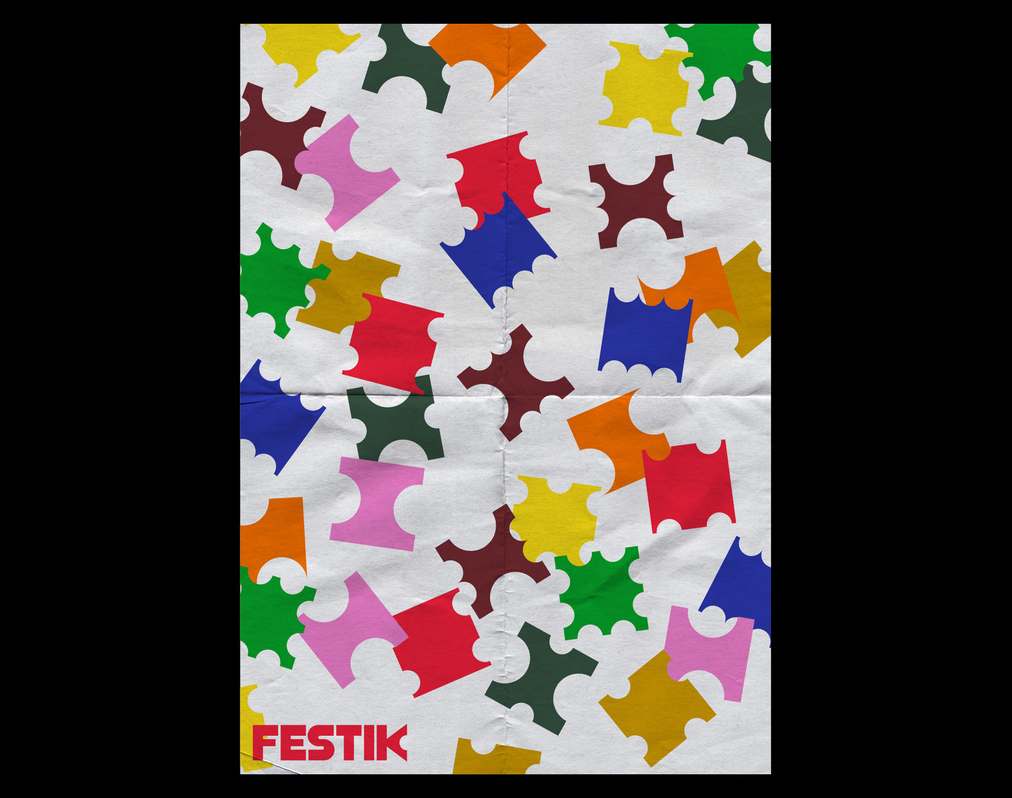
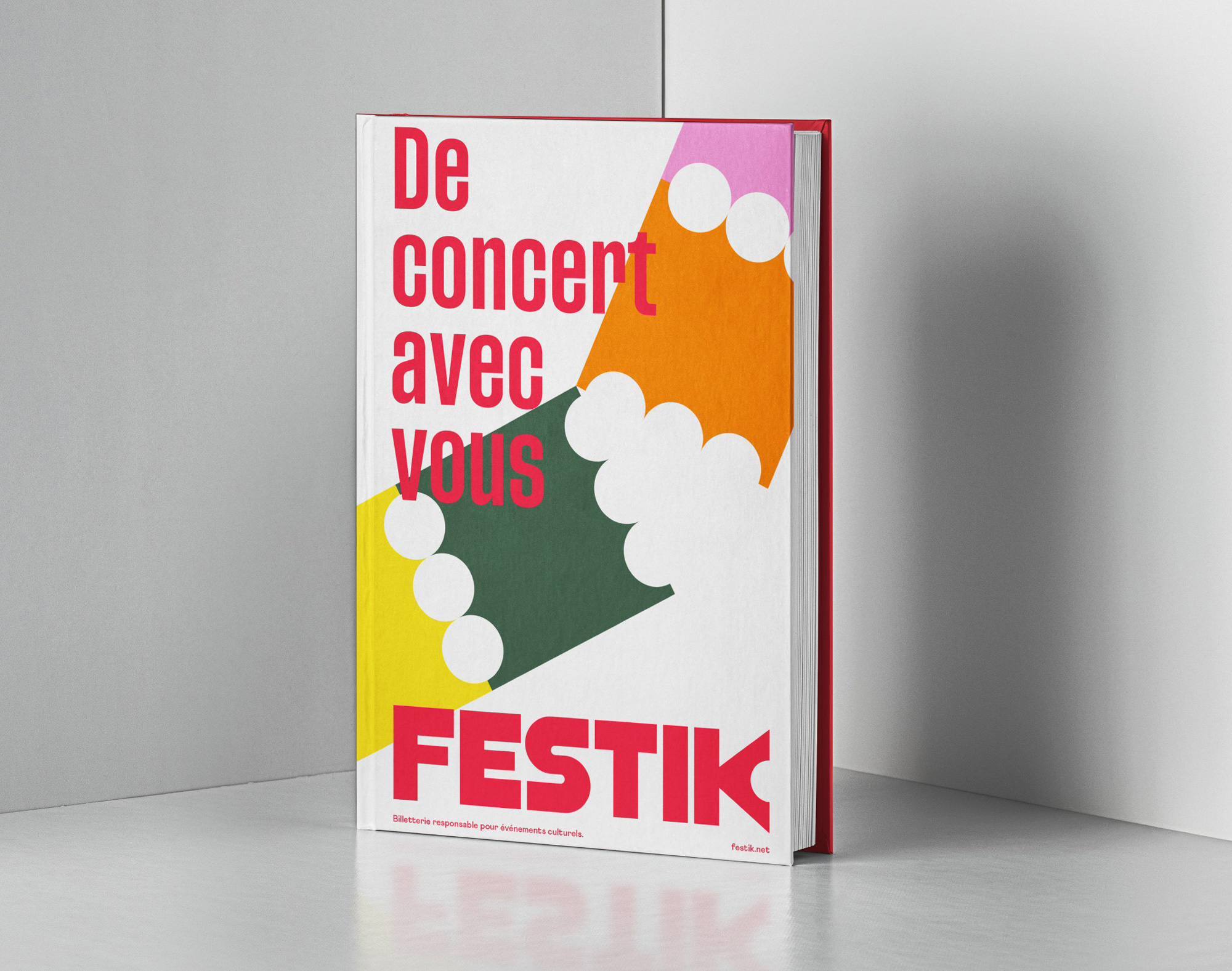
In application, the full-ticket tear gesture comes back in the form of squares with different amounts of notches taken out in different sizes. The resulting shapes and compositions are visually festive and convey a sense of lots of tickets being torn and thrown into those boxes where ticket ends go to die. The primary condensed typeface used, Tusker Grotesk, is okay although, personally, I’m not sure I like it as a typeface on its own with its tiny ascenders and descenders. The secondary typeface, Athletics, maybe has too much personality for a secondary typeface and it somehow gives me 1940s/50s vibes. But I guess it’s at least more interesting than the typical serif/sans serif combination.
Overall, the logo is a great improvement that makes the service look more legit and, while I’m not fully convinced all its elements belong together, the identity is fun and effusive to convey the sense of joy and entertainment associated with cultural events… which we will get to experience one day, again.
 each year since publication began in 2006

 Новости Союза дизайнеров
Все о дизайне в Санкт-Петербурге.
Новости Союза дизайнеров
Все о дизайне в Санкт-Петербурге.