Обзор лучших ресурсов по разработке бренда, разработке упаковки
contact us | ok@ohmycode.ru
contact us | ok@ohmycode.ru
Established in 2009, PayAsUGym is an online, mobile marketplace that offers discounted and flexible access to more than 2,800 fitness venues across the UK, allowing users to purchase day passes or class-specific passes without contract memberships to gyms, pools, and spas. Earlier this month, PayAsUGym changed its name to Hussle and introduced a new identity designed by London, UK-based Onwards.
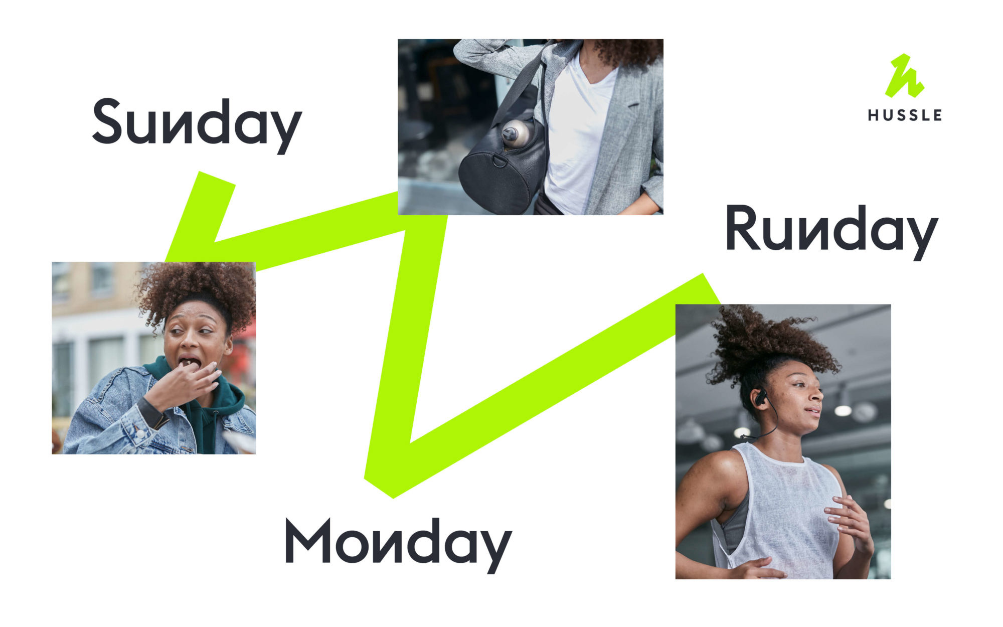
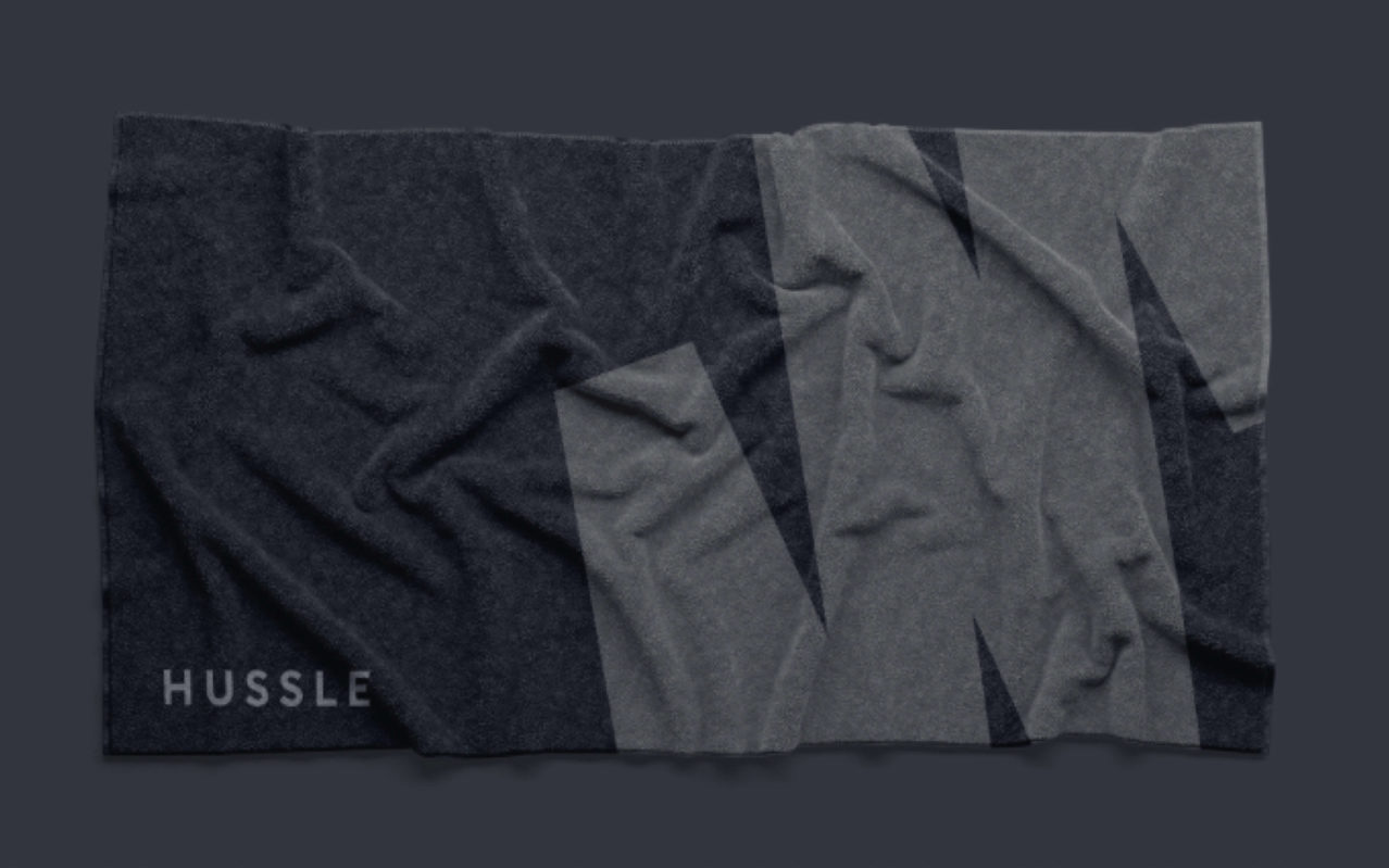
When you Hussle, you make fitness a part of life not the other way around. So, we created a distinctive line device that maps and connects the moments in people’s days, showing how they fit fitness in. We used this line to inform our whole graphic system, from a bespoke typeface and icons to an iconic logo that’s packed with Hussle energy.
Their old name ‘PayAsUGym’ sounded budget. They needed a new name that accurately reflected the modern, disruptive business they’d built. ‘Hussle’ is a bold new name for a new era. It’s simple. It’s standout. And it captures the ‘life-on-your-terms’ attitude at the heart of the brand.
The old name and logo were painful. To its credit, the old name was 10/10 descriptive, telling you exactly what this was and even did so with an economy of language, minimizing “you” to “u”, but in terms of being aspirational or evocative: 0/10. The old logo, in VAG Rounded and a map location pin, were as generic as VAG Rounded inside a map location pin. The whole thing looked as something you would first learn about on Shark Tank/Dragons’ Den.
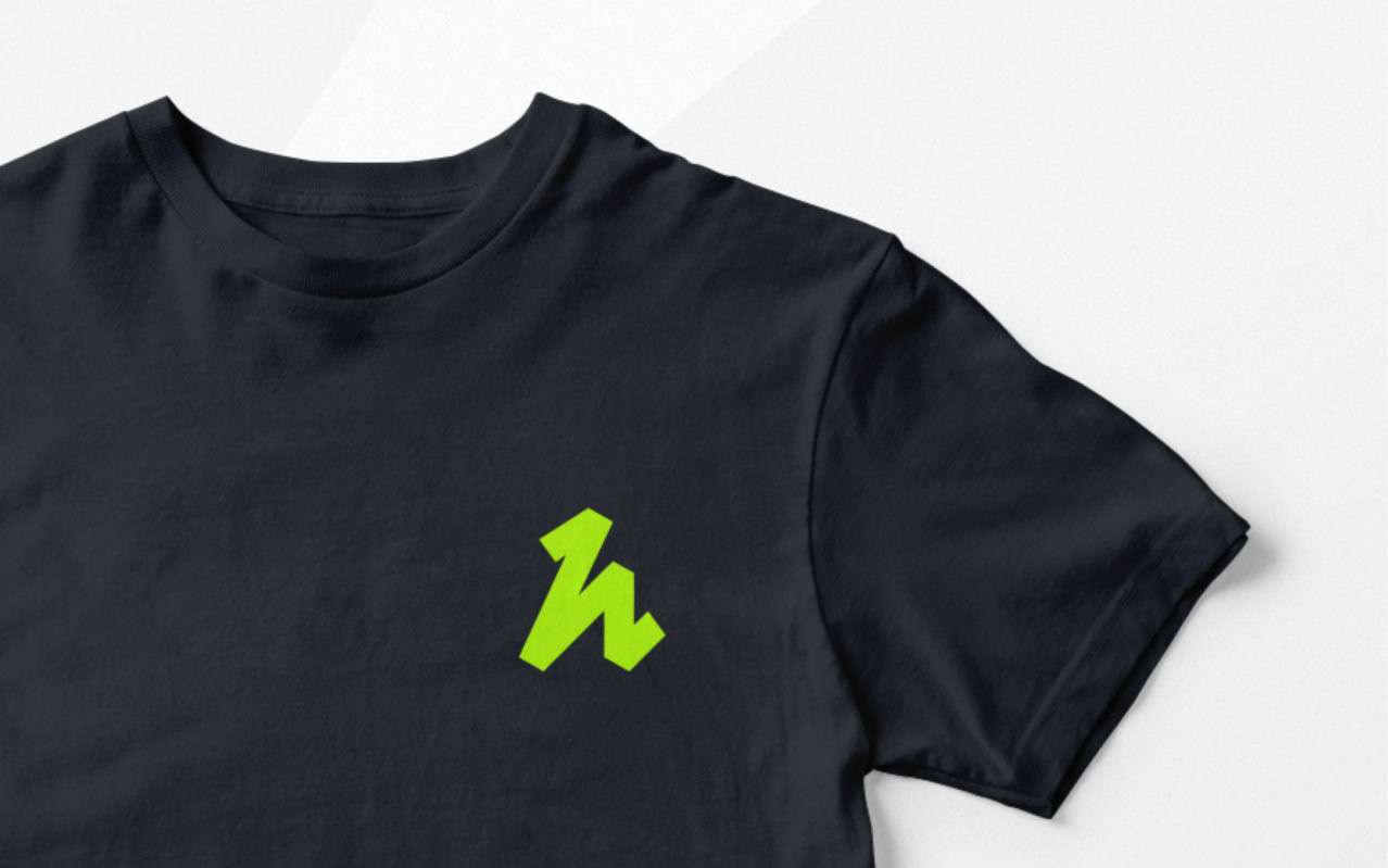
The new name, a relative misspelling of “Hustle” — I say relative ’cause Urban Dictionary classifies it as a word — is not nearly as indicative as the old one of what the service is but it’s far more engaging, it’s shorter, and it sounds more like a brand name you would trust. Additionally, the new name can translate into a verb (e.g., from their website, “When you Hussle, you get access to gyms across the UK”) which can be a really powerful tool to build equity. The new logo features an abstract “h” in the form of a bold, angled, squiggle that conveys energy, speed, and strength and gives the brand a great asset to work with. I really like the execution and how it feels like it’s sprinting towards something. The wordmark, in a simple sans serif, is a good complement — far from exciting or interesting but that’s the icon’s role.
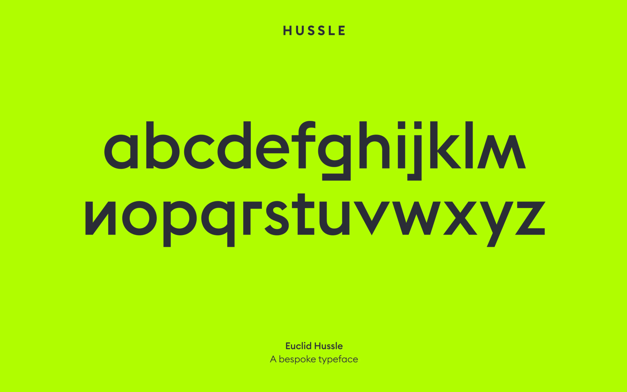
The custom typeface is a little gimmicky and most of the weird characters are just plain weird — that poor “g” — while some are actually distracting, like the reverse “N”, making the text look like Cyrillic at quick glance. In application and in combination with thick squiggles it does manage to work well and continues to expand the relatively edgy tone of the identity.
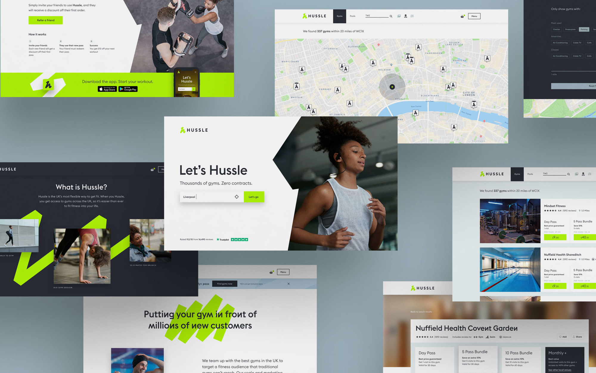
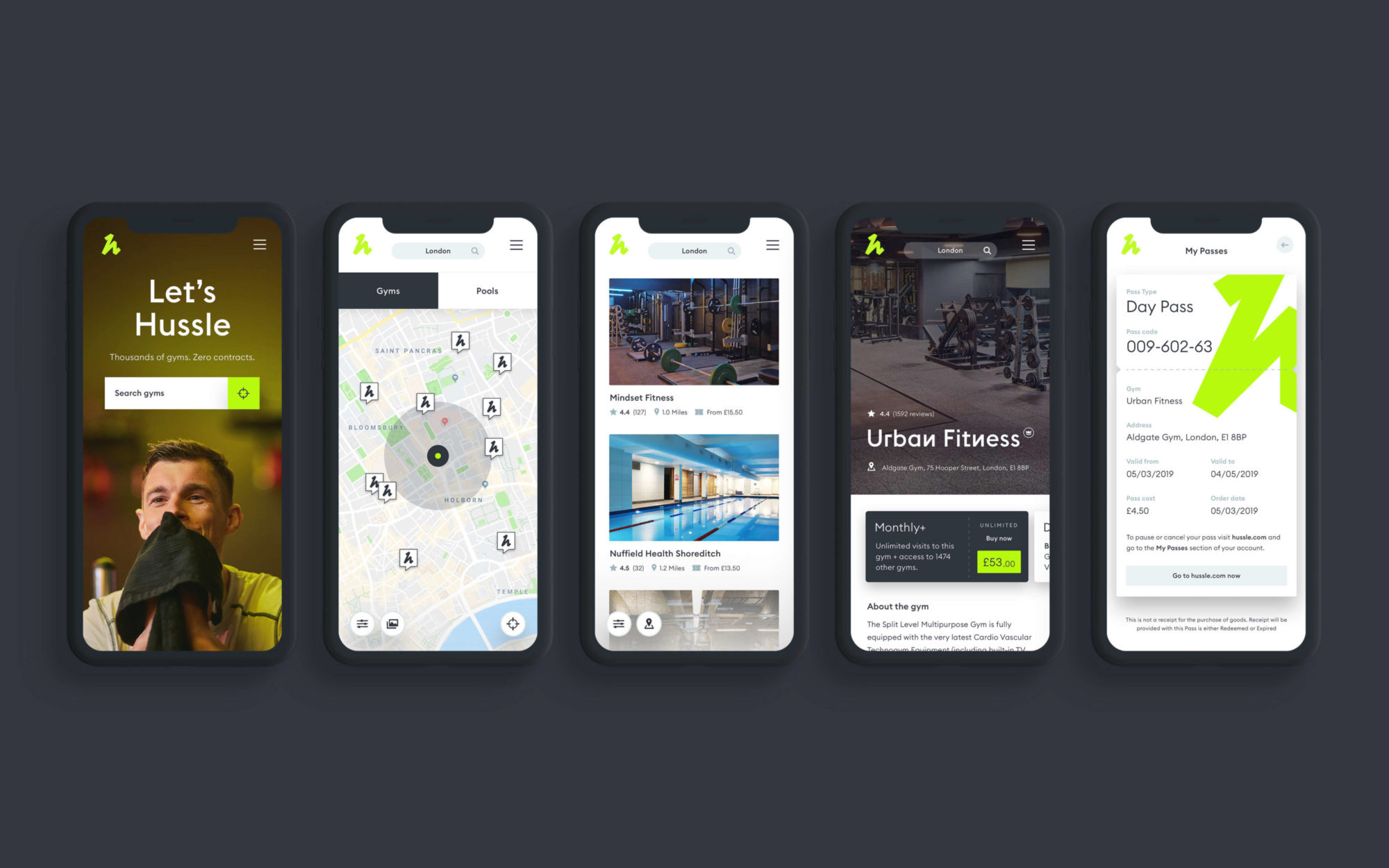
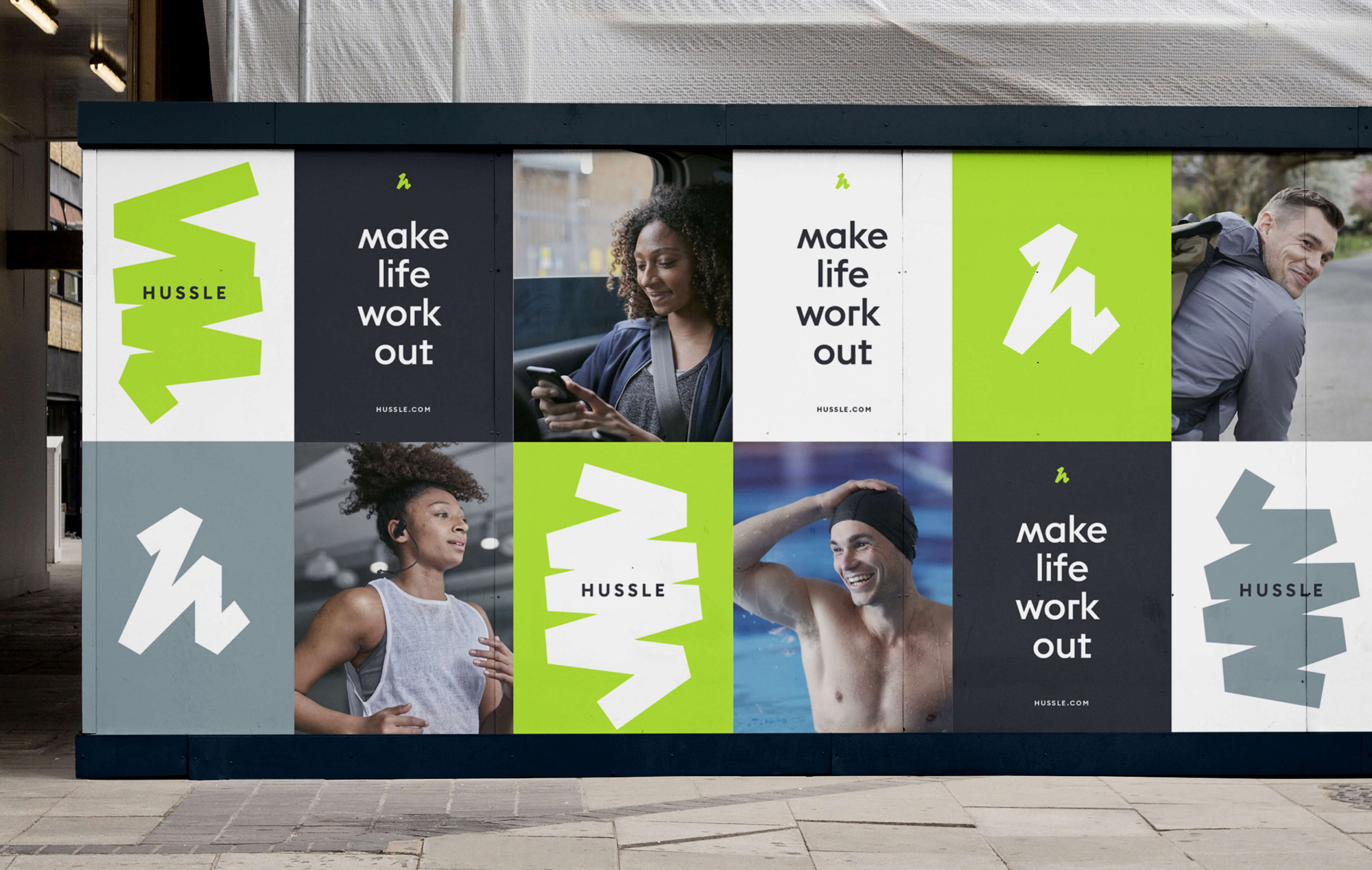
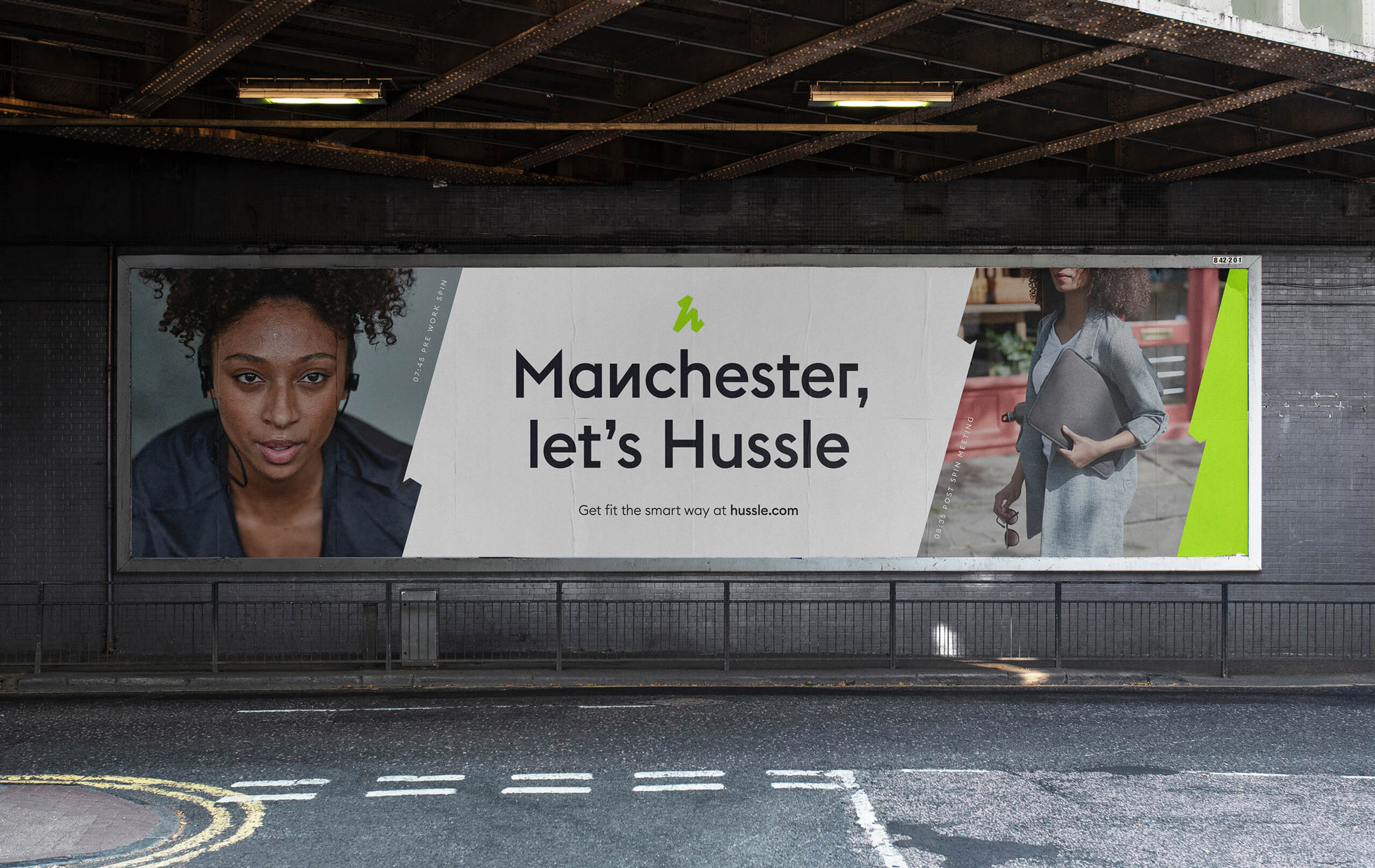
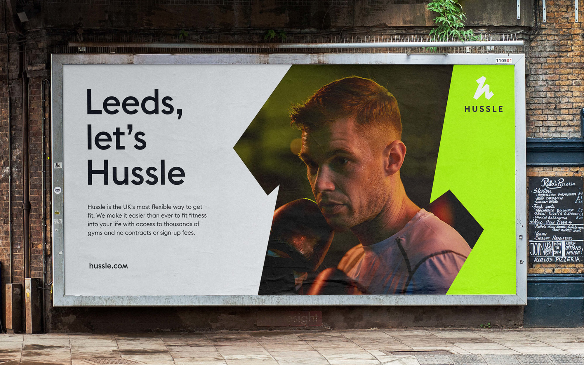
The integration of photography, typography, squiggles, and logo (with the icon and wordmark used on their own) is quite good with enough versatility to create different kinds of combinations but consistent and distinctive enough to stay recognizable. Nothing earth-shattering and the odd-shaped masks for photography and/or layout segmentation is something we’ve been seeing a lot lately but it’s all nice and convincing.
Overall, this is a huge positive change, going from something generic, forgettable, and appearing to be low quality to something more unique, memorable, and high quality. I realize that that sentence just reads like a list of antonyms but I do think it conveys the 180-degree turn this rebranding achieved.

 Новости Союза дизайнеров
Все о дизайне в Санкт-Петербурге.
Новости Союза дизайнеров
Все о дизайне в Санкт-Петербурге.