Обзор лучших ресурсов по разработке бренда, разработке упаковки
contact us | ok@ohmycode.ru
contact us | ok@ohmycode.ru
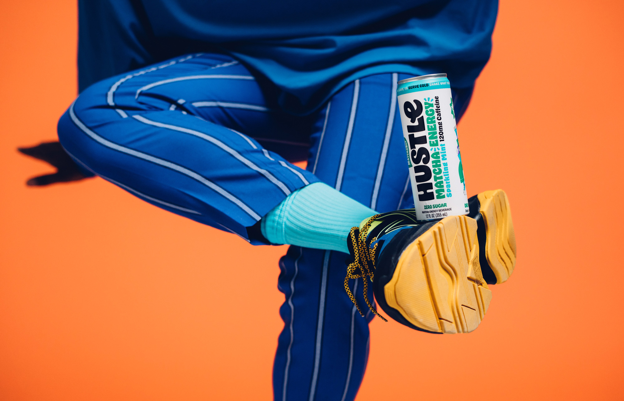
Established in 2014 by brothers Max and Graham Fortgang as a single-location establishment in Brooklyn, NY, MatchaBar is a matcha cafe that has grown into one of the biggest direct-to-consumer brands available of matcha drinks. Their first product was bottling their “ceremonial-grade” tea and landing it in Whole Foods. Their second product, an energy drink called Hustle, was specifically created and marketed for the cool, young, music festival-going crowd and with endorsements and votes of approval by celebrities like Diplo, Billie Eilish, and Drake, Hustle has taken off. So much so that MatchaBar has promoted the Hustle sub-brand to be the primary brand, allowing MatchaBar to possibly launch other products. The new identity and packaging for Hustle has been designed by Jones Knowles Ritchie.
“Hustle is all about positive energy, so we created a brand that looks how the product makes you feel,” said Stephen McDavid, Creative Director at JKR. “Whilst digging for an ownable look and feel we were inspired by the vibrant visual language of funk music, an inclusive culture that encourages self-expression and positivity. Music has always been in the brand’s DNA, we just turned it up to 11.”
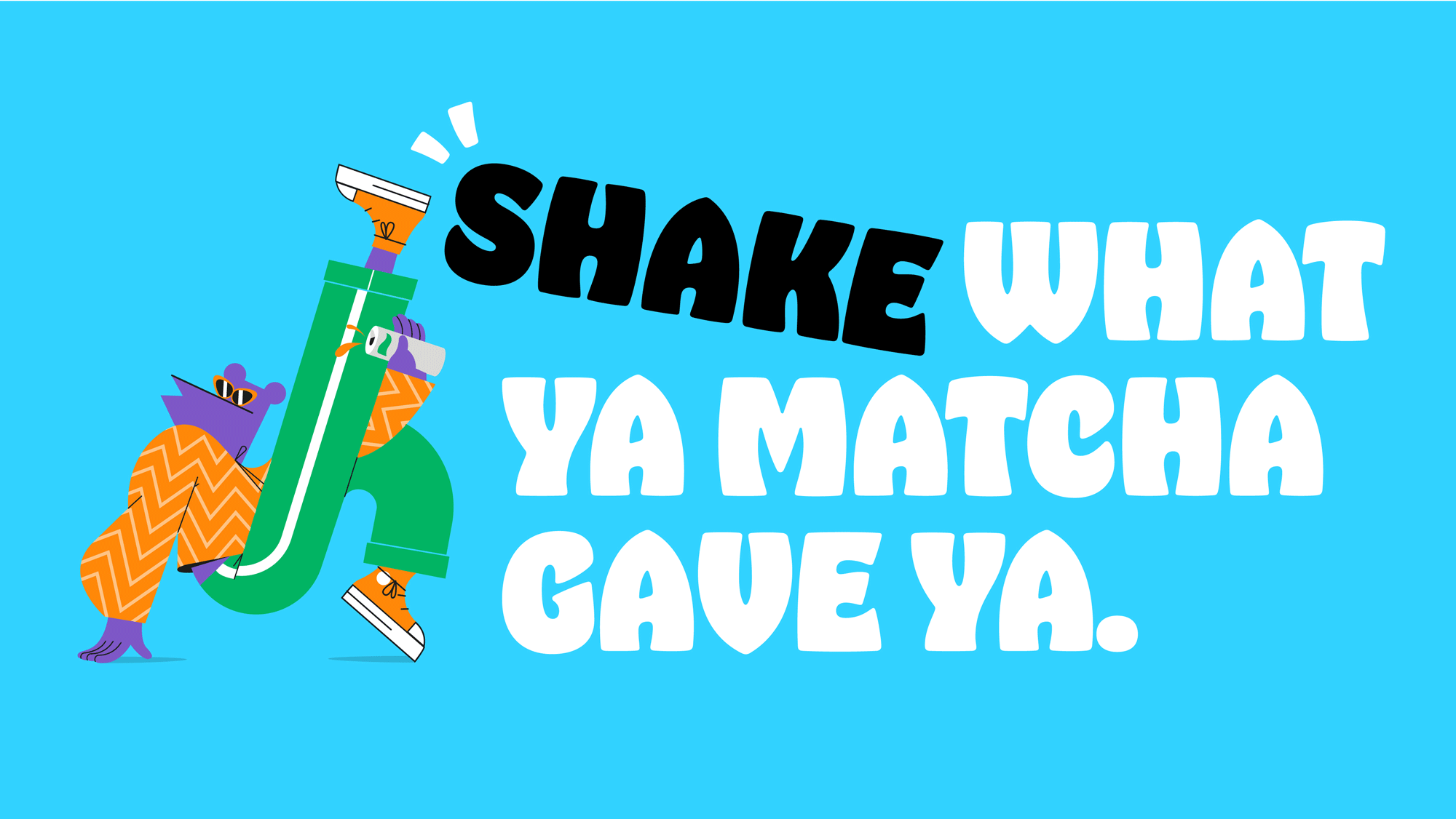
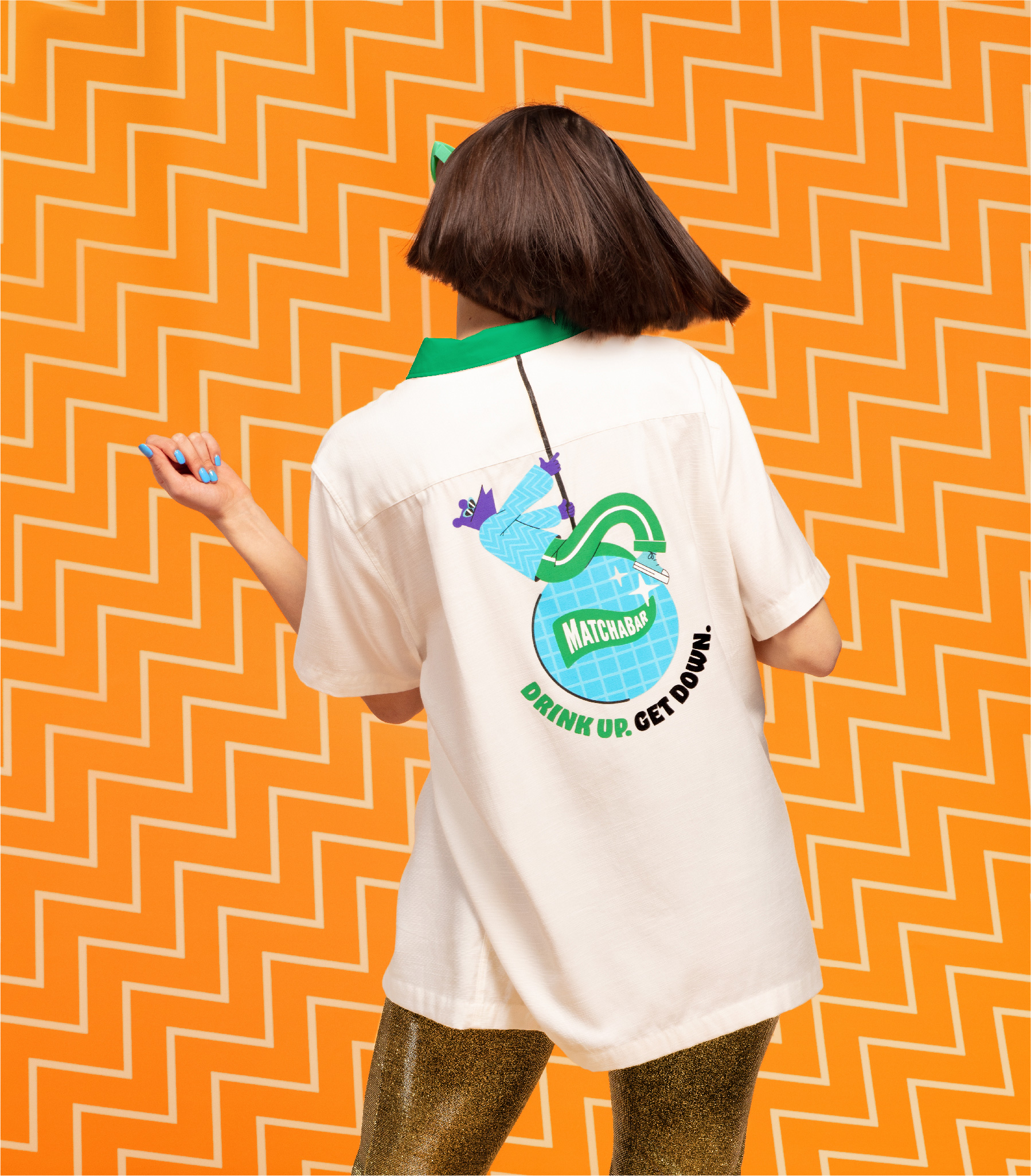
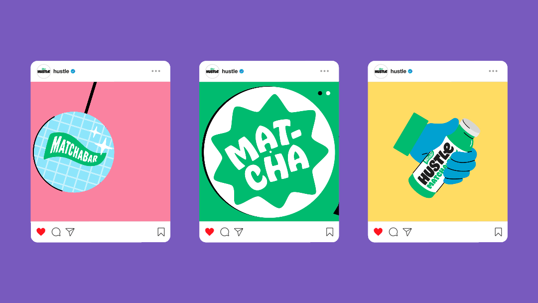
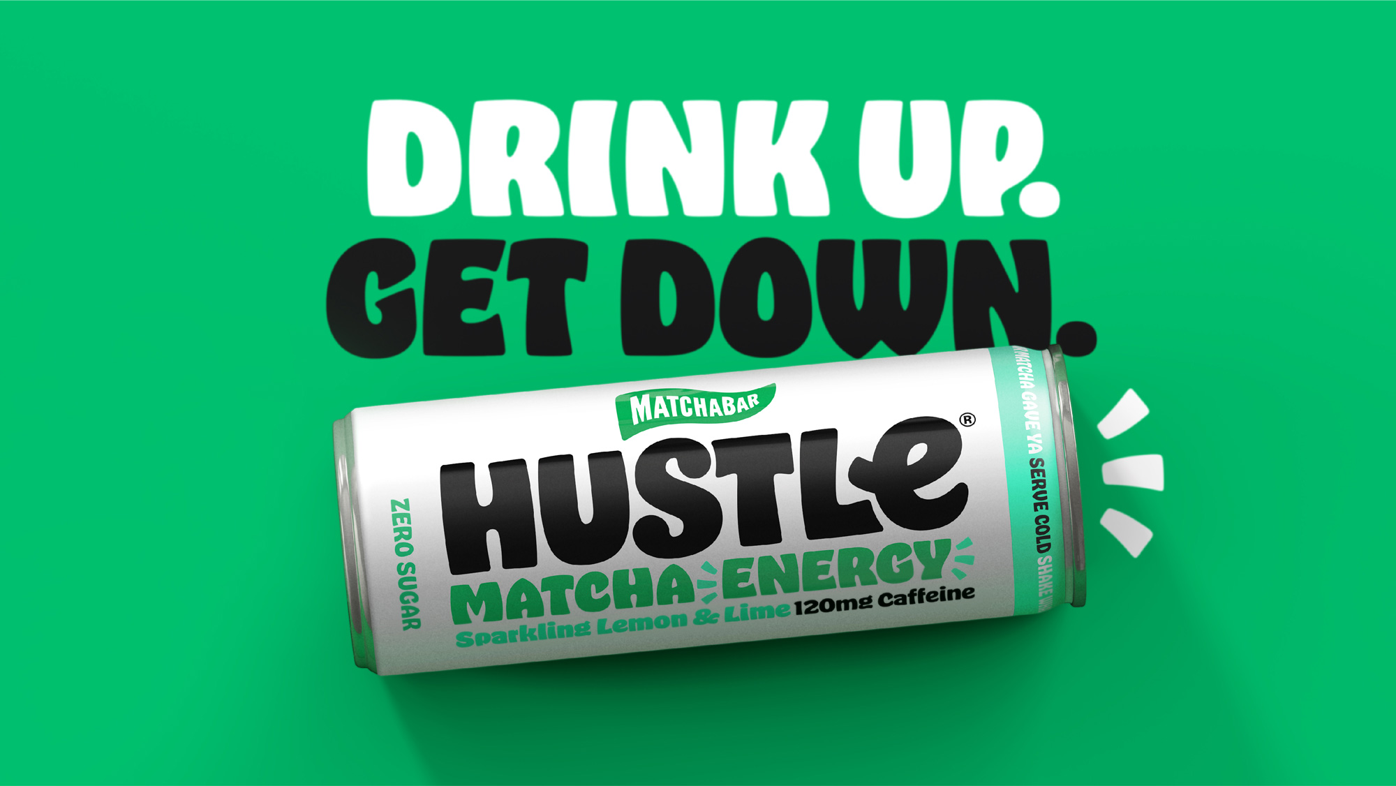
The old logo wasn’t so much a logo as the design that was put on the can at some point but it serves us as a starting point where the MatchaBar brand was the primary visual and Hustle was the pay-off to their mantra. The new logo pumps a whole lot of personality into the Hustle brand with a bold, funky wordmark that has been customized from Oh No’s Hobeaux with some extra flair and an unexpectedly cool unicase treatment with an “e” that neatly fills up the space that otherwise would have been left open from an “LE” pair. It’s a super fun wordmark and the smoothly redrawn MatchaBar flag logo sits very nicely on top and centered.
The Hustlers, a cast of illustrated characters, are the soul of the brand: “Beyond the free-flowing wordmark, funk inspired typography, witty tone of voice and punchy colour palate, we have also introduced the Hustlers, an androgynous funk-fuelled crew of spokes-creatures. With a different character for each product in the range, the Hustlers embody the spirit of the brand—a community powered by positivity, giving you the energy to fuel your passion.”
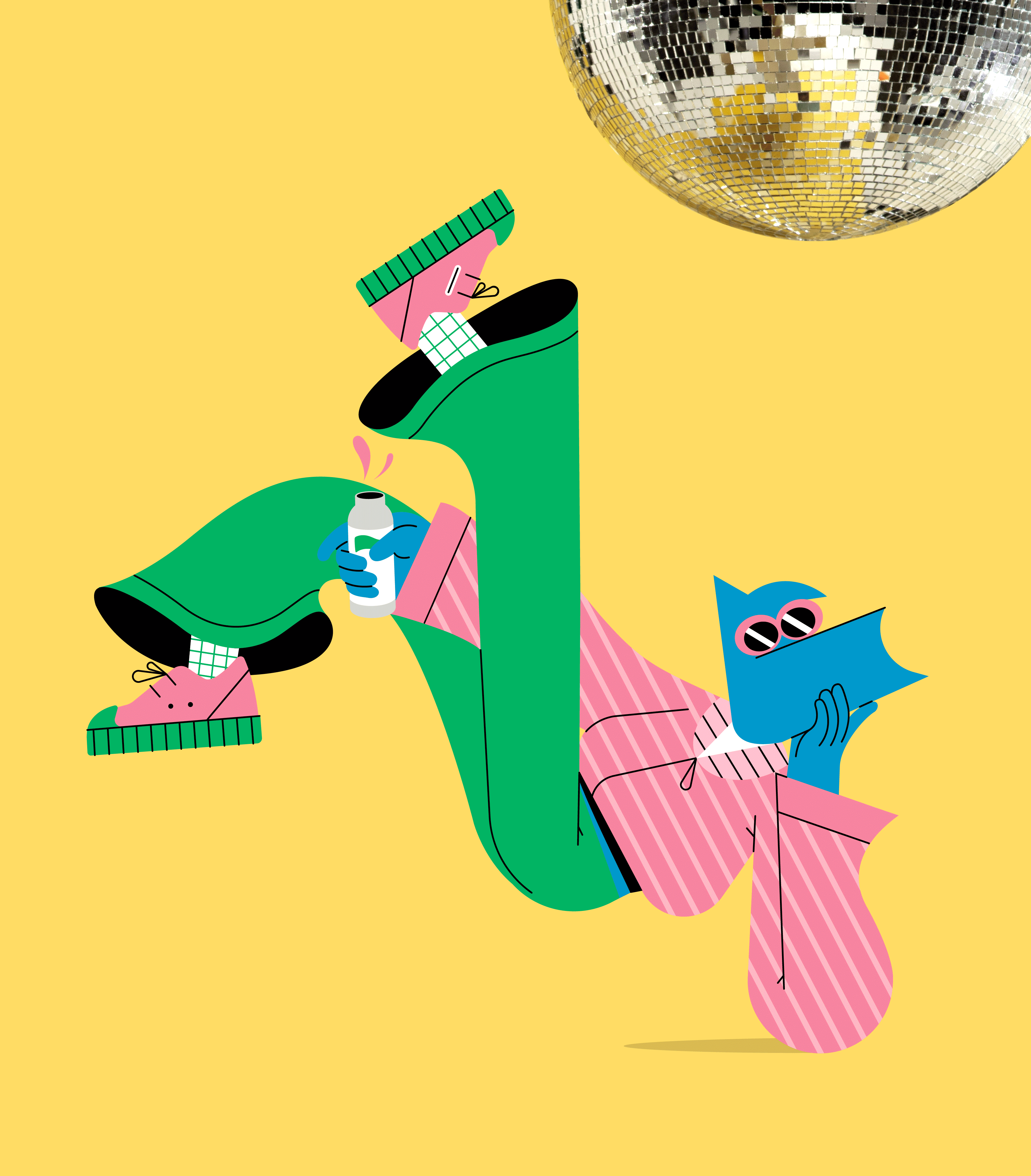
The “Hustlers” illustration are a little weird… well, I mean, they are a lot of weird but I mean more so in that I’m not sure how they fit in well with the typography and overall design, or even if the intended audience needs a mascot. I do like them on their own and how they are different from the typical illustrations of the last five years. Bonus points for making the characters ambiguous about what exactly they are and what gender they conform to.
If you enjoyed the use of Hobeaux in last week’s Byte Bars, this identity will probably convince you to give your money to Oh No and get your own license because it’s everywhere and it’s all good.
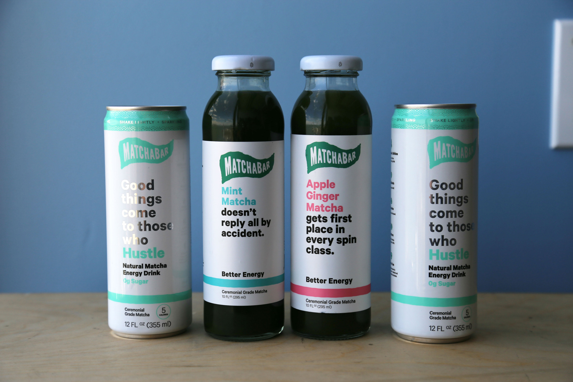
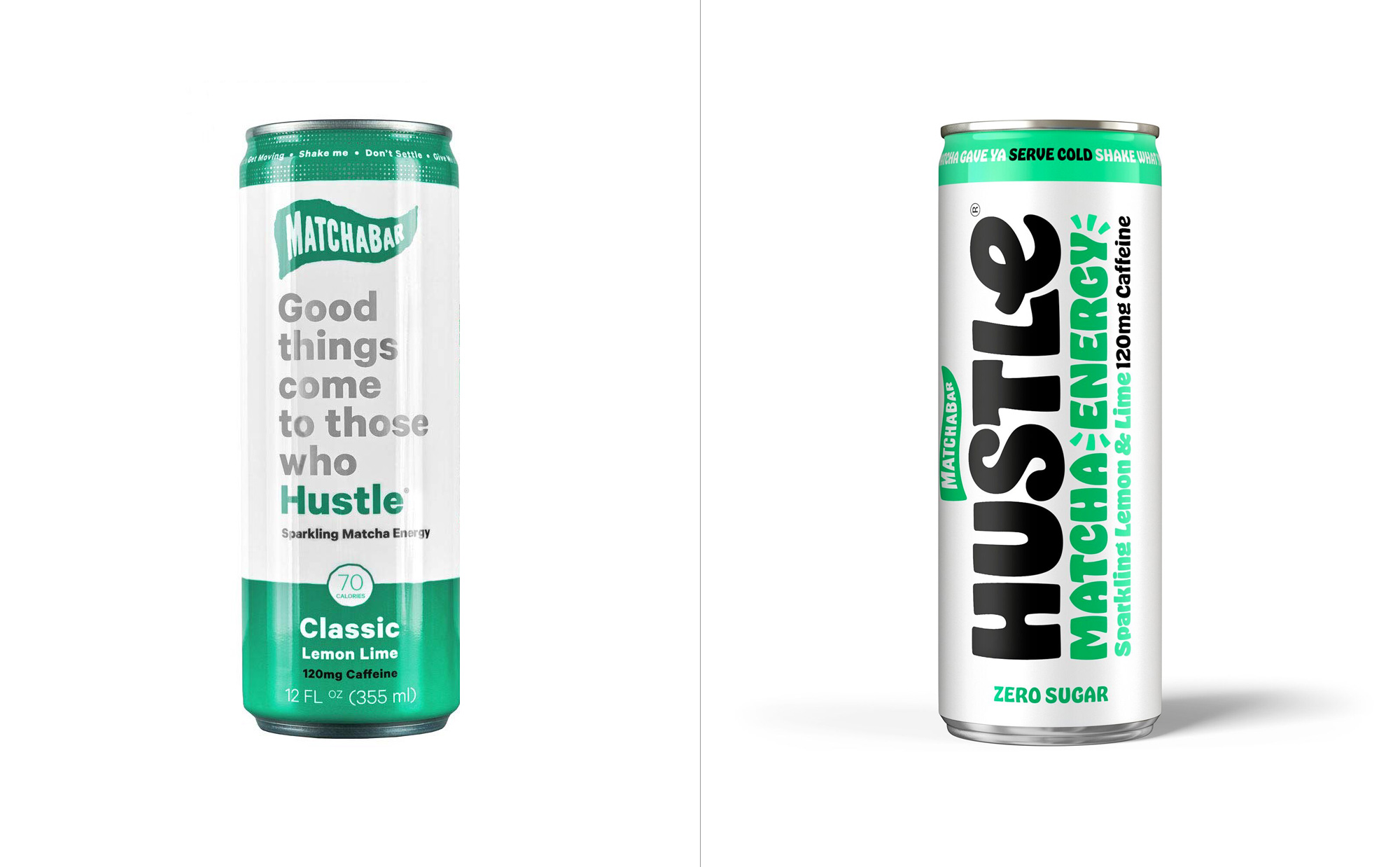
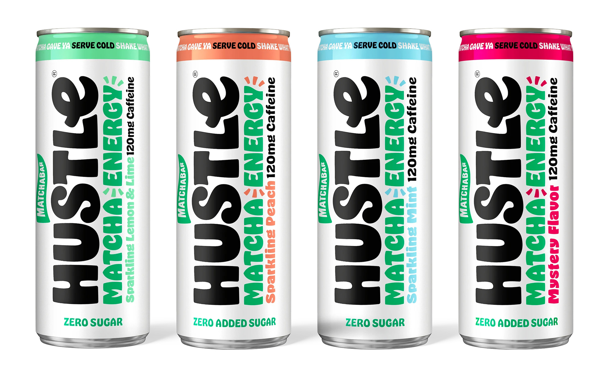
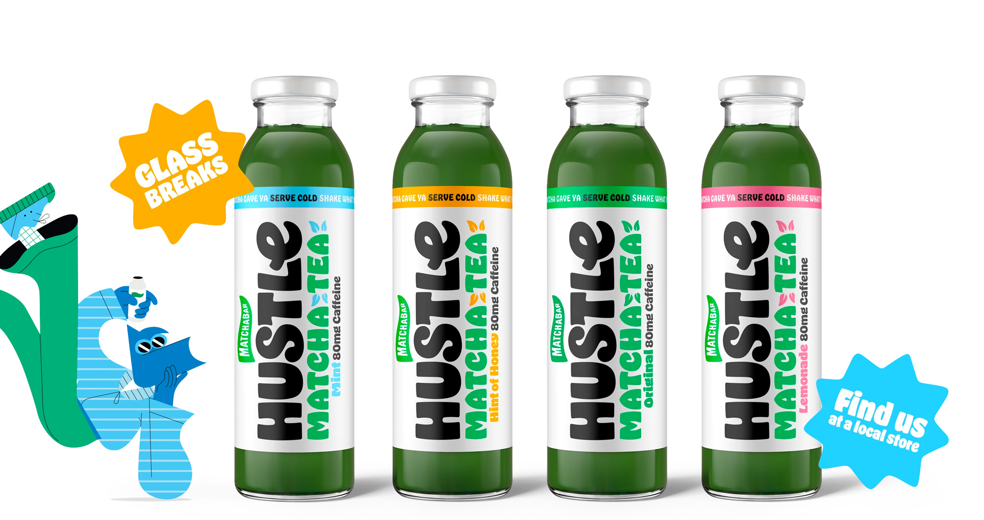
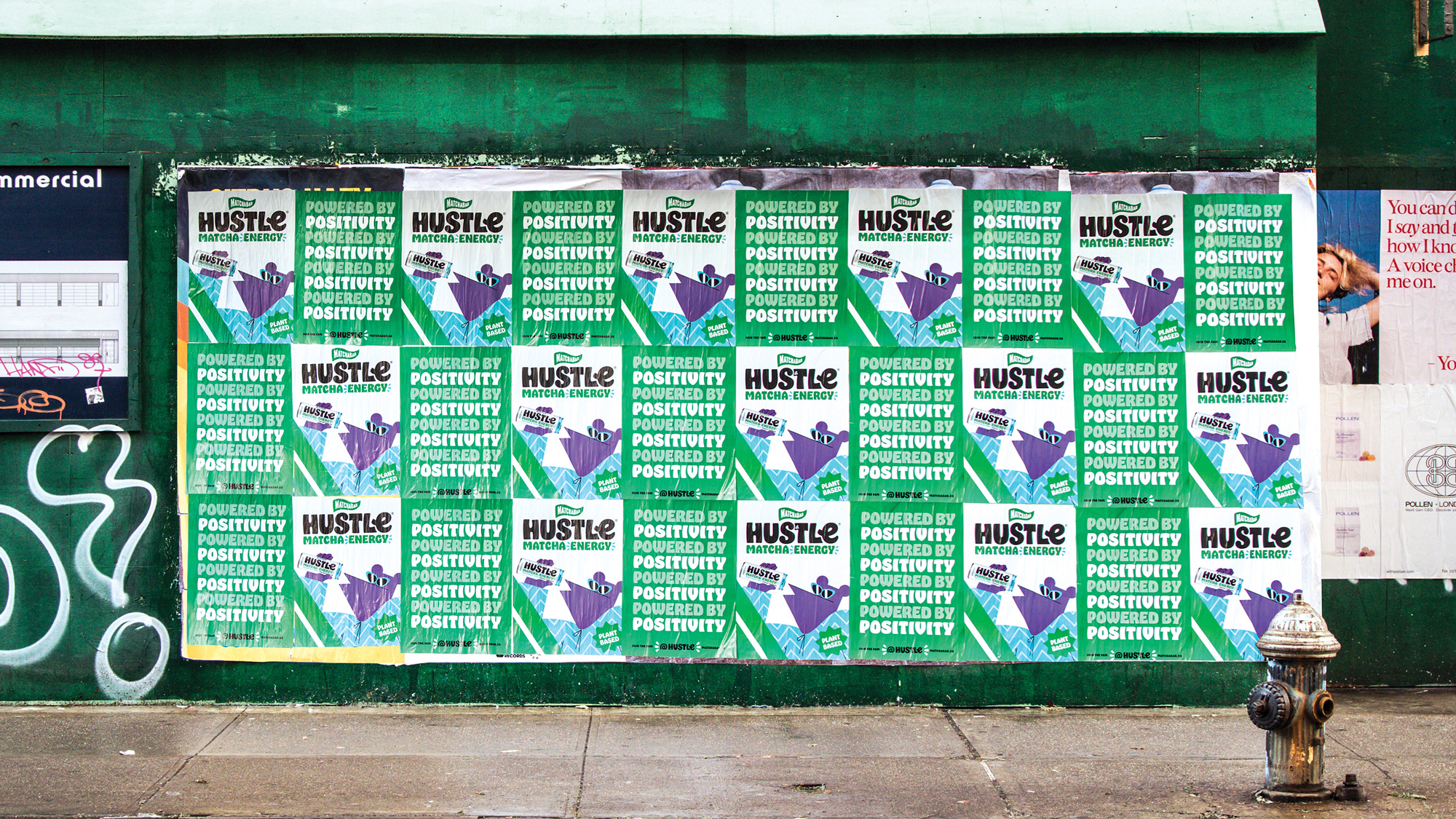
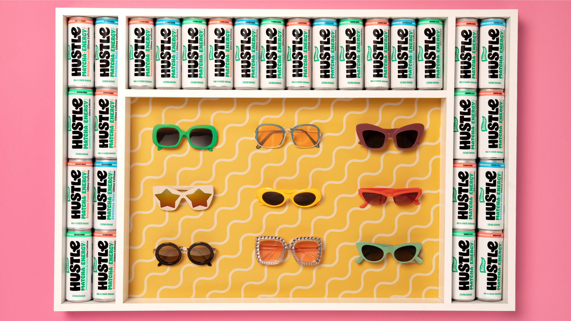
The old packaging was decent and had a fun thing going where each flavor of tea had a different line of copywriting that exalted the benefits of the drink with some swagger. The design wasn’t particularly great but it looked intriguing enough. Like the new logo, the new cans and bottles now have a much more purposeful and evident personality, with the Hustle logo emblazoned large along the product and so much Hobeaux that you will need to drink your own energy drink to get through it all. In other words, it’s great.
While the matcha drink category isn’t super crowded yet and there aren’t many established stereotypes, this definitely zigs before many have even zagged, sort of paving the way for what the unexpected product category of matcha energy drinks looks like.
 each year since publication began in 2006

 Новости Союза дизайнеров
Все о дизайне в Санкт-Петербурге.
Новости Союза дизайнеров
Все о дизайне в Санкт-Петербурге.