Обзор лучших ресурсов по разработке бренда, разработке упаковки
contact us | ok@ohmycode.ru
contact us | ok@ohmycode.ru
Established in 1979, Petbarn is the leading specialty pet care retailer in Australia with 140 stores. (The equivalent of PetSmart or Petco in the U.S.). A part of Greencross Limited, Australasia’s largest integrated consumer facing pet care company, Petbarn offers food, toys, accessories, supplements, and all necessary accoutrements for dogs, cats, fish, birds, reptiles, and small animals (mice, rabbits… hermit crabs!). Recently, Petbarn introduced a new identity designed by the Sydney, Australia, office of Landor.
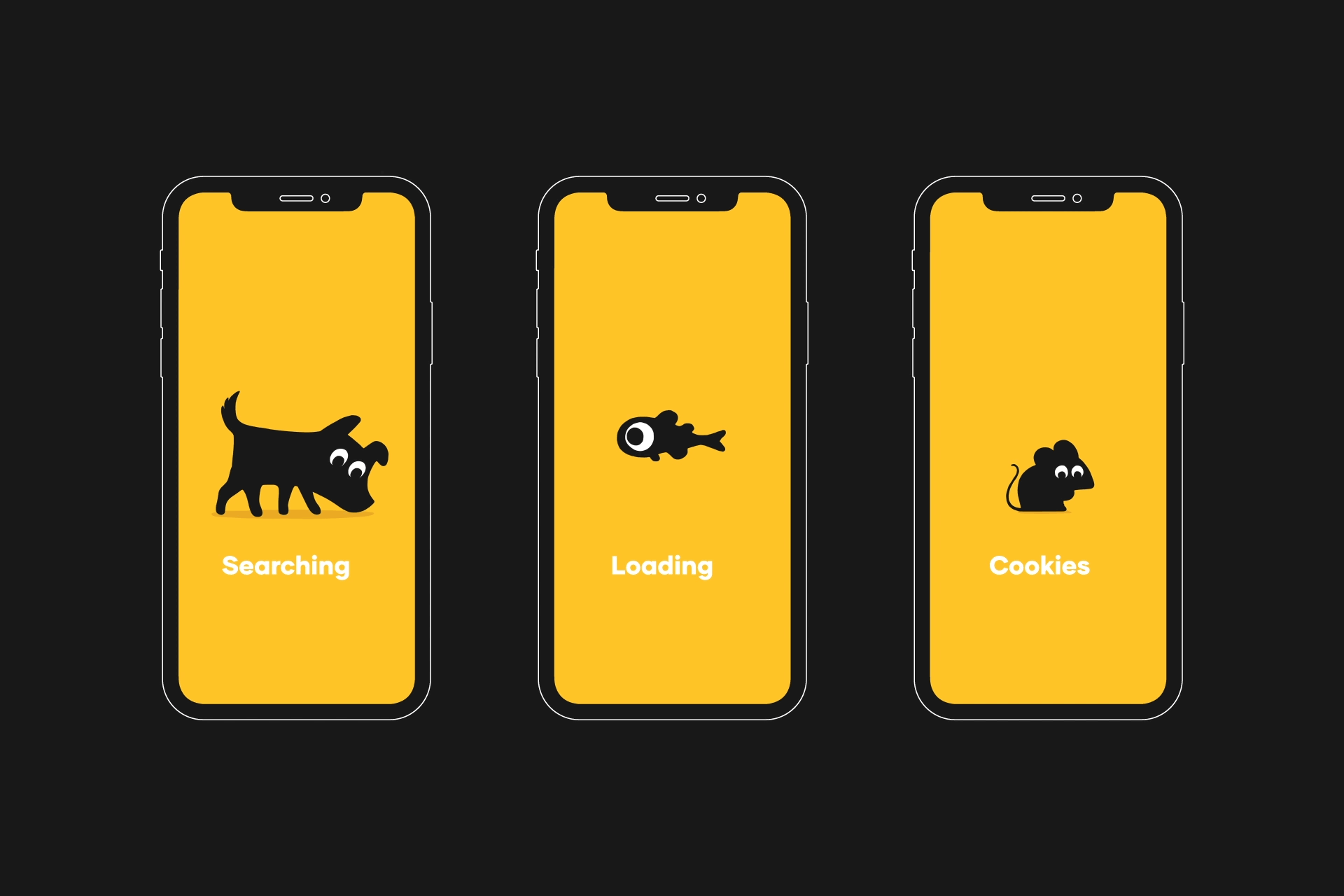
Inspired by the weird and wonderful personalities of the pets we care so much about, we helped transform Petbarn’s identity into a living, breathing, tail-wagging brand. We worked with Australian illustrator/animator, Marco Palmieri, to create the family of furry, feathered and scaley friends who make up the new identity and reflect a business shift from utility to care.
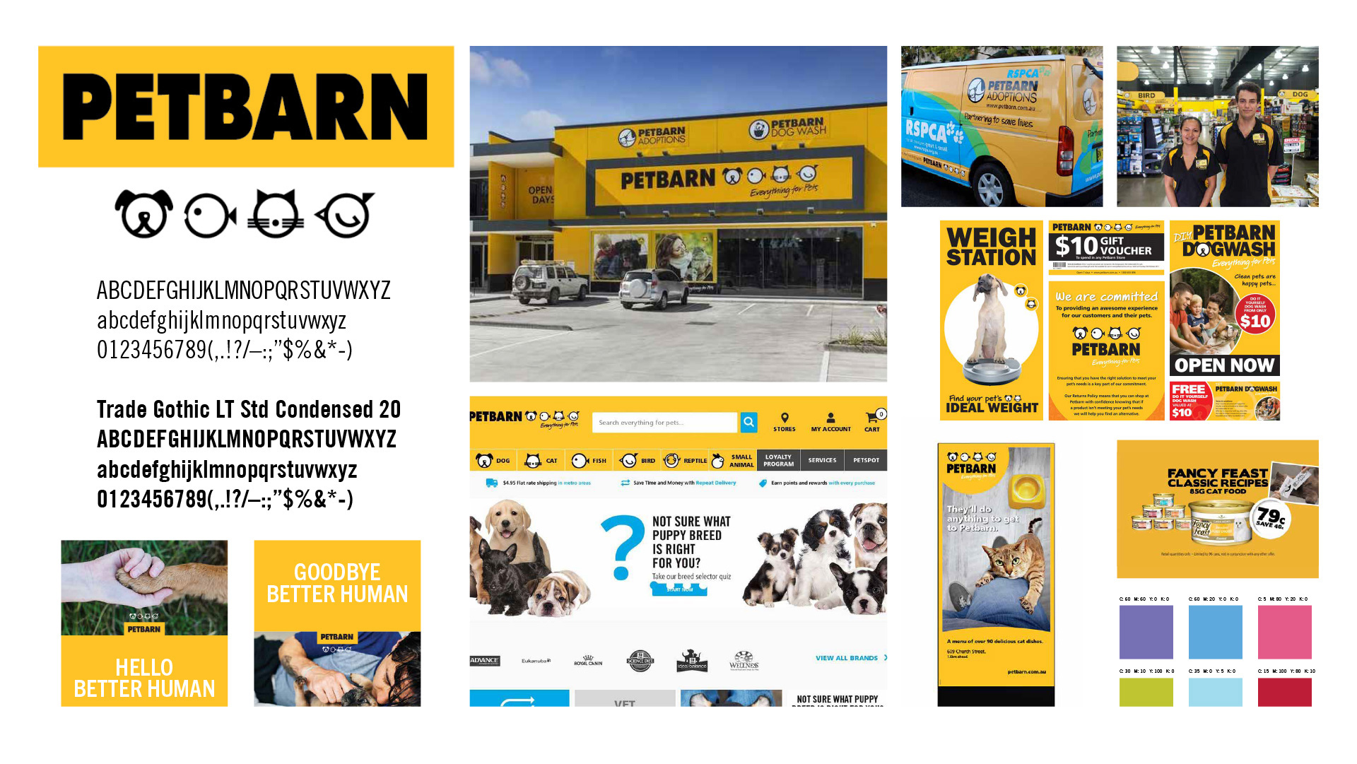
Your eyes are not deceiving you: the logo in the before/after image IS the same. I imagine that it’s a fairly recognizable one in Australia, given its boldness in type and color combination so it’s not surprising for Petbarn to want to stick with it. This redesign mainly retires the old abstract, round animal icons and builds a new identity around the logo.
Petbarn understands the care and importance of the relationships we have with our pets. And we understand the individual personalities, quirks and characters of each and every one. We created an identity that heroes our pets, putting them back at the heart of the Petbarn brand. Inspired by the weird and wonderful personalities that we love so much, we created a family of characters, each with their own little idiosyncrasies. Transforming a rigid icon to a living, breathing, moving, tail-wagging brand.
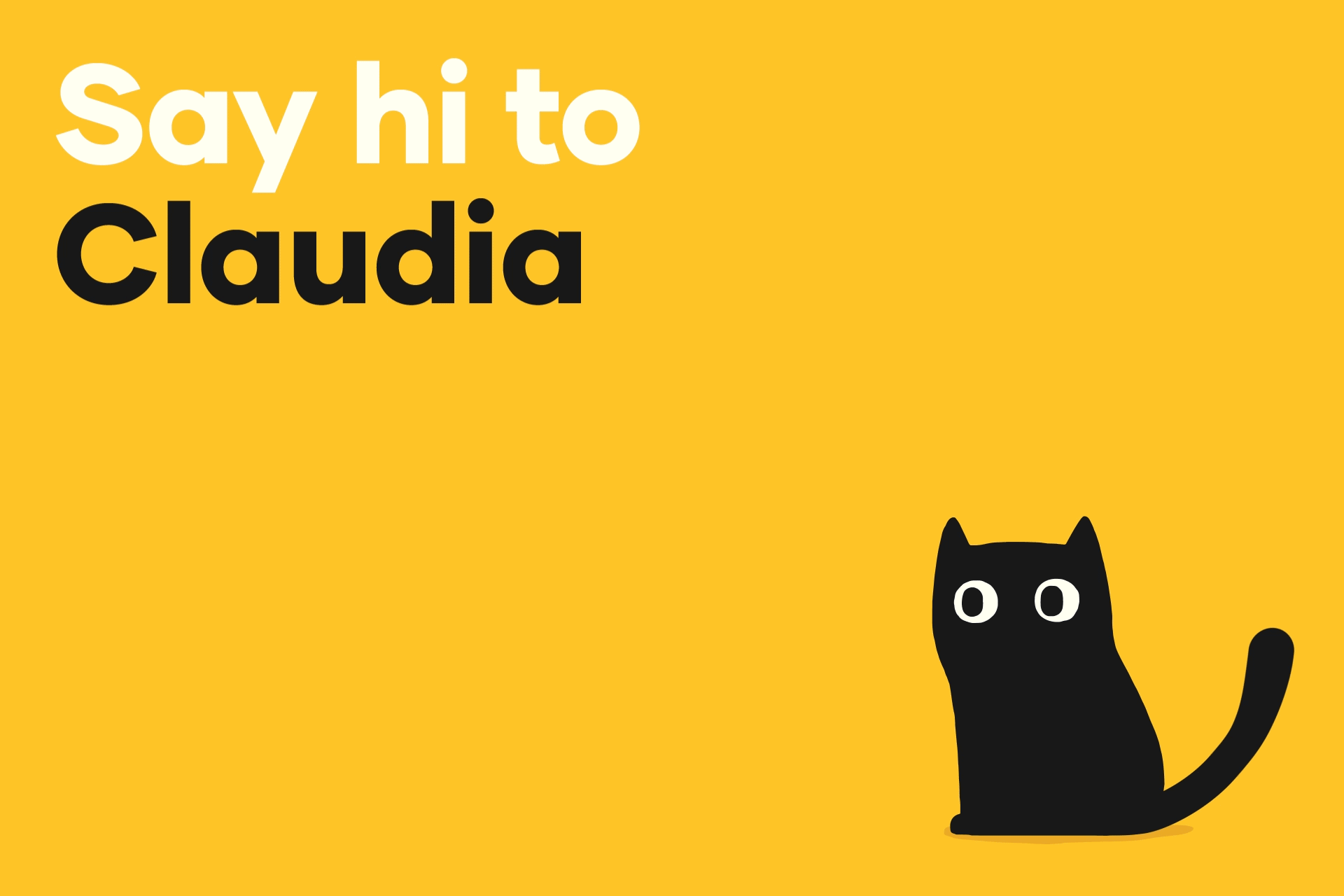
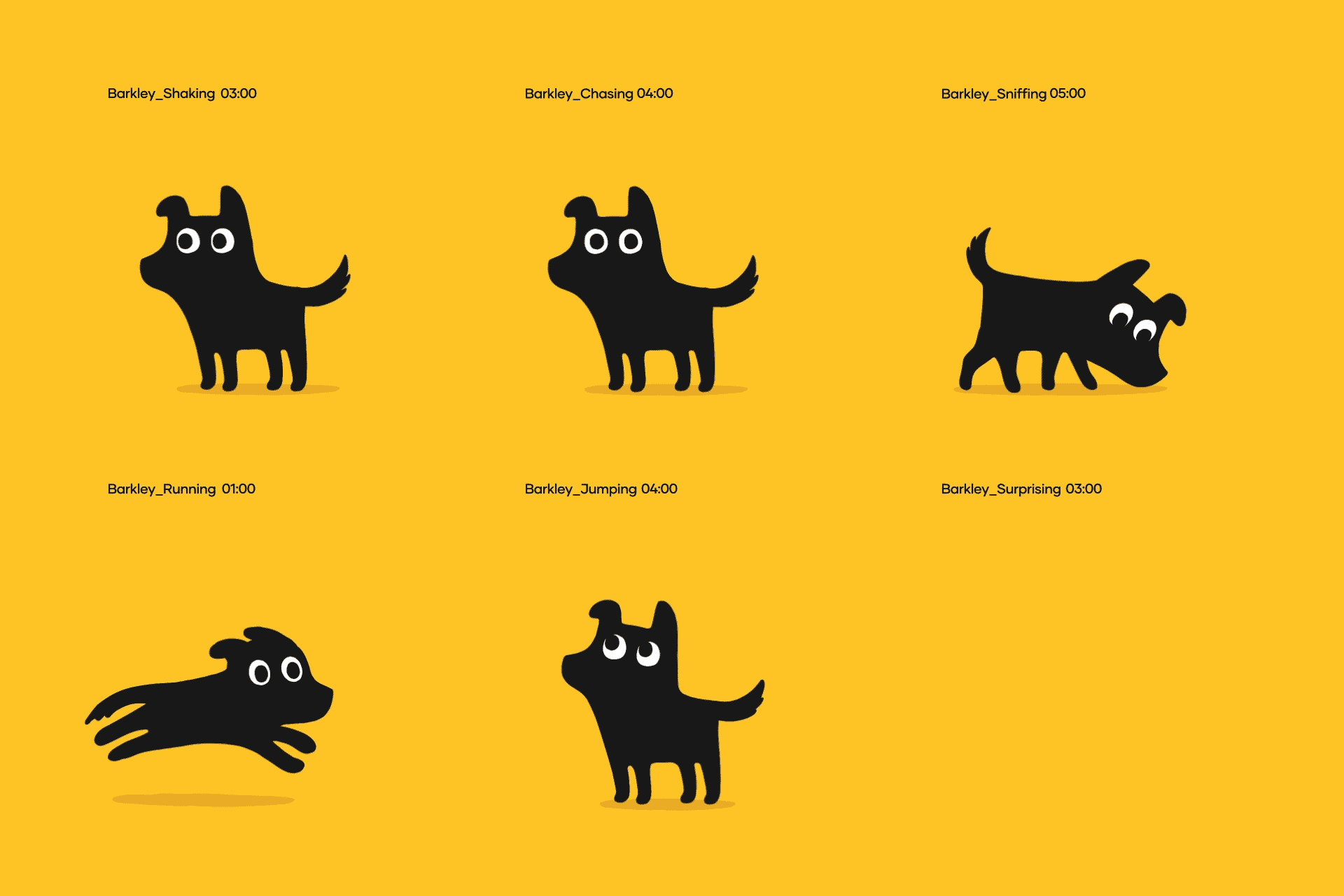
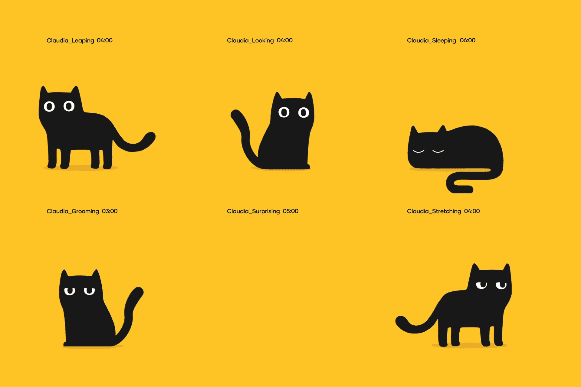

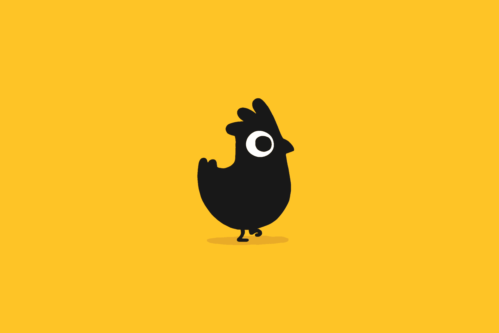
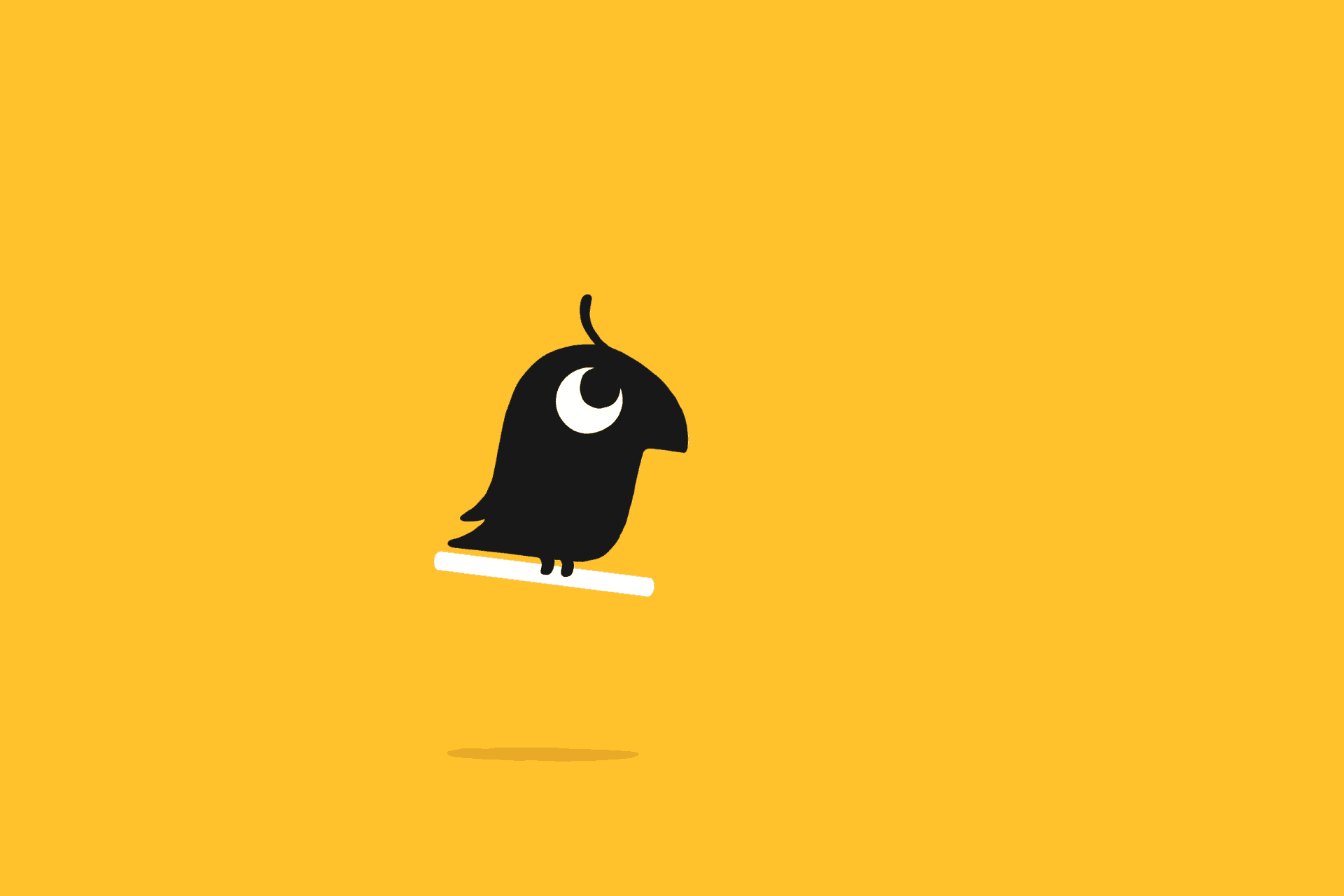
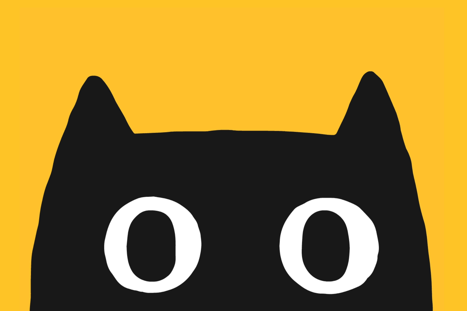

The old animal icons were not too bad, cleverly adapting a circle to be a front-facing dog and cat and profile view of a fish and a bird but they had no real personality nor create any emotional connection. The new animals ooze personality and are so darn cute with their big eyes and deadpan behaviors. I love how they maintained all of them in black and white, sticking to the minimal color palette of the old icons and existing identity. I can imagine it was hard to select the breed of dog and cat to portray but they nailed it with the small dog and generic cat that will satisfy everyone perhaps except for great dane and hairless cat owners. The one thing I would have avoided is naming the characters and instead refer to them as Dog, Cat, Lizard, etc., to trigger less specific associations that names usually do. Nonetheless, If you have been having a bad week, a bad month, or expect today to suck this post is your feel-good moment.
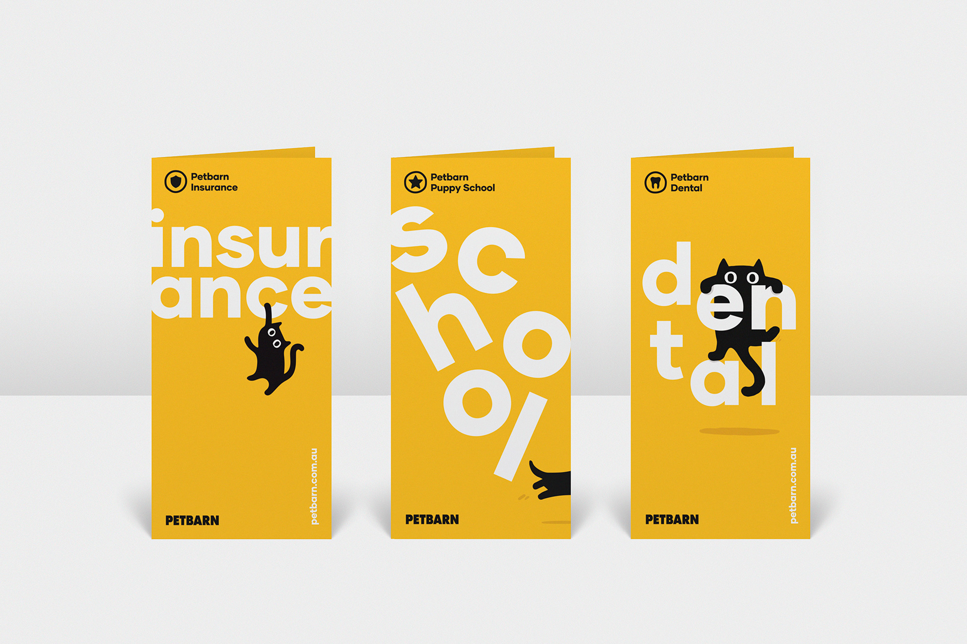
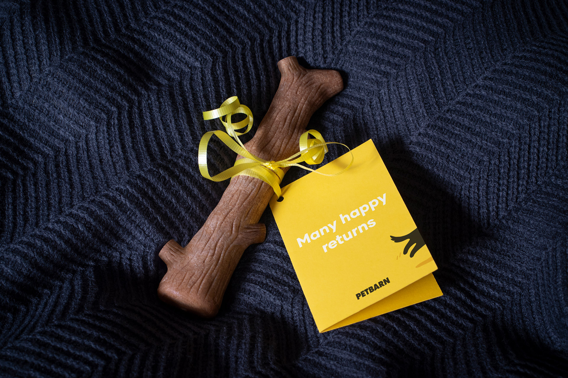
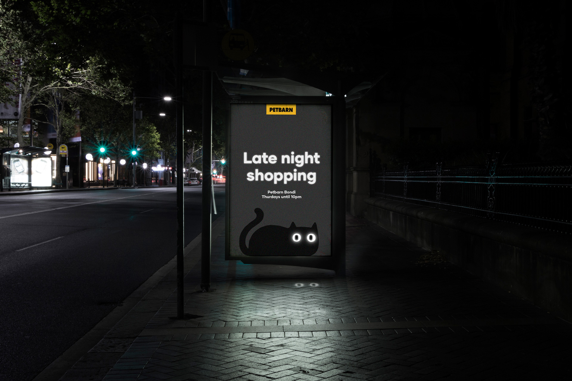
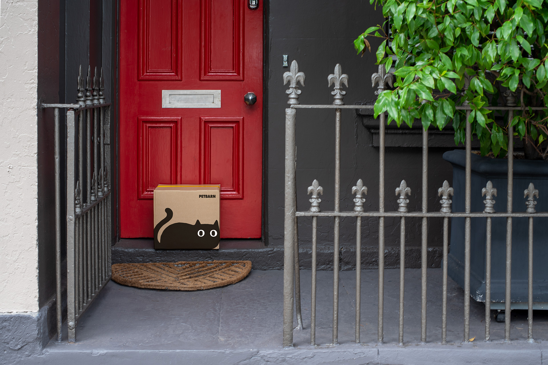
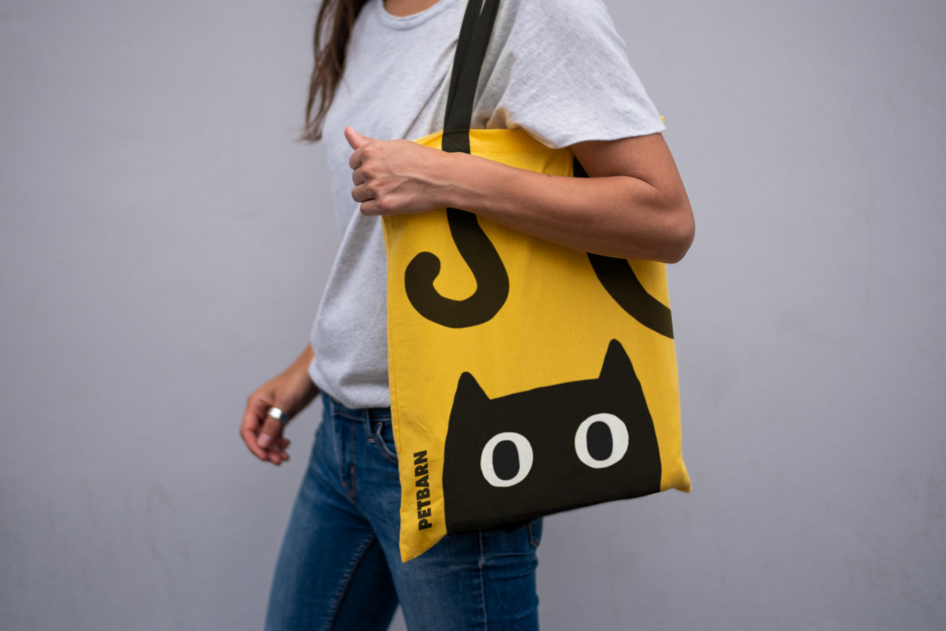
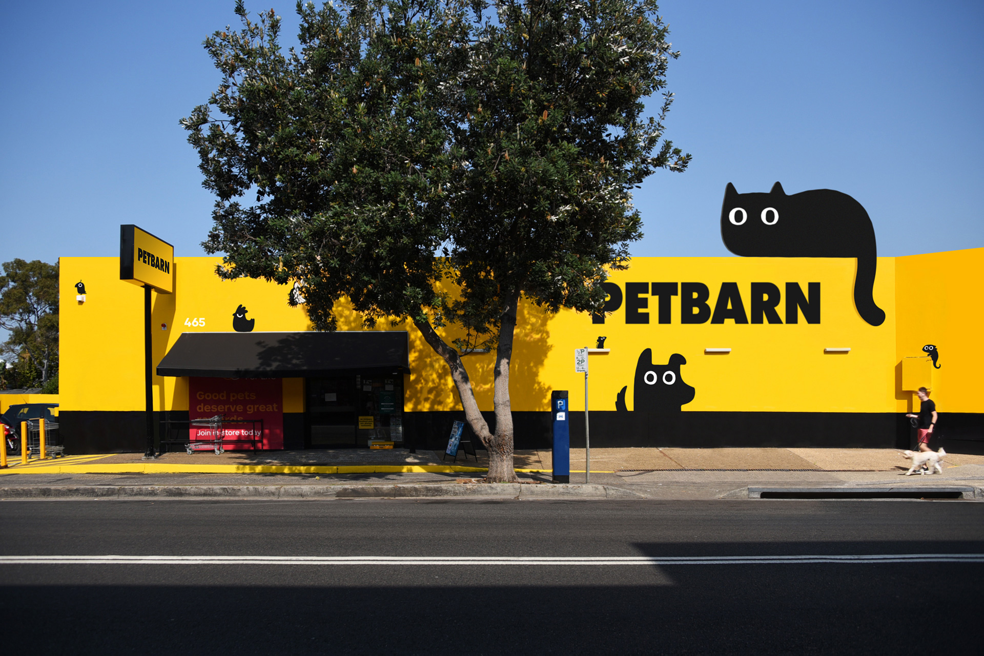
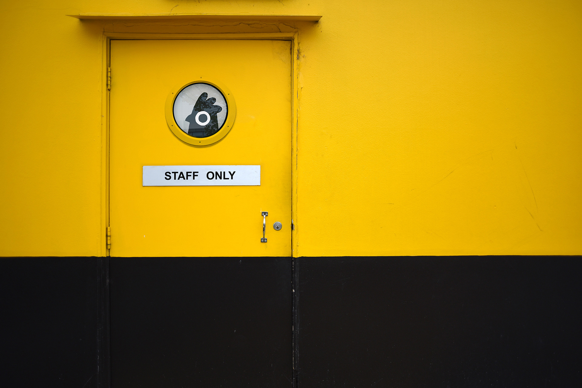
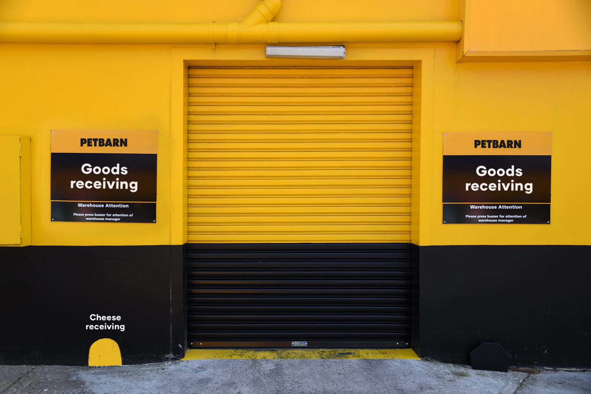
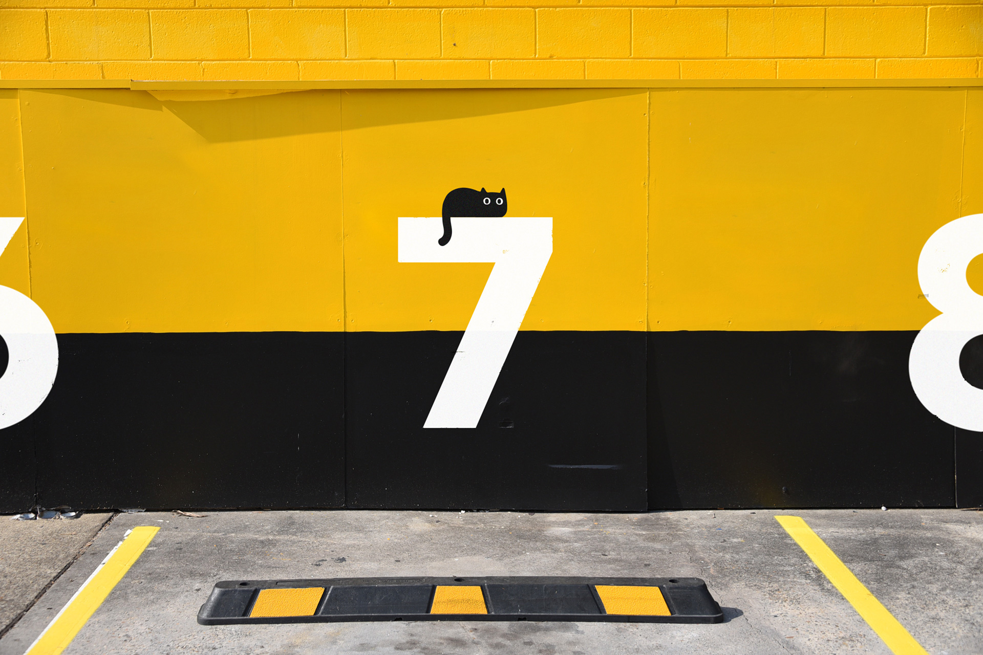
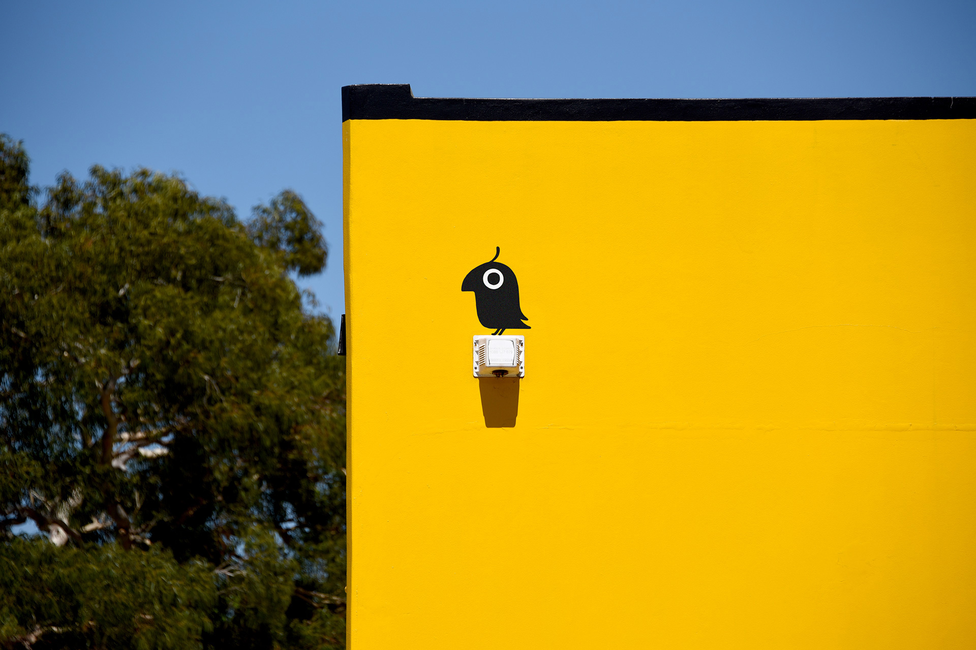
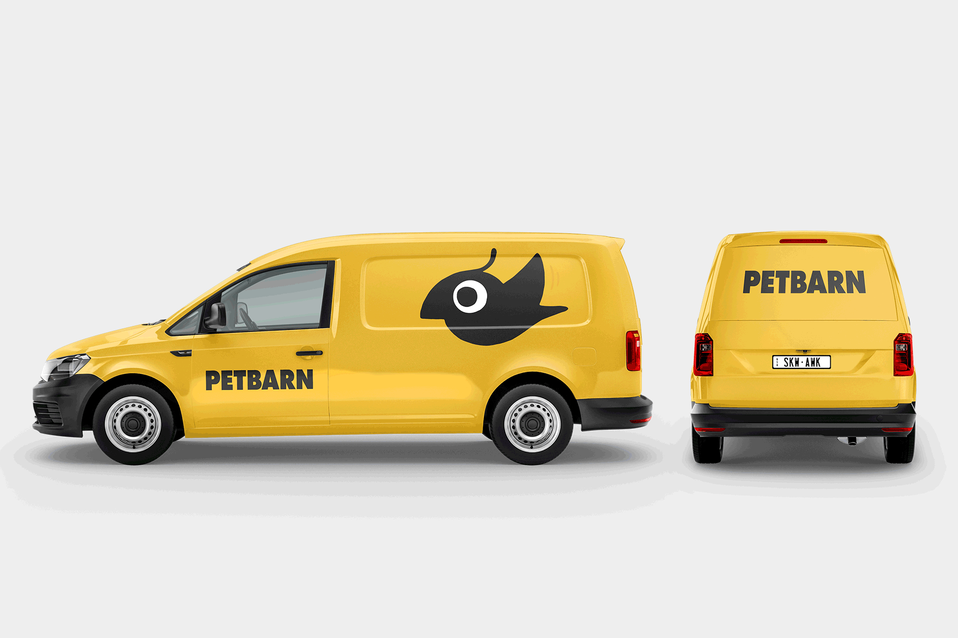
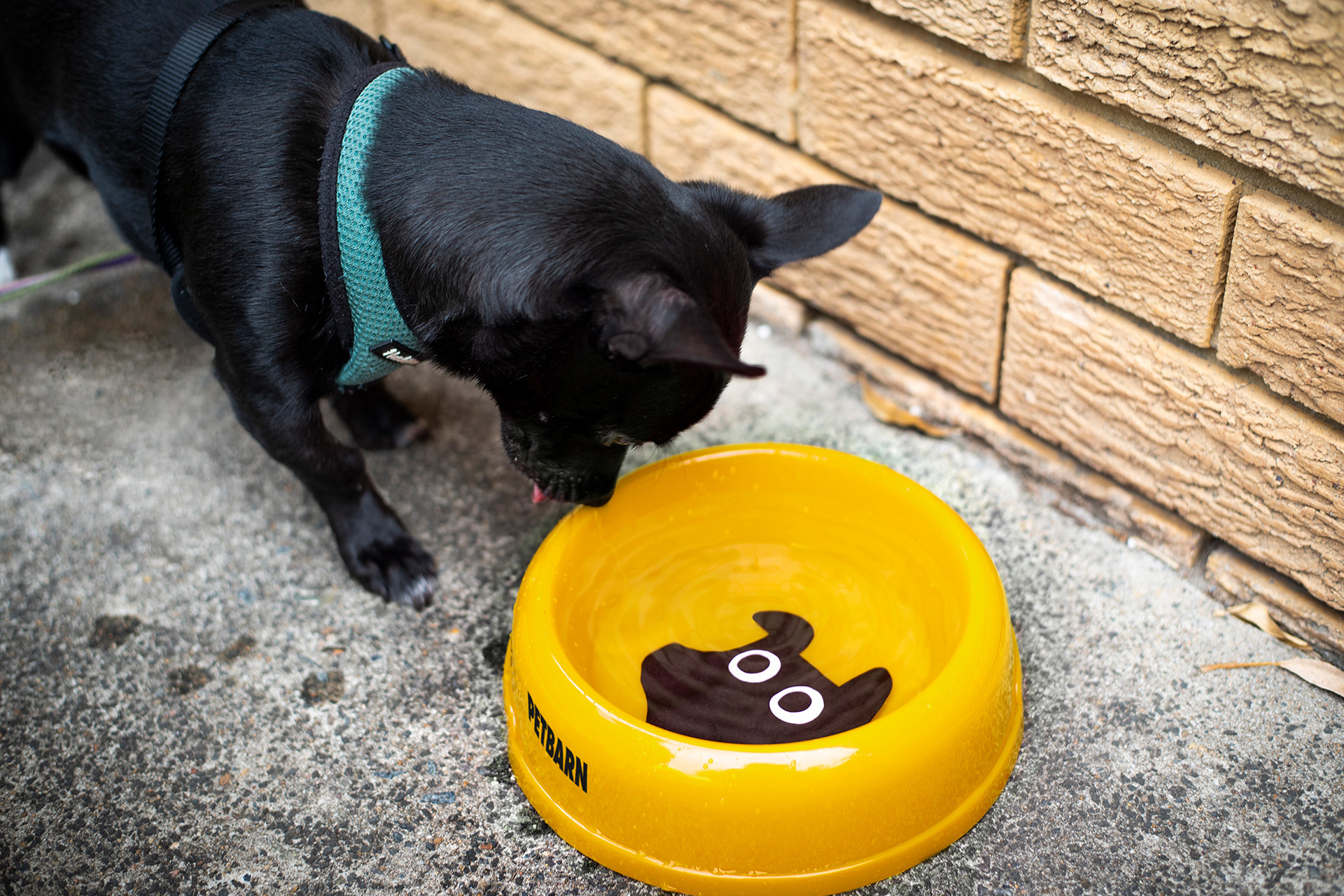
Landor gets 12 out of 10 on their renders. These are really well done — special mention of the night-time bus stop ad where the lit-up eyes of the cat reflect on the sidewalk — and help picture the potential of the new identity, which is fairly straightforward by putting the awesome pets over, under, and around the logo or inside whatever canvas needs to be branded, from dog bowls to store exteriors. Easy and effective. There are some glimpses at typography in action, using a bold geometric sans in playful ways. Overall, this is a great update that maintains the equity of the logo but infuses the brand with a whole new positive energy.

 Новости Союза дизайнеров
Все о дизайне в Санкт-Петербурге.
Новости Союза дизайнеров
Все о дизайне в Санкт-Петербурге.