Обзор лучших ресурсов по разработке бренда, разработке упаковки
contact us | ok@ohmycode.ru
contact us | ok@ohmycode.ru
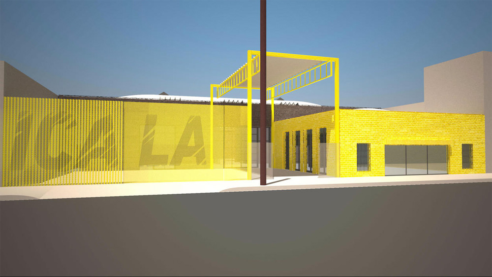
(Est. 1984, originally Santa Monica Museum of Art) “Institute of Contemporary Art, Los Angeles (ICA LA)’s history is founded on organizing exhibitions of internationally recognized artists, including the first-ever U.S. solo museum exhibitions of artists Urs Fischer, Alvaro Siza, Jennifer Steinkamp, Mickalene Thomas, and others. During its tenure in Santa Monica, ICA LA (then SMMoA) organized over 250 shows featuring more than 300 artists and welcomed over 1 million visitors. ICA LA’s new downtown home will be a 12,700-square-foot space that will bring together architecture, urban design, and sustainability to create cutting-edge environments for exhibitions, education, dialogue, and collaboration.”
Mark Bradford (Los Angeles, CA)
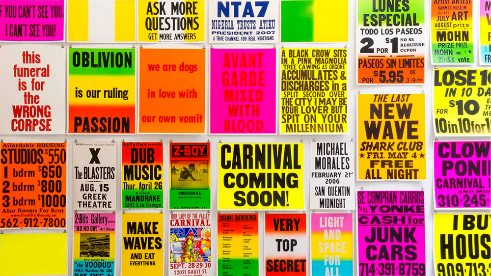
I wanted to be part of propelling ICA LA and its long history forward. The logo and treatment reference merchant posters found from L.A.’s Westside to Eastside, which point to the fluidity of both economics and culture.
The old logo didn't last long as it has only been around for less than a year when the organization announced its name change in May, which is for the better as there was not much positive to say about it or to make of from its unnecessary notches in the "A" and oversized red dot. The new logo has a lot more intention, drawing from one of the variants of vernacular in Los Angeles in the form of silkscreen+wood type posters of cult-following print shop Colby Poster Printing Company. Unfortunately, the reference gets lost as the new logo uses italics — which the Colby posters rarely, if ever, used — and employs a faux distressed finish that would make any block of wood type shed a splinter of wood instead of a tear because blocks of wood can't cry, silly. The resulting logo looks like it's been scratched by a tiger more than weathered by time and use. The "ICA" in all italic and uppercase also reminds me of the much better ICA Boston. It seems like the institution is much prouder of, and impressed with, who designed the logo than what the logo communicates. I'll admit that there IS something about it that somehow fits only, or fits better, in the city of LA than if this were in, say, Chicago. Overall, maybe too much style over substance.
Thanks to Justin Glasson for the tip.

 Новости Союза дизайнеров
Все о дизайне в Санкт-Петербурге.
Новости Союза дизайнеров
Все о дизайне в Санкт-Петербурге.