Обзор лучших ресурсов по разработке бренда, разработке упаковки
contact us | ok@ohmycode.ru
contact us | ok@ohmycode.ru
Established in 1899 (originally as Kiev City Museum of Antiques and Art), the National Art Museum of Ukraine (NAMU) is, as its name implies, dedicated to collecting and showcasing Ukrainian art. Its history, ownership, and focus has changed over time, much of it hand in hand with the two World Wars and ultimately blossoming after the country’s independence in 1991 and adopting its current name in 1994. The museum counts with more than 40,000 items that span Ukrainian painting, sculpture, graphics, and prints dating back to the twelfth century. Last year, NAMU introduced a new identity designed by Kiev, Ukraine-based banda.
That first step we did then taught ourselves and then set the task and instructed the country to call the National Art Museum of Ukraine - NAMU - the National Art Museum of Ukraine. Because when you have something to tell about your history and your art, and you are ready to talk about the world, then it is worth doing in the language of the world.
The new sign and all communications, among other things, had to symbolize both a long history and a present, and to demonstrate national identity and, of course, to be an art. So we agreed that the foundation of the NAMU Identity should be a font.
The old logo was not great in the depiction of its building’s facade with the two lions flanking the entrance. It got the point across but it wasn’t particularly memorable or easy to reproduce small. The new logo, even though now it’s written in English in a Latin alphabet retains some of the traits of the Cyrillic alphabet in a contemporary way that also helps expand the museum’s audience and reach. The logo is an amalgamation of six different font styles (explained below) that are all drawn from typography found in the museum’s vast collection, making the logo uniquely relevant not just to the museum but to Ukrainian heritage in general. It’s a slightly awkward logo but in an age of non-awkwardness logo design, this just feels exciting. It helps that the type family is so well done and that weird individual characters like this can come together so relatively seamlessly.
There are seven variations in the design, each of which is responsible for a separate era of development of Ukrainian culture and art. From the 16th century to the present. Thus, any exposition or event in NAMU may have its own kind of logo designation that corresponds to its time. The seventh drawing is a collection of all variations, a symbiosis of times and views, and the basis of the new identity of the NAMU. The project team collected important symbols on the crumble from works of art, icons, almanacs, magazines, letters and drawings. Perhaps it’s impossible to find one letter of the font, which would not hide a great story.
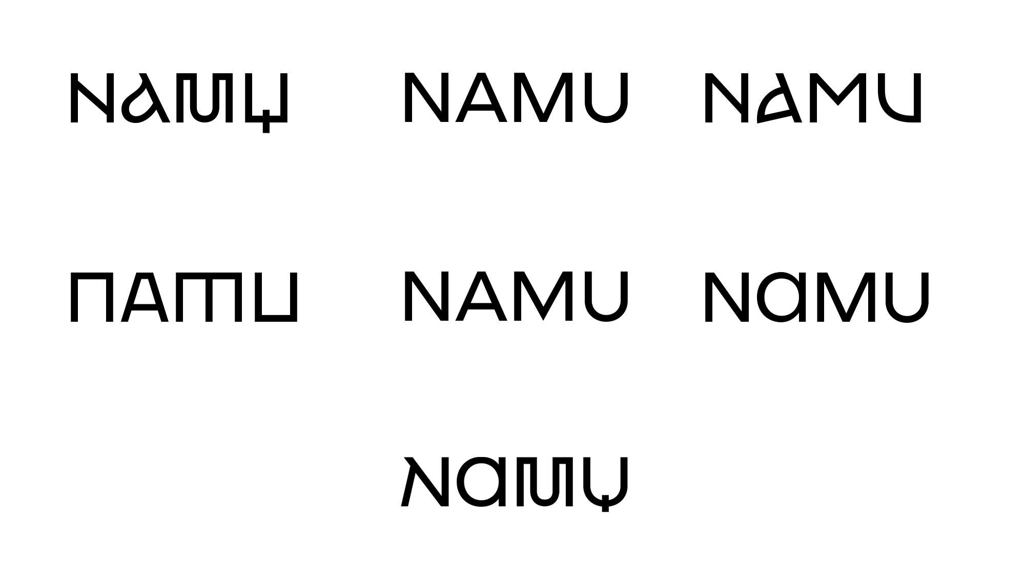
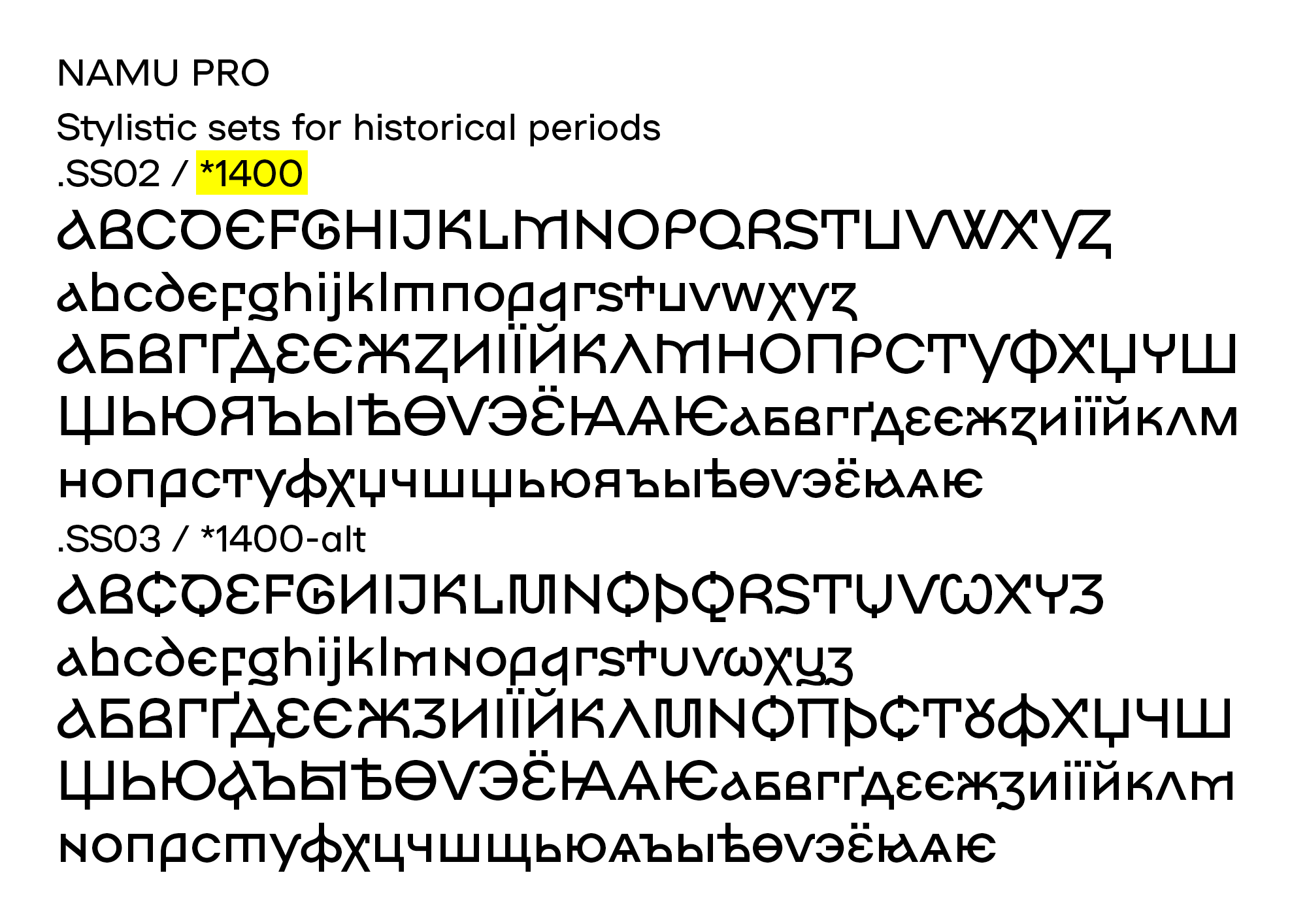
Designed in collaboration with Dmitry Rastvortsev, the six font styles are directly drawn from the collection and are relevant to different periods of time, which allows the museum to use a specific style to promote an exhibit that reflects the timeframe of when those works were created. This PDF (after page 20) shows the direct relationship between pieces of art and each font style. The basis of the custom font is a fairly standard sans serif but the flairs of some of the styles — like the curls in the 1600 one — transform it into something quite unique.
In the identity, the NAMU logo becomes the main recognizable element. We focus on it to immediately make it clear that the updated brand of the museum communicates with the viewer.
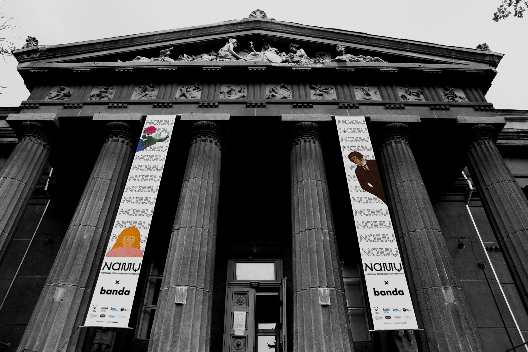
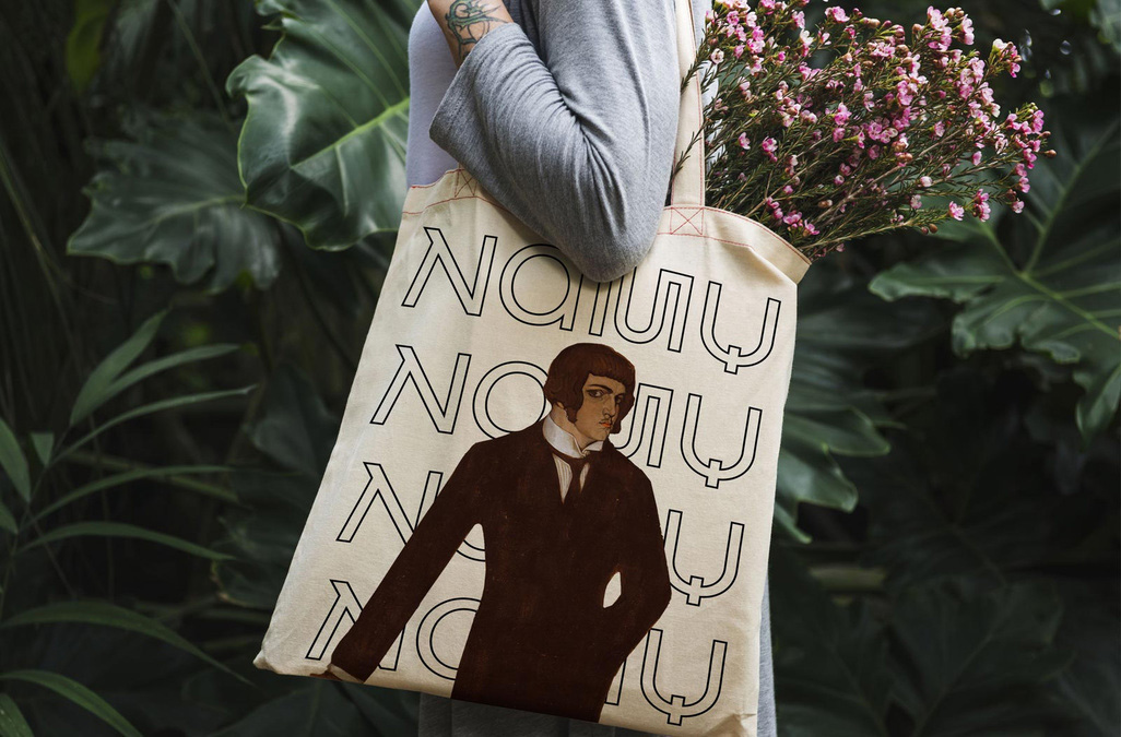
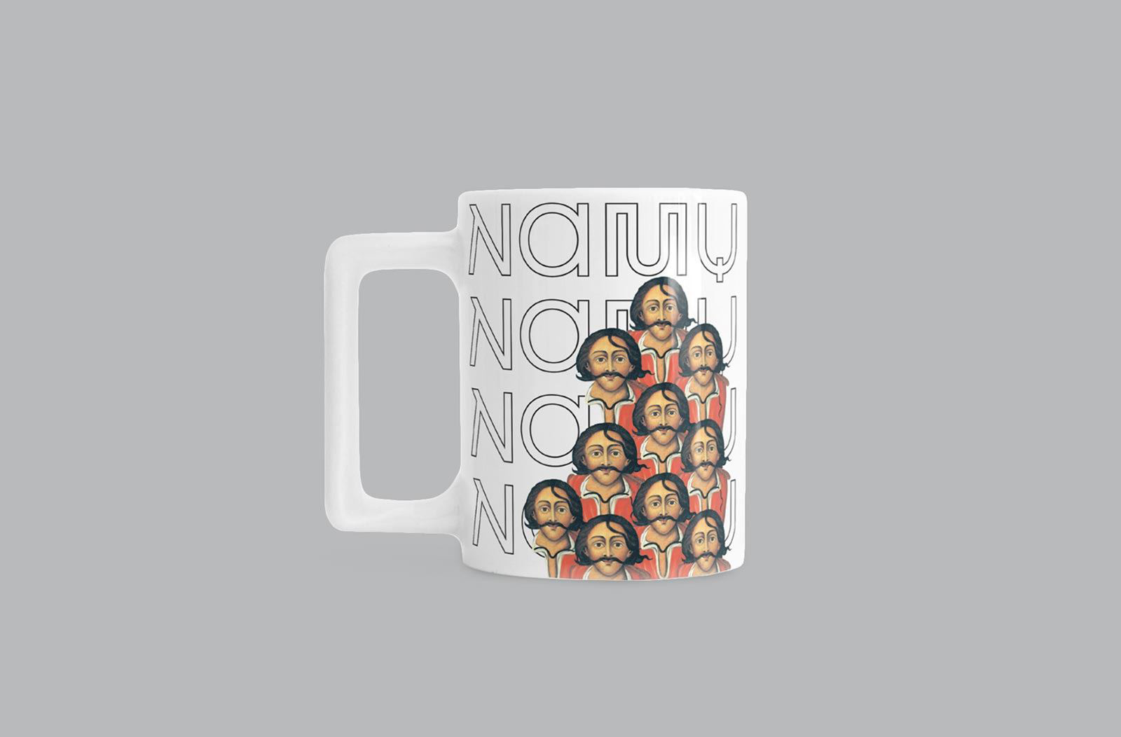
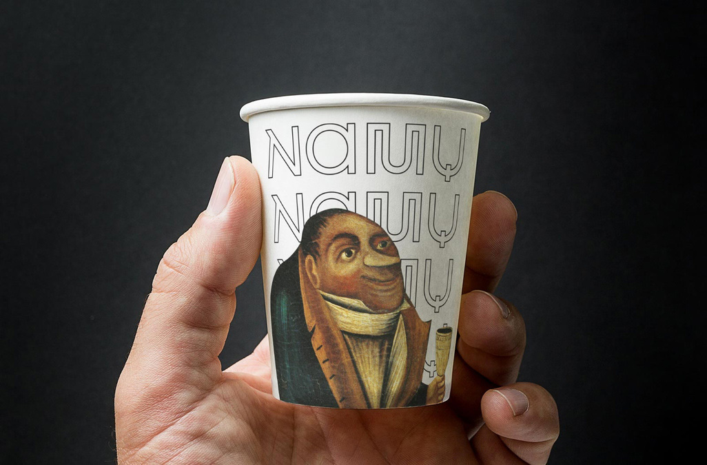
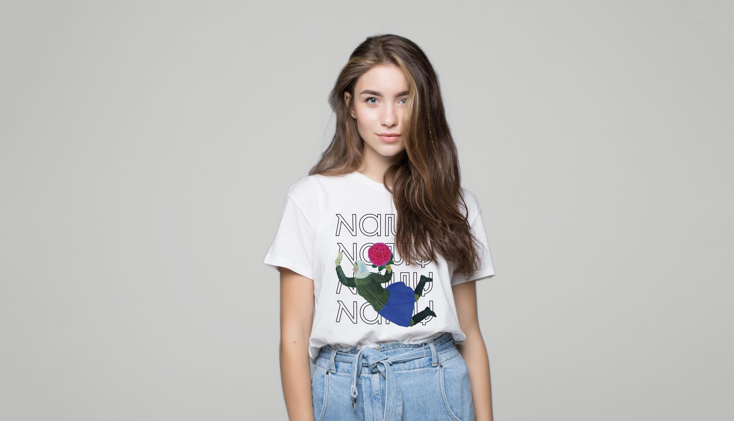
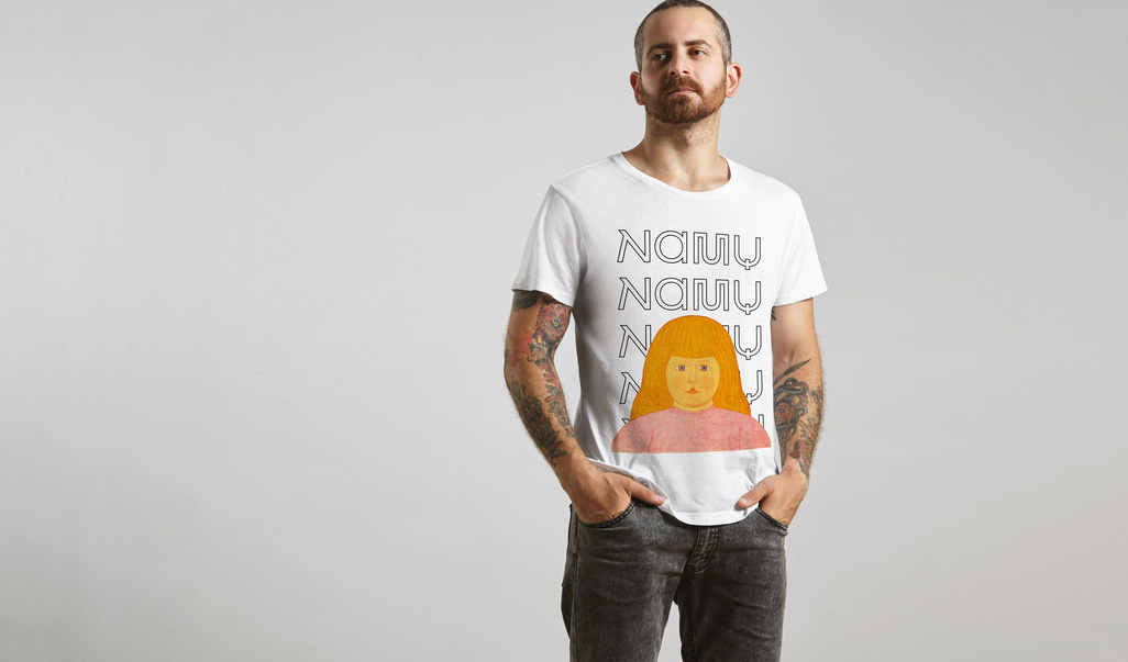
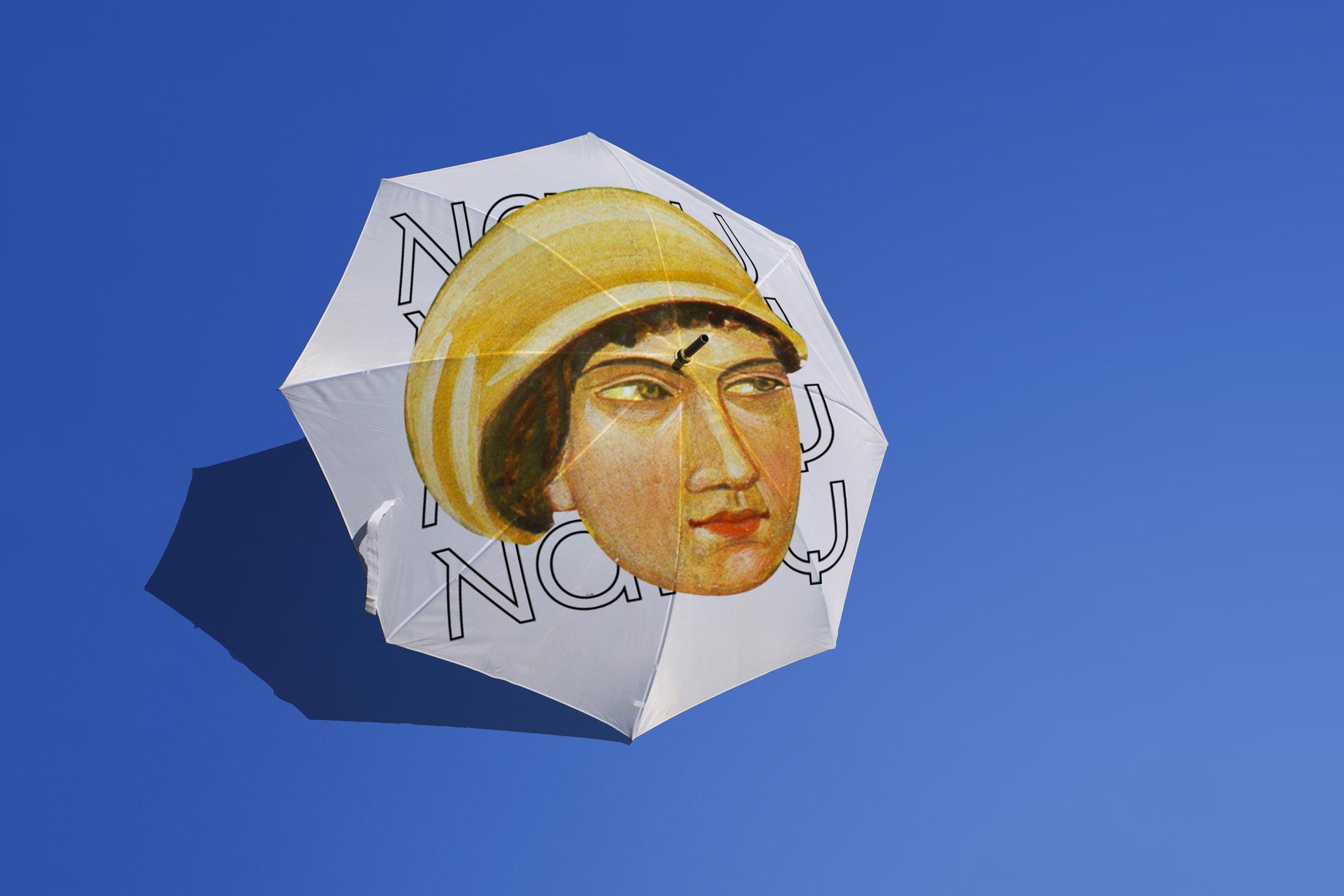
The new NAMU logo becomes a background for heroes of paintings, sculptures and all that can be found in the museum. By putting forward the works to the foreground, as if we get acquainted with people, with heroes, emphasizing their uniqueness, beauty, that they are still interesting and relevant. And yet, we allowed ourselves a small audacity: we changed the scale of the works, introduced the characters of the various paintings in the common materials, formatted as suggested by the composition of the layouts. These techniques made it possible to take a look at the art familiar to many at a different angle from a different distance, in an unusual context.
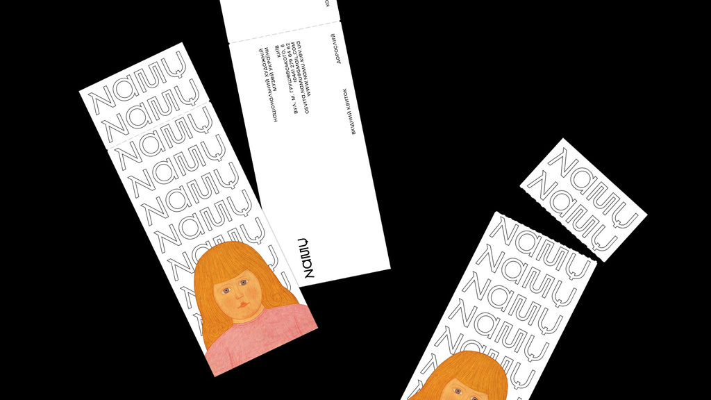
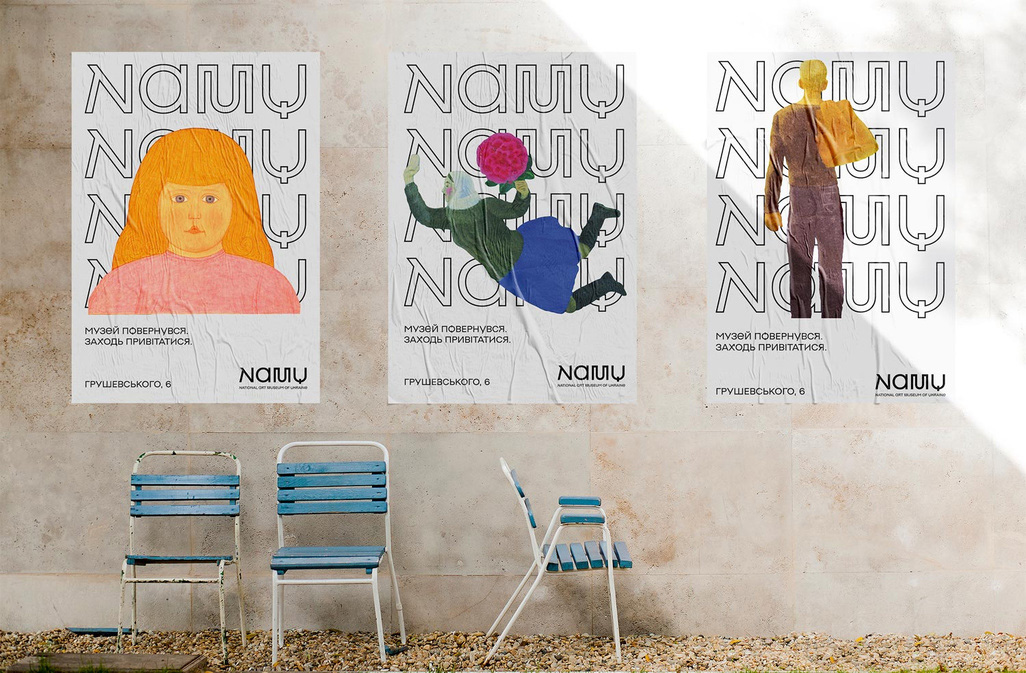
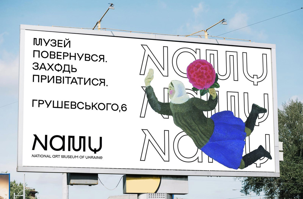
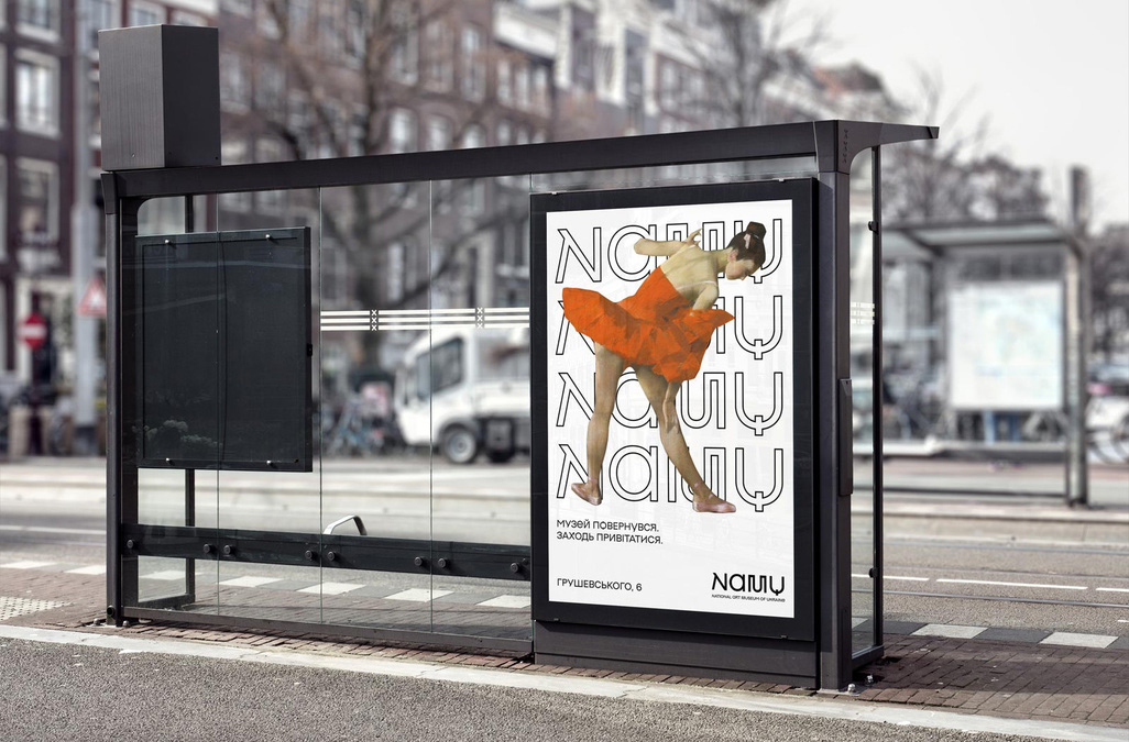
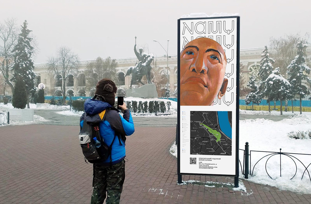
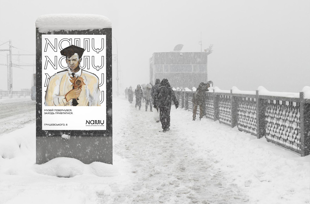
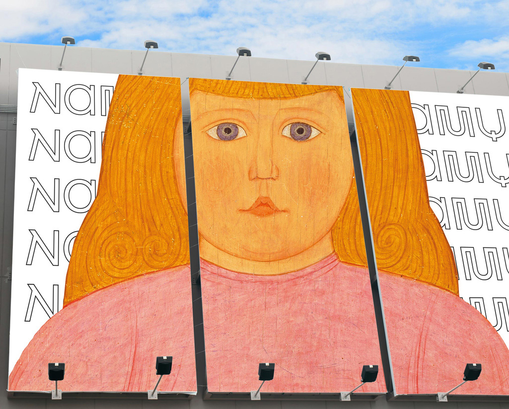
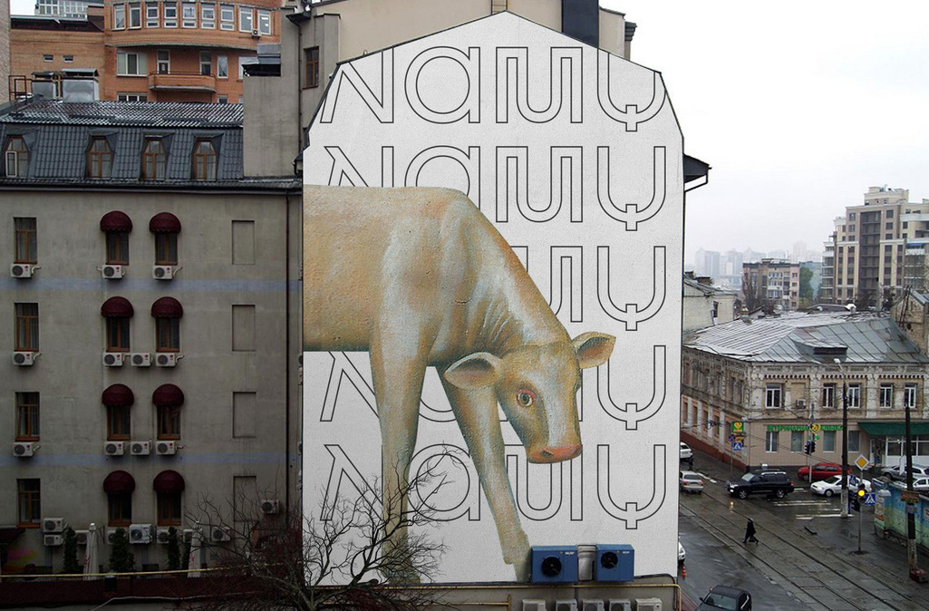
The application is almost infuriatingly simple: A stroked version of the logo repeated in the background with silhouetted characters from the collection placed in front of it. I say “almost” because the result is infinitely satisfying. I know I recently mentioned in the Montréal Alouettes review that the ad nauseam repetition of words is “a way of compensating for a lack of substance” but, here, the repeating contemporary-looking logo interpolated with the artistic, historical elements becomes the substance and I find quite fantastic. The balance of the elements is part of what makes this work so well, with the relatively large use of the logo and the perfectly chosen and isolated elements from the paintings also at a large scale that yield very interesting compositions.
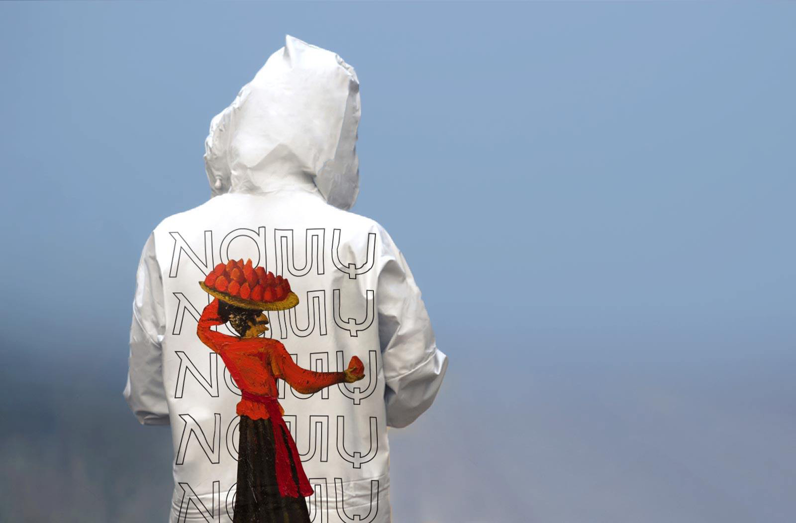
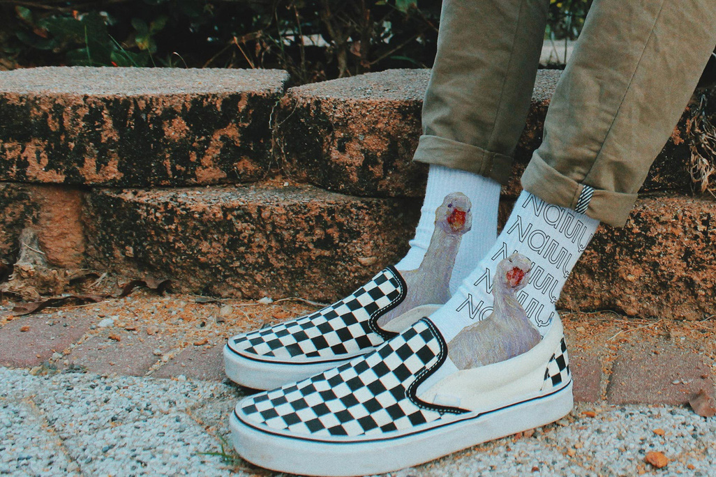
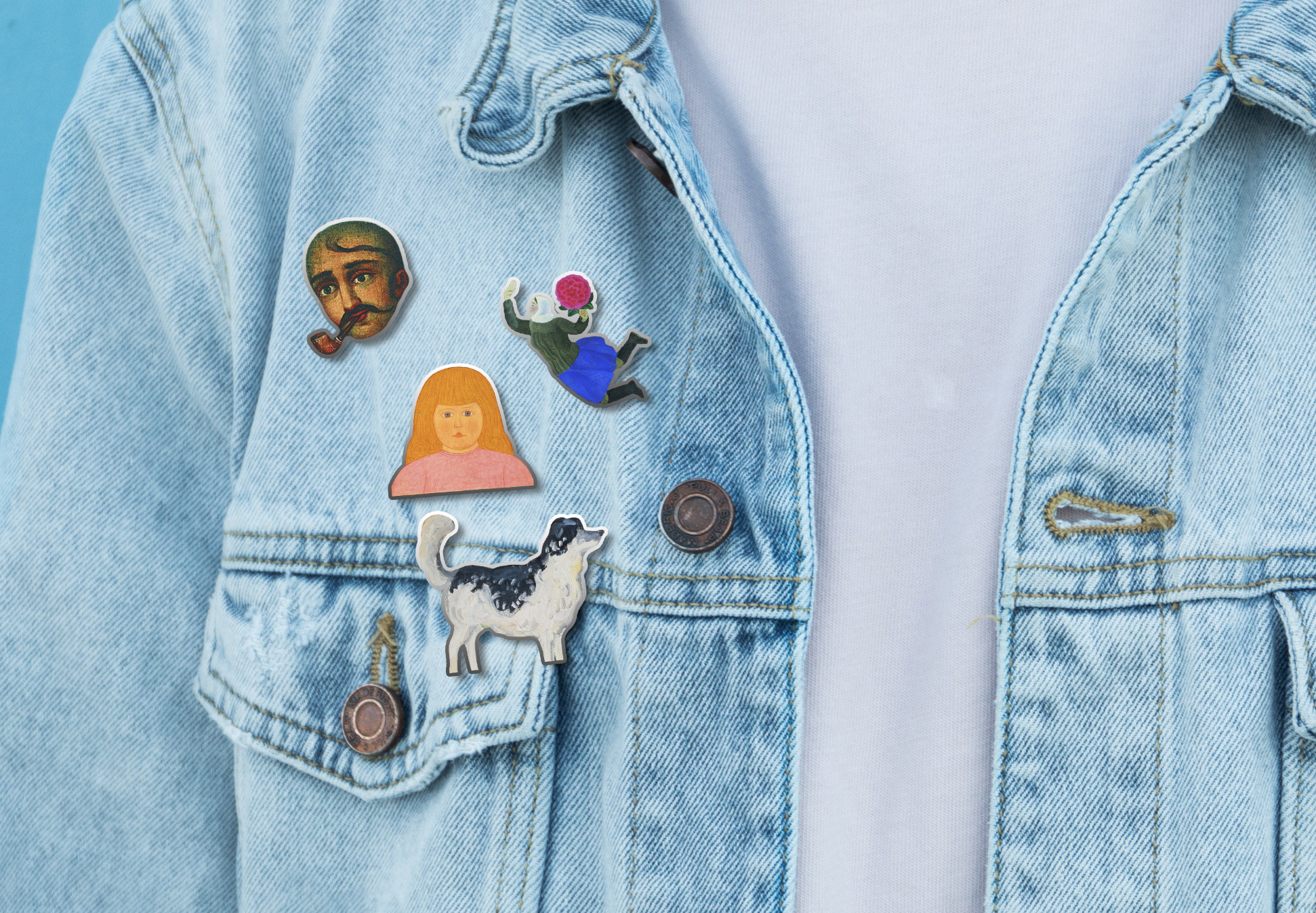
Yup, it’s non-stop. The extension of the idea of the silhouettes as stickers and pins adds an element of joy.

Overall, this is a very successful redesign that is relevant, it feels new, it pays respect to the history of the museum and the country, and should help grow the reputation and appreciation of the institution.
Thanks to Volodymyr Sysak for the tip.

 Новости Союза дизайнеров
Все о дизайне в Санкт-Петербурге.
Новости Союза дизайнеров
Все о дизайне в Санкт-Петербурге.