Обзор лучших ресурсов по разработке бренда, разработке упаковки
contact us | ok@ohmycode.ru
contact us | ok@ohmycode.ru
Launched in 2015 ASICS Tiger is a sports and lifestyle shoe and apparel brand from parent company ASICS Corporation, that also manages the sister consumer brands of ASICS and Onitsuka Tiger. (The press release mentions it was RE-launched but I couldn’t exactly figure out when before the ASICS Tiger brand existed as a combined product and I’m not up to snuff on sneaker history.) ASICS Tiger builds on the legacy of the two names, dating back to the 1950s and 60s, but with a contemporary spin and technology. To coincide with the opening of the first ASICS Tiger store, located in Osaka, Japan, the brand introduced a new logo designed by New York, NY-based Alan Peckolick — who, along with Herb Lubalin, designed the original ASICS logo — and identity designed by Toronto, Canada-based Bruce Mau Design.
Complementing the original 1977 logo used when ASICS was founded, the new brand logo adds the word “TiGER” in similar typography. The new logo expresses the universal dynamism of our sports brand and the strengths that color active lifestyles. The design was developed together with famed graphic designer Alan Peckolick.
The old logo combined the original ASICS logo with Tiger typeset in Kabel — what is it with the word Tiger and Kabel?! — and the famed stripes motif disproportionately large above the name. It was a mishmash of three things that didn’t belong together in a lock-up. Building on the retro aesthetic of the original logo makes perfect sense both in terms of mining the legacy of the brand and of building on the trend of reviving phototypesetting-era typography. The horizontal version of the logo works best in creating a unified wordmark, whereas in the stacked version there is a weird sense of Tiger being bigger. Nonetheless, what makes either version work is the funkiness of the individual characters and the tight spacing between them — those “Si” and “Ti” pairings are killer.
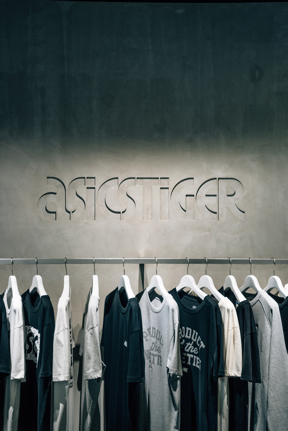
Expanding from ASICS’ seminal logo, this new brand identity acts as a link between the label’s heritage and contemporary culture. The brand system is inspired by overlapping wild postings on the streets and applied through the use of bold brand photography layered over large-scale type. BMD worked with Kontrapunkt to develop a new typeface that merges the geometry of the ASICS logo with updated typographical components.
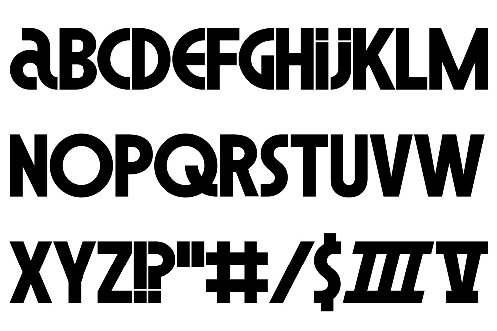
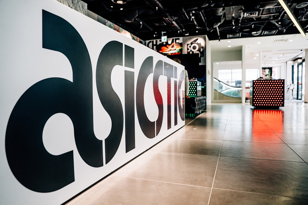
The identity revolves around a custom font designed by Copenhagen-based Kontrapunkt that expands on the language of the ASICS wordmark with a full set of funky characters that mix condensed structures with full circles for the “O” and “Q”. The Roman numerals are a fun twist as well.
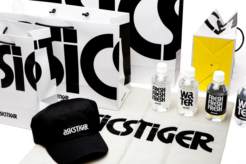
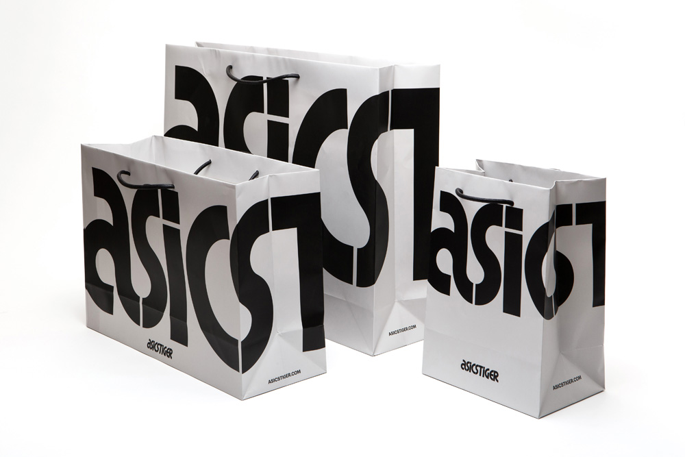
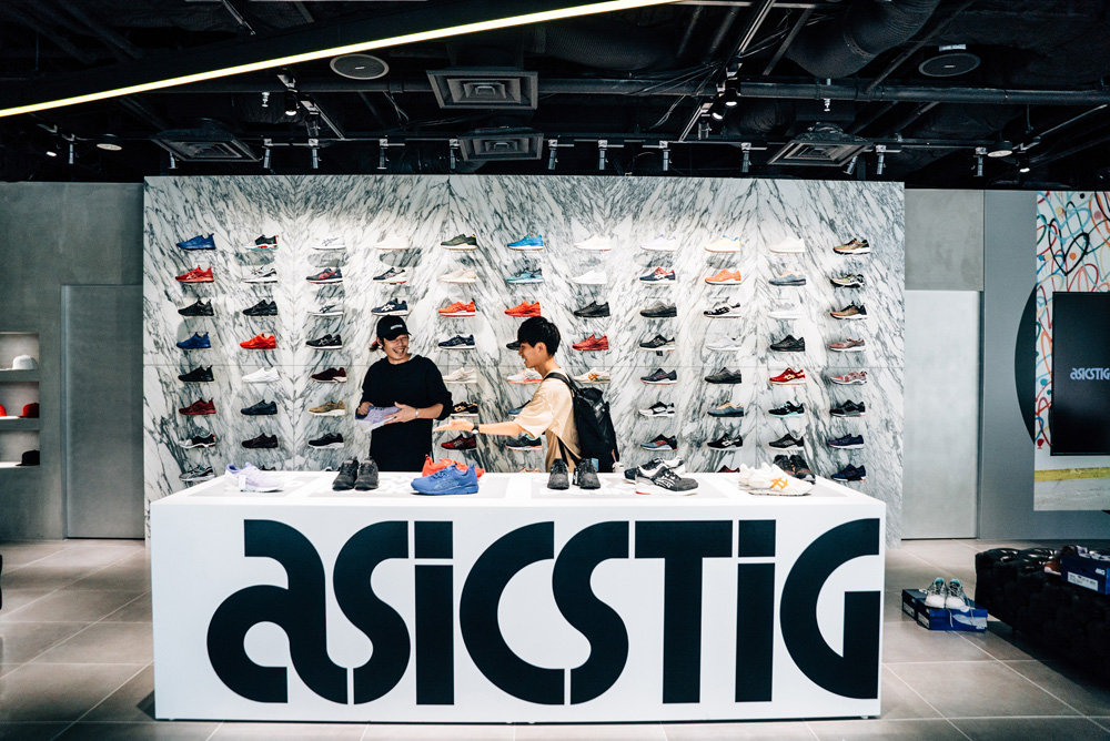
The shopping bags are to die for — absolute design decadence just for the sake it! There is not much in terms of application but even the water bottles show, literally, how fresh this identity can be… as long as you are into this kind of revival. Otherwise I guess it can be a bore — lucky for you, there is a companion approach that breaks from this.
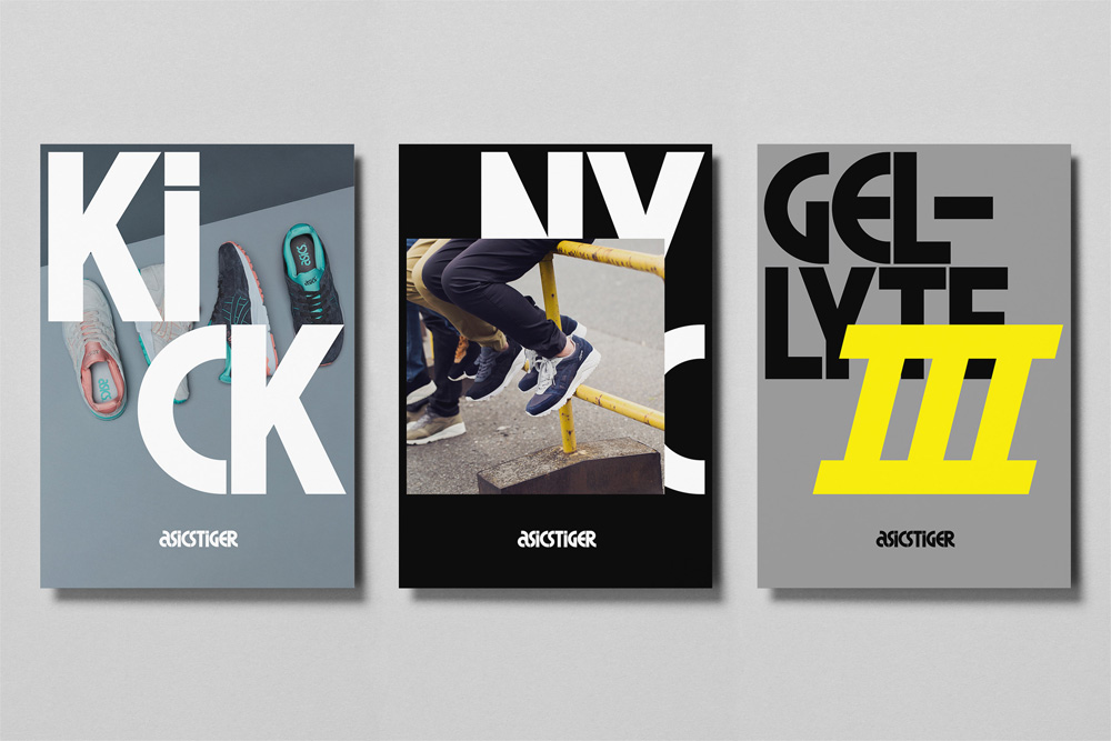
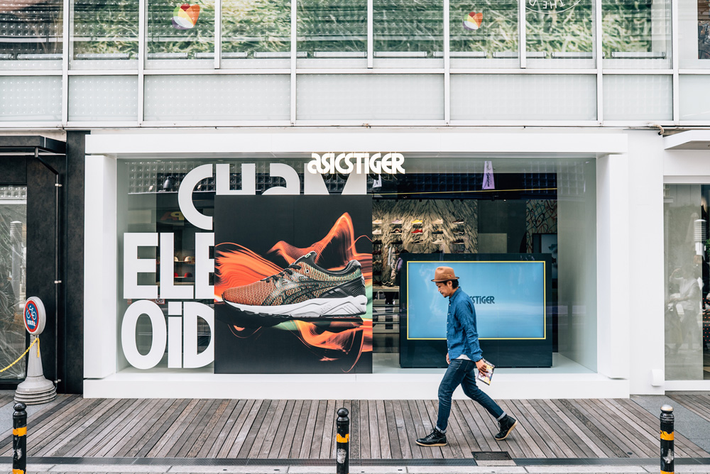
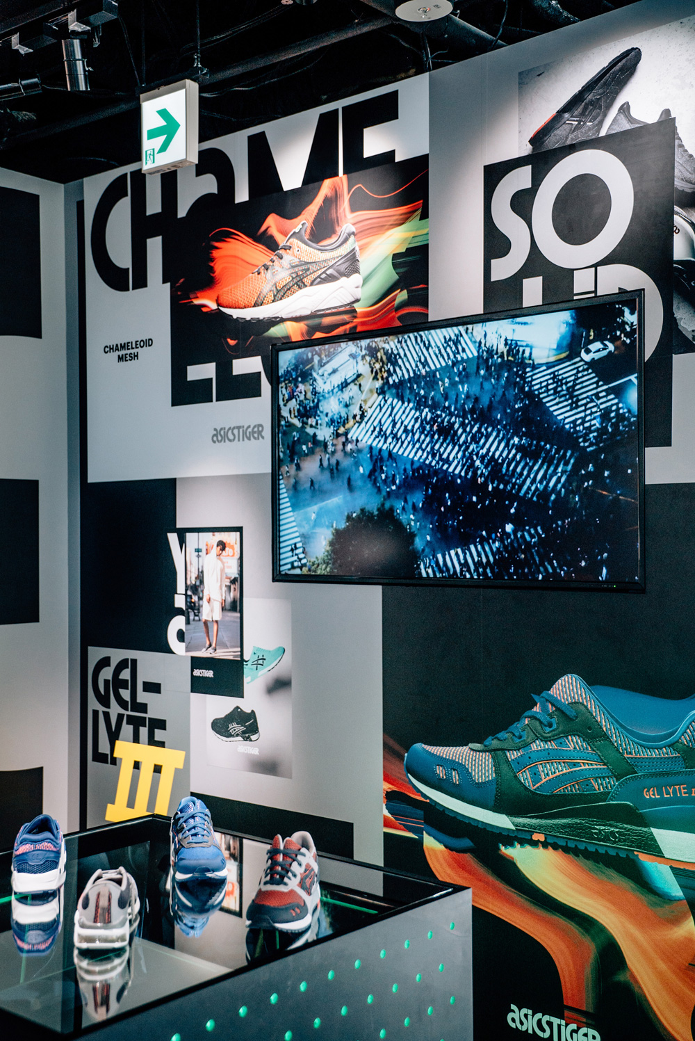
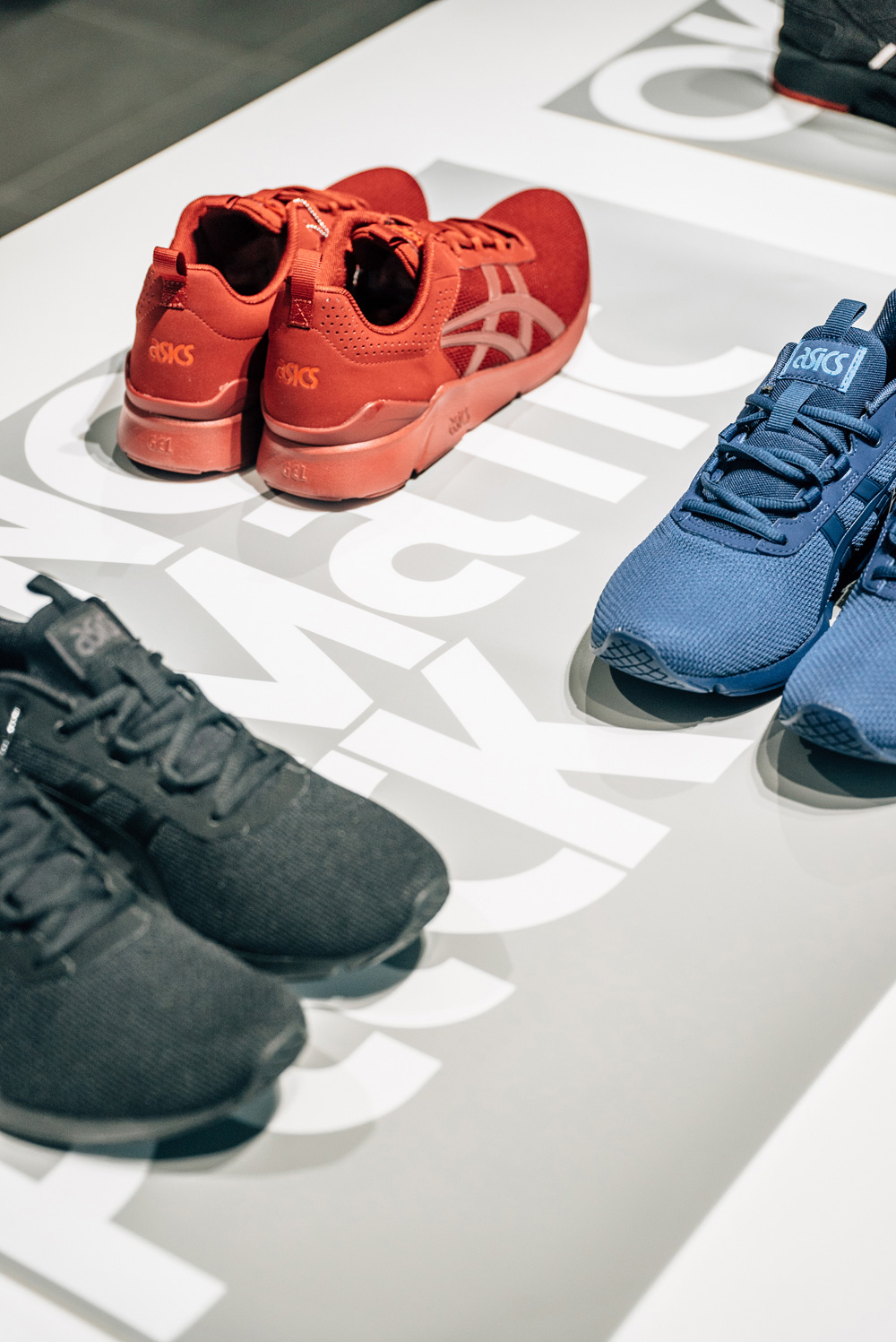
Apart from the barebones approach there is a secondary one where big, colorful shoe and apparel images are stacked on top of the custom font (also used big) resulting in a bold, urban vibe that offsets the heavy 1960s and ’70s influence. Overall, this is a great case of style over substance, where I don’t mean to belittle any strategic or conceptual work, but it’s nice to see some vintage design on steroids and appreciate that it looks awesome just for the sake of being awesome (and selling shoes).

 Новости Союза дизайнеров
Все о дизайне в Санкт-Петербурге.
Новости Союза дизайнеров
Все о дизайне в Санкт-Петербурге.