Обзор лучших ресурсов по разработке бренда, разработке упаковки
contact us | ok@ohmycode.ru
contact us | ok@ohmycode.ru
Launched in 1989, Three (previously TV3) is a general entertainment channel owned by MediaWorks New Zealand with programming focused on (the rather broad) demographic of 25-54 year-olds with a mix of drama, comedy, event television, and news, with an emphasis on local talent and content, including adaptations of shows like Family Feud and The Bachelor amidst a range of original programming. Yesterday, the channel announced its name change and introduced a new identity. No design credit given.
“The world has changed [since 2003]; it was a world where there was no Netflix, there was no Amazon, there was no Hulu, there was no Lightbox, there was no Asos, and so ‘3’ as a brand hasn’t really evolved with that even though our content has,” [Chief content officer Andrew Szusterman] says.
“When we talked to a lot of people externally, there’s a lack of understanding about what pulls them together, what was the glue that sticks all these things together and what does ‘Three’ mean beyond the individual parts of content.
“A channel this strong, with content this strong, should be bigger than the sum of its parts and it should represent the content itself whereas the pieces of content were living in isolation,” Mr Brown says.
Without knowing anything about the channel (which I didn’t 30 minutes ago) I would have guessed (and I failed) that the old logo was for a news-only channel. It was way, way too serious. Even though news is a big component of the channel, that logo didn’t leave room for the more entertaining programming. Now the tables have turned and the channel is all fun, all the time, starting with the name change, from the buttoned up TV3 to just “Three” — hey, Eleven pulled it off, so why can’t Three? (It’s a rhetoric question, Eleven was the bomb). Slight sarcasm aside, I actually do like the name in that it’s more of a brand, rather than just another channel name in the TV guide. I usually don’t like brands where they force you to write their name starting with a lowercase but this is one where it would have benefitted from it — three would re-emphasize the new logo. Or they could have been extra annoying and gone with +HR=E.
The new logo may not read immediately as Three but it’s almost impossible to not let your brain do what it does and fill in the blanks… Eventually, even by mistake, people will read “Three” and the execution is pretty good in helping make the connection. I like the shifting baseline that still keeps the horizontal lines of the characters aligned and it’s that shifting that makes the = sign read as an “E”. I dig it. I don’t think the angled version is very official as it only appears in application but I like how it adds some literal dynamism to the mark and it’s perfect as a complementary usage.
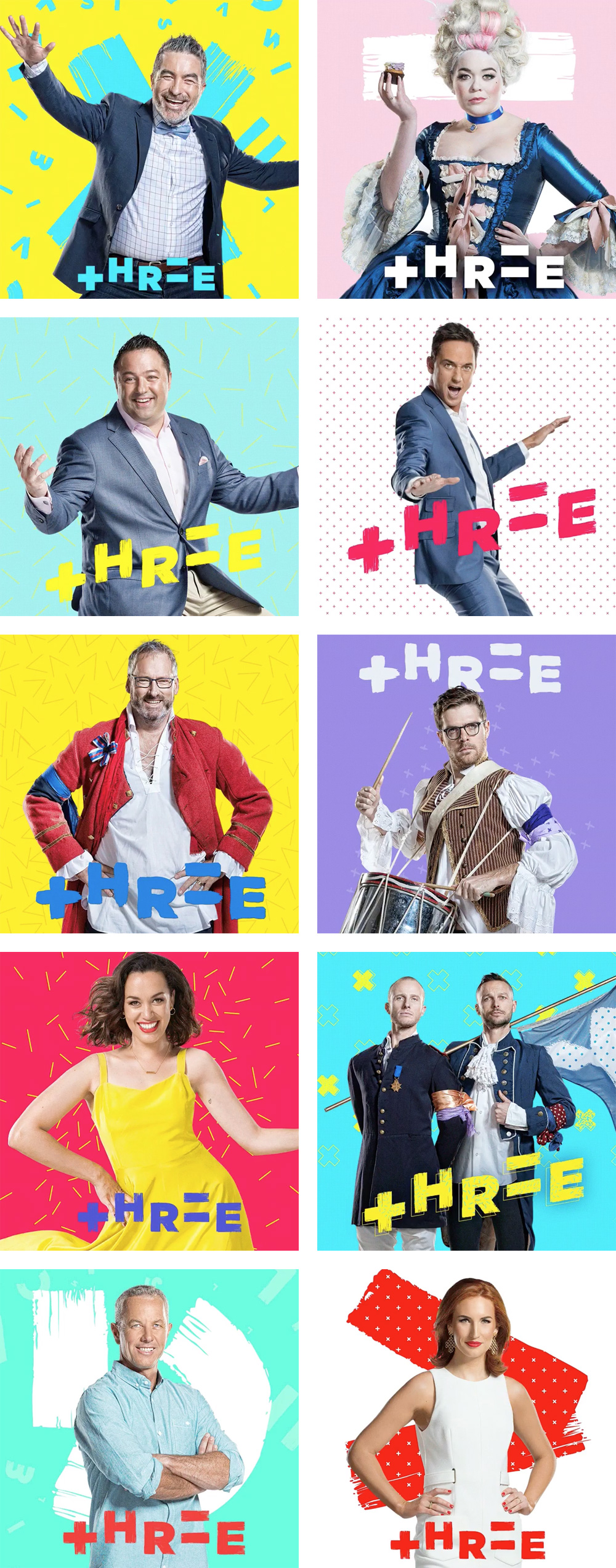
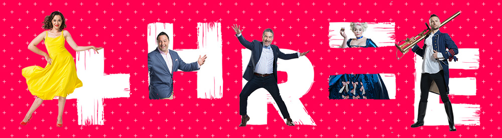
There isn’t a full identity or on-air presentation, only a few things I cobbled together, but it’s enough to get the point across: Lots of energy and playfulness, “+” and “×” patterns, brush textures, et al. It has a slight sense of let’s-throw-stuff-at-the-wall-and-see-what-sticks but a lot of it sticks in a frenetic way. Overall, this seems to position Three very clearly about what kind of channel it is — youthful, pop-culture-y, trying a little harder than it should — that better represents its programming.

 Новости Союза дизайнеров
Все о дизайне в Санкт-Петербурге.
Новости Союза дизайнеров
Все о дизайне в Санкт-Петербурге.