Обзор лучших ресурсов по разработке бренда, разработке упаковки
contact us | ok@ohmycode.ru
contact us | ok@ohmycode.ru
Established in 1961 as Canadian Intercollegiate Athletic Union and later renamed Canadian Interuniversity Sports - Sport Interuniversitaire Canadien (CIS-SIC), the newly named U Sports is the national governing body of university sport in Canada. It counts with 56 university members with over 12,000 student-athletes and oversees more than 7,700 games and 21 national championships a year. This past October, U Sports introduced its new identity designed by Vancouver, Canada-based Hulse & Durrell who also worked on the naming in collaboration with Ariane Perreault of bleublancrouge.
The U Sports brand aims to create a massive change in the way Canadians see university sports in the digital era. Our commitment is to revitalize our place in the national sport conversation by using every technology possible to highlight, celebrate, and present the accomplishments of these remarkable young individuals who pursue the toughest double major of all. Full-time scholar and full-time athlete.
[The] new name and identity resolves remarkable language challenges with a design that clearly conveys “Canadian University Sport” — without ever saying it.
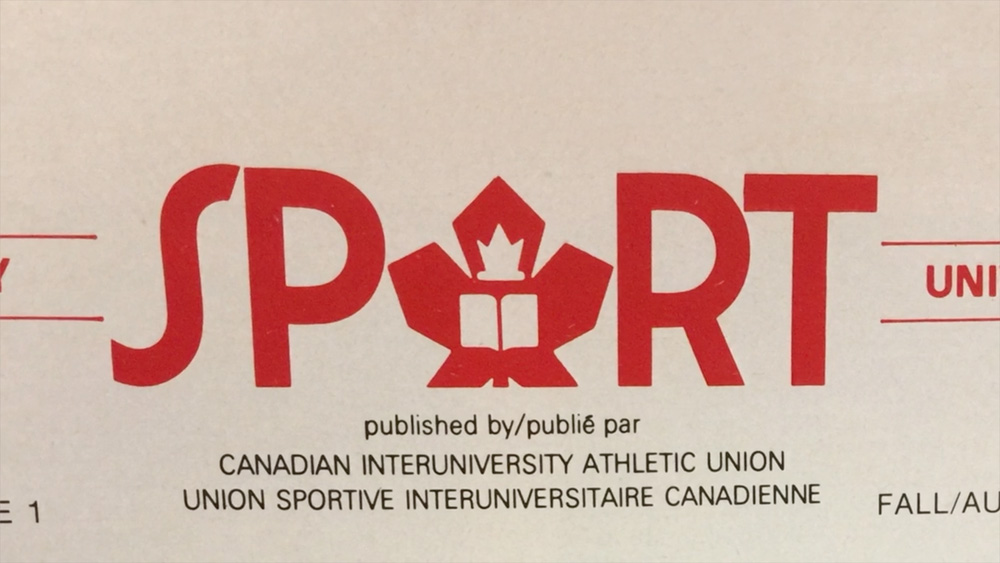
The previous CIS/SIC logos were terrible. I mean, there are worse logos out there, but for a national, academic organization these looked cheap and unprofessional with the clunky strokes, bland swoosh, and a maple leaf that looked as if it had been flattened by a Zamboni. Even before knowing it was a Hulse & Durrell project as I received a couple of tips about it — if I had known from the get-go it was theirs I would have been way more predisposed (biased) to like it — I saw in the new logo a finesse and freshness to it that’s rare to see in any collegiate logo using the 100%-cliché slab serif.
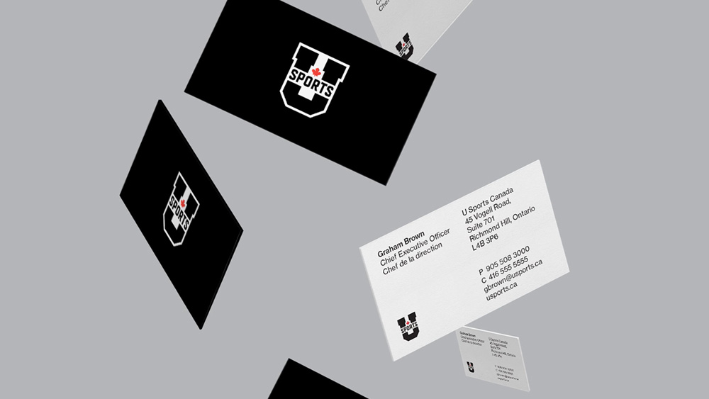
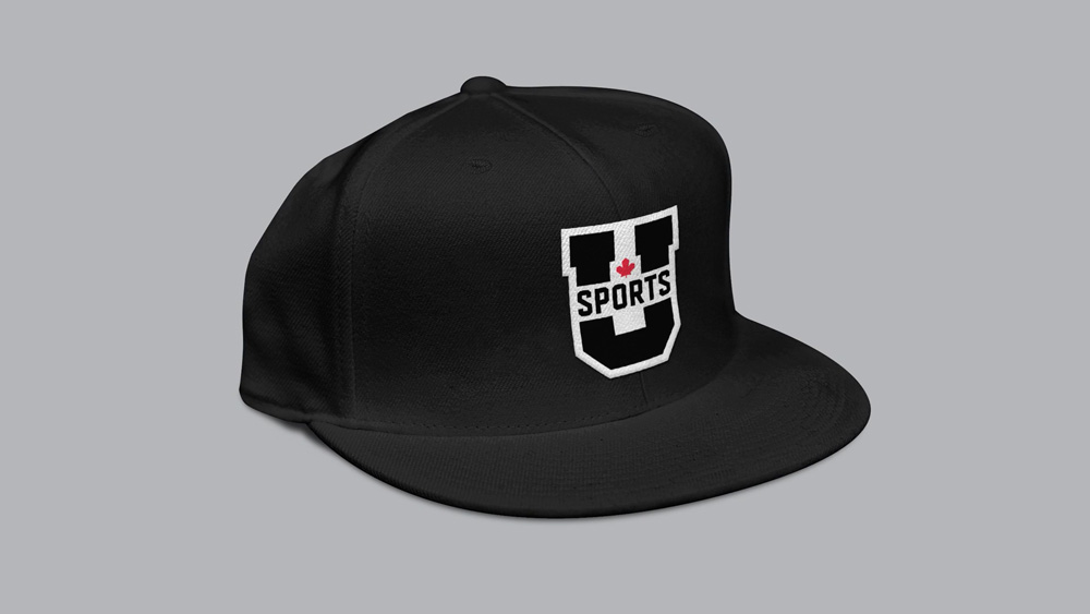
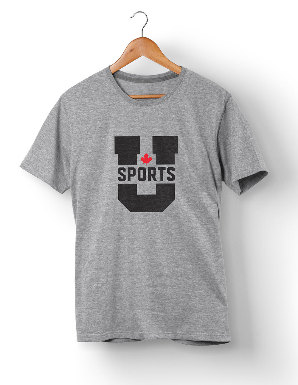
The large “U” helps establish the new name in a bold way by giving that single letter, which looks somewhat odd and alone when written in text, the most prominence in the logo and making it the anchor of the identity. The “U” is broken in the middle by “SPORTS” typeset in an extended version of Matt Wiley’s Timmons (which is used as the primary font in the identity) and punctuated by a minimalist maple leaf that’s tucked perfectly in the counter space. This is a great take on the maple leaf and works great with the angular shapes of the typography. I imagine Greg and Ben have this scene in their dreams a lot, but with maple leaves falling on them as they keep having to reinvent it on all their Canadian projects.
As mentioned above, Timmons becomes the main visual element of the identity and it’s very bad-ass. It manages to look collegiate but also industrious and elegant. Not to gratuitously knock on the Nike Graphic Identity Group but this is the kind of typographic elegance and nuance that’s usually missing from their projects: this looks like it belongs in university sports world but it doesn’t feel cliché.
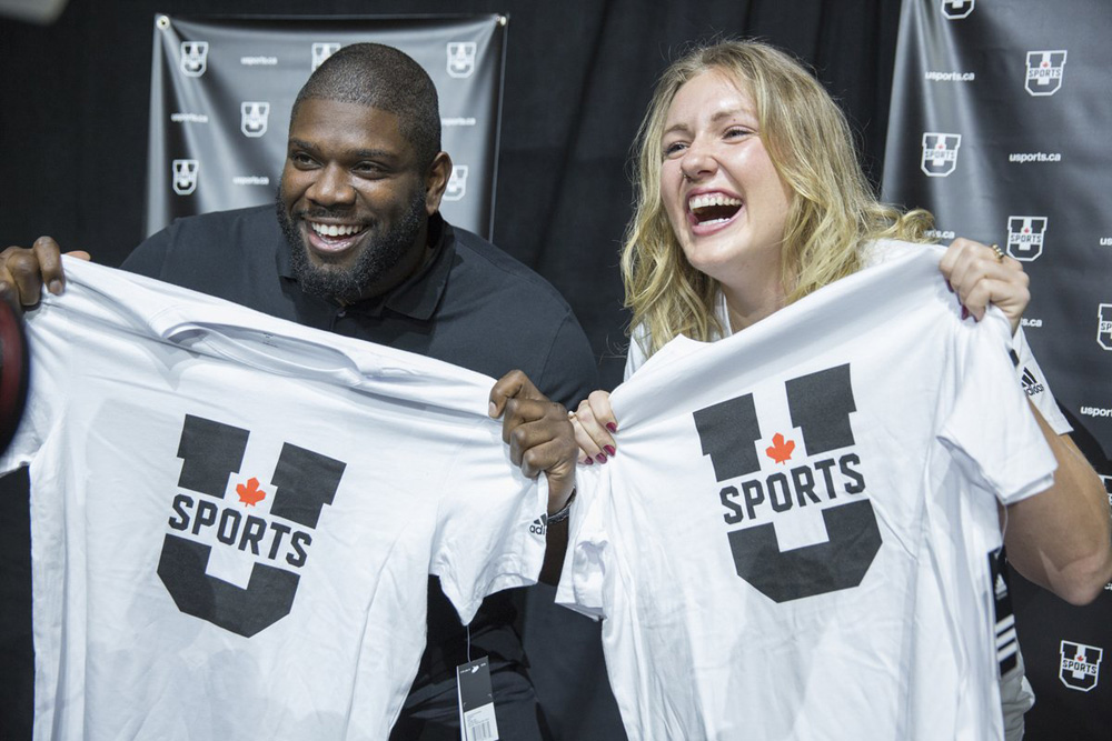
Not much in application — a few extra glimpses of type layouts and arrangements in the video — but even judging from the website alone, you can tell this has a solid typographic foundation and an elegant restraint. Overall, this is a massive improvement that takes a pair of confusing acronyms to establish a single, memorable name that puts U Sports in the same class as the U.S.’s NCAA which is literally a competitor as Canadian student-athletes tend to flock here in search of scholarships and a professional sports career — whether a cool logo with a killer maple leaf makes a difference or not is still to be seen, it’s a solid start.
Thanks to Owen Kerr for the tip.

 Новости Союза дизайнеров
Все о дизайне в Санкт-Петербурге.
Новости Союза дизайнеров
Все о дизайне в Санкт-Петербурге.