Обзор лучших ресурсов по разработке бренда, разработке упаковки
contact us | ok@ohmycode.ru
contact us | ok@ohmycode.ru
Established in 2003, Skyscanner is an online travel platform that started as a flight search engine only and has grown into a full travel booking service for flights, hotels, and car rentals. Owned by Chinese company, Ctrip, the largest online travel agency, Skyscanner has been growing steadily with their website available in over 30 languages and with offices in the UK, Singapore, Spain, China, United States, Hungary, and Bulgaria. Last week, Skyscanner introduced a new identity designed by Koto.
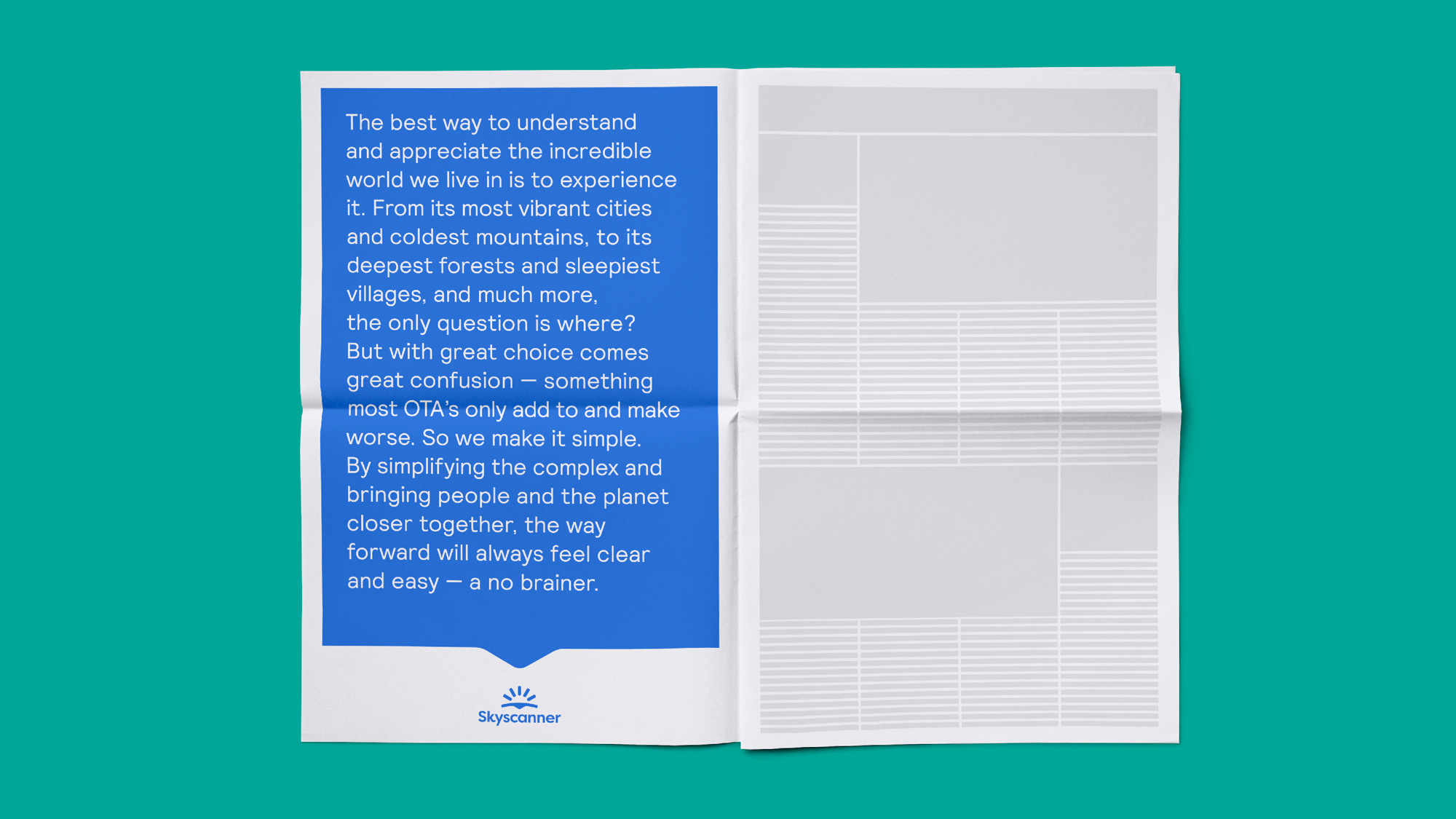
Travel brands have got lost. Wacky advertising, same-same destination photos, product experiences that are hard to differentiate. As one of the originals, Skyscanner prided itself on product excellence, but was lagging on emotional resonance. We worked with them to build a brand leading the global transformation to modern and sustainable travel.
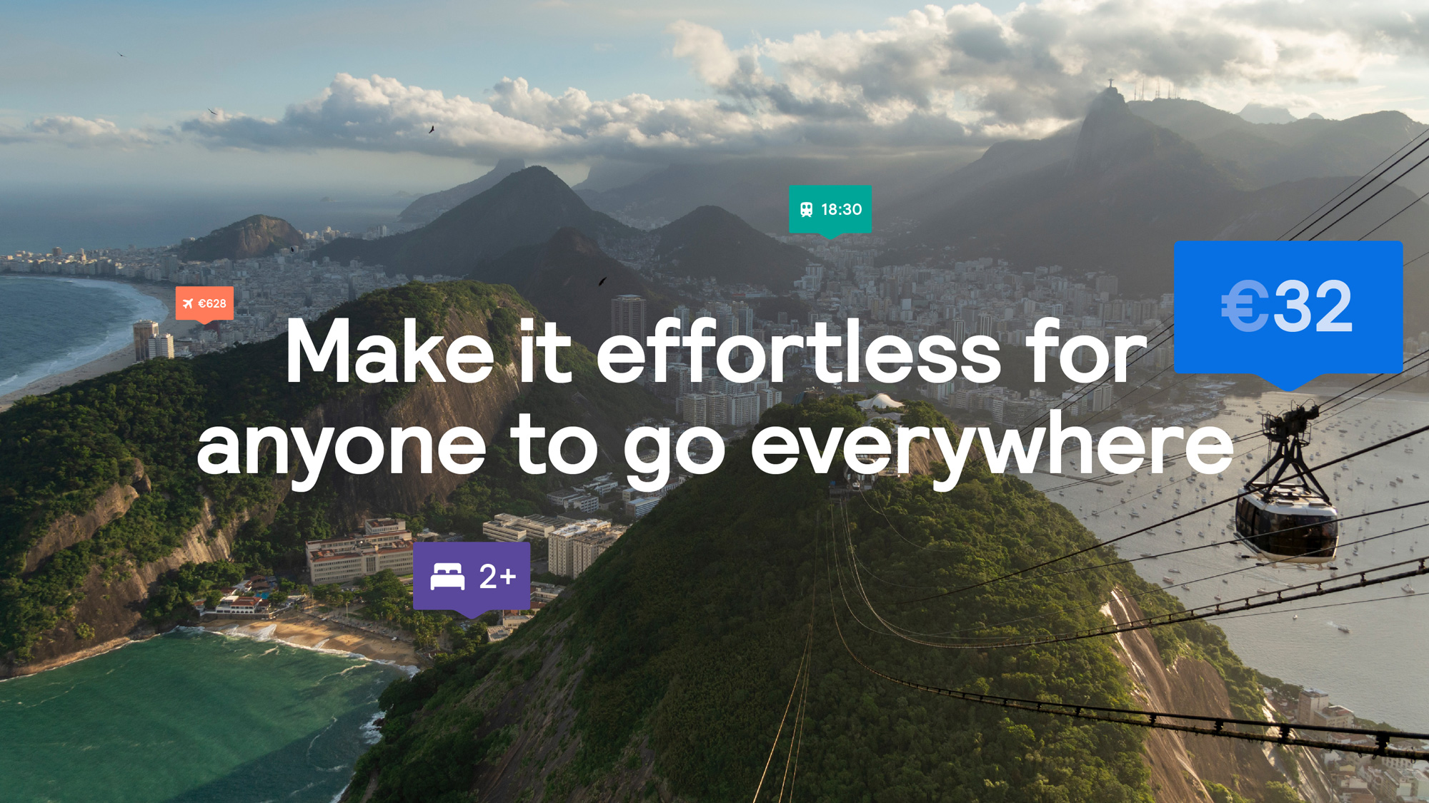
The new symbol is a key step in Skyscanner’s brand evolution. It embodies the optimism of a sunrise, and positions Skyscanner as the catalyst for a new era of sustainable travel. We worked hard to create something with global appeal, which would be well-suited to a brand that gives travelers everywhere new ways to ethically and effortlessly explore the world.
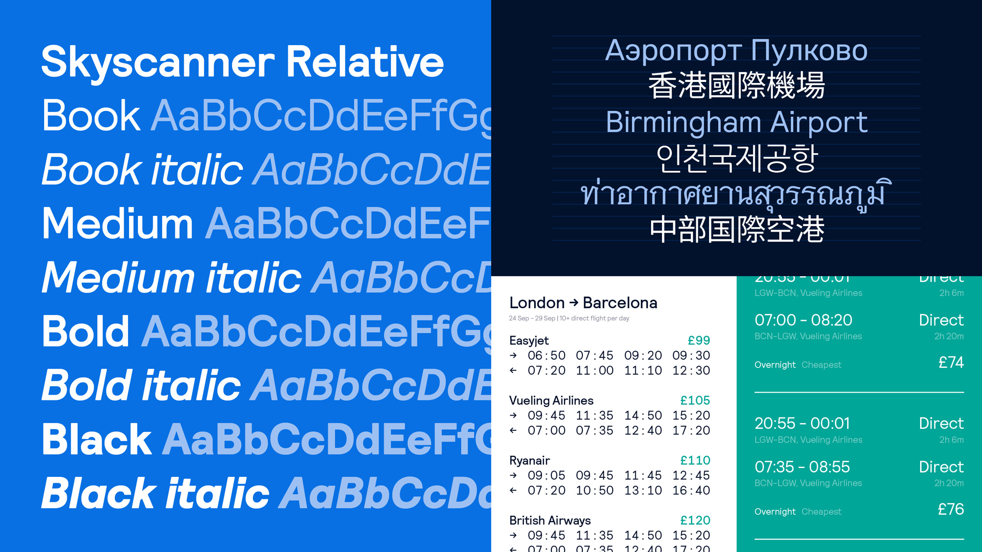
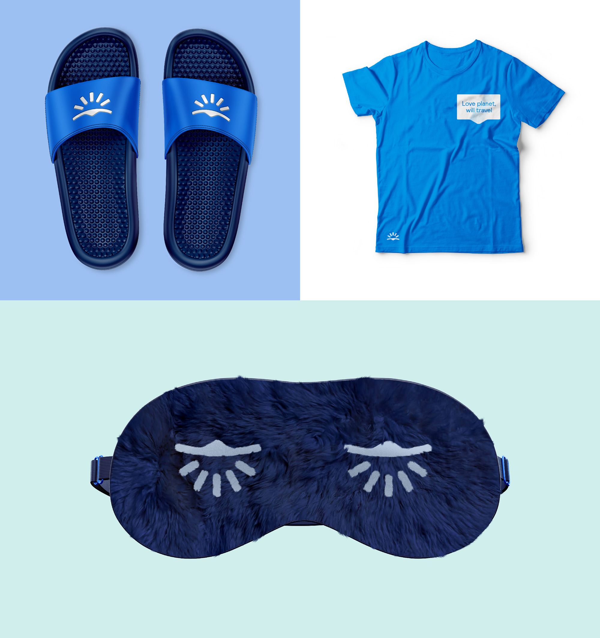
The old logo wasn’t great but it did a good job in interpreting the name visually by showing a cloud (“sky”) with frequency waves (“scanner”). Not super deep but functional and it did look like a kind of digital utility tool. As the site has evolved into more of a lifestyle travel platform it certainly felt cold. The new logo immediately feels more optimistic and vacation-y with the sun rays, which is the element that stands out the most in the new icon. From there, things get a little confusing about what the icon is… my instant interpretation was that it’s an eye but it’s a rather creepy eye that is sort of looking at you dubiously and if that’s an eye then wouldn’t the rays be the eyebrows but then if those are eyebrows why do they look like eyelashes? Maybe I’m over-analyzing it — welcome to my life — because, in principle, it’s a good icon in the sense that it’s distinct and ambiguously evocative about searching for vacation options. Interestingly none of the meanings behind the logo are an eye, so maybe I’m just seeing things and this whole paragraph is misguided but, in my defense, I would have not derived “ideas” or “sustainability” from looking at the logo — “destinations” maybe because I did think of the icon as pointing down at something. The accompanying wordmark is nice… nothing too special but, thankfully, nothing completely generic either — golf clap for extending the “k” to fill the counterspace with the “y”.
One thing that I like a lot about the icon is how it’s treated on motion and photos, masked with specific elements. The relative complexity of the icon and all the spaces between its various elements lends itself very well to this treatment. Hard to explain, sorry… I just like the effect.
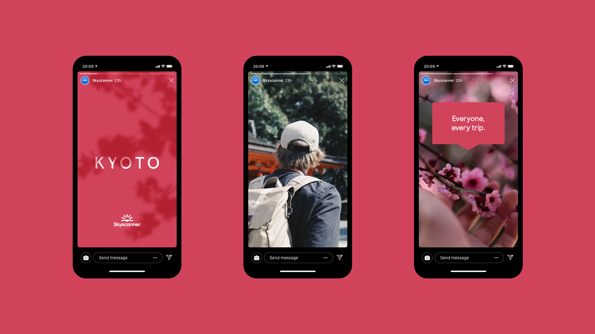
We’ve developed an identity which can stretch easily from calm and simple to energetic and loud. Where every element is used sparingly and communicated clearly, but always with personality and impact. It’s a system that works for all Skyscanner’s diverse global audiences and across every touchpoint - from brand-building to price-led communications.
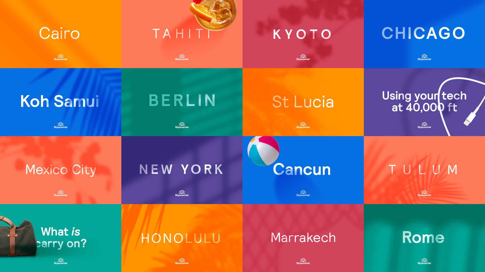
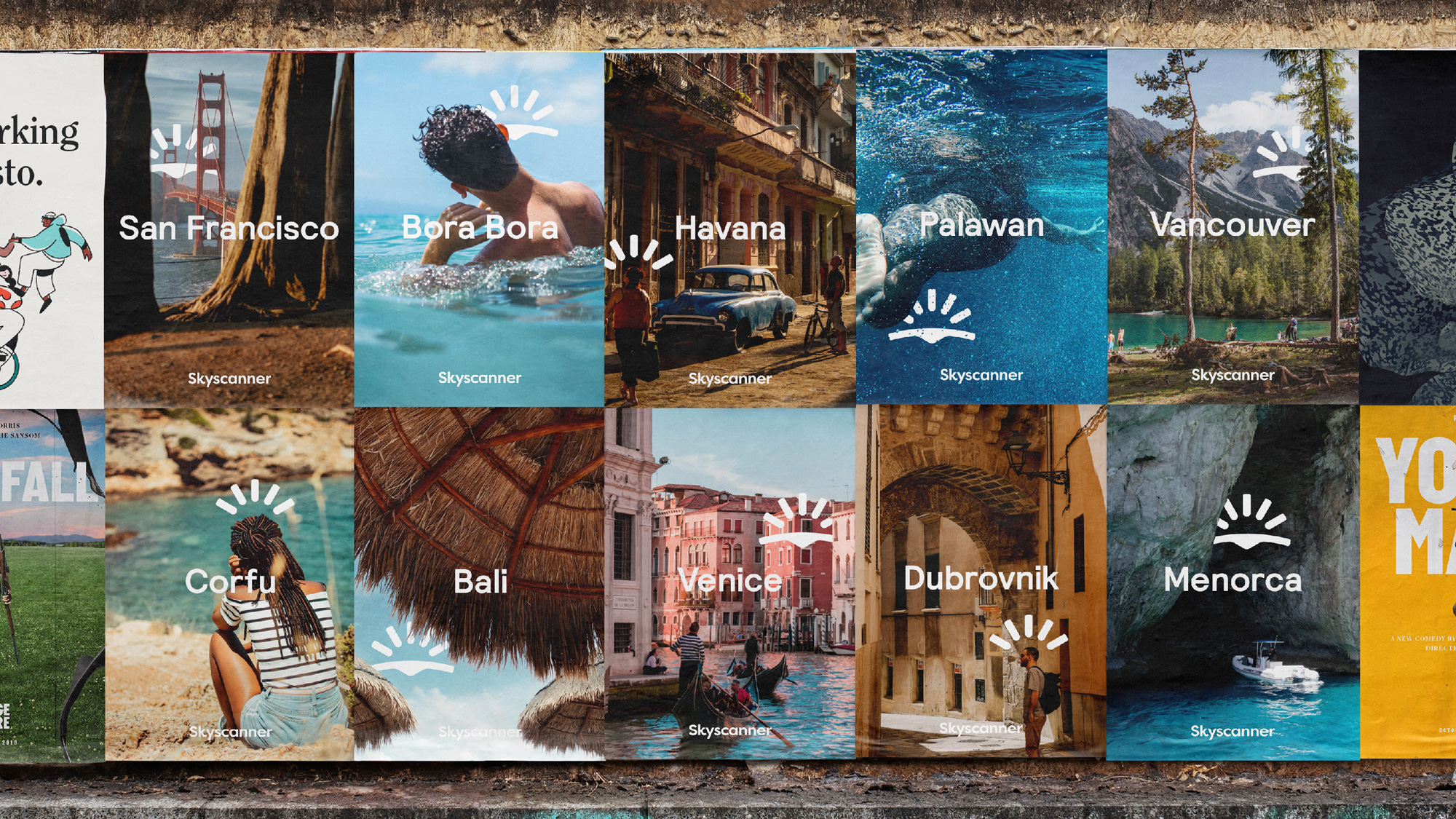
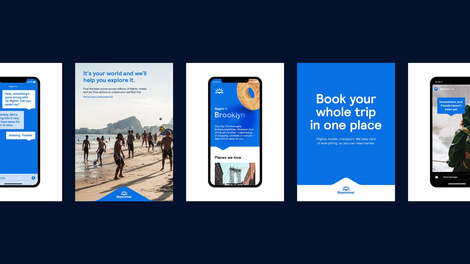
The identity goes in a few different directions, all good on their own and as a whole. For example, in the image directly above, there is a nice use of the arrow in the icon to create a holding shape for the logo that also helps point towards the content. There is also the grid with the colors and the destinations that has playful, subtle shadows that are representative of each location. And then there are cool travel photos with the icon acting as an accent over specific elements in each picture.


Overall, this is a great evolution that moves Skyscanner away from something like, say, Priceline and more into Airbnb territory with a brand that aims to be more human and evocative in a way that helps it be distinctive from competitors like Travelocity and Kayak.
Thanks to Billie Gray for the tip.
 each year since publication began in 2006

 Новости Союза дизайнеров
Все о дизайне в Санкт-Петербурге.
Новости Союза дизайнеров
Все о дизайне в Санкт-Петербурге.