Обзор лучших ресурсов по разработке бренда, разработке упаковки
contact us | ok@ohmycode.ru
contact us | ok@ohmycode.ru
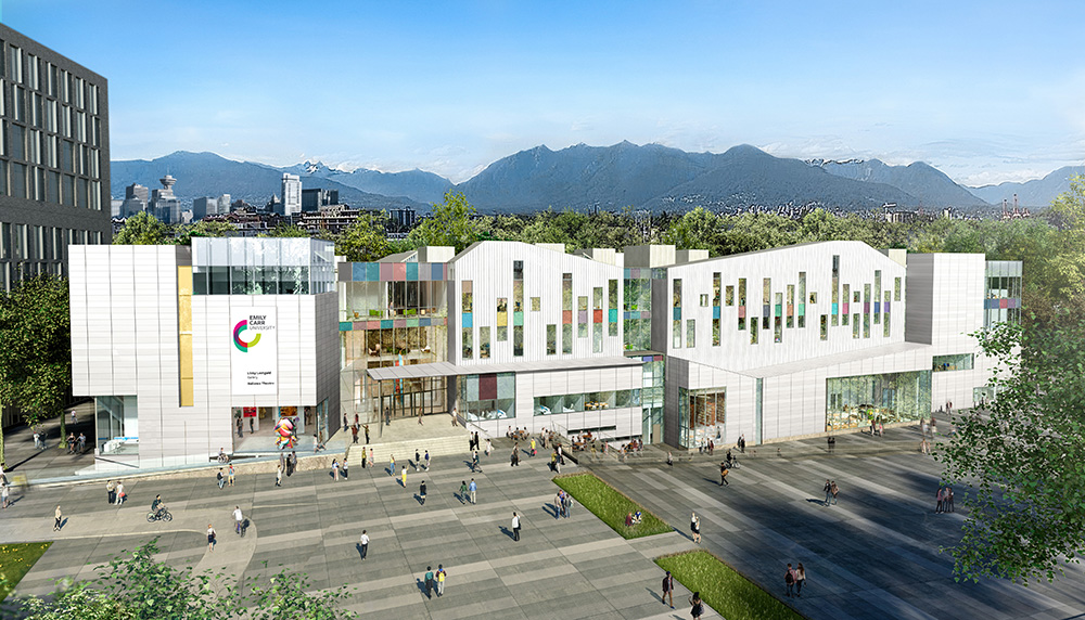
(Est. 1925) “Emily Carr University of Art + Design, established in 1925, is a world leader in education and research. Encouraging experimentation at the intersection of art, design, media and technology, our learning community merges research, critical theory and studio practice in an interdisciplinary environment. Alumni and faculty are internationally recognized as award-winning creators and thought leaders who have enormous impact on both the cultural sector and economy. We engage students, industry, and society to continuously explore and think differently about creativity and how it shapes our world. Emily Carr is building a state-of-the art campus for 21st century learning at Great Northern Way. The University will be at the centre of a new social, cultural, educational, and economic engine for British Columbia.”
Camp Pacific (Vancouver, BC)
Emily Carr blog post
2009 Brand New post
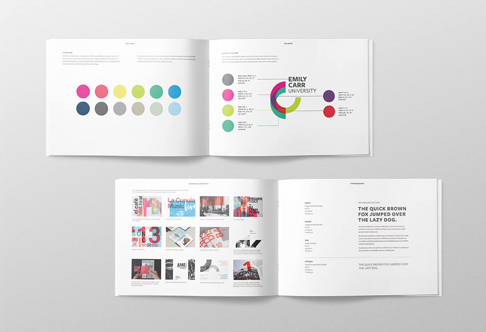
The new visual identity, designed by Camp Pacific, features vivid colours which curve around the University's name. Inspired by the painting palette of the University's namesake, the artist Emily Carr, the colours layer and overlap, referencing the transformative and accretive process of learning. The youthful and dynamic multi-toned, multi-layered surfaces of the logo depict the energy, progress and joy of expression attained through education. Developed through a year-long process of consultation with the University’s faculty and staff, the logo's layered design also pays homage to the many disciplines encompassed by Emily Carr University's diverse faculties.
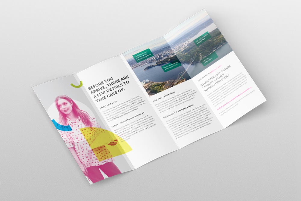
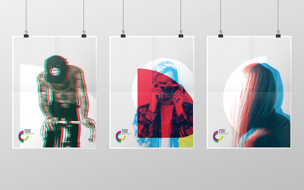
The old logo was okay in a "Look at me, I'm artsy!" way but kind of flimsy and imbalanced with the extra large name and thinner elements around it. The new logo can maybe be read as having an ECU in its icon, formed by the overlapping half circles, but I think that's either a stretch or not executed convincingly enough. Both the icon and the name are overly ambiguous and to make the associations expressed in the quote with it is really not gonna happen. The logo feels stuck between wanting to represent an arts and design university and wanting to represent a serious university (not just a place where you take nude-drawing classes) and somehow misses to hit either. The applications are pretty dry, with the posters being the closest thing to something interesting. The animation at the end is cool and it would have been nice to see some of those more organic shapes make their way not just to the identity but even the logo. Overall, this needs to put more art and design into it than university-ness.
Thanks to Sam Dal Monte for the tip.

 Новости Союза дизайнеров
Все о дизайне в Санкт-Петербурге.
Новости Союза дизайнеров
Все о дизайне в Санкт-Петербурге.