Обзор лучших ресурсов по разработке бренда, разработке упаковки
contact us | ok@ohmycode.ru
contact us | ok@ohmycode.ru
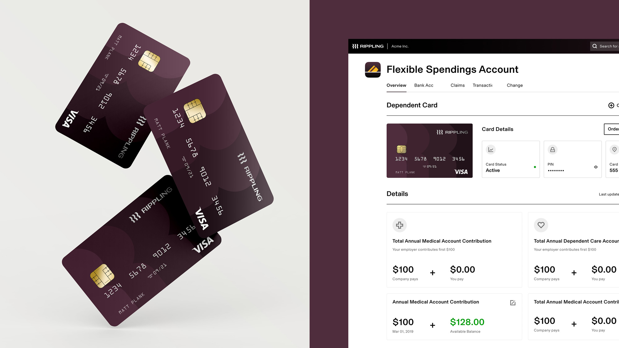
Established in 2016, Rippling is a software platform for businesses to manage employees’ human resource and IT needs. With customers that range from fast-growing tech startups to Midwestern manufacturing companies, San Francisco, CA-based Rippling competes in the market with more well-known payroll companies like Gusto and ADP and online benefits providers like Zenefits. The platform offers payroll; benefit management, including medical, dental, vision, 401K, and more; setting up employees cloud apps; and buying and managing employees’ devices, from laptops to monitors. Recently, Rippling introduced a new identity designed in-house.
The goals of our brand evolution:
- Become more mature and sophisticated, with a broader set of assets
- Stand out meaningfully from the competition
- Buck common tech tropes like explainer cartoons and soft, lowercase sans-serifs
- Create a hardworking system that matches the power of our product
- Speak to business of all sizes and kinds.
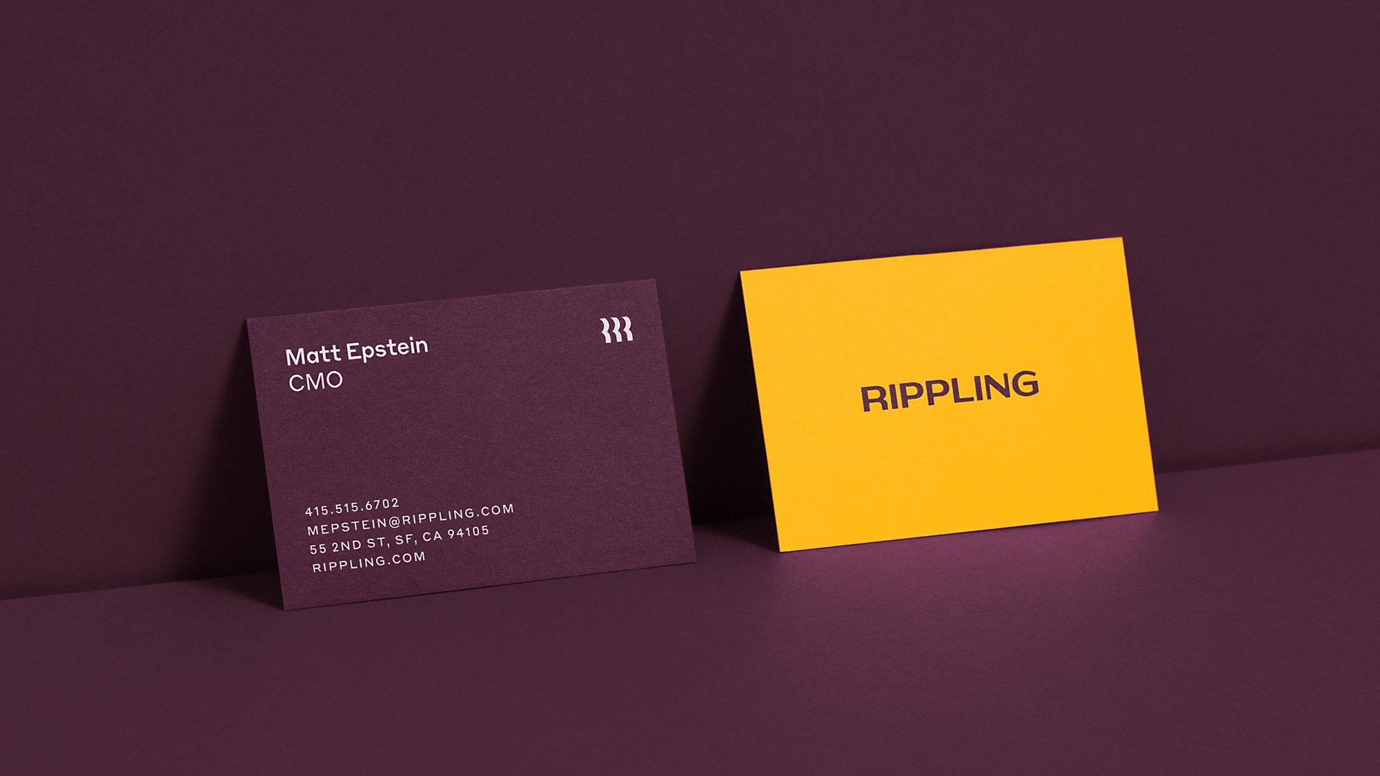
Conceptually, our icon embodies three things: the “R” in Rippling, the visual of a ripple, and—of course—people. Our Marketing team likes that it feels fast, Product appreciates that it works at tiny sizes, and Parker enjoys how it looks on a hat.
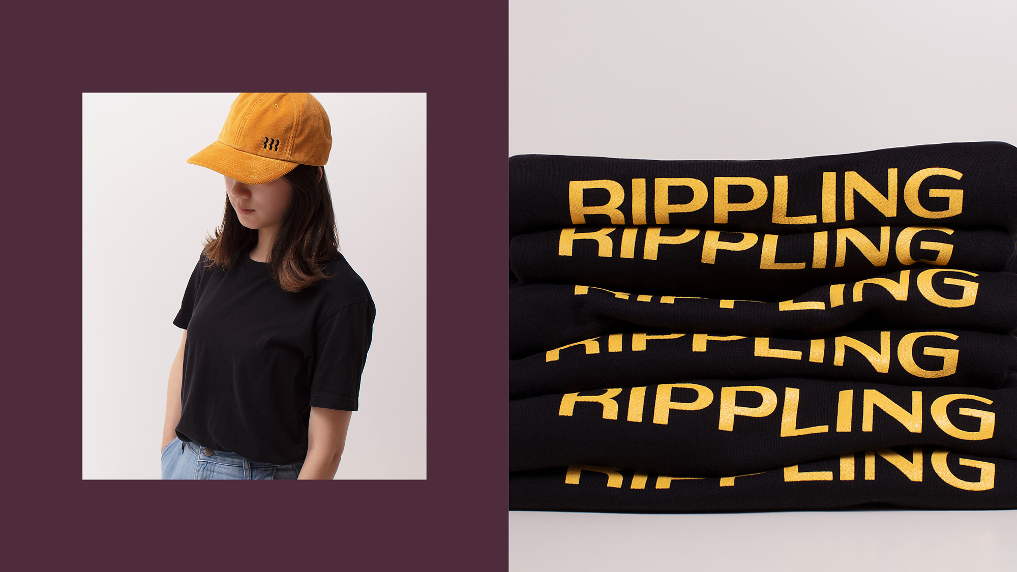
Our custom wordmark by Graham Bradley adds an industrious vibe uncommon in the tech space.
The old logo was not great but it wasn’t terrible, although it did have the ripple effect backwards where the thicker stroke should be on the inside ring and the lighter stroke on the outside as ripples get weaker as they go out. The new logo replaces the simple ring ripple with an abstract “R” ripple that’s more interesting, dynamic, and with some bonus meanings that can be squeezed out of it, including the abstract people, which I hadn’t seen before watching the construction video. A little on the nose but, I admit, it’s relevant, appropriate, and subtle. I’m surprised the three abstract “R”s are the same thickness as it would be very easy to vary them and create that ripple effect, the way the animations below appear or kind of like this banner. But maybe that would be too literal and I do like the sturdiness of the monogram as it is. The wordmark is solid with a slight contrast in the thicks and thins and an extended-but-not-too-extended structure.
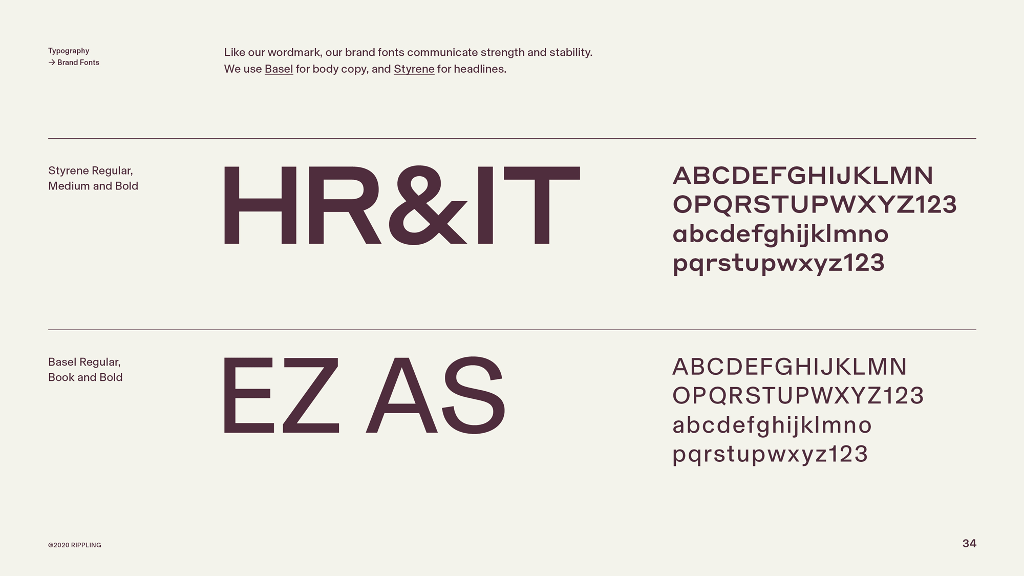
Our typographic system is built on Styrene and Basel—optimal in that they work seamlessly in product and marketing applications alike.
Our colors (yellow and plum) represent a thoughtful effort to stand out. Very few competitors use them, and—lucky for us—they strike the “powerful yet premium” tone we need to achieve.
Beyond visuals, we take a lot of pride in our voice. It’s an honest reflection of how our employees communicate: “plainspoken and contrarian, but with a wink.”
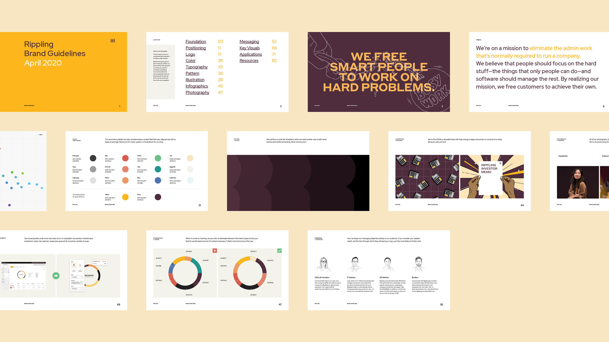
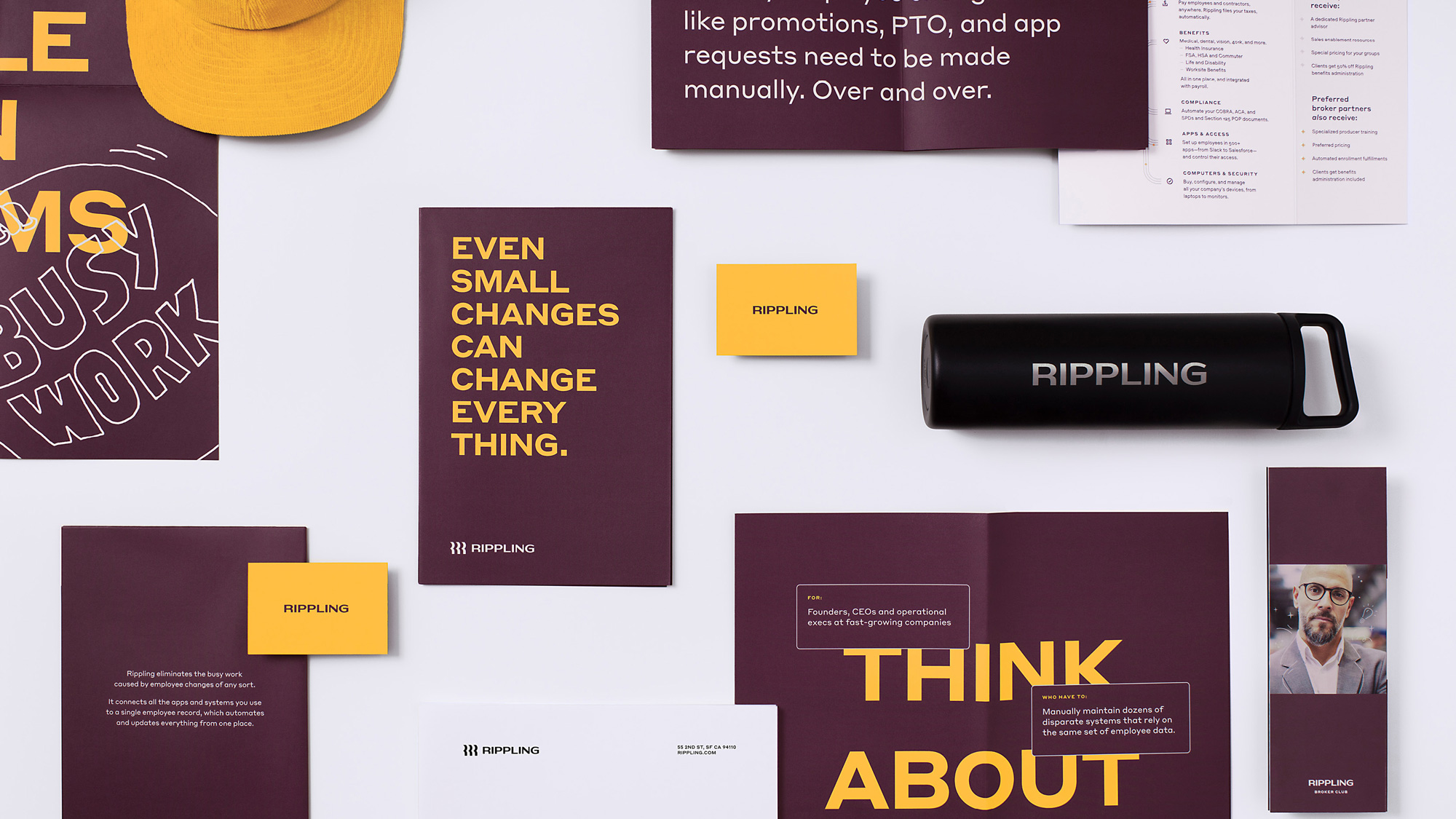
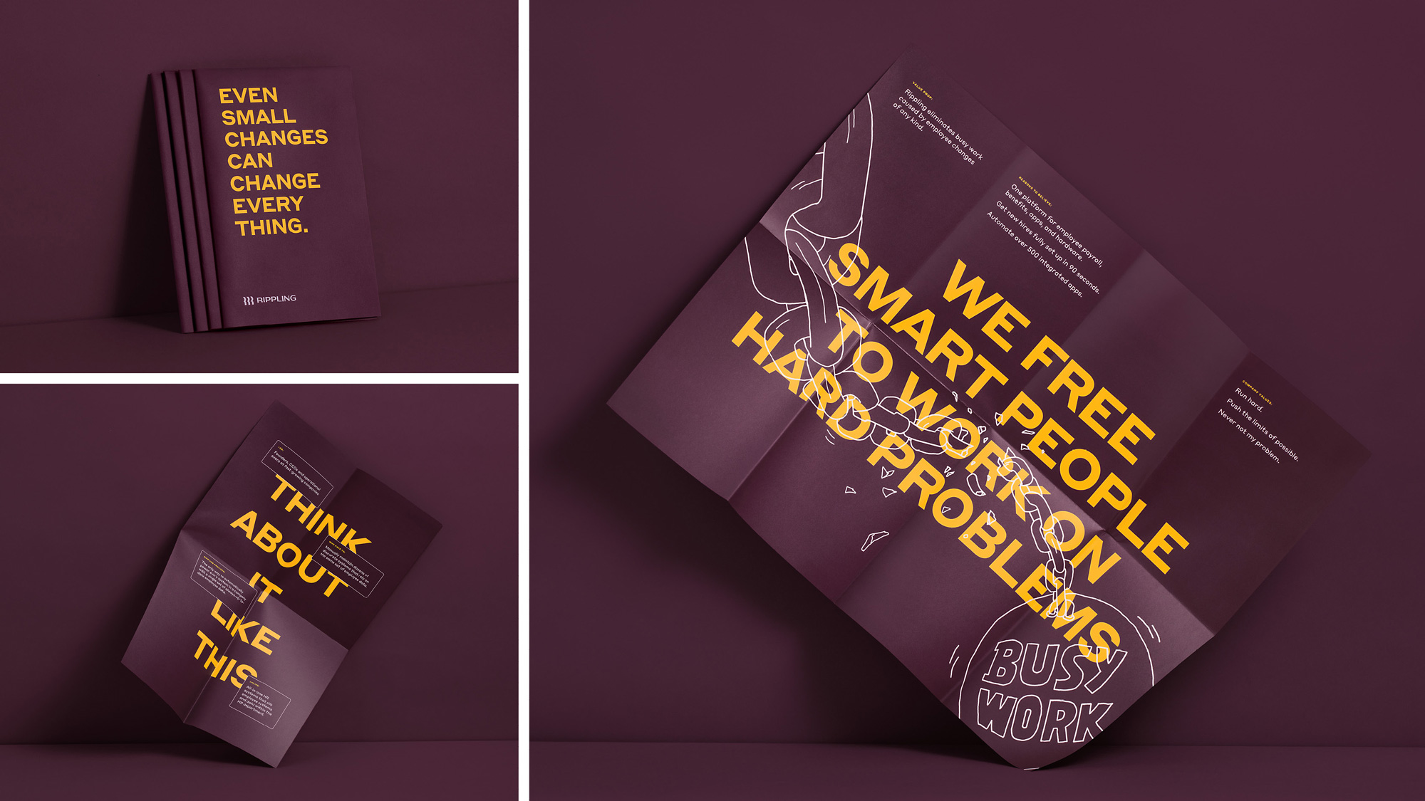
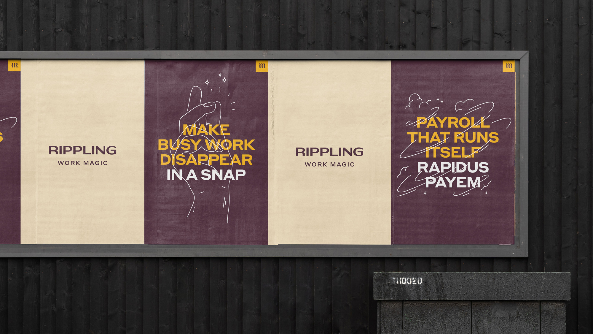
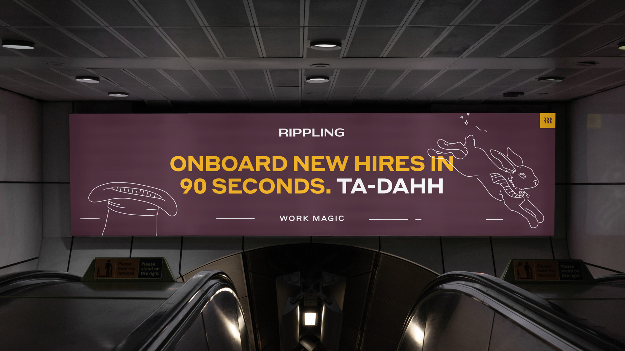
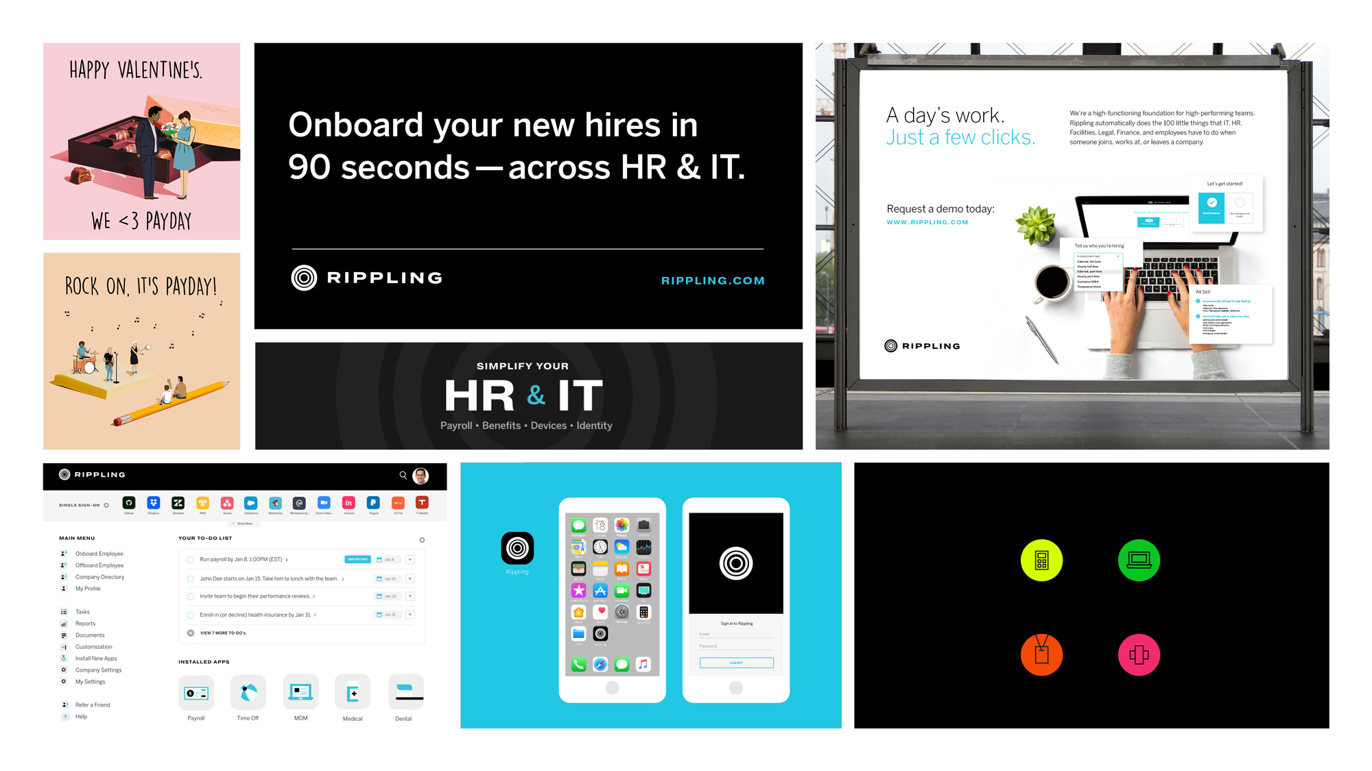
The applications are all quite decent and there are some nice surprises in here, like the use of very thin and playful illustrations interacting with the big headlines and the monogram neatly tucked on the top-right corner in a square. Small things that make a difference. The plum and yellow color palette is unexpected… there is something old-school about it — and by old-school I mean maybe early 2000s — with a certain heaviness to it but in avoiding the more expected bright colors it manages to stand out nicely as well as feel fairly serious with the playfulness of the copy and illustrations for balance.
These last three videos… I’m not really sure what’s up with them and at first glance they are a little corny but for some reason they are oddly pleasing — like, they are not funny or super well done or exactly on brand but somebody thought that a monogrammed pooper scooper was a great idea and I’m willing to support that. Aside from this last aside, the identity is relatively straightforward but done with plenty of care and attention while being conscious of not just repeating the same visual language and behaviors of most other SaaS companies in San Francisco.
 each year since publication began in 2006

 Новости Союза дизайнеров
Все о дизайне в Санкт-Петербурге.
Новости Союза дизайнеров
Все о дизайне в Санкт-Петербурге.